2. Creating App UI - Pages and Tabs
Learn how to work with screens (pages) and tabs available in the visual App Builder
Introduction
This section describes how to work with your Ionic project pages and provides details on how you can easily define the UI components to customize your app appearance.
You will also be introduced to the visual App Builder components PALETTE and explained how to customize the appearance of your app.
Appery.io App Builder Overview: Getting Started VideoYou can also check this video for detailed instructions on how to get started developing with the Appery.io visual App Builder:
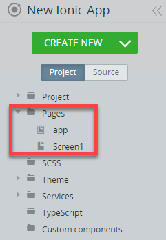
Every brand new Ionic app has two default pages (screens), app and Screen1:
Note!It is important to differentiate between these two types of the Page component for different pages types (check the Project view):
- IndexScreen for app pages (there can be only one app page in a project)
and- Page for Screen pages (numerous Screen pages can be created in a project).
The number of screens is plan-dependent, so check our Pricing table to learn how many screens can be created under your plan.
Let's review the difference between those two.
General Page (app/Screen) Overview
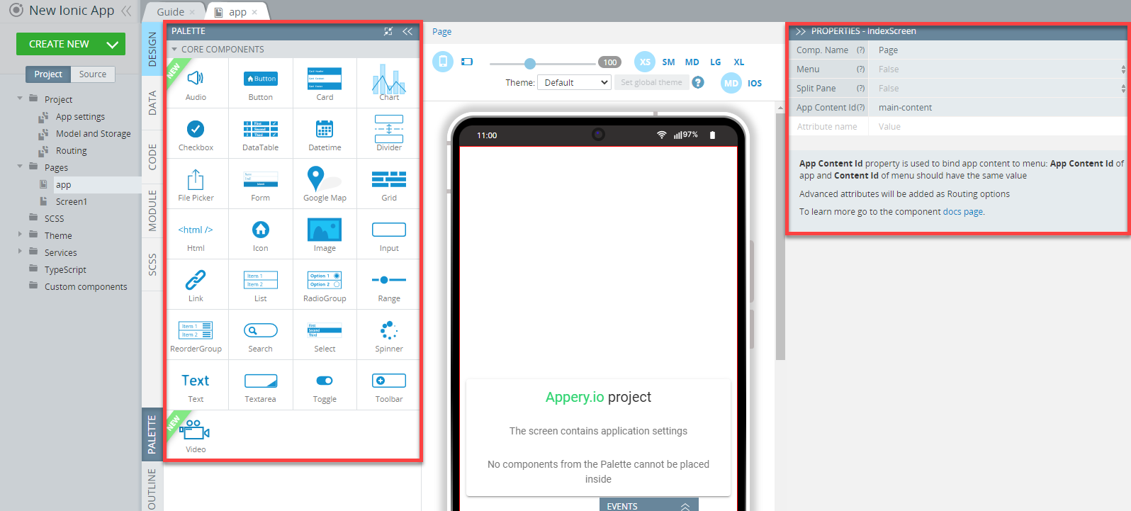
When you open the app page (or any other page), you will see the image of your device in the middle (the Mobile frame), the components PALETTE (with the set of predefined UI components to the left of it, and the PROPERTIES panel (an instrument for components customization) to the right:
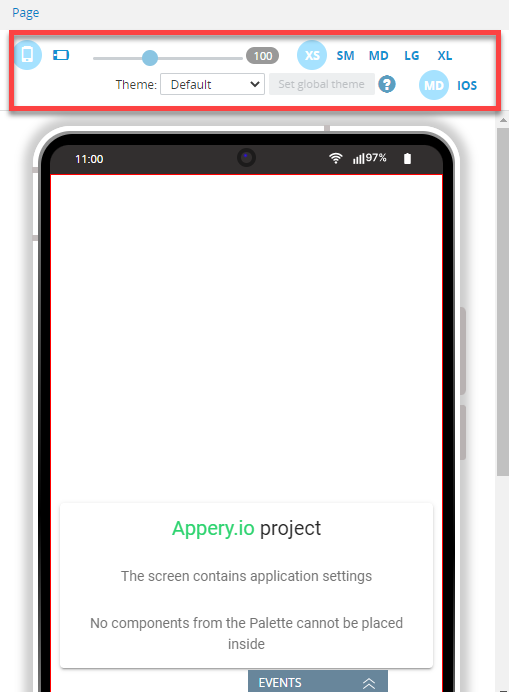
Page layout can be portrait or landscape, screen size set to extra small, small, medium, large, or extra large, and the screen view switched between iPhone OS and Material Design. You can also use the preview option to see how this particular app page will look like with the selected theme (works in the editor preview only):
For the app page, the nested Content, Footer, and Header components are contained within the Menu component.
Index Screen
Being the container of the highest level for all app pages, IndexScreen is the construction element that manages the general app behavior (for example, adds a split pane or a side menu to your app).
IndexScreen can be found under the app page only (check the Project view) and cannot be added to any other screen:
No PALETTE components can be added to IndexScreen.
Properties
The IndexScreen properties available for modifying are the following:
| Property Name | Property Description |
|---|---|
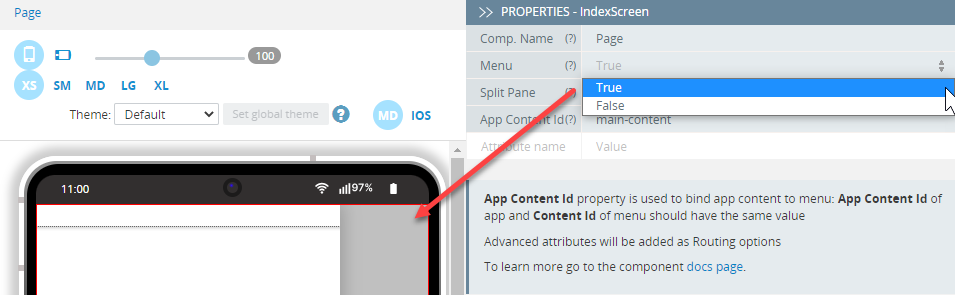
| Menu | To create a side menu, select True. |
| Split Pane | Set to True to add a split pane to the project. (Menu should also be set to True). If set to False, the side pane will not be displayed. |
| App Content Id | The App Content Id property is used to bind app content to the menu: the app App Content Id and the menu Content Id should be of the same value. |
Video Tutorial: Adding Side Menu to Ionic AppCheck out this video guide for detailed instructions on how to add a side menu to your Ionic application:
For correct work of the menu and split pane, Menu Content Id, Split Pane Content ID, and App Content Id of the app should have the same value.
Modifying these properties is recommended for experienced users only.
The advanced attributes can be added for routing purposes including main app content.
Menu
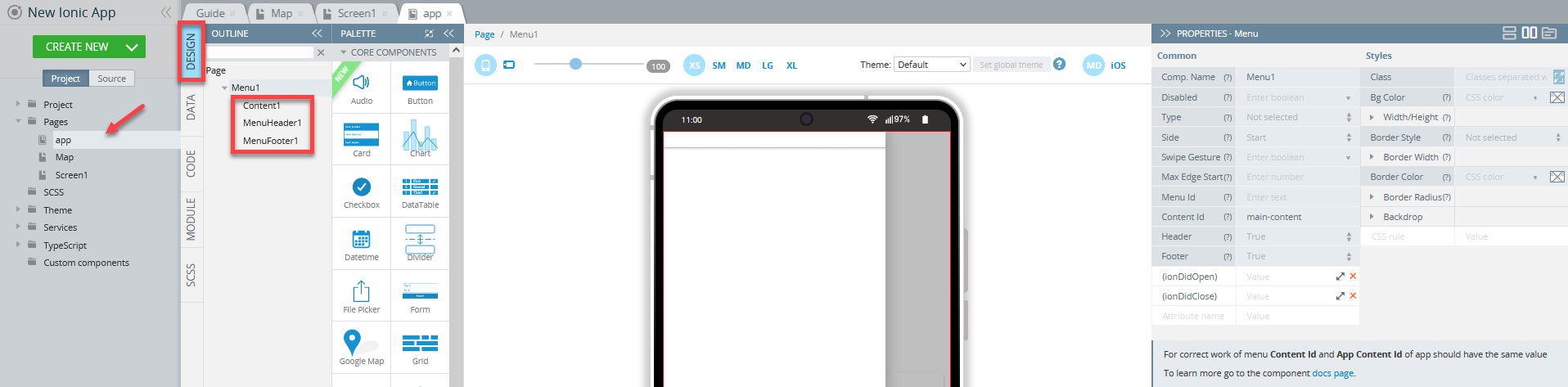
To add a side menu to your app, set the IndexScreen Menu property to True:
The created Menu component contains Content, Menu Header and Menu Footer and has the following properties:
Common Menu Component Properties
| Property Name | Property Description |
|---|---|
| Disabled | Every component on the page is enabled by default. You may need to disable components. If set to true, the user cannot interact with the component. For more details, read here. |
| Type | The display type of the menu. Available options are Push, Reveal, Overlay. |
| Side | What side of the view the menu should be placed to: Start or End. |
| Swipe Gesture | If set to true, the menu swiping is enabled. |
| Max Edge Start | The edge threshold for dragging the menu open. If a drag/swipe takes place over this value, the menu is not triggered. |
| Menu Id | The menu ID. |
| Content Id | The content's ID to be used in the menu. |
| Header | If set to True, adds the header to the menu. |
| Footer | If set to True, adds the footer to the menu. |
| (ionDidOpen) | Emitted when the menu is open. |
| (ionDidClose) | Emitted when the menu is closed. |
Styles Menu Component Properties
Under the Styles tab, the menu can be styled with several attributes to look like in a specific way:
| Property Name | Property Description |
|---|---|
| Class | The Class property allows listing different classes. Check this link for Ionic CSS utility classes. |
| Bg Color | Color to use from your application's color palette. Select CSS color from the available colors: Primary, Secondary, Tertiary, Success, Warning, Danger, Light, Medium, Dark, and Custom, use the Color-picker, or enter your custom color name. |
| Width/Height |
|
| Border Style | Set the line style of an element's border. Available values are: Solid, Dotted, Dashed, and Double. |
| Border Width | Set the line width of an element's border in px, em, vh, and vw: All sides, Top, Right, Bottom, Left. |
| Border Color | Select border color from the available colors: Primary, Secondary, Tertiary, Success, Warning, Danger, Light, Medium, Dark, and Custom or use the Color-picker. |
| Border Radius | Round the corners of an element's outer border edge in px, %, em, vh, and vw: All sides, Top Left, Top Right, Bottom Left, Bottom Right. |
| Backdrop | Select the background color of the menu backdrop from the available colors: Primary, Secondary, Tertiary, Success, Warning, Danger, Light, Medium, Dark, and Custom or use the Color-picker. Set the opacity of the menu backdrop. Opacity is the degree to which the content behind an element is hidden. |
| CSS rule | Add here all the necessary styles. |
The app page Menu component (activated if set to True under the IndexScreen PROPERTIES tab) offers three child components to be defined:
These properties are similar to the Content, Header and Footer components of the Screen Page component.
Menu Header and Menu Footer (for the app page) become available if the Header and Footer properties are set to True under the IndexScreen PROPERTIES view.
Similarly, Header and Footer (for Screen pages) become available if the Header and Footer properties are set to True under the Page PROPERTIES view:
Check out this documentation link to learn how to create a simple Ionic mobile application with a menu in Appery.io.
Besides, you can check this document to learn how to use Ionic Side Menu Template in Appery.io.
You can also watch this Appery.io community video that shows how to add a menu to a mobile application.
Split Pane
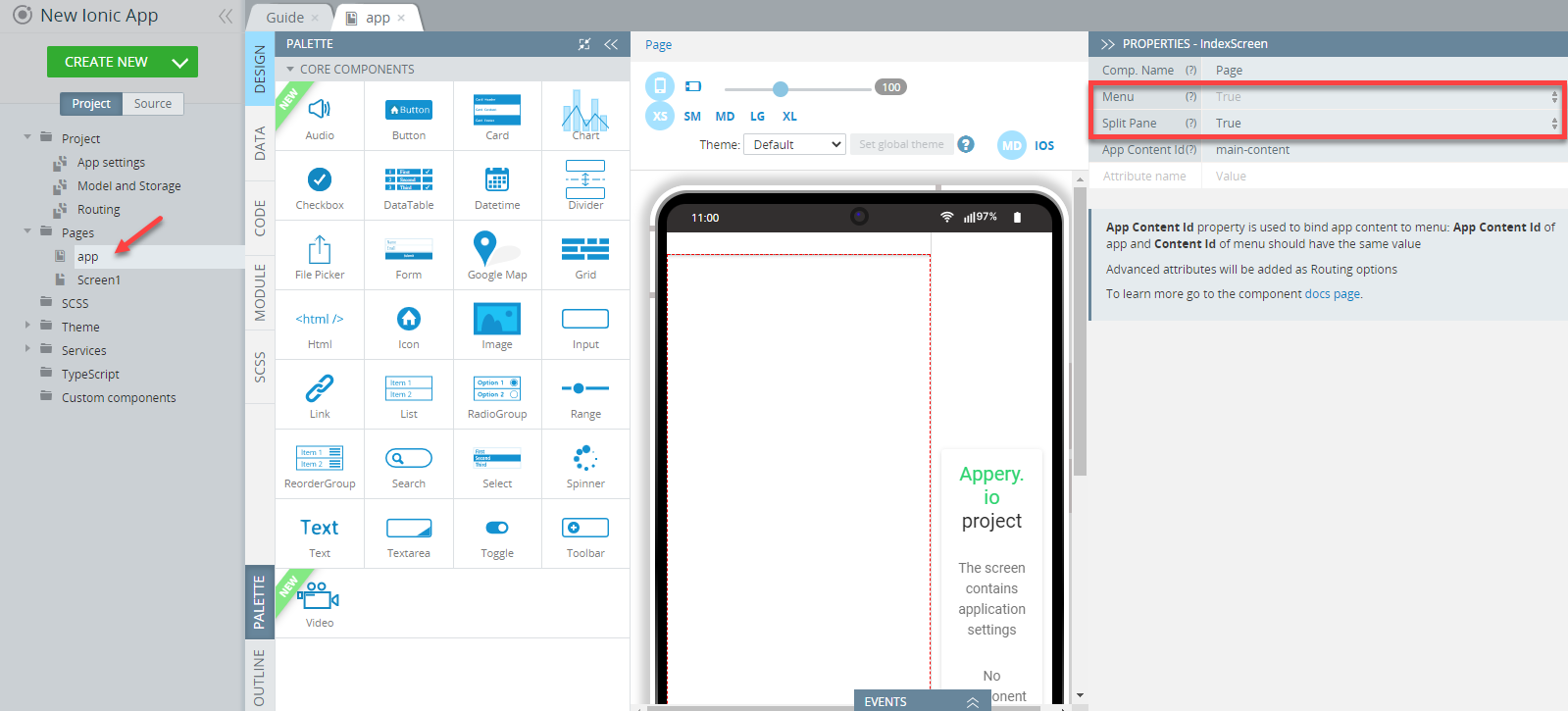
To add a split pane, set the IndexScreen Split Pane property to True:
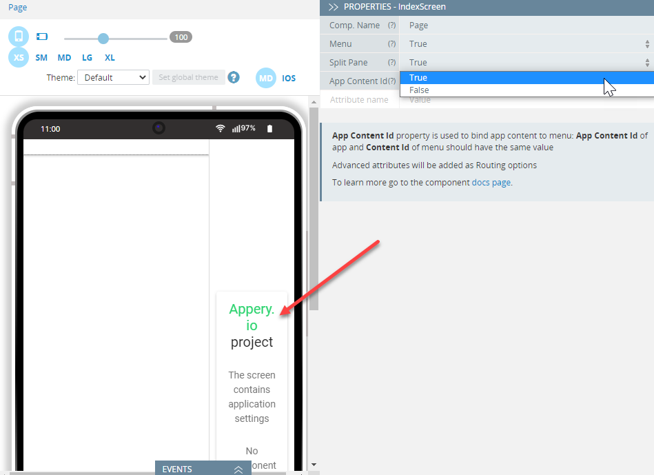
The IndexScreen Menu property should be also set to True to make the Split Pane accessible.
The Split Pane component has the following properties:
| Property Name | Property Description |
|---|---|
| Disabled | Every component on the page is enabled by default. You may need to disable components. If set to true, the user cannot interact with the component. For more details, read here. |
| Content Id | The content's ID to be used in the menu. |
| When | Define when the split pane should be shown. From the drop-down, selecting from Ionic's predefined sizes is available: xs, sm, md, lg, and xl. It can also be passed as a CSS media query expression or a shortcut expression. Using a boolean expression is also possible. |
| (ionSplitPaneVisible) | Expression to be called when the split pane visibility has changed. |
| Class | The Class property is found under the Styles tab and allows listing different classes. Check this link for Ionic CSS utility classes. |
| CSS rule | Add here all the necessary styles. |
Learn more about Split Pane and read on how to customize its When property here.
Pages (Screens)
The Page (Screen) component is the main container for other Ionic UI components PALETTE and, in its turn, consists of three more Ionic components:
Content is the main part of the page where the components may be placed.
Header and Footer may be shown or hidden.
Tip!Using the OUTLINE view can be helpful in locating the needed component and/or arranging UI components on the screen.
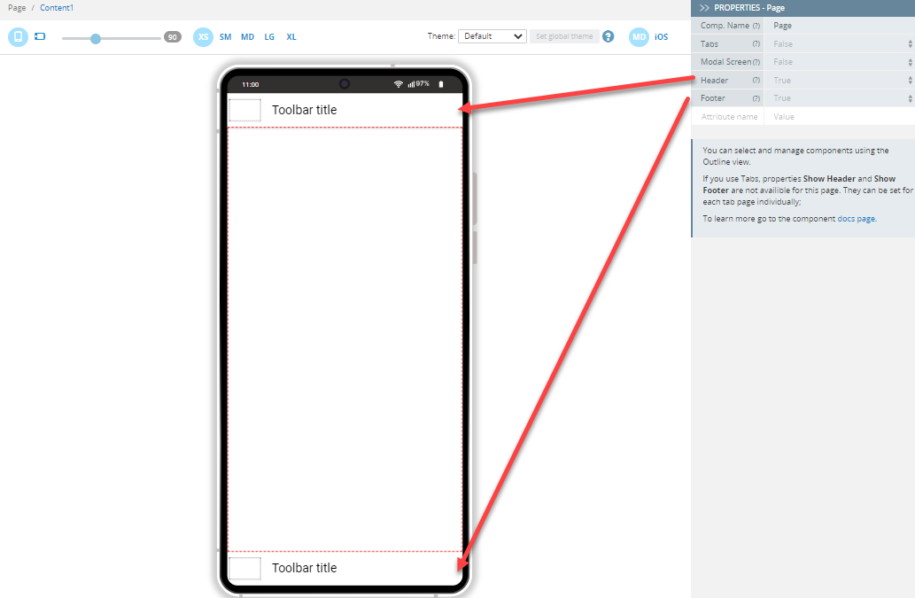
Properties
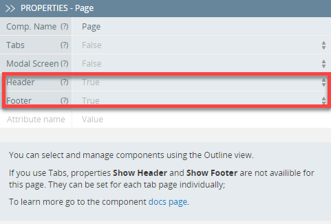
The Page component (for app Screen pages) has the following properties:
| Property Name | Property Description |
|---|---|
| Tabs | If set to True, tabs will be added to the page |
| Modal Screen | If set to True, this page will be used as a Modal page. |
| Header | If set to True, the header will be added to the page. |
| Footer | If set to True, the footer will be added to the page. |
If you use Tabs, the properties Show Header and Show Footer become unavailable for this page. They can be set for each tab page individually.
Header and Footer (for Screen pages) become available if the Header and Footer properties are set to True under the Disabled tab:
Similarly, Menu Header and Menu Footer (for the app page) become available if the Header and Footer properties are set to True under the IndexScreen PROPERTIES tab.
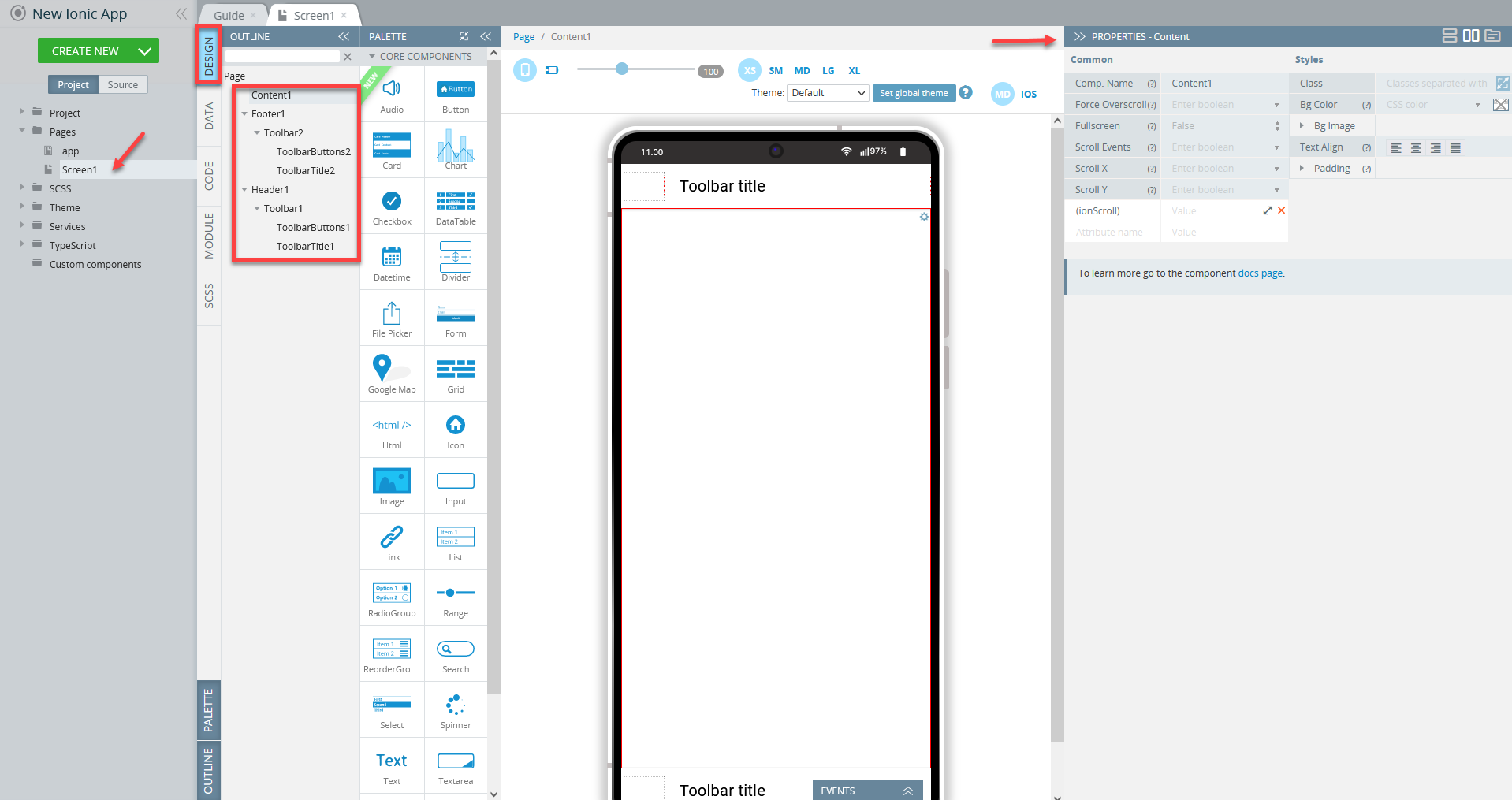
Content component
Content is the main part of the page where all the UI components may be placed:
You can easily select and manage components added to the working area by using Breadcrumbs or use the OUTLINE view to select, rearrange or filter them:
The Content component has the following properties:
Common properties of the component are grouped under the component's PROPERTIES Common tab while the properties used to define styling can be found under the Styles tab:
Common Properties
| Property Name | Property Description |
|---|---|
| Force Overscroll | If set to true (with the content not triggering an overflow scroll), the scroll interaction will cause a bounce. |
| Fullscreen | If set to True, the content will scroll behind headers and footers. |
| Scroll Events | If set to true, ionScrollevents will be enabled and listening from(ionScroll)will start. Because of performance reasons, ionScroll events are disabled by default. |
| Scroll X | If set to true, the content scrolling will be enabled on the X-axis. |
| Scroll Y | Setting to false will disable the content scrolling on the Y-axis. |
| Parse HTML | Click Parse HTML to create Appery.io components from any HTML code copied from 3rd party resources. |
| AI Assistant | Use the AI Assistant property to quickly generate app UI. You can enter your query or use speech recognition to input your request. |
| (ionScroll) | The event emitted while scrolling. This event is disabled by default. |
In order to scroll content behind headers and footers, the Fullscreen attribute needs to be enabled for Content.
Styles Properties
| Property Name | Property Description |
|---|---|
| Class | Classes can be listed here. Check this link for Ionic CSS utility classes. |
| Padding | Set the element's padding area in px, %, em, vh, and vw: All sides, Top, Right, Bottom, Left. |
| Bg Color | Select the background color of an element from the available colors: Primary, Secondary, Tertiary, Success, Warning, Danger, Light, Medium, Dark, and Custom or use the Color-picker. |
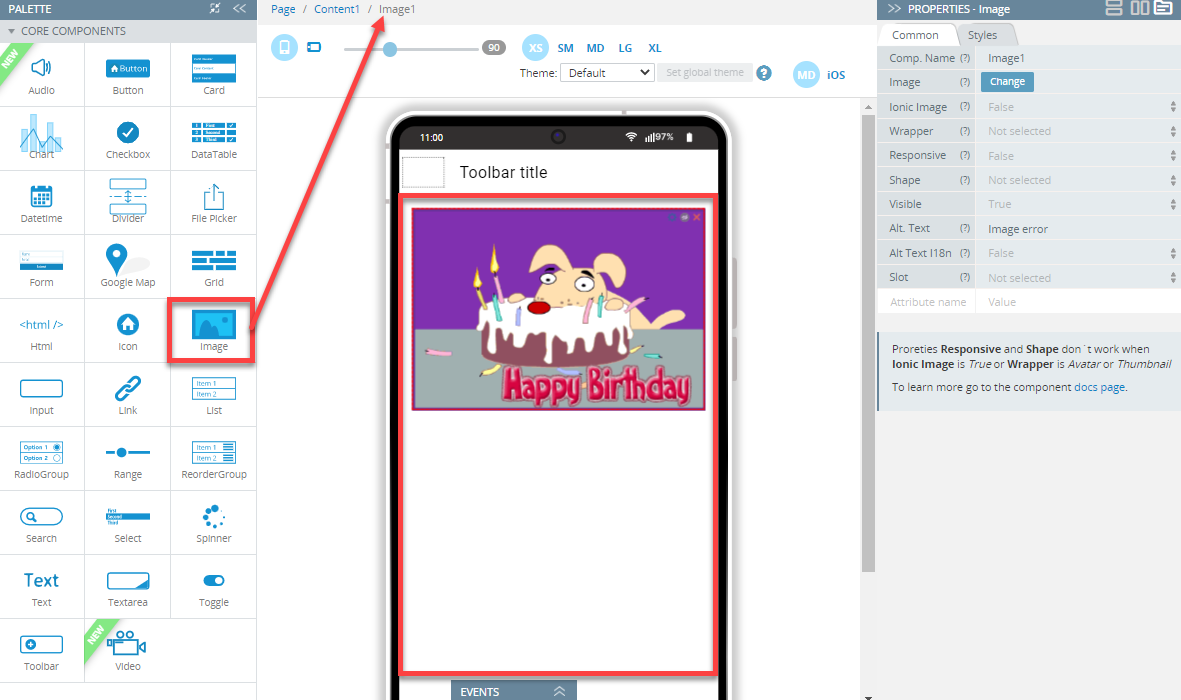
| Bg Image | Click the Change button to select the uploaded image from Media Manager.
|
| Text Align | Set the horizontal alignment of the card text.
|
| Vertical Align | Set the vertical alignment of the content.
|
| CSS rule | Add here all the necessary styles. |
Check this link to read more about Content.
Header and Footer
Switch to the Styles tab to get access to modifying the following properties of the Header and/or Footer components:
| Property Name | Property Description |
|---|---|
| Class | Header/footer class. |
| Padding | Set the element's padding area in px, %, em, vh, and vw: All sides, Top, Right, Bottom, Left. |
| Mode | Determine which platform styles to use. Possible values are iOS or MD. |
| Translucent | If set to True, the header/footer will be translucent. In order to scroll content behind the header/ footer, the fullscreen attribute needs to be set on the content. Defaults are set to False. |
| Height | Set an element's height in px, %, em, vh, and vw. |
| Min Height | Set the minimum height of an element in px, %, em, vh, and vw. |
| Max Height | Set the maximum height of an element in px, %, em, vh, and vw. |
| Border Style | Set the line style of an element's border. Available values are: Solid, Dotted, Dashed, and Double. |
| Border Width | Set the line width of an element's border in px, em, vh, and vw: All sides, Top, Right, Bottom, Left. |
| Border Color | Select CSS color from the available colors: Primary, Secondary, Tertiary, Success, Warning, Danger, Light, Medium, Dark, and Custom or use the Color-picker. |
| Border Radius | Round the corners of an element's outer border edge in px, %, em, vh, and vw: All sides, Top Left, Top Right, Bottom Left, Bottom Right. |
| Bottom Shadow | Click to hide the bottom shadow of the element. |
| CSS rule | Add here all the necessary styles. |
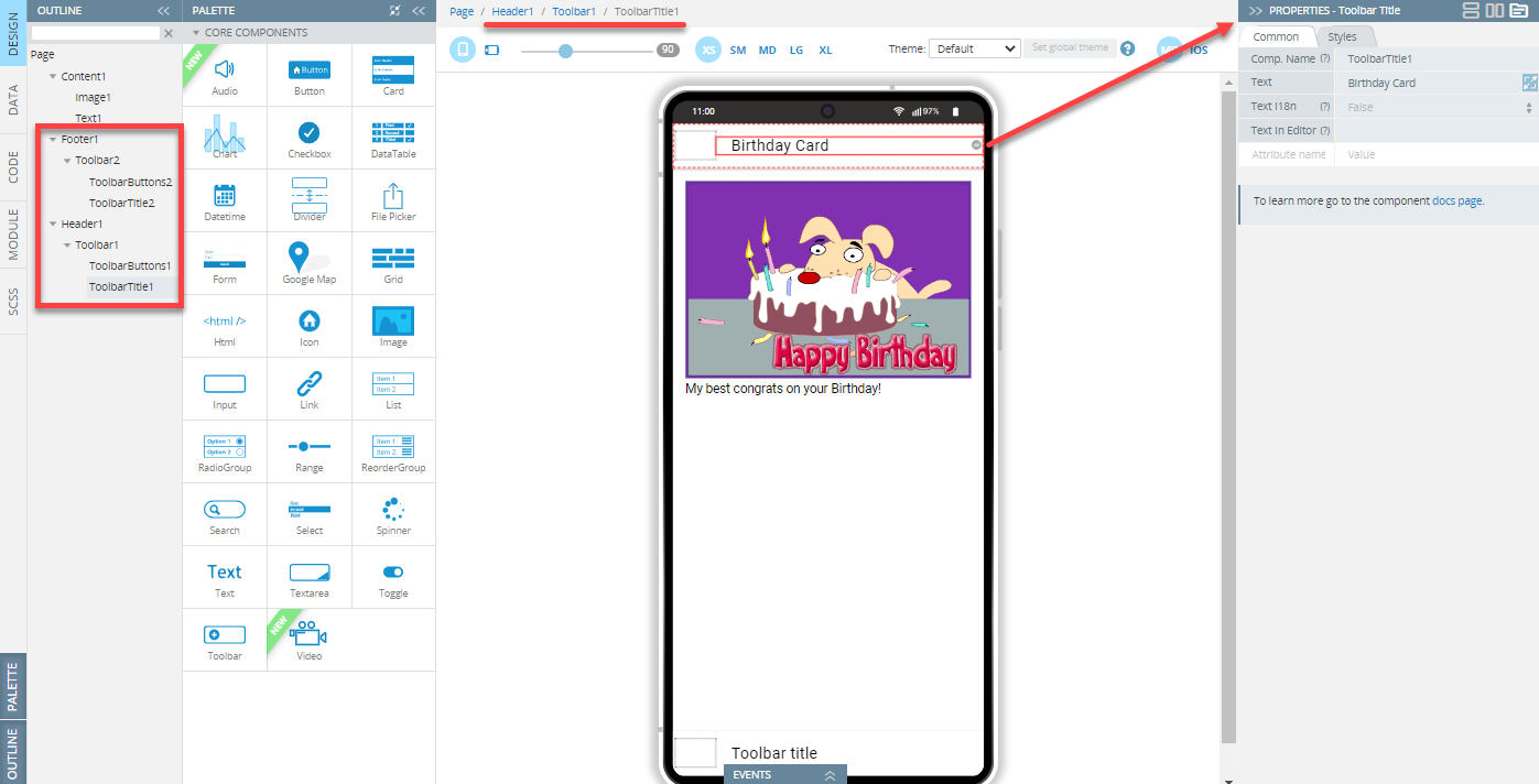
By default, any new Screen page is created with its Header and Footer which, in their turn, contain the following nested components: Toolbar, Toolbar Title, and Toolbar Buttons.
Check this section of the document to learn more about the Toolbar component.
Check these links to learn more about Headers and Footers.
Tabs
Tabs are a top-level navigation component to implement a tab-based navigation. The component is based on Ionic ion-tabs, ion-tab-bar and ion-tab-button components.
Setting the Page Modal Screen property to True will remove Tabs from the page.
Working with Tabs
To add Tabs to your application, create a new screen page and set its Tabs property to True: the Tabs component with a Tab Bar (including a Tab Button) will be added to the screen:
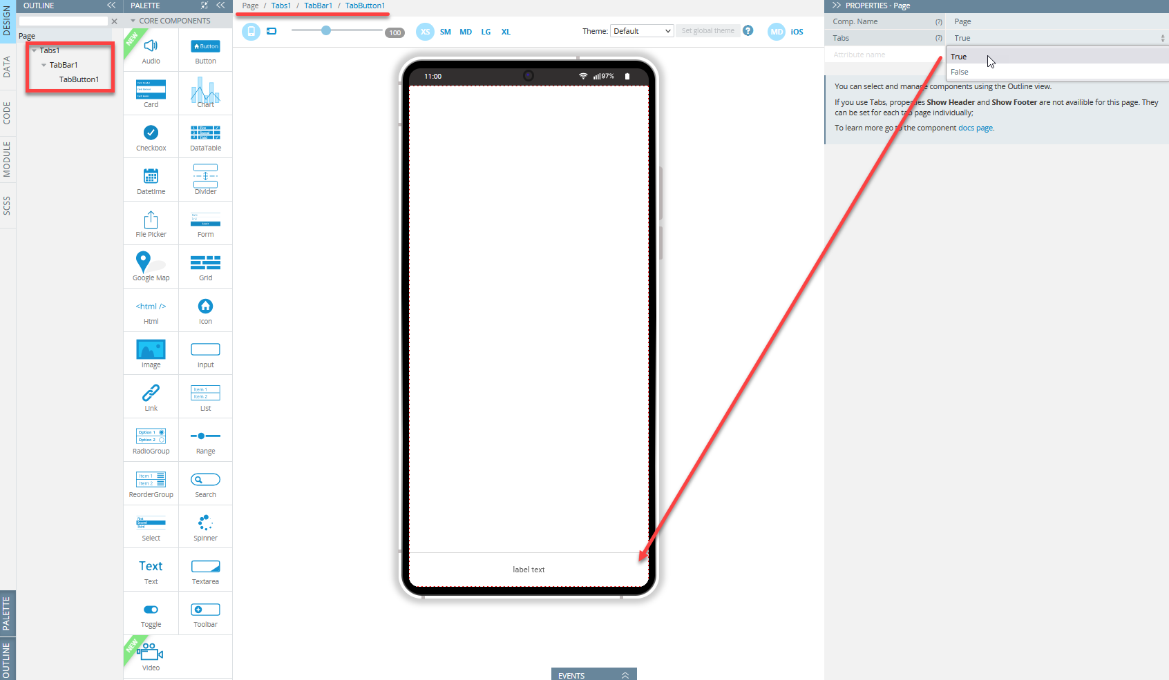
If the Tabs property is set to True, all the existing components will be removed from the page.
In the Tabs mode, Tabs, Tab Bar and Tab Button components become available for editing. You can select any of them by clicking on each or use Breadcrumbs or the OUTLINE view of the visual editor:
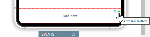
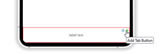
Use the green + button on the selected Tab Bar if you need to add more Tab Button components:
Binding a page to every Tab Button is carried out with the Tab property of the button. The property contains a list of created pages where users can navigate to.
The created tabs will be displayed after navigating to the appropriate tabs page. For example, you can choose such a page with tabs as the default opening page on application loading under the Project > Routing tab.
Want to know more?You might be interested in our Restaurant App template with integrated Tabs functionality.
Changing Tab Name in URL
If you need to have a special tab name in the URL, enter a new name to the Tab Path property of the Tab Button component. If the property isn't specified, the name of the screen will be used in the URL.
Navigation from Tabs to Child Pages
By default, created tab buttons won't be displayed after users' navigation from the current tab to other pages that are not bound to other tab buttons.
If you need to show tab buttons for such navigation, use the Tab Path property of the Tab Button component.
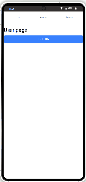
Suppose we have an app where we would like to define navigation using the Users tab button to the UserDetails page:
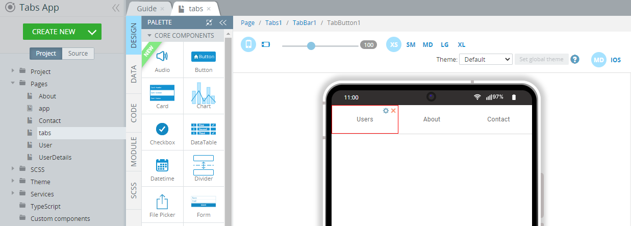
To do it, we'll need to define a child route for this button that has the following structure:
[{"path": "userdetails", "screenName": "UserDetails"}]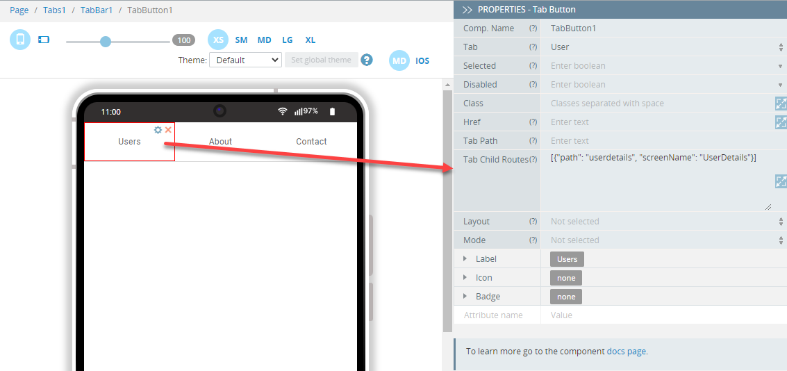
In these cases, path is the name of the tab that will be used in the URL and screenName is the name of the page from the Project tree.
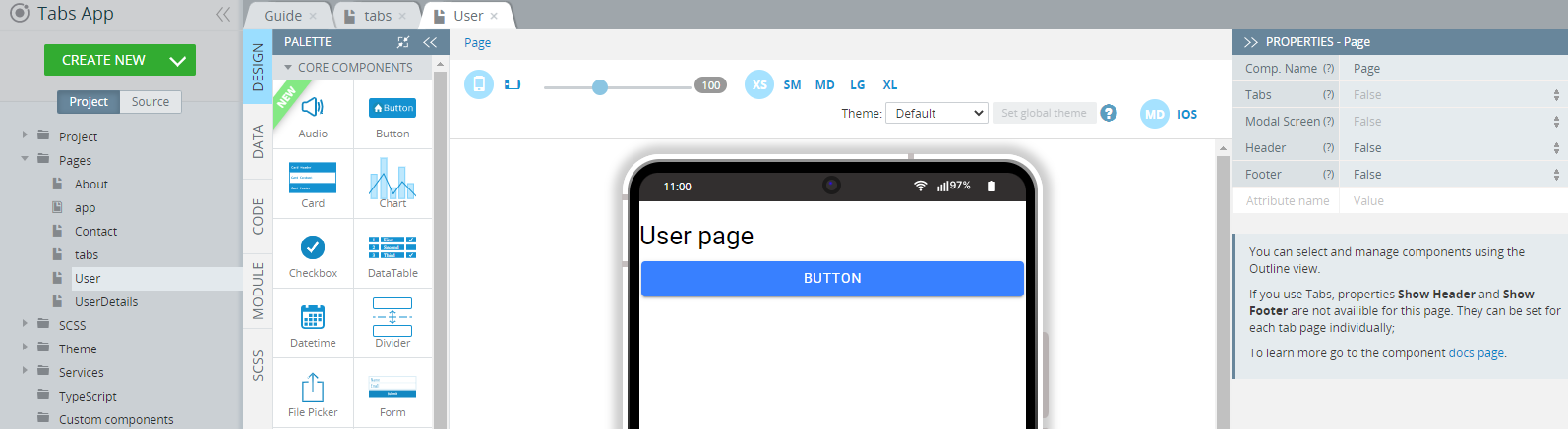
After child routes have been defined, drag and drop a linking component (for example, the Button) from the PALETTE to the tab page navigation from which will be carried out (here, it is the User page):
You can also add an advanced attribute routerLink to the linking component so that a button click will navigate you to a child page.
Pass the path of the created child route as the value of the attribute [routerLink] as userdetails:
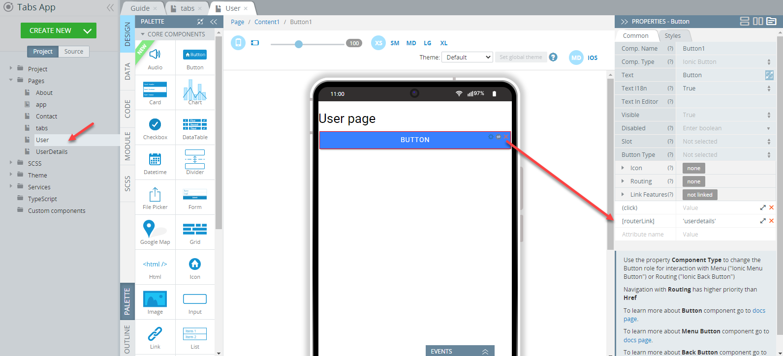
As a result, after clicking on the linking component, navigation will take place and tab buttons will be kept on the page.
Please check how this routing works in an app:
If you use Tabs, properties Show Header and Show Footer will become unavailable for this page. They can be set for each tab page individually.
Properties
The Tabs component has the following properties:
| Property Name | Property Description |
|---|---|
| Class | Classes can be listed here. Check this link for Ionic CSS utility classes. |
| (ionTabsDidChange) | The event emitted when the navigation has finished transitioning to a new page. |
| (ionTabsWillChange) | The event emitted when the navigation is about to transition to a new page. |
Read more about Tabs here.
Tab Bar
The Tab Bar component has the following properties:
| Property Name | Property Description |
|---|---|
| Selected Tab | The selected tab by default. |
| Color | Select from the predefined value types (primary, secondary, tertiary, success, warning, danger, light, medium and dark) or enter your custom color name. |
| Slot |
|
| Class | Classes can be listed here. Check this link for Ionic CSS utility classes. |
| Mode | Determine which platform styles to use. Possible values are iOS or MD. |
| Translucent | If set to True, the Tab Bar will be translucent. It only applies when the Mode is iOS and the device supports backdrop-filter. |
You can check this document to learn how to use Ionic Tabs Template in Appery.io.
Tab Button
To add a new Tab Button, click the green + button on the Tab Bar:
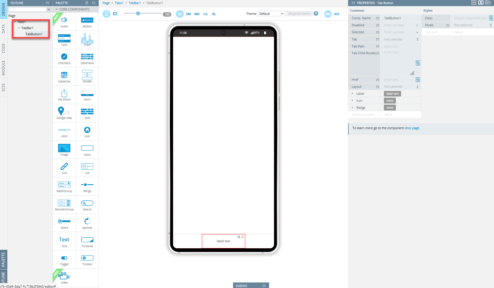
The Tab Button component has the following properties:
| Property Name | Property Description |
|---|---|
| Disabled | Every component on the page is enabled by default. You may need to disable components. If set to true, the user cannot interact with the component. For more details, read here. |
| Selected | If set to true, the tab component will be selected. |
| Tab | A tab id must be provided for each tab button. It is used internally to reference the selected tab or by the router to switch between them. |
| Tab Path | The URL path for this tab. If not set, the screen name will be used. |
| Tab Child Routes | A list of child routes to set internal navigation of the tab.\ |
| Href | It contains a URL or a URL fragment that the hyperlink points to. If this property is set, an anchor tag will be rendered. |
| Layout | Set the layout of the text and icon in the tab bar. Possible values are Icon Bottom, Icon End, Icon Hide, Icon Start, Icon Top, Label Hide. The defaults are set to Icon Top. |
| Label |
|
| Icon | Add an icon to the Tab Button.
|
| Badge | Add a badge to the Tab Button.
|
| Class | Define equal styles for elements with the same class name. |
| Mode | Determine which platform styles to use. Possible values are iOS or MD. |
| CSS rule | Add here all the necessary styles. |
Check this Ionic documentation for more information.