Range
Overview of the Range Component
The RangeWrapper slider lets users select from a range of values by moving the slider knob. It can accept dual knobs, but by default, one knob controls the value of the range.
The component is based on Ionic ion-range.
Properties
Important Note!This document lists the properties that are specific to this particular UI component.
To check for the properties common for most UI components, please check the General components document.
Every new RangeWrapper component is created with two default child Range components which, in their turn, include two ItemLabels ( Startand End).
Common Properties
| Property Name | Property Description |
|---|---|
| Item Wrapped | If set to true, the component will be included in the Item with additional properties |
| Show Label | If set to true, the component will have a label. |
| Lines | How the bottom border should be displayed on the item. Possible values are; Full, Inset, None. |
| Reorder | Reorder properties:
|
Range
The Range component has the following properties:
Common Properties
| Property Name | Property Description |
|---|---|
| Name | The name of the control, which is submitted with the form data. |
| Value | The value of the range. |
| Start Label | If set to true, the component will have a start label. |
| End Label | If set to true, the component will have an end label |
| Dual Knobs | Show two knobs by setting the value to True. |
| Start Icon | If set to true, the component will have a start icon. |
| End Icon | If set to true, the component will have an end icon. |
| Max | Maximum integer value of the range. |
| Min | Minimum integer value of the range. |
| Step | Specify the value granularity. |
| Pin | If set to True, a pin with an integer value is shown when the knob is pressed. |
| Snaps | If set to True, the knob snaps to tick marks evenly spaced based on the step property value. |
| Ticks | If set to True, tick marks are displayed based on the step value. Only applies when Snaps is set to True. |
| Debounce | Set for how long, in milliseconds, to wait to trigger the ionChange event after each change in the range value. |
| [(ngModel)] | Angular directive for data binding. Contains a variable with the current value of the group. |
| (ionChange) | The event emitted when the value has changed. |
Styles Properties
Under the Styles tab, Range components can be styled with several attributes to look like in a specific way:
| Property Name | Property Description |
|---|---|
| Range Color | Set a common color scheme of the range - select CSS color from the available colors: Primary, Secondary, Tertiary, Success, Warning, Danger, Light, Medium, Dark, and Custom or use the Color-picker. |
| Bar |
|
| Knob |
|
| Pin |
|
ItemLabel
The ItemLabel components have the following properties:
Common Properties
| Property Name | Property Description |
|---|---|
| Truncate Text | Set to True (default) to truncate label text if it is too long. |
Styles Properties
Under the Styles tab, ItemLabel components can be styled with the following attributes to look like in a specific way:
| Property Name | Property Description |
|---|---|
| Font Size | Enter font size in px, %, em, vh, and vw. |
| Font Weight | Set the weight (or boldness) of the font: Normal or Bold. |
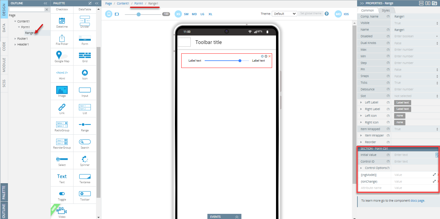
Using Range as a Form Control
If included in a Form component, Range becomes a Form Control; the Name property should be specified (by default, the Name property is defined as the Component name property, so change it if necessary):
Note!Use the following description only when the Form component has the disabled Native validation property. If the Native validation property is enabled the control can be used as a default HTML Form Control.
To set the initial value of the control, use the Initial Value property of the Form Control properties section.
The component can have a number value (e.g. 20) or an object value if the Dual Knobs property is True (e.g. { lower: 20, upper: 80 }). If the property isn't specified the initial value will be set to null.
To use variables as the control's data, the advanced property [(ngModel)] should be specified - the variable name should be entered as the property value. It replaces the value that is set by the Initial Value property.
The component can get additional properties (Control ID and Control options) that allow checking the validity, changing updating strategy, etc. These properties can be used if the Native Validation property is disabled for the Form component.
Read more about validation in the Form section.
Note!The component can't be used with array iteration data for creating a dynamic form structure. If you need to create such kind of structure, follow these recommendations
Updated about 1 year ago