Ionic Custom Components
Working with Ionic Custom Components
Introduction
In an Ionic app, you are free to create custom components that can be further reused in your project.
Suppose you want to create an app with several screens. Each screen has its own content but all the screens have the same component, say Grid, with several dependent elements (text, icons, etc.).
Rather than adding and modifying every new grid on every screen, you can create a new custom component, add the Grid component to it, set its properties, add the needed events to it, and then simply drag this customized component to all the app pages.
Creating Custom Components
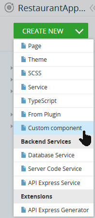
To create a custom component:
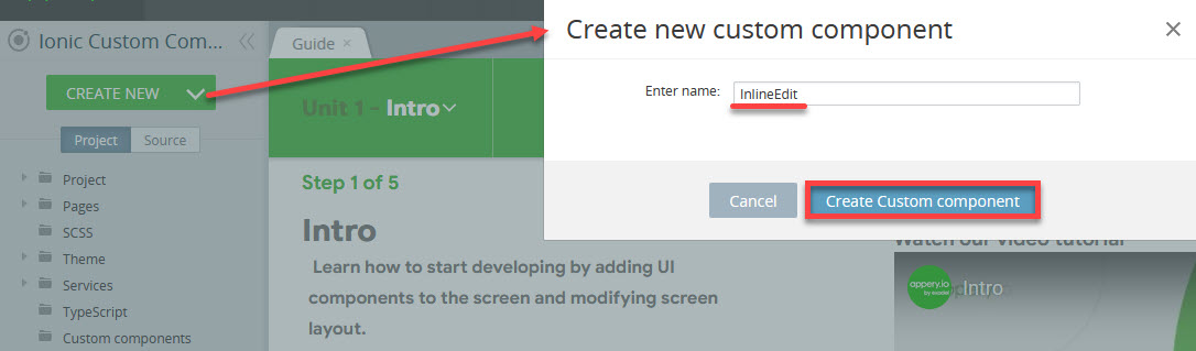
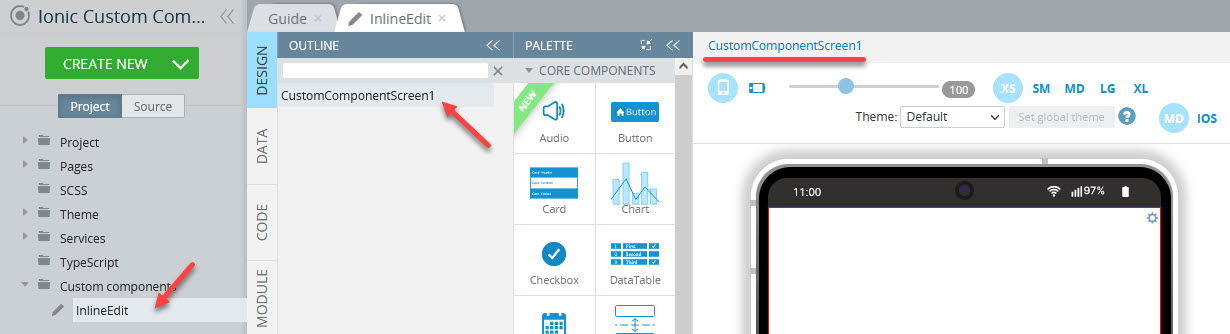
- In the App Builder, click CREATE NEW > Custom component:
- In the new window, provide the component name and confirm by clicking the Create Custom component button.
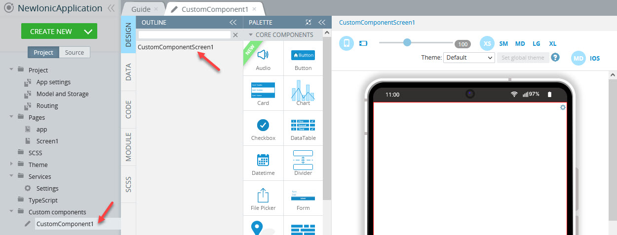
Check that it has appeared both in the Project view and in the OUTLINE tab:
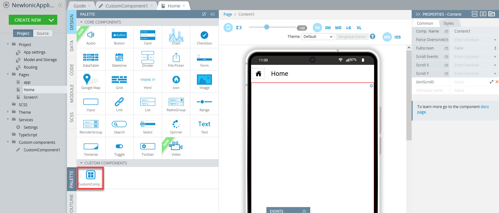
If you switch to any app page, you can see that the custom component became available on the custom components list at the bottom of the PALETTE tab and can now be managed just like any other UI component:
Important Note!Note that custom components CANNOT be added to other custom components.
However, before this custom component can be of good use, it must be defined by adding different UI components or their combinations, providing code, or setting input data or output events.
Defining Custom Components
- Go to the CustomComponentScreen (can be renamed to any meaningful name) and drag the needed UI component(s) from PALETTE to the screen editor:
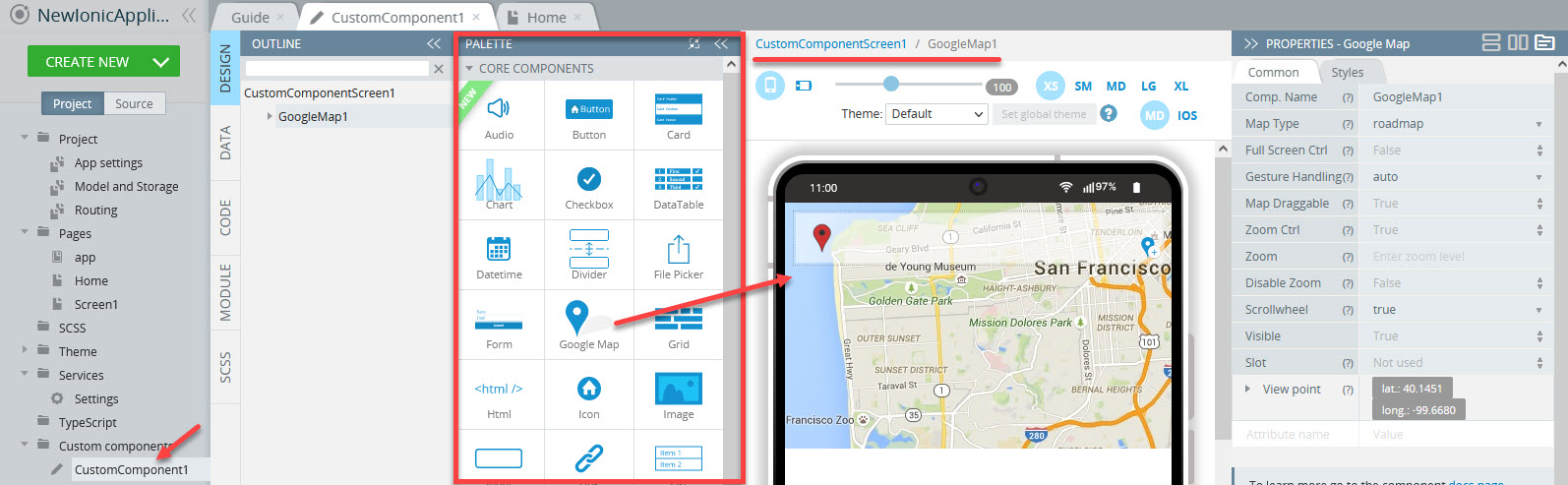
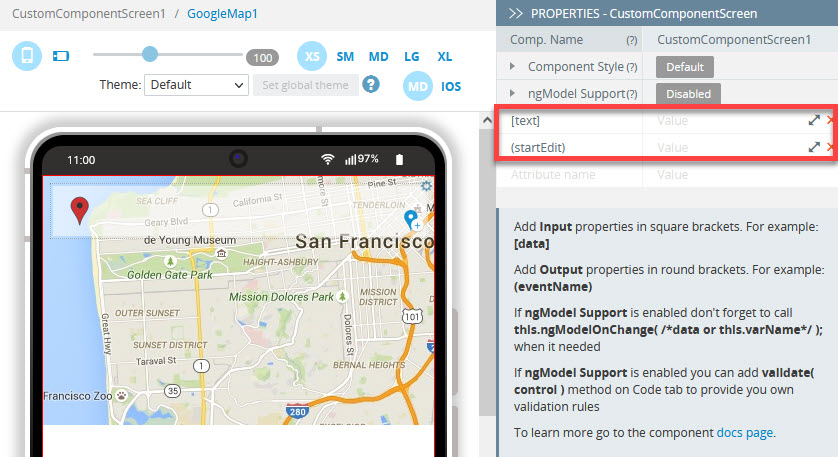
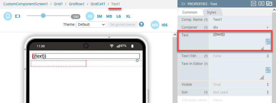
- Under the PROPERTIES panel, set the needed input data (provided in square brackets, for example
[text]) and/or output event(s) (provided in round brackets, for example(startEdit)):
- Custom component input data added under the PROPERTIES panel can be further used in mappings.
- Custom components output events are defined by adding the event handler under the PROPERTIES panel.
Note!If a custom component incorporates some data, adding events to it will be unavailable in the EVENT tab.
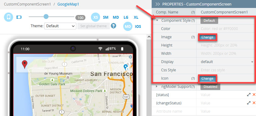
- Also, you can modify the custom component style: this will make your custom component look more attractive both in the PALETTE and in the page UI.
To do it, in the PALETTE view, set the custom component Size properties and upload the beforehand prepared image file(s) by clicking the Change button for the Image and/or Icon properties:
Editing Custom Components
To edit your custom component, click on it in the list of custom components in the Project view, or select it in the OUTLINE view. The CustomComponentScreen will open where you can make the changes you need.
While editing your custom component, you can drag and drop any standard UI component from the components PALETTE, add or modify data and/or events.
After changes have been made to the custom component properties, they appear in the PROPERTIES panel of any page where the custom component is used. Here, the needed values can be passed. Thus, you can customize any of the exported properties for every use of the custom component.
Note!When you edit the existing custom component, all of its copies used in the project will also change!
Want to know more?Please check our instructional video that shows how to create custom components in Appery.io:
Custom Components Sample App
In this section, we will demonstrate how you can build the tasks list app using the Ionic Custom Components feature.
In this app, you can edit the names of the tasks, edit their text, and change their status:
Downloads and Resources
You can also try this sample app by creating it from the backup. To restore the app from the backup, follow these steps:
- Download the app backup file.
- Click From backup and select the project backup file on your drive.
- Type in the app name and click Create.
But if you are interested in the details, please follow the instructions below.
Creating New App
- Navigate to the Appery.io dashboard. Here, from the Apps tab, click Create new app.
- Select Ionic Blank for its template. Name it, for example, Ionic Custom Components Sample App and confirm by clicking Create.
Creating App Custom Components
For this sample app, we will create two custom components, InlineEdit and Status.
InlineEdit Custom Component
- Create a new custom component: CREATE NEW > Custom component, name it InlineEdit and confirm:
After the custom component has been created, it appears in the Project view and in the OUTLINE view:
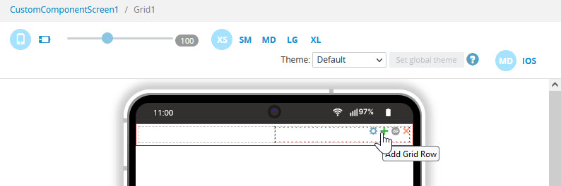
- Inside the CustomComponentScreen editor, drag the Grid component and drop it to the screen. By default, a new grid is created with one row so add one more Grid Row by clicking the + button on the Grid:
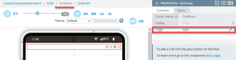
- Select the Grid Row1 component and add the ngIf property to it, then set its value to !edit;
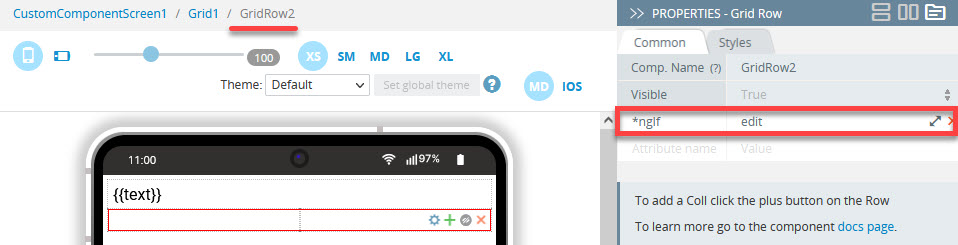
- Now, select the second Grid Row and, under PROPERTIES, add the ngIf property and define it as edit:
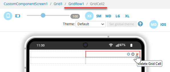
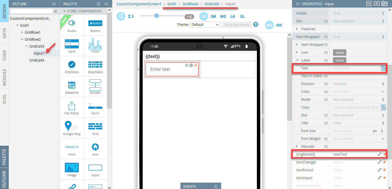
- Then, set the following structure for its two Grid Cell components:
a) the left grid cell has an Input component with the cleared Label Text field and the [(ngModel)] property set to newText:
b) the right grid cell has two Icon components defined as follows:
- the close icon:
Name = close-circle;
Color = danger;
Class = ion-padding-end:

Close icon
- the checkmark icon:
Name = checkmark-circle;
Color = primary;
Class = ion-no-padding:

Checkmark icon
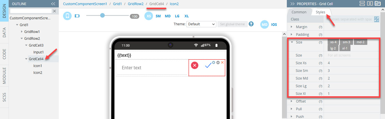
- Also, set the Grid Cell size properties to the values shown in the screenshot:
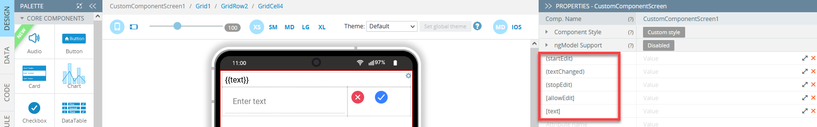
- Select the CustomComponentScreen1 using Breadcrumbs or the OUTLINE view and add the following input and output attributes to it:
- (startEdit);
- (textChanged);
- (stopEdit);
- [allowEdit];
- [text]:
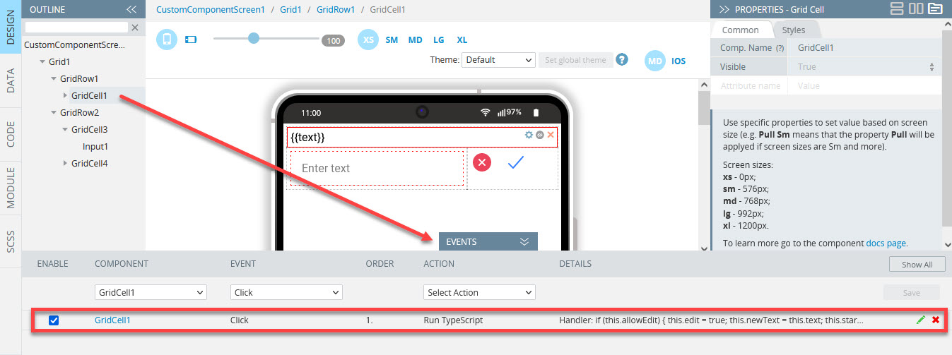
It's time to assign the grid components with the actions they will perform.
We need to assign three actions: editing the names of the tasks, editing the task's texts, and changing their statuses:
- Expand the EVENTS tab, then select the GridCell1 component; for its Click event, select Run TypeScript, enter the following script into the editor window and save:
if (this.allowEdit) {
    this.edit = true;
    this.newText = this.text;
    this.startEdit.emit();
}
Here is how it should look like:
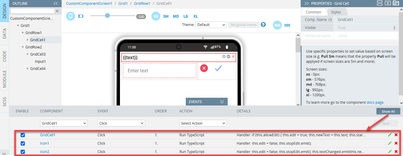
- Now, select the close icon and paste the following TypeScript for its Click event:
this.edit = false;
this.stopEdit.emit();- Then, select the checkmark icon and for its Click event, paste the following TypeScript:
this.edit = false;
this.stopEdit.emit();
this.textChanged.emit(this.newText);
With three actions added, the EVENTS tab should look like this:
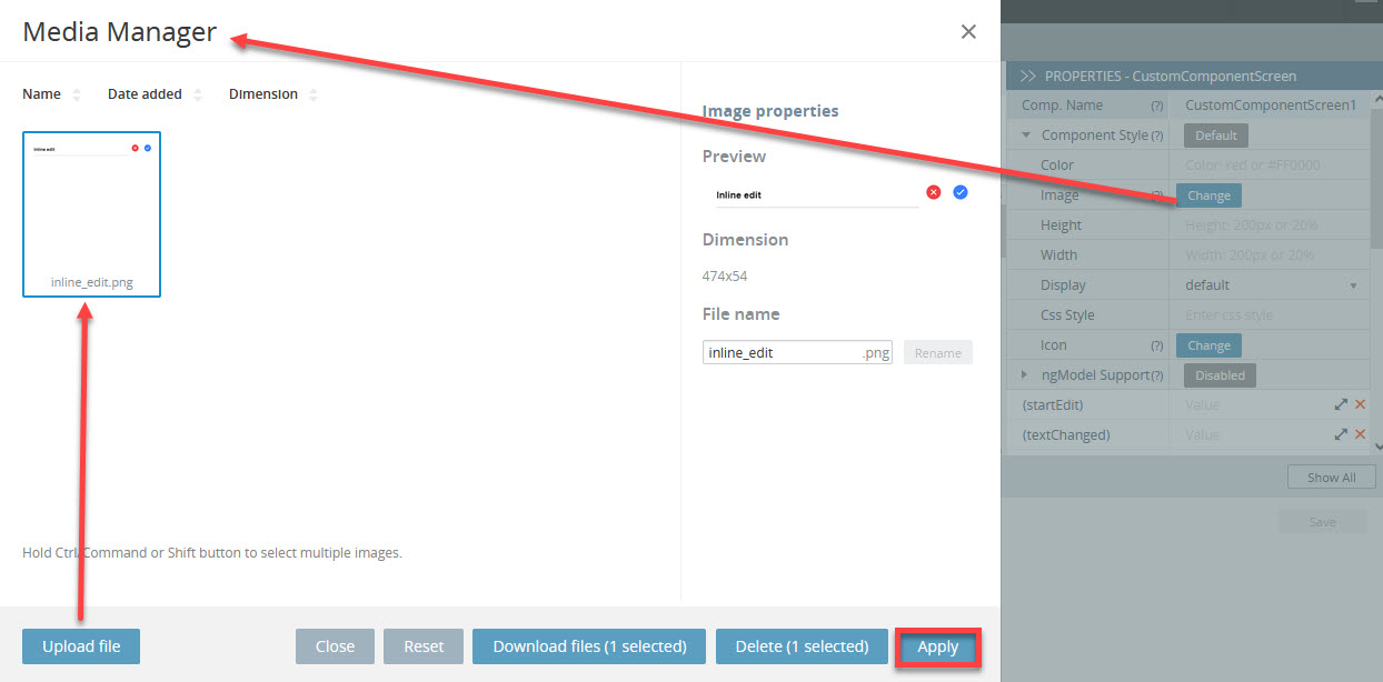
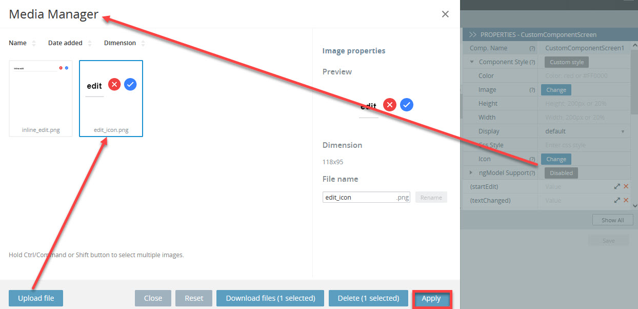
- Finally, let's define the InlineEdit custom component style.
Unfold the corresponding folder in the PROPERTIES panel, click the Change button for the Image property, upload the prepared image file from your drive by using Media Manager and click Apply:
- Similarly, define the custom component Icon property by uploading the image that you have prepared beforehand:
Adding Custom Component Variables
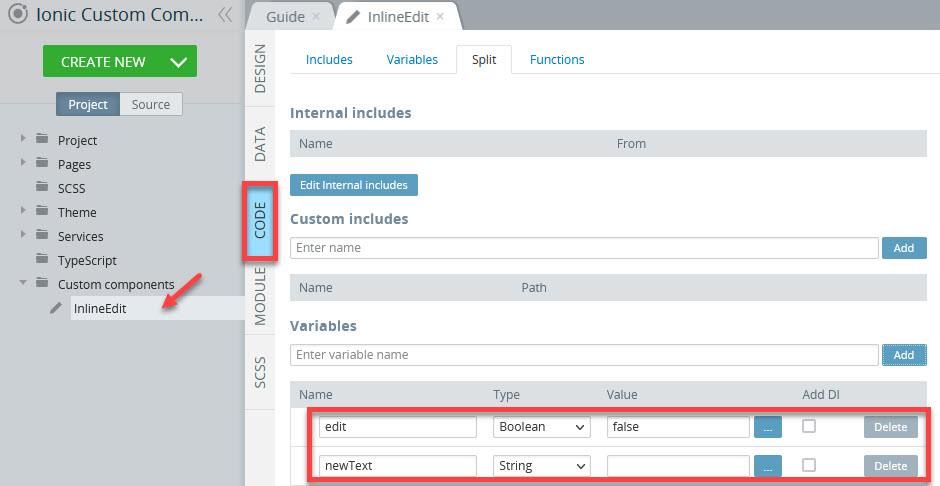
Now, switch to the component screen CODE panel.
- Add a new variable, name it
edit, set its type to Boolean and value tofalse. - Add another variable, name it
newText, and leave its type as String.
Here is how the CODE panel should look like with two variables added:
Status Custom Component
- Now, let's create another custom component: CREATE NEW > Custom component, name it Status and confirm.
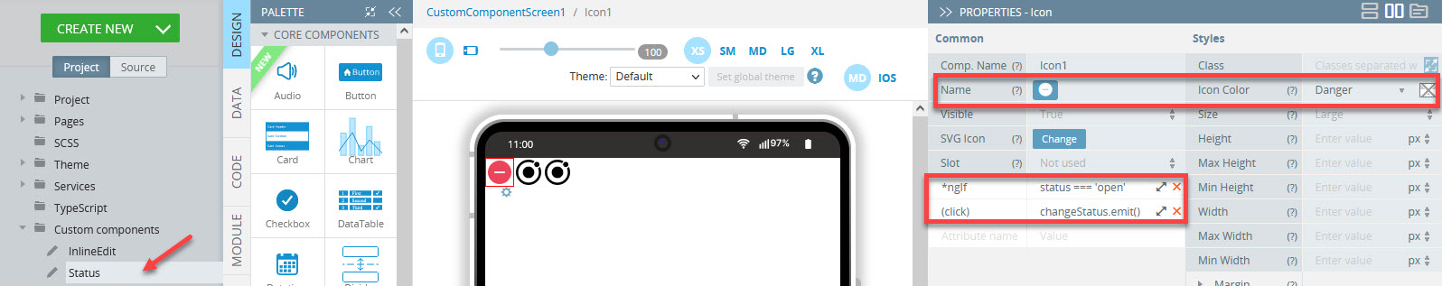
- Add three Icon components to the CustomComponentScreen and define their properties like the following:
- the remove icon:
Name = remove-circle;
Color = danger;
*ngIf = status === 'open';
(click) = changeStatus.emit():
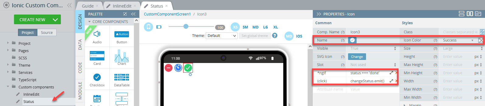
- the timer icon:
Name = timer;
Color = primary;
*ngIf = status === 'progress';
(click) = changeStatus.emit():

- the checkmark icon:
Name = checkmark-circle;
Color = success;
*ngIf = status === 'done';
(click) = changeStatus.emit():
It's time that the Status custom component style be defined.
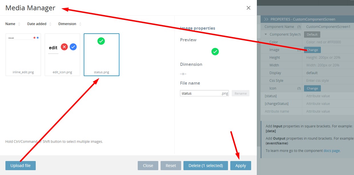
- Select the CustomComponentScreen1 component and unfold the Component Style folder, click the Change button for the Image property, upload the prepared image file from your drive by using Media Manager.
- Click Apply:
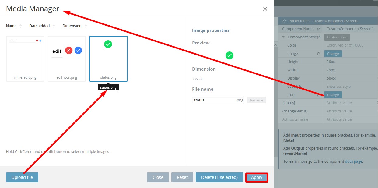
- Apply the same image for the Icon property of the Status custom component screen:
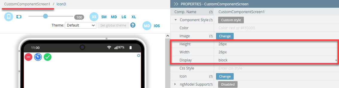
- Under the PROPERTIES panel, set its properties as:
- Height = 26px;
- Width = 26px;
- Display - block:
- Then add two attributes to it: [status] and (changeStatus):
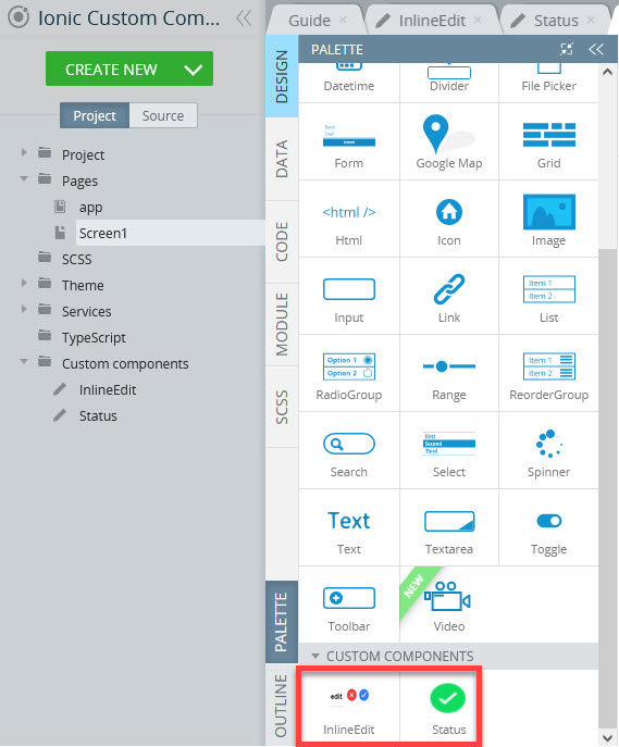
Congratulations! You are done with both custom components and can check now that they are ready to be added to the application pages. To see them, just select any page in the Project view and scroll down the PALETTE components list:
Note!The same custom component can be reused multiple times (including using it on the same page).
Configuring App
Creating App UI
First of all, let's define the UI using the created custom components.
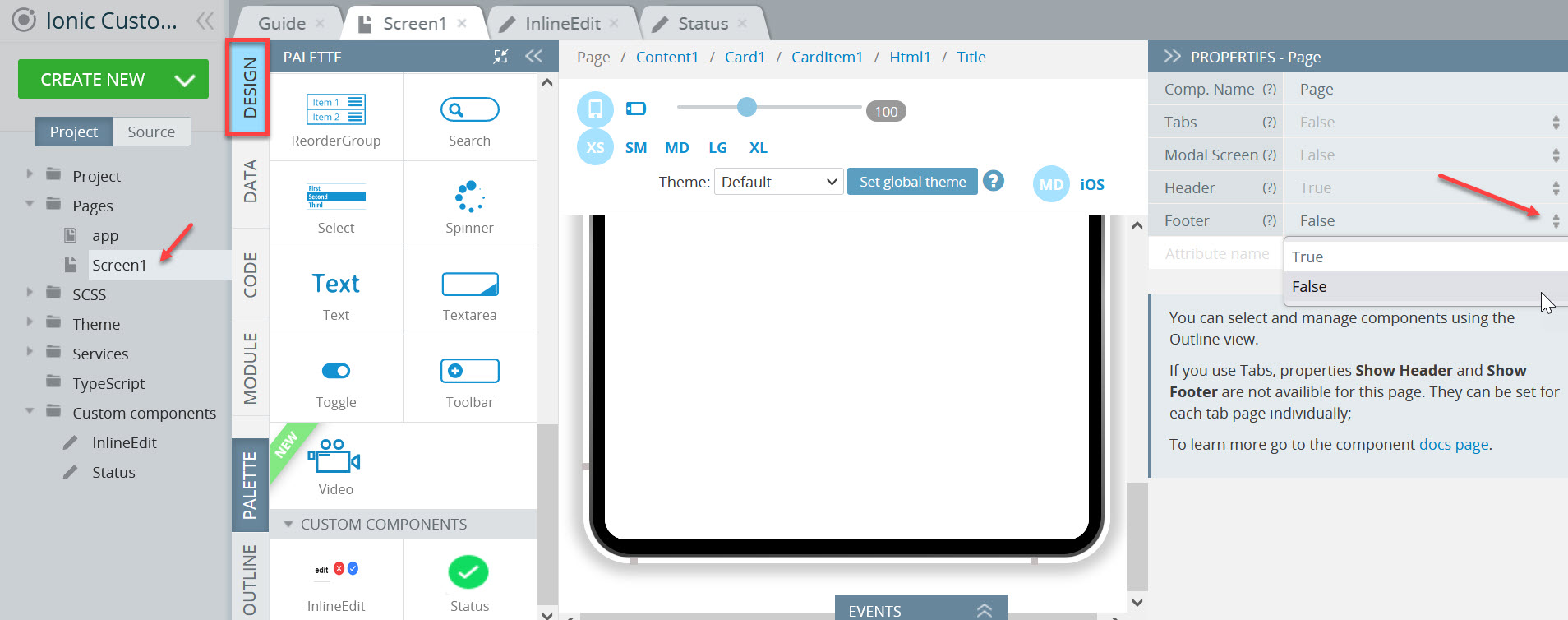
- Disable the page Screen1 footer as we will not use it. To do it, select the the Page component, set its Footer property to False, and confirm the change:
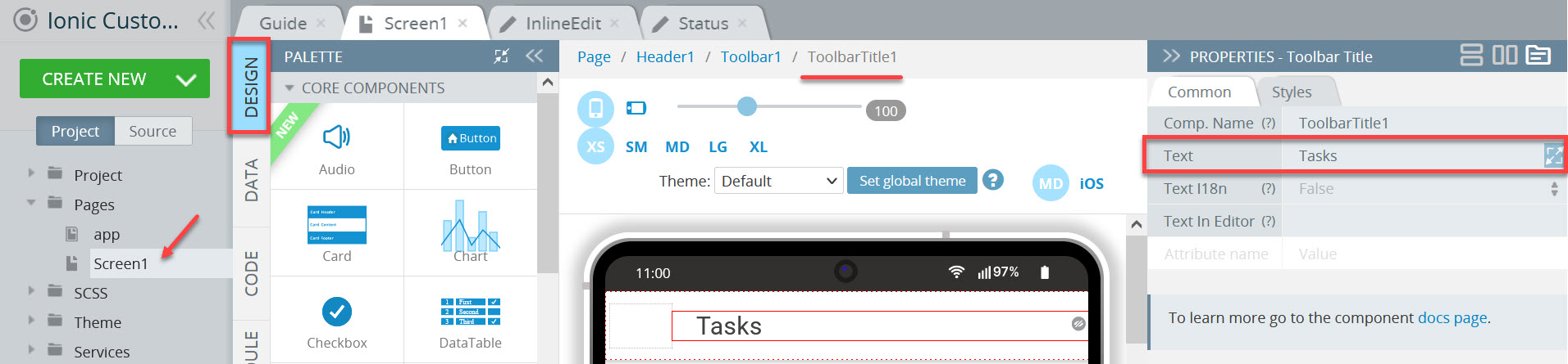
- Now, define the header Toolbar Title Text property as Tasks:
The page content will be of a complex structure.
- First, drag the Card component with one CardItem to the screen, delete its Card Item title component and add the Html component from PALETTE instead.
- For the Html component, define the Container property as ion-card-title.
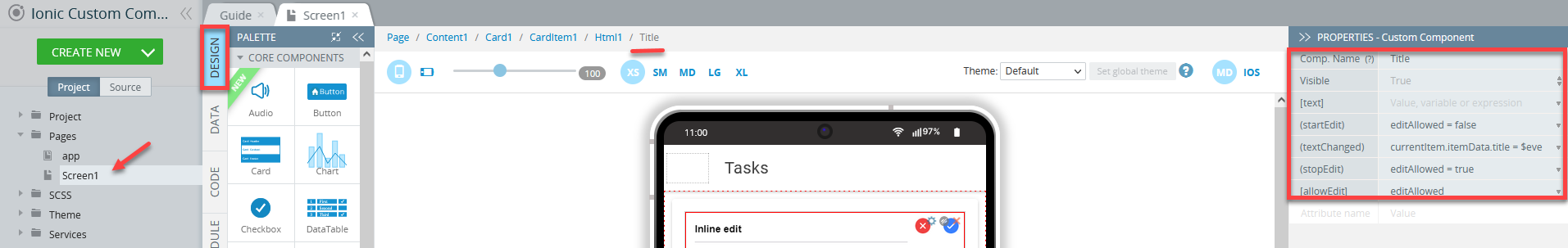
- Drag the InlineEdit custom component to the Html area, change its name to Title and populate its attributes with the following values:
- (startEdit) = editAllowed = false;
- (textChanged) = currentItem.itemData.title = $event;
- (stopEdit) = editAllowed = true;
- [allowEdit] = editAllowed:
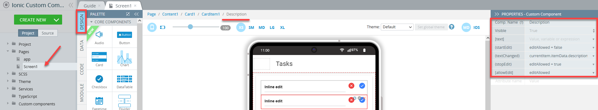
- Now, select the Card Item component and drop another InlineEdit custom component from PALETTE; name it Description and set the properties as follows:
- (startEdit) = editAllowed = false;
- (textChanged) = currentItem.itemData.title = $event;
- (stopEdit) = editAllowed = true;
- [allowEdit] = editAllowed:
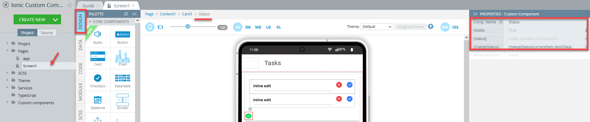
- Finally, and drag the Status custom component to the Card component, rename it to Status and set its (changeStatus) property to changeStatus(currentItem.itemData):
Defining App Logic
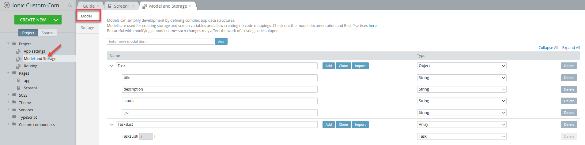
For this app, we will also need to create two models, Task and TasksList.
- Go to Project > Model and Storage and click the Model tab. Add a new model, call it
Task. Then, for theTaskmodel, add 4 parameters, all of the String type: title, description, status, and id: - Now, create one more model,
TasksListof the Array type with one nested item of the Task type. Check how the Model tab with these two models should look like:
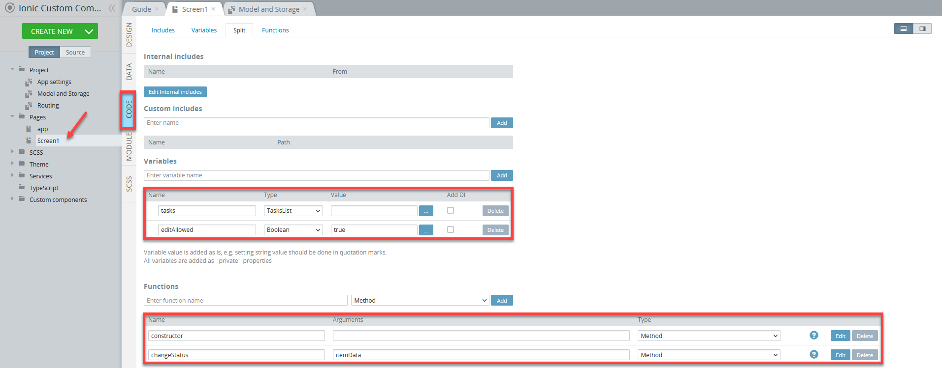
- Then, switch to the Screen1 >CODE panel and add two variables:
tasksof TasksList type;editAllowedof Boolean type with the value set to true.
- Also, add two functions:
constructorof Method type;changeStatusof Method type anditemDatafor its argument.
Here is how the page CODE panel should look like:
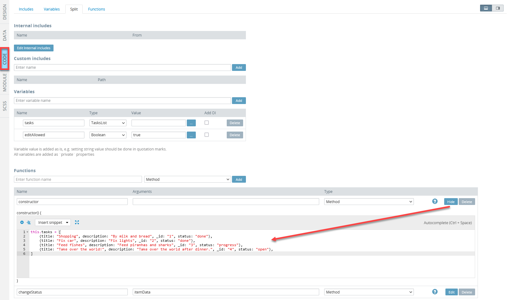
- Click the Edit button for the
constructorfunction and add the following script to the editor. Here, we will provide tasks with their descriptions:
this.tasks = [
    {title: "Shopping", description: "Buy milk and bread", _id: "1", status: "done"},
    {title: "Fix car", description: "Fix lights", _id: "2", status: "done"},
    {title: "Feed fish", description: "Feed piranhas and sharks", _id: "3", status: "progress"},
    {title: "Take over the world!", description: "Take over the world after dinner.", _id: "4", status: "open"},
]
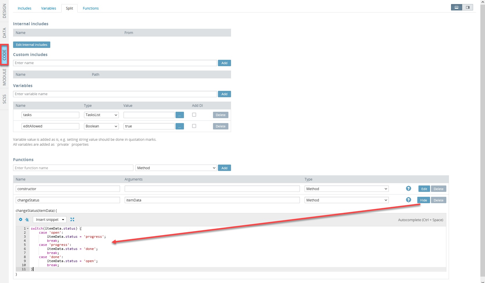
- Now, insert the following code into the
changeStatusfunction:
switch(itemData.status) {
    case 'open':
        itemData.status = 'progress';
        break;
    case 'progress':
        itemData.status = 'done';
        break;
    case 'done':
        itemData.status = 'open';
        break;
}
- Save the project.
Creating Mapping
In this step, we will define app mapping.
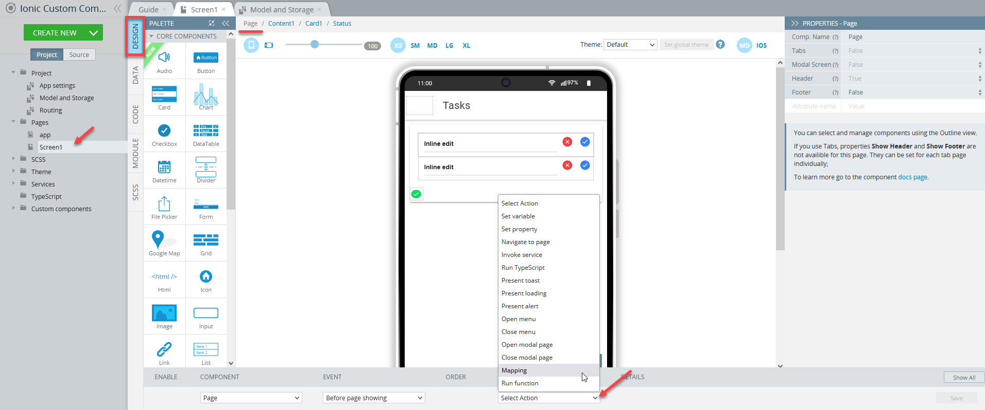
- Go to the page DESIGN panel and expand its EVENTS tab.
- Select the Before page showing event for the Page component. Then, select Mapping for its action:
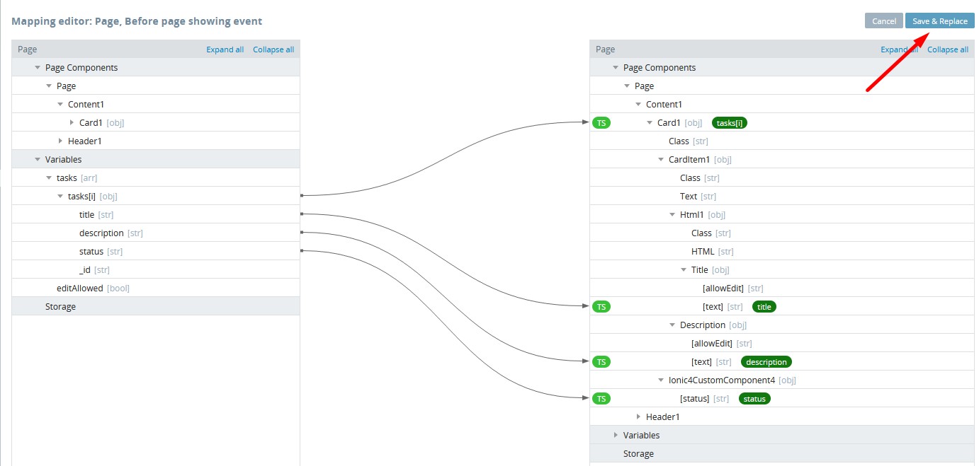
- In the mapping editor, map the following variables to the page UI components. To apply the mapping, click Save & Replace:
Testing App
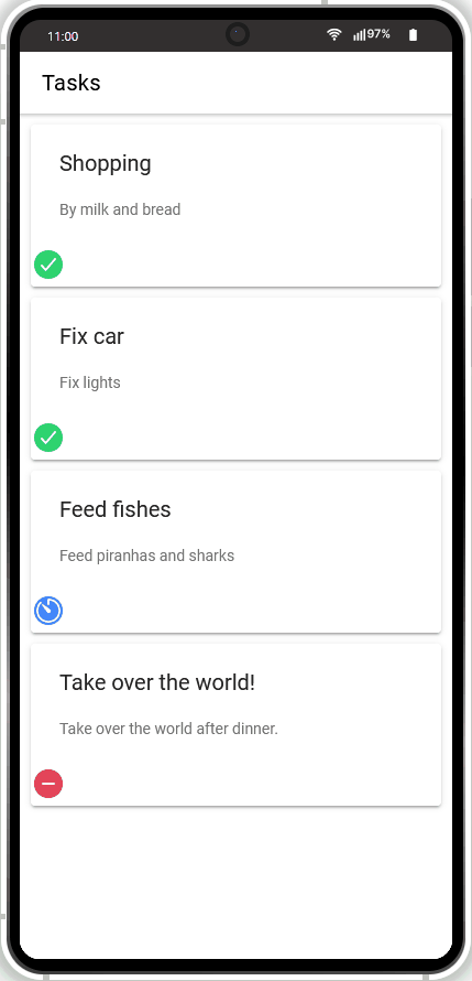
Finally, the app is ready and can be tested: try editing the names of the tasks or their texts, and/or changing their status:
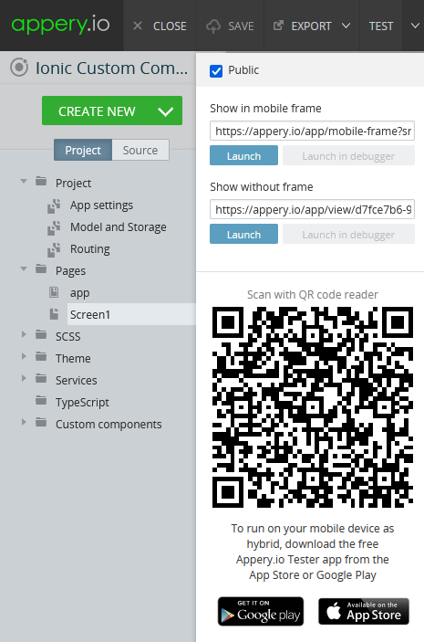
When your app version is ready, you might also like to test it on the device.
Appery.io Tester AppA great option to quickly test the app on the device is to use our Appery.io Tester app.
The app is free and available for both iOS and Android.
You can check out this page to learn more about using the Appery.io Tester app.