5. Building App Logic - Events Handling
This section shows how to define events and actions for Ionic apps
Introduction
All the events used in Appery.io Ionic projects are based on the methods of Angular lifecycle and Ionic events.
Angular Life Cycle EventsPlease check the guide covering how the page life cycle works in an app built with Ionic and Angular: https://ionicframework.com/docs/angular/lifecycle.
When building a mobile web app, almost everything that happens in your app is based on events. For example, clicking a button is a Click event, and based on this event, you can navigate to another page or invoke some TypeScript, among many other options.
Another example is when you change a value inside an input field: Change event. Once the event fires, you can pretty much go wherever you want from there.
Ionic Components EventsPlease check this document for more details about Ionic components and their events: https://ionicframework.com/docs/api.
All of the events available in the Appery.io App Builder can be defined for:
Defining Events for UI components
For example, to see the events available for a particular UI component, select the needed component, open the page EVENTS tab, and then select the event from the drop-down list:

NoteThe selection of events will be different for different components.
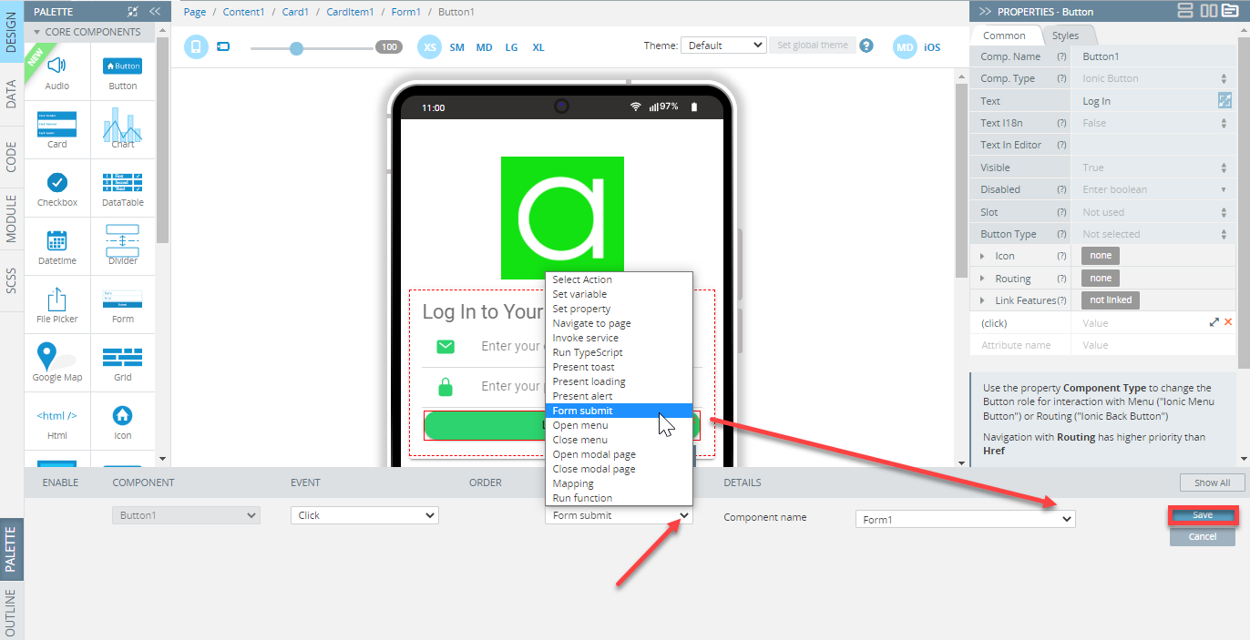
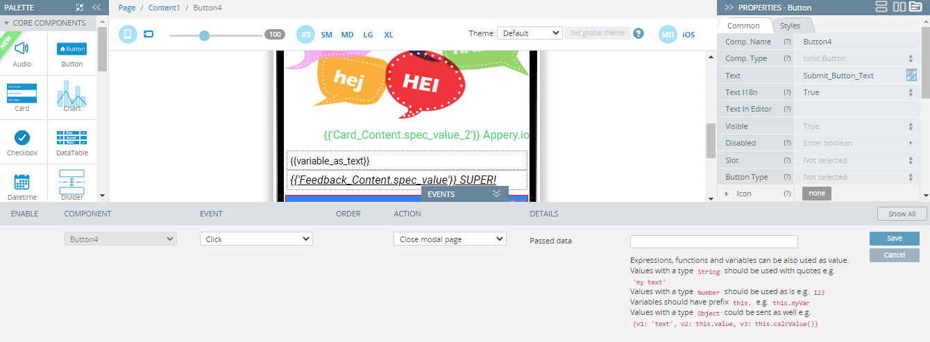
Now, to define the action for the button Click event, click the corresponding arrow, select the action from the drop-down list, and, if needed, define it with the needed details:

Logic Video TutorialYou can check this Appery.io YouTube Education Guide video to learn how to add the simplest logic to your Appery.io application:
Important noteYou may also need to define more details for the action to perform correctly.
For example, to define the Navigate to page action, you will be asked to set Route name and/or Route params.
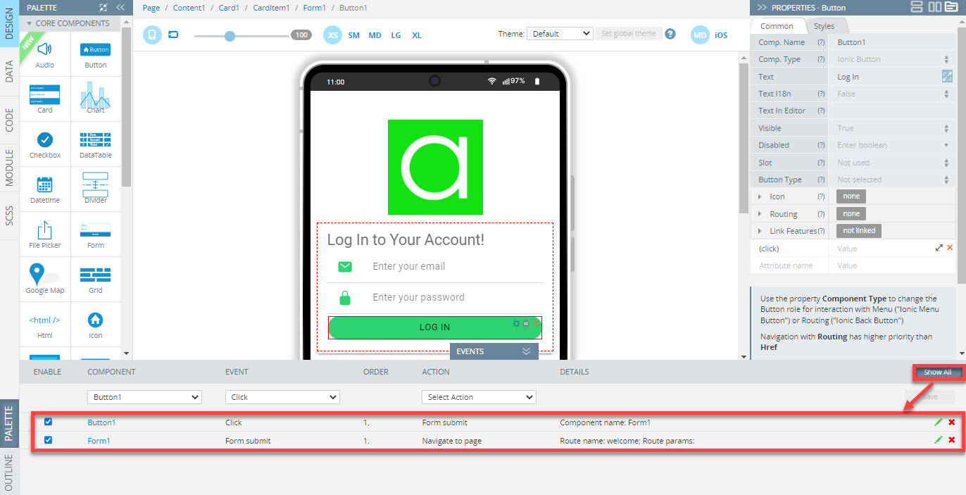
To see the events/actions defined for another component, select it from the COMPONENT drop-down list or select it on the page. To see all the events defined for the particular page, click the Show All button on the right-hand side:
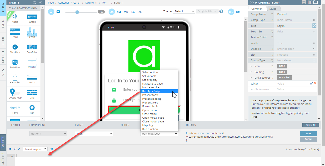
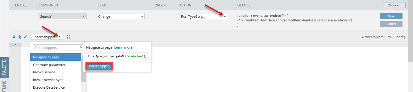
Tip!Also, in case the Run TypeScript action is selected, UI components can be customized using predefined snippets.
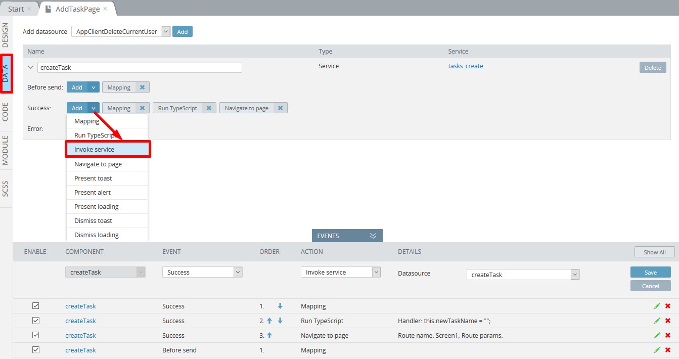
Defining Events for Datasources
Datasources serve as a connection between the app UI and data you obtain from services.
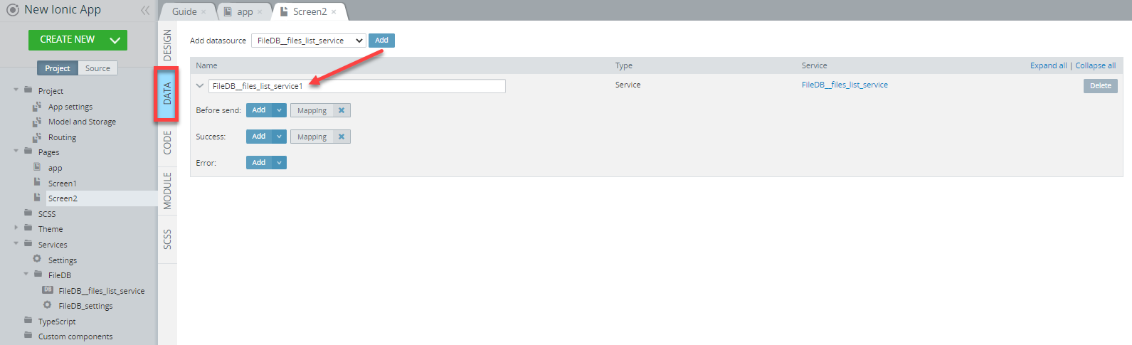
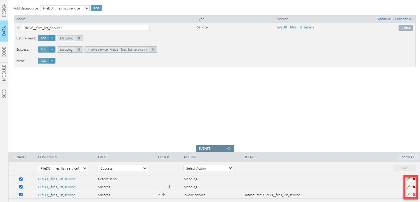
Before the event can be defined, a new datasource needs to be added under the page DATA panel. As many datasources as needed can be added.
For example, you can add any of the previously imported database services as a new datasource for the page.
Select the needed service and click the Add button to confirm the operation:
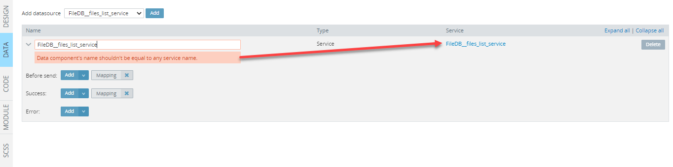
Naming DatasourcesNote, that the datasource name should be different from the name of the service:
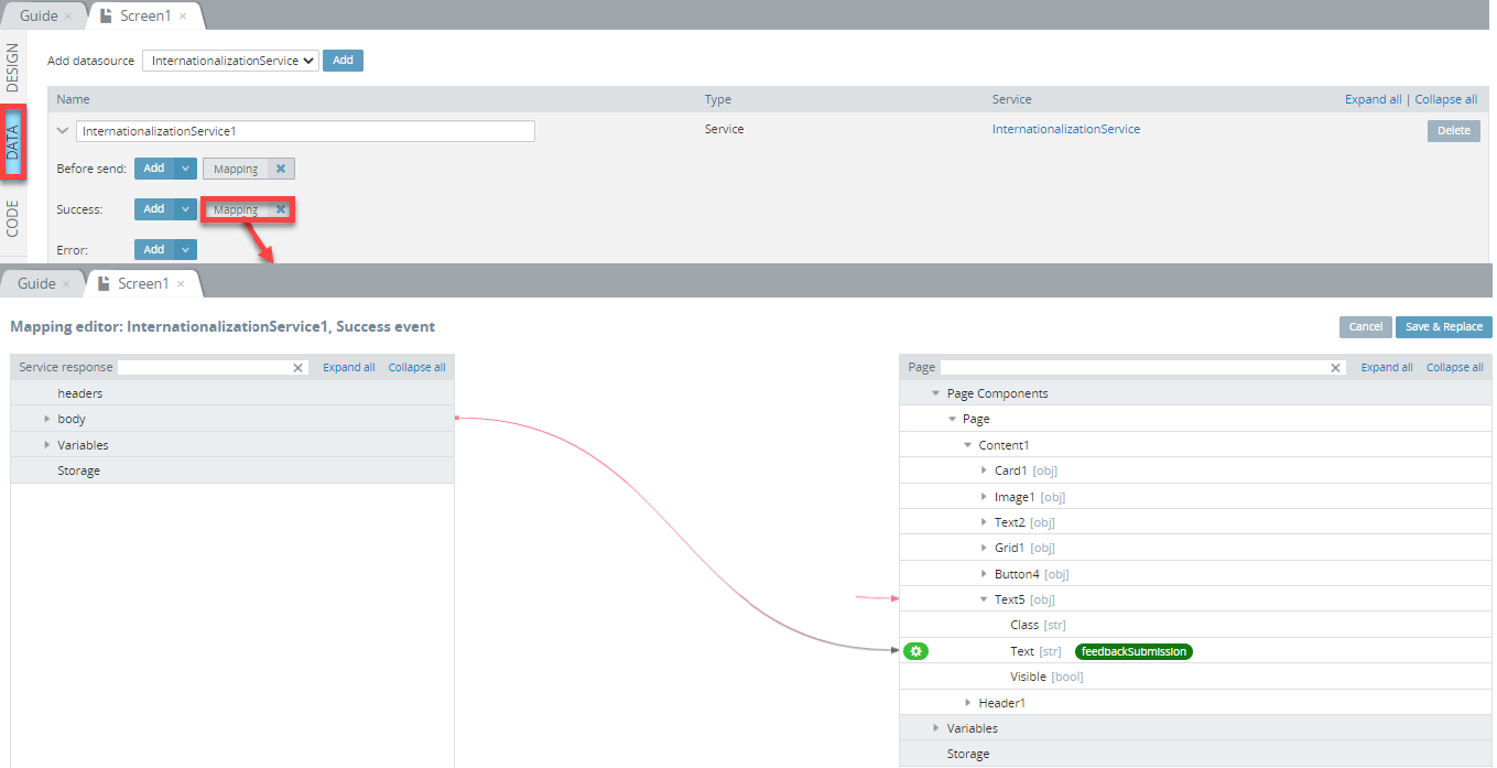
Afer the datasources is added, you can define its Before send, Success, and Error events. Click the arrow next to the corresponding button to select the needed event and open the EVENTS tab where the event can be customized and saved:
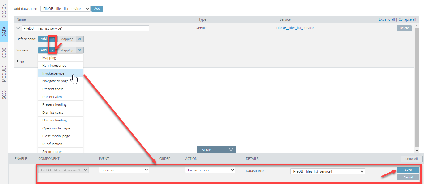
Tip!Also, in case the Run TypeScript action is selected, datasources can be customized using predefined snippets.
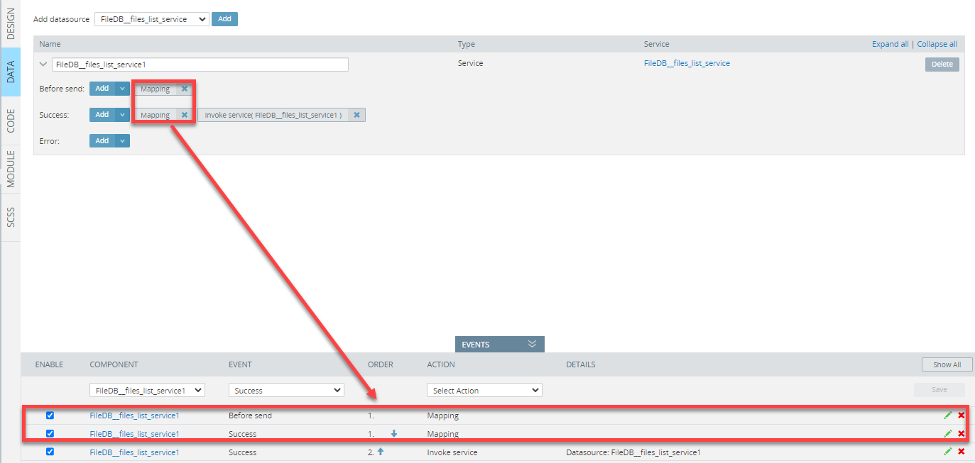
Note, that after the datasources is added, two Mapping actions are automatically created. By default, they are empty but, if needed can be customized.
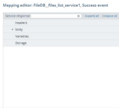
To open the mapping window, click on the corresponding button or the green pencil icon for the needed datasource under the EVENTS tab:
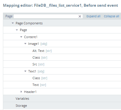
Working with Mapping editor
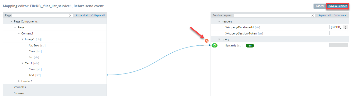
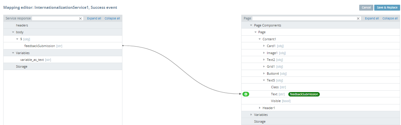
Click on the Success Mapping button to open the mapping window where you can create the needed mapping by using simple drag-and-drop and then save it by clicking Save & Replace.
Also, any mapping can be deleted: simply select the line and confirm by clicking the red cross icon:
If, for example, the page has many components, you can select to unfold the needed folder(s) only or use the Expand All button to see all of them. Click Collapse all to collapse the list:
The Mapping editor view also has a useful feature of filtering components added to the screen. Just start typing the name of the component to retrieve its parent(s) on the tree:
All the actions can be edited or deleted any time:
Event Types
Inside the App Builder, all the Ionic events are grouped into several categories: Common, Ionic, Angular, PhoneGap (device), Google Maps, and Push events.
Appery.io Events: Adding Custom CodeThe Run TypeScript action allows the execution of custom TypeScript code inserted into the editor.
Appery.io offers many different snippets that can be added to your project to call different properties and/or methods. The full list of available properties and functions can be accessed from the EVENTS tab where the Run TypeScript action is added to the corresponding event.
Please check this page for some examples of how to work with them.
Common Events
| Event | Description |
|---|---|
| Click | Fires when a pointing device button has been pressed and released on an element. |
| Double click | Fires when a pointing device button is clicked twice on an element. |
| Hover | Fires when any of the events fire. This event can be applied to the Chart component. |
| Form submit | Fires when a valid form is submitted (when the user clicks a submit button or presses Enter while editing a field). This event can be applied to the Form component. |
| Form value change | Fires when a form value change is detected. This event can be applied to the Form component. |
| Form status change | Fires when a form status change is detected. This event can be applied to the Form component. |
| Keydown | Fires when ANY key is pressed. |
| Keyup | Fires when ANY key is released. |
| Keyup Enter | Fires when the Enter key is released. |
| Keypress | Fires when ANY character (except Shift, Fn, or CapsLock) is in a pressed position (fired continuously). |
| Mouse over | Fires when a pointing device is moved onto the element that has the listener attached or onto one of its children. |
| Mouse leave | Fires when a pointing device is moved off the element that has the listener attached. |
| Mouse move | Fires when a pointing device is moved over an element (fired continuously as the mouse moves). |
Ionic Events
| Event | Description |
|---|---|
| After page leaving | Fires when the component routing has finished animating and does not get called until after the new page gets successfully transitioned into. Corresponds to the ionViewDidLeave Ionic page event. |
| After page showing | Fires when the component routing has finished animating directly after the transition ends. Corresponds to the ionViewDidEnter Ionic page event. |
| After tab changing | Fires when the navigation has finished transitioning to a new component. Corresponds to the ionTabsDidChange Ionic tabs event. |
| Before page leaving | Fires when the component routing from the page is about to animate and gets called directly before the transition away from the current page begins. Corresponds to the ionViewWillLeave Ionic page event . |
| Before page showing | Fires when the component routing is about to animate but before the page transition begins. Corresponds to the ionViewWillEnter Ionic page event. |
| Before tab changing | Fires when the navigation is about to transition to a new component. Corresponds to the ionTabsWillChange Ionic tabs event. |
| Blur | Fires when the element has lost focus. Corresponds to the ionBlurIonic event. |
| Cancel | Fires when the selected value of interactive UI components has been canceled (for example Select. Corresponds to the ionCancel Ionic select event. |
| Change | Fires when the value of interactive UI components (for example HTML, Input, or Select has been changed. Corresponds to the ionChange Ionic event. |
| Clear | Fires when the clear input button is clicked. Corresponds to the ionClear Ionic event. |
| Drag | Fires when the sliding position changes. It reports the relative position. Corresponds to the ionDrag Ionic item sliding event. |
| Focus | Fires when the element has received focus (does not bubble). Corresponds to the ionFocus Ionic event. |
| Image did load | Fires when the component has finished loading. Corresponds to the ionImgDidLoad Ionic image event. |
| Image error | Fires when the component failed to load or couldn't be used. Corresponds to the ionError Ionic image event. |
| Image will load | Fires when the component is about to animate into view. Corresponds to the ionImgWillLoad Ionic image event. |
| Input | Fires when the value has been changed by typing. Corresponds to the ionInput Ionic input event. |
| Item reorder | Fires when the item has been reordered. Emits from an object with from and to properties. This event can be applied to the ListItem component of the Item Sliding type and to the ReorderGroup component. Corresponds to the ionItemReorder Ionic item reorder group event. |
| Scroll | Fires on every scroll event. Corresponds to the ionScroll Ionic content event. |
| Scroll start | Fires when scrolling ends. Corresponds to the ionScrollStart Ionic content event. |
| Scroll end | Fires when scrolling first starts. Corresponds to the ionScrollEnd Ionic content event. |
| Select | Fires when an item has been clicked/selected. This event can be applied to the Radiobutton component. |
| Swipe | Fires when an item has been fully swiped. Corresponds to the ionSwipe Ionic event. |
Angular Events
| Event | Description |
|---|---|
| Page create | Fires once during component initialization. This event can be used to initialize local members and make calls into services that only need to be done once. Corresponds to the Angular Life Cycle event ngOnInit. |
| Page destroy | Fires right before the view has been destroyed. Useful for the cleanup like unsubscribing from observables. Corresponds to the Angular Life Cycle event ngOnDestroy. |
Want to know more?Please visit this page to learn about Angular Life Cycle Events.
Google Maps Events
| Event | Description |
|---|---|
| Bounds change | Fires when the viewport bounds have changed. |
| Center change | Fires when the map center property changes. |
| Drag | Fires repeatedly while the user drags the map. |
| Drag end | Fires when the user stops dragging the map. |
| Drag start | Fires when the user starts dragging the map. |
| Info window close | Fires when the InfoWindow is closed by removing it from the DOM structure. |
| Map click | Fires when the user clicks on the map. |
| Map double click | Fires when the user double-clicks on the map. |
| Map ready | Fires to notify the map is fully ready. |
| Map right click | Fires for a right-click on the map. |
| Marker click | Fires when the marker icon has been clicked. |
| Marker double click | Fires for a double-click on the marker. |
| Marker right click | Fires for a right-click on the marker. |
| Mouse out | Fires when the user's mouse exits the map container. |
| Mouse over | Fires when the user's mouse enters the map container. |
| Tiles loaded | Fires when the visible tiles have finished loading. |
| Zoom change | Fires when the map zoom property changes. |
Push Notifications Events
If your app uses push notifications, the following events appear on the list:
| Event | Description |
|---|---|
| Push initialize | Fires when the app initializes a connection with the server. |
| Push notification | Fires when the device receives a notification. You can access message data in the handler of this event. |
alert(data.message);| Event | Description |
|---|---|
| Push registration fail | Fires when device registration fails. |
| Push registration success | Fires when device registration is successful. |
Read more about push notification events here.
Managing Events & Actions
Adding Events & Actions to Components
Available ActionsThe list of all the available actions, with their detailed descriptions, can be found in the Actions section.
To add a new event and/or action to a component:
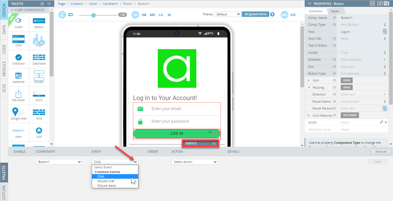
- Open the DESIGN panel, then select a UI component to that you want to add the event. It’s always a good idea to give components meaningful names, this makes it easier to find the needed component on the list.
- Select the needed component on the page and unfold the EVENTS tab from the bottom: the component will be selected automatically on the COMPONENTS list:
Adding Actions Video TutorialYou can check this Appery.io YouTube Education Guide video to learn how to manage the Card component’s Visible property using events:
Working with MappingWhen you select the Mapping action for a service or a UI component, a new window with the Mapping Editor opens. Check here to learn how to work with mapping.
Some components are preselected with their default events as they are most frequently used.
For example:
- With selecting the Button component, the Click event will be selected.
- With selecting the Input component, the Change event will be selected.
The following is an example of selecting the Button component Click event:
- You can always select a different event from the EVENT drop-down list.
- After the event is defined, select the action to be run. For example, select the Run TypeScript action to open the code editor where the needed code can be added:
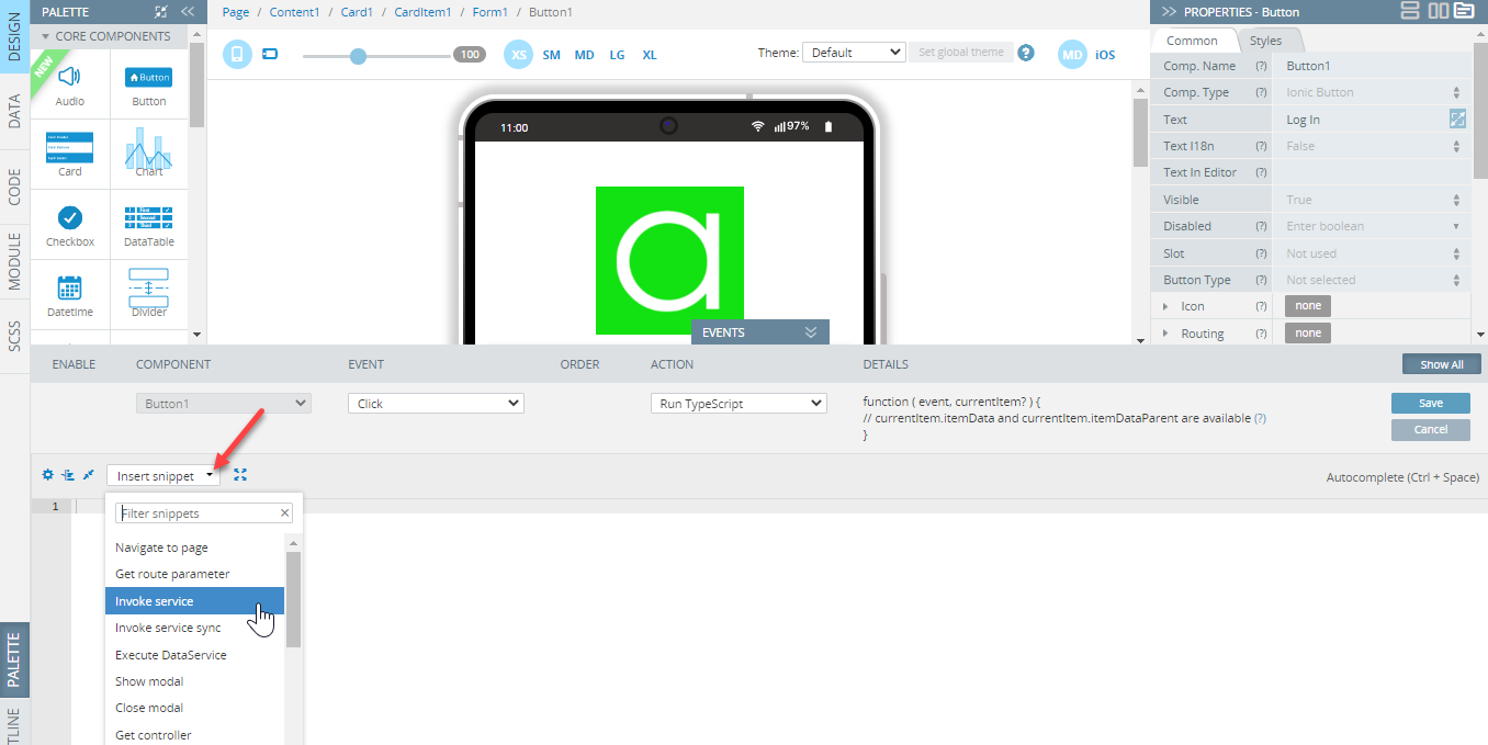
Tip!You are also free to use the predefined snippets: they will make writing your custom code easier:
- To save the event/action, click Save.
Check the below links to learn how to define events:
for datasources (DATA panel);
and functions (CODE panel).
Editing Events & Actions
It’s possible to edit an existing event. To do it, click the green pencil icon, and from the EVENT drop-down list, pick the new event for your component; you can also modify the code or insert the needed snippet. Then, click Save.
To delete an event, click the red x icon:
Multiple Events
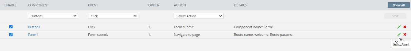
You can add any number of events to components and every event may have several actions defined. The event/action combination will be processed in the order defined.
Below is the example of the Button component with two events added (click Show All):

Multiple events added
Multiple Actions Video TutorialYou can check this Appery.io YouTube Education Guide video to learn how to modify Buttons’ Click events to add more complex hide/show behavior:
Note!If different event handlers are added to different pages, the most recent event will be prioritized in handling (processing) a notification. This can be used to activate/deactivate alerts when opening a particular page.
Events Order
Events/actions will be invoked in the order defined but this order can be modified by clicking the up and down event arrows.
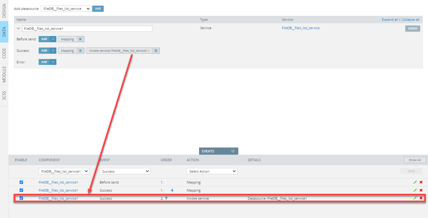
The first action will be invoked, but the browser will not wait for the first action to complete and will simply move to invoke the second action. The solution is to use service callback events to invoke the next service.
For example, you have several services added to the page. To invoke one service after the other one has been completed, in the DATA panel, add the Invoke service event:
This way, all the available service events can be added/edited:
| Event | Description |
|---|---|
| Before send | Fires before a request is started, allows you to modify the jqXHR request object before it is sent. |
| Success | Fires only if the request is successful. A variable data contains a full-service response. You can handle it as a usual JavaScript object. Each service has a different response structure. |
| Error | Fires only if the request fails. The function receives three arguments (jqXHR, textStatus, and errorThrown). There are the jqXHR object, a string describing the type of error that occurred, and an optional exception object if one occurred. Possible values for the second argument (besides null) are timeout, error, abort, and parsererror. When an HTTP error occurs, errorThrown receives the textual portion of the HTTP status, such as Not Found or Internal Server Error. |
Assistance with Error MessagesSometimes the actual error message from the service invocation is needed (for example when you are running the app on the device), you can use the below code:
alert(JSON.stringify(jqXHR));
Actions
NoteThe list of actions is the same for DESIGN panel and DATA panel events.
All of the actions available in the Appery.io App Builder can be defined for the actions for:
- UI components (under the DESIGN panel);
- Datasources (under the DATA panel);
- Functions (under the CODE panel).
The following actions are available:
- Set variable
- Set property
- Navigate to page
- Invoke service
- Run TypeScript
- Present toast
- Present loading
- Present alert
- Open menu
- Close menu
- Open modal page
- Close modal page
- Mapping
- Run Function
- DataTable update
- DataTable clear
- Chart init
- Chart destroy
- Custom chart code
- Update chart options
- Update chart labels
- Update chart datasets
- Reorder complete
- Mark all as touch
Run TypeScript Action SnippetsWhile the App Builder defines a number of actions, its primary purpose is to make development easier and faster.
All actions can also be defined in TypeScript via the Run TypeScript action.
To add the needed snippet from the list, unfold the EVENTS tab, click the UI component, select the needed event and assign it with the Run TypeScript action:
Set variable
This action sets a value to an existing variable from the list.
Variables should be specified on the CODE panel of the screen editor to have the possibility of setting value by the action.
A variable for setting value is chosen by the Variable name option. A value is set by the Value option.
NoteThe value is set as a JavaScript expression with special syntax depending on the variable type.
| Variable name | Variable type | Value syntax | Generated code |
|---|---|---|---|
| name | String | 'john' | {name: 'john', age: 21} |
| age | Number | 21 | this.age = 21; |
| isShown | Boolean | true | this.isShown = true; |
| user | Any | {name: 'john', age: 21} | this.user = {name: 'john', age: 21}; |
If the value is another variable specified on the CODE panel, it should be passed with the this. prefix:
this.user.nameThe value can be set from a function invocation result. If the function is specified on the CODE panel, it should be passed with the this. prefix:
this.getUserName()Value Examples
Using arrow functions:
() => this.age.toString()Boolean expressions:
this.age >= 21Transform object data to string:
JSON.stringify({name: 'john', age: 21}) // "{"name":"john","age":21}"Read from routing parameter
The value of the variable can be set from a parameter passed through the URL at navigating to the page.
If the Read from routing parameter option is selected, the Value option is replaced with the Parameter name option.
The Parameter name option takes the name of a URL parameter (e.g. user's id with the id name)
Parameters passed through the URL are specified on the Routing tab of the Project settings by changing the Path of the route that should have parameters for navigation (e.g. profile/:id).
Set property
This action allows you to set any attribute but is limited to the property details that are predefined by the UI component selected:

Click on the button will make theimage visible
Want to know more?More details with examples of using the Set property action can be found here and here, as well as in this step-by-step tutorial on how to generate a QR Code on a button click.
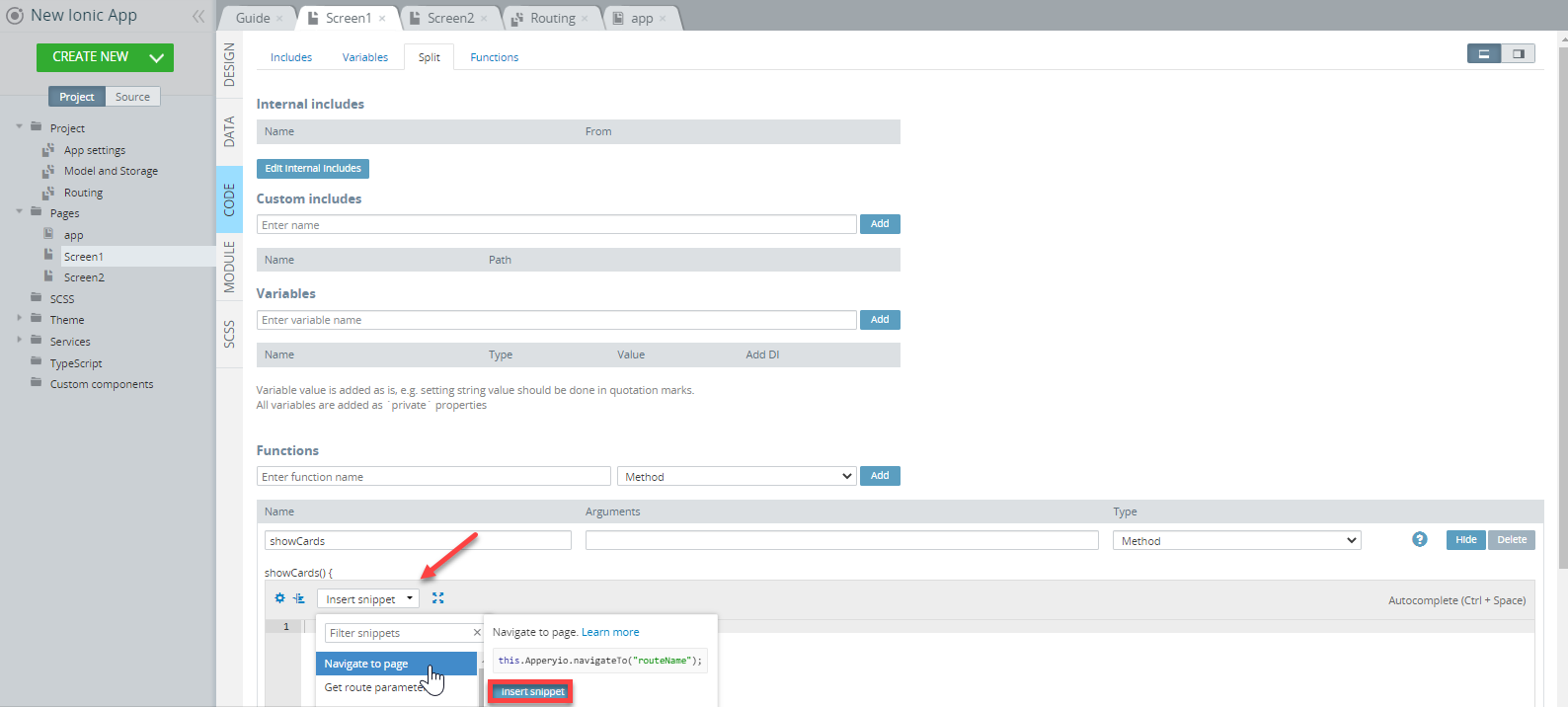
Navigate to page
The action is used for navigating the application pages.
A route for navigation can be chosen by the Route name option. The option is the list of route names specified on the Routing tab of the Project settings.
Also, setting the Direction, Route params, and Query params is available:
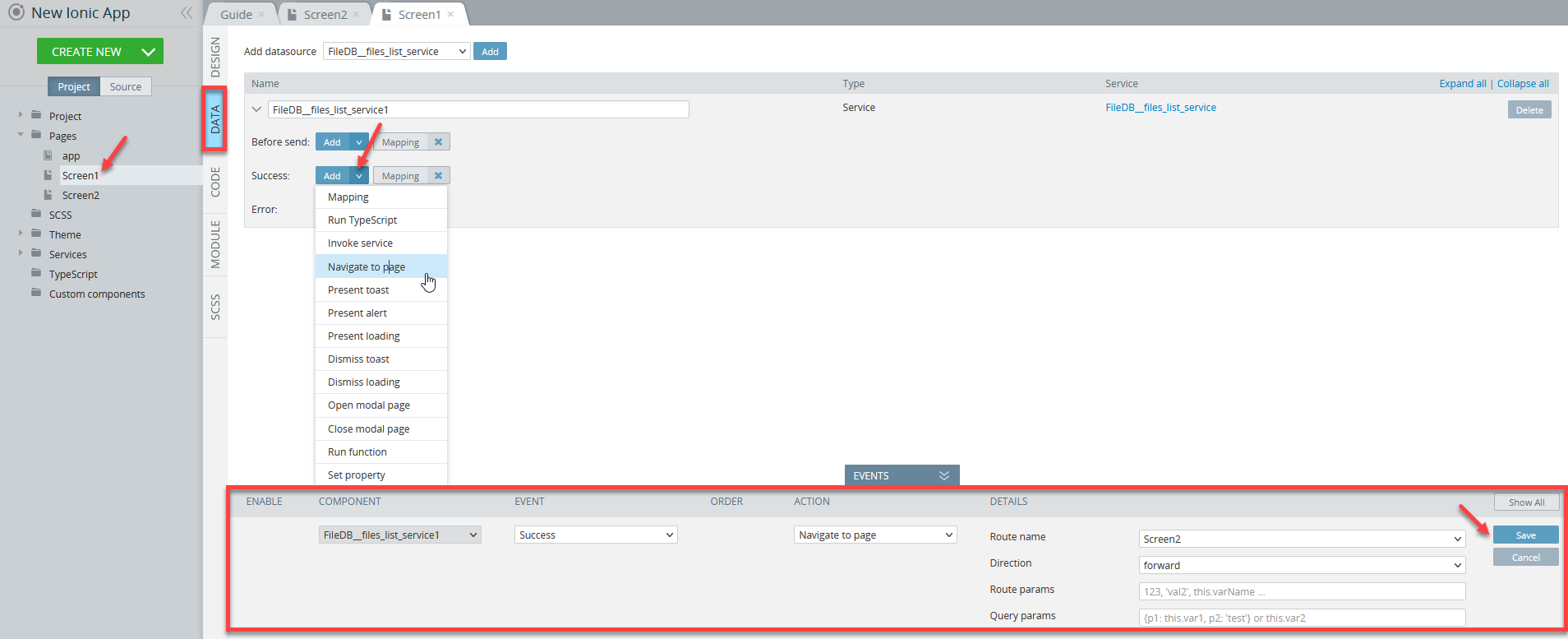
Every route is bound to its own page. Also, several routes can be bound to one page. Depending on the situation, several routes can be used in both scenarios: when navigation has some parameters defined or has no parameters.
Parameters sending
Parameters are used when simple data should be passed to the page at navigation through the URL.
Note that for sending complicated data (e.g. objects) it is better to use a different method, for example, variables using a combination of the Run TypeScript action and the Set variable snippet before navigation and the Get variable snippet after navigation.
Setting parameters is carried out by the Route params option. Parameter values are passed as comma-separated data.
Every parameter is set as a JavaScript expression with special syntax depending on a variable type.
| Parameter name | Data type | Value syntax |
|---|---|---|
| id | Number | 123 |
| name | String | 'john' |
| active | Boolean | true |
The order of parameters should be the same as the order specified in the route Path.
For example, the parameters for the route path profile/:id/:name/:active should be passed as 123, 'john', true.
If the passed parameter is an object it should be converted to a string:
JSON.stringify({id: 123, name: 'john'}) // "{"id":123,"name":"john"}"Parameters receiving
Every parameter can be received by its name after navigation to a page.
To write the parameter in a variable specified on the CODE panel, use the Set variable action.
In other cases, the Get route parameter code snippet can be used:
let paramName = this.Apperyio.getRouteParam("paramName");In this case, the paramName argument should be replaced with the name of a route parameter specified in route Path:
let id = this.Apperyio.getRouteParam("id");         // "123"
let name = this.Apperyio.getRouteParam("name");     // "john"
let active = this.Apperyio.getRouteParam("active"); // "true"
NoteEvery parameter is converted to a string after it is received.
Convert parameters to the initial data type.
let paramId = this.Apperyio.getRouteParam("id");         // "123"
let paramActive = this.Apperyio.getRouteParam("active"); // "true"
let paramUser = this.Apperyio.getRouteParam("user");     // "{"id":123,"name":"john"}"

JSON.parse(paramId)     // 123
JSON.parse(paramActive) // true
JSON.parse(paramUser)   // {id: 123, name: "john"}
Invoke service
The action executes the selected datasource service added on the DATA panel.
NoteDatasource services are executed asynchronously. Speaking of actions, it means that executing another following action will not wait for the result of the datasource service.
Run TypeScript
This action allows the execution of custom TypeScript code inserted into the Ace Editor.
Adding Custom CodeAppery.io offers many different snippets that can be added to your project to call different properties and/or methods. The full list of available properties and functions can be accessed from the EVENTS tab where the Run TypeScript action is added to the corresponding event.
Please check this page for some examples of how to work with them.
The code editor supports the features of the ES6+ standard.
Variables and functions
Variables and functions defined on the CODE panel can be accessed only if their names start with the this. prefix.
const userName = this.user.name;
const userStatus = this.getUserStatus();
Adding variables automatically
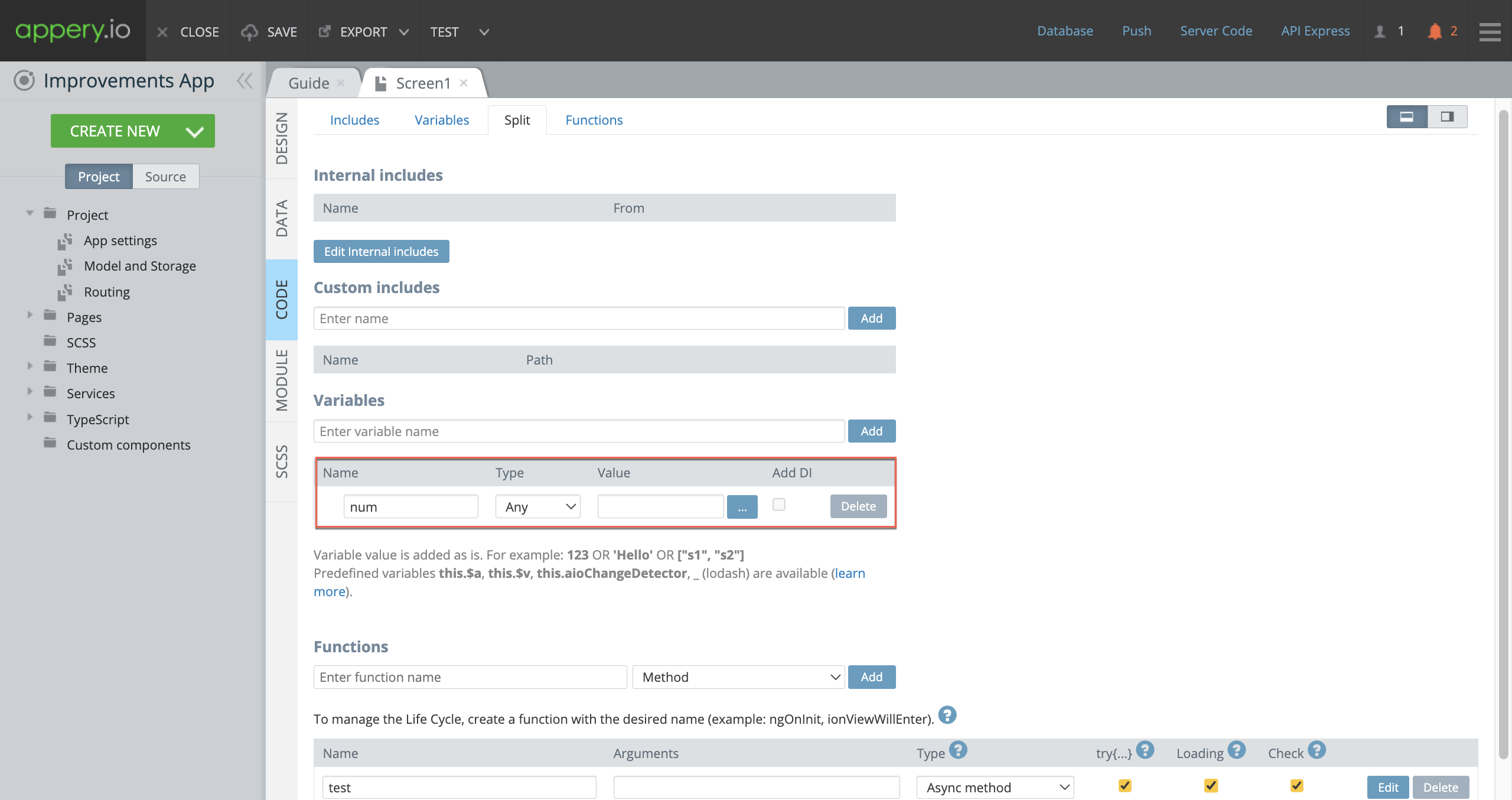
Quite often, in our apps, we need to define the properties enclosed in square brackets.
Don't spend extra time switching between the DESIGN and CODE panels and losing your focus just to duplicate the variable name: click the green + button when defining, for example, the [ngModel] property of the Input component as num:
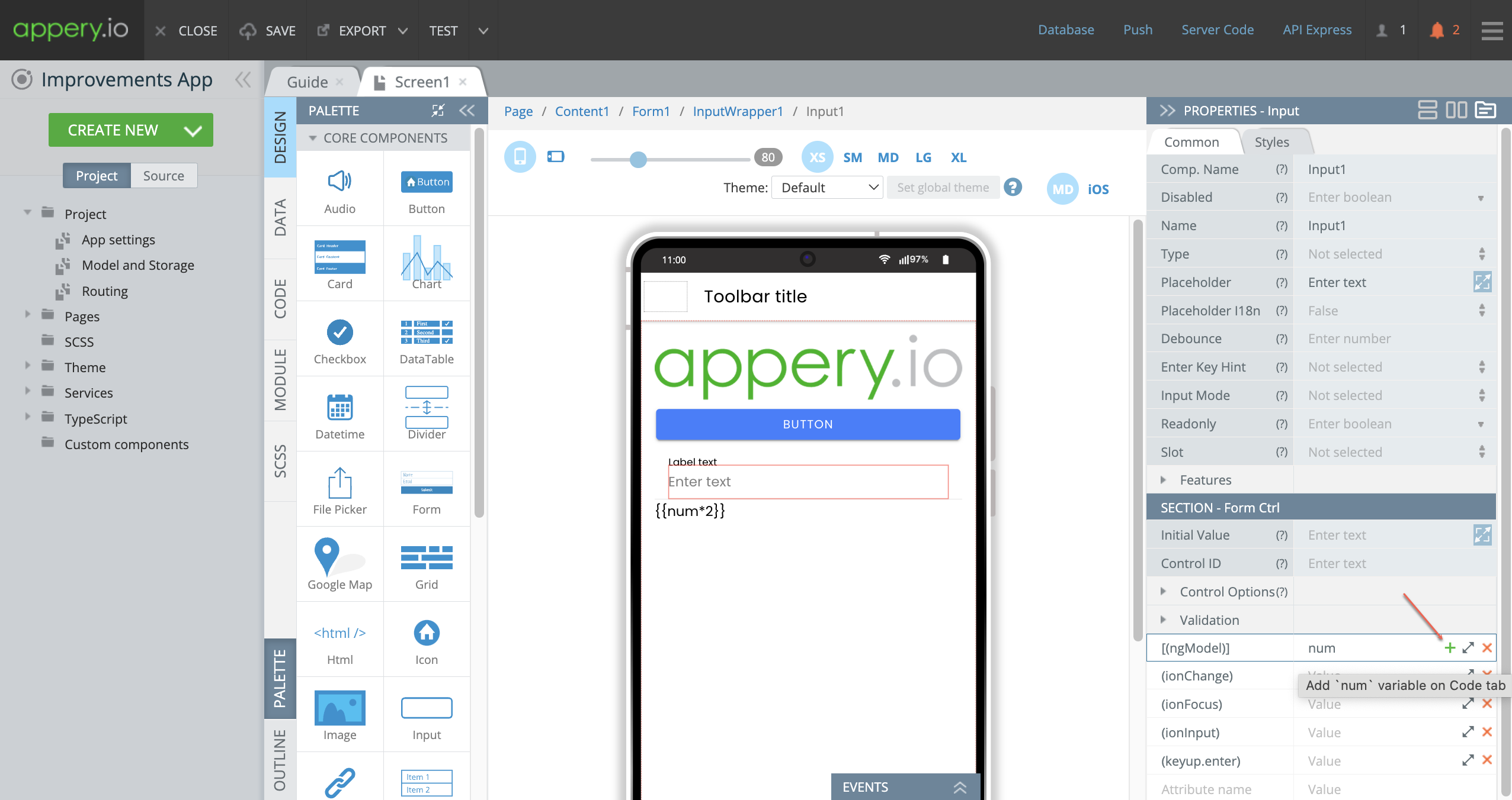
The num variable is instantly added to the CODE panel:
Want to know more?You can also watch this video to learn how Appery.io helps you automatically add variables to your pages, saving you time and effort.
The video also demonstrates how to include try-catch error handling for streamlined debugging, use the loading indicator for asynchronous methods and form validation checks to ensure data integrity:
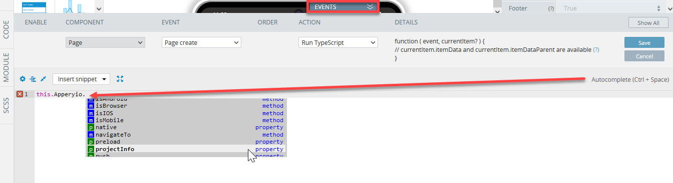
Action arguments
There are variables that can be used inside the Run TypeScript action.
Available variables for current action are displayed in the DETAILS column of the action editor.
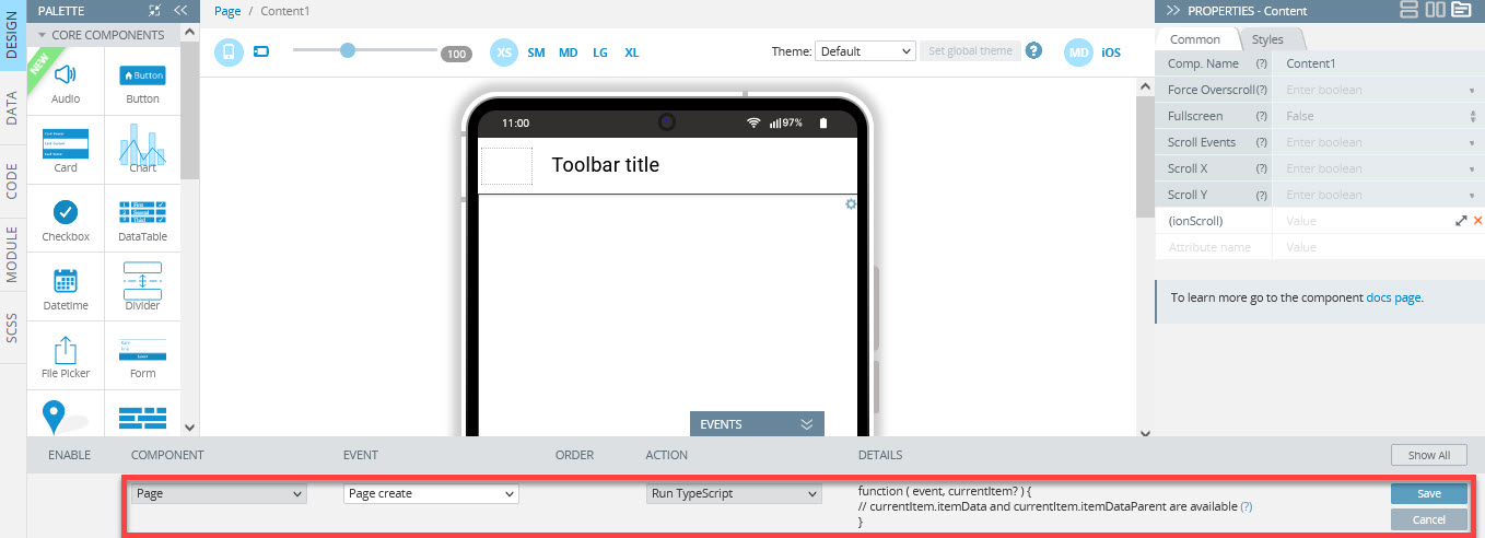
For example, if the Run TypeScript action is added to the Page component, its available variables are displayed as
function ( event, currentItem? ) {
  // currentItem.itemData and currentItem.itemDataParent are available
}
Available Run TypeScript action variables:
event
event is represented by an object which has fields and/or functions used to get information about what happened.
It is based on Angular event.
For example, the Change event of the Input component has the following data:
event.target- contains the HTML element for which the event happened (Input)event.target.value- contains the entered value of the Input.
currentItem
The currentItem variable can be used when data, as an array of elements, is bound to the component with using mapping. In this case, every element of the array will be bound to its own instance of the component, and data of the element will be placed into the currentItem variable. Every instance of the component has its own currentItem variable.
The currentItem variable gives access to the following data:
currentItem.itemData- contains the element of the array bound to the instance of the component with using mappingcurrentItem.listData- contains the parent array which includes the bound element
data, params, and headers
data, params and headers variables are available only for the Before send event of a datasource on the DATA panel.
These variables give access to request parameters of the invoked service.
res
The res variable is available only for the Success event of a datasource on the DATA panel.
The variable gives access to response parameters that the service returns.
err
The err variable is available only for the Error event of the datasource on the DATA panel.
This variable gives access to error data returned when the service running completed with an error.
Code snippets
The code snippets are blocks of JavaScript code implementing different useful functionality. Using snippets makes writing custom code easier.
To insert a needed event snippet for a particular component, in the editor window, click Insert snippet and select the needed snippet from the drop-down list:
NoteThe list of snippets is the same for DESIGN panel and DATA panels events as well as for the CODE panel functions.
Want to know more?More details about code snippets can be found here.
Present toast
This action creates and shows the Toast component based on the Ionic Toast component.
For advanced customization of the Toast component, a combination of the Run TypeScript action and the Toast present code snippet can be used.
Options
Options that allow customizing the showed Toast:

Present toast details
Header- header text;Message- message text;Color- the color to use from the application's color palette;CSS class- additional classes to apply for custom CSS. If multiple classes are provided they should be separated by spaces;Position- position of the toast on the screen;Duration- how many milliseconds to wait before hiding the toast. By default, it will be shown until dismissed;Keyboard Close- if selected, the keyboard will be automatically dismissed when the overlay is presented;Translucent- if selected, the toast will be translucent. Only applies when the Mode is iOS and the device supports backdrop-filter;Animated- if selected, the toast will animate;Mode- determines which platform styles to use (MD or iOS);Cancel button- if selected, the button dismissing the toast will be shown;Ionic icon- Ionic icon name to display in the close button;Text- text to display in the close button;Side- position inside the toast where the close button will be shown;CSS class- additional classes to apply for custom CSS. If multiple classes are provided they should be separated by spaces.
For dismissing the showed toast, a combination of the Run TypeScript action and the Toast dismiss code snippet can be used:
this.Apperyio.getController("ToastController").dismiss();Present loading
This action creates and shows a Loading component based on the Ionic Loading component.
For advanced customization of the Toast component, a combination of the Run TypeScript action and the Loading present code snippet can be used.
Options
Options that allow customizing the showed Loading:

Present loading details
Spinner- spinner name to display;Message- optional text content to display in the loading indicator;Duration- number of milliseconds to wait before dismissing the loading indicator;Animated- if selected, the toast will animate;Show Backdrop- if selected, a backdrop will be displayed behind the loading indicator;Backdrop Dismiss- if selected, the loading indicator will be dismissed when the backdrop is clicked;Translucent- if selected, the loading will be translucent. Only applies when the Mode is set to iOS and the device supports backdrop-filter;CSS class- additional classes to apply for custom CSS. If multiple classes are provided they should be separated by spaces;Mode- determines which platform styles to use (MD or iOS).
For dismissing the showed Loading, a combination of the Run TypeScript action and the Loading dismiss code snippet can be used:
this.Apperyio.getController("LoadingController").dismiss();Present alert
This action creates and shows an Alert component based on the Ionic Alert component.
For advanced customization of the Toast component, a combination of the Run TypeScript action and the Loading present code snippet can be used.
Options
Options that allow customizing the showed Alert:

Present alert details
Header- main title in the heading of the alert;Sub Header- subtitle in the heading of the alert. Displayed under the title;Message- main message to be displayed in the alert. It can accept either plaintext or HTML as a string;CSS class- additional classes to apply for custom CSS. If multiple classes are provided they should be separated by spaces.
Button:
Button text- text of the button;Cancel Role- if selected, clicking on the button closes the alert;Button CSS class- additional classes to apply for custom CSS. If multiple classes are provided they should be separated by spaces.
Open menu
This action opens the menu created on the app page:
this.Apperyio.getController("MenuController").open();
Want to know more?You can find more information about interaction with the menu here.
Close menu
This action closes the opened menu:
this.Apperyio.getController("MenuController").close();
Want to know more?You can find more information about interaction with the menu here.
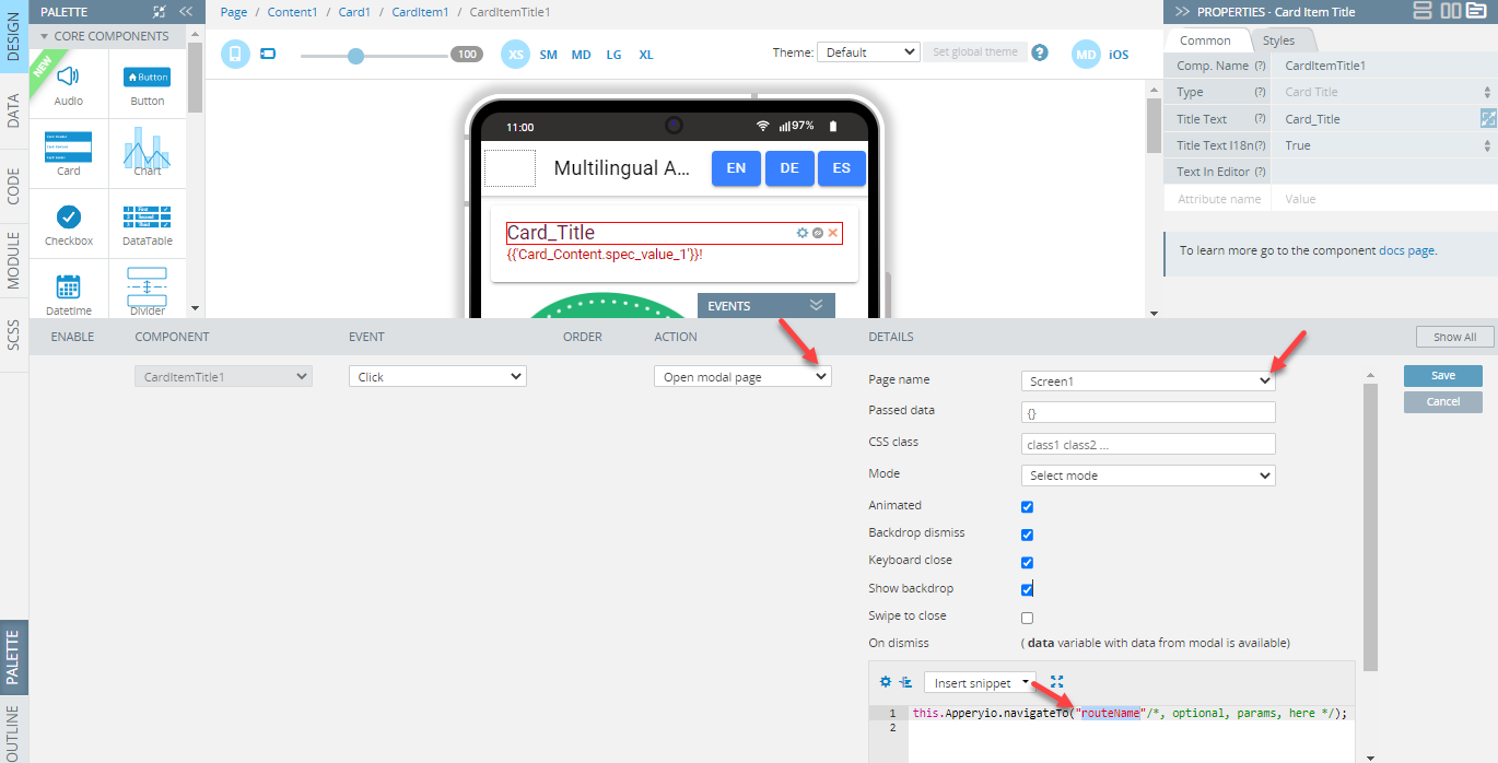
Open modal page
This action opens a modal page. To use the action, a modal page should be selected.
Alternative way of opening modal pagesAnother way for opening modal pages is by using a combination of the Run TypeScript action and the Show modal code snippet.
All created modal pages are available in the Select page option.
Modal page creation
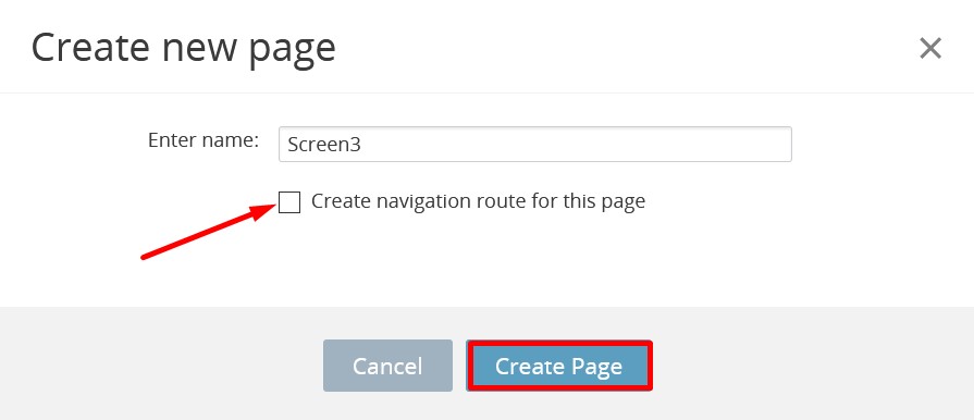
How to create a modal page:
- Click the CREATE NEW button.
- Choose the Page option with clearing the Create navigation route for this page check box:
- Select the just-created page in the Project View tree.
- Set the Modal Screen property to True under the PROPERTIES panel:
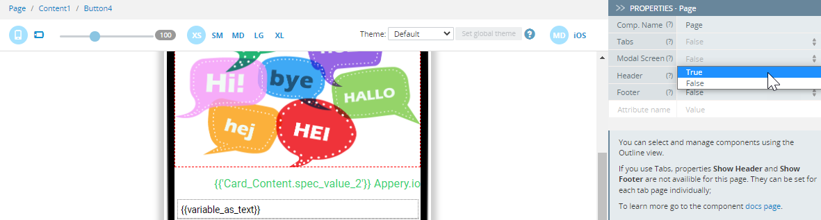
The modal page is ready!
Want to know more?In this example, you will learn how to pass properties from Screen1 to a modal screen and back.
Options
Options that allow customizing the showed modal page:

Open modal page details
Page name- the modal page name;Passed data- data to pass to the modal page;CSS class- additional classes to apply for custom CSS. If multiple classes are provided they should be separated by spacesMode- determines which platform styles to use (iOS or MD);Animated- if set to true, the modal will animateBackdrop dismiss- if set to true, the modal will be dismissed when the backdrop is clickedKeyboard close- if set to true, the keyboard will be automatically dismissed when the overlay is presented;Show backdrop- if set to true, a backdrop will be displayed behind the modal;Swipe to close- if set to true, the modal can be swiped to dismiss. This only applies in iOS mode.
You can find more information here.On dismiss- this callback function for receiving data from the modal allows executing any code on modal dismiss.
You are also free to select the needed snippet from the snippets drop-down:
The value of the Passed data option should be a JavaScript object or variable name containing such an object.
NoteThe variables created on the CODE panel of the screen should be used with
this.prefix:{userName: 'John', age: 21}or
this.user // contains {userName: 'John', age: 21}
The value of the CSS class option should be a string of words separated with space (e.g. name1 name2 name3).
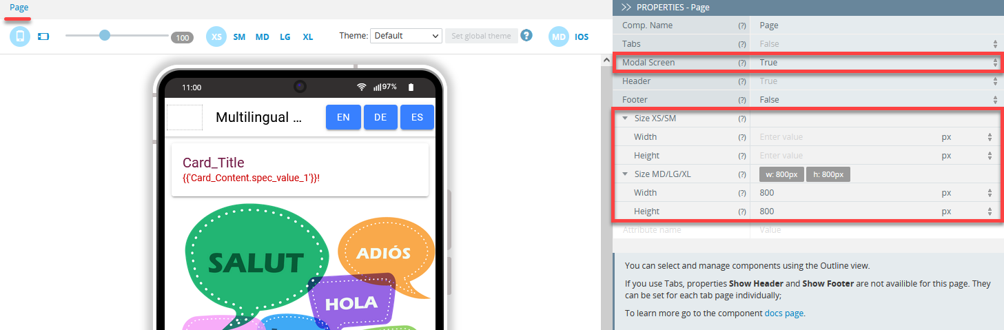
Resizing modal page
If you are building a responsive app (one made for tablets or even desktops) and the default modal window size is not something you need, you can resize it according to your intended device’s screen:
Sending data to a modal page
The Passed data option is used for sending data to a modal page.
To make data available on the modal page, it should be specified as variables on the CODE panel of the opened modal page.
In this case, the names of the created variables should be the same as the names in the sent data object (e.g. name or age).
When defined the variables are available as:
this.name // 'john'
this.age  // 21
Receiving data from a modal page
Want to know more?You can check this document to learn how to pass properties from a screen to a modal screen and back by using the corresponding snippets.
Close modal page
The action closes the opened modal page:
Expressions, functions and variables can be also used as values.
The value of the Passed data option should be a JavaScript object or variable name containing such an object.
Another way for closing modal pages is by using a combination of the Run TypeScript action and the Close modal code snippet.
Mapping
This action makes binding data in the application easier.
Mapping Video TutorialYou can check this Appery.io YouTube Education Guide video to learn how to map Input value to the Card component on the button click:
Basics
After adding the action to an event, the user gets access to the editor where data can be bound.
Data binding represents the definition of dependencies between different points of the application.
Such dependencies are based on setting the direction of data flow from one point to another point while running the action.
Every dependency can be set by dragging a point with source data and dropping it to another point where data should be updated.
Want to know more?More details about how to work with mapping in Ionic apps can be found in this document.
The existing dependencies are displayed as arrows between the bound points:
The result of every dependency can be processed using custom code which transforms the received data into the necessary format.
Mapping Transformation EditorCheck here for more information about how to work with Transformation Editor.
The available types of data points types in the application can be used for:
Components binding
Mapping to component
There is a possibility to do the mapping to component properties (e.g mapping to the value property of inputs). Such mapping updates the current value of the HTML property of the component.
Mapping to a component's element is represented only by iteration of the component.
Mapping from component
There is a possibility to do the mapping from component properties (e.g mapping to the value property of inputs). Such mapping returns the current value of the HTML property of the component.
When the mapping is done from the component's element, the HTML element is returned.
Iteration of component
The iteration of a component is based on the Angular *ngFor directive.
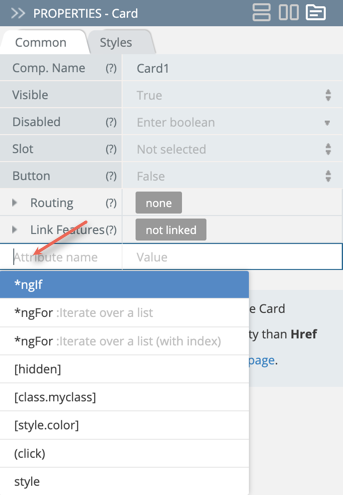
TIPWhile adding custom attributes under the Common tab, you can use autocomplete to create the most popular directives, for example *ngFor or *ngIf. To do it, place the cursor in the Attribute name field and select from the drop-down list offered:
Such iteration represents binding data of an Array to a component.
The data of every element of the array is bound to its own instance of the component, for example, mapping of the array elements to the Text property of the Text1 element:
const arr = [1, 2, 3];results in the following:
<p>1</p>
<p>2</p>
<p>3</p>
In the mapping editor, the arrays are represented by their names and elements. Elements can be determined or not determined.
Determinate elements have defined number indexes (e.g. arr[0]).
Indeterminate elements don't have defined indexes. Their indexes are united by a common index [i] that should be understood as "every" or "some".
For example, the above array consists of the name arr and its elements united by the index [i] and displayed as arr[i].
To make an iteration of the component, the indeterminate elements should be bound to the component's element.
In the editor, it looks like the arrow connects the indeterminate elements, and the component element (e.g. arr[i] is connected with Text1 element).
Such binding should be understood as "Make copies of theText1 component and bind data of every array element to its copy of the component".
If the array elements are objects, their properties can be also bound to the component properties
by arrows.
For example, this shows a list of users using the Text2 component:
const users = [
  {
    "id": 1,
    "name": "John"
  }, {
    "id": 2,
    "name": "Alice"
  }, {
    "id": 3,
    "name": "Michael"
  }
];
The binding of the users[i] point makes three copies of the Text2 component. The binding of the name point to the Text property sets the content of each component.
As a result, we get:
<p>John</p>
<p>Alice</p>
<p>Michael</p>
NoteFor using a mapping from the array elements and their properties it is necessary to add a mapping from the
[i]element defining iteration of the component.
Bound data can also be used through the following variables:
- currentItem.itemData - contains all data of the current element of the array from mapping
- currentItem.itemDataParent - contains the array from mapping
NoteThese variables are also available in components templates and in other actions such as Run TypeScript.
The example with users can be written without binding the name point to the Text property with an arrow.
Instead, the Text property we should have the value {{currentItem.itemData.name}}.
In this case, we get the same result but such a method can be useful in other cases (e.g. using Angular Pipes).
Service binding
Mapping from a service is available only if it is used as an action for events of the datasource (Before send and Success) added on the DATA panel:
Variable and Storage binding
Using iteration of components with variables and storages is available only when variables (storages) have a custom model type that has arrays in its structure.
Such a custom model can be specified on the Model and Storage tab of Project settings.
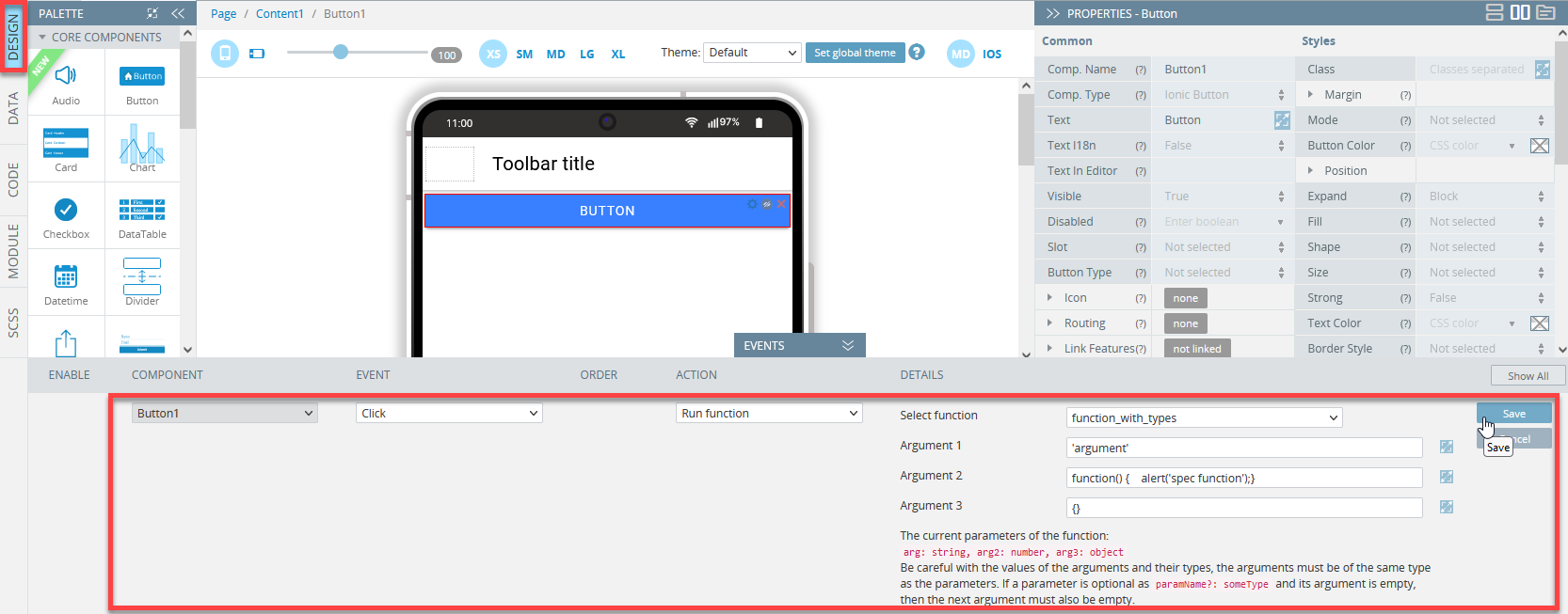
Run Function
This action allows starting of custom functions with user-defined arguments.
Working with Run Function action
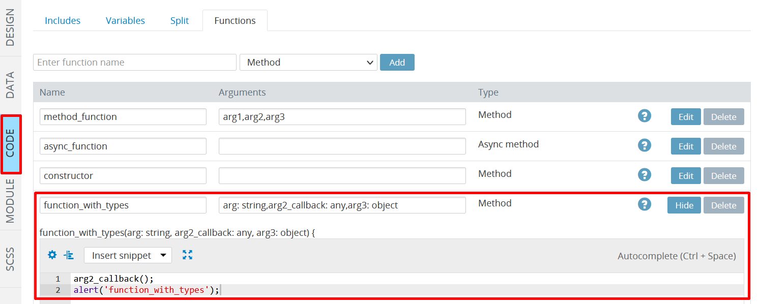
- To start, you need to create (a) needed function(s) under the CODE panel:
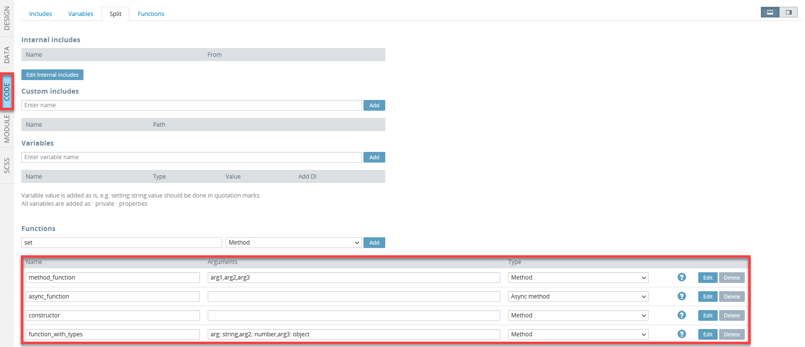
Important!The Run Function action can start the Method and Async method functions types only!
- Select the UI component to be defined with the Run function action (here, it is the Button), unfold the EVENTS tab, and select the Run Function action from the drop-down:
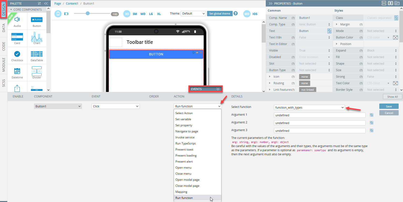
- In the Select function drop-down, choose the needed function to be defined. By default, all the function arguments (that were created with the function in Step 1) are set to undefined.
- All the arguments can be custom-defined but the argument field cannot be left empty:
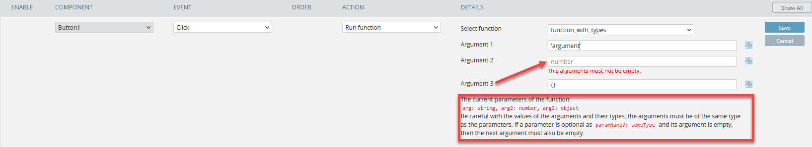
Good to Know!It is recommended that you carefully read the hints before working with any components and their properties!
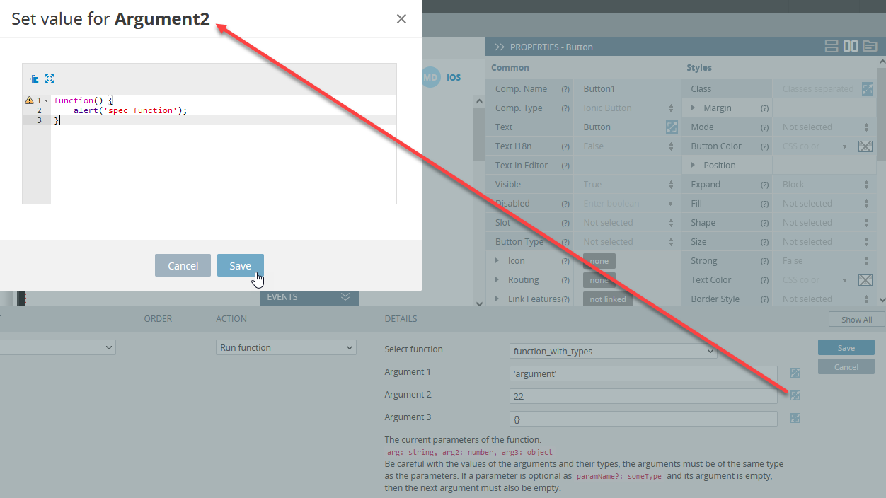
- If you need to add some custom code for the function argument(s), you can use the modal window. Do not forget to save the value:
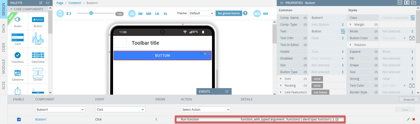
- After that, save the modified action:
- After the action is saved, its name and defined arguments will be displayed:
- Save the project by clicking the SAVE button on the App Builder Toolbar.
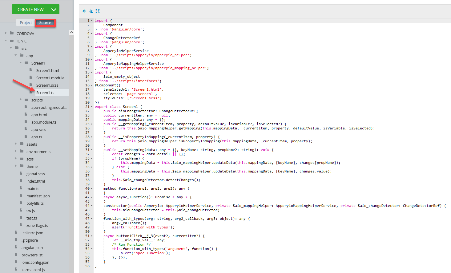
- The generated action can be reviewed under the Source tab:
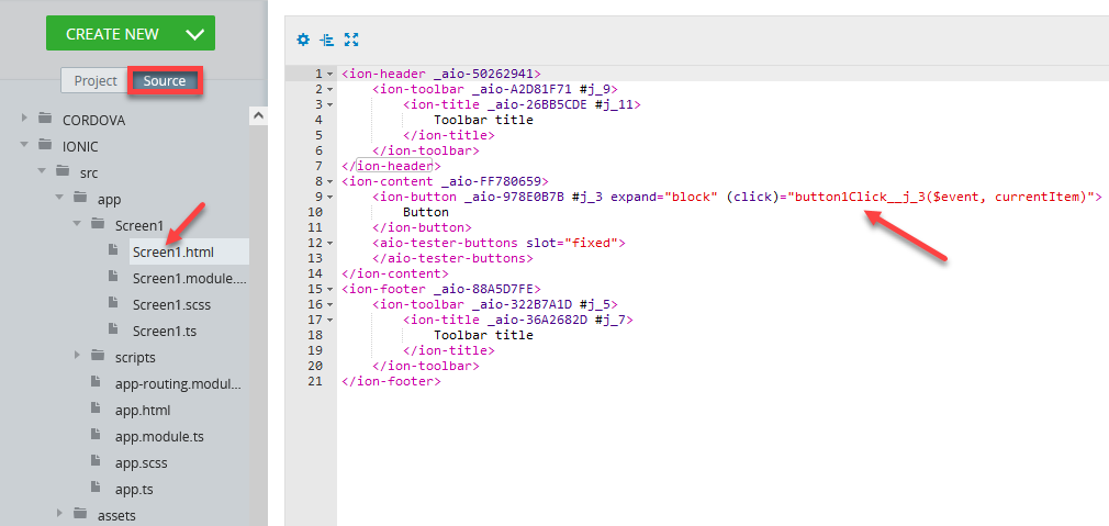
- If there are any errors, they will be displayed in this view:
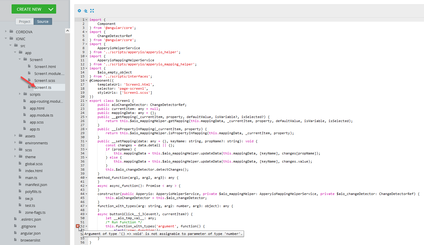
The needed information on how to correct functions or modify actions is also provided so that the needed action(s) can be taken.
- In this case, we can correct the function:
- After the changes are saved, let's go back to the Source tab to make sure it has been corrected:
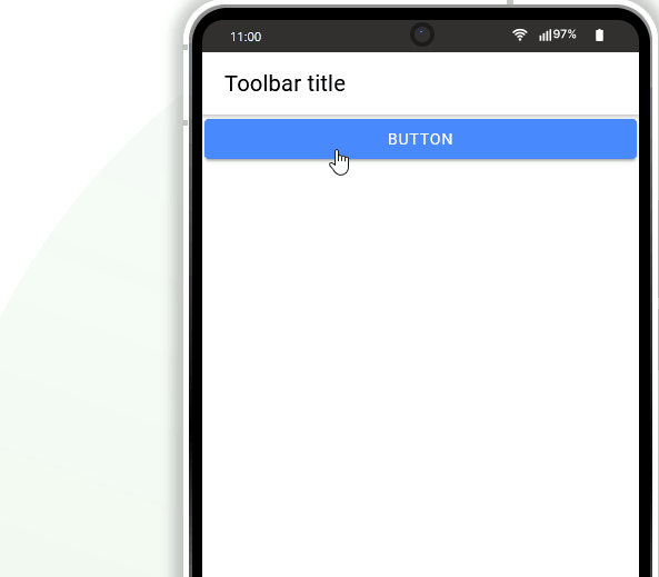
- The last step is testing the app: run it and then click the button to see how the defined event and action work:
DataTable update
This action updates the DataTable component data.
The action is visible on the actions list only if at least one DataTable component exists on the screen.
A component to update is chosen by the Component name option.
The Clear data before update option is used to clear the selected component before its data is updated.
If the component receives data from a datasource specified on the DATA panel (the source of data for the component is set by the Service Name property of the Data Mode property), the datasource service will be executed for updating the data.
DataTable clear
This action clears the DataTable component data.
The action is visible on the actions list only if at least one DataTable component exists on the screen.
A component to clear its data is chosen by the Component name option.
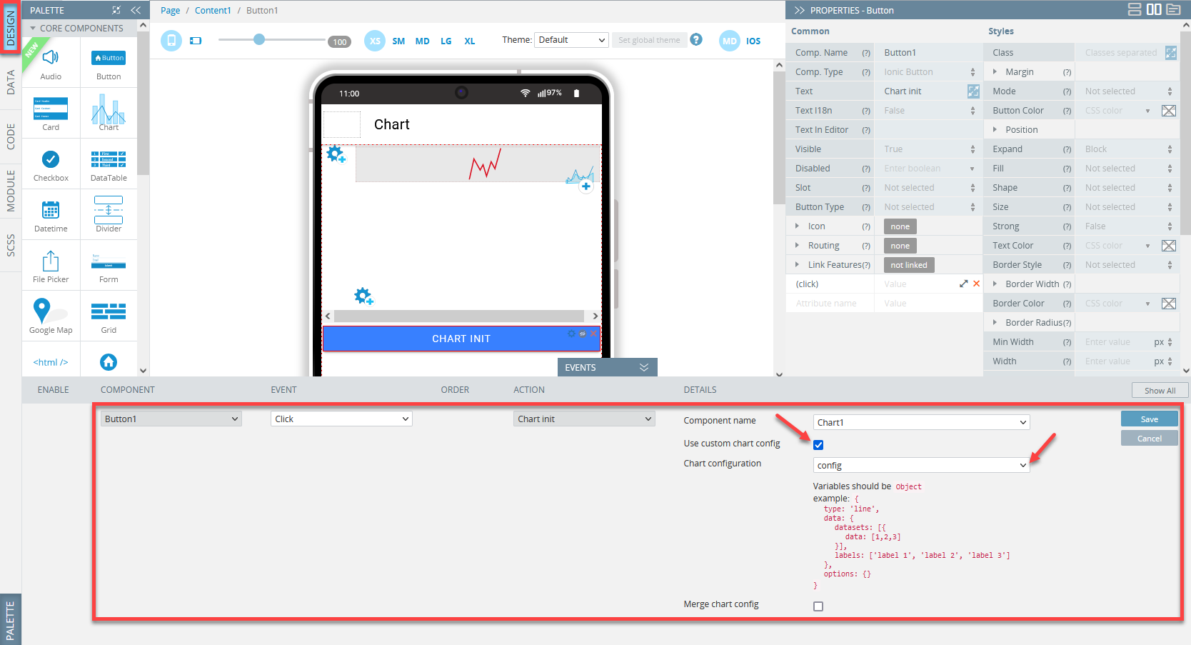
Chart init
This action is available on the actions list only if at least one Chart component exists on the screen.
This action is used to initialize the chart.
Using Chart properties
By default, the Chart properties are used to configure it.
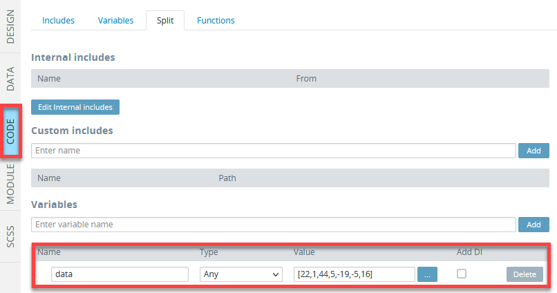
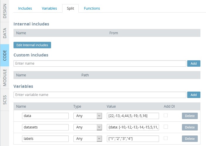
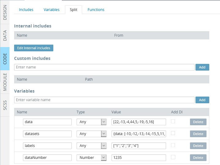
Let us add the data variable of type Any and value [22,1,44,5,-19,-5,16] in the CODE panel:
Now, switch to the DESIGN panel and add the Chart component to the screen and define its Chart Data properties in the following way:
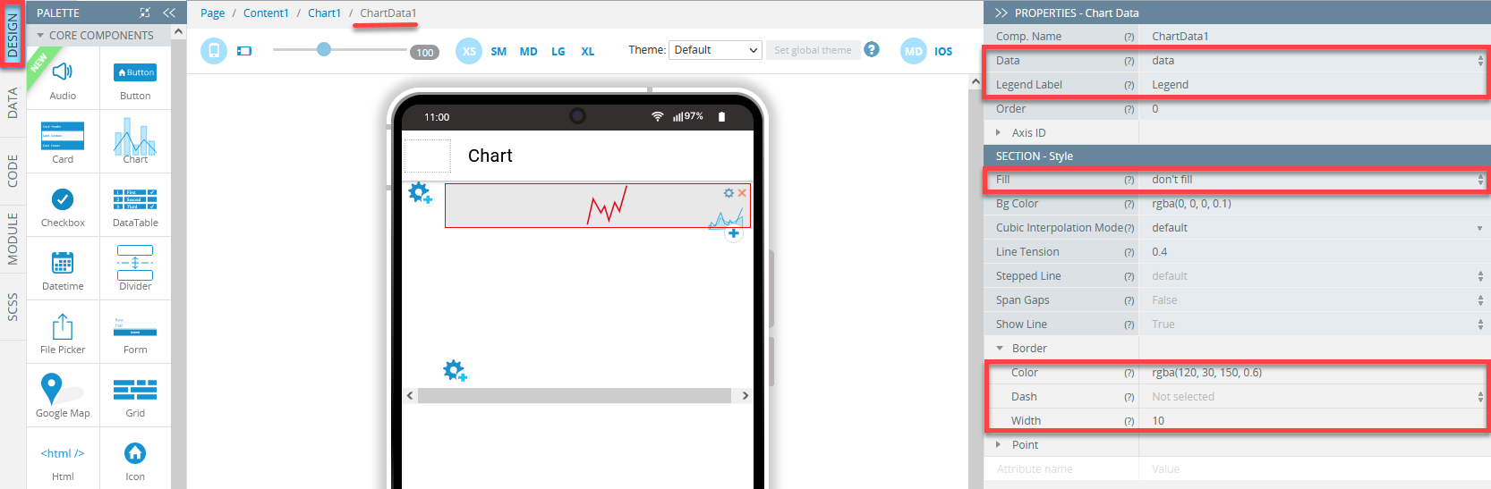
NoteThe Auto init Chart property for the Chart component must be set to False under the chart PROPERTIES tab.
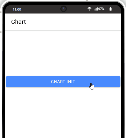
Then, drag the Button to the page (change its Text property to Chart init), unfold the EVENTS tab and add the Chart init action to the button Click event and save:
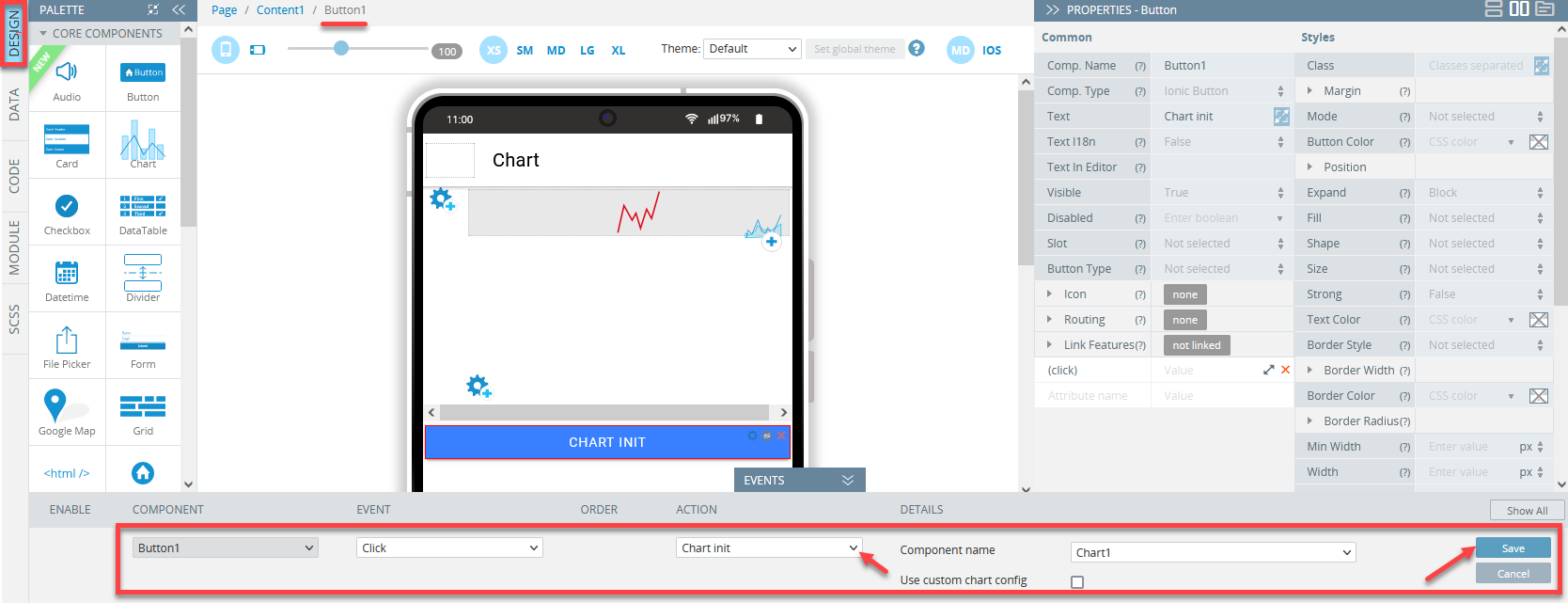
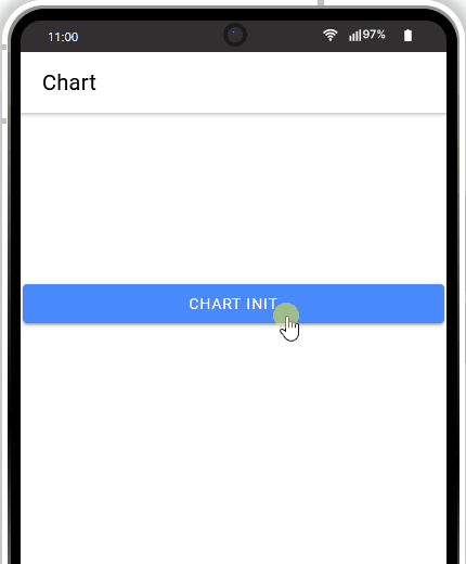
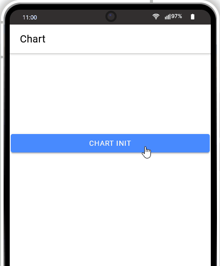
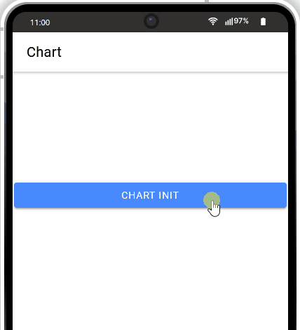
Click TEST to see the chart in action:
Using Custom chart config option
Custom chart config optionYou can also use custom parameters for the Chart component:
First, add the needed custom parameter, for example, variable config, in the screen CODE panel:
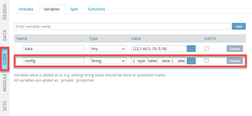
The sample variable value:
{
  type: 'radar',
  data: {
    labels: ['A', 'B', 'C'],
    datasets: [{
      data: [20, 140, 30]
    }]
  }
}
Then, in the DESIGN panel, modify the Chart init action by enabling Use custom chart config to use these custom parameters for Chart:
Now, when clicking the button, we get:
Using Custom chart config and Merge chart config options
Custom chart config and Merge chart config optionsAlso, the Merge chart config option (becomes available after selecting Use custom config) can be used to merge chart properties with custom Chart Data properties like the defined here:
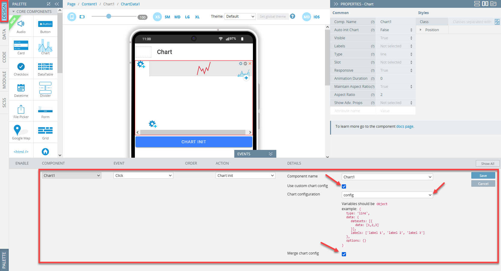
The result of combining Use custom chart config and Merge chart config:

Chart destroy
This action is available on the actions list only if at least one Chart component exists on the screen.
This action is used to destroy the selected chart.
A component to destroy its data is chosen by the Component name option.
NoteThe Chart destroy action will destroy the canvas but not remove the component itself.
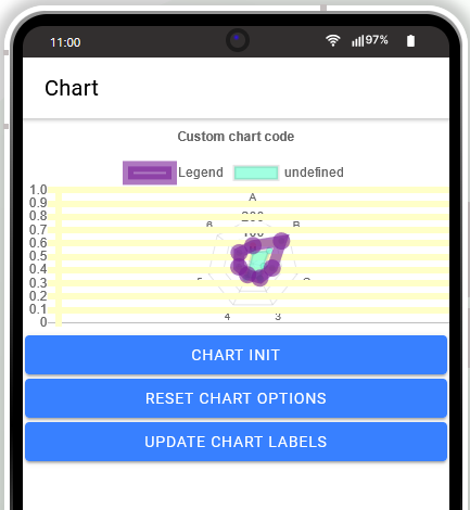
Custom chart code
This action is available on the actions list only if at least one Chart component exists on the screen.
This action allows using the Chart API to work with the Chart component.
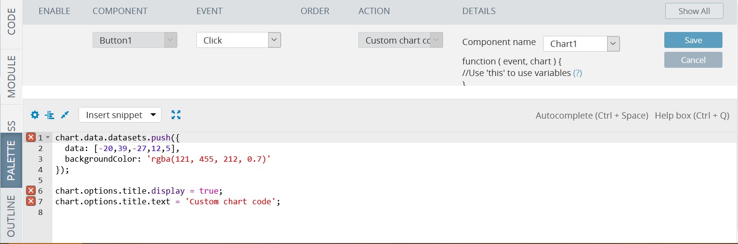
Use this to get screen variables.
chart.data.datasets.push({
data: [-20,39,-27,12,5],
backgroundColor: 'rgba(121, 455, 212, 0.7)'
});
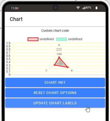
chart.options.title.display = true;
chart.options.title.text = 'Custom chart code';Check out the result on the button click:
InfoBasic Chart API Commands can be found here.
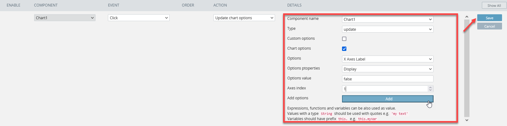
Update chart options
This action is available on the actions list only if at least one Chart component exists on the screen.
This action is used to update/remove options for Chart, such as axes, ticks, animations, legends, and others.
The supported options: Animation, Legend, Title, Tooltips, Elements, Scales Ticks, Scales Grid Lines, Scales Point Labels, Scales Angle Lines, Y Axes Scales, Y Axes Ticks, Y Axes Label, Y Axes Grid Lines, X Axes Scales, X Axes Ticks, X Axes Label, X Axes Grid Lines.
Every option, in its turn, comes with the options properties set. For example, the X Axes Label option allows selecting the following properties: Display, Label String, Line Height, Font Color, Font Size, Font Style, and Padding.
The Options value field is used to enter the value of the option to be updated/deleted.
The Axes index allows setting the needed axes index for the particular option.
To apply the defined option settings, click the Add button next to the Add options field:
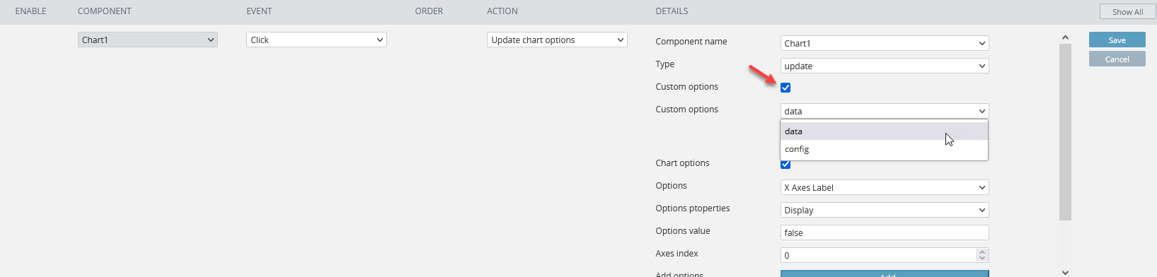
Enabling Custom options provides access to the variables data defined in the screen CODE panel:
Updating Options
To update the chart options on the Update chart options button Click event, for the Update chart options action, select the update type, select the Chart options check box and define the Y Axes Grid Lines Color property as the following. Click Add to save:
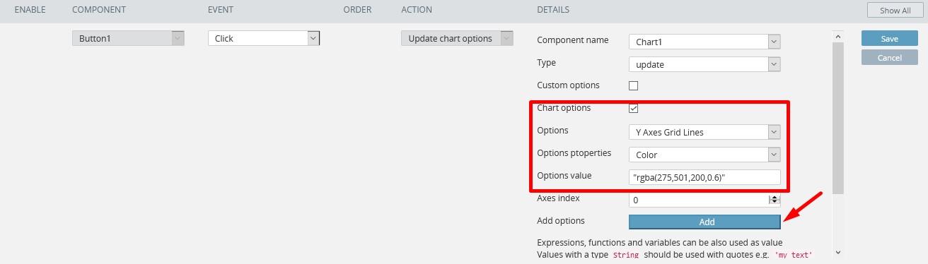
Similarly, the Y Axes Grid Lines Line Width property can be defined: for example, set the Options value to 6. When saved, the button Click event with the Update chart options action will look like this:
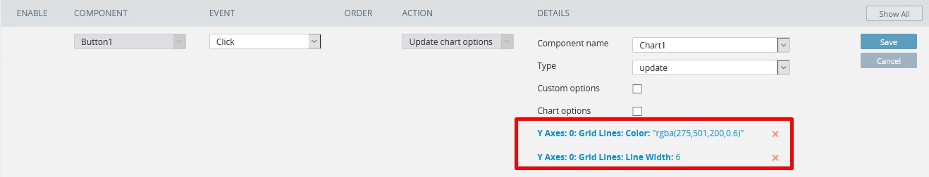
Now, when testing the app, you will see the changes applied to the chart Y Axes Grid Lines. The color and width of the grid lines have been updated:
Resetting Options
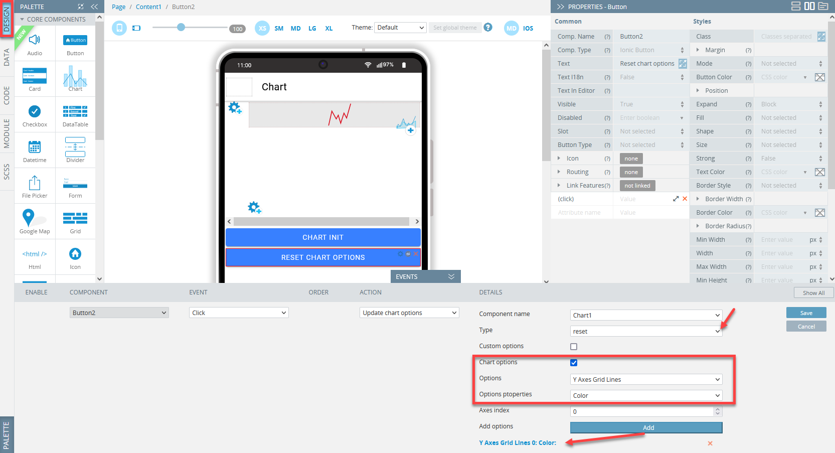
To reset one of the chart options, for example, Color, add another button (name it Reset chart options) to the screen and define its Click event as follows: for the action, select Update chart options, then select the reset type, select the Chart options check box and select the Y Axes Grid Lines option from the drop-down. Next, select the property, that needs to be reset: Color Note that the Line Width property added earlier should be kept unchanged.
Finally, click Add, then Save to save the event:
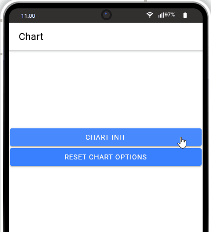
Check how clicking the Update chart options button updates the grid Y Axes lines' color and width and then clicking the Reset chart options button removes the grid Y Axes lines' color.
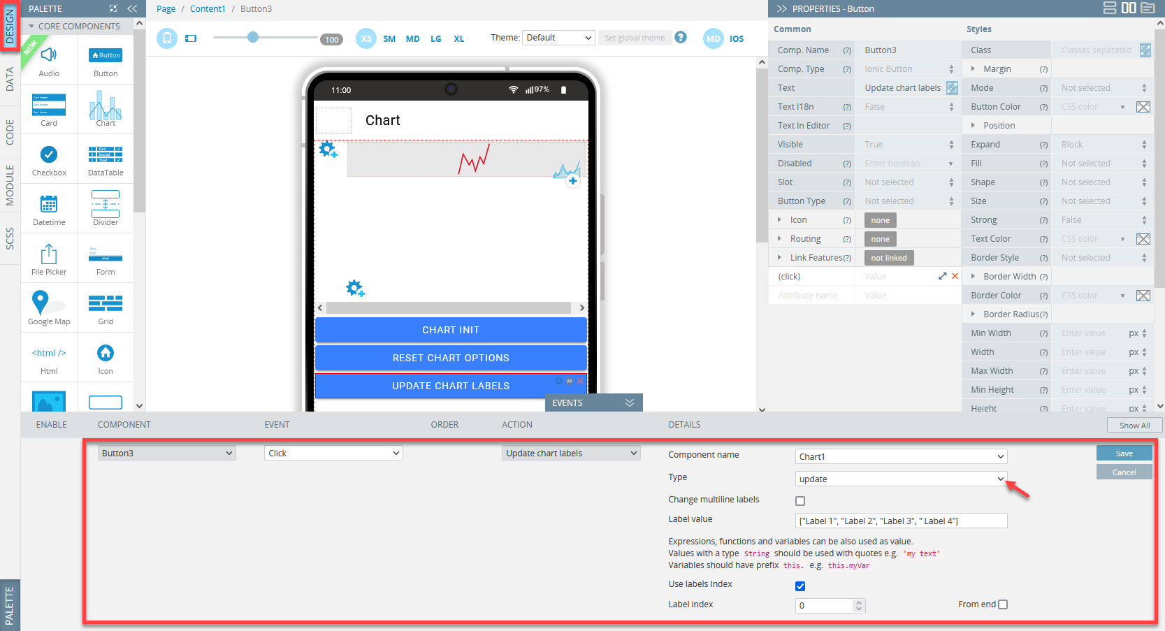
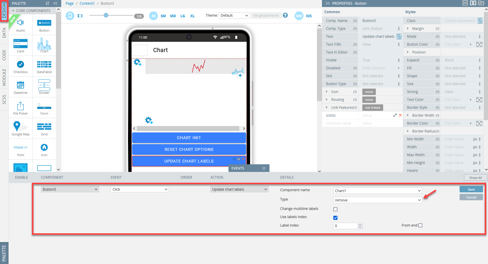
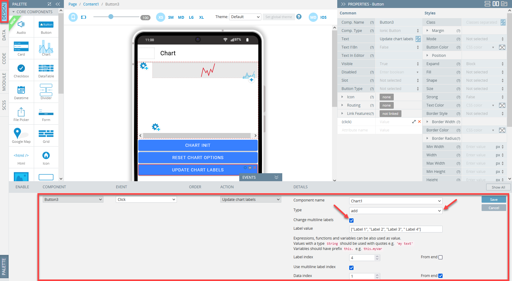
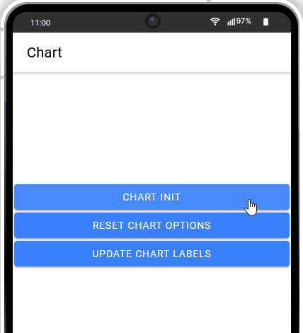
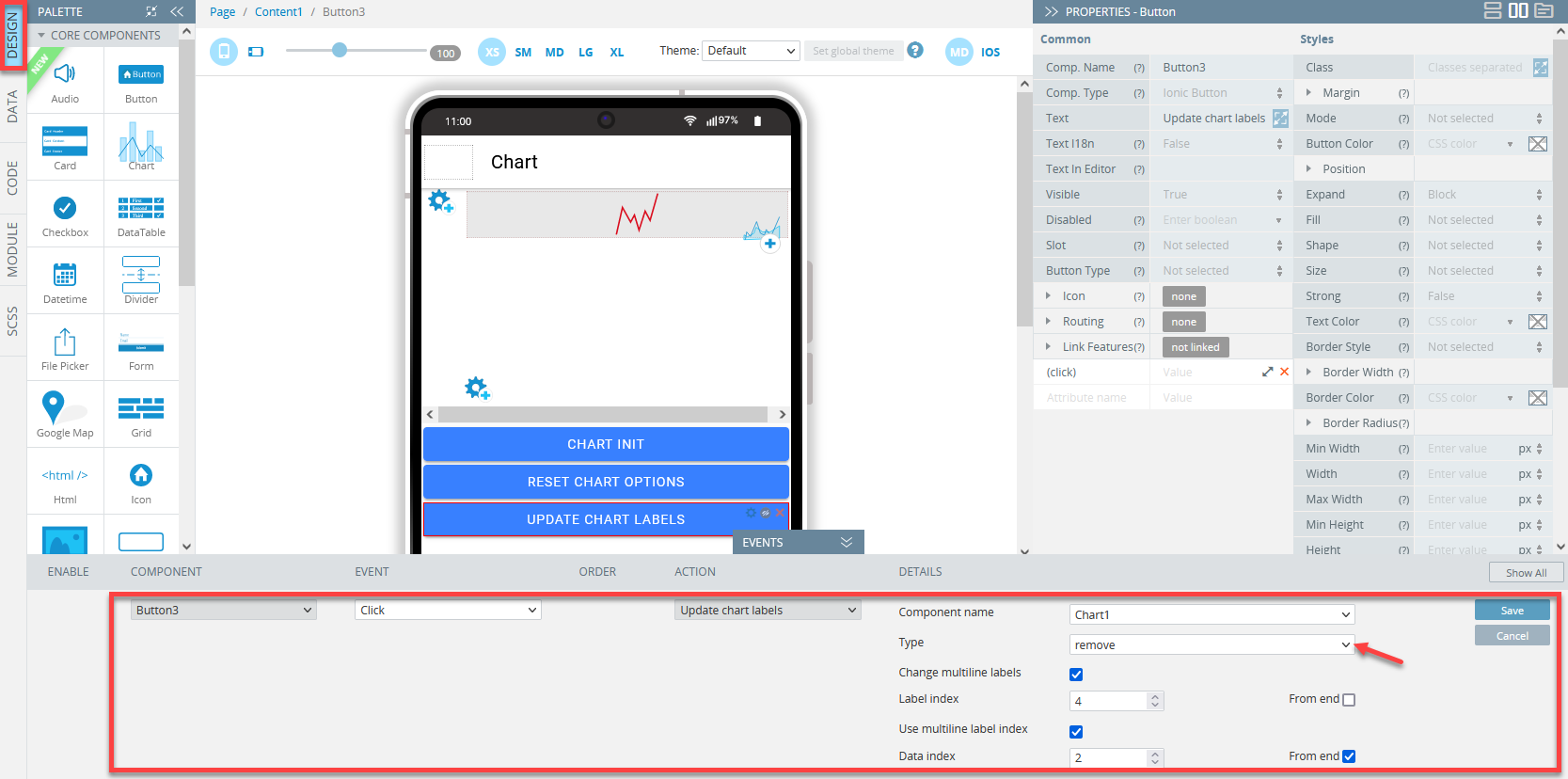
Update chart labels
This action is available on the actions list only if at least one Chart component exists on the screen.
This action is used to add/update/remove labels.
To select the labels modification type, click the Type drop-down.
SelectChange multiline labelsto change multi-line labels.Label/multiline label index\ is used to select a label/multiline label by index:
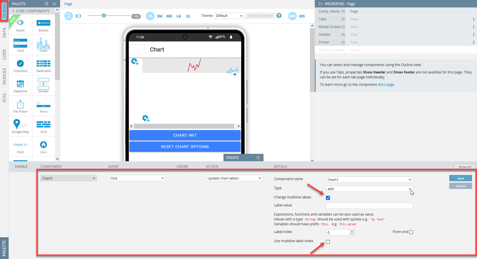
Label value is used to write label values, you can use:
- an array of strings:
["Label 1", "Label 2"]; - string:
"Label"; - function:
function() {return "label";}or() => "label" or () => { return "label"; }.
Note!To use the screen variable, use the arrow function:
() => { return this.variable_1; }// return value from variable_1.
To use the Chart API, use the arrow function with the chart argument:(chart) => { return chart.data.labels[0]; } // return first label from selected chart component.
Managing Labels
Adding Labels
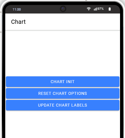
Add one more button (name it Update chart labels) to the screen and define click on it with the Update chart labels action of the add type with the "Label" value :

Clicking on the button will yield the following:
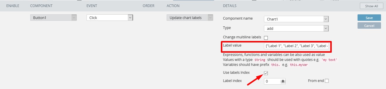
You can use ["Label 1", "Label 2", "Label 3", " Label 4"] with enabling the Use labels index option:
Updating Labels
Removing Labels

Managing Multiline Labels
Select Change multiline label to modify multi-line labels.
Adding Multiline Labels
Updating Multiline Labels


Removing Multiline Labels
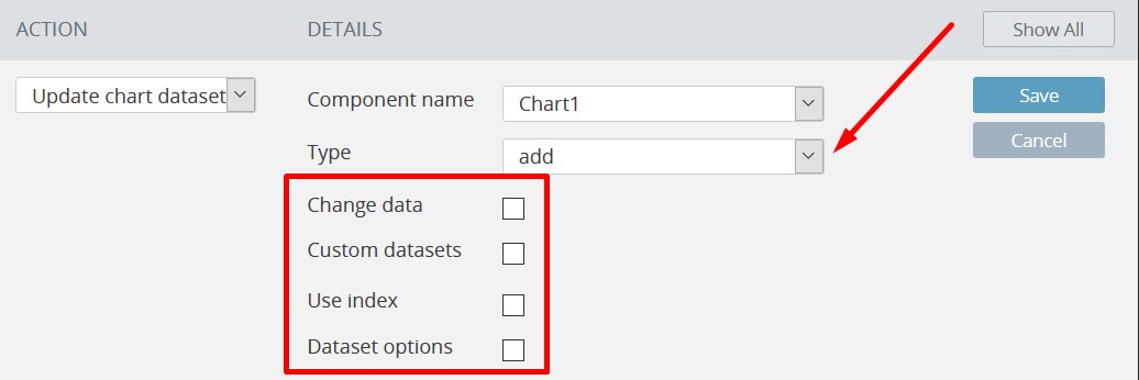
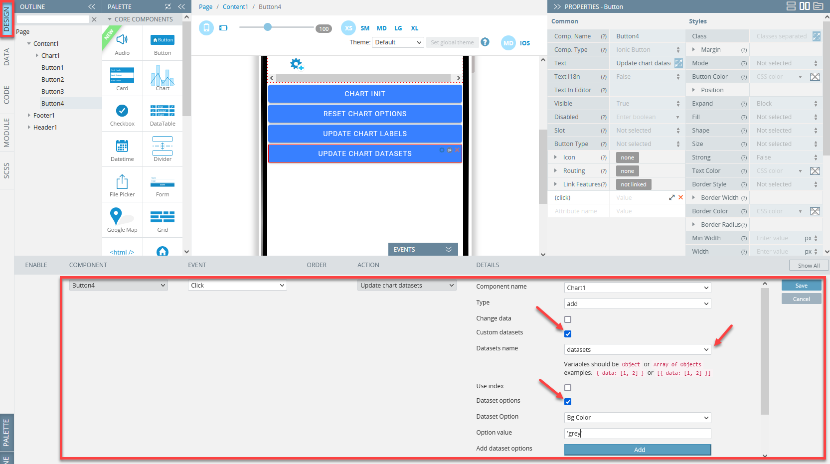
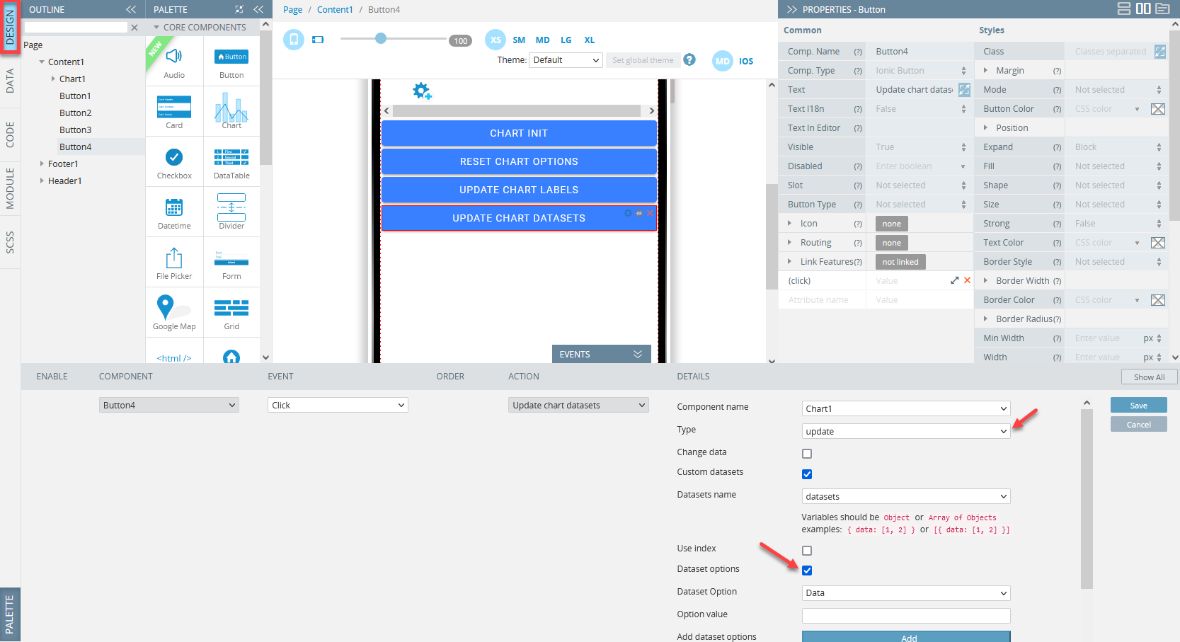
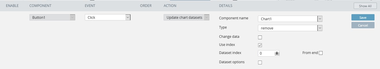
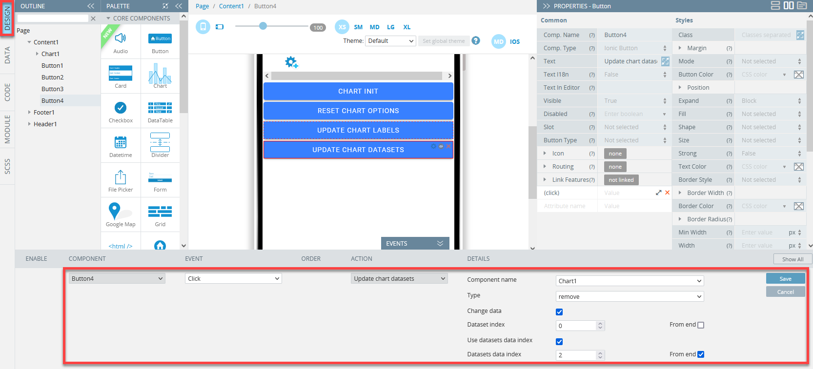
Update chart datasets
This action is available on the actions list only if at least one Chart component exists on the screen.
This action is used to add/update/remove datasets.
To select the datasets modification type, click on the Type drop-down.
Select Change data to change the data of the dataset.
Custom datasets uses screen variables to update datasets/data.
Use index is used to select datasets/data to update.
Datasets options is a list of dataset/dataset properties you can select and record a value for:
NoteUse the String format for string properties:
Data.
Use the Number format for numeric properties:25.
Use the Boolean format for boolean properties:true, false.
Use the Arrays format for array properties:[‘data’, 25, {}, []].
You can also use functions that return the desired format:function() {return [25]}.
To use the Chart API and the screen variable, use the arrow function:(chart) => { chart.update(); return this.variable_1; }.
Managing Datasets
Adding Datasets
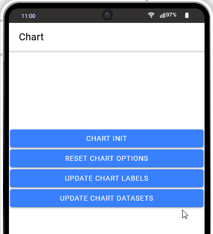
Add one more button (name it Update chart datasets) to the screen and define click on it with the
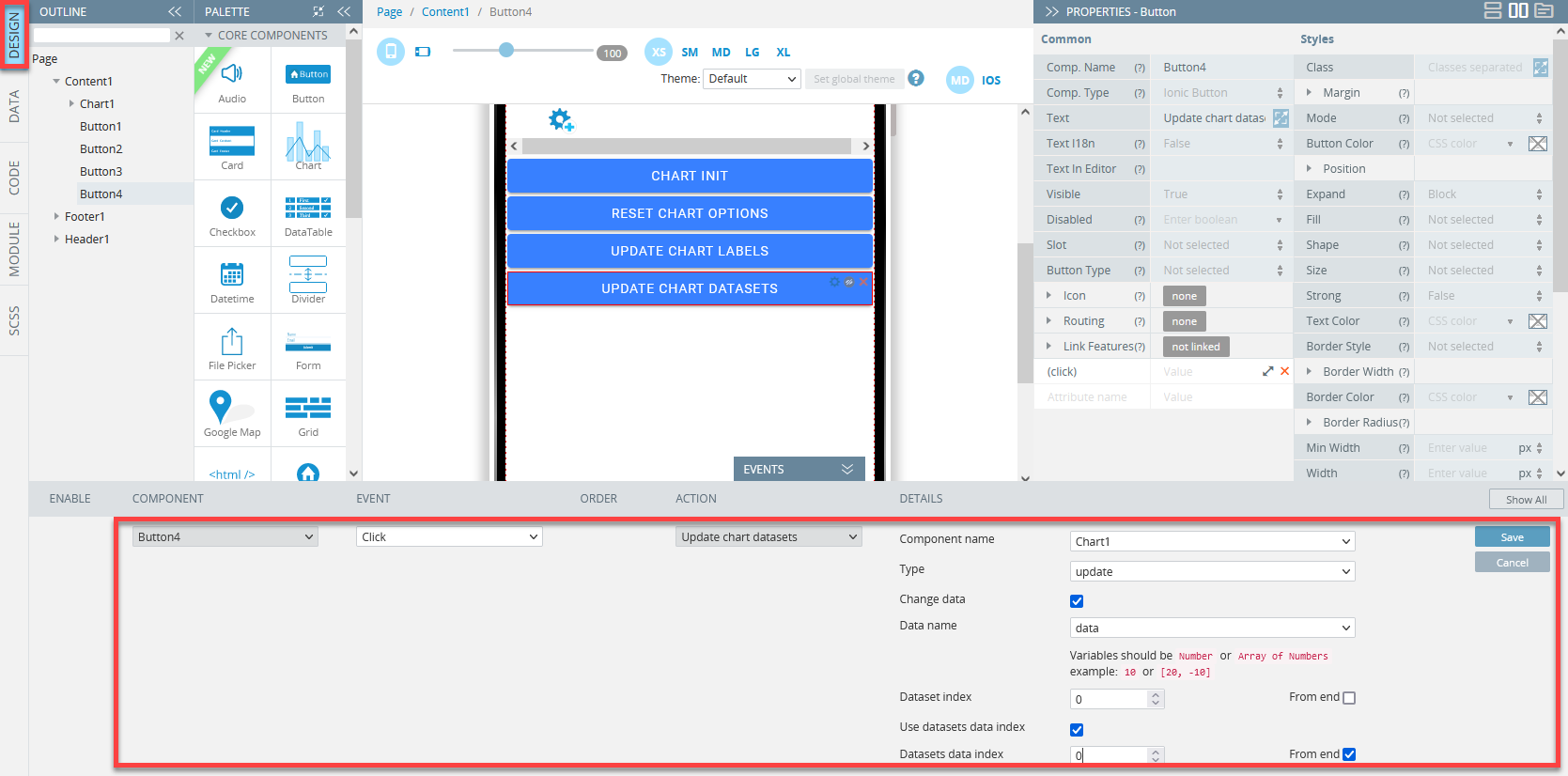
Updating Datasets

Removing Datasets
Change data
Select Change data to modify the data of the dataset.
Addng data
First, define the variable dataNumber:
Then, select it as the Data name option:
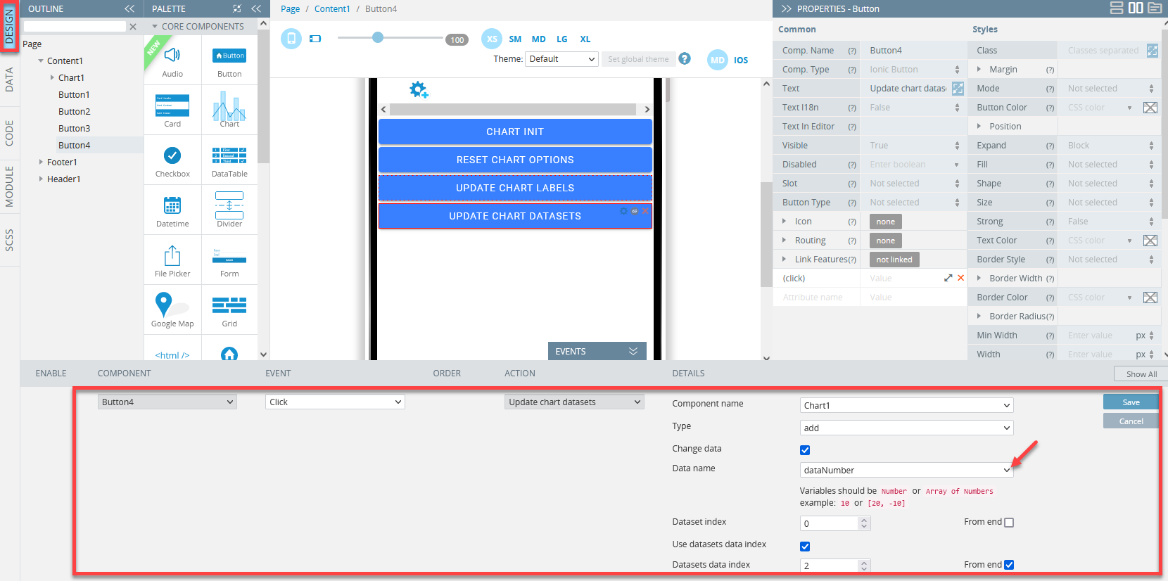
The result:

Updating data
Removing data

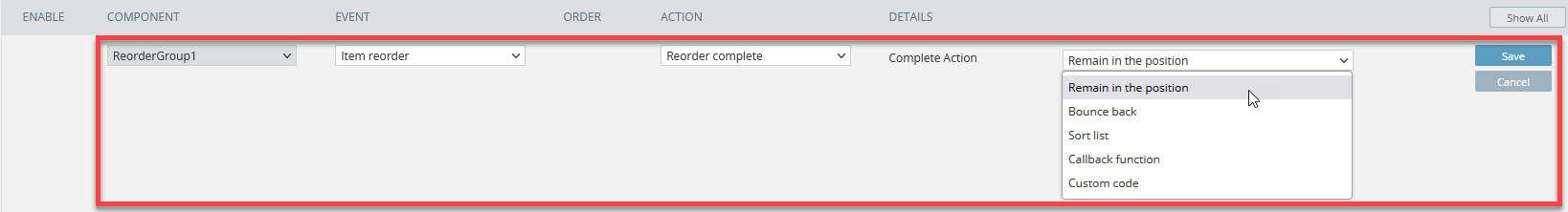
Reorder complete
This action completes the ReorderGroup component data.
The action is visible on the actions list only if at least one ReorderGroup component exists on the screen.
Reorder complete options
When setting the complete action, you can select the following options:
- Remain in the position;
- Bounce back;
- Sort list (a variable should be defined: go to the CODE panel to do it);
- The callback function (a function should be defined: go to the CODE panel to do it);
- Custom code (enter custom code):
Mark all as touch
This action allows finetuning the validation flow by showing the errors if any.
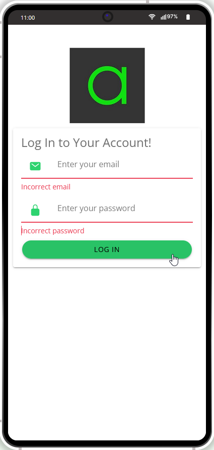
The main prerequisite is adding the Form component to the screen. Also, he needed components must be placed inside the form. Define the component(s) you want to add validation to, for example, inputs for email and password:
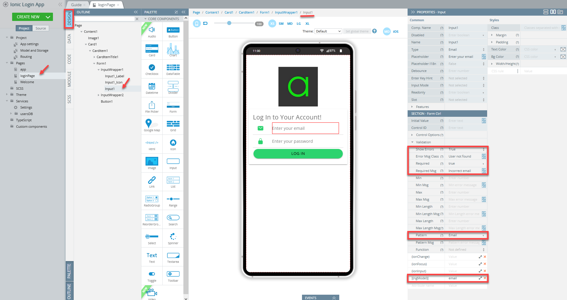
Important Note!Note that the property Validation > Required must be set to True.
Set the Link Features > Type property of the LOG IN Button added inside the Form to Submit and define it with the Mark all as touch action where Form1 is set as a Component name:
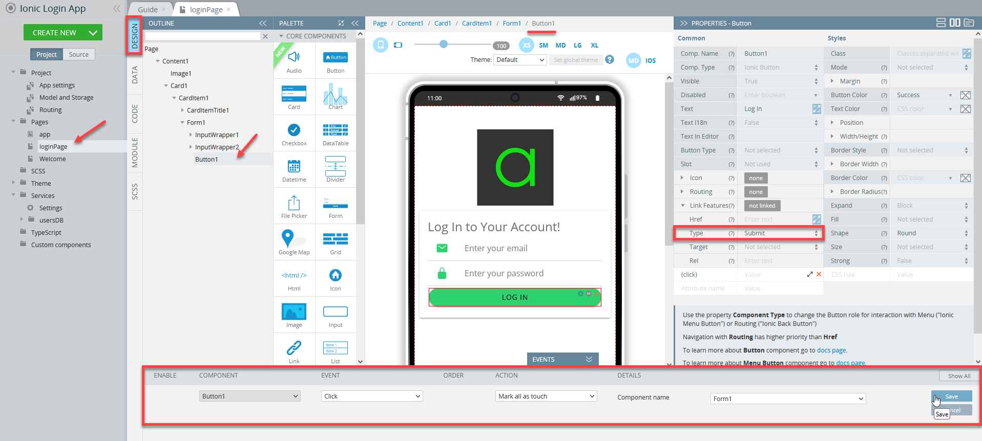
When done, you can define the button with other click events, for example, Form submit that will process the event if the user enters the correct password.
Want to know more?You can check this document for more details on how to define input validatin.
When testing, you are asked to enter the correct credentials to start login form validation: