Checkbox
Overview of the Checkbox Component
The CheckboxWrapper allows users to select multiple options from a set of choices. Checkboxes appear as checked (ticked) when activated. Clicking a checkbox toggles its checked property. Checkboxes can also be programmatically checked by setting the checked property.
Properties
Important Note!This document lists the properties specific to this UI component.
For properties common to most UI components, please refer to the General components document.
Every new CheckboxWrapper component is created with two default child components: Checkbox and ItemLabel.
Properties
| Property Name | Property Description |
|---|---|
| Item Wrapped | If set to true, the component will be included in an Item with additional properties. |
| Show Label | If set to true, the component will display a label. |
| Lines | Determines how the bottom border displays on the item. Possible values: Full, Inset, None. |
| Reorder | Reorder properties:
|
Checkbox
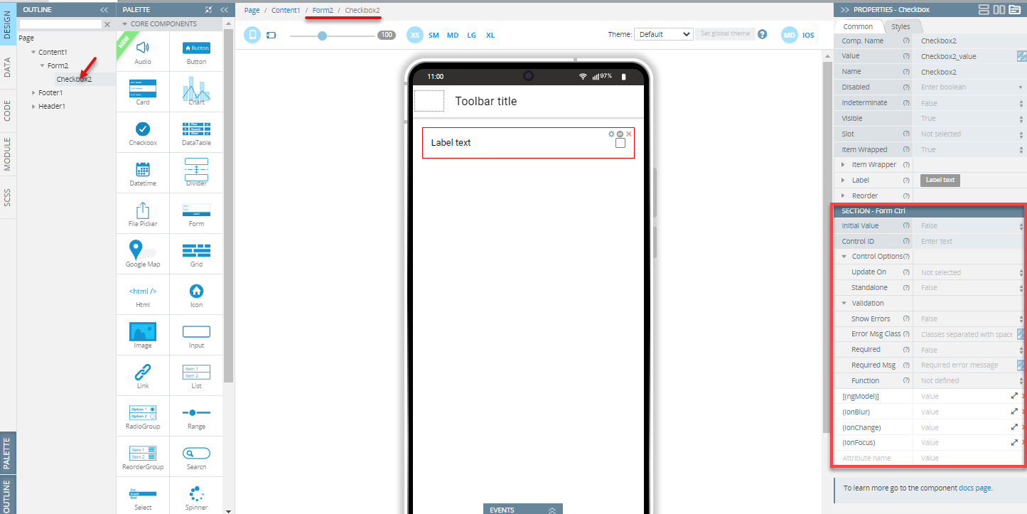
The Checkbox component properties can be configured under the Common and Styles tabs:
Properties
| Property Name | Property Description |
|---|---|
| Name | The name of the control, which is submitted with the form data. |
| Value | Used as data for forms and groups. The checkbox value does not indicate whether it is checked; use the checked property for that. |
| Checked | If set to true, the checkbox is selected. The default is false. |
| Indeterminate | If set to true, the checkbox will visually appear as indeterminate. The default is false. |
| [(ngModel)] | Angular directive for data binding. |
| (ionBlur) | Event emitted when the checkbox loses focus. |
| (ionChange) | Event emitted when the value changes. |
| (ionFocus) | Event emitted when the input receives focus. |
Styles Properties
Under the Styles tab, checkboxes can be styled with additional attributes:
| Property Name | Property Description |
|---|---|
| Checkbox Size | Set the checkbox size in px, %, em, vh, and vw. |
| Checkmark |
|
ItemLabel
The ItemLabel component has the following common properties:
| Property Name | Property Description |
|---|---|
| Truncate Text | Set to true (default) to truncate label text if it is too long. |
| Position | Determines where and how the label behaves inside an item. |
Styles Properties
Under the Styles tab, ItemLabel components can be styled with the following attributes:
| Property Name | Property Description |
|---|---|
| Font Size | Enter font size in px, %, em, vh, and vw. |
| Font Weight | Set the font weight (boldness): Normal or Bold. |
Using Checkbox as a Form Control
When included in a Form component, Checkbox becomes a Form Control:
The Name property should be specified (by default, the Name property is defined as the Component name property, so change it if necessary).
Use the following description only when the Form component has the Native validation property disabled. If Native validation is enabled, the control can be used as a default HTML Form Control.
To set the initial value of the control, use the Initial Value property in the Form Control properties section. The component accepts only boolean values (true or false). If the property is not specified, the initial value will be null.
To use variables as the control's data, specify the advanced property [(ngModel)] - enter the variable name as the property value. This replaces the value set by the Initial Value property.
The component can receive additional properties (Control ID and Control options) that allow validity checking, updating strategy changes, etc. These properties can be used when the Native Validation property is disabled for the Form component.
Read more about validation in the Form section.
Note!This component cannot be used with array iteration data for creating dynamic form structures. If you need to create such structures, follow these recommendations.
Visit the Ionic documentation to learn more about checkboxes.
Updated 8 months ago