Button
Overview of the Button Component
Button Component
Buttons provide clickable elements used in forms or anywhere simple, standard button functionality is required. As the most popular component, the Button component can be used to navigate to pages or links, copy properties to local storage variables, set other components' properties, open and close popups, invoke services, or run JavaScript. Buttons may display text, icons, or both.
Important Note!This document lists properties specific to this UI component. For properties common to most UI components, please check the General components document.
Ionic Button
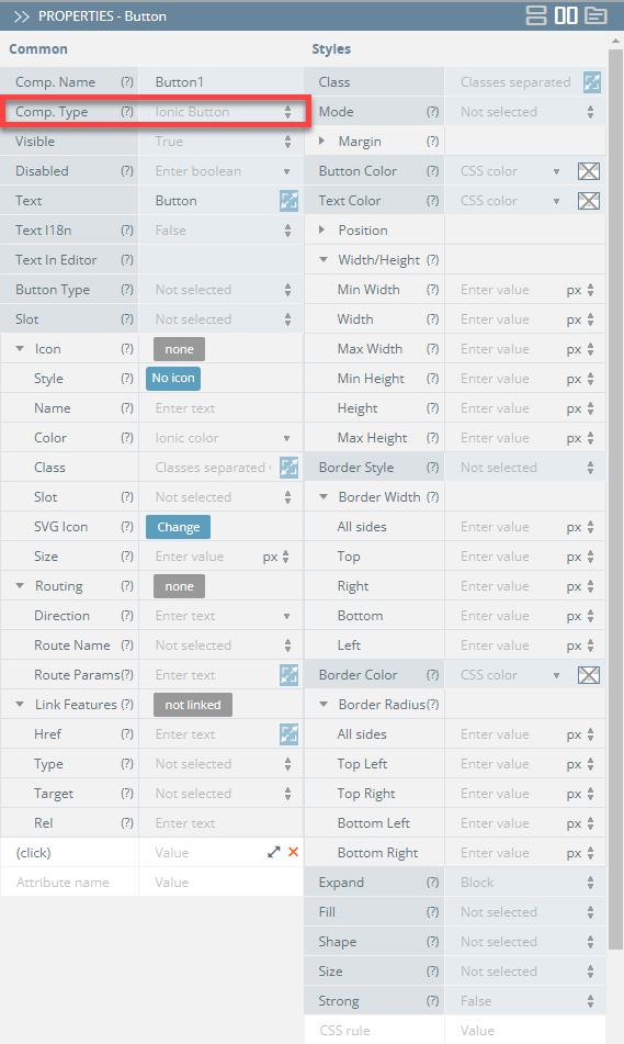
If the button's type is set to Ionic Button (default) under the PROPERTIES panel (Common tab), the component will feature the following properties:
| Property Name | Property Description |
|---|---|
| Comp. Type | Use this property to change the button role for interaction with Menu (Ionic Menu Button) or Routing (Ionic Back Button):
|
| Button Type | Select between Button (default) or Bar Button. |
| Icon | Makes a button look like an icon. This property converts the button to an icon by changing its Style property and ignoring the Text property.
|
| Routing |
|
| Link Features | Options for the component to be used as a link:
|
| (click) | Action to be triggered on button click. |
Styles Properties
Under the Styles tab, buttons can be styled with several attributes:
| Property Name | Property Description |
|---|---|
| Button Color | Select button color from available colors: Primary, Secondary, Tertiary, Success, Warning, Danger, Light, Medium, Dark, and Custom or use the Color-picker. |
| Expand | Set to Block for a full-width button or to Full for a full-width button without left and right borders. |
| Fill | Set to Solid or select Clear for a transparent button, or Outline for a transparent button with a border. |
| Shape | Setting to Round makes the button rounded. |
| Size | Select the preferred button size: Small, Default, or Large. |
| Strong | If set to True, activates a button with heavier font weight. |
| Text Color | Select button text color from available colors: Primary, Secondary, Tertiary, Success, Warning, Danger, Light, Medium, Dark, and Custom or use the Color-picker. |
Ionic Menu Button
Menu Button is a component that automatically creates the icon and functionality to open a menu on a page. If you define the button Comp. Type property as Ionic Menu Button, the component will have additional Menu Button properties under its Common tab:
Auto Hide - Automatically hides the menu button when the corresponding menu is not active (set to true).
SVG Icon - Used to select an SVG file. This path will be added as the src attribute. Click the Change button to select the uploaded image from Media Manager.
Menu - An optional property that maps to a Menu's menuId property. It can also be start or end for the menu side. It is used to find the correct menu to toggle.
Type - Type of the menu button (Submit, Reset, or Button):
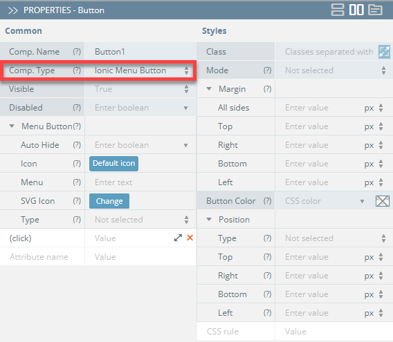
If you switch to the Styles tab, you will have access to modifying the component's Class, Margin, Mode, and Button Color properties, similar to the default Ionic Button.
Ionic Back Button
With the button Comp. Type property set to Ionic Back Button, the component will have additional Back Button properties under its Common tab:
Icon - Icon name to use for the back button. Click the Default icon button to select an icon, or leave it as default.
SVG Icon - Used to select an SVG file. This path will be added as the src attribute. Click the Change button to select the uploaded image from Media Manager.
Text - Text to display in the back button.
Type - The type of the back button (Submit, Reset, or Button).
Default Href - The URL to navigate back to by default when there is no history:
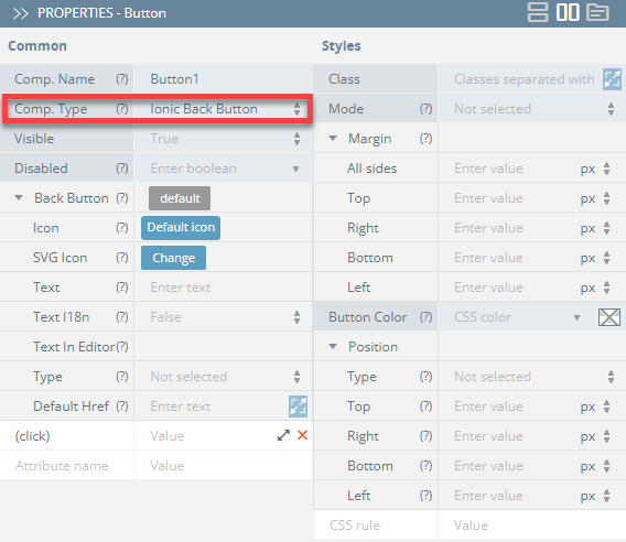
If you switch to the Styles tab, you will have access to modifying the component's Class, Margin, Mode, and Button Color properties, similar to the default Ionic Button.
You can also check the Ionic documentation to read more about Button.
Updated 8 months ago