jQM UI Components
UI components available in App Builder for jQuery Mobile.
Important Note!The option of creating new apps with thejQuery Mobile framework was removed but we still support the projects that were created with it earlier.
Components
The App Builder for jQuery Mobile provides a large number of UI components for building your mobile app. The components fall into one of the following categories:
- jQuery Mobile components;
- HTML components (including HTML for writing custom code);
- YouTube, Vimeo, Google Maps component.
Additional Resources
As the Visual App Builder uses standard jQuery Mobile and HTML components, if you need additional help using these components or their other properties, it's best to visit the following resources:
Link
The Link component renders an HTML link control.
| Property name | Property description |
|---|---|
| Text | The link label/text. |
| URL | The link URL. |
| Name | Component name. Used to reference via Appery.io JavaScript API. |
| Visible | Determines if the component is visible on the page. |
| Margin | Sets the component margins (top, bottom, left, right). |
| Font Face | Label font face: Georgia, Gisha, Gulim, or Helvetica. |
| Font Color | Label color. |
| Font Size | Label size. |
| Font | Label font. |
| Align | Label alignment. |
| Class Name | Custom CSS class for this component. |
Button
The Button component is one of the most commonly used on our platform. It can navigate to a page, link, or copy a property to a local storage variable. It can also set the other component’s property, open and close pop-ups, and invoke a service or run JavaScript.
| Property name | Property description |
|---|---|
| Mini version | Check to make a button smaller. |
| Inline | Check to put several buttons in a line. |
| Icon | Select the icon to be added to the button. |
| Position | Select the position of the icon on the button. It can be right, left, top, bottom, or notext. |
| Corners | Check to make a button with rounded corners. |
| Tab index | Allows you to change item order by using the Up and Down buttons. |
Group Buttons
The Group Buttons component includes several buttons in a group, each button has properties similar to those listed above.
| Property name | Property description |
|---|---|
| Mini Version | Check to make all the buttons in a group smaller. |
| Orientation | Select vertical (by default), or horizontal placement for the buttons. |
| Items | Select how many buttons you need in the group. |
Input
The Input component allows you to receive data from the app user. It may be a name, login, email, or password, a word, phrase, location, or anything else that you need in your app.
| Property name | Property description |
|---|---|
| Text | Write the text to appear in the input field once the page has loaded. Leave this property empty if you need the input field to have placeholder text. |
| Placeholder | If you want the text to disappear once the user starts typing, enter the placeholder text in this field. |
| Type | Select the type of the input text. If the password is selected, the entered text is shown as dots. |
| Tab index | Allows you to change item order by using the Up and Down buttons. |
Text Area
The Text Area component allows the app user to enter text.
| Property name | Property description |
|---|---|
| Text | Write the text to appear in the text area. This text may not be a placeholder so it may not disappear by itself, but it can be cleared if needed. |
| Placeholder | Write the placeholder text you want to appear in the text area; the Text property should be empty. |
| Mini Version | Check if you want to decrease the text size. |
| Tab index | Allows you to change item order by using the Up and Down buttons. |
Dialog
Dialog is a page that can be opened as a pop-up window. Because it is a page, it can contain any UI components. The dialog is not presented in the UI components palette so to create a dialog select CREATE NEW > Dialog. It’s a good idea to set a name for the dialog in PROPERTIES to make it easier to refer to.
Datepicker
The Datepicker component is very helpful when the app user needs to enter a date.
| Property name | Property description |
|---|---|
| Date Format | You can change the standard mm/dd/yy order of the elements to any you like, but there are some notes you should know:
|
| Default Date | By default, the current date is set but this setting can be changed. |
| Min Date | The dates before the one set in this field will be unselectable. |
| Max Date | The dates after the one set in this field will be unselectable. |
| First Day | You can select the first weekday: Sunday (default) or Monday. |
| Day Names | You can change day names to symbols or other names if your language differs from English. |
| Month Names | You can also change month names if your language isn’t English. |
| Tab index | Allows you to change item order by using the Up and Down buttons. |
Label
The Label component is used to show information to the app user.
| Property name | Property description |
|---|---|
| Text | Write the text to appear when the page loads. |
| Font Face | Select the font face family to be used for the text of the Label component. |
| Font Color/Size | Specify the color and the size of the symbols in the Label component. |
| Font | Define if the text font will be bold, italic, underlined. |
| Align | Defining the text alignment in the component will be either: left, center, right, or justify. By default, it is left. |
Radio
The Radio component is a group of options where only one may be checked.
| Property name | Property description |
|---|---|
| Options Count | Define the number of alternatives from which to choose. |
| Orientation | Select vertical* (default) or horizontal placement of the options. When vertical orientation is chosen a circular hole precedes the description, and the selection is marked with a dot in it. When the horizontal orientation is chosen, a circular hole is absent and the selected item is highlighted. |
| Mini Version | Check to make all the options in a group smaller. |
| Value | The value which will be set if the option is selected. |
| Text | The description of the selection, by default it is the same as the value. |
| Selected | Check if you want this option to be selected by default. Once Selected is checked for one option, it will become unchecked for the rest of the options. |
| Tab index | Allows you to change item order by using the Up and Down buttons. |
Checkbox
The Checkbox component is a group of options where one or more options may be checked.
| Property name | Property description |
|---|---|
| Options Count | Define the number of alternatives from which to choose. |
| Orientation | Select vertical (default) or horizontal placement of the options. When the vertical orientation is chosen a circular hole precedes the description, and the selection is marked with a dot. When the horizontal orientation is chosen, a circular hole is absent and the selected item is highlighted. |
| Mini Version | Check to make all the options in a group smaller. |
| Value | The value which will be set if the option is selected. |
| Text | The description of the selection; by default it is the same as the value. |
| Selected | Check if you want this option to be selected by default. Once Selected is checked for one option, it will become unchecked for the rest of the options. |
Slider
The Slider component allows choosing a numeric value by moving an indicator.
| Property name | Property description |
|---|---|
| Max Value | The value set when the indicator is on the right end of the slider. |
| Value | The default value. |
| Min Value | The value set when the indicator is on the left end of the slider. |
| Mini Version | Check to make the Slider component smaller. |
| Tab index | Allows you to change item order by using the Up and Down buttons. |
Toggle
The Toggle component allows switching between two values.
| Property name | Property description |
|---|---|
| Toggled | Check to switch the toggle component on. |
| Label On Text | Text appearing when the toggle component is switched on. |
| Label Off Text | Text appearing when the toggle component is switched off. |
| Tab index | Allows you to change item order by using the Up and Down buttons. |
Select
The Select component allows choosing one item from a predefined set of values.
| Property name | Property description |
|---|---|
| Icon | Select the icon to be shown on the component, or remove the icon. The selected icon appears only on the main component, not on the lines of the list. |
| Position | Select the icon position. |
| Options | Click Change to set labels and values of the list. |
| Selected | Choose the option to be selected by default. |
| Native Menu | Check to make the list look like a menu. |
| Mini Version | Check to make the Select component smaller. |
| Inline | Check to locate several components in line. |
| Tab index | Allows you to change item order by using the Up and Down buttons. |
Working with Long List
The jQuery Mobile Select component opens a full-page dialog if there are many items on the list. When the dialog closes, the component will generate a Page show event for the main (parent page). This means that any Page show events will be fired on the parent page.
The following is a solution to manage
- Add the Page show event handler with action Run JavaScript.
- Add the following JavaScript code:
var data = arguments[1];
var prevPage = data.prevPage;
var isFromSelect = jQuery(prevPage).is('[data-role="dialog"]');

//debug
//console.log("isFromSelect  = " + isFromSelect);

//No action is this a "Page show" event triggered from "select" component.
if(isFromSelect) {
    return;
}

//Any other "Page show" event logic
console.log("Page show logic goes here");
List
The List component shows a list of items.
| Property name | Property description |
|---|---|
| Numbered | Check to make the list ordered. |
| Round Corners | Uncheck to make the list square and screen wide. |
| Data Filter | Check to add a filter field. |
| Auto Divider | Check to add a divider to the list. The divider shows the first letter of the item (or group of items, if they start with one letter). |
| Split Button | Check to split each button into two parts: label and icon. If the property is checked, each part has specific properties (these properties will be listed below) and can have their own events. |
| Buttons Icon | Select the default icon for list items. |
| Buttons Swatch | Select the default swatch for list icons. This property appears only when Split Button is checked. |
| Placeholder | enter the text for the filter field. This property appears only when Data Filter is checked. |
| Divider Swatch | Select the swatch for dividers. |
| Counter Swatch | Select the swatch for counters. |
| Items | Set the number of items in the list. |
| Linked | Makes the list items active (checked by default). |
| Tab index | Allows you to change item order by using the Up and Down buttons. |
List items have the following properties:
| Property name | Property description |
|---|---|
| Image Type | Select whether you want to have images on the list items. You can select thumbnail image, icon image, or no image - none. |
| Image | Click Change to upload or select the image. |
| Icon | Click Inherit to choose an icon. |
| Counter Value | The counter appears if the Counter Visible box is checked. |
| Counter Visible | Check to make the Counter Value property accessible. |
| Text | Enter the text for the list item. |
| Divider | Check to highlight the item as a divider. When the Auto Divider list property is checked, this check box becomes inactive. If the Divider property is checked, the following changes will appear: The button icon and image are hidden on the divider item. If the Split Button list property is checked, the divider item will not be split because it has no icon. If the list is numbered, the numbering starts from 1 after every divider. If the Split Button list property is checked, you can define it for every list item’s unique icon and swatch. |
| Linked | Makes the list items active or passive. This property is inherit by default (takes value from List linked value). To turn off the inherit mode switch the toggle. |
| Tab index | Allows you to change item order by using the Up and Down buttons. |
Image
The Image component allows adding custom images to your app.
| Property name | Property description |
|---|---|
| Preserve Ratio | Uncheck to change the image ratio. |
| Asset | Click Change to upload or select the image, or Clear image to clear it. |
Grid
The Grid component allows formatting page content into rows and columns.
| Property name | Property description |
|---|---|
| Rows | Number of rows. |
| Cols | Number of columns. |
| Dimension | Grid width and height. Allowed values are <num>px, <num>pt, <num>%, or auto. |
| Border Thickness | The default value is 0 (it is invisible), but you can set a different value. |
| Border Color | Select the color for the border. |
Every Grid cell has the following properties:
| Property name | Property description |
|---|---|
| Background Transparent | Uncheck, if you want the cell background to be colored. |
| Background Color | Select the color for the cell background if Background Transparent is unchecked. |
Navbar
The Navbar component may be dragged and dropped on the page header or footer. It can consist of several buttons with optional icons. The Navbar component has only one main property – Items. The number of items in a Navbar can vary from 1 to 10. If the number of items you set doesn’t exceed 5, the buttons will be on one line. If you set more than 5 items, they will be placed on several lines – two buttons in a line (regardless of the page size). This doesn’t look very professional, which is why we don’t recommend using the Navbar component with more than 5 items.
| Property name | Property description |
|---|---|
| Icon | You can select any icon from the list or none. |
| Text | Enter the text to appear on the button (this field may be left empty). |
| Active | Check to make the button highlighted on this page. |
Search
The Search component is an input field with a search icon, and a clear text icon that appears once the app user begins typing.
| Property name | Property description |
|---|---|
| Text | Enter the text that should appear in the input field. This text may not be a placeholder so it may not disappear by itself, but can be cleared if needed. |
| Placeholder | Write the placeholder text you want to appear in the text area; the Text property should be empty. |
CollapsibleSet
CollapsibleSet is a complex component that, when tapped, allows you to expand and collapse content. The CollapsibleSet component consists of one or several blocks, and each block has a header and content area. The header stays visible even when the content is collapsed. Using the CollapsibleSet component saves space on your mobile page.
| Property name | Property description |
|---|---|
| Items | Number of blocks. |
| Mini Version | Check if you want the block headers be smaller. |
| Data Inset | Uncheck to make the component full width, without corner styling. |
| Data Collapsed Icon | Select the icon that appears on the header of the collapsed block. |
| Data Expanded Icon | Select the icon that appears on the header of the expanded block. |
| Data Iconpos | Select the position of the icon on all block headers. |
| Swatch | Select the component swatch if you want it to differ from the inherited. |
| Data Content Theme | Select the block contents’ swatch if you want it to differ from the inherited. |
| Tab Index | Allows you to change item order by using the Up and Down buttons. |
The CollapsibleSet block properties are as follows:
| Property name | Property description |
|---|---|
| Collapsed | Uncheck to make this block expanded by default. You can uncheck the box to fill the content area of the block, and then check it again. |
| Swatch | Select the block swatch if you want it to differ from other blocks. If you set the block swatch it will not change after changing the component swatch. |
| Tab index | Allows you to change item order by using the Up and Down buttons. |
| Mini Version | Check if you want the block headers to be smaller. |
The CollapsibleSet block header properties:
| Property name | Property description |
|---|---|
| Icon Position | Select this block headers icon position. |
| Collapsed | Uncheck to make this block expanded by default. You can uncheck it to fill the content area of the block, and then check it again. |
| Text | Enter the block header text. |
| Swatch | Select the block header swatch if you want it to differ from the inherited. |
Collapsible
The Collapsible component differs from the CollapsibleSet component only in the number of items – it has only one block, which has a header and content area, it may be collapsed or expanded by default, and can be of standard or mini size.
The Collapsible block properties are as follows:
| Property name | Property description |
|---|---|
| Collapsed | Uncheck to make this block expanded by default. You can uncheck it to fill the content area of the block, and then check it again. |
| Swatch | Select the block swatch if you want it to differ from other blocks. If you set the block swatch it will not change after changing the component swatch. |
| Tab Index | Allows you to change item order by using the Up and Down buttons. |
| Mini Version | Check if you want the block headers be smaller. |
The Collapsible block header properties:
| Property name | Property description |
|---|---|
| Icon Position | Select this block header’s icon position. |
| Collapsed | Uncheck to make this block expanded by default. You can uncheck it to fill the content area of the block, and then check it again. |
| Text | Enter the block header text. |
| Swatch | Select the block header swatch if you want it to differ from the inherited. |
Spacer
The Spacer component is used to make space between other components. You can resize it with mouse cursor or by changing the Dimension properties (allowed values are <num>px, <num>pt, <num>%, or auto).
Video
The Video component allows embedding a video on your app page.
The video file can be uploaded into the App Sources files
WEB_RESOURCES/app/...folder. On the screen is shown the configuration when aSampleVideo.mp4file has been uploaded into this directory. Keep in mind that uploading big files into the App sources will increase the overall size of the final binary app, we strongly encourage you to keep such files in the backend.

Video Component Properties
| Property name | Property description |
|---|---|
| Auto Play | Check to make the video start once the page loads. |
| Src | Specify the location of the video file. |
| Type | Specify the MIME-type of the video file. There are 3 pairs of Src/Type properties so that you can specify 3 different video locations and types because different browsers support different video formats. |
| Show Controls | Check to show play/stop/pause controls (they will be different depending on the browser). |
| Loop | Check to make the video start over every time it is finished. |
| Mute | Check if you want the audio output of the video to be muted. |
| Poster | Specify the image to be shown when the video loads (but isn’t playing yet). It’s also used if the video isn’t available. |
| Preload | Select whether the video should be loaded as soon as the page loads. Possible values are:
|
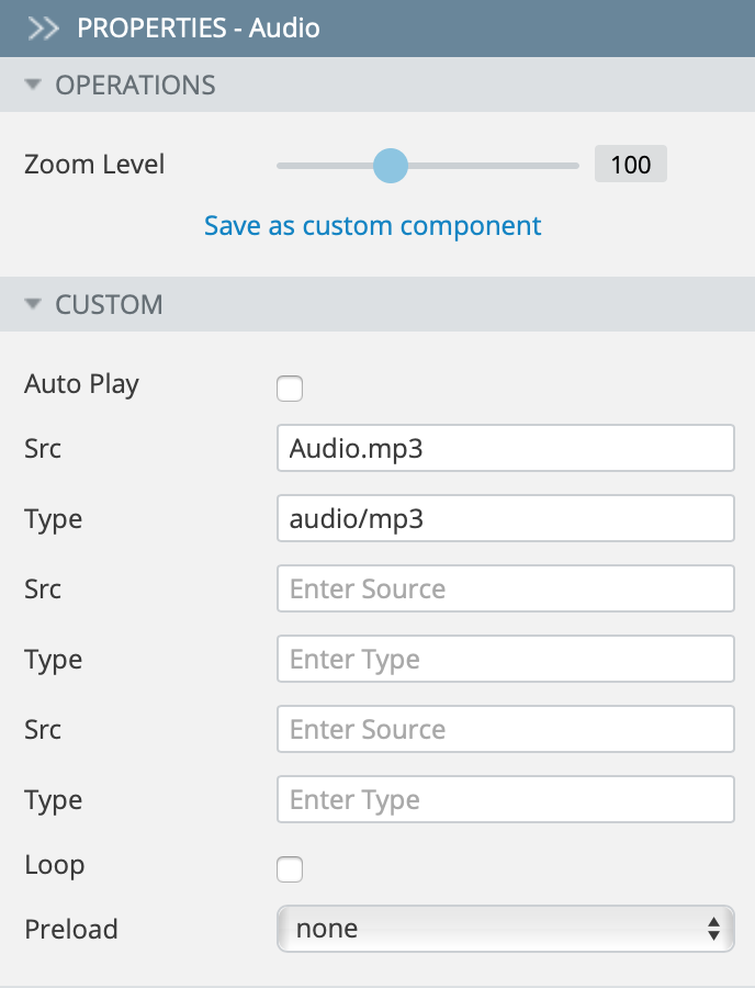
Audio
The Audio component allows embedding a sound on your app page.
The audio file can be uploaded into the App Sources files
WEB_RESOURCES/app/...folder. On the screen is shown the configuration when anAudio.mp3file has been uploaded into this directory.
| Property name | Property description |
|---|---|
| Auto Play | Check to make the audio start playing as soon as it is ready. |
| Src | Specify the URL of the audio file. |
| Type | Specify the MIME-type of the audio file. There are 3 pairs of Src/Type properties, so that you can specify 3 different audio locations and types because different browsers support different audio formats. |
| Loop | Check to make the audio start over every time it is finished. |
| Preload | Select if/how the audio should be loaded when the page loads. Possible values are:
|
For more ways of handling audio with JavaScript check out our JQM example here.
Map
The Map component allows embedding Google Maps into your app page.
| Property name | Property description |
|---|---|
| Latitude | Specify the coordinate which should be shown on the map when the page loads. |
| Longitude | Specify the coordinate which should be shown on the map when the page loads. |
| Address | Specify the address which should be shown on the map when the page loads. |
| Zoom | Specify the zoom level of the map. |
| Show marker | Check if you want the markers to be visible. |
The Map component contains a marker, which is an info window. The Map marker has the following properties:
| Property name | Property description |
|---|---|
| Show Info Window | Check if you want it to appear. |
| Latitude | Specify the default coordinate of the info window. |
| Longitude | Specify the default coordinate of the info window. |
| Address | Specify the default address of the info window. |
| Text | Enter some text. |
API Key
The Map (Google Maps) component API key is required for the component to work properly. Read how to get an API key. The API key can be set in Project > App settings > Components. The same API key will be used for all Map components in an app. If you are creating a hybrid app, you don't need to set any API key restrictions.
HTML
The HTML component allows inserting custom HTML code inside the div and span tags.
| Property name | Property description |
|---|---|
| Type | You can select either div, span, html, or form. |
| HTML | The Edit HTML button is enabled when the Type property is set to HTML. On clicking the Edit HTML button, the HTML Editor pop-up opens, where any custom HTML, JavaScript or CSS code can be entered. |
| Dimension | Component width and height. Allowed values are <num>px, <num>pt, <num>%, or auto. |
Carousel
The Carousel component allows creating a list of frames, which can be scrolled horizontally back and forth.
| Property name | Property description |
|---|---|
| Frames | Set the number of frames in the Carousel component. |
| Indicators | Set the name of the component to which indicators of the carousel will be outputted. If it is empty, indicators will be displayed at the top of the carousel block. |
| Show indicator | Uncheck to hide indicators. |
| Show title | Uncheck to hide the title of the carousel. |
| Title Built In | Allows for the formatting of the frame title. If it is checked the title text is wrapped in two divs with class ui-carousel-title, and an inside div with class ui-carousel-title-inside. Otherwise, the title text is wrapped in only one div with class ui-carousel-title. |
| Title Is Text | If checked then an attempt to pass html-code as a text will lead to the HTML being displayed as plain text with tags. Otherwise, the title is interpreted as HTML (e.g. you can pass <b>Text</b> and the text will be displayed as bold). |
| Animation Duration | You can set the duration of an animation (in milliseconds). |
| Use Legacy Animation | If checked, the JS code will be used for animation; otherwise, it will try to use the built-in browser mechanisms for animation through CSS3-styles. |
| Enabled | If unchecked, carousel won’t work (frames won’t change, only the first frame will be accessible). |
The Carousel item has the following properties:
| Property name | Property description |
|---|---|
| Type | You can select HTML or image type:
|
| Title | Set the frame title. |
| Image URL | This property appears when the image frame type is selected. |
Panel
The Panel component allows creating sliding panels that appear from the left or right.
| Property name | Property description |
|---|---|
| Swatch | By default, this property inherits the screen swatch property value. |
| Position | The panel can slide out from the left or right side of the screen. |
| Display | Select one of the following modes:
|
Popup
The Popup component allows presenting any data as a pop-up. All the pop-ups are listed under OUTLINE. You can manage (delete or hide/show) certain pop-ups from the OUTLINE tab by clicking the corresponding link. You can also hide pop-ups by clicking the small down arrow above the pop-up.
| Property name | Property description |
|---|---|
| Swatch | Select the button swatch if you want it to differ from the default type specified in the app settings. |
| Overlay Theme | When pop-up is opened, it can overlay UI in the background with a different swatch. |
YouTube
The YouTube component has the following built-in events:
- YouTube state change – fires whenever the player’s state changes. The value specifies an integer that corresponds to the player state. Possible values are:
-1 (unstarted)
0 (ended)
1 (playing)
2 (paused)
3 (buffering)
5 (video cued)
This event returns a state object that can be handled. - YouTube video ended – fires when the player’s state changes to 0 (ended); this event is based on the YouTube state change event; it does not return any object.
- YouTube video playing – fires when the player’s state changes to 1 (playing); this event is based on the YouTube state change event; it does not return any object.
- YouTube video paused – fires when the player’s state changes to 2 (paused); this event is based on the YouTube state change event; it does not return any object.
- YouTube video buffering – fires when the player’s state changes to 3 (buffering); this event is based on the YouTube state change event; it does not return any object.
- YouTube playback quality change – fires whenever the video playback quality changes. The value is a string that identifies the new playback quality. Possible values are:
small
medium
large
hd720
hd1080
*highest**
YouTube playback rate change – fires whenever the video playback rate changes. The value is a number that identifies the new playback rate.
YouTube error – fires if an error occurs in the player. The value is an integer that identifies the type of error that occurred.
YouTube playback quality change – fires whenever the video playback quality changes. The value is a string that identifies the new playback quality. Possible values are:
2 – The request contains an invalid parameter value.
100 – The video requested was not found.
101– The owner of the requested video does not allow it to be played in embedded players.
150 – This error is the same as 101. It’s just a 101 error in disguise!
Vimeo
The Vimeo component allows embedding video from Vimeo.
| Property name | Property description |
|---|---|
| Auto Play | Check to make the video start once the page loads. |
| Video ID | Enter the video ID from vimeo.com. |
| Loop | Check to make the video restart every time it is finished. |
| Show title | Checked by default; uncheck if you want to hide the video title. |
| Show portrait | Checked by default; uncheck if you want to hide the author’s portrait. |
| Controls color | Change the color of the component controls to make it more appropriate to your application appearance. |
Updated about 1 year ago