List
Overview of the List Component
List Component
By default, any new List component contains two List Items. To add a new List Item, click the + button inside the List.
Properties
Important Note!This document lists the properties specific to this UI component. For properties common to most UI components, please check the General components document.
The List component has the following properties:
Common Properties
| Property Name | Property Description |
|---|---|
| Container | Defines the container type for including items: Items list or Items group. |
Styles Properties
Under the Styles tab, lists can be styled with several attributes:
| Property Name | Property Description |
|---|---|
| Lines | Defines how the bottom border should be displayed on the item: Full, Inset, or None. |
| Inset | If set to True, the list will have a margin around it and rounded corners. |
Visit the Ionic documentation to read more about lists.
TutorialYou can check this tutorial to learn how to build an Appery.io mobile app that displays a list of data from a cloud database.
List Item
The List Item component has the following properties:
Common Properties
| Property Name | Property Description |
|---|---|
| Item Type | Used to change the Item role (Item Divider, Item Sliding, List Header). |
| Sliding Sides | Visible if Item Type is set to Item Sliding. Available sides for Item Sliding: Start, End, or Both. |
| Label | If set to True, adds a label to the list item. |
| Sliding State | Visible if Item Type is set to Item Sliding. Switches the state of item sliding in the Visual Editor: Swipe Right or Swipe Left. |
| Routing | • Route Name - list of route names from the Routing panel • Route Params - adds values for Route Params described in the Routing panel • Router Direction - when using a router, specifies the transition direction when navigating to another page using href: back, forward, root |
| Link Features | Options for the component when used as a link: • Download - instructs browsers to download a URL instead of navigating to it, prompting the user to save it as a local file. If the attribute has a value, it is used as the pre-filled file name • Href - specifies the relationship of the target object to the link object • Type - the type of button: Submit, Reset, Button • Target - specifies where to display the linked URL (only applies when href is provided): Blank, Self, Parent, Top • Rel - specifies the relationship of the target object to the link object |
Styles Properties
Under the Styles tab, list items can be styled with several attributes:
| Property Name | Property Description |
|---|---|
| Line Style | Defines how the bottom border should be displayed on the item: Full, Inset, or None. |
| Sticky | Visible if Item Type is set to Item Divider. When set to True, the item-divider will stay visible when it reaches the top of the viewport until the next ion-item-divider replaces it. |
| Button | If set to True, a button tag will be rendered and the item will be tappable. |
| Detail | If set to True, a detail arrow will appear on the item. |
| Detail Icon | The icon to use when Detail is set to True. Click the Default icon button to select the needed icon. |
| SVG Icon | Used to select an .svg file. This path will be added as the src attribute. Click the Change button to select the uploaded image from Media Manager. |
Important Notes• The Detail property defaults to False unless the Mode is iOS and an Href, onclick, or Button property is present.
• The Type property is only used when an onclick or Button property is present.
• The Sliding State property is used only in the Visual Editor to switch the state of Item Sliding. Use double-click on the item Sliding to perform the same action.
• Navigation with Routing has higher priority than Href.
Item Label
The Item Label component has the following properties:
Styles Properties
Under the Styles tab, item labels can be styled with several attributes:
| Property Name | Property Description |
|---|---|
| Text Color | Select CSS color from available options: Primary, Secondary, Tertiary, Success, Warning, Danger, Light, Medium, Dark, Custom, or use the color picker. |
| Font Size | Enter font size in px, %, em, vh, or vw. |
| Font Weight | Set the weight (or boldness) of the font: Normal or Bold. |
| Line Height | Set the height of a line box in px, %, em, vh, or vw. Commonly used to set the distance between lines of text. |
| Font Style | Set whether a font should be styled with a Normal or Italic face. |
| Text Decoration | Set the appearance of decorative lines on text: • None - no line for the text • Underline - line displayed under the text • Line-through - line displayed through the text |
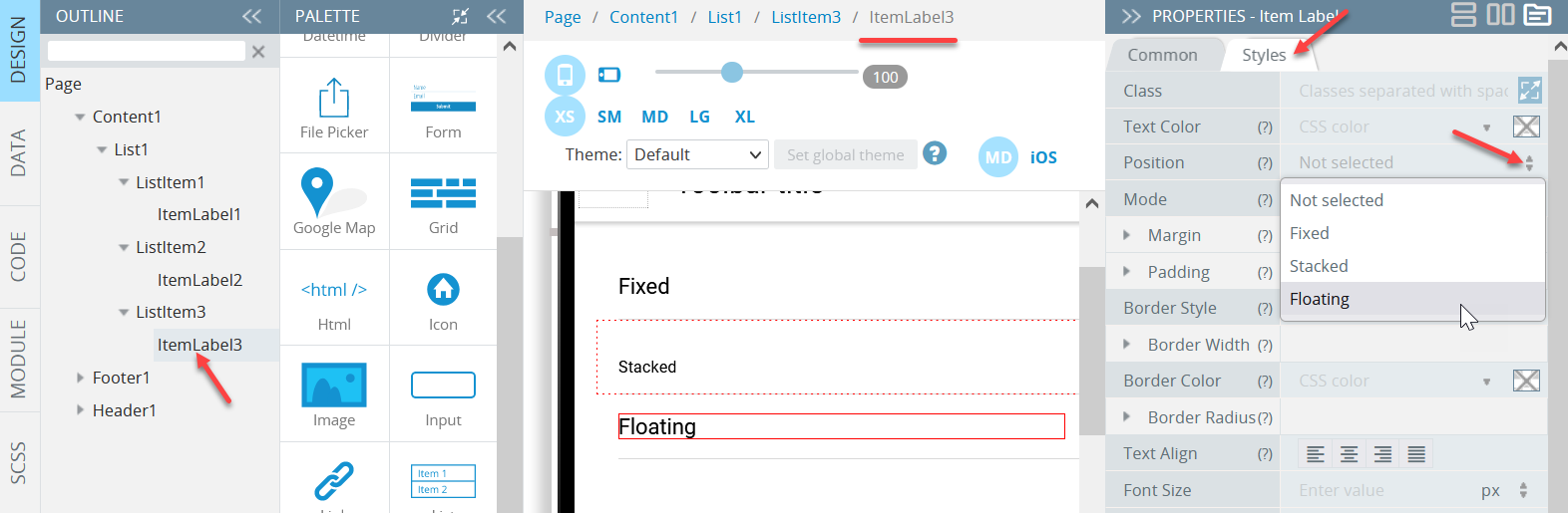
Example: Different Position Values
In the following example, a list has three list items with their item labels having different Position values (Fixed, Stacked, and Floating respectively). Switch to their Common tabs to set their Text properties to the corresponding values:
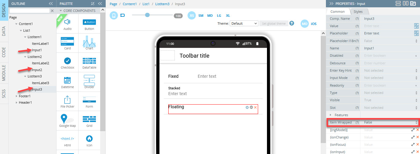
Next, add one Input to every ListItem and set their Item Wrapped property to False:
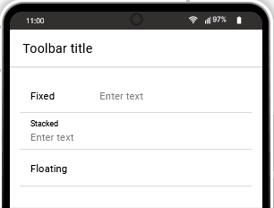
See how the components with different positions behave in the app:
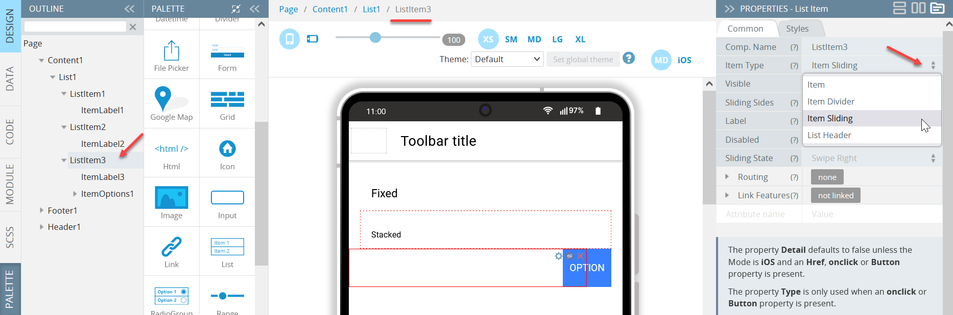
Item Options
Set the List Item component's Item Type property to Item Sliding to access Item Options:
The Item Options component offers three Sliding Side values: Start, End, or Both.
Adding Item Options
Click the + button on the Item Options to add a new Item Option:
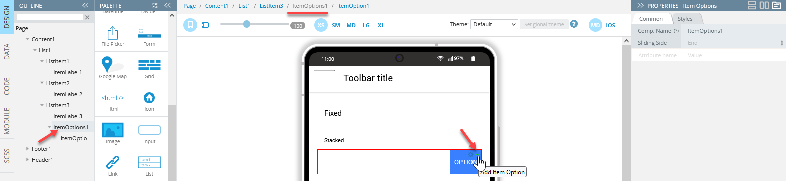
Use double-click on the element to hide/show options.
The Item Option component has the following common properties:
| Property Name | Property Description |
|---|---|
| Href | Contains a URL or URL fragment that the hyperlink points to. If this property is set, an anchor tag will be rendered. |
| Icon | • Style - click No icon to change the icon style by selecting the needed icon • Name - allows changing Ionic icon style dynamically by property binding • Color - the icon CSS color. Select from predefined values (primary, secondary, tertiary, success, warning, danger, light, medium, dark) or enter a custom color name • Class - icon CSS classes • Slot - the position determines where and how the icon behaves inside an element: Start, Top, Icon Only, Bottom, or End • SVG Icon - select an .svg file. This path will be added as the src attribute. Click the Change button to select the uploaded image from Media Manager |
| (click) | Action to be triggered when the option is clicked. |
Additionally, the following Item Option styling properties are grouped under the Styles tab:
| Property Name | Property Description |
|---|---|
| Expandable | If set to True, the option will expand to take up the available width and cover any other options. |
| Option Color | Select CSS color from available options: Primary, Secondary, Tertiary, Success, Warning, Danger, Light, Medium, Dark, Custom, or use the color picker. |
| Text Color | Select CSS color from available options: Primary, Secondary, Tertiary, Success, Warning, Danger, Light, Medium, Dark, Custom, or use the color picker. |
Video TutorialIf you're interested in a detailed video tutorial showing how to create a List - Details mobile application, please check this Appery.io Community link.
Updated 9 months ago