Online Store App Template
Use our Shopify Store app template to build your own online store business app integrated with Shopify
Introduction
This document describes our customizable Shopify Store app template that is designed to create a professional-looking online store that can boost your online business by combining the best of two platforms: multiple customizing options from Appery.io and powerful Shopify services:
Since our template is based on Shopify, a widely known and highly trusted platform with all the eCommerce and point-of-sale features, it is designed to grow into the perfect app choice for your business.
As a bonus, we provide detailed explanations for those who are interested in customizing the offered app template.
Using Shopify Store App Template
No special knowledge or experience is required to use our Shopify Store app template — just follow the simple steps below to install the app and enjoy low-code development with Appery.io!
Important!Please rest assured that you are the creator and you are the only owner of this application (actually, like any other app created with Appery.io).
For more details, you can check our Copyright, Trademark, and Content Ownership section here.
Customizing OptionsBesides, many customization options are available like renaming the app, changing the template color themes, launch icons and screens, and customizing app pages, etc.
If interested, check out the instructions in the Customizing App Template section or watch this video to learn how to do it.
Creating App from Template
It is simple to create this app by using our Create new app dialog:
- From the Apps tab, click Create new app.
- Select Shopify Store, enter the name for your project (for example, Online Store App ), and click the Create button.
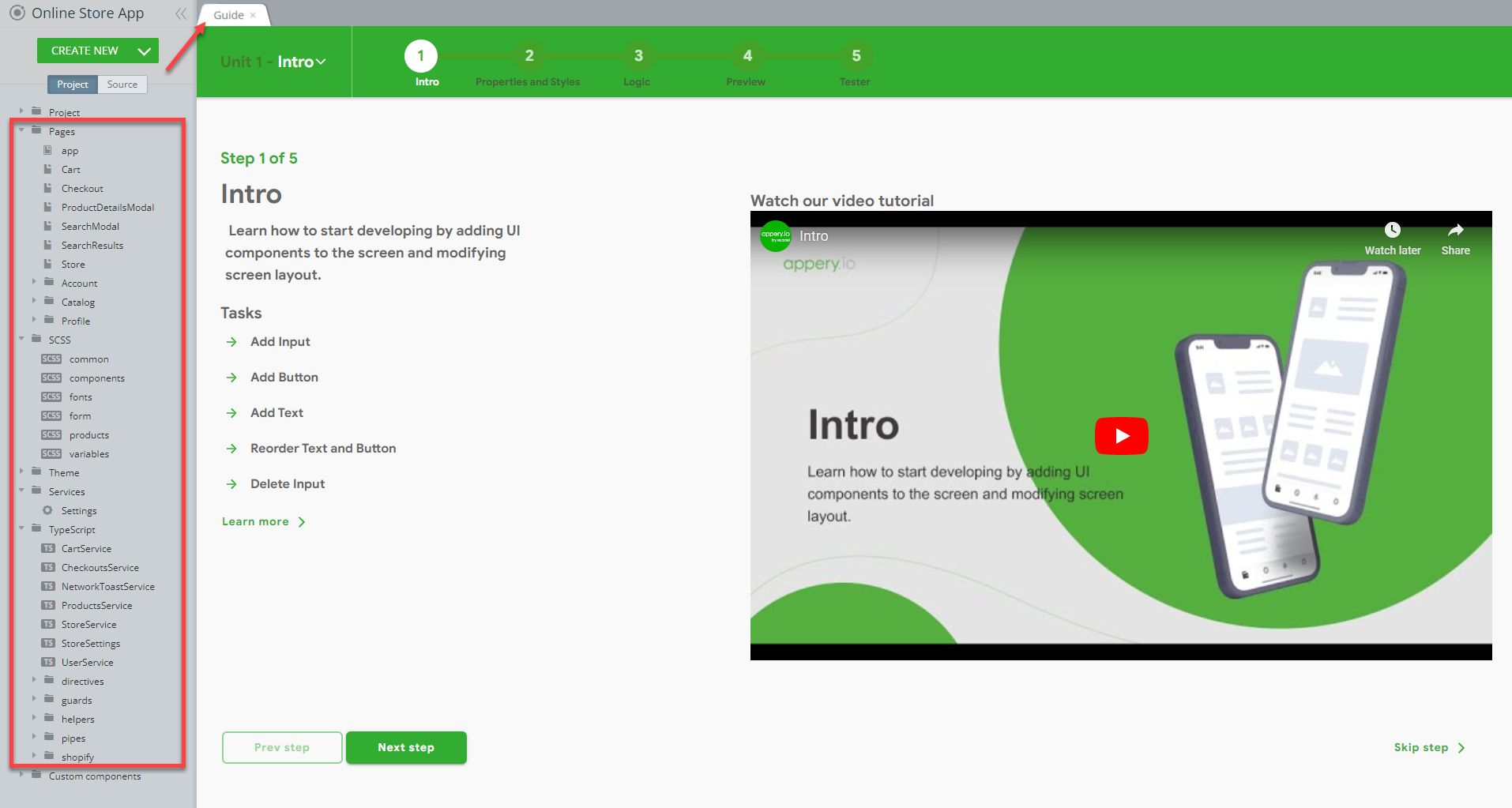
In a moment, refresh the browser window to see that the app is created and the first thing you can see is our App Builder Educational Video Guide page with the Project View section on the left where all the predefined project data can be found.
Actually, the application is ready and you are really close to releasing your own online store app but there is one thing you will need to do before you can actually use it: you need to link your Shopify store.
If you click the TEST button in the app Toolbar right now, you will get the following error message on the app preview:
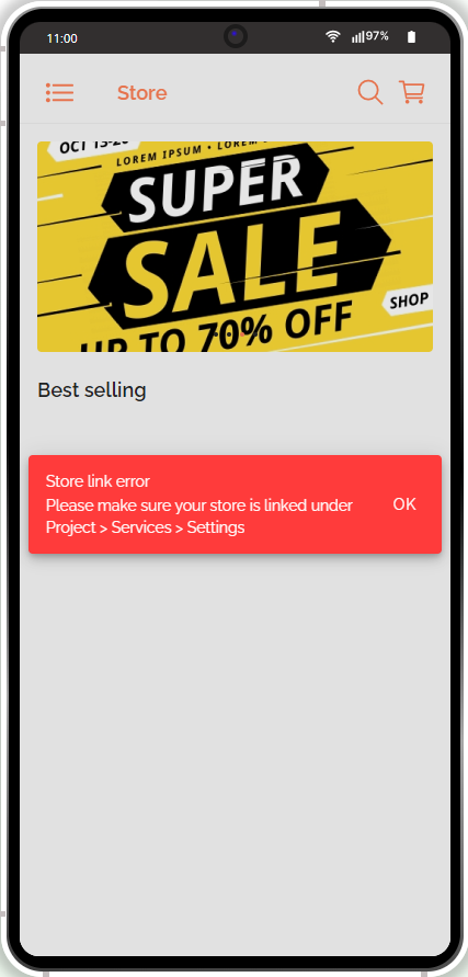
This message signifies that the needed credentials (see below for the details) are missing or incorrect, so you need to specify them in the app before you can go on with testing the template.
Linking Your Shopify Store
Our Online Store App template uses the Shopify platform and to be able to test the app, you will first need to link it to your existing Shopify store.
Below you will find simple instructions on how to do it.
Creating Shopify AccountNote, that to be able to create your first store in Shopify, you will first need to register an account with them. The process is simple and no credit card is required to start.
Also, you can try Shopify free for 14 days to see if this is something that fits your requirements.
In the app, go to Project > Services > Settings to see what data should be provided:
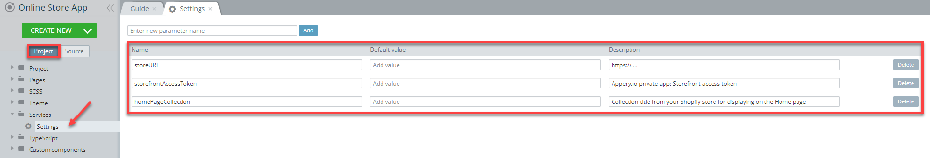
Check the below sections for where to look for the needed data.
Shopify Store URL
The Shopify Store URL can be found on the General tab of your Shopify account page:
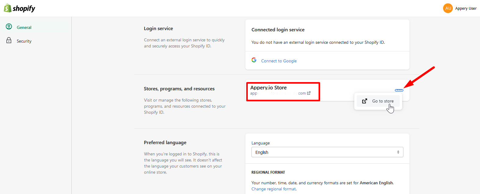
You can then click the three-dot button to go to the store page:
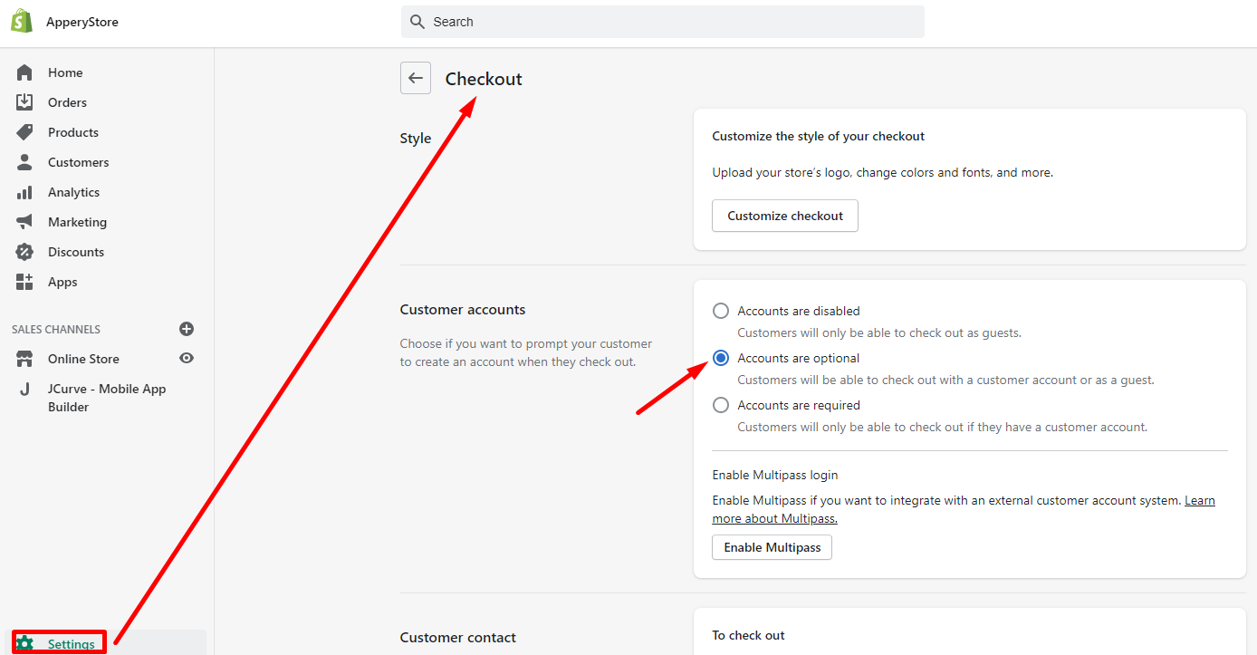
Copy the store URL and go back to Project > Services > Settings to paste this into the storeURL field.
Also, to let your customers check out with a customer account or as a guest., you will also need to go to Settings > Checkout and check Accounts are optional for the Customer accounts section:
Storefront Access Token
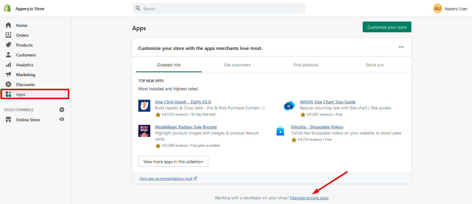
- When on the store page, select the Apps tab and click the Manage private apps link:
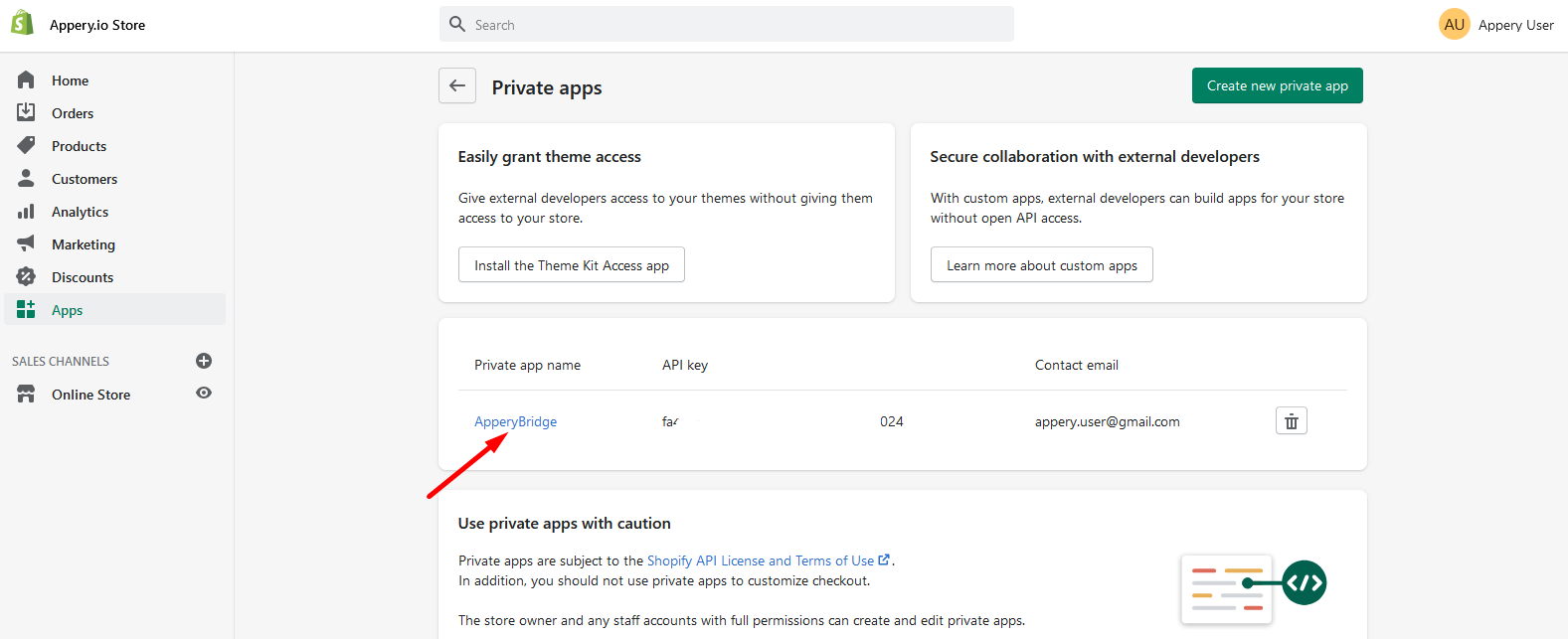
- Now, open the existing private app (if you have none, create it):
- Scroll down to the Storefront API permissions section and locate the Storefront access token entry:
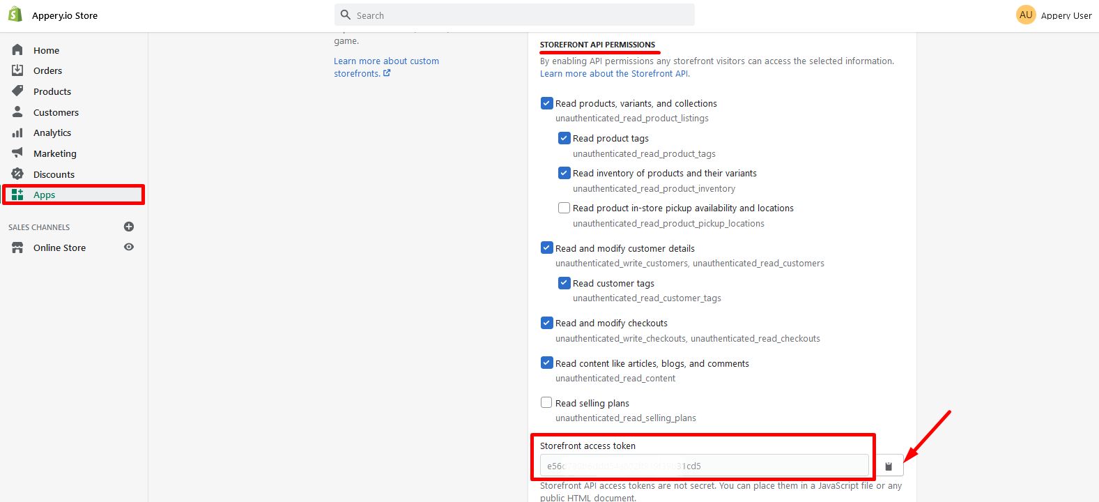
This is the token needed for the storefrontAccessToken field. Copy it and go back to Project > Services > Settings to fill the field.
Home Page Collection
You are also free to specify the field homePageCollection (optional) - the collection title from your Shopify store for displaying on the app Home page. However, this needs to be created independently since Shopify does not provide an import option.
Now, when you are done with specifying the needed settings, you can click the TEST button in the app Toolbar to check how the app works.
Note!If you are launching your project for the first time, please allow some time for the app preview to load.
App Description
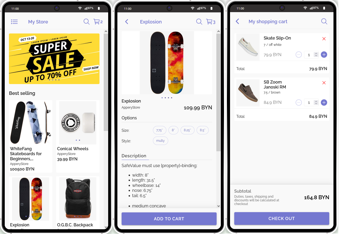
Once loaded, the application Home page will launch in the preview, looking like this:
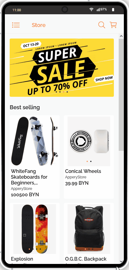
As an app user, you can start right away selecting products and adding them to the cart where you can review the items before checking out.
No special training is needed to use the app: from the Home page, you can simply choose the product you like, specify its needed options (size, color, etc.) and add it to the cart; also, you can go to the Catalog page to see the store collections list, or select to manage (create) your account profile.
When ready to place the order, review the products added and, if necessary, make adjustments; then tap the related button to proceed to checkout and, finally, fill in all the required information to be redirected to the Shopify page.
Among others, this template also offers the options of browsing the catalog collections with applying filters, searching for products, and adjusting the cart.
Also, you are free to create (and later manage) your user profile, or use the password recovery feature if you once forget one. Learn here how you can manage your user account.
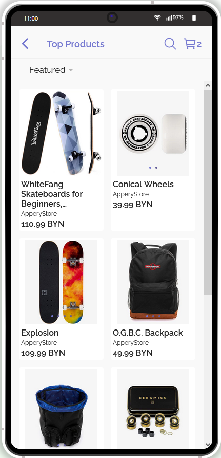
Viewing Products
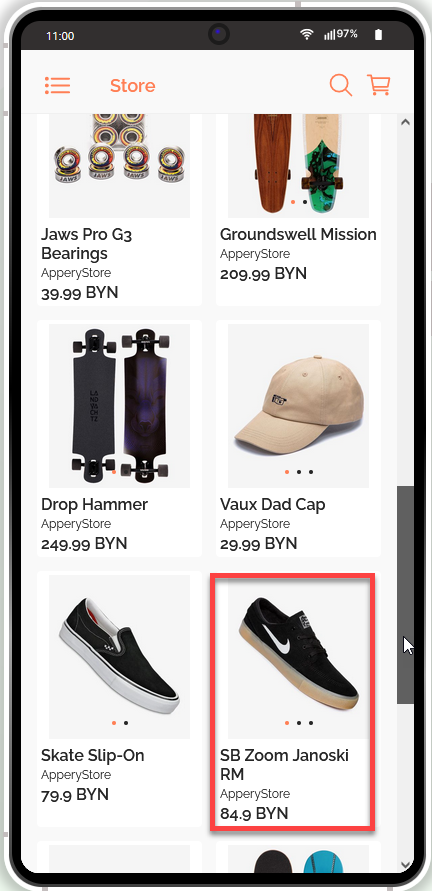
- On the Home screen, multiple product cards are displayed so you can browse for the product you are interested in. Every product card consists of its name, vendor, price, and images. If the product has multiple images, you can swipe right and left to view them:
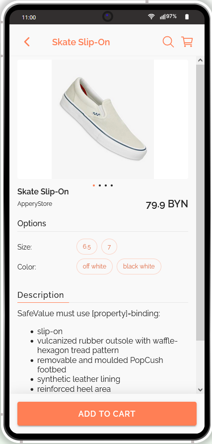
- If you select the card, the detailed view of the product will open displaying the product's name and image(s), its vendor, price, options, and description.
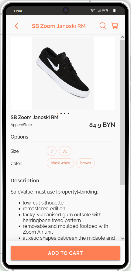
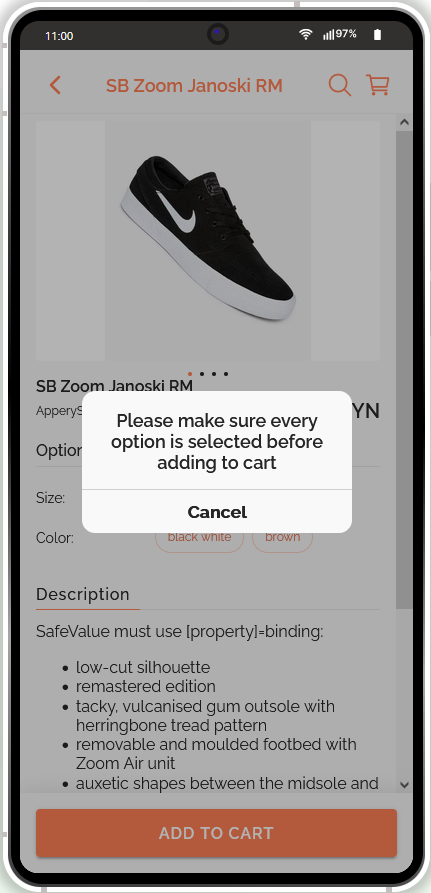
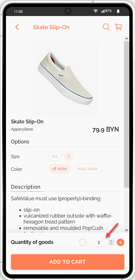
- The product's options are the listed product properties. So, to add the product to the shopping cart, you will be required to select from every option entry provided. When done, the quantity selection becomes available so that you can select multiple items of this product to be added to the cart:
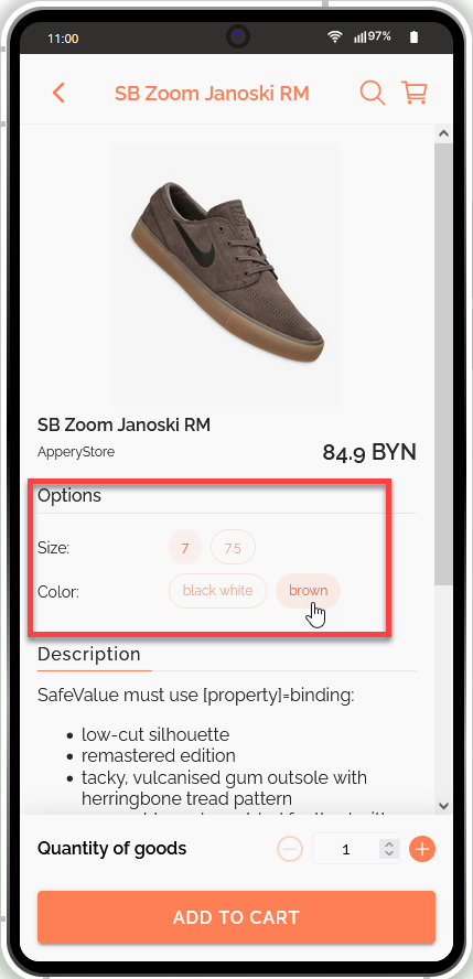
If you fail to do that (in the below screen, for example, the Size option is not selected), you will receive a notification saying that all the product options should be selected before you can add it to the cart:
Using Products Catalog
You can also choose to view the store products by using the products catalog.
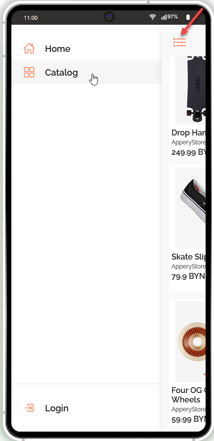
- To open the Catalog view, click the three-line button and select Catalog on the side menu:
- Now, you can select the needed collection of products to be displayed:
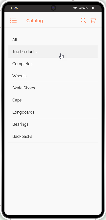
The requested collection opens where you can go on with selecting which products should go to the shopping cart:
Using Filters
For your convenience, different filters can be applied to every collection:
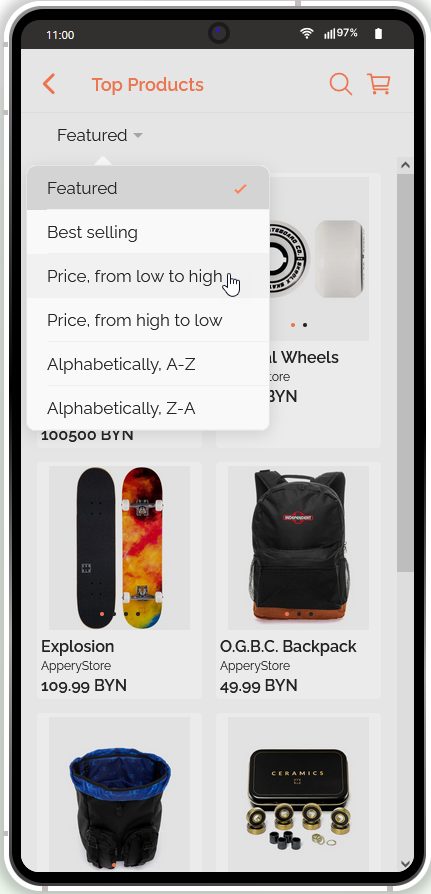
By default, filtering by Featured is enabled but you can customize this functionality from inside your app settings.
Searching for Products
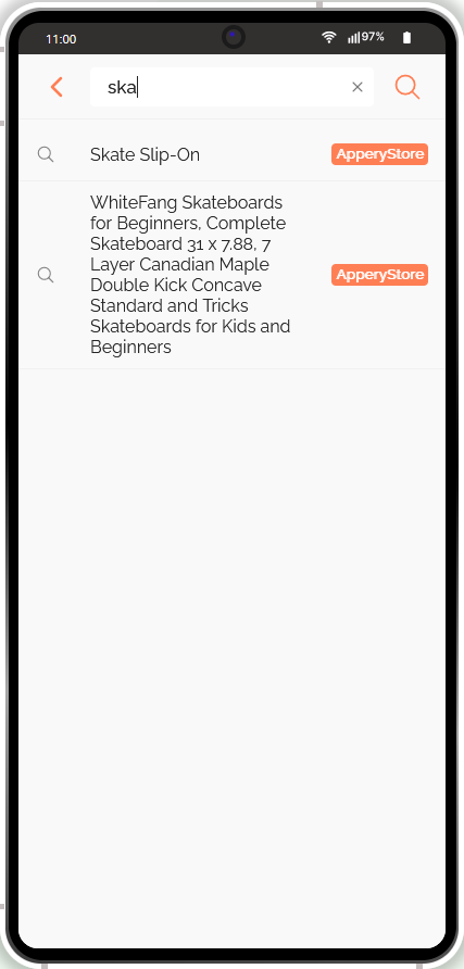
If the store has many products entries the option of searching for a needed one can be really useful.
- All you need to do is to click the search icon (loupe icon) and start entering the request in the search field:
- After you click "Enter", the search results can be viewed on the screen so, you can proceed with adding the product to the shopping cart:
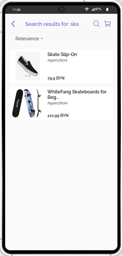
- You can now select the product you are interested in to view its card:
- Before you can check out, you will need to indicate the needed product options. Only after it's done, the quantity selection becomes available and you can proceed to checkout by clicking ADD TO CART:
Checking Out
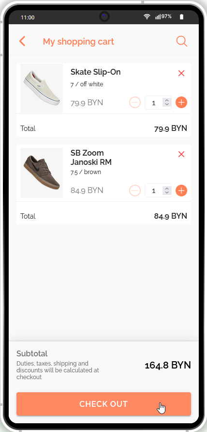
- Once you have added the needed products to your shopping cart, you can open it to review (and adjust, if needed) before you proceed to make a payment. Click CHECK OUT to finish the operation:
- The next screen will open suggesting to fill out all the necessary contact and shipping information:
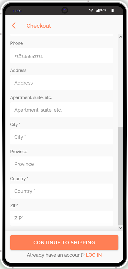
When finished, click CONTINUE TO SHIPPING to confirm.
The existing users can click the LOG IN link and be redirected to their profile for checking out.
Managing User Profile
To make purchases online, you can create user profiles where all the necessary contact and shipping information is entered.
Signing Up
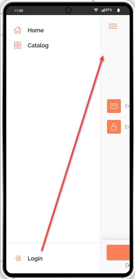
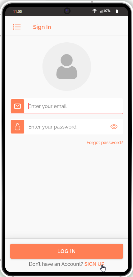
- In the top left corner, locate the three-line List panel icon. Click it or just swipe left to go to the Sign In dialog page where you will be asked to enter your email address and password:
- Since you are a new user, click the SIGN UP link to be redirected to the Sign up page:
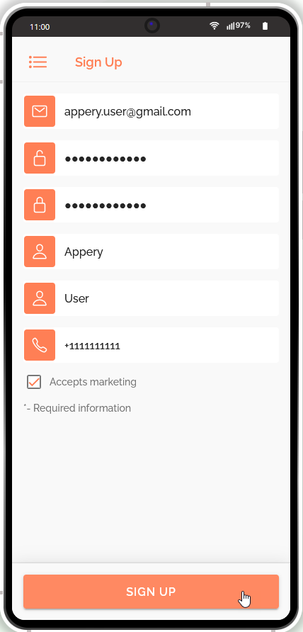
- You will be asked to provide all the necessary data to get registered with the service. When you are done configuring your profile, click SIGN UP:
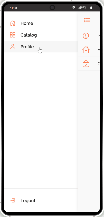
- Now, check the left panel for the Profile section:
- Your profile page will store information about your account data, addresses, and orders:
Now, when you have successfully registered, you will be able to log in the next time you start the app by providing your profile information on the Sign In page:
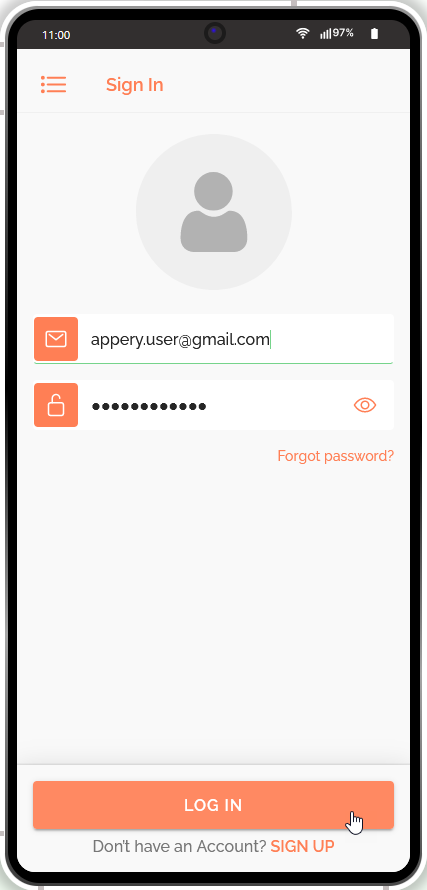
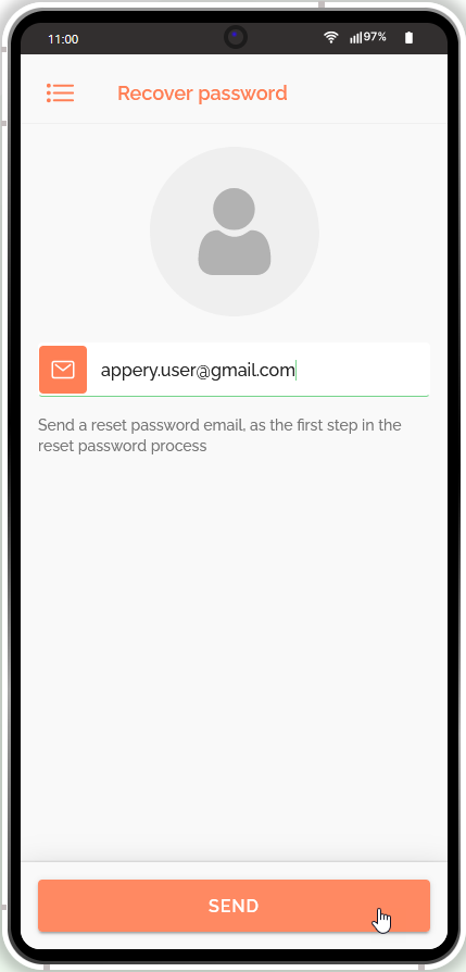
Recovering Password
If you experience issues with signing in, you can use the Forgot password? link on the Sign In page so that the system will automatically send the password reset instructions to the email address you indicated during registration:
The Log in page is accessible from either the Checkout page or the left panel.
Customizing App Template
It is natural that being a template, our Online Store App offers many customization options. So, if you are interested in customizing this template, we highly recommend that you check out the instructions in this section.
Also, you can watch this video (also available on the app Start page) for some tips on how it can be modified according to your needs:
Note that our Services Team will be happy to assist you in building the application you need. So, if you require professional help with additional customizing or debugging your app code and/or logic, you can consider purchasing one of our Support Packs to get the highest priority support.
Renaming App
The first thing you might like to do to make your app unique is to rename your project.
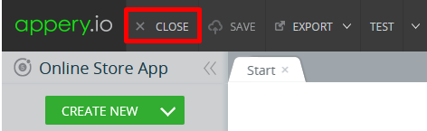
- To do it, you will need to exit the App Builder so click the CLOSE button in the top app Toolbar:
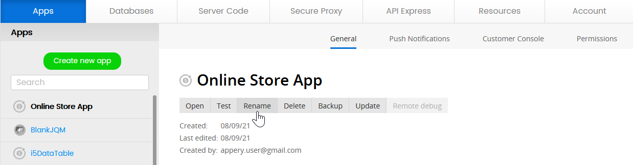
- After that, you will be redirected to the Apps tab with the information about your Appery.io projects, their saved versions, people with whom you share the project, and about hosting on Appery.io. Here, click the app Rename button:
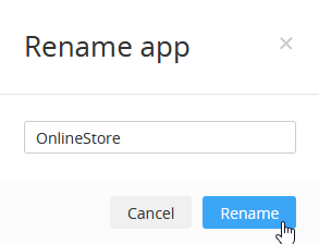
- Now, in a new window, provide a new app name, for example, OnlineStore and confirm this change:
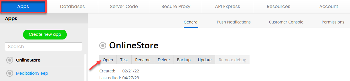
- In a moment, the Apps tab will be updated with a new app name and you can click Open to proceed with customizing your own application:
Reviewing General App Structure
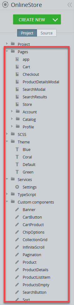
When the app opens in the App Builder, you will see that this app template was created with Ionic 5 and has multiple folders comprising a set of organized pages, SCSS resources, predefined color Themes, TypeScripts (used to integrate the Shopify’s API) and custom components all of which can be customized as per your needs and app requirements. You can unfold any of them to see what resources are available:
Every file or folder in the Project tree was created using our App Builder and we will now give you a little background on how you can customize the template resources.
Customizing App Pages
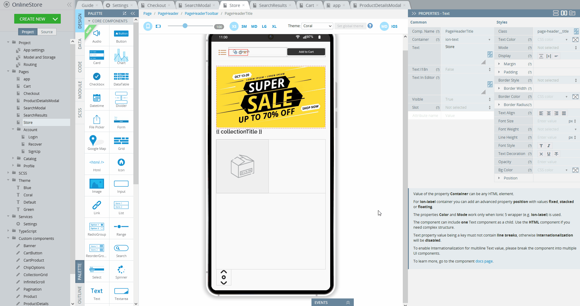
Opening the Pages folder, for example, will allow you to customize the individual app pages' UI and behavior. The easiest is changing text so let's have a closer look at how this can be done.
Changing Text Property
With Appery.io, not only can you easily change the name of your application, but you can also modify any text in the suggested template.
Let's review the example of changing the text of one of the *Store page UI components.
- First, select the Store page on the Project tab list located to the left of the mobile phone frame. The page will open in the DESIGN panel.
Adjusting Screen SizeNote that you might need to switch to the comfortable screen size (depending on your monitor) XS, SM, MD, LG, XL to see the whole page.
- Select the text instance you would like to modify, for example, the text for the page Header Toolbar Title.
Using BreadcrumbsYou might have noted that there are the breadcrumbs above the phone frame: they are often used for easy navigation between the parent/child components.
- The PROPERTIES panel for that component will be shown on the right where you can locate its Text property.
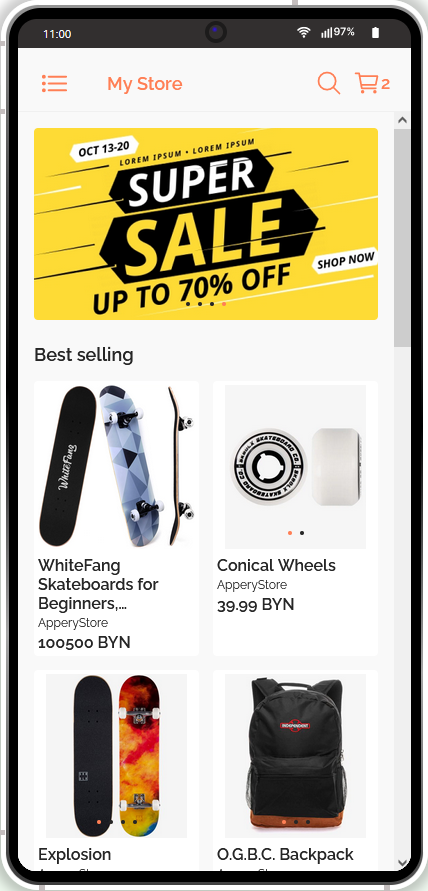
- Now, you can simply modify the text value, for example, modify the default Store and rename it to My Store, and this change will be automatically reflected in the UI:
- Now, when you click TEST once again and open its Store page, you will see that the preview has also been updated according to the recent change made:
Customizing App Color Themes
Another great way to make your application stand out from a plethora of other apps is by changing the app color theme. You will be surprised to see how easy it is to completely change the looks of your app using our Theme Generator option.
Each of our templates has its unique design. What it also has is called Themes that are created under the Theme folder.
Our Online Store app template offers four different color themes to select from: Blue, Coral, Default, and Green:
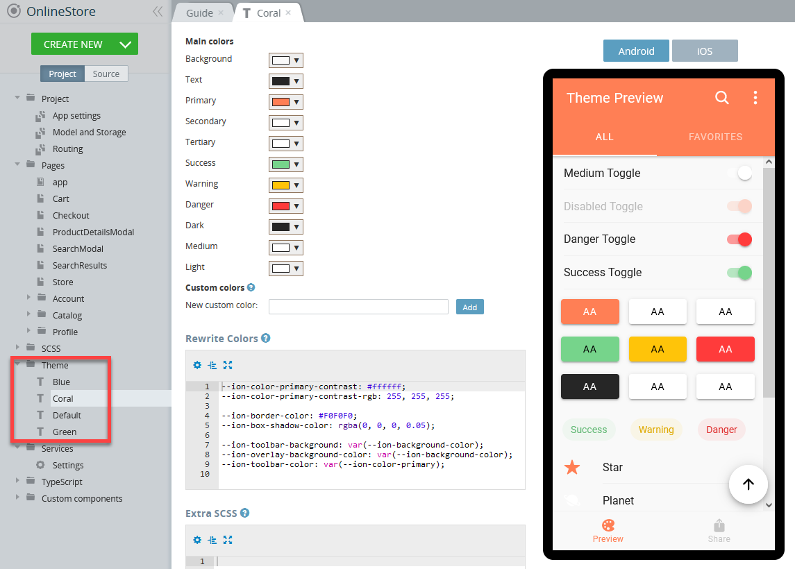
Creating Custom ThemesIf you would like to create your custom theme, you can do it using the CREATE NEW > Theme drop-down and following the instructions in this document.
Every app page has a Theme drop-down and you can try selecting other theme options from the drop-down to see what this specific page will look like under a different theme:
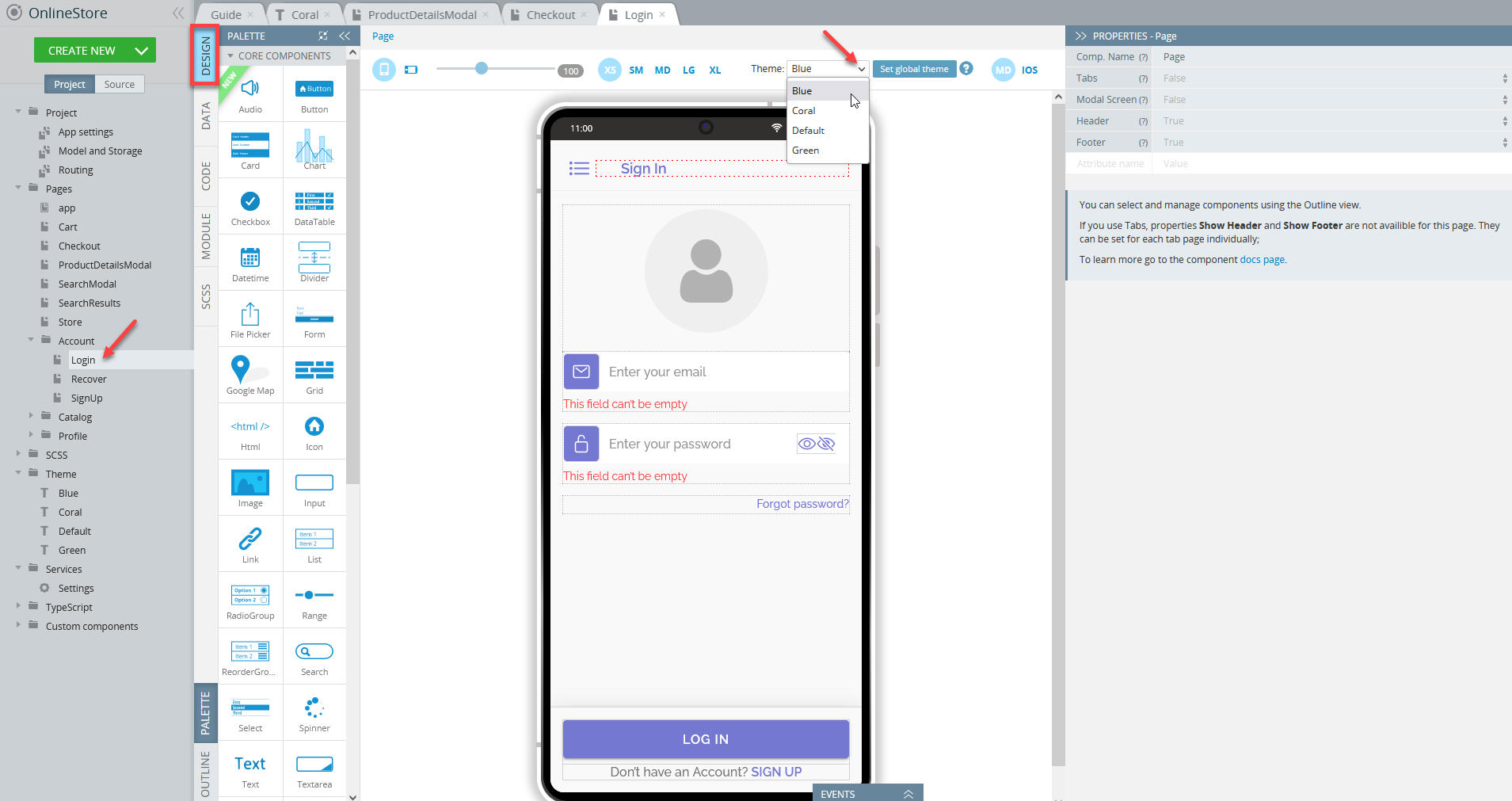
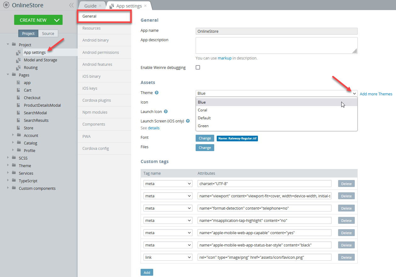
Important!This dropdown works for preview purposes only and if you decide to apply the selected theme to the entire application, go to Project > App Settings> General and select the needed theme from the dropdown, for example, Coral:
Now, save the app and click TEST again to see how the application looks like with a newly selected theme:
Working with App Banners
Another exciting and one of the most useful features of this template is using integrated banner slides.
The app template ships with a predefined Banner custom component consisting of four slides with identical images each assigned some particular behavior and all of them can be easily adjusted to meet your business needs.
Changing App Banner Image
First of all, let's see how you can replace the default banner image with any other image you like.
- In the app Project tab, expand the Custom Components folder and select Banner. Here you can see four images that are currently used for the banner slides and all of which can be easily replaced by some images of your choice.
- To proceed, click on the needed image to open its PROPERTIES panel:
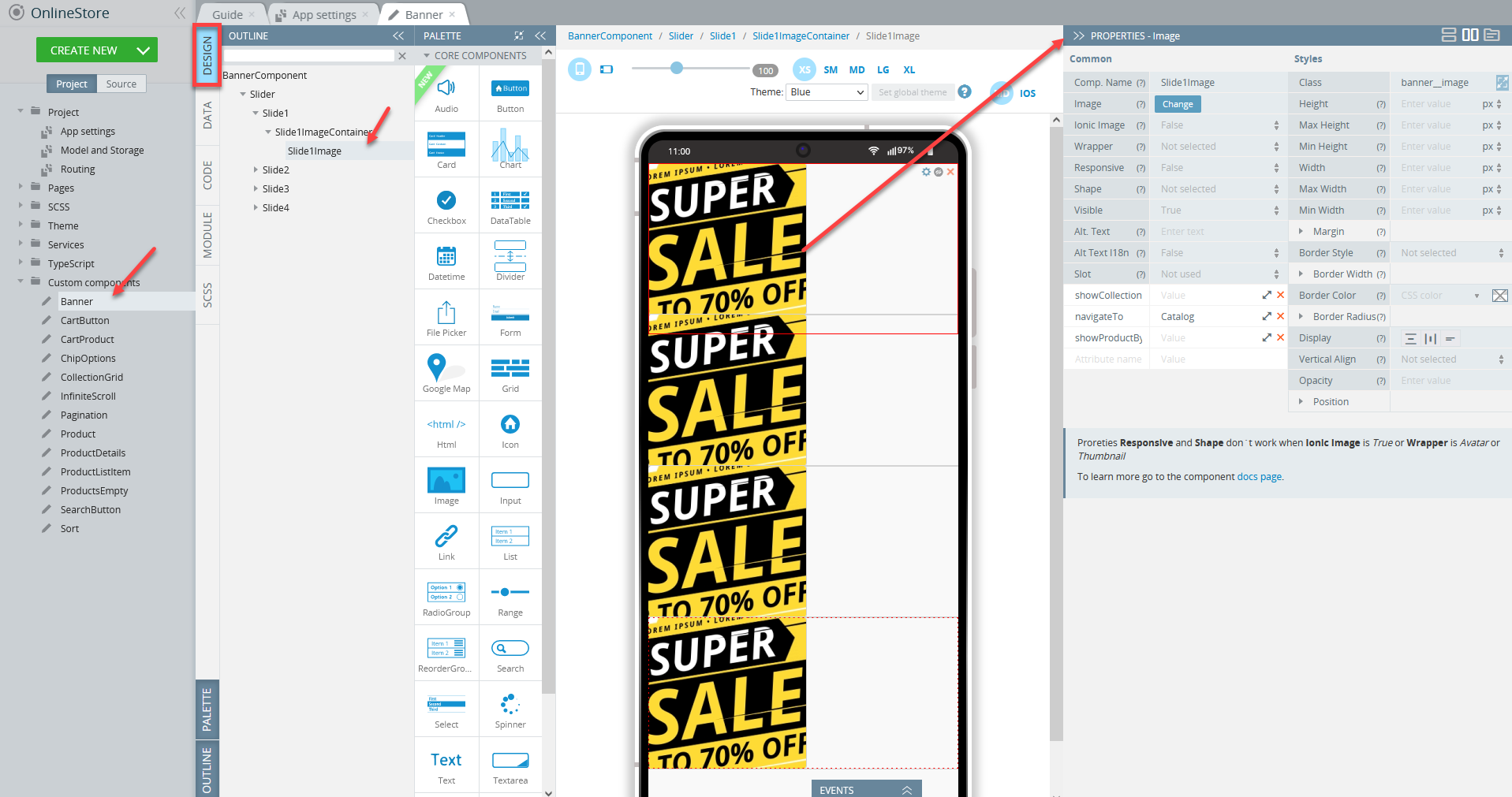
Note that the needed component also gets selected under the OUTLINE view.
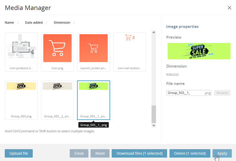
- Navigate to the right panel, PROPERTIES, and click the Change button for the Image property of the component you would like to modify (here, Slide1Image):
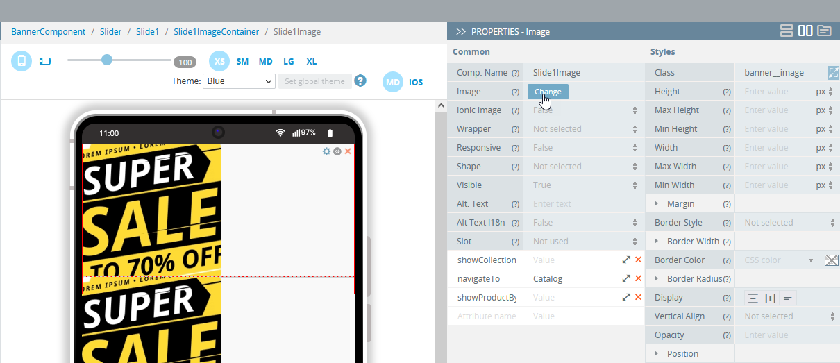
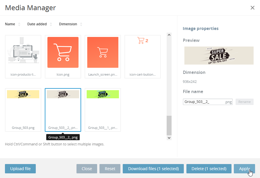
- The Media Manager window will open where you can either select one of the available images or upload a needed file from your drive:
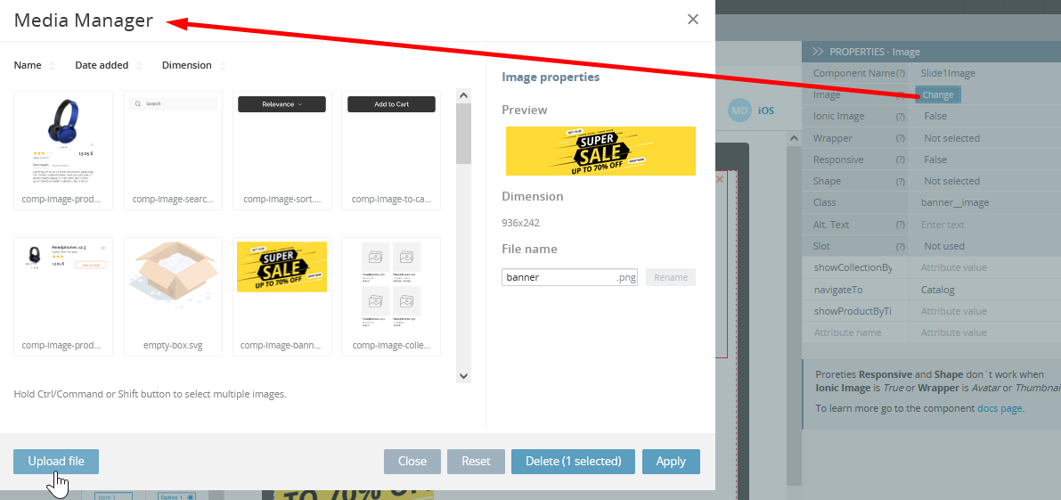
- Upload your custom file or select one on the images list and then apply it as a new app banner image:
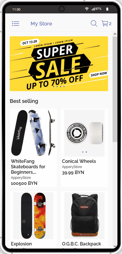
As a result, an updated banner image will be shown when testing:
Modifying Banner Image Navigation
Another interesting feature used in the app is the integrated navigation from the banner image(s) to some particular resource(s).
Let's go back to the PROPERTIES panel of the Banner custom component and take a closer look at the slide image we've just modified.
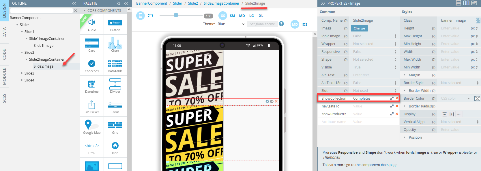
- The first slide image has three custom attributes added: showCollectionByTitle, navigateTo, and showProductByTitle with only one of them provided with the value navigateTo = Catalog:
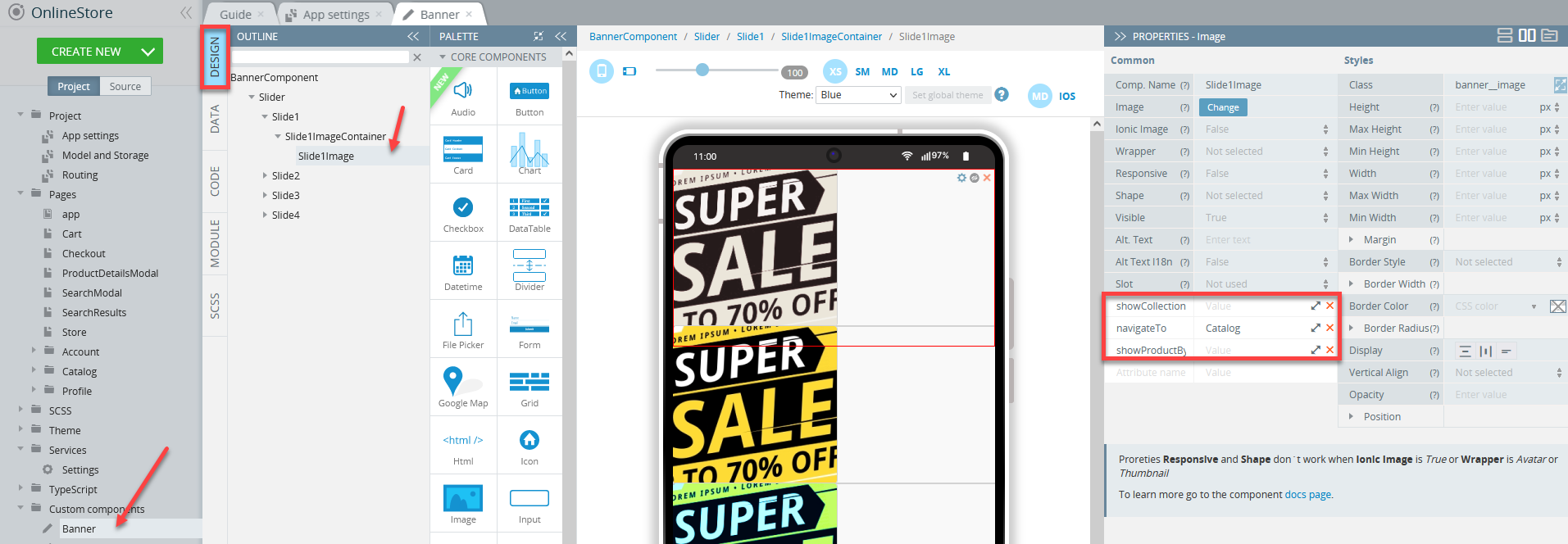
This attribute sets the image navigation to the Catalog page. Let's see how it works in the app: switch back to the mobile preview tab and click the first (modified) banner image to be redirected to the app catalog page:

- The second slide image has a different navigation route: a click on it will redirect you to the Completes store collection:
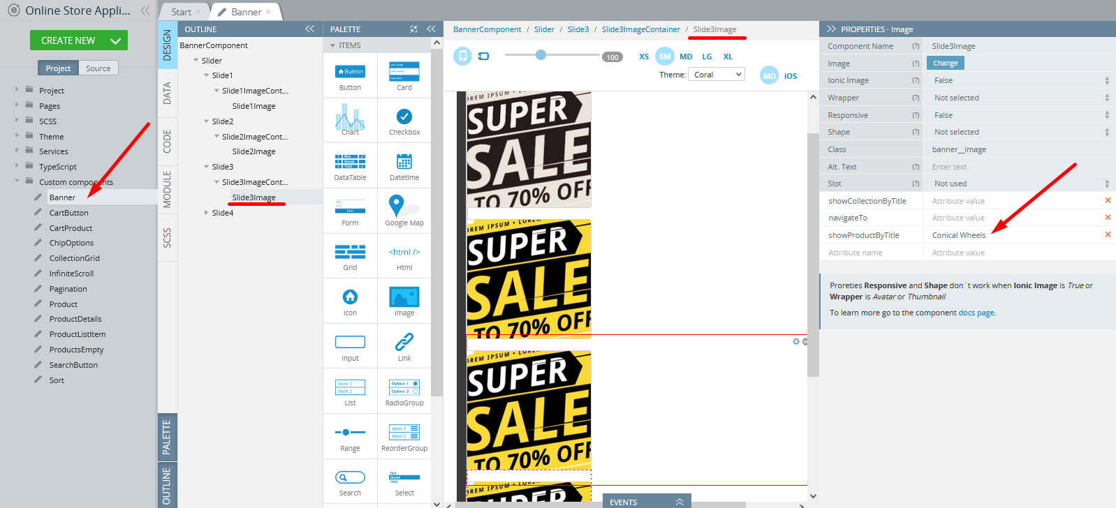
- The third slide image, when clicked, will open the Conical Wheels product card:
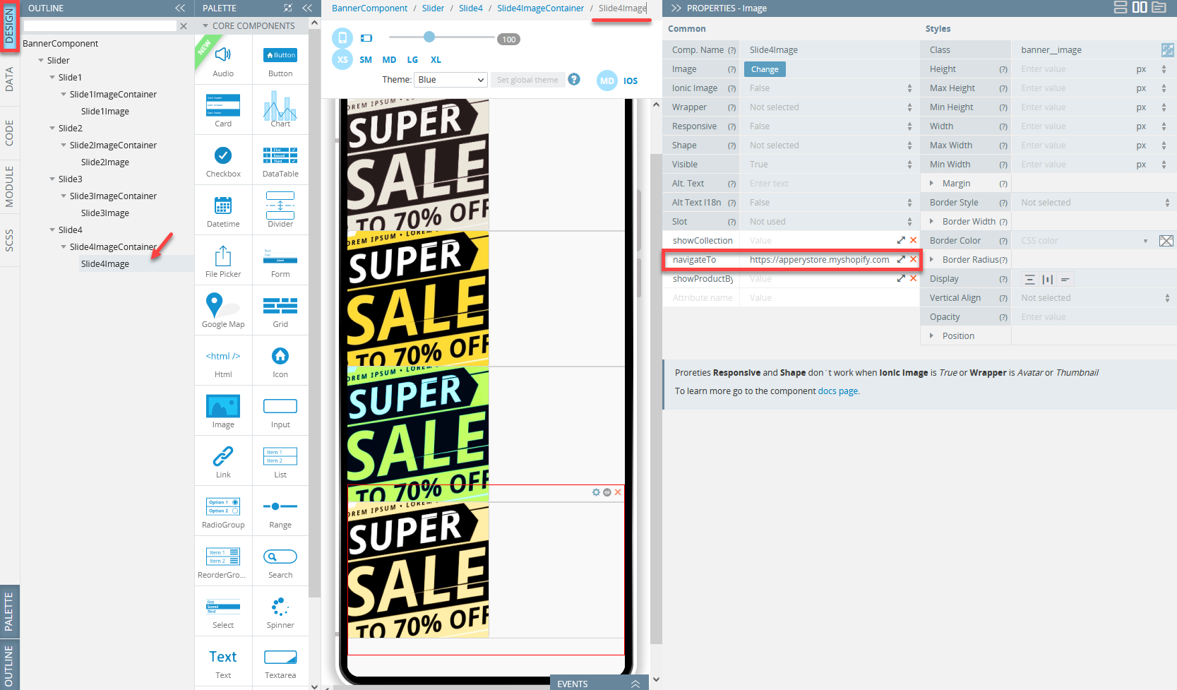
- And the fourth slide image is predefined with the feature of navigating to the external link provided as the navigateTo value:
If needed, you can customize behavior for any image according to your preferences by changing the values of the needed attribute.
Let's check how this can be done for the first image and reroute it to some other app page.
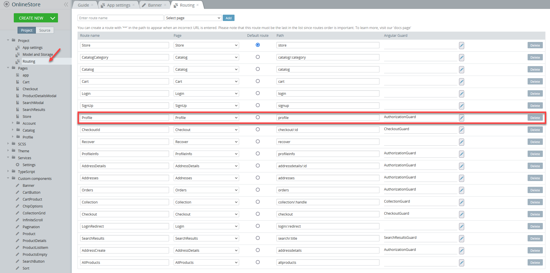
- First of all, open the Routing folder on the Project tab to see what routes are available and copy the name (or path) of the needed page:
- Go back to the Banner tab and set the navigateTo value to Profile.
- Save the project and click TEST once again to make sure that the first slide image will be redirected to the user profile page:

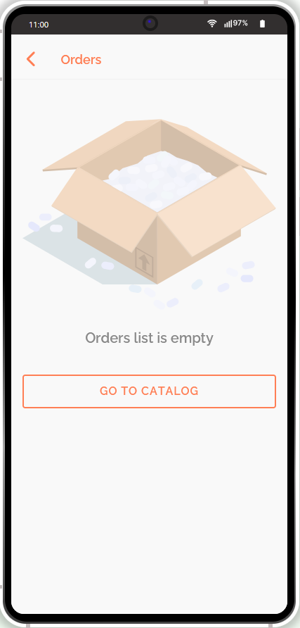
You can now click any list item on this page to get redirected to the corresponding app page, for example, Orders.
Adding Custom Banners
Not only can you change the existing banners UI and their behavior, but you can also add as many banners to the app as you need. The easiest way to do it is by using the Cloning option.
- Select the component you want to clone (here, it's Slide1) and click its cog button, then select Clone to get the copy of this particular component - it will be named to Slide1_copy and contain two nested components: Slide1ImageContainer_copy and Slide1Image_copy:
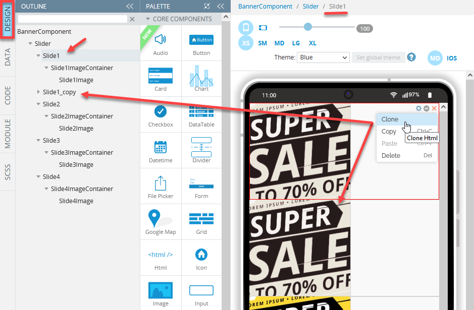
Now you are free to customize it as you did for the first banner slide.
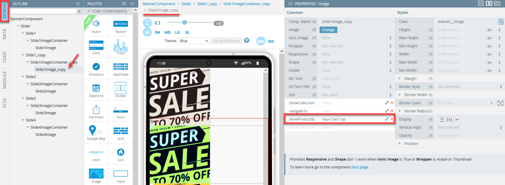
- To customize a new banner slide, select its image (here, it is Slide1Image_copy), go to its PROPERTIES panel and upload a new image by using the Media Manager feature to apply it as a new image:
To apply the needed image, you will first need to upload it from your drive.
- Now, let's make this slide navigate to the Vaux Dad Cap product detail page by setting its showProductByTitle value to Vaux Dad Cap and clearing the navigateTo value field:
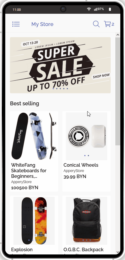
- When done, let's click TEST to see that there are five interchanging banner slides now and check that the second banner behaves as expected:
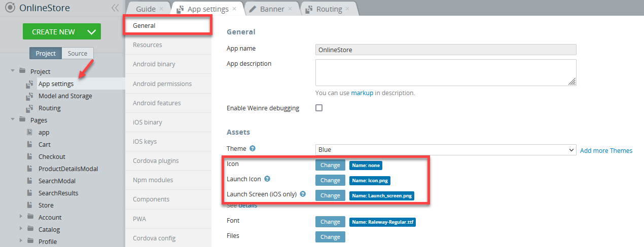
Customizing App Launch Icons and Screens
In addition to modifying the appearance of the app pages, you are also free to replace the default launch icons and screens (iOS only) by using our Launch Icons and Screens generator (or upload your custom fonts by using the Files Manager).
It works similar to what was demonstrated in the Changing App Banner section: by clicking the Change button and using the Media Manager:
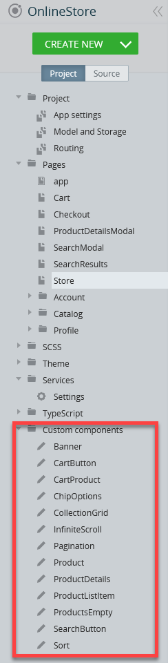
Custom Components
Now, let's take a look at one more instrument you can use to modify your app appearance: using our custom components feature.
In this application, as many as thirteen custom components have been predefined:
Let's take a closer look at one of the custom components, Product:
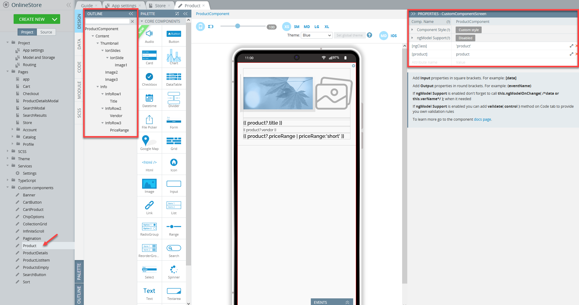
It has been specifically created for the Store page (but also applied to the All products and Collection pages):
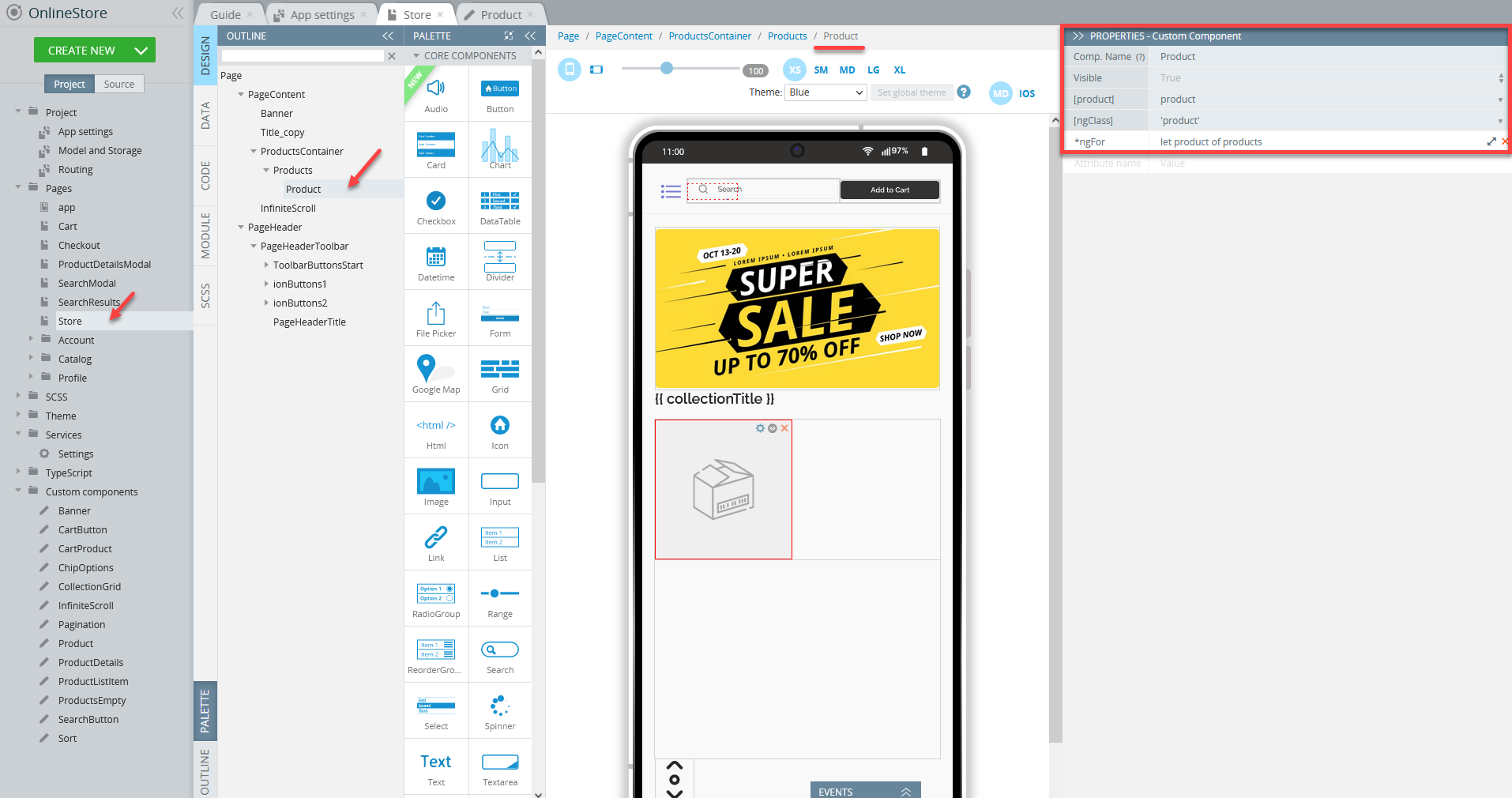
If needed, any custom component can be modified like any other UI component. Check the Working with App Banner section to learn how to modify the UI and/or behavior of the banner that is a part of the Banner custom component.
Testing Customized App
Testing the app is fast and simple. All you need to do is simply click the TEST button in the top App BuilderToolbar.
The browser will launch with the app that you have just built.
Testing on Device
When your app version is ready, you might also like to test it on the device.
Appery.io Tester AppA great option to quickly test the app on the device is to use our Appery.io Tester app.
The app is free and available for both iOS and Android.
You can check out this page to learn more about using the Appery.io Tester app.
Exporting App
When your final app version is ready, you might like to proceed with exporting your app for
Android or iOS with further installing it on a device.
Selecting Build TypeBefore you can proceed with exporting your app, go to Project view > Project > App settings > Android binary/iOS binary to select the Release build type (Debug is the default type for both and can be used for testing purposes only).
If the Release and Publish type is selected under the iOS binary tab, building the release app version will be performed together with publishing it to the App Store.
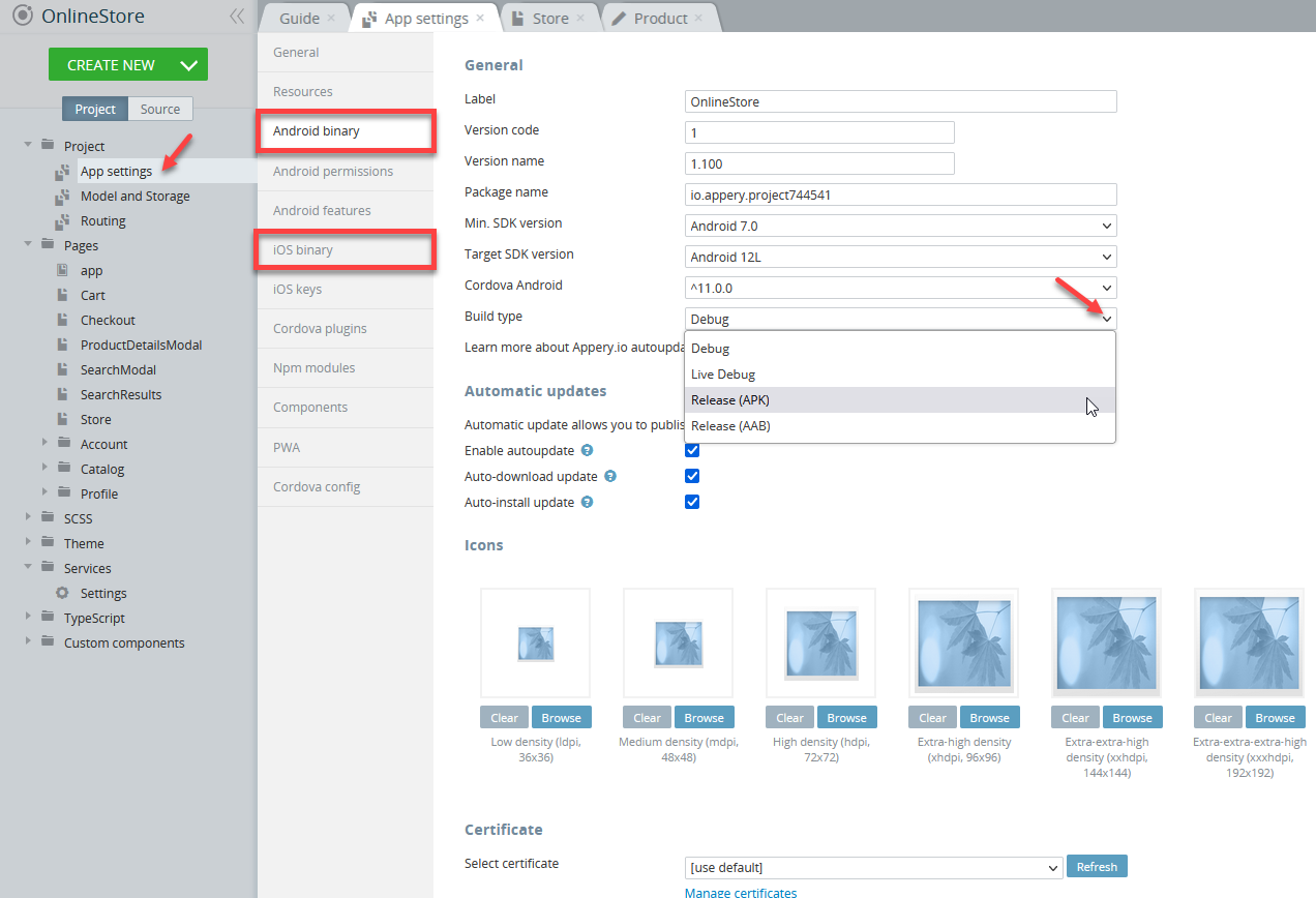
Selecting iOS binary build type
Important Note!Please, note that before you can export the app, the app certificates must be imported or automatically generated (in the case of Android).
You can check this document in case you need help with exporting your application for iOS.
Here, you will find information on generating certificates for Android.
Note as well that starting from August 2021, new apps are required to publish with the Android App Bundle (.aab) on Google Play.
Please read more here.
You can also check this Appery.io Community video that shows how to create Android and iOS certificates:
-
After the needed certificates have been added to your app all you need to do is to wait for the bundle to be created.
-
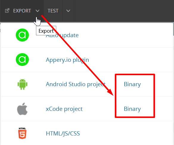
Now, you need to select the format you prefer (you are also free to build both if you need):
.apk/.aabor.ipato start building your project:
Managing Build Error The certificate file is not setIf this is your first app created with Appery you will most likely get the error signifying about missing certificates that will prevent you from successfully finishing the build process.
The error reads similar for both binary types and indicates that you should set the corresponding certificate before starting a new build.
If this notification is what you see after starting your build, please check out the this document about the certificate management that explains how to add the needed certificate to your project:
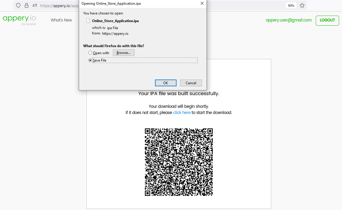
- Once your project is generated, you will see the QR-Code that you can use to upload the application to your device (or save the
.apk/.aabor.ipafile for further use):
- Then, install the app on your device and enjoy the result of your customization experiments:

Online Store App installed on an iOS device
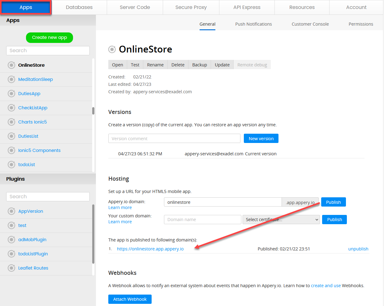
Publishing App
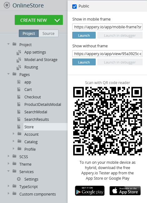
Any app that you build in Appery.io can be published as a mobile web app. This means the app will be hosted on a server and can be accessed from any browser on a mobile device:
Please check this link to see what it will look like.
Also, you are free to add the published app to any site of your choice as a widget.
Below is the sample code you can use for embedding the app published on Appery.io as a widget:
<script>
  var script = document.createElement('script');
  script.type = 'text/javascript';
  script.src = 'https://app.appery.io/aio_onlinestore_widget.js';
  script.onload = function() {
    window.aioChatWidget.init({
      frameUrl: "https://onlinestore.app.appery.io/",
      // buttonColor: "blue",
      // buttonTextColor: "red",
      // buttonImgUrl: "https://appery.io/app/resources/img/mobileframe/favicon-192x192.png",
      preload: true,
      // autoOpen: 5000,
      // position: "top_right",
    });
  }
  document.head.appendChild(script);
</script>
where:
frameUrl: '', // the iframe url;buttonColor: '#4DC95B', // css color. The button color for the chat button (if set to default, the button image is used) and close button;buttonTextColor: '#FFFFFF', // css color. The button text color for the chat button (if set to default, the button image is used) and close button;buttonImgUrl: '', // custom image for the button, if not set, then the default.svgimage is used;preload: false, // if set to true - add iframesrcon init (load frameUrl immediately), otherwise, the iframe will be loaded only after opening;autoOpen: 0, // ms. If 0 - do not open;position: "bottom_right" // bottom_right, bottom_left, top_right, top_left.
Updated about 1 year ago