3. Creating App UI - Styling Apps
Learn how to design your app UI according to your preferences by using a custom color theme, launch icons and/or launch screens, or adding custom fonts, etc.
Introduction
This section demonstrates how you can customize an Ionic mobile app with a custom color theme, custom fonts, or customized UI components properties according to your preferences.
Customizing App UI
In Appery.io, customizing your app UI is easy and you can use several approaches (or use their combination) to create the app with the needed UI.
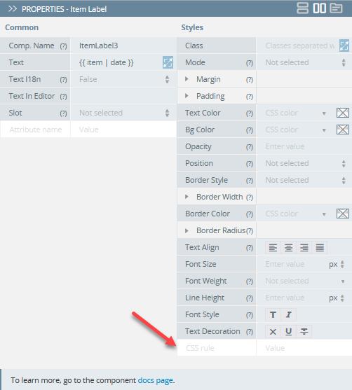
Defining CSS rulesWith Appery.io, you can quickly add the needed styles to any components under the PROPERTIES > Styles tab. All you need to do is add the needed CSS rule to the corresponding field:
Mobile Apps with Responsive UI Video TutorialYou can check this Appery.io YouTube video to learn how to make your app design responsive across various screen sizes and resolutions:
Using Styles UI Components Properties
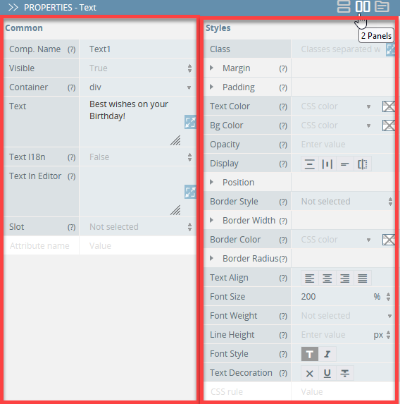
Most Appery.io Ionic UI components feature subdivision into common properties and properties related to the component's styling.
You are free to use different styling options offered for particular UI components. To get access to them, select the Styles tab:
Properties & Styles Video TutorialYou can check this Appery.io YouTube Education Guide video to learn how to modify UI components’ properties and styles:
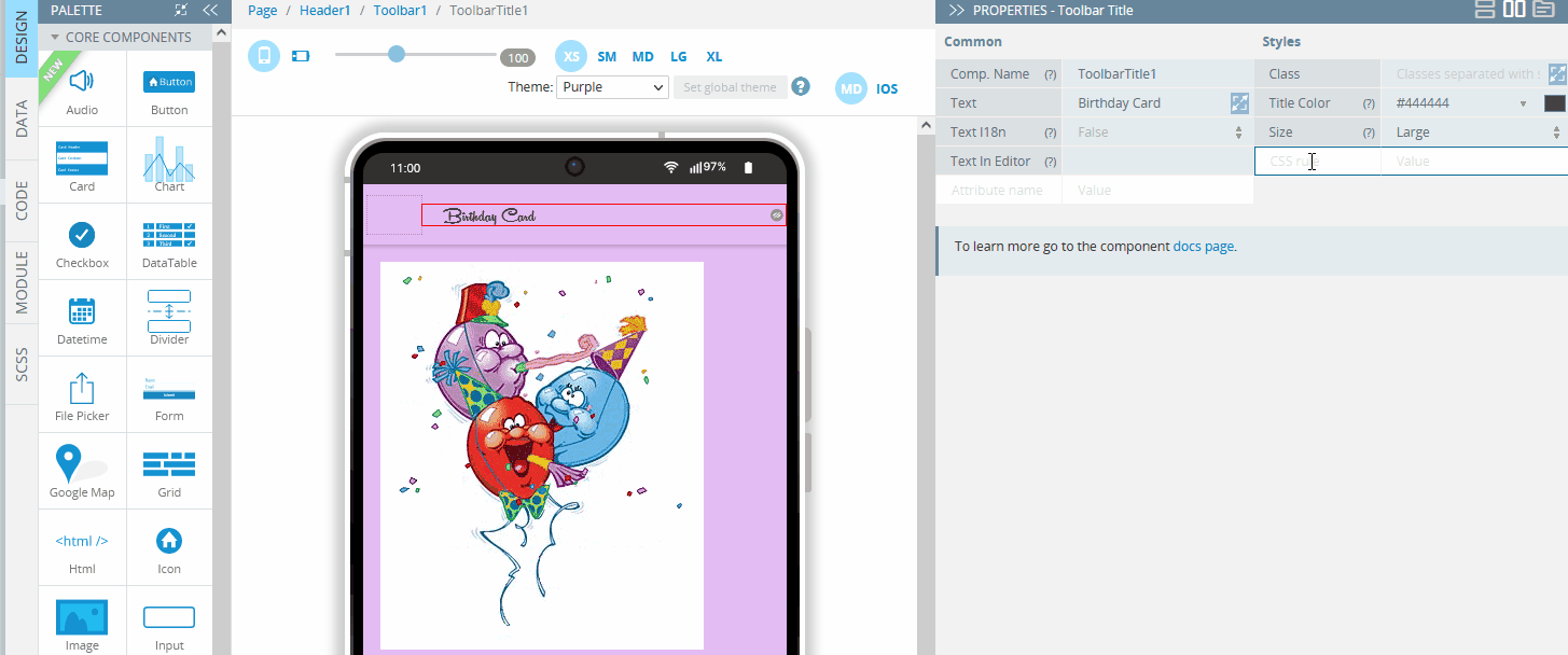
PROPERTIES Panel View ModesNote that, in App Builder, you can make styling UI components even more comfortable and easily adjustable to different monitors' sizes: now, you can switch the PROPERTIES panel views between 2 Panels, 1 Column or Tabs modes:
2 Panels Mode
Using Class CSS on the Components' Styles PanelIf you are interested in the samples of how class CSS can be used on the components' Styles panel, visit this document page.
Also, if you experience issues with prioritizing CSS styles for some UI components please check this section for help.
Tip!If needed, you can also define custom styles under the Common tab as well. For this, you need to add the style attribute and set its value (for editing long text strings, click the double sided arrow icon: a popup with a big text area will open):
Card Item custom styling
Expanding Icon Toolset with Material Symbols from Google
In the Appery.ioApp Buider, we offer the standard icon toolset selection that can be accessed from the Select icon modal window:
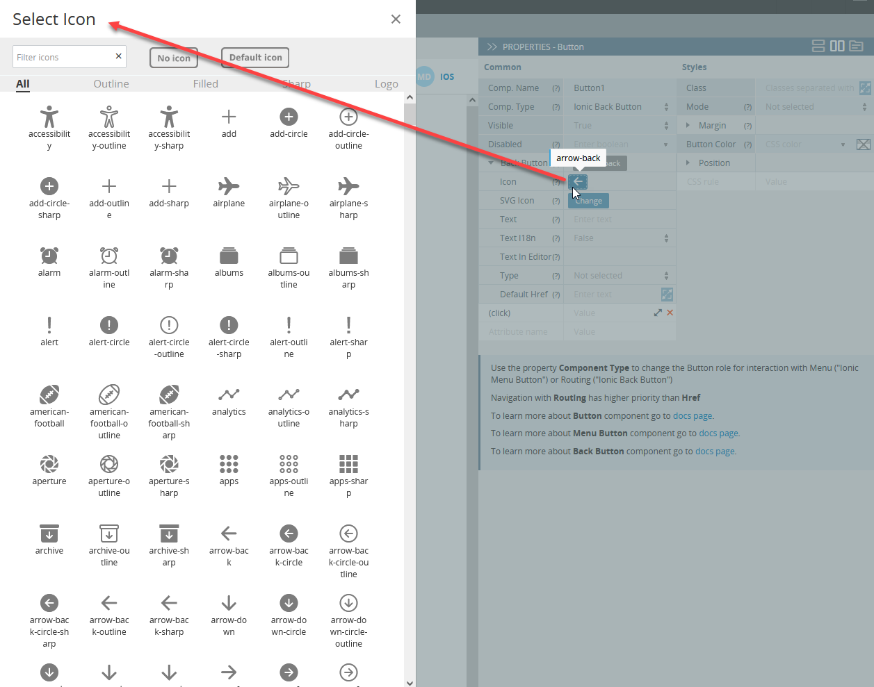
But if this selection is insufficient, you can expand it with Material Symbols from Google. This is a huge library that currently offers “over 2,875 glyphs in a single font file with a wide range of design variants”.
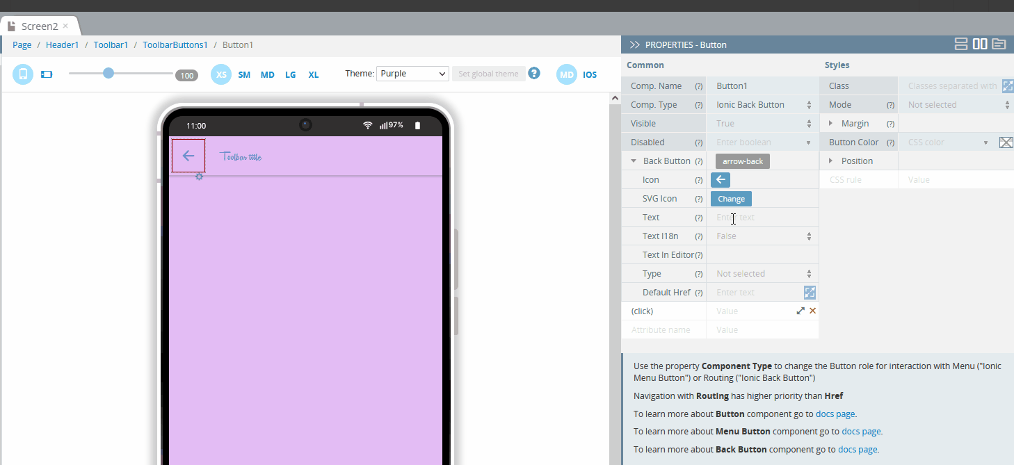
To be able to add the icon you like, you will need to first export it:
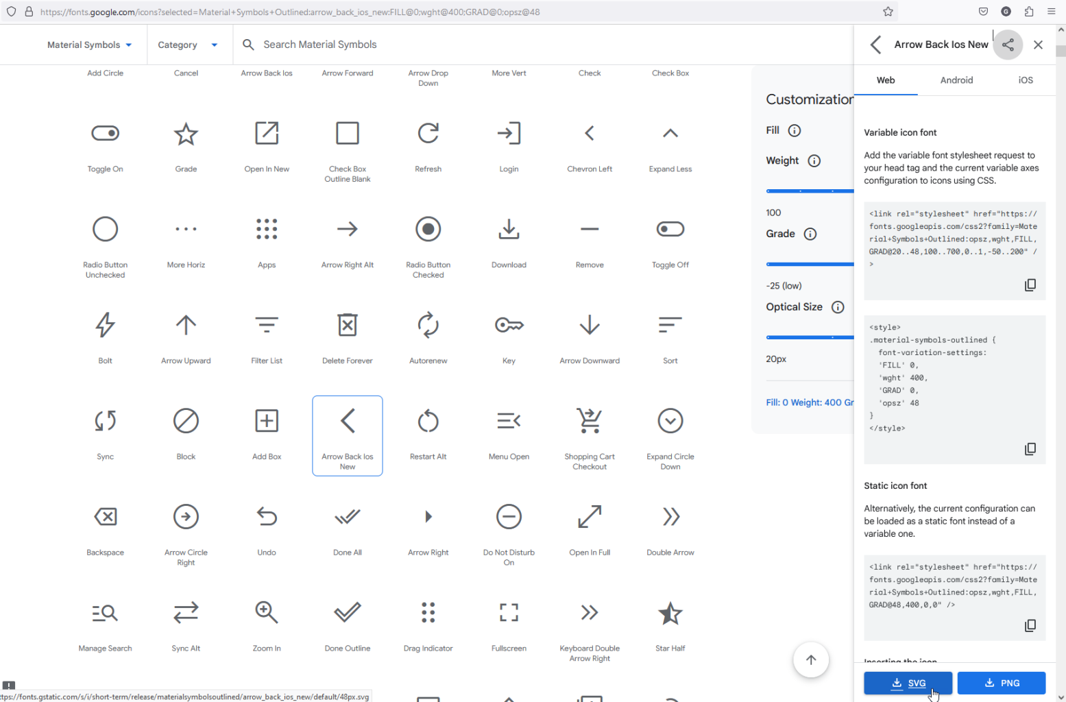
After that, select the component you want to apply it to, click the Change button next to the SVG Icon property, and upload the file by using Media Manager:
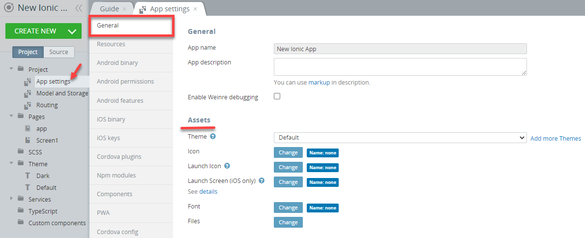
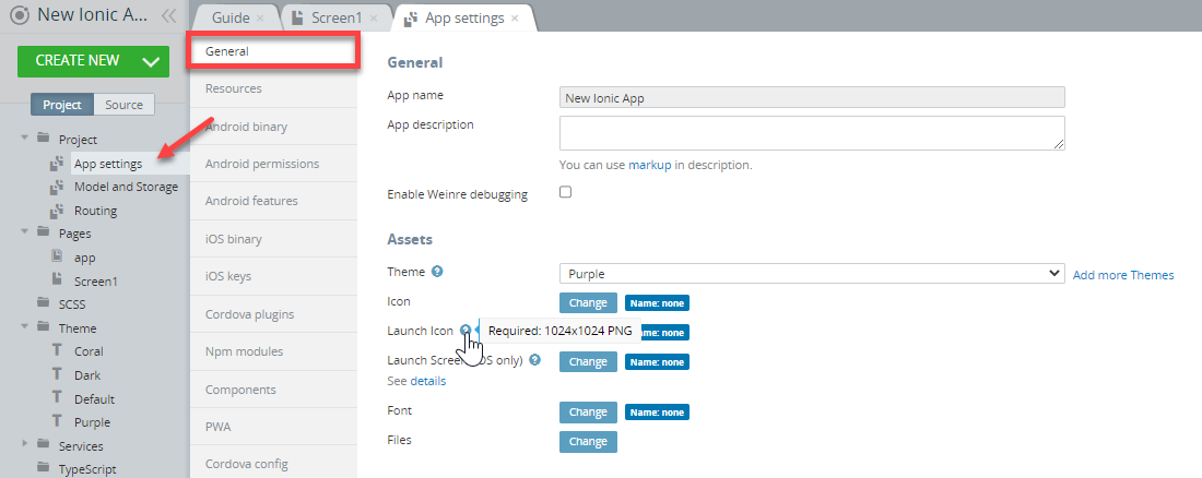
Using App Settings > General > Assets
Go to the App settings > General > Assets section to access the UI customizing options like:
- Appery.io Theme Generator
- Appery.io Media Manager
- Appery.io Files Manager
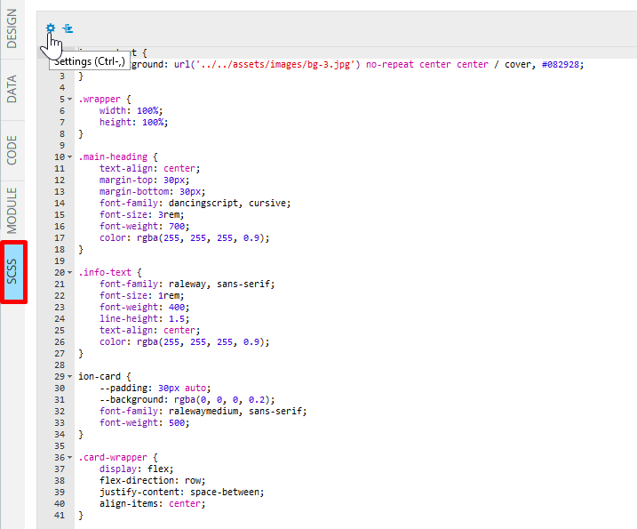
Using SCSS Panel
The SCSS panel is the style code editor that is also equipped with the cog icon that opens the code editor color schemes settings and the Auto format code button (formats unreadable code in the JavaScript editor):
Using Themes in App
Every Appery.io app comes with a default theme located under the Themes folder of the Project tab.
How to Work with Themes Video TutorialYou can check this Appery.io YouTube video to learn how to make your app design responsive across various screen sizes and resolutions:
You are free to choose whether you would like to further customize the default theme using the Theme Generator tool, create a new theme, or just apply it to your app as it is:
Also, before you decide whether you like the predefined theme and add it to your Appery.io project or further experiment with more themes, you can review the app pages with the imported theme applied.
Every app page has a Theme drop-down. Try selecting the available theme options from the drop-down (here, it is our imported Dark theme that was created under CREATE NEW > Theme dialog) to see how this specific page will look like under a different theme:
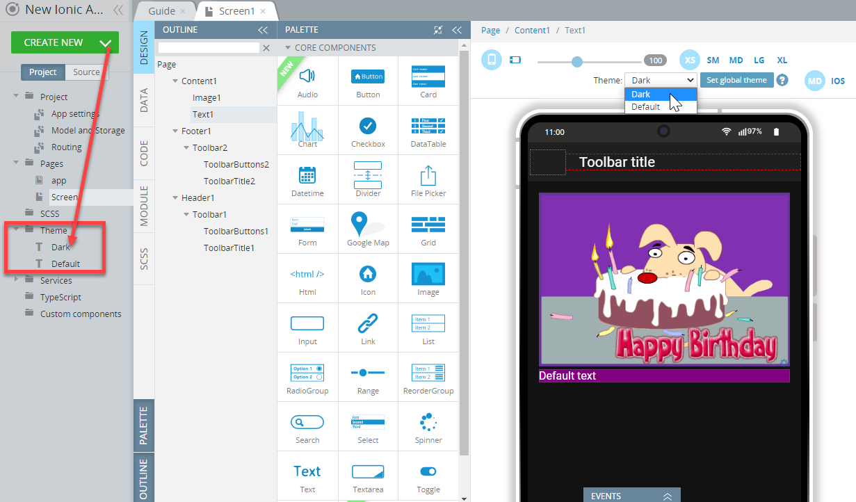
You can now see what the page UI will look like with the theme applied (can be repeated for every app page).
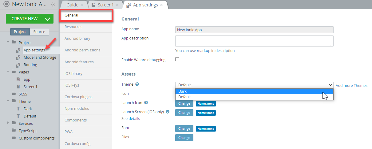
Important!The above drop-down works for preview purposes only and if you decide to apply the selected theme to the entire application, go to Project > App Settings (or just click the Set global theme button next to the drop-down to open the App Settings > General > Assets menu) and select the needed theme from the drop-down.
So, if this theme is something you like and you decide to apply it to an entire application, you need to set it as a global theme under App Settings > General > Assets:
Using Appery.io Theme Generator
Theme Generator is a tool that allows generating custom color themes that can be reused in an app. With this extension, you can instantly visualize how changes made to the app are reflected on its UI.
Ionic provides several global variables that are used throughout components to change the default theme of an entire application: https://ionicframework.com/docs/theming/basics.
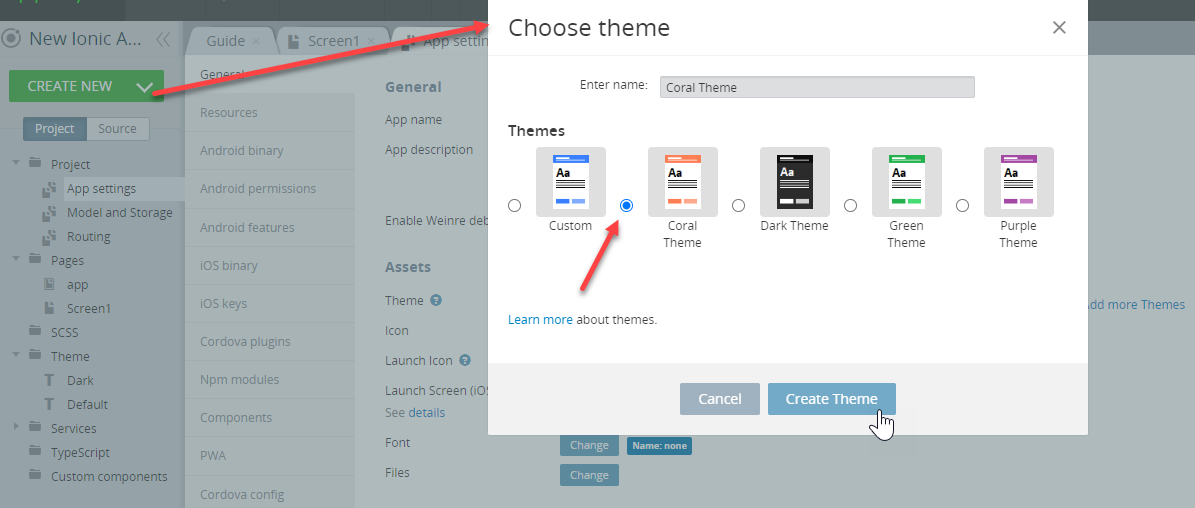
Creating Themes
To create a new theme, from the Project view, click CREATE NEW > Theme, select the option that looks closest to what you plan to have for your app and give it a name, for example, Theme1:
The theme is created and appears in the Theme folder of the Project tab:
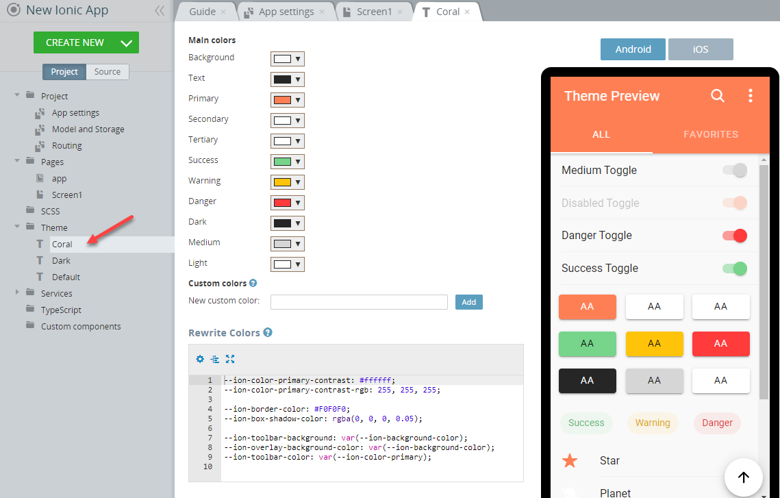
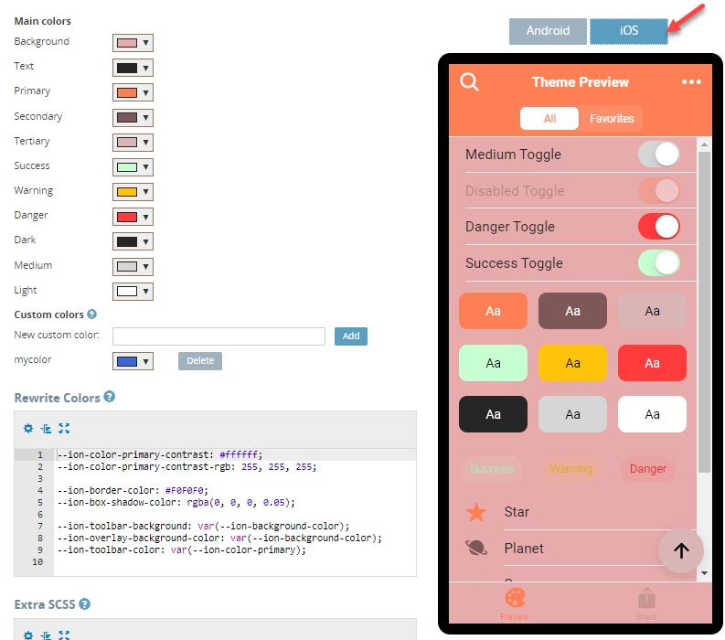
Now, you can modify the theme template using the Theme Generator editor: you just need to select the main colors one by one and configure them using the color picker tool until you get the UI you would like your app to show on the screen:
When ready, you can check how your app UI will look like on both:
- the Android:
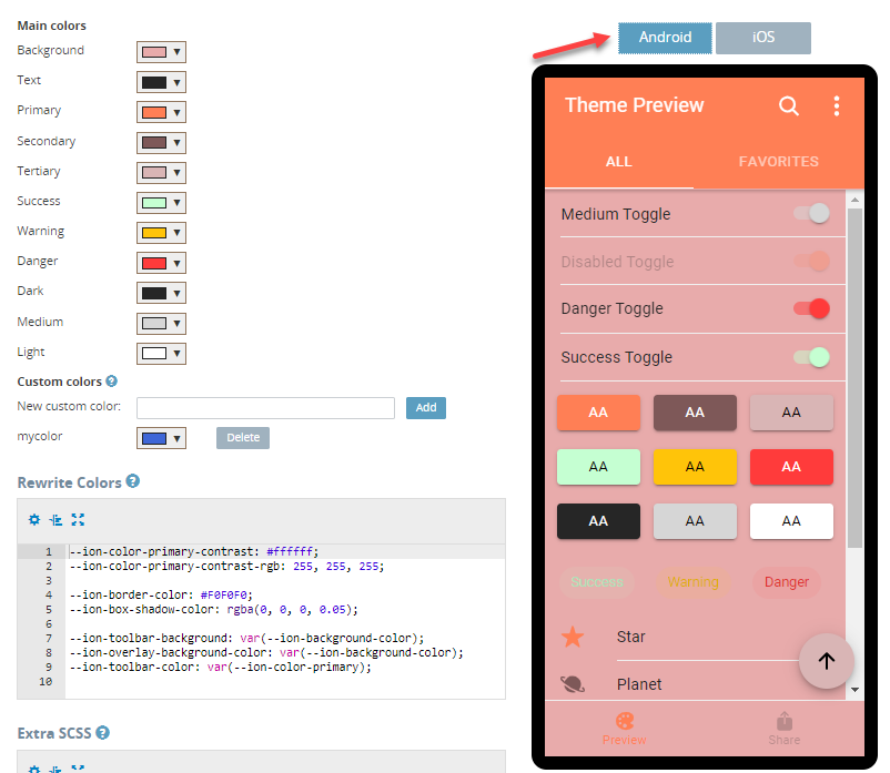
- and the iOS views:
You can create as many themes as you need.
Exporting Themes as Private Plug-insAs a bonus, any theme you like can be exported as a private plug-in so that it can be further reused for other project(s) you create with Appery.io. You can read more here.
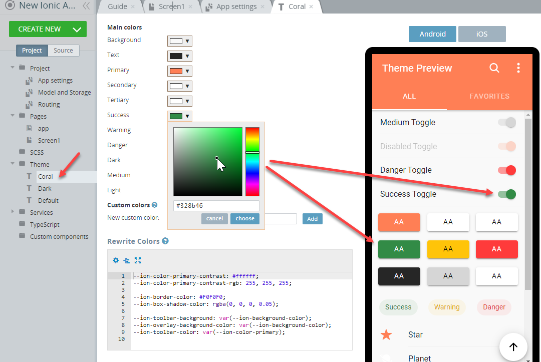
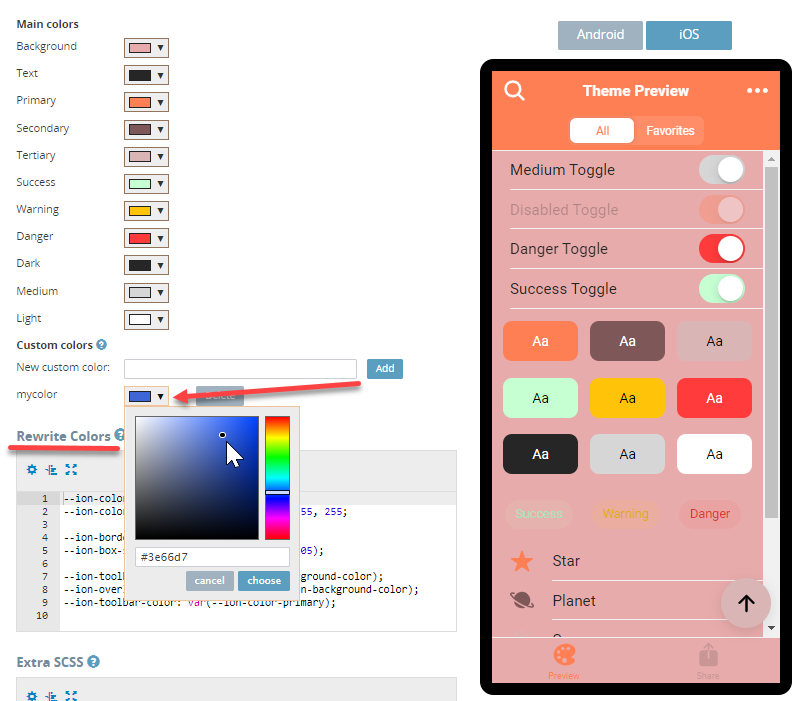
Adding Custom Colors
You are also free to add custom colors to your app. This can be done under the Custom colors section using the color picker:
Rewriting Colors
You can also use the Rewrite Colors editor to overwrite any color or add any css variable.
Extra SCSS
In the Extra SCSS section, you can add any additional scss for your theme. You can use $_THEME_NAME instead of the actual theme name.
If you scroll down, you will also be able to open the theme code preview.
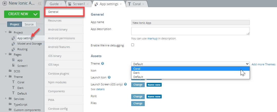
Adding Themes to App
When finished, go to Project > App settings >General and, in the Assets section, select the theme you need:
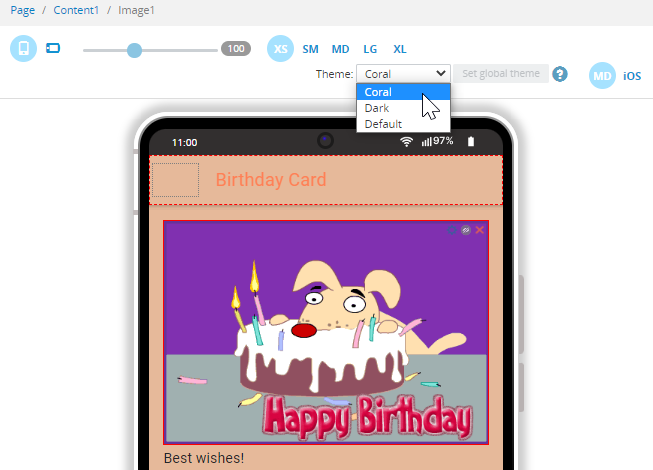
Previewing Themes
You can use the preview option to see how some particular app page will look like with the selected theme (works in the editor preview only):
Applying Themes
Now, let's see how to apply the needed theme to the particular UI component:
First, you need to select the Run TypeScript action for Page create event of the Page component and then choose and save the snippet you need:
- Get current theme snippet:
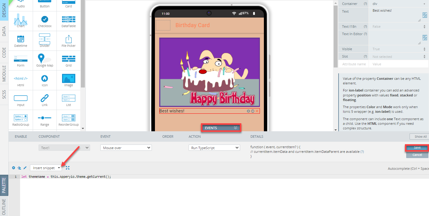
- Set theme snippet.
If you select the second option, you will need to provide the theme name in the code:
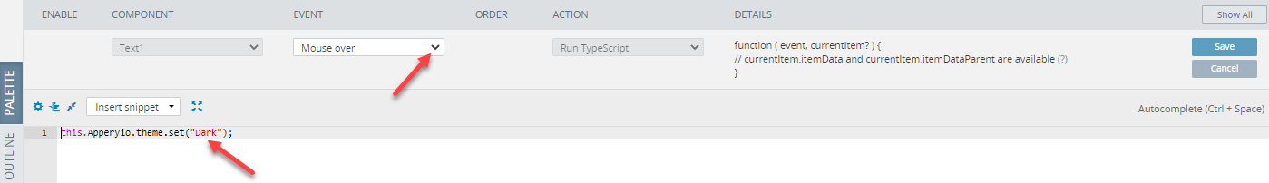
For example, here is how the Mouse over event will work with the this.Apperyio.theme.set("Dark");code:
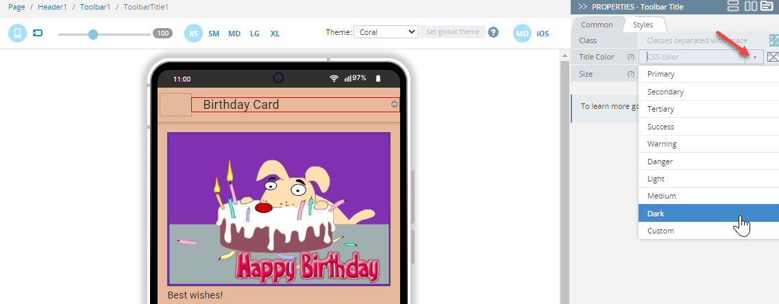
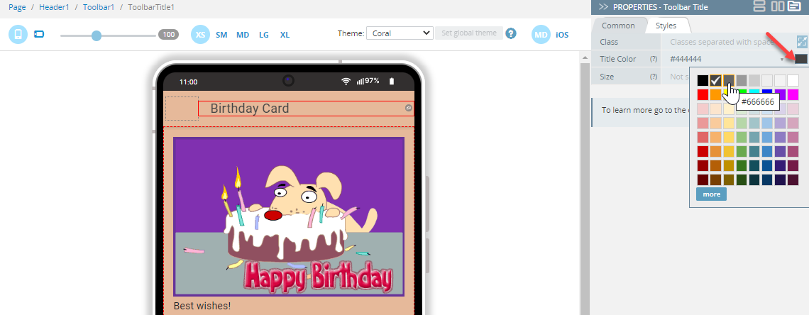
Tip!When modifying some component's UI, you can select from the predefined value types for the component's Color property (under the PROPERTIES panel, click the Styles tab to access it) to apply it to the page UI:
You can also enter your custom color name (manually) or use the Color-picker:
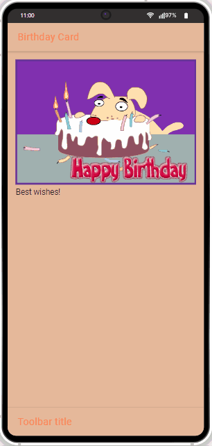
Testing
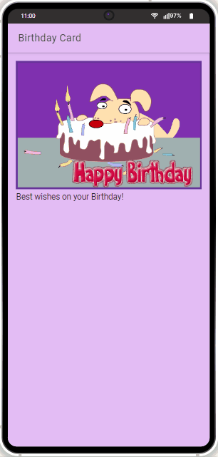
After the needed action(s) have been defined for the page (and its components), its updated UI can be tested in work.
Using Media Manager
Media Manager allows working with custom image files in the App Builder. You can upload, rename, delete images, and/or select them as assets for your app.
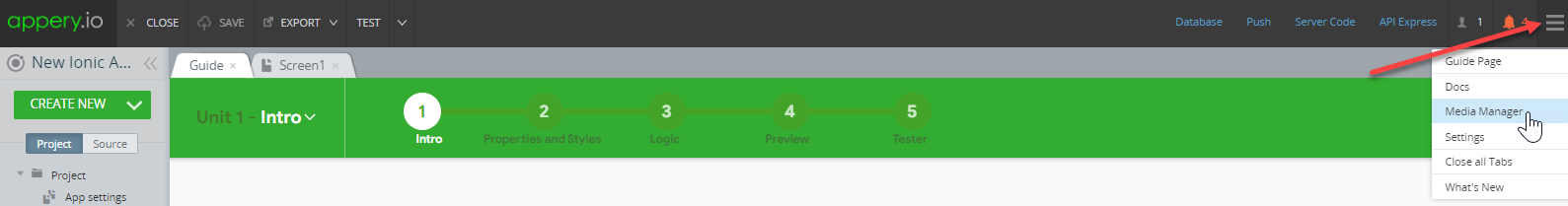
To open the Media Manager, click additional menu (the three lines button) in the upper-right corner of the builder and select Media Manager:
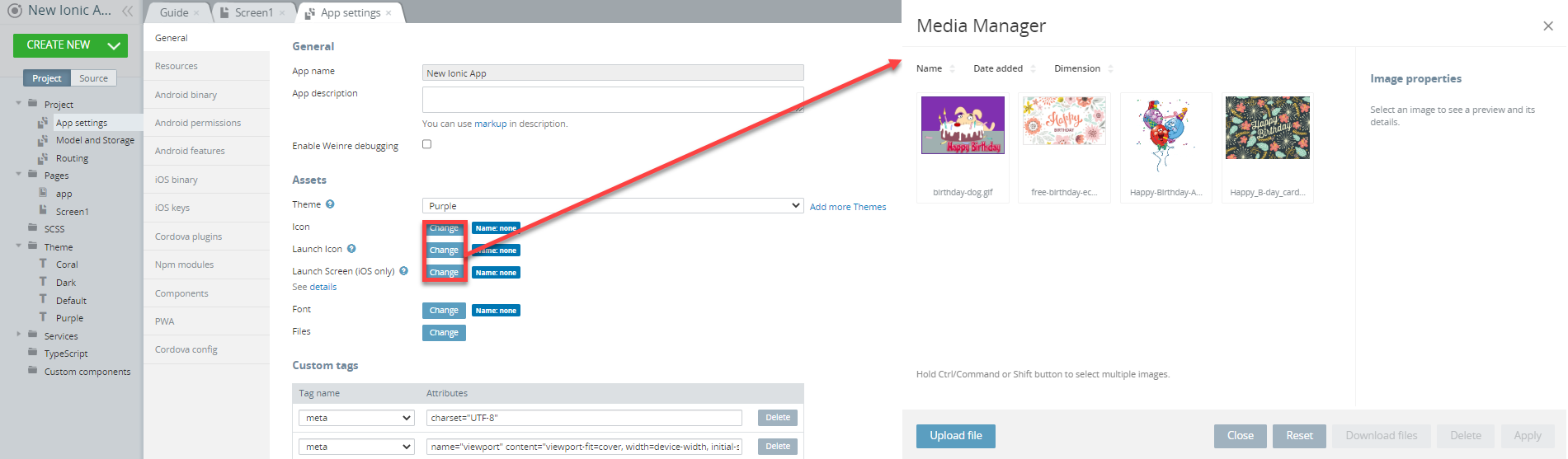
Media Manager can also be accessed right from the Assets section. When the Media Manager window opens, you will see all the previously uploaded images:
If you need to upload a new image, just click Upload file and, in the new window click Select files to select the needed one from your drive:
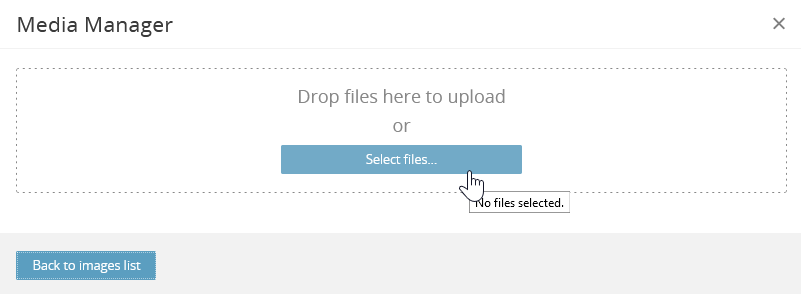
When the upload of the selected images is complete, click Back to images list where you can apply the selected image to your app.
Only image files can be uploaded with Media Manager. If you select anything but an image file, an error message will be shown. In this case, you will need to use the Files Manager option.
Renaming Images
If you select the image, you will be able to see its name and size in the Image properties block. If needed, you can edit its name:
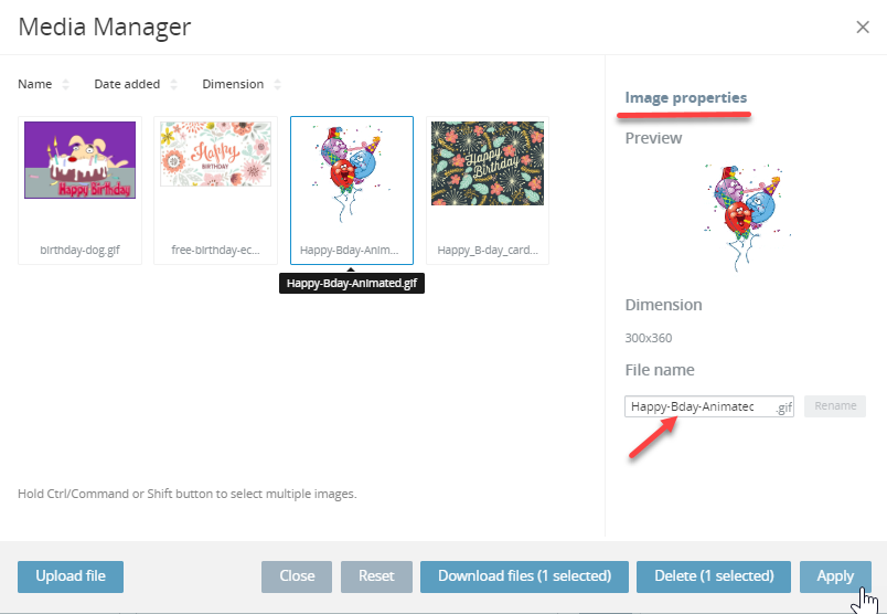
To save the new image name, click Rename.
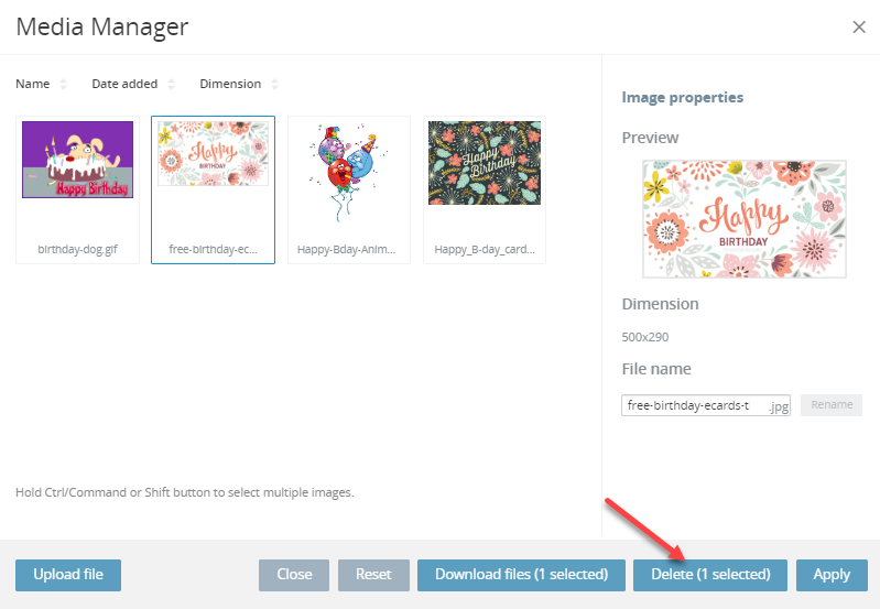
Removing Images
To remove an image from the Media Manager click the image on the list, and in the Image properties block, click Delete: the image will be removed:
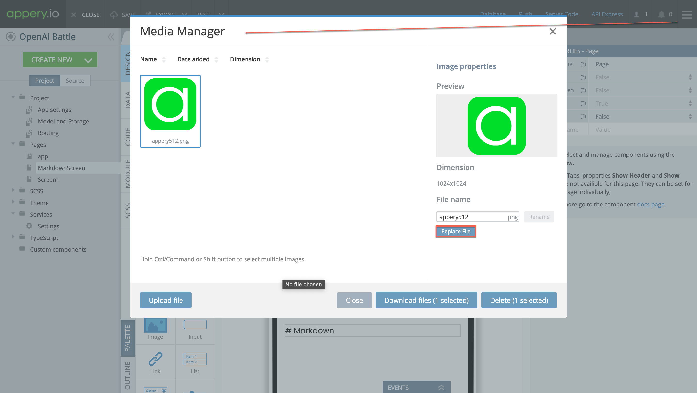
Bulk Image Replacement
If you need to replace some image that is added to multiple pages of your app, you can do this in bulk by clicking the Replace File button and selecting a new file from your drive:
Want to know more?Learn how to use the bulk image replacement feature to easily update images across your app.
In this video, you will also learn how to include try-catch error handling for streamlined debugging, use the loading indicator for asynchronous methods and form validation checks to ensure data integrity:
Selecting Images for Image Component
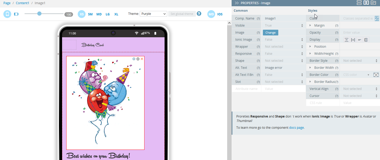
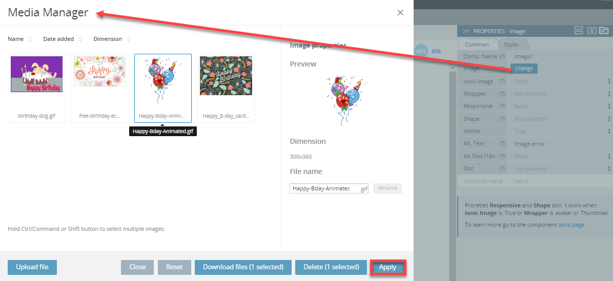
In the editor, select the Image component and, on the PROPERTIES panel, select the Styles tab and click Change.
After the Media Manager window opens, select the image from the list or upload a new image and select it. To select the image, simply click it on, the image should appear in the Image properties block. Then click the Apply button:
Using Launch Icons and Screens Generator
Also, you can significantly simplify the process of adding launch icons and screens to your app by using our built-in generator instead of uploading sets of files of needed sizes via the Media Manager.
ImportantNote that Appery.io Launch Icons and Screens Generator works for projects with the latest Cordova libraries versions.
To do it, follow some simple steps:
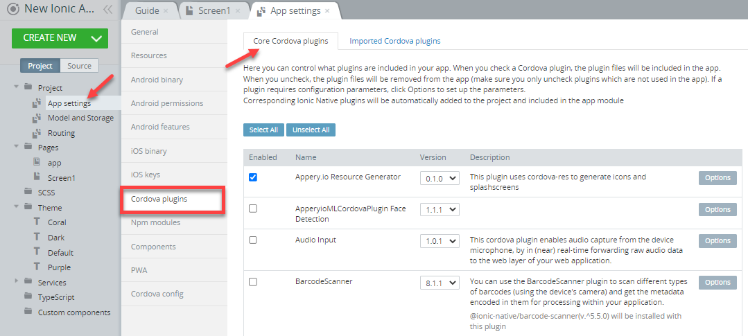
- Go to the App settings >General tab and, in the Assets section, click Change to upload the image file as a launch icon and/or as a launch screen (for iOS only):
Note!Note that that only the
1024x1024 .PNGfiles for launch icons and2732x2732 .PNGfor launch screens are accepted.
- Switch to the Cordova plugins > Core Cordova plugins tab and make sure that the Appery.io Resource Generator plug-in is enabled (it is enabled for all new Ionic projects by default):
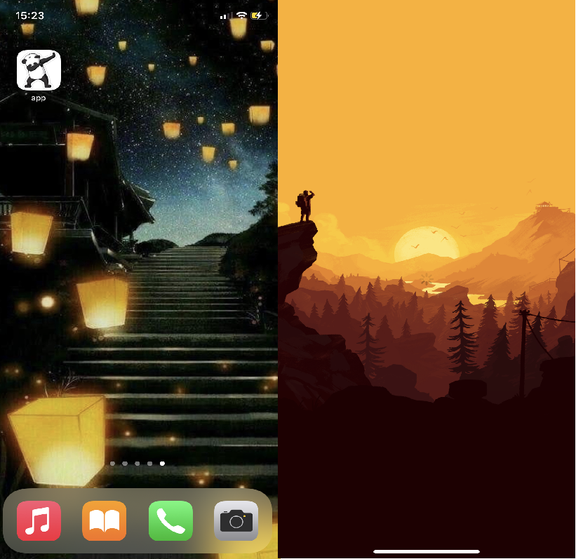
Now, you can generate icons and splash screens automatically and this is how it can look like on the device:
Using Files Manager
Using the Appery.io Files Manager is similar to what is described in the Using Media Manager section with the only difference - the type of the managed files are different from the image types ( like .jpg, .png, etc.).
Let's have a look at the example of how it works for adding custom fonts to an Appery.io project.
Changing Font to Custom
To change the default font to any corporate font if needed, you can use our Files manager to upload any the custom font file:
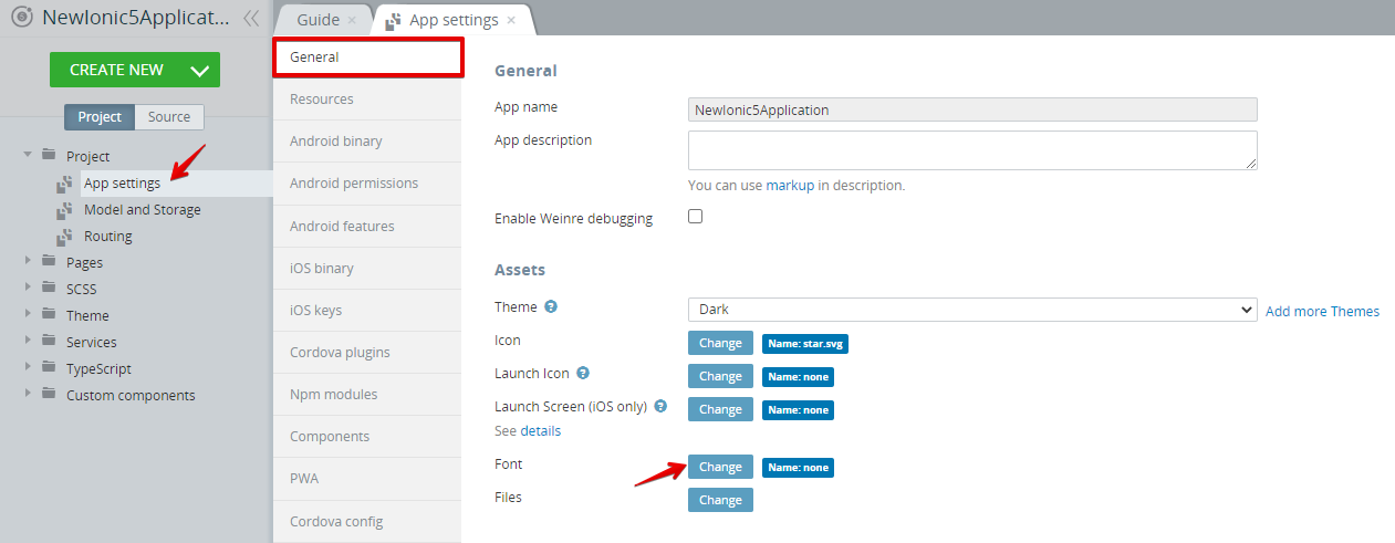
- Open the App settings > General tab and, under Assets, click Change for the Font asset:
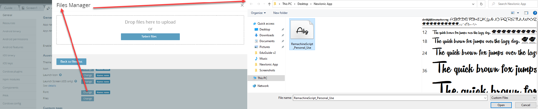
- In the new window, click Upload file and select the font file you prepared beforehand (there are many resources to download fonts, like https://www.1001freefonts.com/):
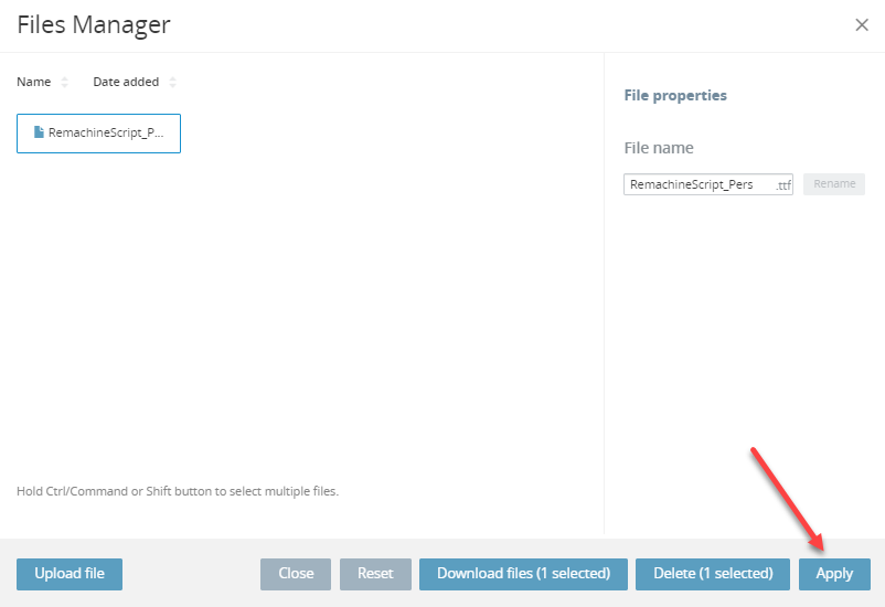
- Click Back to files list, select the file in the Files Manager, and with the uploaded file selected, click Apply:
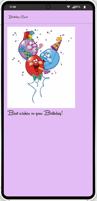
- The font has been added to all project pages and you can test it and see what it looks like:
Application Colors
Application Colors are useful to change the look of most of the Ionic components; Stepped Colors are used as variations in some of the Ionic components.
The application colors are used in multiple places in Ionic. These are useful for easily creating dark themes or themes that match a brand.
It is important to note that the background and text color variables also require an RGB variable to be set in RGB format.
| Name | Description |
|---|---|
| --ion-background-color | Background color of the entire app |
Ionic has a recommended theme for variables to be used in order to get a dark mode based on the device running the app. It can be broken down into the following parts:
- Changing the default Ionic colors for all modes to complement the dark background in the
body.darkselector. - Setting variables for the dark theme on iOS devices.
- Setting variables for the dark theme on MD devices.
The following code can be copied and pasted into an app to get the Ionic's dark theme. We add the dark class to the document body:
/*
 * Dark Colors
 * -------------------------------------------
 */

body.dark {
  --ion-color-primary: #428cff;
  --ion-color-primary-rgb: 66,140,255;
  --ion-color-primary-contrast: #ffffff;
  --ion-color-primary-contrast-rgb: 255,255,255;
  --ion-color-primary-shade: #3a7be0;
  --ion-color-primary-tint: #5598ff;

  --ion-color-secondary: #50c8ff;
  --ion-color-secondary-rgb: 80,200,255;
  --ion-color-secondary-contrast: #ffffff;
  --ion-color-secondary-contrast-rgb: 255,255,255;
  --ion-color-secondary-shade: #46b0e0;
  --ion-color-secondary-tint: #62ceff;

  --ion-color-tertiary: #6a64ff;
  --ion-color-tertiary-rgb: 106,100,255;
  --ion-color-tertiary-contrast: #ffffff;
  --ion-color-tertiary-contrast-rgb: 255,255,255;
  --ion-color-tertiary-shade: #5d58e0;
  --ion-color-tertiary-tint: #7974ff;

  --ion-color-success: #2fdf75;
  --ion-color-success-rgb: 47,223,117;
  --ion-color-success-contrast: #000000;
  --ion-color-success-contrast-rgb: 0,0,0;
  --ion-color-success-shade: #29c467;
  --ion-color-success-tint: #44e283;

  --ion-color-warning: #ffd534;
  --ion-color-warning-rgb: 255,213,52;
  --ion-color-warning-contrast: #000000;
  --ion-color-warning-contrast-rgb: 0,0,0;
  --ion-color-warning-shade: #e0bb2e;
  --ion-color-warning-tint: #ffd948;

  --ion-color-danger: #ff4961;
  --ion-color-danger-rgb: 255,73,97;
  --ion-color-danger-contrast: #ffffff;
  --ion-color-danger-contrast-rgb: 255,255,255;
  --ion-color-danger-shade: #e04055;
  --ion-color-danger-tint: #ff5b71;

  --ion-color-dark: #f4f5f8;
  --ion-color-dark-rgb: 244,245,248;
  --ion-color-dark-contrast: #000000;
  --ion-color-dark-contrast-rgb: 0,0,0;
  --ion-color-dark-shade: #d7d8da;
  --ion-color-dark-tint: #f5f6f9;

  --ion-color-medium: #989aa2;
  --ion-color-medium-rgb: 152,154,162;
  --ion-color-medium-contrast: #000000;
  --ion-color-medium-contrast-rgb: 0,0,0;
  --ion-color-medium-shade: #86888f;
  --ion-color-medium-tint: #a2a4ab;

  --ion-color-light: #222428;
  --ion-color-light-rgb: 34,36,40;
  --ion-color-light-contrast: #ffffff;
  --ion-color-light-contrast-rgb: 255,255,255;
  --ion-color-light-shade: #1e2023;
  --ion-color-light-tint: #383a3e;
}

/*
 * iOS Dark Theme
 * -------------------------------------------
 */

.ios body.dark {
  --ion-background-color: #000000;
  --ion-background-color-rgb: 0,0,0;

  --ion-text-color: #ffffff;
  --ion-text-color-rgb: 255,255,255;

  --ion-color-step-50: #0d0d0d;
  --ion-color-step-100: #1a1a1a;
  --ion-color-step-150: #262626;
  --ion-color-step-200: #333333;
  --ion-color-step-250: #404040;
  --ion-color-step-300: #4d4d4d;
  --ion-color-step-350: #595959;
  --ion-color-step-400: #666666;
  --ion-color-step-450: #737373;
  --ion-color-step-500: #808080;
  --ion-color-step-550: #8c8c8c;
  --ion-color-step-600: #999999;
  --ion-color-step-650: #a6a6a6;
  --ion-color-step-700: #b3b3b3;
  --ion-color-step-750: #bfbfbf;
  --ion-color-step-800: #cccccc;
  --ion-color-step-850: #d9d9d9;
  --ion-color-step-900: #e6e6e6;
  --ion-color-step-950: #f2f2f2;

  --ion-toolbar-background: #0d0d0d;

  --ion-item-background: #000000;
}


/*
 * Material Design Dark Theme
 * -------------------------------------------
 */

.md body.dark {
  --ion-background-color: #121212;
  --ion-background-color-rgb: 18,18,18;

  --ion-text-color: #ffffff;
  --ion-text-color-rgb: 255,255,255;

  --ion-border-color: #222222;

  --ion-color-step-50: #1e1e1e;
  --ion-color-step-100: #2a2a2a;
  --ion-color-step-150: #363636;
  --ion-color-step-200: #414141;
  --ion-color-step-250: #4d4d4d;
  --ion-color-step-300: #595959;
  --ion-color-step-350: #656565;
  --ion-color-step-400: #717171;
  --ion-color-step-450: #7d7d7d;
  --ion-color-step-500: #898989;
  --ion-color-step-550: #949494;
  --ion-color-step-600: #a0a0a0;
  --ion-color-step-650: #acacac;
  --ion-color-step-700: #b8b8b8;
  --ion-color-step-750: #c4c4c4;
  --ion-color-step-800: #d0d0d0;
  --ion-color-step-850: #dbdbdb;
  --ion-color-step-900: #e7e7e7;
  --ion-color-step-950: #f3f3f3;

  --ion-item-background: #1e1e1e;

  --ion-toolbar-background: #1f1f1f;

  --ion-tab-bar-background: #1f1f1f;
}
Updated about 1 year ago