Appery.io Components
Introduction
When you build an app in Appery.io, you create pages (called Screens) that contain predefined UI components such as buttons, inputs, check boxes, lists, etc.
Every Appery.io UI component has its own properties: some are available for most components (called General and can be found here), and others are specific to a particular component (the full list of them can be found in this document).
Core Components
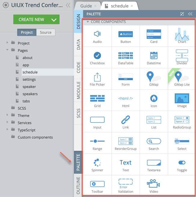
Every new Ionic app comes with this default set of UI components that are ready for use (core components). All of the available core UI components can be accessed from the PALETTE panel:

Currently, the following core UI components grouped under the PROPERTIES CORE COMPONENTS folder are available:
- Audio
- Button
- Card
- Chart
- Checkbox
- DataTable
- Datetime
- Divider
- File Picker
- Form
- Google Map
- Google Map Lite
- Grid
- Html
- Icon
- Image
- Input
- Link
- List
- RadioGroup
- Range
- Reorder
- Search
- Select
- Spinner
- Text
- Textarea
- Toggle
- Toolbar
- Validation
- Video
Custom Components
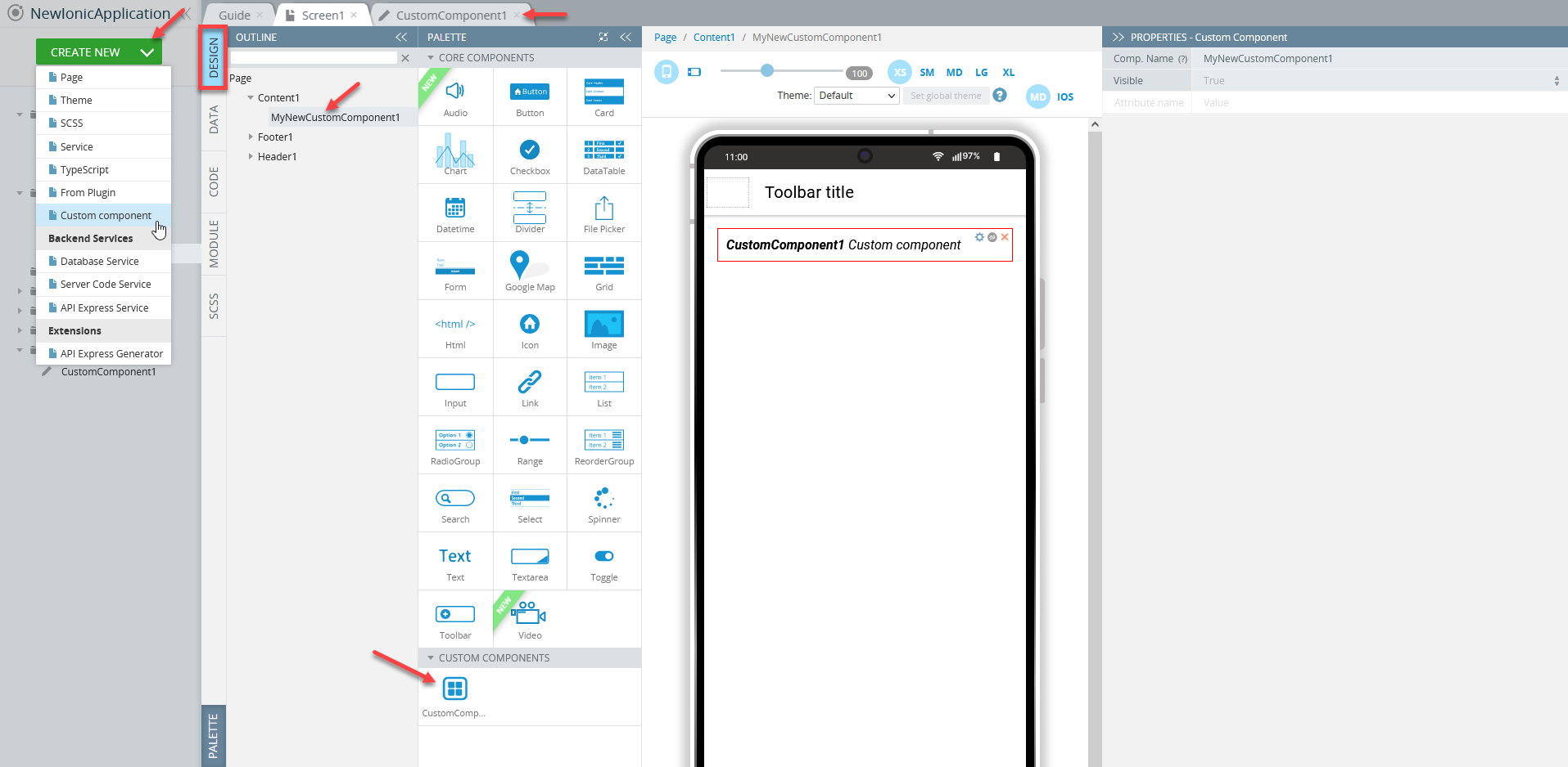
You are not limited to using core UI components only. If needed, a set of custom components can be created.

More information about how to work with custom components is here.
PROPERTIES Overview
Any component, core or custom, as well as the page itself, has a set of properties some of which are common to most components (General components), others are specific to particular components. All properties that are available for a particular component can be accessed from the PROPERTIES view on the right of the working area.

Properties of the Chart component
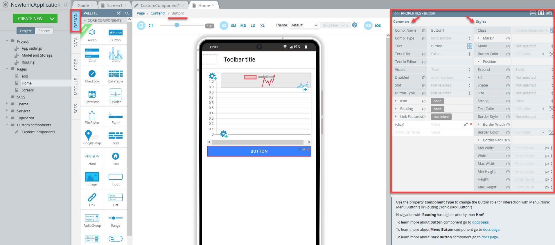
Common / Styles PropertiesMost UI components offer subdivision into common properties and properties related to the particular components' styling. They can be found under PROPERTIES > Common/ Styles tabs respectively:

Properties of the Button component: Common and Styles tabs
Try our Ionic Custom UI Components App TemplateWe highly recommend that you check out our ready-to-go Ionic Custom UI Components App Template where you can find all Ionic UI components currently presented by Appery.io.
With this template, you will be able to review them in detail and try customizing any UI component according to your needs.And even more: you can now enjoy the one-click-away option of installing the template app: simply click the button below and in a moment, your app is ready to start! There’s no need to go to the Create new app dialog or download the template backup with further installing it!
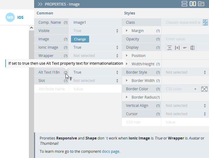
Tips!Most properties are provided with their corresponding ? tooltips: by hovering over them, you can get information on the property and how to use it:

Updated 10 months ago
