1. Creating App UI - PALETTE
Overview of the Components PALETTE
Introduction
The first step in building an app is usually creating its pages with the desired UI. This is done in the Appery.io visual App Builder.
This section describes how to start with creating Appery.io Ionic projects.
Creating New App
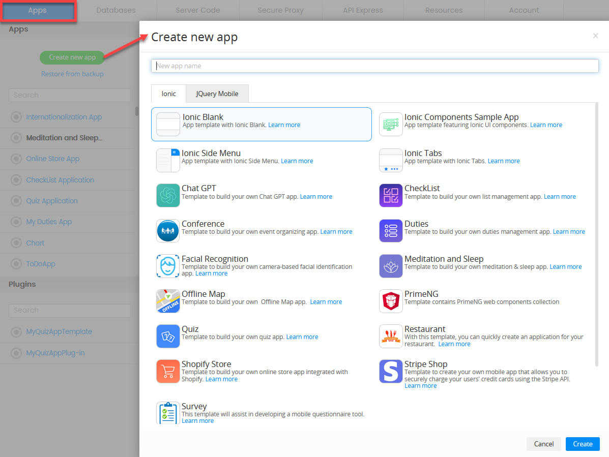
Before you can start designing the app UI you need to create a new app. Under the Apps tab, click Create new app to open the modal window.
Create new app Modal WindowIn this step, you can also select to create an app recreating it from a backup or using your own templates.
Important Note!The option of creating new apps with the jQuery Mobile framework was removed but we still support the projects that were created with it earlier.
When the Create new app modal window opens, enter the name for your new project, and confirm creating:
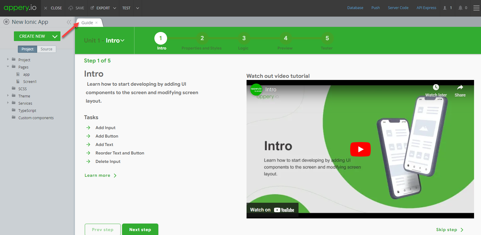
In a moment, your first Ionic app will be created and the first thing you will see is the Guide page where you can learn how to create a stunning UI for your very first mobile app, get help on how to add the needed features, debug and test it, and much more…
Also, every brand new Ionic app comes with two default pages (screens), app and Screen1.
Unfold the Pages folder in the Project View tree on the left to open the screen where the UI components will be added:
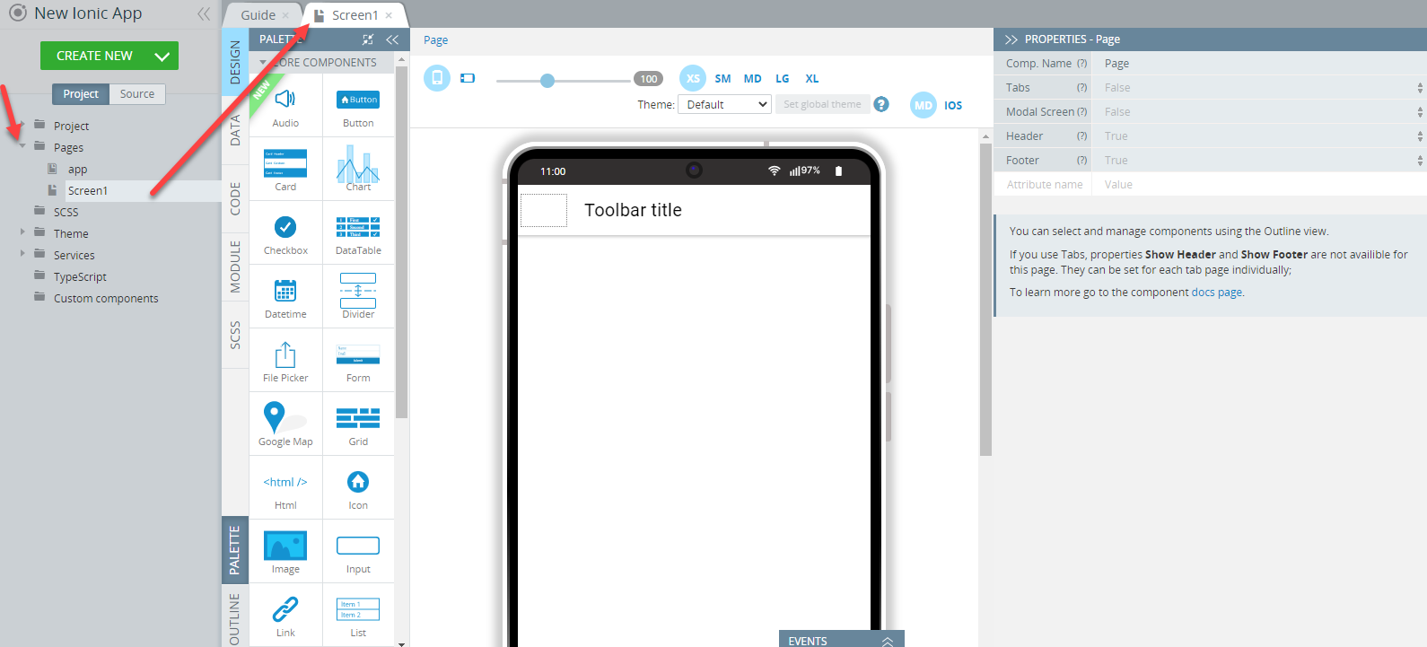
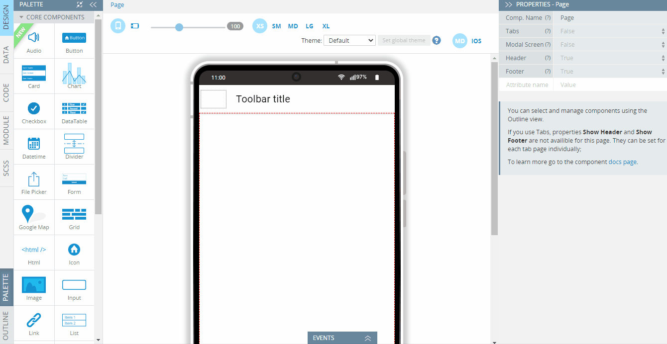
By default, any page (including blank) will be opened in the DESIGN panel with the image of your device in the middle (Mobile frame), the components PALETTE to the left of it, and the PROPERTIES panel to the right.
Want to know more?Check this page to learn more details about working with app pages and screens.
Editor Mobile frame
By default, the page opens in the special mobile frame. In the dashbord above, you can change the device’s size (by selecting from the predefined options, XS, SM, MD, LG, or XL or using the toggle) and layout (portrait or landscape), set the theme for the page preview, as well as select the format you want to preview the app in: ANDROID or IOS.
For example, here is what the DESIGN panel with the device's mobile frame for the page we designed for our Multilingual app looks like:
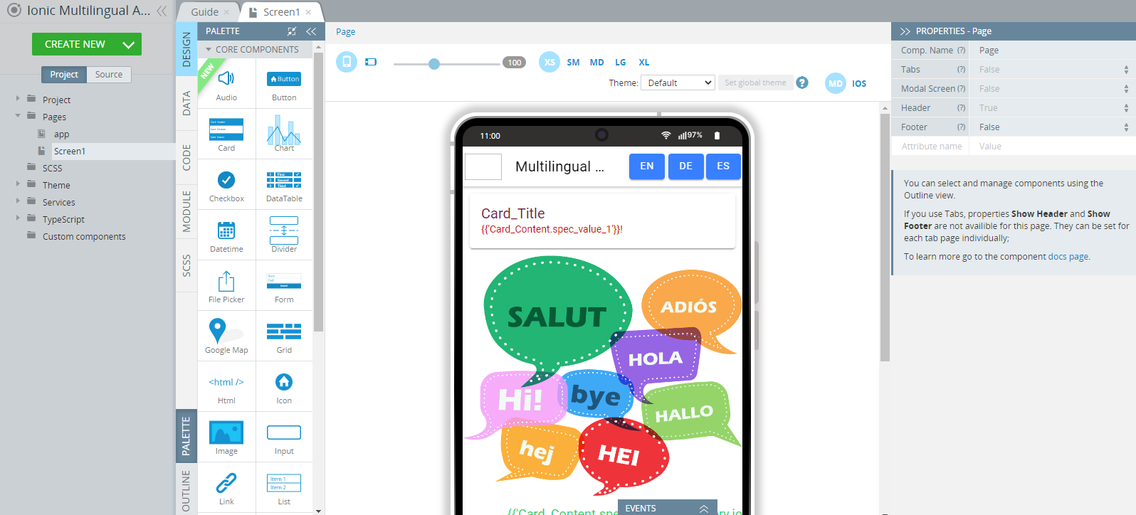
Let's review the main part of the DESIGN panel and the main toolset for creating the app UI: the components PALETTE.
UI Components PALETTE Overview
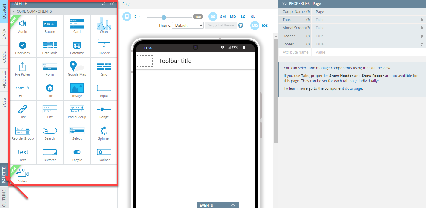
The components PALETTE is the main instrument for designing the page UI and is shown to the left of the visual App Builder canvas:
Intro Video TutorialYou can check this Appery.io YouTube Education Guide video to learn how to start developing by adding UI components to the screen and modifying screen layout in the Appery.io App Builder:
The default components (Core components) available in the PALETTE are used to configure the app UI by dragging and dropping them to the frame and include the following groups of UI components all of which can be used for building the page UI:
- Appery.io components
- AngularJS and Ionic components
- HTML components (including HTML for writing custom code)
- Google Maps component.
Note!In an Ionic app, you are also free to create custom components that can be further reused in your project. Please read here to learn how to work with custom components.
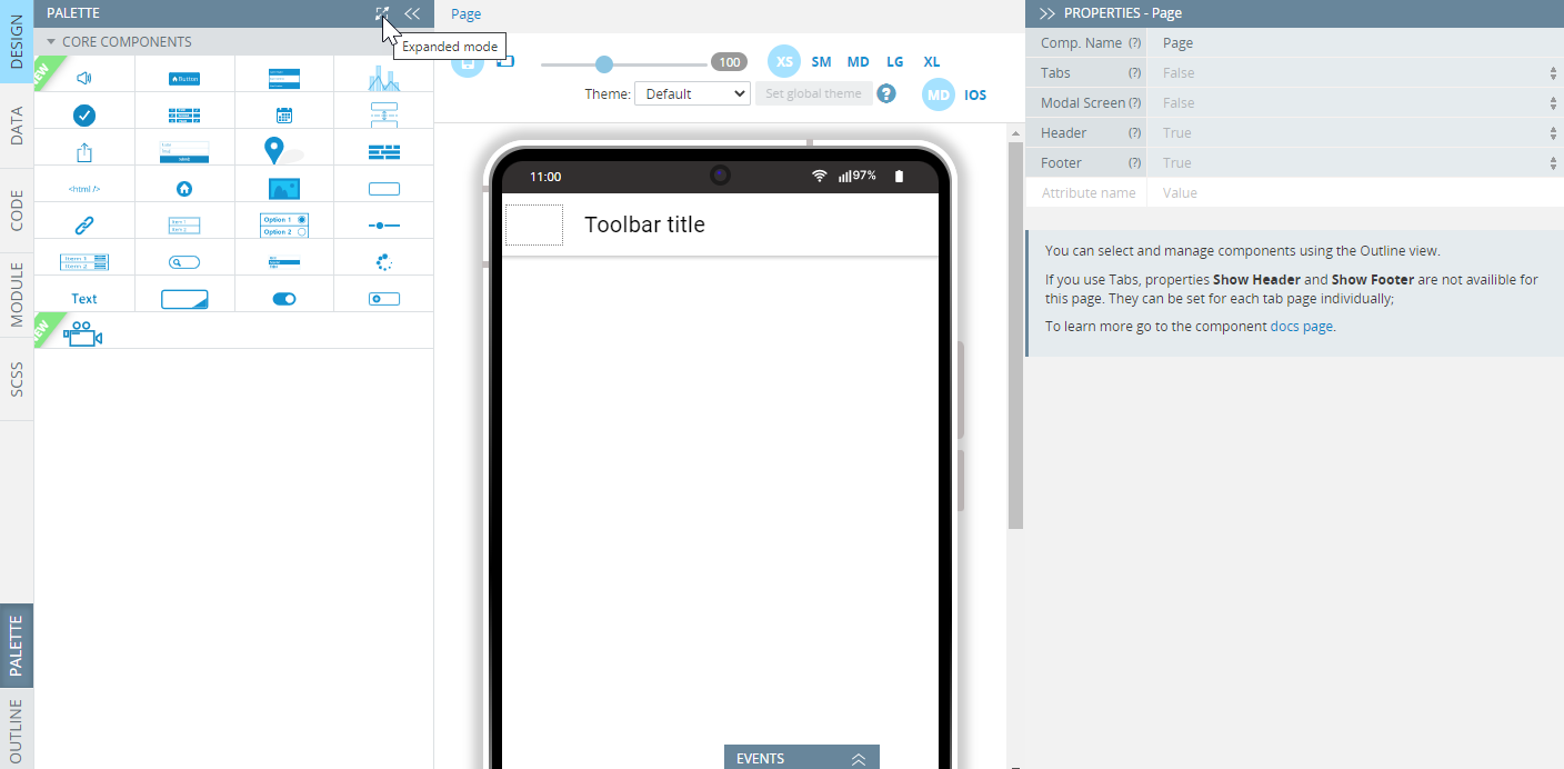
To compact the items on the PALETTE (can be handy for working on a smaller monitor), you can click the button on top of it. To go back to the expanded mode, unclick this button:
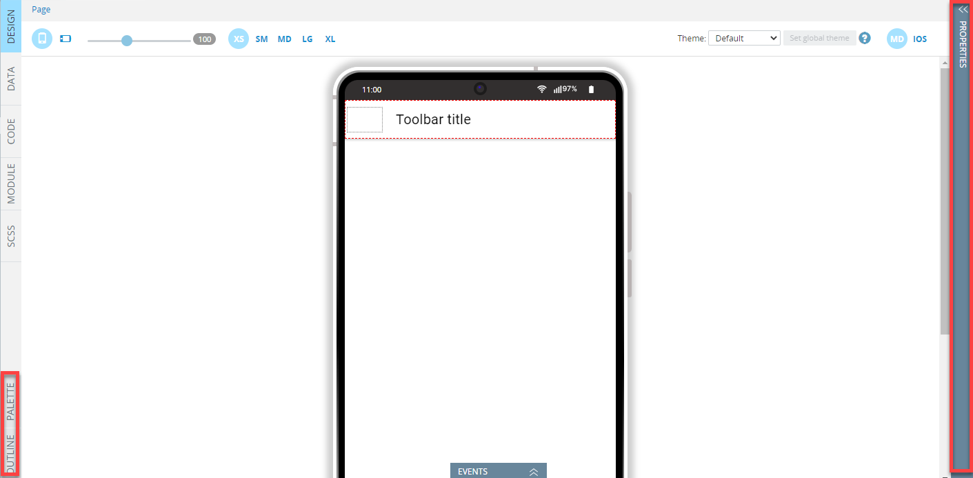
NoteAll frame panels can be hidden, if you need to increase your working area for some purpose (just click the doubled arrow buttons, >>):
Adding Components
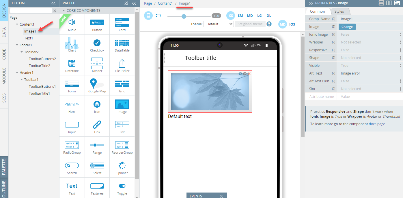
To start work, you need to locate the needed UI component on the PALETTE and add it to the App Builder page editor by using simple drag-and-drop:
After the UI component is added to the screen, it gets automatically selected and you can see it on the Breadcrumbs on top of the working area:
To customize it, the PROPERTIES panel on the right can be used:
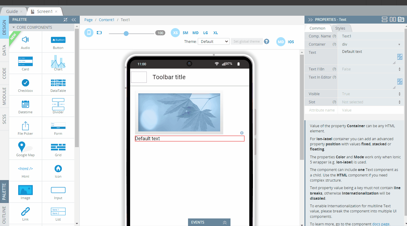
Appery.io UI Components PropertiesAll properties that are available for a particular component can be accessed from the PROPERTIES view on the right of the working area.
- To learn about the properties available to most UI components, check the General components page.
- The properties of a particular UI component can be found in this section; for example, the details of the Chart component properties can be found here.
OUTLINE View
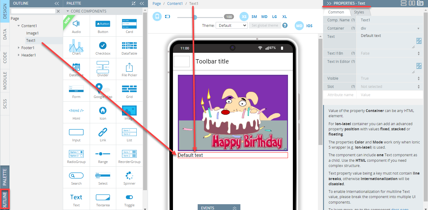
The OUTLINE view shows the components tree where all the added components can be seen and/or edited. Using OUTLINE can be handy for defining the UI of the page where many components were added.
To show the OUTLINE view with the elements tree, click the corresponding button in the bottom left corner of the working area and select the needed component. It will be also shown in the Breadcrumbs on top and this particular component's properties will become accessible for editing on the PROPERTIES tab:
Outline Video TutorialYou can check this Appery.io YouTube Education Guide video to learn how to arrange components on the screen using the OUTLINE panel:
Besides, selecting and deselecting components can be done by clicking on the component on the OUTLINE list.
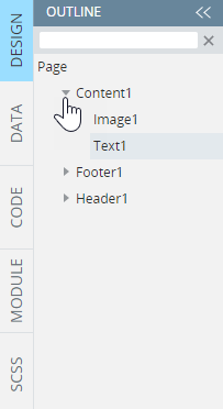
To expand/collapse the list of sub-items, use the triangle icon next to the item name:
OUTLINE Drag-and-Drop Feature
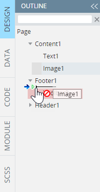
Also, from here, you can use the drag-and-drop feature to arrange the components on the screen of your mobile app:
You will be warned if trying to do something that cannot be implemented for this particular component:
OUTLINE Filtering
The OUTLINE view also has a useful feature of filtering components added to the screen. Just start typing the name of the component to retrieve its parent(s) on the tree:
Context Menu Overview
Appery.io provides a standard set of tools to copy, paste, clone (duplicate), and remove UI components. All of these actions can be easily accessed through the context menu.
To manage a component, you can select it using Breadcrumbs or opening the OUTLINE view (bottom left) and access the context menu by clicking the gear button:
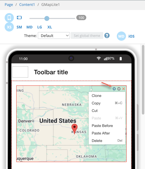
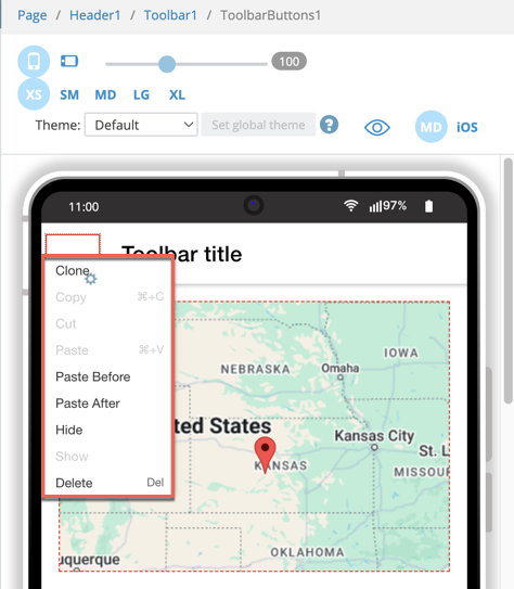
Generally, the context menu consists of the Сlone, Сopy, Cut,Paste, Paste Before, Paste After, Hide, Show, and Delete options:
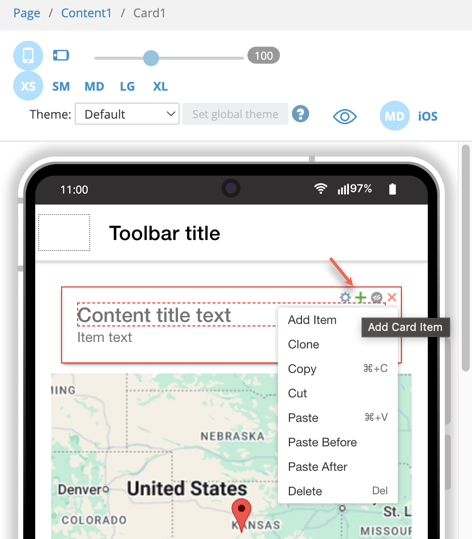
However, several UI components (for example, Card or Grid) have more than one option available from the context menu. The green + button duplicated by an Add item option from the drop-down menu will add another nested item to such components. For example, this will add another item to the Card:
Depending on the situation certain options may be unavailable.
Cloning Components
The cloning option can be useful and time-saving in creating a full clone of a UI component with all of the nested children, including other components. To apply it, select the component from the menu and click Clone.
The component with the same properties appears right after the original component by default. For the most part, all UI components or their parts can be cloned, but the ability to be cloned depends on the component’s environment. Some components cannot clone their own parts, for example, you cannot clone a Button inside the Input Addon in an AngularJS project. In this instance, cloning will be unavailable for the Button component.
Copying and Pasting Components
Most of the components of the PALETTE can be copied with all their properties and nested components by using the context menu for the selected components.
To use the copy-paste feature:
- Click Copy to deposit the selected component in local storage, (this also allows copying and pasting for different projects and sessions).
- Then select any container UI component. The component may be located on the same page or placed on the other one.
- Open the intended destination context menu and select Paste.
If the Paste option is disabled, the remembered component may not be contained within the currently selected one.
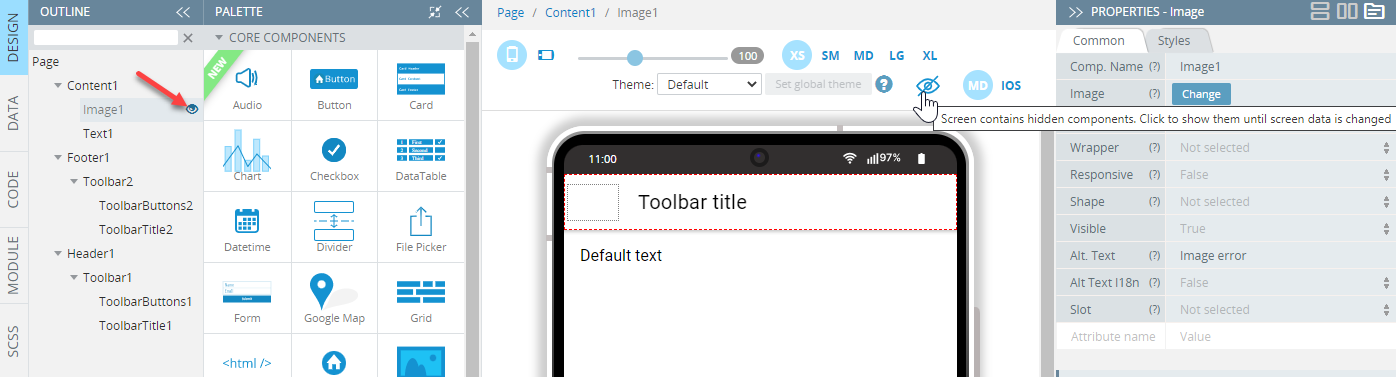
Hiding Components
Components can also be hidden by clicking the icon located next to the Context Menu icon (the gear button):
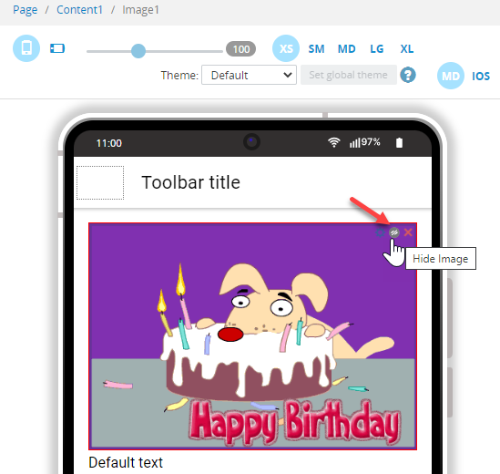
The corresponding eye icon on the screen gets crossed indicating that the screen contains hidden components and, in the OUTLINE view, the eye icon appears next to the hidden item (to unhide it, click this icon):
Copy-Paste Hotkeys
Components can be copied and pasted via the Ctrl+C (⌘+C for Mac) and Ctrl+V (⌘+V for Mac) hotkeys as well. Some components (i.e. those not present in the PALETTE) cannot be copied, as well as sub-components (e.g. Card Item, Grid Cell, etc.).
The previously copied component cannot be pasted into the currently selected one due to the following reasons:
- different project types (e.g. copying from an Ionic project and trying to paste into a JQM project)
- incompatible components (e.g. trying to paste a Grid component into the IndexScreen editor page
- nothing to paste (in this case, the Empty Clipboard message appears)
With Ctrl+V hotkeys (⌘+V for Mac), you can paste a component inside of the currently selected one, but also right after it. If the selected component is not a container or is incompatible with the component being pasted – the latter attempts to be pasted near the selected component (only if it is compatible with one’s parent).
Copying/pasting works for the active frame context only: clicking outside the DESIGN tab of the screen editor (for example, Toolbar or Project view) and applying special hotkeys will result in no action. Click within the Project pages: DESIGN, PROPERTIES), PALETTE panels, etc, to make the hotkeys work.
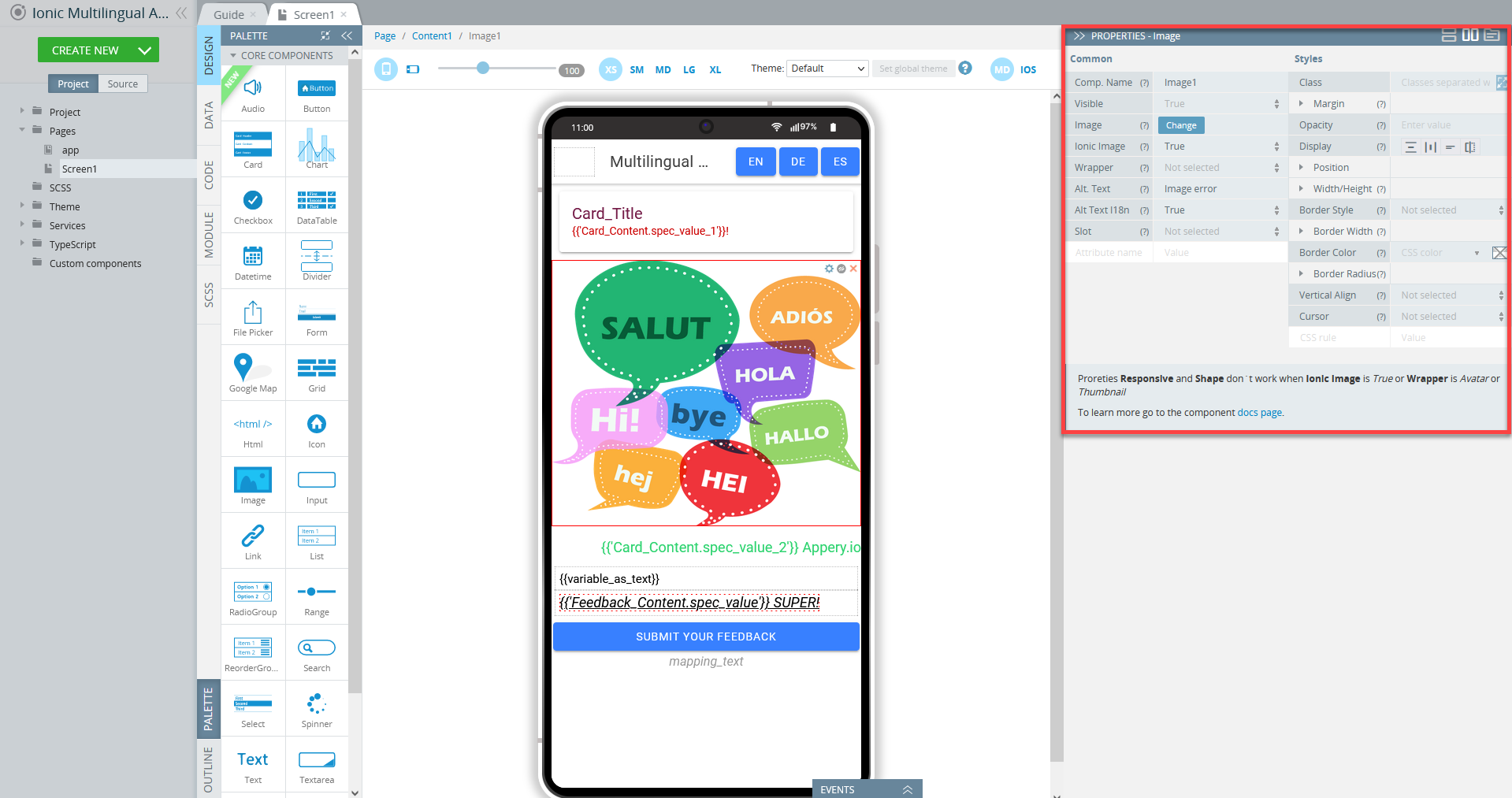
PROPERTIES Overview
Every component has a set of properties some of which are general, and others are specific to particular UI components. All properties that are available for a particular component can be accessed from the PROPERTIES) view to the right of the working area:
Intro Video TutorialYou can check this Appery.io YouTube Education Guide video to learn how to modify UI components’ properties and styling in the Appery.io App Builder:
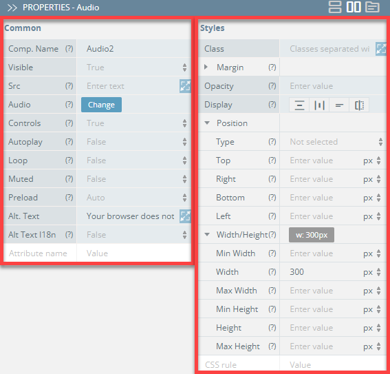
Many UI components available in the Visual App Builder feature further subdivision into common properties and properties related to the component's styling.
Common properties are grouped under the component's PROPERTIES Common tab while the properties used to define styling can be found under the Styles tab:
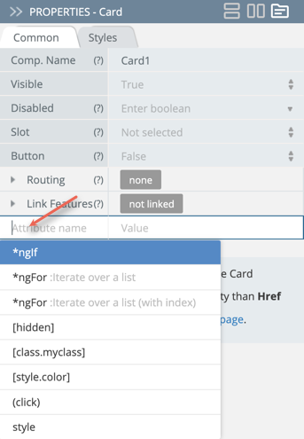
You are free to add custom attributes under the Common tab. Also, you can make use of the most popular attributes, for example *ngFor or *ngIf, by using autocomplete: place the cursor in the Attribute name field and select from the drop-down list offered:
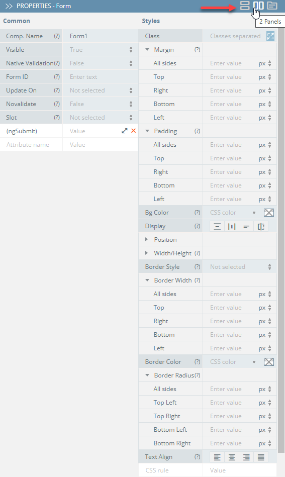
Tip!Note that, in the App Builder, you can make styling UI components even more comfortable and easily adjustable to different monitors' sizes: now, you can switch the PROPERTIES panel views between 2 Panels, 1 Column or Tabs modes:
Here is the description of the properties that can be defined for most PALETTE components.
To check for the properties of a particular UI component, please see the documentation for the corresponding component; for example, the details of the Chart component can be found here.
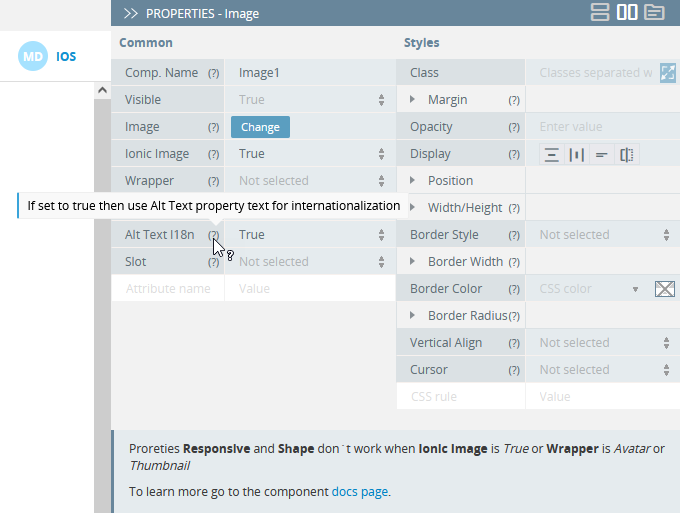
Note!Most properties are provided with their corresponding ? tooltips: by hovering over them, you can get information on the property and how to use it: