Ionic ngx-datatable Tutorial Advanced
Introduction
This is part 2 (advanced part) of the ngx-datatable Ionic application tutorial.
Please refer to the basic tutorial and complete it first, then move to this tutorial.
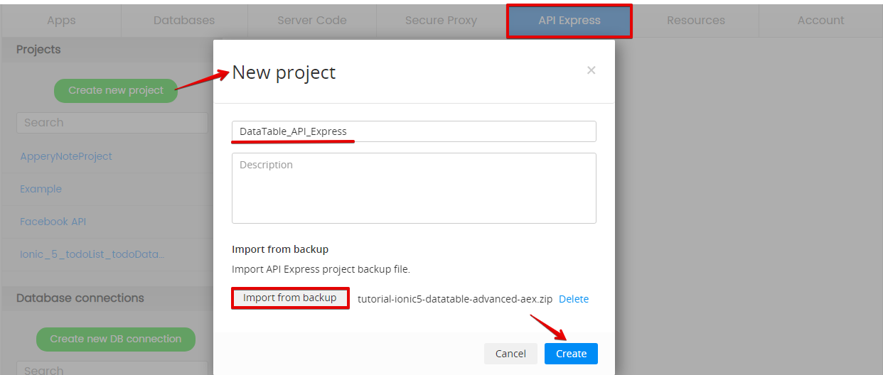
Pre-conditionThere is an important pre-condition to make your app work: you will need to create an API Express Service (step 1 of this tutorial) by adding the below API Express project to your app.
So, please, download the API Express project backup file to your drive and then import it into your app under the API Express tab:
Downloads and Resources
You can also download the advanced Ionic DataTable app backup file for importing to your app. In this case, the API Express service will be created automatically.
Step 1: Creating API Express Service
- To start, create a new Ionic app (Ionic Blank).
- After that, click CREATE NEW > API Express Service:
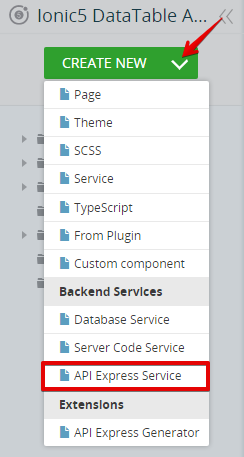
- In the new window, select the API Express project you recreated from the backup (see the Introduction section for more details) and confirm importing all of its services (click the Select All link) into your app:

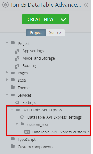
Creating API Express service
In a moment, the selected services will be instantly imported under the Project tabServices folder:
Step 2: Creating Page UI and Defining its Logic
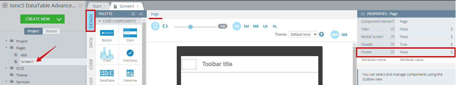
- Open the Pages >Screen1 DESIGN panel.
- Now, use the Breadcrumbs to select the Page component. Then, under its PROPERTIES panel, set the Footer property to False:
Defining DataTable Component
- Drag & drop the DataTable component to the screen. A table with two default DataTableCol components will be created.
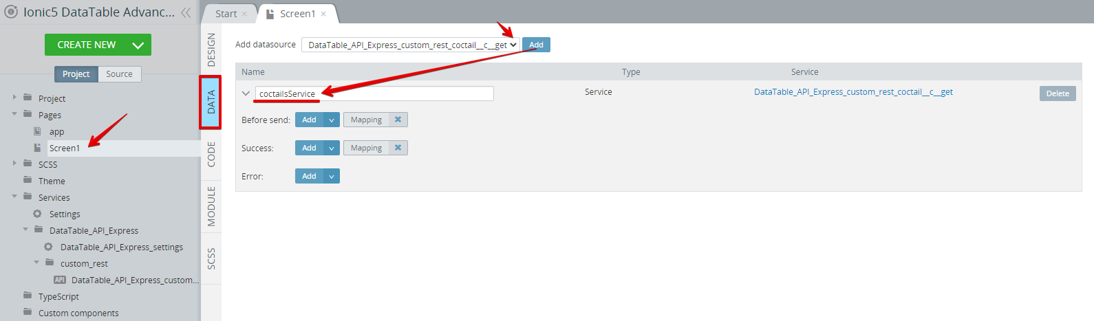
- Now, switch to the DATA panel and, for datasource, select Service, and add the API Express service we have just created. Rename the service to coctailsService:
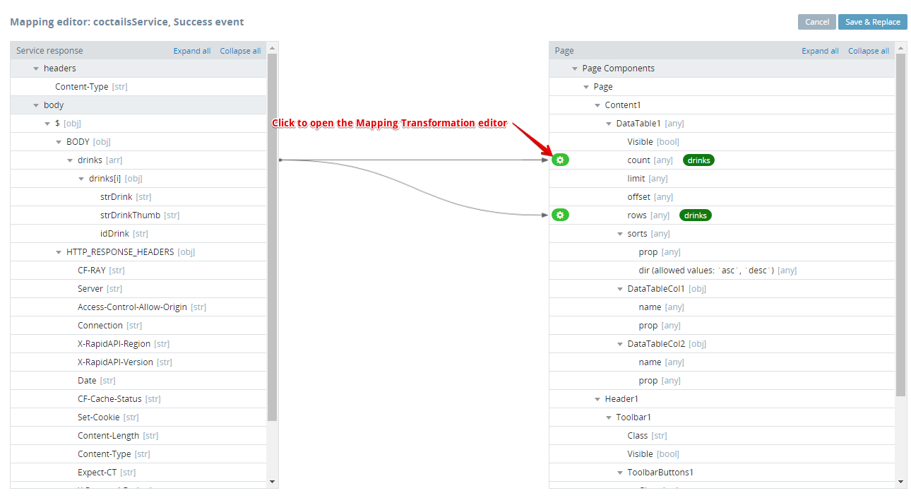
- Now, click the Success mapping button and, in the mapping editor, click Expand all for both Service response and Page panels. We should map the added service to the DataTable component like this:
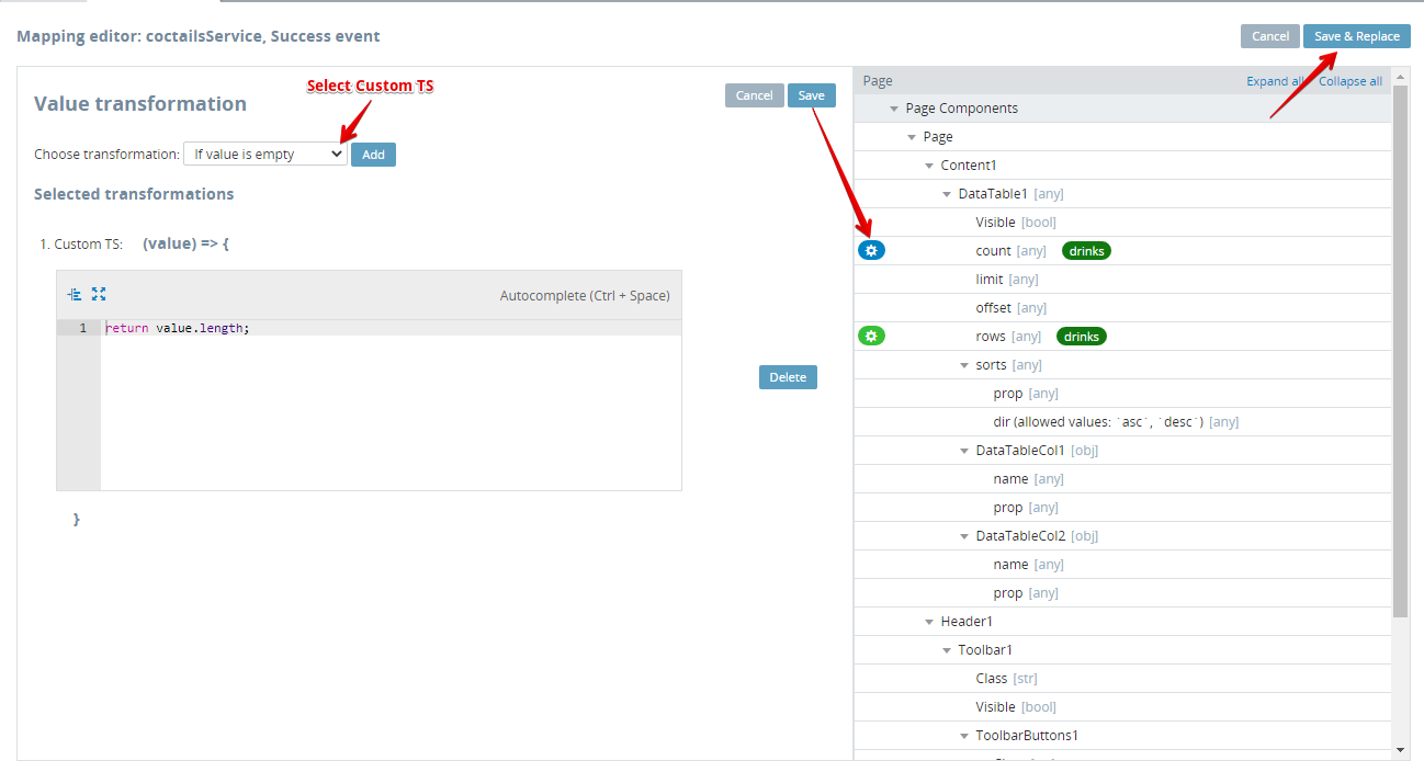
- Then, click the green gear button next to DataTable1> count to open the Transformation editor; for transformation, select Custom TS and, in the Selected transformations section, paste the
return value.length;TypeScript and then Save. The green button should become blue when the change is saved. Finally, click Save & Replace to exit the mapping editor:
- Go back to the DESIGN panel and select [DataTable]https://docs.appery.io/docs/ionic-5-ui-components-properties#datatable).
You can use the OUTLINE view or Breadcrumbs for navigating between App UI components:
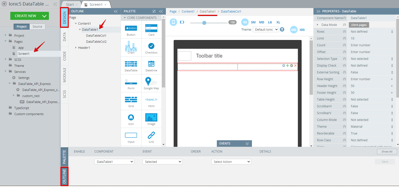
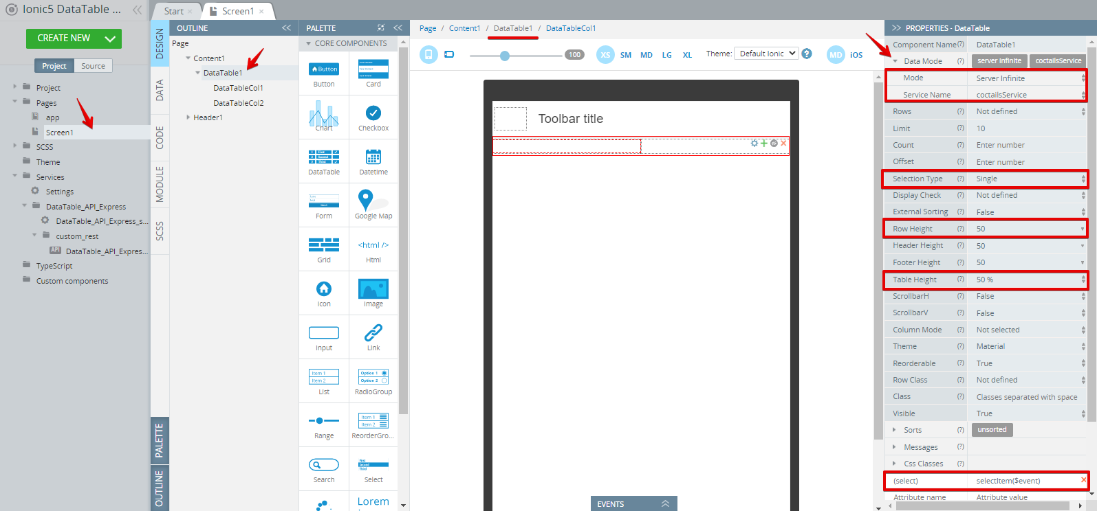
- Under the PROPERTIES panel, expand the Data Mode property and select Server Infinite for Mode. For Service Name, select the added service, coctailsService. Set the Row Height and Table Height properties to 50(%). Then define SelectionType as Single and for the (select) attribute, enter selectItem($event):
- Now, we should define both DataTable columns. To do it, select them one by one and set the next properties:
- For DataTableCol1: Name to Drink and Property to strDrink:
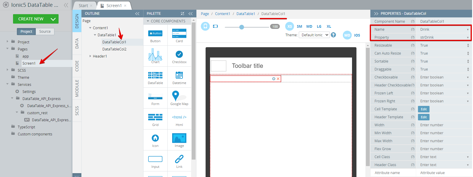
- For DataTableCol2: Name to Image and Property to *strDrinkThumb:

- Open the DESIGN panel and for DataTableCol2, click the Edit button next to the Cell Template property, then insert the below HTML and save:
<ion-thumbnail>
  <img [src]="value">
</ion-thumbnail>
Here is how it should look in the HTML editor:

Editing DataTableCol2
Now, when we have configured the dataTable component, we need to initiate it:
- Expand the EVENTS tab from the bottom and select Page from the COMPONENT list. Then, select Before page showing for EVENT and DataTable update for ACTION with DataTable1 as the Component name. Do not forget to save the event:

Setting up Page event
- Now, switch to the CODE panel and add two more variables of String type:
nameandimage. - Then add a new function, named
selectItemwith the next code and defineeventas an argument:
console.log(event.selected);
this.name = event.selected[0].strDrink;
this.image = event.selected[0].strDrinkThumb;
When ready, the CODE panel should look like this:

CODE tab
Defining Card Component
- Go back to the DESIGN panel and drag & drop the Card component to the screen.
- Then add the Image component to the Card and insert the
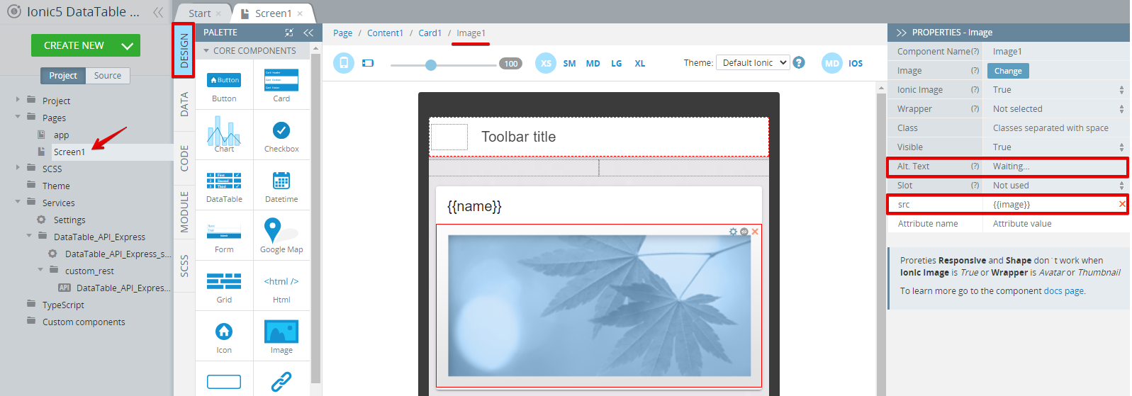
{{name}}variable as the Title Text and clear the Card Item Text value. - Now, select the Image component and under the PROPERTIES panel, enter Waiting... for Alt.Text.
- After that, add a src attribute with the
{{image}}variable:
Defining Grid Component
-
To finish with the app UI, add the Grid component under the card and drag per one Button to both Grid Cells.
-
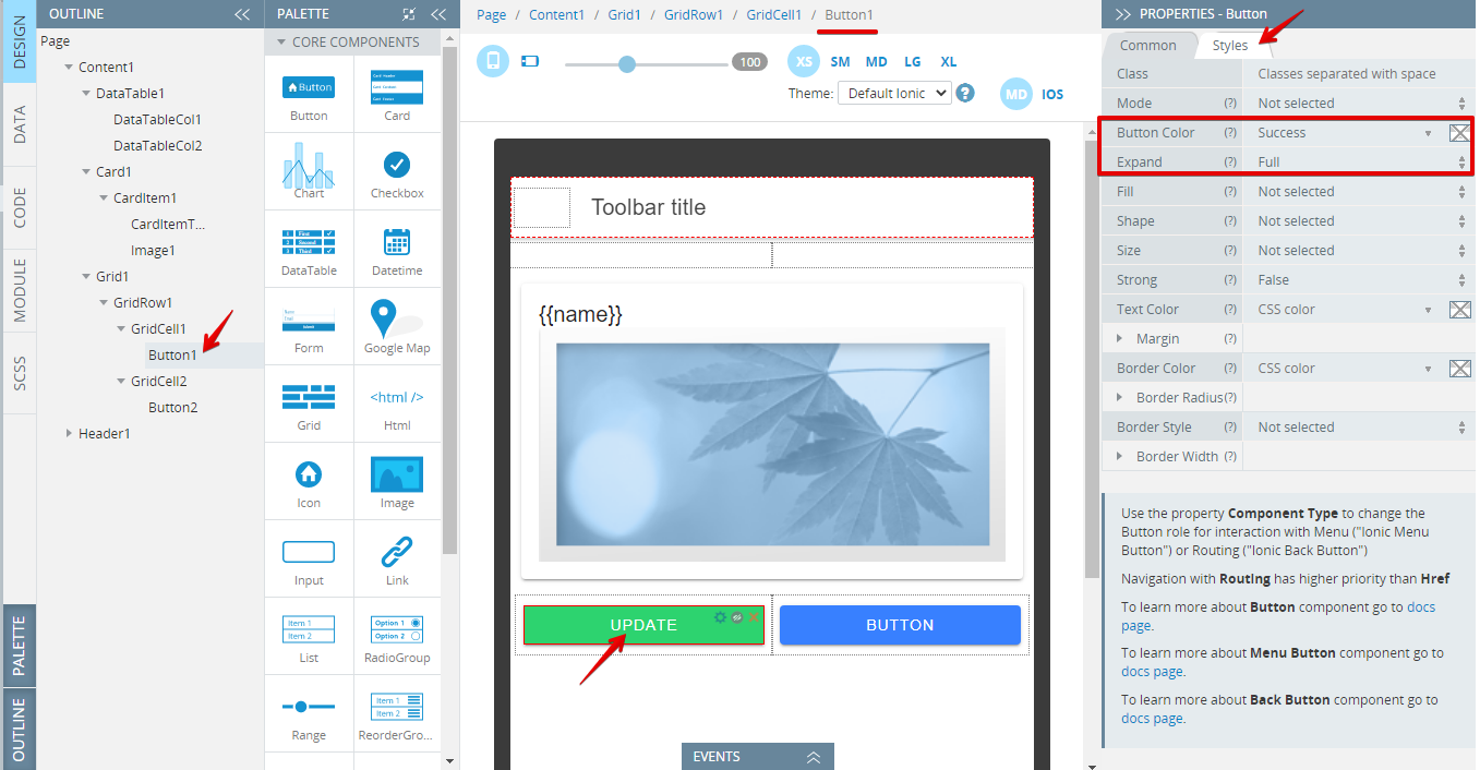
Let's define Button1 first. Set its Text property to Update. Then, switch to the Styles tab and set:
- Button Color= Success;
- Expand= Full:
- Expand the EVENTS tab and add the DataTable update event for the Button1 Click event, save. This event will allow quick updating of the table whenever new items are added to it:

Defining Button1 click event
- Similarly, define Button2. First, set its Text property to Clear. Then, switch to the Styles tab and set:
- Button Color= Dark;
- Expand= Full:
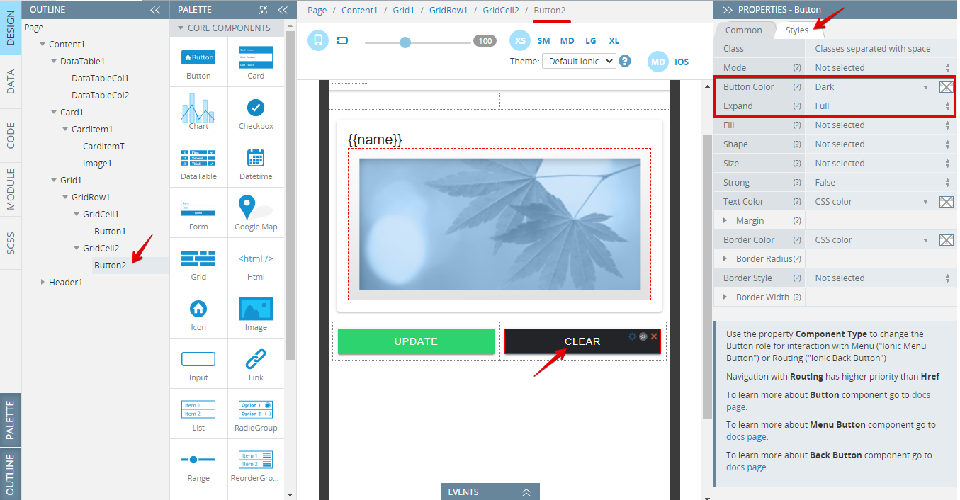
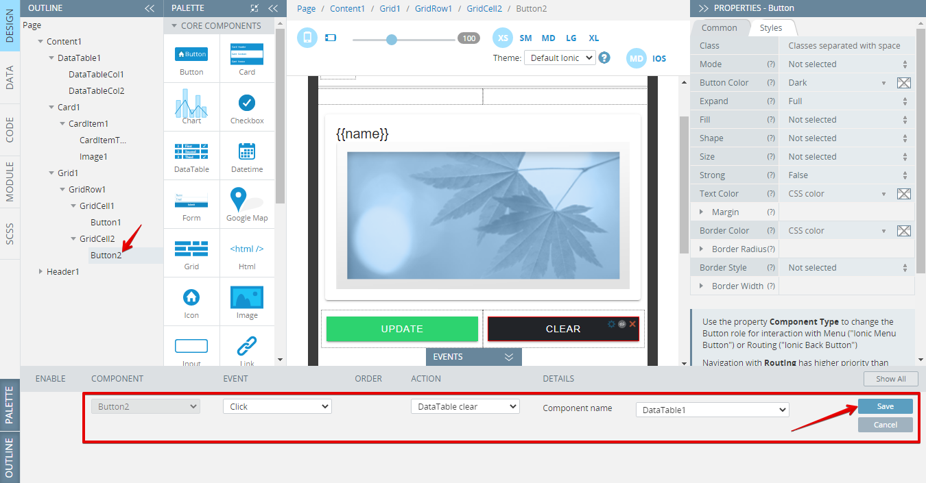
- Under the EVENTS tab, select the DataTable clear action for the Click event. Don't forget to save:
Finishing Touches
You might also like to beautify your app UI.
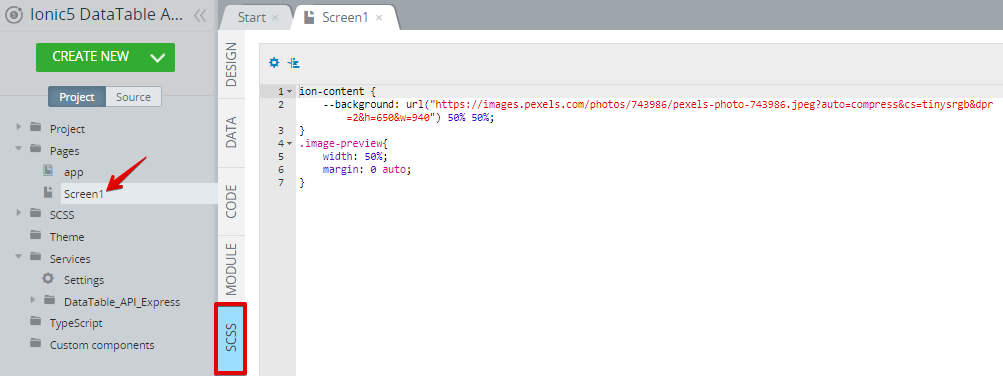
- To do it, add the below code to the SCSS panel of Screen1:
ion-content {
    --background: url("https://images.pexels.com/photos/743986/pexels-photo-743986.jpeg?auto=compress&cs=tinysrgb&dpr=2&h=650&w=940") 50% 50%;
}
.image-preview{
    width: 50%;
    margin: 0 auto;
}
The SCSS panel should look like this:
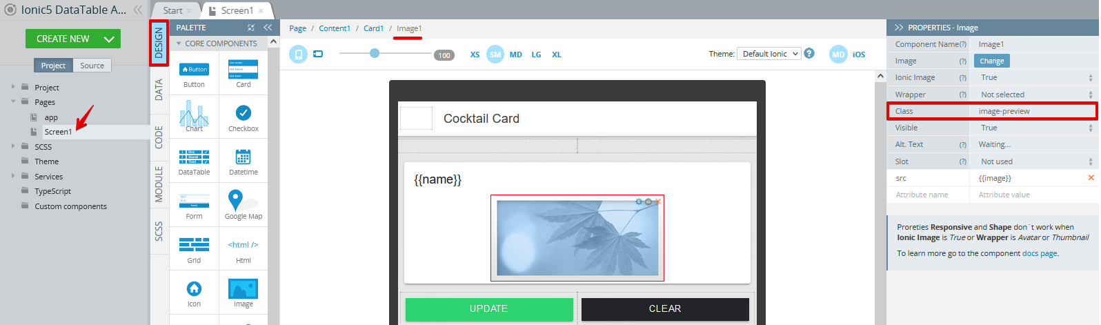
- Additionally, go to the DESIGN panel and set the image Class property to image-preview:
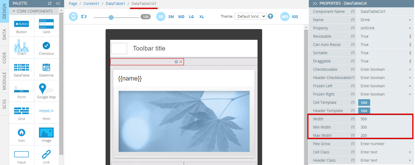
You can additionally experiment with the Width, Min Width, and Max Width properties to adjust the table columns to your content. In our example, the DataTableCol1 is defined as follows:
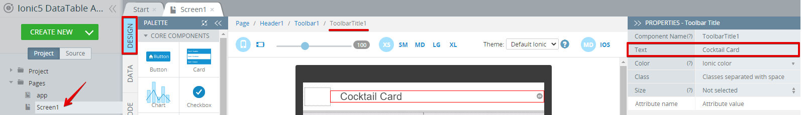
- To finish with the app UI, select the Header Toolbar title component, and enter Cocktail Card for its Text property:
- Click the SAVE button in the App BuilderToolbar to save your work.
Step 3: Testing App
Congratulations, you have successfully completed this tutorial and can now click the TEST button in the App BuilderToolbar to enjoy your app working:

App testing
Testing on Device
When your app version is ready, you might also like to test it on the device.
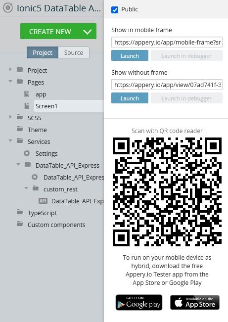
Appery.io Tester AppA great option to quickly test the app on the device is to use our Appery.io Tester app.
The app is free and available for both iOS and Android.
You can check out this page to learn more about using the Appery.io Tester app.
Updated about 1 year ago