Toggle
Overview of the Toggle Component
The ToggleWrappper component changes the state of a single option. They can be switched on or off by pressing or swiping. They can also be checked programmatically by setting the Checked property.
Properties
Important Note!This document lists the properties that are specific to this particular UI component.
To check for the properties common for most UI components, please check the General components document.
Every new CheckboxWrapper component is created with two default child components: Checkbox and ItemLabel.
Common Properties
| Property Name | Property Description |
|---|---|
| Item Wrapped | If set to true, the component will be included in the Item with additional properties |
| Show Label | If set to true, the component will have a label. |
| Lines | How the bottom border should be displayed on the item. Possible values are; Full, Inset, None. |
| Reorder | Reorder properties:
|
Toggle
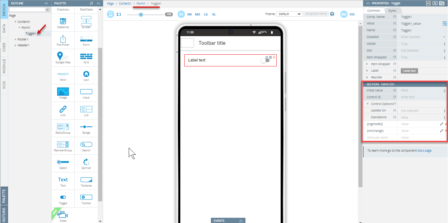
The Toggle component has the following properties:
Common Properties
| Property Name | Property Description |
|---|---|
| Name | The name of the control, which is submitted with the form data |
| Value | The value of the toggle does not mean if it is checked or not, use the checked property for that. The value of a toggle is analogous to the value of a <input type=checkbox>, it is only used when the toggle participates in a native form. The default is set to on. |
| Checked | If set to true, the toggle is selected. The default is set to false. Not available if the toggle is included in the Form component. |
| [(ngModel)] | Angular directive for data binding. |
| (ionChange) | The event emitted when the value has changed. |
Styles Properties
Under the Styles tab, toggles can be styled with several attributes to look like in a specific way:
| Property Name | Property Description |
|---|---|
| Handle | Toggle handle properties:
|
| Track | Toggle track properties:
|
ItemLabel
The ItemLabel component has the following properties:
Common Properties
| Property Name | Property Description |
|---|---|
| Truncate Text | Set to True (default) to truncate label text if it is too long. |
| Position | The position determines where and how the label behaves inside an item. |
Styles Properties
Under the Styles tab, ItemLabel components can be styled with the following attributes to look like in a specific way:
| Property Name | Property Description |
|---|---|
| Font Size | Enter font size in px, %, em, vh, and vw. |
| Font Weight | Set the weight (or boldness) of the font: Normal or Bold. |
Using Toggle as a Form Control
The component is the Form Control of Angular form when:
- it is included into the Form component
- the Form has the Native validation property disabled (is set to False)
- it doesn't have the Standalone option under Control Options enabled
- the component has the property Name specified:
Note!Use the following description only when the Form component has the disabled Native validation property. If the Native validation property is enabled the control can be used as a default HTML Form Control.
To set the initial value of the control use the Initial Value property of the Form Control properties section. The component can have only boolean (true or false) values or null. If the property isn't specified the initial value will be null.
To use variables as the control's data, the advanced property [(ngModel)] should be specified - the variable name should be entered as the property value. It replaces the value that is set by the Initial Value property.
As a Form Control, the component can get additional properties (Control ID and Control options) that allow checking the validity, changing updating strategy, etc. These properties can be used if the Native Validation property is disabled for the Form component.
Read more about validation in the Form section.
Note!The component can't be used with array iteration data for creating a dynamic form structure. If you need to create such kind of structure, follow these recommendations
Visit the Ionic documentation to read more about the Ionic toggle.
Updated about 1 year ago