Applying User Styles
Using Class CSS on the Components' Styles Panel
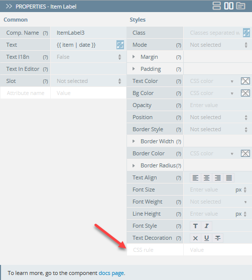
Defining CSS rulesWith Appery.io, you can quickly add the needed styles to any components under the PROPERTIES > Styles tab. All you need to do is add the needed CSS rule to the corresponding field:
However, in some cases, users can experience issues with prioritizing CSS styles for some UI components they add to their apps.
The following solutions (or their combinations) can be applied for prioritizing Styles properties over the Class properties for most UI components.
Note, that customizing styles can work differently for different components because of many factors.
For example, for all the current UI components (with the exception of Input, Card, Textarea, and Toolbar title) the Text Color custom properties have the highest priority.
At the same time, Input, Card, Textarea, and Toolbar title will prioritize the color defined for the Class property of the corresponding component under its PROPERTIES > Styles tab.
We highly recommend using our Appery.io Tester app for quick testing the app UI on the device.
Applying !important in CSS Styles
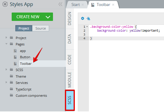
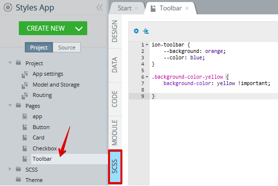
- First of all, open the page SCSS panel and enter the needed code using
!important, for example:
.background-color-yellow {
    background-color: yellow !important;

}
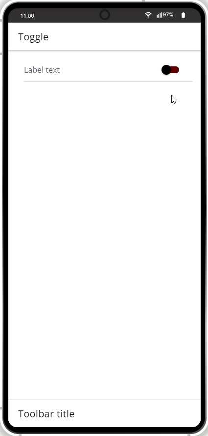
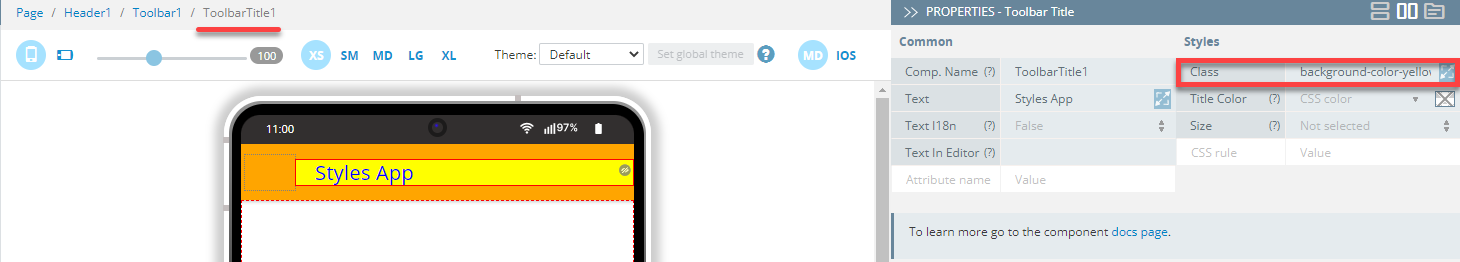
- Then, switch to the DESIGN panel and apply it to the needed component(s) (here, it is a Toolbar title):
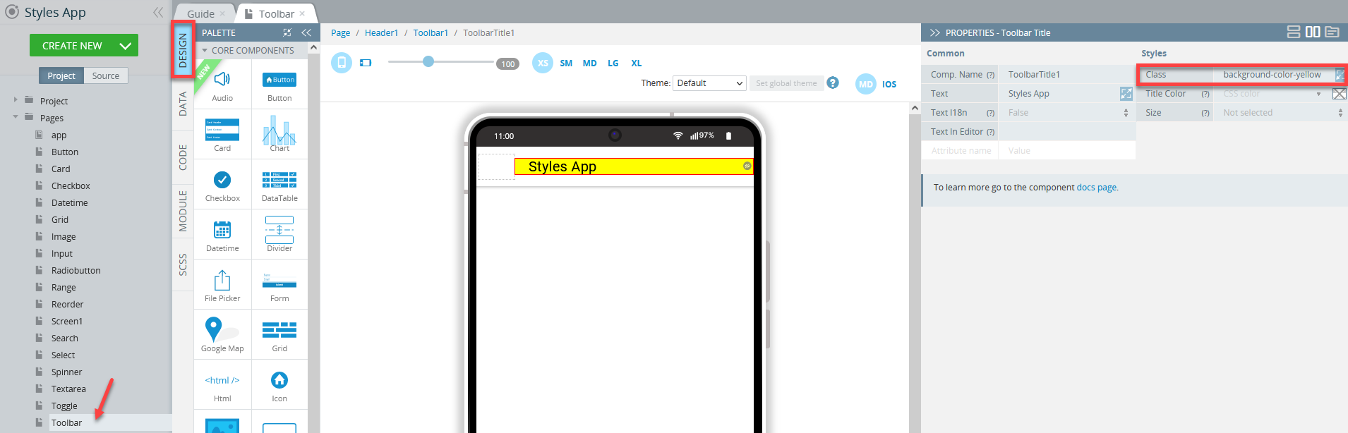
This method can be applied to most UI components.
Applying Additional Selectors for Prioritizing
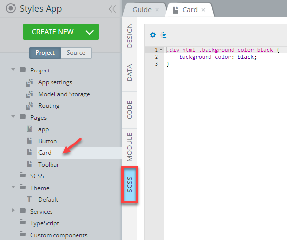
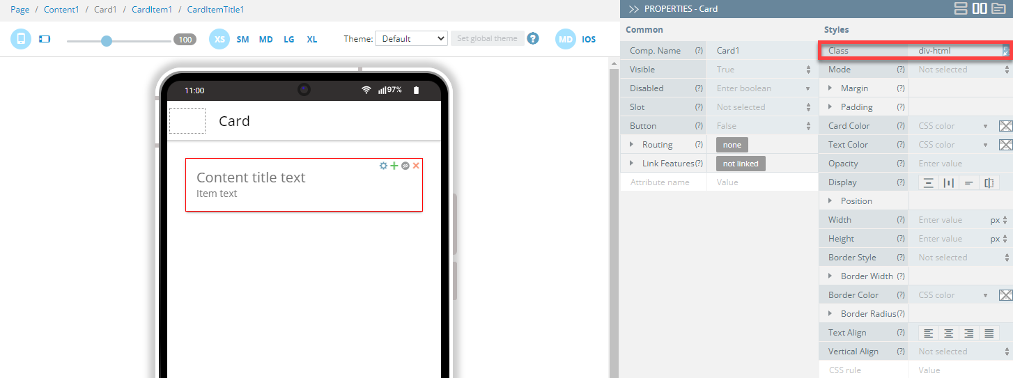
Here is an example of how using the .div-html selector can change the appearance of the Carddoc: component.
- Enter the next code for the page SCSS panel:
- Go to the page DESIGN panel and under PROPERTIES, set the Class property of the Card to div-html:
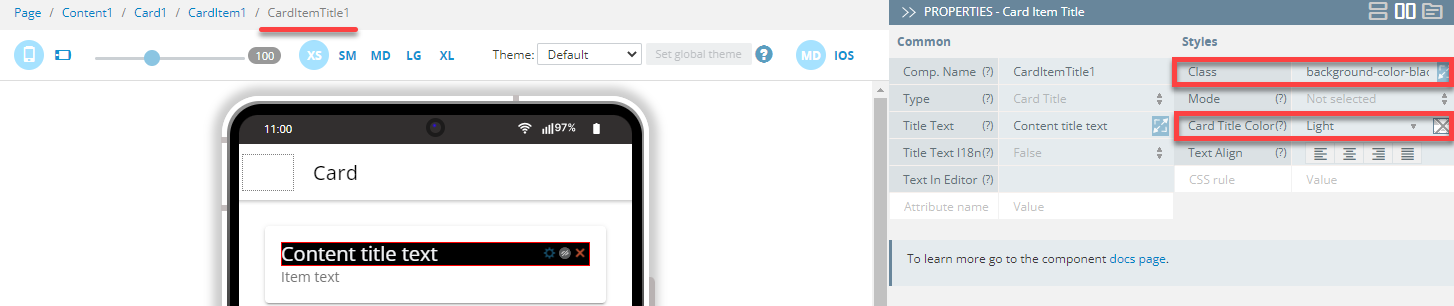
- For the Card Item Title component, set its Class to background-color-black. To experiment, you can also change its Card Title Color properties as shown below:
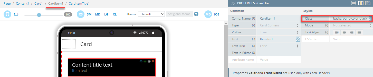
- If you proceed with modifying the Class property of the Card Item component as background-color-black, you will get this:
Applying CSS Custom Properties and Shadow Part
Below you will find popular CSS custom properties (and Shadow Part) used for styling different UI components.
Button Component
In this example, the following ion-button CSS custom properties are used for styling the Button components:
| Name (Shadow Part) | Description | Example |
|---|---|---|
| native | The native HTML button or anchor element that wraps all child elements. | ion-button::part(native) { ….css_styles } |
| Name | Description | Example |
|---|---|---|
| --background | Button background | ion-button { --background: red; } |
| --color | Text color of the button | ion-button { --color: red; } |
| --opacity | Button opacity | ion-button { --opacity: 0; } |
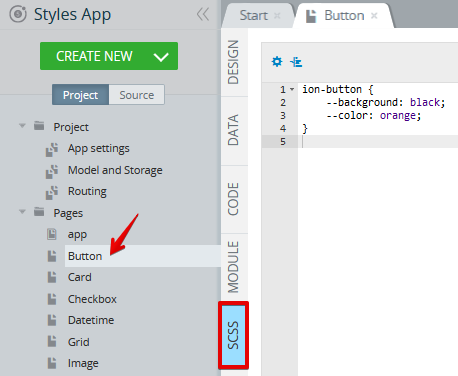
- Go to the page DESIGN panel and add two Button components to the page.
- Now, open the page SCSS panel and add the following code:
ion-button {
    --background: black;
    --color: orange;
}
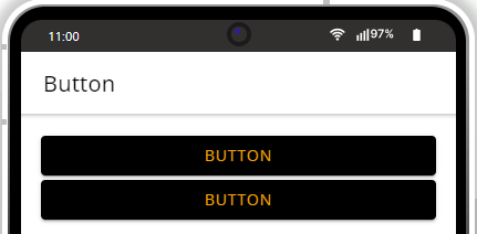
- Click the TEST button on the App BuilderToolbar to go to the page preview. As you can see, both buttons are identical:
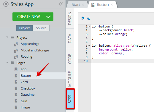
- Now, let's modify the page SCSS panel by adding the following to the existing code:
ion-button.native::part(native) {
    background: yellow;
    color: orange;
}
Now, the code should look like this:
- Go back to the page DESIGN panel and under its PROPERTIES > Styles tab, set the Button2 component's Class property to native:
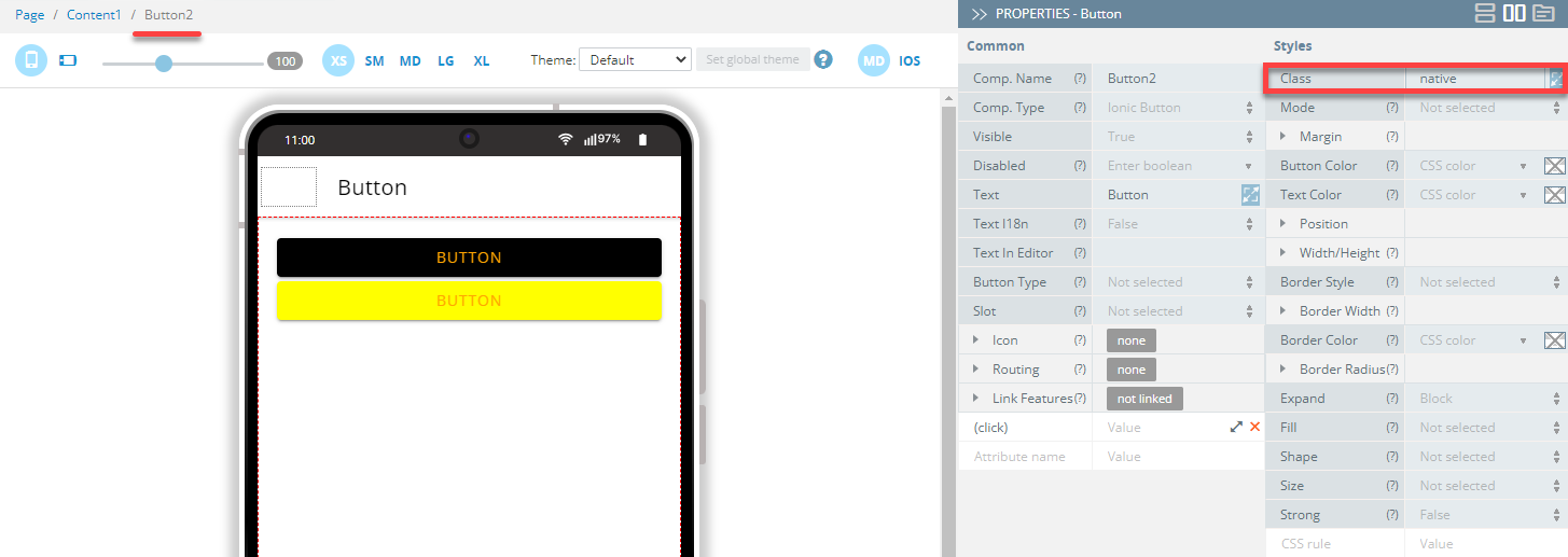
- Indicating the custom
nativeclass for this particular Button component will prioritize it over the common style applied to the other buttons.
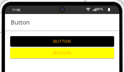
Let's click the TEST button on the App BuilderToolbar once again to see the updated page preview:
Want to Know More?Check here for more information about the ion-button CSS custom properties.
Card Component
In this example, the followingion-card CSS custom properties are used for styling the Card component:
| Name (Shadow Part) | Description | Example |
|---|---|---|
| native | The native HTML button, anchor, or div element that wraps all child elements. | ion-card::part(native) { ….css_styles } |
| Name | Description | Example |
|---|---|---|
| --background | Card background | ion-card { --background: red; } |
| --color | Card color | ion-card { --color: red; } |
- Open the page SCSS panel and add the following code:
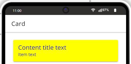
ion-card::part(native) {
    background: yellow;
    color: blue;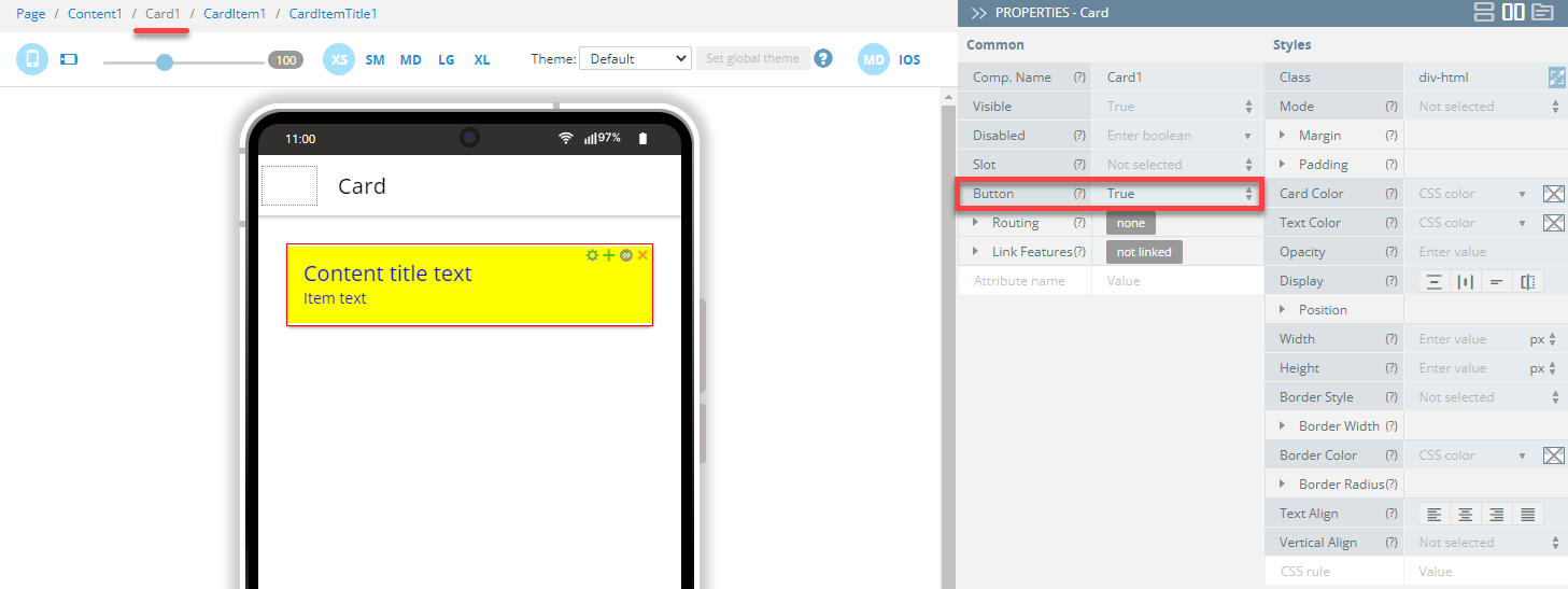
}- To be able to apply
native, go to the page )DESIGN panel and under its PROPERTIES Common tab, set the component's Button property to True:
- Click the TEST button on the App BuilderToolbar to go to the page preview:
Want to Know More?Check here for more information about the ion-card CSS custom properties.
Checkbox Component
In this example, the following ion-checkbox CSS custom properties are used for styling the Checkboxdoc: component:
| Name (Shadow Part) | Description | Example |
|---|---|---|
| container | The container for the check box mark. | ion-checkbox::part(container) { ….css_styles } |
| mark | The checkmark used to indicate the checked state. | ion-checkbox::part(mark) { ….css_styles } |
| Name | Description | Example |
|---|---|---|
| --background | Checkbox background | ion-checkbox { --background: red; } |
| --color | Checkbox color | ion-checkbox { --color: red; } |
| --checkmark-color | Color of the check box checkmark when checked | ion-checkbox { --checkmark-color: red; } |
- Open the page SCSS panel and add the following code:
ion-item::part(native) {
    background: yellow;
    color: black;
    }

ion-checkbox::part(container) {
    background: yellow;
    border-radius: 25%;
      }

ion-checkbox::part(mark) {
    background: red;
    stroke: red;
      }

ion-label.blue-color {
    --background: red;
    --color: blue;
      }
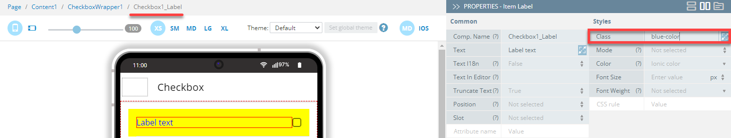
- To specify the label class indicated in the code above, go to the page DESIGN panel, add the Checkbox component to the page, and under its PROPERTIES > Styles tab, set the component's Item Label > Class property to blue-color:
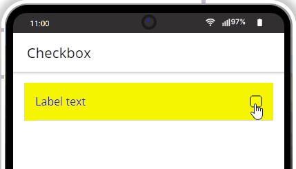
- Click the TEST button on the App BuilderToolbar to go to the page preview:
Want to Know More?Check here for more information about the ion-checkbox CSS custom properties.
Datetime Component
In this example, the following ion-datetime CSS custom properties are used for styling the Datetime component:
| Name (Shadow Part) | Description | Example |
|---|---|---|
| placeholder | The placeholder of the datetime. | ion-datetime::part(placeholder) { ….css_styles } |
| text | The value of the datetime. | ion-datetime::part(text) { ….css_styles } |
| Name | Description | Example |
|---|---|---|
| --padding-bottom | Bottom padding of the datetime | ion-datetime { --padding-bottom: 20px; } |
| --padding-top | The primary background of the datetime component in RGB format. | ion-datetime { --padding-top:20px; } |
- Open the page SCSS panel and add the following code:
ion-item::part(native) {
    background: yellow;
    }

ion-datetime::part(placeholder) {
    background: orange;
    color: black;
      }

ion-datetime::part(text) {
    color: black;
      }

ion-label.blue-color {
        --color: blue;
      }

ion-datetime {
         --padding-bottom: 50px;
         --padding-top:50px;
  }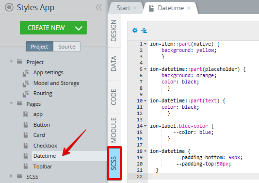
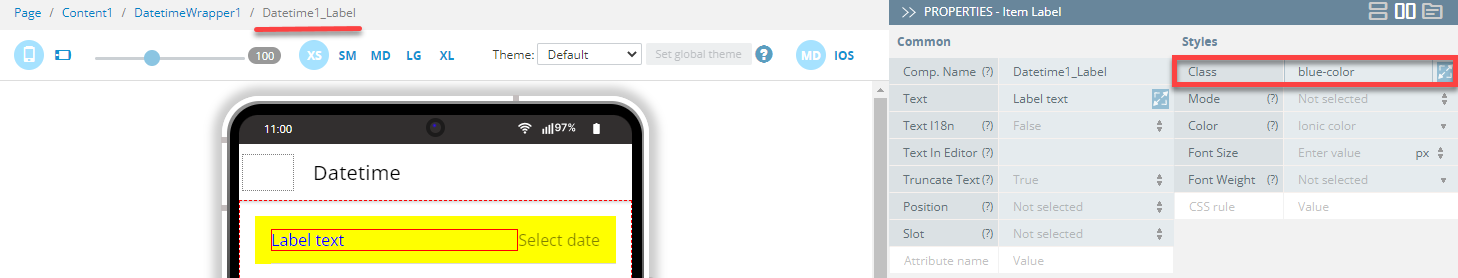
- To specify the label class indicated in the code above, go to the page DESIGN panel, add the Datetime component to the page, and under its PROPERTIES > Styles tab, set the component's Item Label > Class property to blue-color:
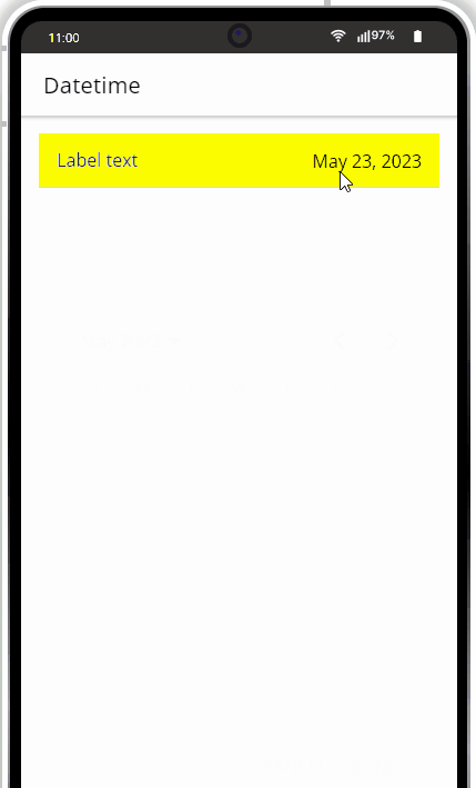
- Click the TEST button on the App BuilderToolbar to go to the page preview:
Want to Know More?Check here for more information about the ion-datetime CSS custom properties.
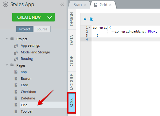
Grid Component
In this example, the --ion-grid-padding CSS custom property is used for styling the Grid component:
| Name | Description | Example |
|---|---|---|
| --ion-grid-padding | Padding for the Grid | ion-grid { --ion-grid-padding: 10px; } |
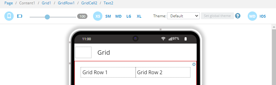
- First, drag the Grid and to the Content area. A grid with one default Grid Row with two child Grid Cell components will be created.
- Now, drag per one Text component to each grid cell and rename them:
- Open the page SCSS panel and add the following code:
ion-grid {
          --ion-grid-padding: 50px;
  }
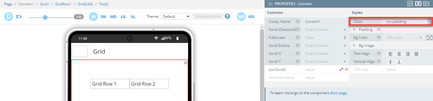
The CSS padding settings should be instantly applied:
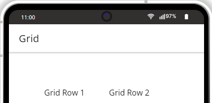
- Click the TEST button on the App BuilderToolbar to go to the page preview:
Want to Know More?Check here for more information about the ion-grid CSS custom properties.
Image Component
In this example, the following ion-img CSS custom properties are used for styling the Image component:
| Name (Shadow Part) | Description | Example |
|---|---|---|
| image | The inner img element. | ion-img::part(image) { ….css_styles } |
- For Avatar:
| Name | Description | Example |
|---|---|---|
| --border-radius | Border radius of the avatar and inner image | ion-img { --background: red; } |
- For Thumbnail:
| Name | Description | Example |
|---|---|---|
| --border-radius | Border radius of the thumbnail | ion-avatar { --border-radius: red; } |
| --size | Size of the thumbnail | ion-thumbnail { --size: red; } |
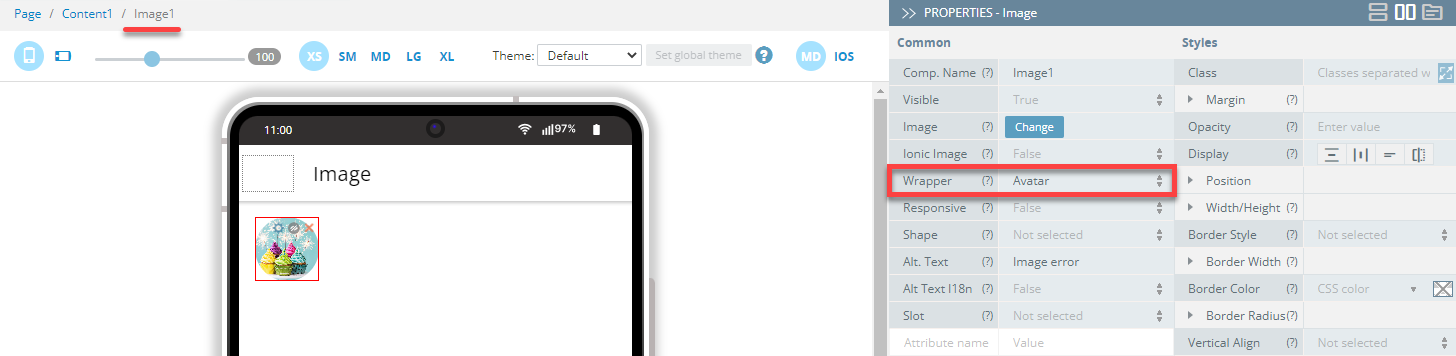
- First, drag the Image component to the Content area.
- Under its PROPERTIES > Common tab, click the Change button to upload the needed image (should be prepared beforehand).
- Then, set the component's Wrapper property to Avatar:
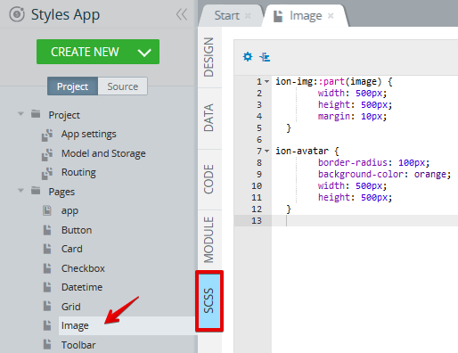
- Now, open the page SCSS panel and add the following code:
ion-img::part(image) {
        width: 500px;
        height: 500px;
        margin: 10px;
  }

ion-avatar {
        border-radius: 100px;
        background-color: orange;
        width: 500px;
        height: 500px;
  }
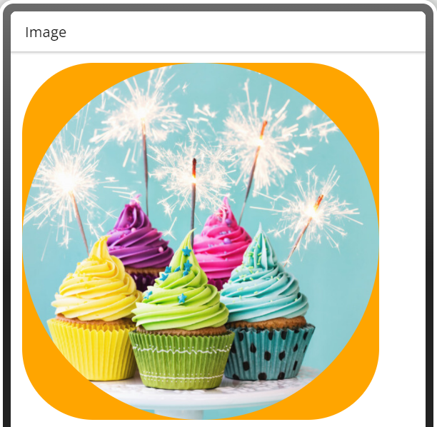
- Click the TEST button on the App BuilderToolbar to go to the page preview:
Want to Know More?Check here for more information about the ion-img CSS custom properties.
Input Component
In this example, the following ion-input CSS custom properties are used for styling the Input component.
| Name | Description | Example |
|---|---|---|
| --background | Input background | ion-input { --background: red; } |
| --color | Color of the input text | ion-input { --color: red; } |
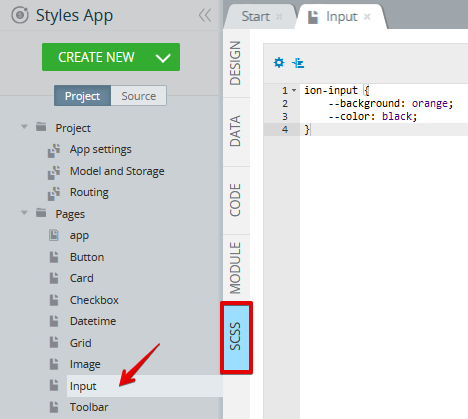
- Open the page SCSS panel and add the following code:
ion-input {
    --background: orange;
    --color: black;
}
The resulting component's UI is as follows:
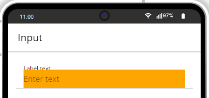
- Now, for experimenting, let's add the following to the existing code:
ion-item::part(native) {
    background: yellow;
    }

ion-label.rebeccapurple-color {
    --color: rebeccapurple;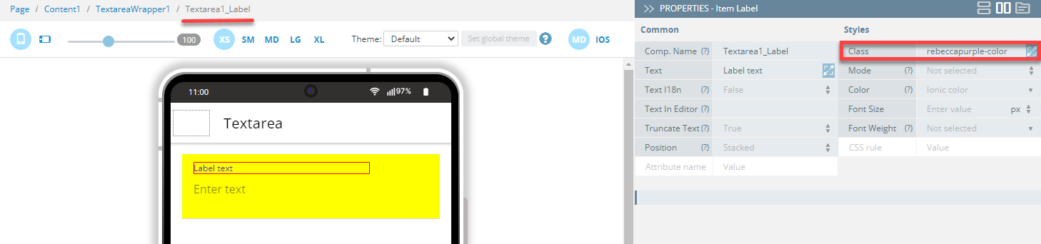
}- Also, to specify the label class indicated in the code above, go to the page DESIGN panel and under its PROPERTIES > Styles tab, set the component's Label > Class property to rebeccapurple-color:
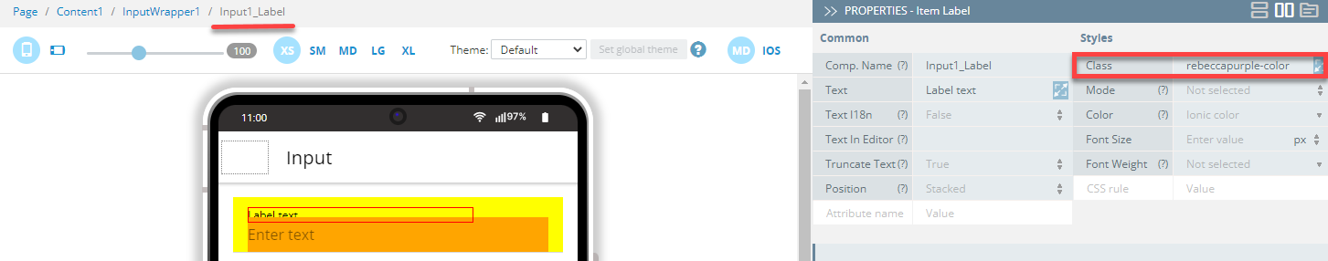
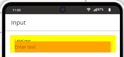
- Click the TEST button on the App BuilderToolbar to go to the updated page preview:
Want to Know More?Check here for more information about the ion-input CSS custom properties.
Radiobutton Component
In this example, the following ion-range CSS custom properties are used for styling the Radiobutton component:
| Name (Shadow Part) | Description | Example |
|---|---|---|
| container | The container for the radio mark. | ion-radio::part(container) { ….css_styles } |
| mark | The checkmark or dot used to indicate the checked state. | ion-radio::part(mark) { ….css_styles } |
| Name | Description | Example |
|---|---|---|
| --border-radius | Border radius of the radio | ion-radio { --border-radius: red; } |
| --color | Color of the radio | ion-radio { --color: red; } |
| --color-checked | Color of the checked radio | ion-radio { --color-checked: red; } |
- First, drag the Radiogroup component to the Content area.
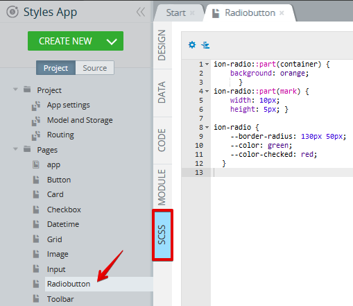
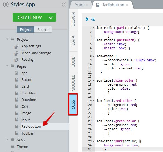
- Then, open the page SCSS panel and add the following code:
ion-radio::part(container) {
    background: orange;
      }
ion-radio::part(mark) {
    width: 10px;
    height: 5px; }

ion-radio {
    --border-radius: 130px 50px;
    --color: green;
    --color-checked: red;
  }
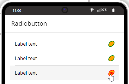
Here is what the page UI looks like when testing on preview:
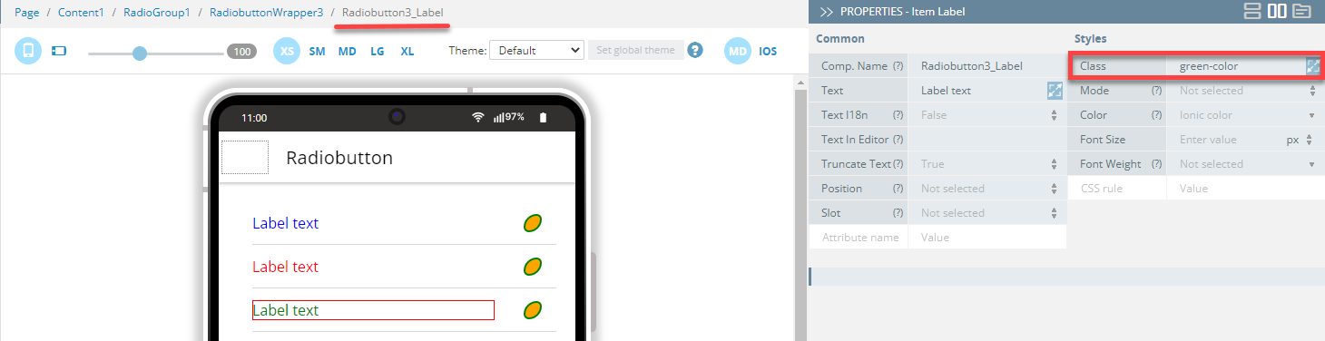
- If you are additionally interested in different styles for the different Radiobutton labels, open the SCSS panel again and add the following code:
ion-label.blue-color {
    --background: red;
    --color: blue;
      }

ion-label.red-color {
    --background: red;
    --color: red;
      }

ion-label.green-color {
    --background: red;
    --color: green;
}- Now, under the PROPERTIES > Styles tab, one by one, select the needed buttons, and set their Label > Class properties to their corresponding classes:
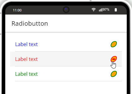
- Click the TEST button on the App BuilderToolbar to go to the updated page preview. The UI will change to:
- Finally, if you also need to add background to your radios, you can add
nativeto the existing code under the page SCSS panel:
ion-item::part(native) {
    background: yellow;
    }
With the above code added, the page should look like this:
- Once again, click the TEST button on the App BuilderToolbar to go to the updated page preview. The final page UI is like this:
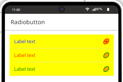
Want to Know More?Check here for more information about the ion-radio CSS custom properties.
Range Component
In this example, the following ion-range CSS custom properties are used for styling the Rangedoc: component:
| Name (Shadow Part) | Description | Example |
|---|---|---|
| bar | The inactive part of the bar | ion-range::part(bar) { ….css_styles } |
| bar-active | The active part of the bar. | ion-range::part(bar-active) { ….css_styles } |
| Name | Description | Example |
|---|---|---|
| --bar-background | Background of the range bar | ion-range { --bar-background: red; } |
| --height | Height of the range | ion-range { --height: 20px; } |
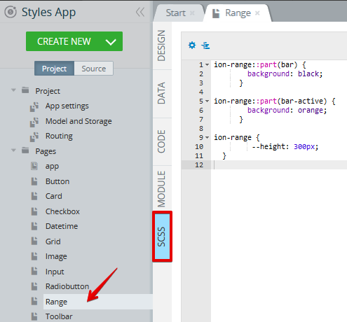
- Open the page SCSS panel and add the following code:
ion-range::part(bar) {
        background: black;
      }

ion-range::part(bar-active) {
        background: orange;
      }

ion-range {
         --height: 300px;
  }
- Add the Range component to the page and click the TEST button on the App BuilderToolbar to open the page preview:
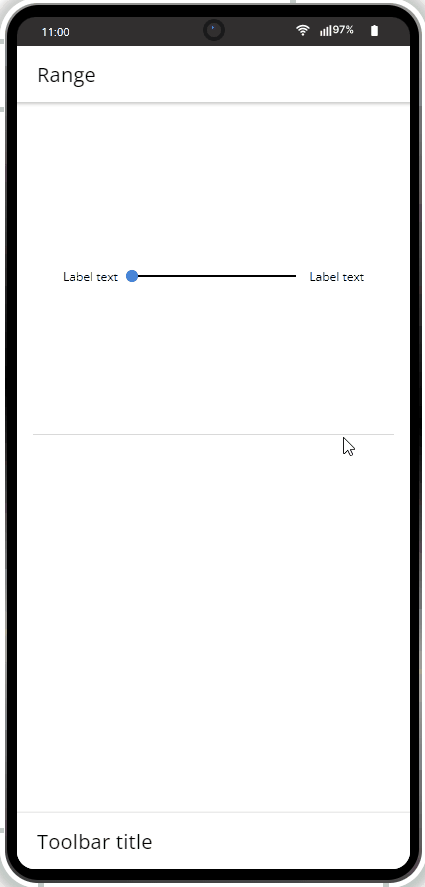
Want to Know More?Check here for more information about the ion-range CSS custom properties.
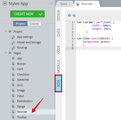
Reorder Component
In this example, the followingion-reorder CSS custom properties are used for styling the Reorder component:
| Name | Description | Example |
|---|---|---|
| icon | The icon of the reorder handle (uses ion-icon). | ion-reorder::part(icon) { ….css_styles } |
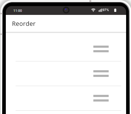
- First, drop the Reordergroup component to the Content area. A group of three default Reorder components will be created.
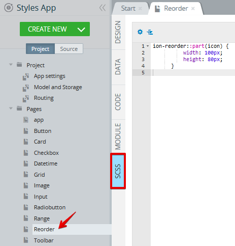
- Open the page SCSS panel and add the following sample code:
ion-reorder::part(icon) {
          width: 100px;
          height: 80px;
      }
- Click the TEST button on the App BuilderToolbar to open the page preview:
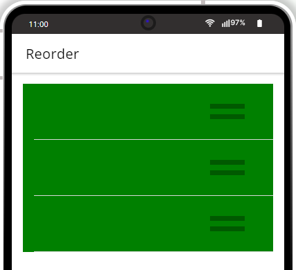
- If you need to add some background to your items, you can add
nativeto the existing code under the page SCSS panel:
ion-item::part(native) {
    background: green;
    }
- Click TEST once again to see the updated preview:
Want to Know More?Check here for more information about the ion-reorder CSS custom properties.
Search Component
In this example, the followingion-searchbar CSS custom properties are used for styling the Search component:
| Name | Description | Example |
|---|---|---|
| --background | Background of the searchbar input | ion-searchbar { --background: black; } |
| --color | Color of the searchbar text | ion-searchbar { --color: red; } |
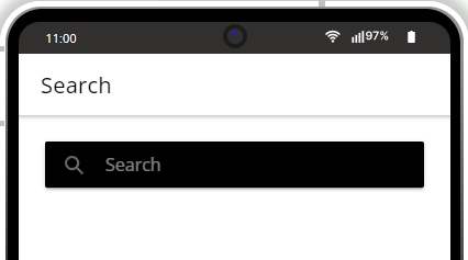
- Open the page SCSS panel and add the following code:
ion-searchbar {
      --background: black;
      --color: white
  }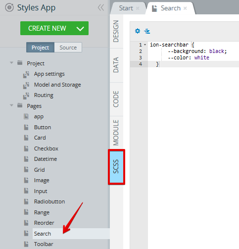
- Add the Search component and click the TEST button on the App BuilderToolbar to open the page preview:
Want to Know More?Check here for more information about the ion-searchbar CSS custom properties.
Select Component
In this example, the followingion-select CSS custom properties are used for styling the Selectdoc:doc: component:
| Name (Shadow Part) | Description | Example |
|---|---|---|
| icon | The select icon container. | ion-select::part(icon) { ….css_styles } |
| placeholder | The text displayed in the select when there is no value. | ion-select::part(placeholder) { ….css_styles } |
| text | The displayed value of the select. | ion-select::part(text) { ….css_styles } |
| Name | Description | Example |
|---|---|---|
| --padding-bottom | Bottom padding of the select | ion-select { --padding-bottom: 20px; } |
| --padding-top | Top padding of the select | ion-select { --padding-top: 20px; } |
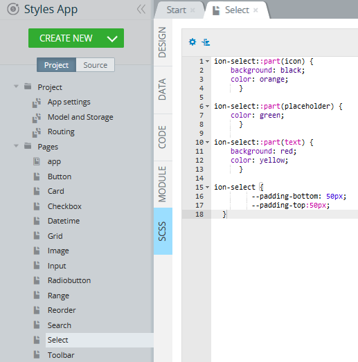
- Open the page SCSS panel and add the following code:
ion-select::part(icon) {
    background: black;
    color: orange;
      }

ion-select::part(placeholder) {
    color: green;
      }

ion-select::part(text) {
    background: red;
    color: yellow;
      }

ion-select {
         --padding-bottom: 50px;
         --padding-top:50px;
  }
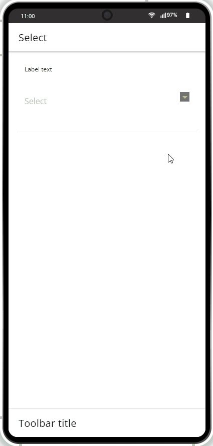
- Add the Select component and click the TEST button on the App BuilderToolbar to open the page preview:
Want to Know More?Check here for more information about the ion-select CSS custom properties.
Spinner Component
In this example, the followingion-spinner CSS custom properties are used for styling the Spinnerdoc: component:
| Name | Description | Example |
|---|---|---|
| --color | Color of the spinner | ion-spinner { --color: red; } |
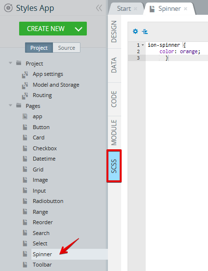
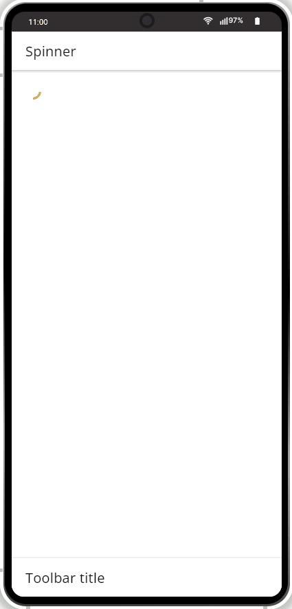
- Open the page SCSS panel and add the following code:
ion-spinner {
    color: orange;
      }
- Add the Spinner component to the page and click the TEST button on the App BuilderToolbar to open the page preview:
Want to Know More?Check here for more information about the ion-spinner CSS custom properties.
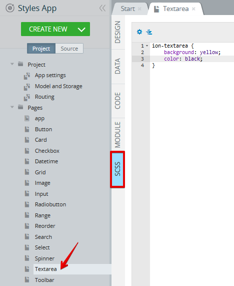
Textarea Component
In this example, the followingion-textarea CSS custom properties are used for styling the Textareadoc: component:
| Name | Description | Example |
|---|---|---|
| --background | Background of the textarea | ion-textarea { --background: red; } |
| --color | Color of the text | ion-textarea { --color: red; } |
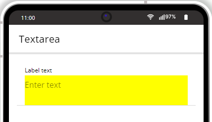
- Open the page SCSS panel and add the following code:
ion-textarea {
    background: yellow;
    color: black;
}
- Add the Textarea component to the page and click the TEST button on the App BuilderToolbar to open the page preview:
- Now, for experimenting with the element's label and background, let's add the following to the existing code:
ion-item::part(native) {
    background: yellow;
    }

ion-label.rebeccapurple-color {
    --color: rebeccapurple;
      }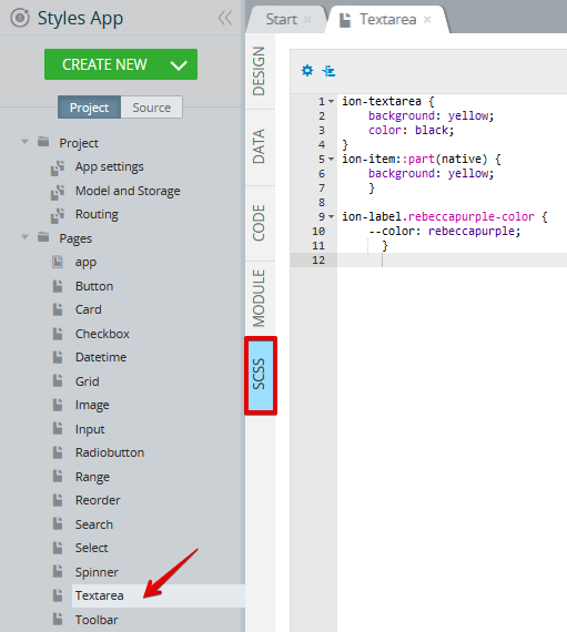
4 Also, to specify the label class indicated in the code above, go to the page DESIGN panel and under its PROPERTIES > Styles tab, set the component's Label > Class property to rebeccapurple-color:
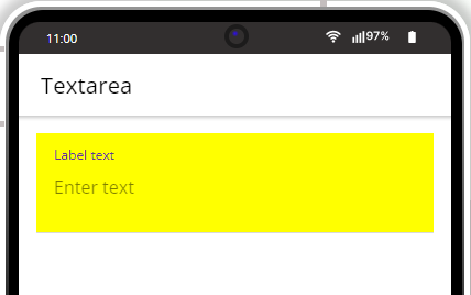
- Click the TEST button on the App BuilderToolbar to go to the updated page preview:
Want to Know More?Check here for more information about the ion-textarea CSS custom properties.
Toggle Component
In this example, the followingion-toggle CSS custom properties are used for styling the Toggle component:
| Name (Shadow Part) | Description | Example |
|---|---|---|
| handle | The toggle handle, or knob, used to change the checked state. | ion-toggle::part(handle) { ….css_styles } |
| track | The background track of the toggle. | i on-toggle::part(track) { ….css_styles } |
| Name | Description | Example |
|---|---|---|
| --background | Background of the toggle | ion-toggle { --background: red; } |
| --background-checked | Background of the toggle when checked | ion-toggle { --background-checked: black; } |
- Open the page SCSS panel and add the following code:
ion-toggle::part(handle) {
    background: black;
    color: orange;
}

ion-toggle::part(track) {
    background: red;
}

ion-label.rebeccapurple-color {
    --color: rebeccapurple;
      }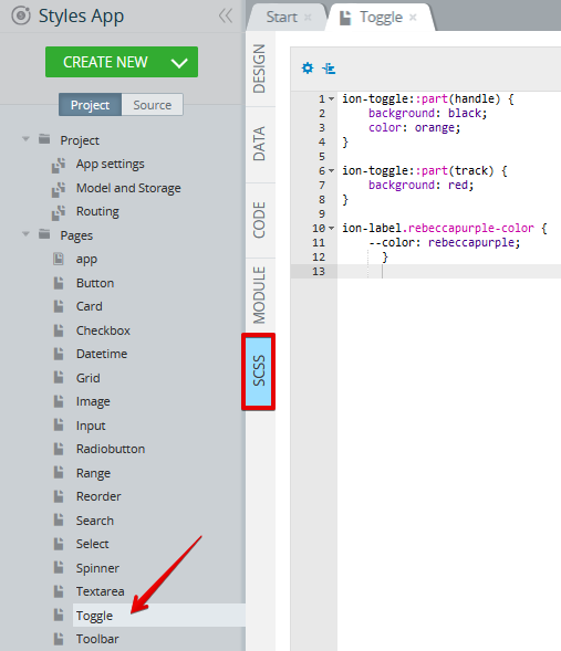
- To specify the label class indicated in the code above, go to the page DESIGN panel and under its PROPERTIES > Styles tab, set the component's Label > Class property to rebeccapurple-color:
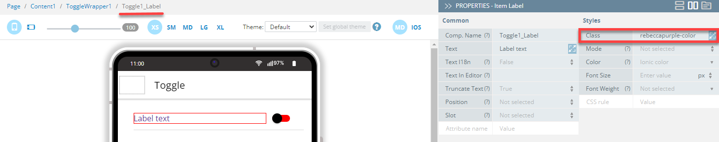
- Click the TEST button on the App BuilderToolbar to open the page preview:
Want to Know More?Check here for more information about the ion-toggle CSS custom properties.
Toolbar Component
In this example, the followingion-toolbar CSS custom properties are used for styling the Toolbar component:
| Name | Description | Example |
|---|---|---|
| --background | Background of the toolbar | ion-toolbar { --background: red; } |
| --color | Color of the toolbar text | ion-toolbar { --color: black; } |
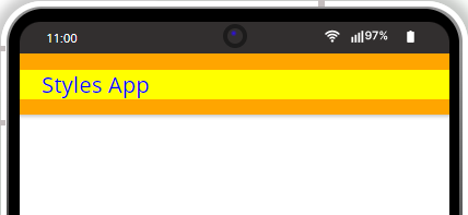
- Open the page SCSS panel and add the following code:
ion-toolbar {
    --background: orange;
    --color: blue;
}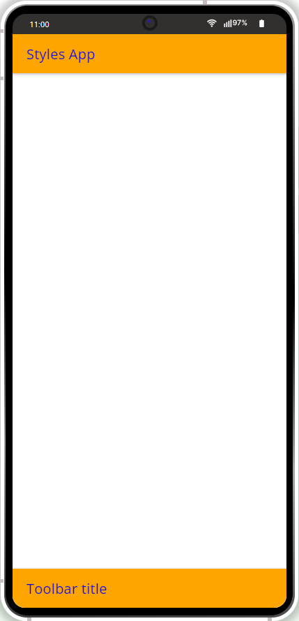
- If you additionally need to differentiate the Toolbar title from the Toolbar, go back to the SCSS panel and paste the following code below the existing lines:
.background-color-yellow {
    background-color: yellow !important;

}
- Additionally, you will need to open the Toolbar title PROPERTIES > Styles tab and specify its Class as background-color-yellow:
- Click the TEST button on the App BuilderToolbar to open the page preview. The resulting toolbar UI will look like this:
Want to Know More?Check here for more information about the ion-toolbar CSS custom properties.
Applying Combinations of Above Solutions
You can try different combinations of the solutions described above, for example, use custom CSS together with additional selectors and/or !important for achieving the needed UI components' view.
Updated 12 months ago