Ionic Property: Disabled
How to set up the Disabled property for your mobile app
Introduction
The Disabled property allows us to visually influence UI components on the preview.
It is available for the following UI components:
By default, the Disabled property value field for a newly added UI component is empty which stands for false but can be set to true, false as well as via variable values:
Using Disabled
There are several ways of modifying the Disabled property: in the PROPERTIES view, via the EVENTS tab, or by using Mapping, or Rest Service.
Let's experiment applying the Disabled property to different Ionic UI components.
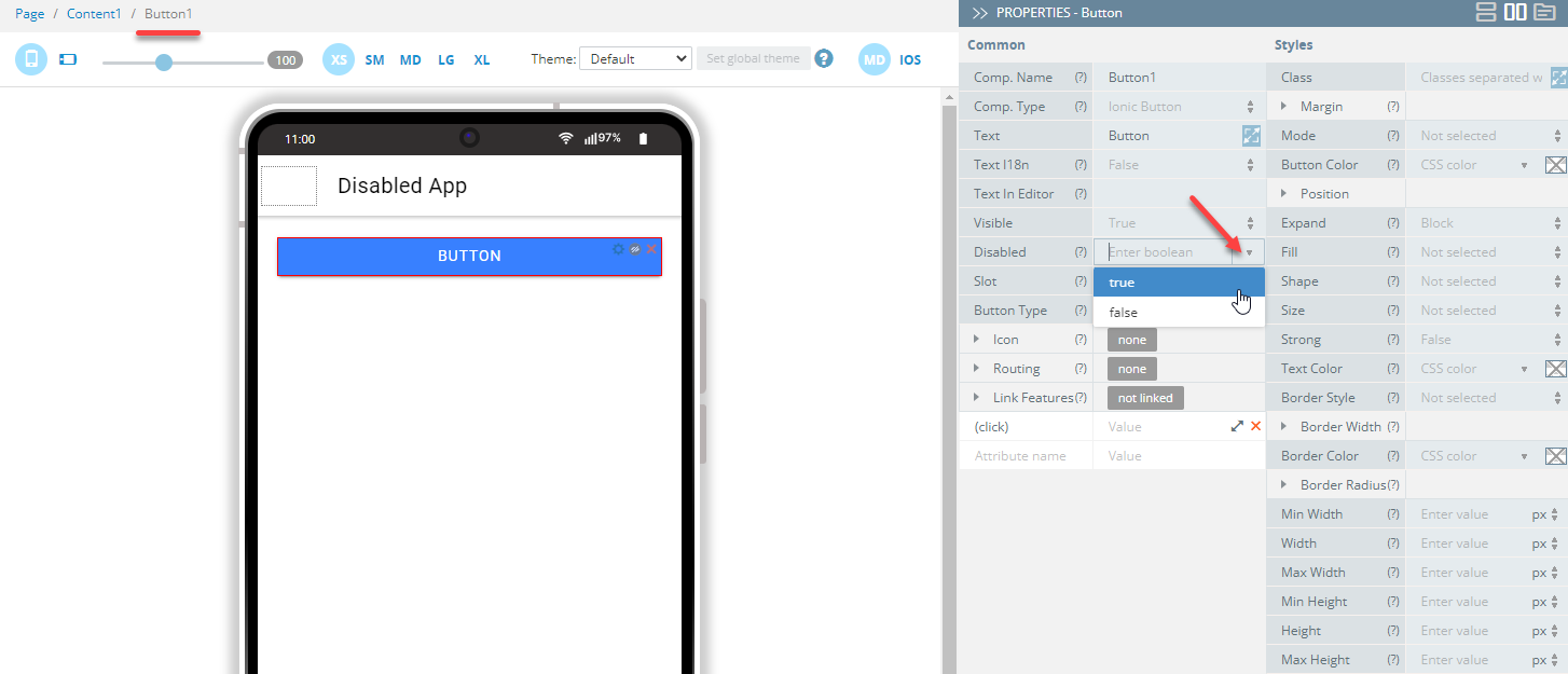
Working with PROPERTIES View
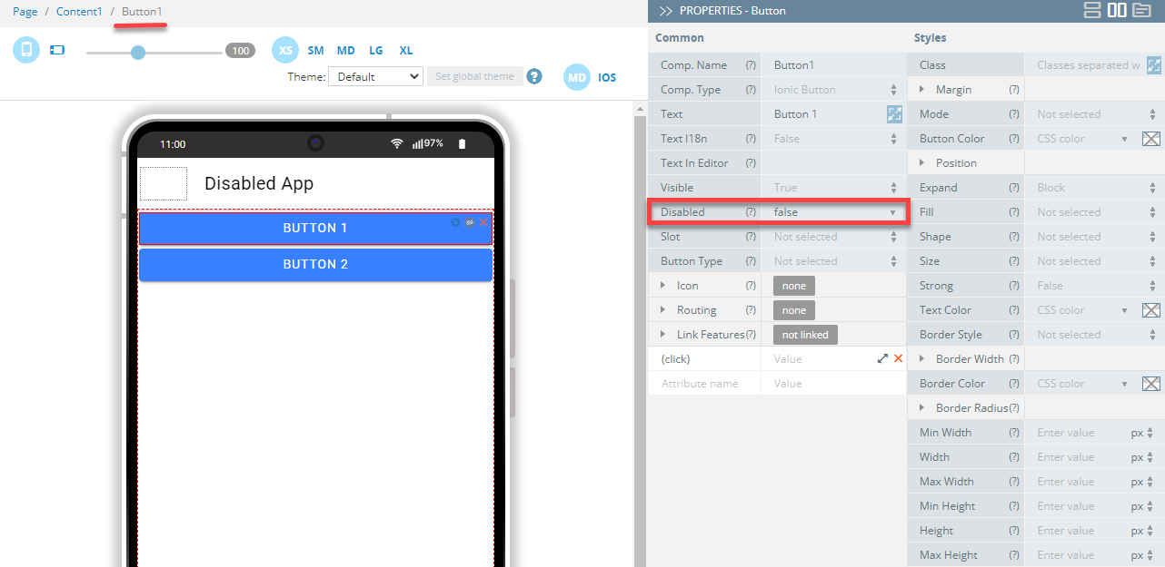
Setting the Disabled property to true is the easiest way to disable the UI component.
- Under the PROPERTIES view, set the Disabled to true so that the component (here, Button1) visually appear as disabled.
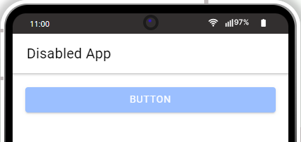
- If you now click the TEST button in the App Builder Toolbar to run the app in the preview, you will see that the button is disabled:
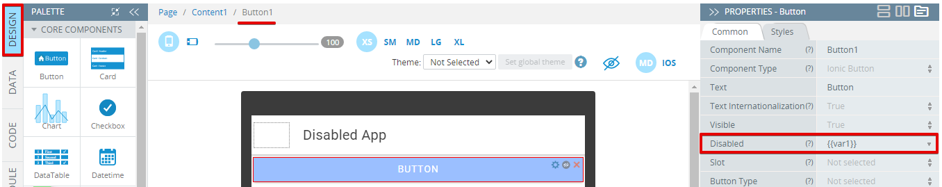
Working with Variables
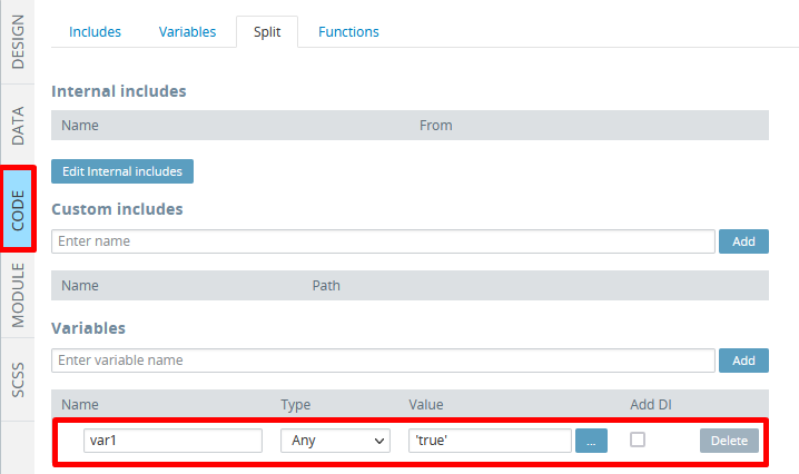
- Open the page CODE panel and create a new variable there, e.g. var1. Fill it in with some value, e.g.
'true':

- Go to the page DESIGN panel, select the button, and under the Common properties tab, fill the Disabled field value as {{var1}}.
- You are now ready to test your app: click the TEST button in the App Builder Toolbar to run the app in the preview to launch the app in the browser and check the button disabled:

Working with Set property Action
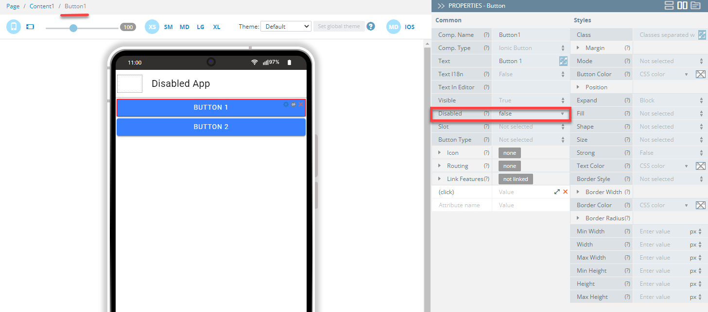
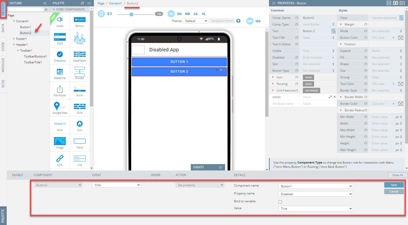
- From the PALETTE, drag and drop two Button components to the screen.
- Under the PROPERTIES view, define Button1 setting its Common > Disabled property to false:
- Then, unfold the EVENTS tab, and select Button2 (you can also use the OUTLINE view to locate the needed component).
- For its Click event, select the Set property action from the drop-down list and select Button1 as the Component name.
- Leave the Property name parameter as Disabled and Value as True and click Save:
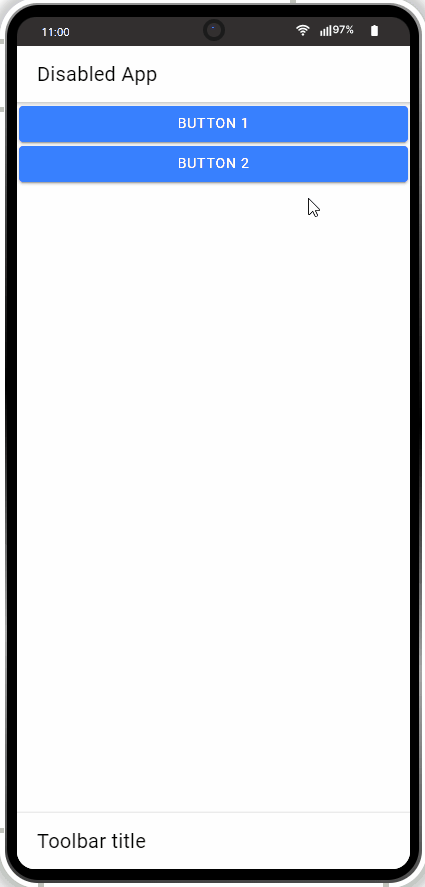
Now, test the app.
If you press Button2 on preview, Button1 should visually appear as disabled:
Working with Events and Variables
Using Set property with Binding to Variable
For events, you can also insert values from variables.
- Drag two Button components and drop them to the screen.
- Under the PROPERTIES view, set the Common > Disabled property to false for Button1:
- Open the page CODE panel and create a new variable there, e.g. var1. Fill it in with some value, e.g.
'true':
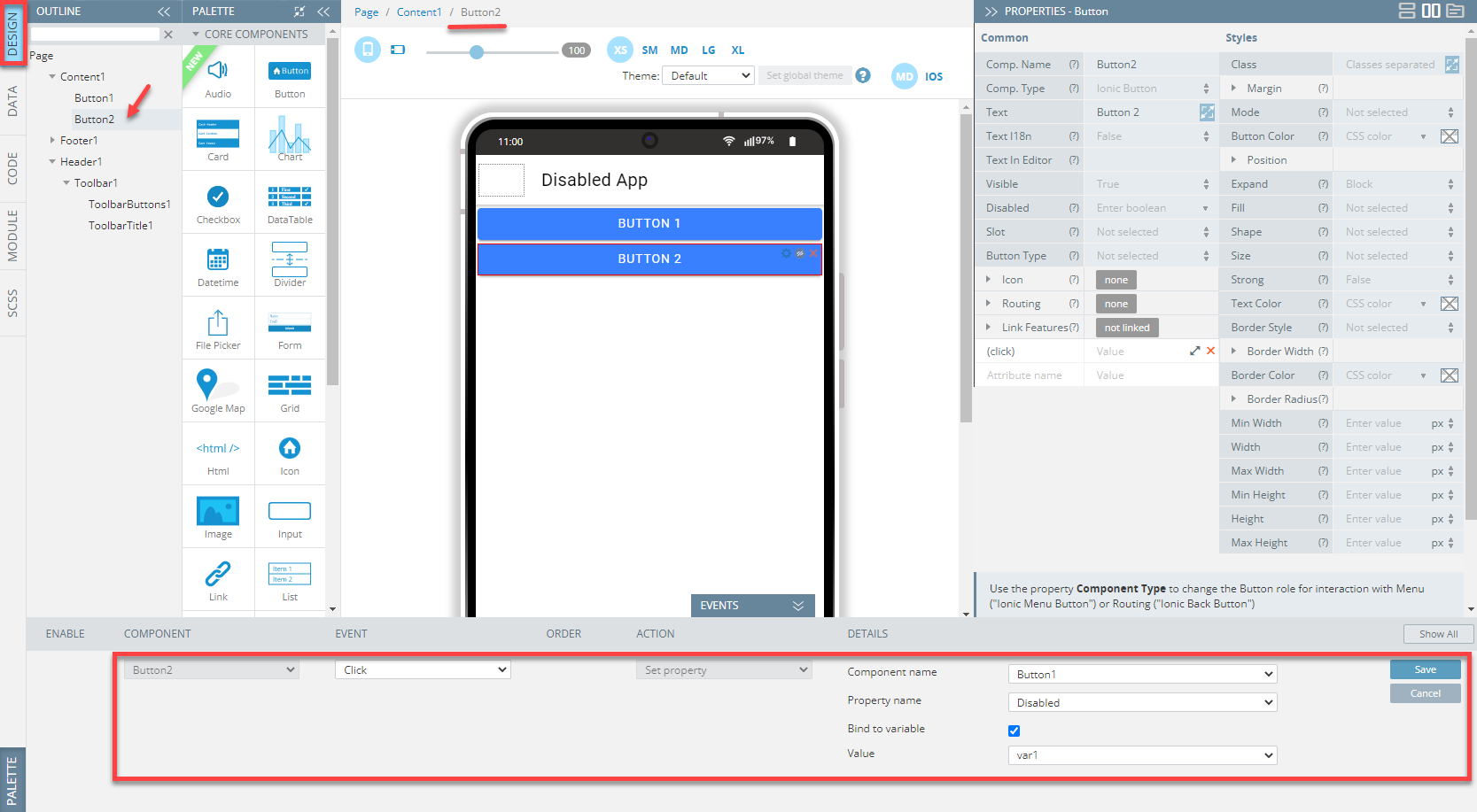
- Then, let's go to the page DESIGN panel and unfold the EVENTS tab.
- With Button2 selected, select the Set property action from the drop-down list for its Click event and then select Button1 as the Component name.
- Now, define the Property name parameter as Disabled, click the Bind to variable check box, set the Value field to var1, and save:
Now, you can test the app.
Again, if you press Button2 on preview, Button1 should visually appear as disabled:

Note!If you use the Bind to variable option, after the variable changes, it is picked up on the fly.
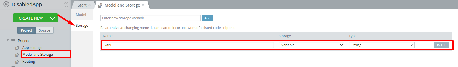
A storage variable can also be set under Project view > Project > Model and Storage > Storage:
Using [(ngModel)] with Binding to Variable
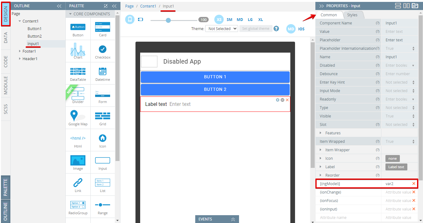
- Drag and drop two Buttons and one Input component to the screen.
- Open the page CODE panel and create a new variable there, e.g. var2. Fill it in with some value, e.g.
'true': - Under the PROPERTIES Common tab, set the [(ngModel)] field of the Input component to var2:
- Then, unfold the EVENTS tab, for Button1 Click event, select the Set property action from the drop-down list and select Button2 as the Component name.
- Define the Property name parameter as Disabled, click the Bind to variable check box, set the Value field to var2, and save:

When testing, after we click Button1 and then enter some value into the input field, this value will be written to the var2 variable.
Thus, every time when some data is entered the value is not empty (True) and the Button2 component becomes disabled. As soon as the input entry is cleared, the button automatically re-enables:
Working with Mapping Action
- Drag and drop one Button and one Input component to the screen.
- Then, unfold the EVENTS tab, and for the Click event of the Input component, and select the Mapping action from the drop-down:
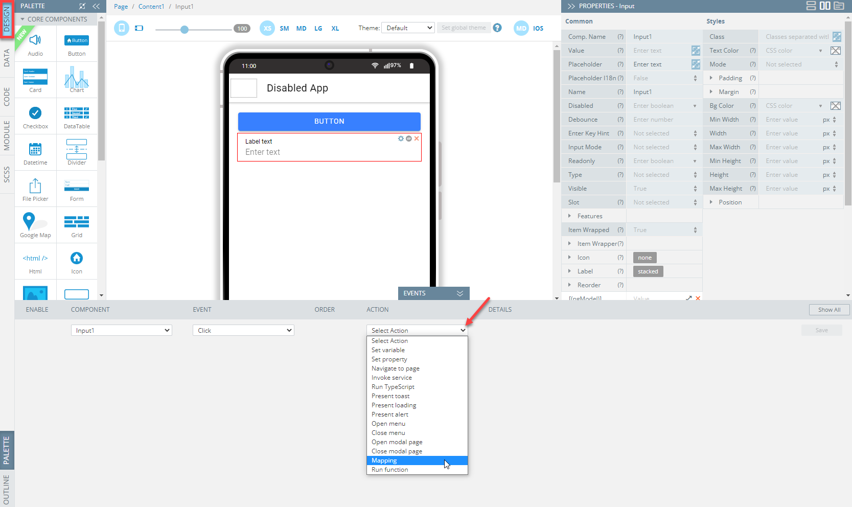
- Then, create the following mapping and save:
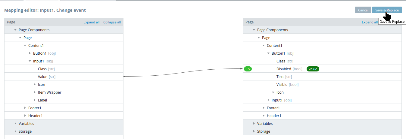
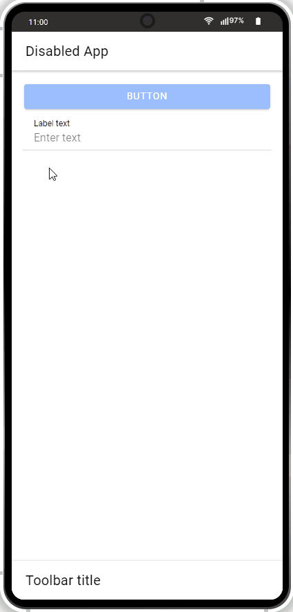
Save your work and test.
Entering some input data on the preview, you will make the button visually appear as disabled:
Working with TS editor
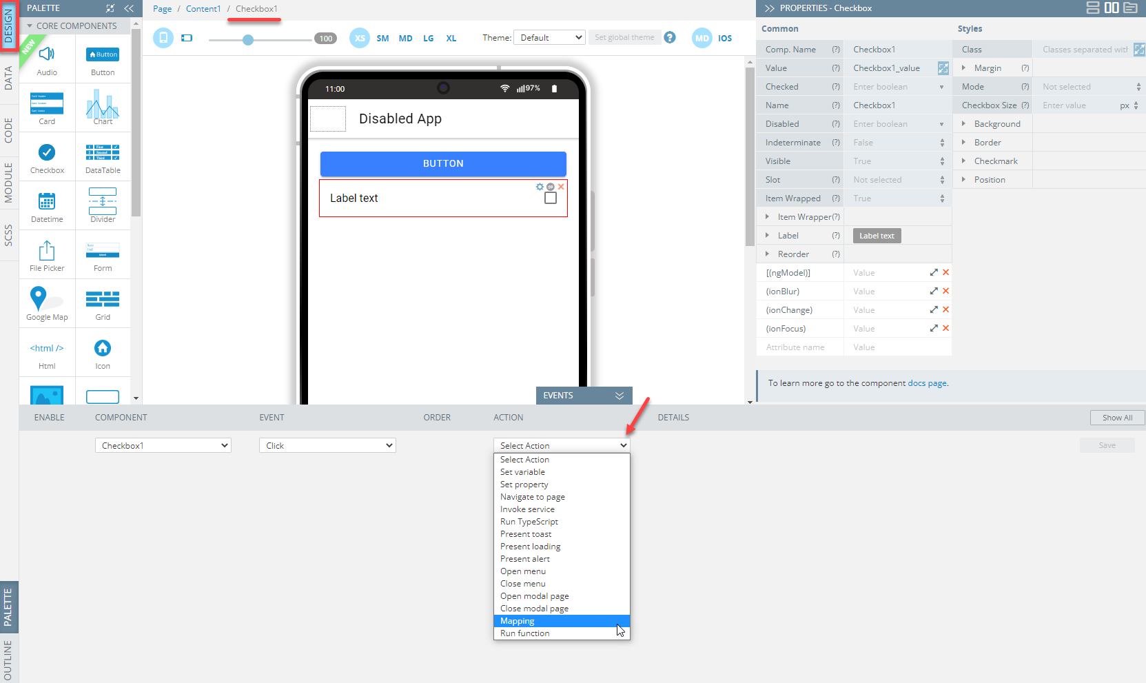
Another way to apply mapping is via using the TS editor.
- Drag one Button and one Checkbox component and drop them to the screen.
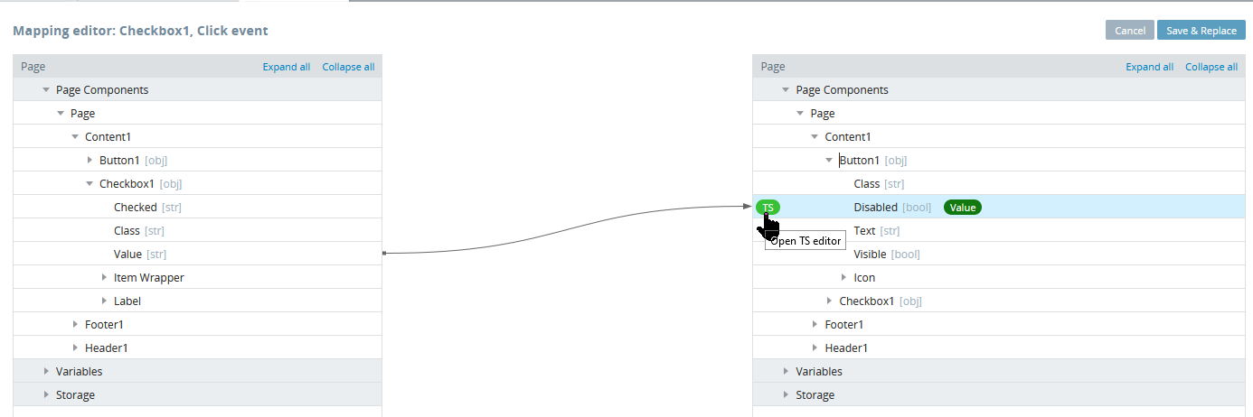
- Unfold the EVENTS tab and for the Click event of the Checkbox component, select the Mapping action from the drop-down actions list:
- In the open Mapping editor window, create the following mapping then, click the green TS button next to Disabled to open the TS editor:
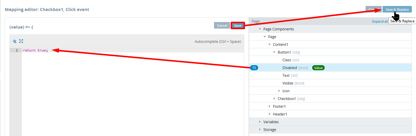
- In the TS editor window, enter the custom TS
return true;then click Save and Save & Replace:
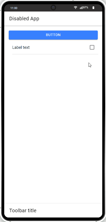
Save the app and click TEST.
If you click the check box on preview, the button will visually appear as disabled:
Working with Services Mapping
- Drag a Button component and drop it to the screen.
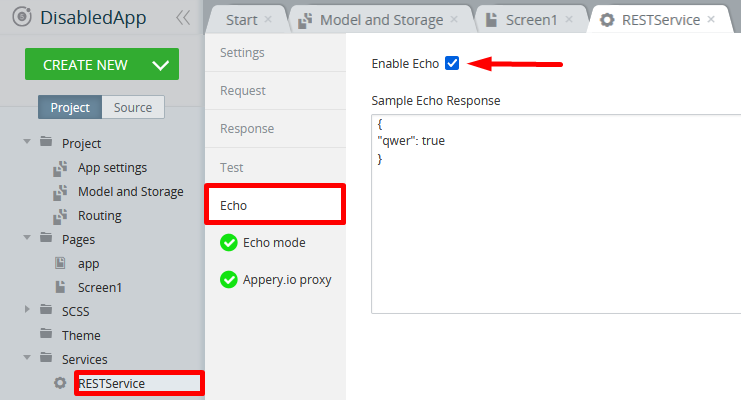
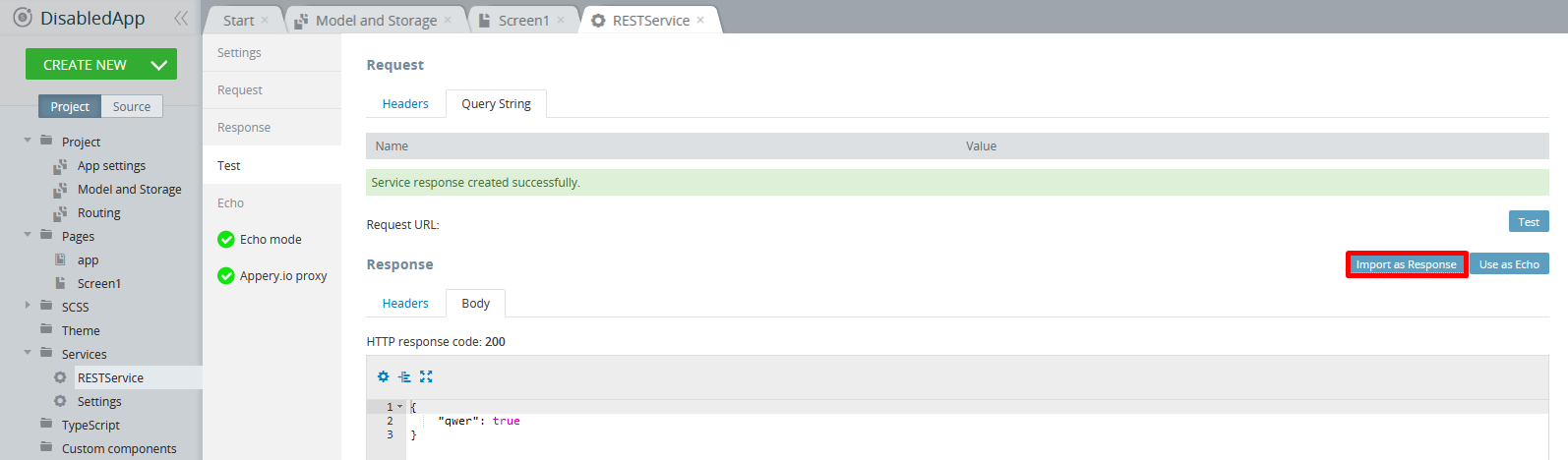
- Create a service: CREATE NEW> Service> RestService and click Create Service.
- In the service, select the Echo tab, click the Enable Echo check box, and enter the sample echo response (
{ “qwer”:true }) and save your work:
- Switch to the service Test tab and enter the below test data in the Query String > Body tab:
{
"qwer": true
}- Now, click Import as Response and the HTTP response code: 200 message appears:
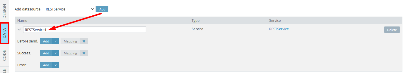
- Go to Screen1 DATA panel, click the Add button to add RESTservice1 to the app:
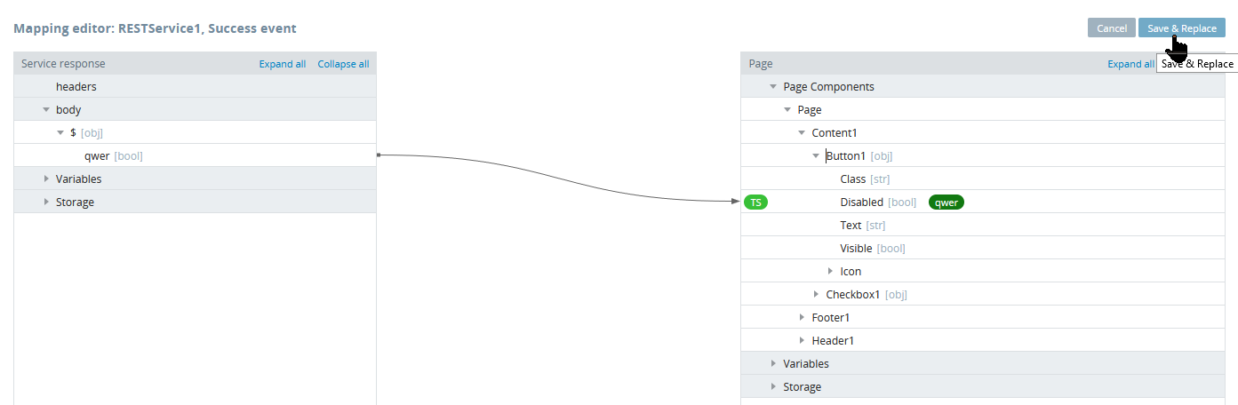
- In the open Mapping editor window, click the service Success > Mapping button, create the following mapping and click Save & Replace:
- Now, go to the page DESIGN panel and unfold the EVENTS tab.
- For the Click event of the Button1 component, select the Invoke service action, select RESTservice1 from the drop-down, and save:
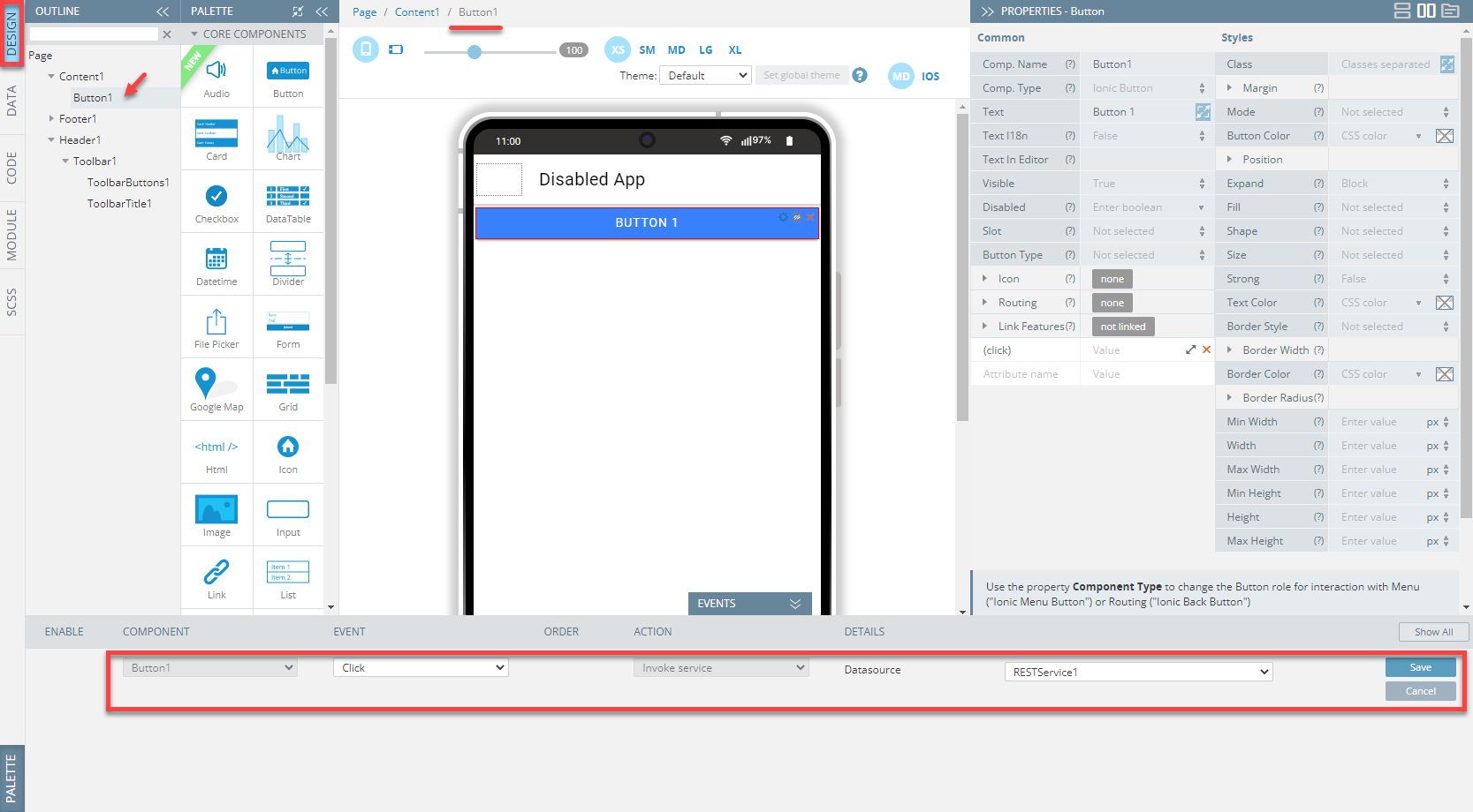
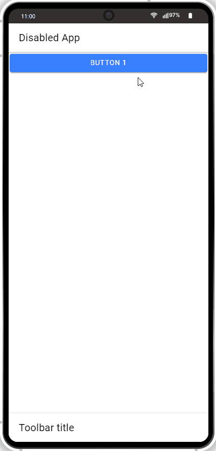
Click the TEST button in the App Builder Toolbar to run the app in the preview, then click the button to see that it gets disabled:
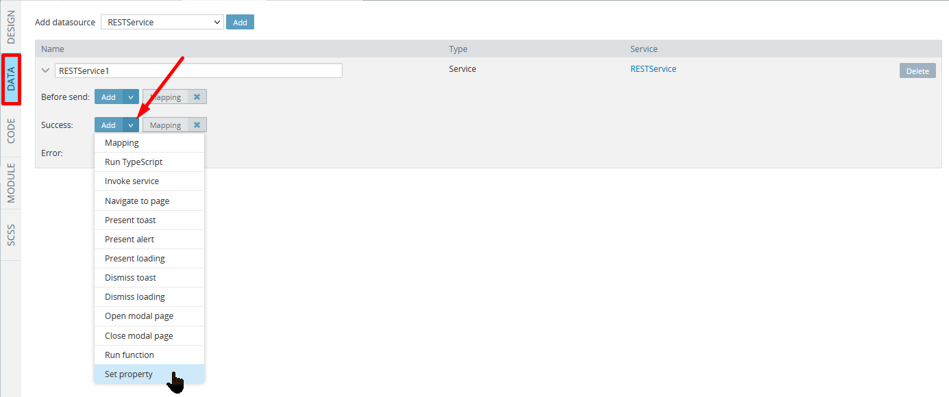
Also, some properties can be set using the EVENTS tab.
- Switch back to the Screen1 DATA panel, click the Add button for Success and, from the drop-down, select the Set property action for another service success event:
- Under the EVENTS tab, define the event details as follows and save:
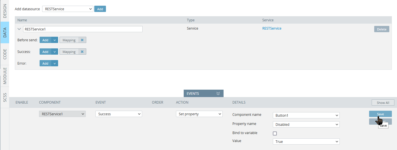
You can select True or False for the service Value or enable Bind to variable check box with further selecting the variable as shown above.
Once saved, a new action will be instantly added to the right of the Success datasource event and listed in the EVENTS tab along with the other events:
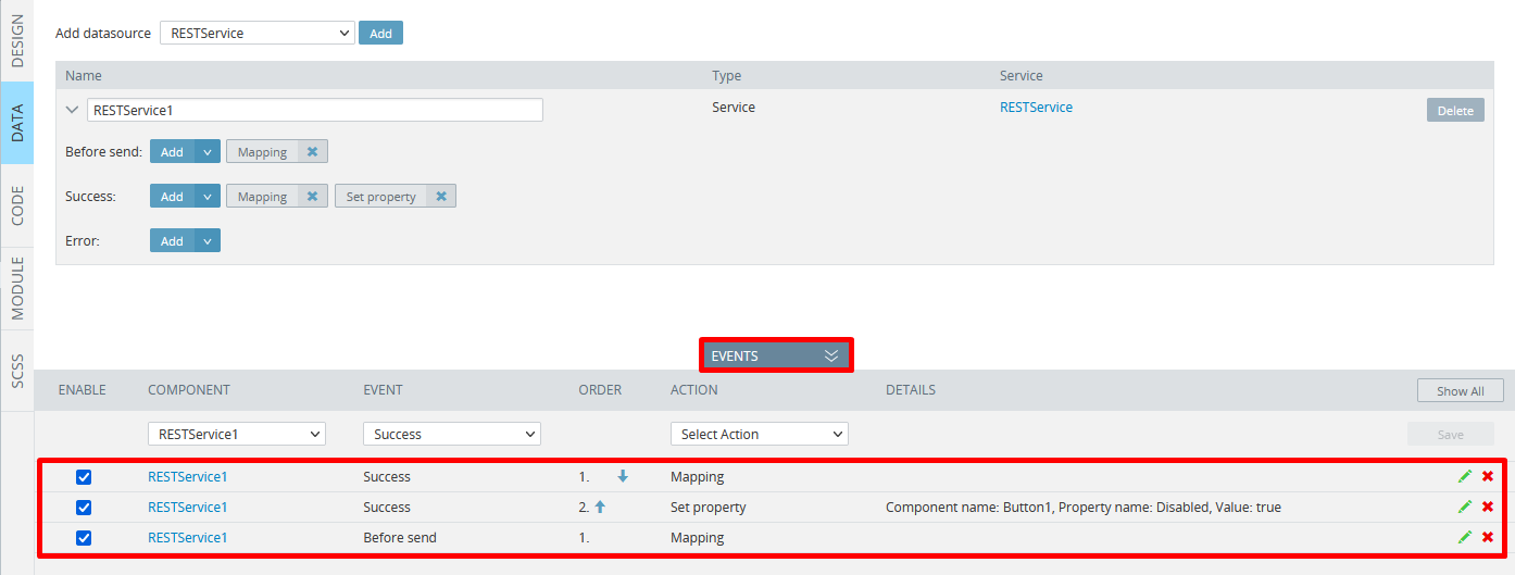
Ready! You can test the service now:
