App Builder Overview
This document gives an overview of the Appery.io visual App Builder tools and options
Introduction
App Builder is the main development tool where the app UI is created and backend services are integrated. Our visual App Builder uses Ace editor for its code editor.
This document introduces all the functions of the Appery.io App Builder and provides detailed information about how to start working with it.
Appery.io Visual App Builder Overview: Getting Started VideoYou can also check this video for instructions on how to get started developing with the Appery.io visual App Builder:
Appery.io Education Video GuideIt's also a great idea to check out our Education Video Guide where you will learn how to create a stunning UI for your first mobile app, how to add the needed features to it, debug and test it, and much more…
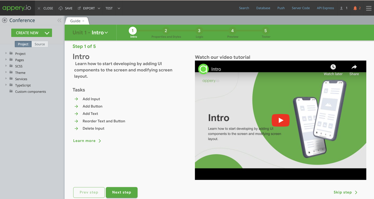
When you create a new or open an existing project in the Appery.io App Builder, the Guide tab opens by default:Note that this works for async methods only.
This page consists of three main parts: Toolbar (top), Project view (to the left), and Project tabs (those will be the pages created for this project).
Toolbar
The Appery.io Toolbar has the following buttons:

- CLOSE – click to close the project and open the Apps tab. If you have made any changes to the project, you will be asked whether the changes should be saved.
- SAVE – click to save the project. Don’t forget to click this when you edit the project.
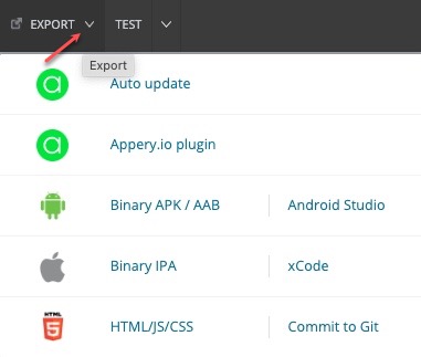
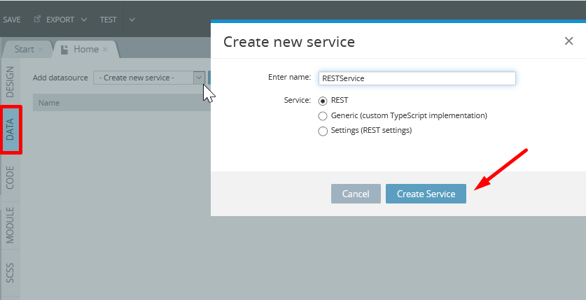
- EXPORT – click to select the file type you need for exporting the project to another platform or package it as a private plugin or enable auto update:
- TEST – click the button to preview the app in a desktop web browser.
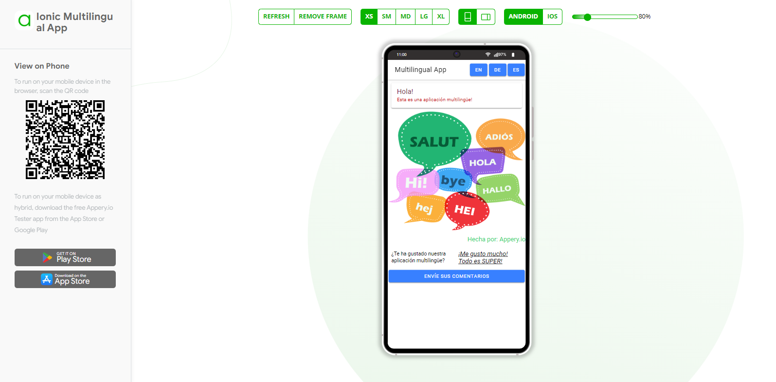
Click TEST to open the default app preview page in a new desktop web browser tab:
If you want to edit testing settings, click the arrow icon next to the TEST button:
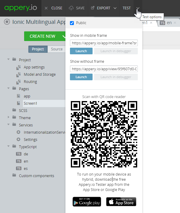
Appery.io Tester AppA great option to quickly test the app on the device is to use our Appery.io Tester app.
Here are the details how you can use it.
.png")
Appery.io Tester App
Check Public if you want to share the app link with other people, and copy the link. You can also scan the QR-code.
The links located to the right of the Toolbar redirect to the following platform backend tabs:
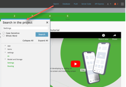
Search - click to open the Search in the project window. The search works everywhere: it searches on screens, it searches in styles, it searches in code.
You can enable the options Case Sensitive and Whole Word to refine your search results.
Appery.io Visual App Builder FeaturesYou can check how search works in this video about the Appery.io visual App Builderfeatures:
Database – click to open the Databases dashboard in a new window. You can work with your databases without closing the project.
Push – click to open the Push Notifications settings in a new window. You can work with your push notification services without closing the project.
Server Code – click to open the Server Code tab in a new window. You can work with your server scripts without closing the project.
API Express – click to open the API Express tab in a new window. You can work with your API Express projects and connections without closing the project.
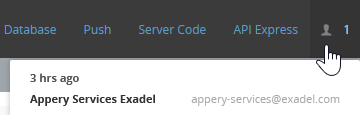
Active users icon – click to see who is working with the project at the moment:
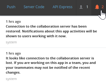
Notifications icon – view notifications about the other users working with the project or informs about other system events:
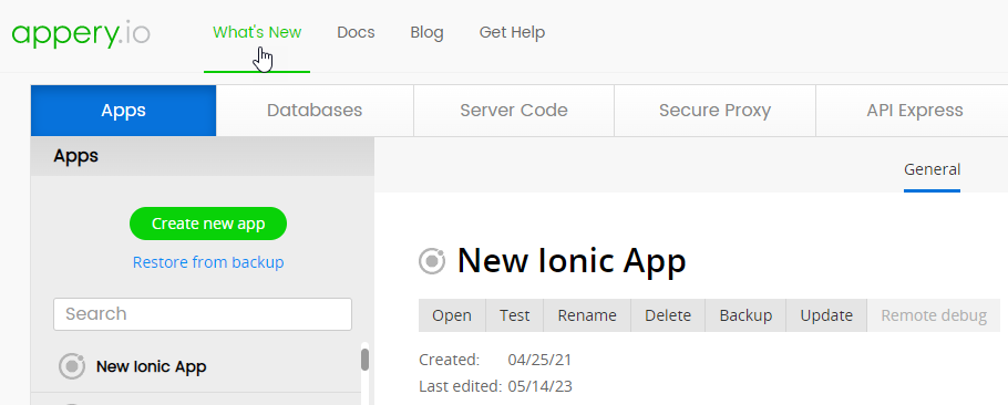
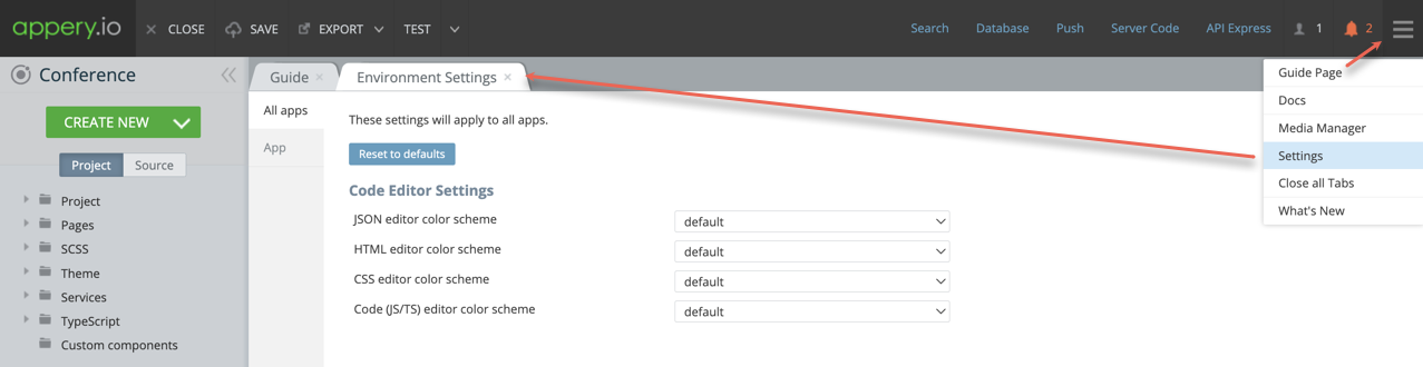
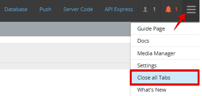
Additional Menu (the three lines button) – click to open the Guide Page, Docs, Media Manager, Settings, Close all Tabs, or What's new:
What's NewThe What's new page can also be accessed from here and includes information about the most recent videos, the latest enhancements to Appery.io, quickstarts and trending tutorials from Appery.io:
Editor Settings
To open the visual editor environment settings, click the three lines button and select Settings. There are the color schemes settings on the All apps tab:
But if you switch to the App tab, you can activate or deactivate confirmations for several actions or change the Code Editor settings for the current application:
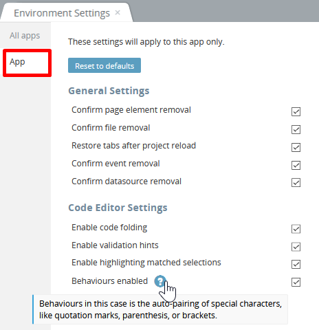
- Enable code folding allows you to truncate the code blocks by clicking the small arrow icon to the right of the line numbers.
- Enable validation hints shows a warning or error icons to the right of the specific line number.
- Enable highlighting matched selections searches for the matching text and highlights it via a blue wavy line.
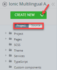
Project View
The Project view has the CREATE NEW button and two tabs: Project and Source:
Project Tab
The Project tab includes the menu of the main parts of the project. Its tab menu can consist of the following items:
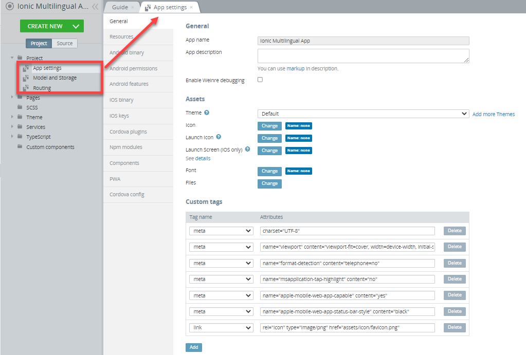
- Project – here you can find the App settings, Model and Storage, and Routing. Click the needed line to open a new tab:
-
Pages(Screens) – any project must have some pages, even if you have just created a new project. While building an app, you may create new pages, which appear on the list in alphabetical order.
-
SCSS – the folder with a predefined SCSS file with Ionic variables and theming. You can also create custom themes that appear on the list under the Theme folder.
-
Theme – the folder with custom color themes.
-
Services– it is almost impossible to create an app without using services. All the services you create appear on this list. You can rename, duplicate and delete any service on the list.
-
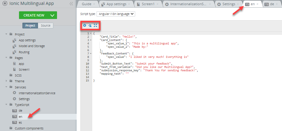
TypeScript – using TypeScript makes building your app easier. When you create a JavaScript file, it appears in this list. Any TypeScript file can be renamed, duplicated, and removed.
-
Custom components – you can edit any of the custom components via this list. You can rename and remove any custom component.
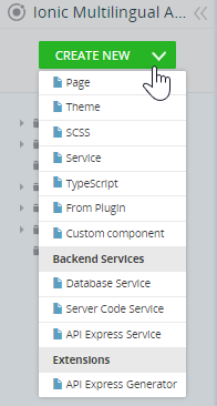
App pages, services, scripts, etc. can be created by clicking CREATE NEW and then selecting what project item or even out-of-the-box example app (if you click From Plugin) needs to be created:
All the items on the Project tab menu can be selected for more customization.
The triangle sign before the menu item shows that the item has a list of objects. Click the icon or the menu line to open the list.
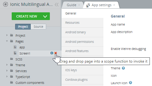
When you hover the mouse over the item, two more icons become available:
The cog icon that appears for a menu item shows that the item can be renamed, deleted, duplicated, or moved. Click the icon to perform a needed action:
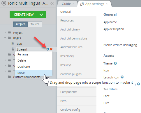
The X sign that appears for a menu item shows that the item can be deleted. Click the icon to delete the item:
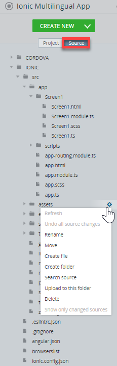
Source Tab
Click on the Source tab will open the Source view that will allow you to access the source code of your app. You can see the folders that contain platform-specific resources: CORDOVA and IONIC. By editing these resources, you can influence the results of code generation.
Hover the mouse over the needed item (file or folder) and click the cog icon to perform a needed action.
In the Source view, you can:
- Work with source files:
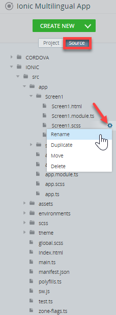
- Rename – click the cog icon and select Rename.
- Duplicate – click the cog icon and select Duplicate.
- Move – click the cog icon and select Move; in the pop-up window, select the folder where the file should be moved and click OK.
- Delete – click the cog icon, select Delete, and confirm the action.
- Work with source folders:
- Refresh root folders – click the cog icon and select Refresh to update the source tree.
- Undo changes – click the cog icon and select Undo all source changes to restore changed or deleted generated files and folders. You can only restore generated files, not custom files; after saving the project, all changed files become custom.
- Rename subdirectories.
- Move subdirectories.
- Create files or folders – click the cog icon, select Create file or Create folder, and in the pop-up, enter the new resource name.
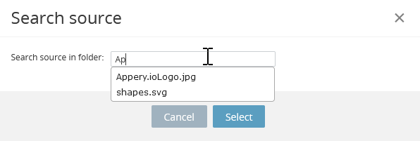
- Search files – click the cog icon, select Search source, and in the pop-up wiindow, start typing the source name:
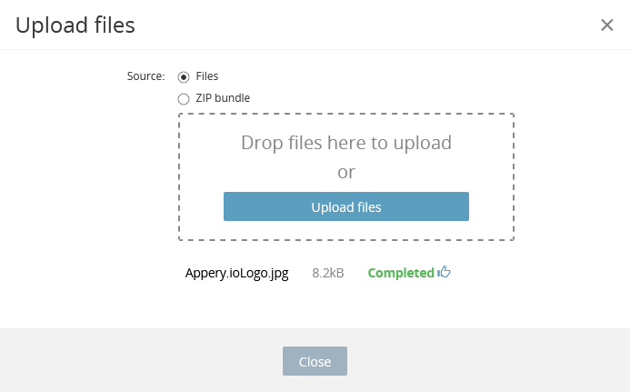
- Upload files and zip archives – in the folder line, click the cog icon, select Upload to this folder, and select files to be uploaded; if you choose a zip bundle when uploading, it is unzipped and all folders and files are added to the folder:
- Delete subdirectories.
- Select all or only changed files in the root folder – click the cog icon and select Show only changed sources or Show all.
After saving the project, the changes you made to the source files appear when testing on the browser desktop, but they do not appear in the visual builder. Similarly, all changes made in the visual builder do not appear in the changed source files and they will not be seen during testing.
You cannot make any changes in the Visual Builder after you have edited the source code, hence, all the necessary changes in the code should be made at the end of the UI design.
Learn more about source editing and check for more samples of managing Source files and folders via this link.
Project Pages
As you open any page, service, file, etc. from the Project view, new tabs open:
The tabs with code (SCSS, TypeScript, Source code, etc.) typically have:
- The cog icon – opens the visual editor environment settings;
- The Auto format code button – use it to make your code more readable;
- The Screen mode button – switch to full-screen mode and back:
When you work with a big project with a large number of pages or services, or when you work with project sources and have a lot of opened tabs, you can close all open tabs in one click by using the Close all Tabs option. It is located in the upper-right corner of the editor toolbar:
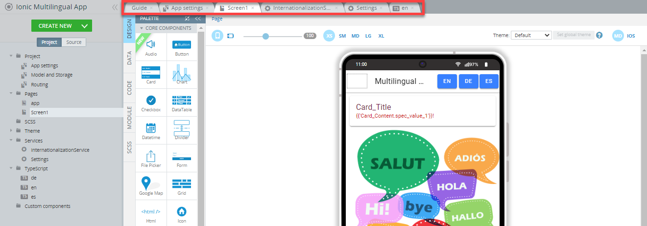
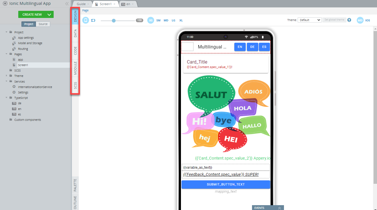
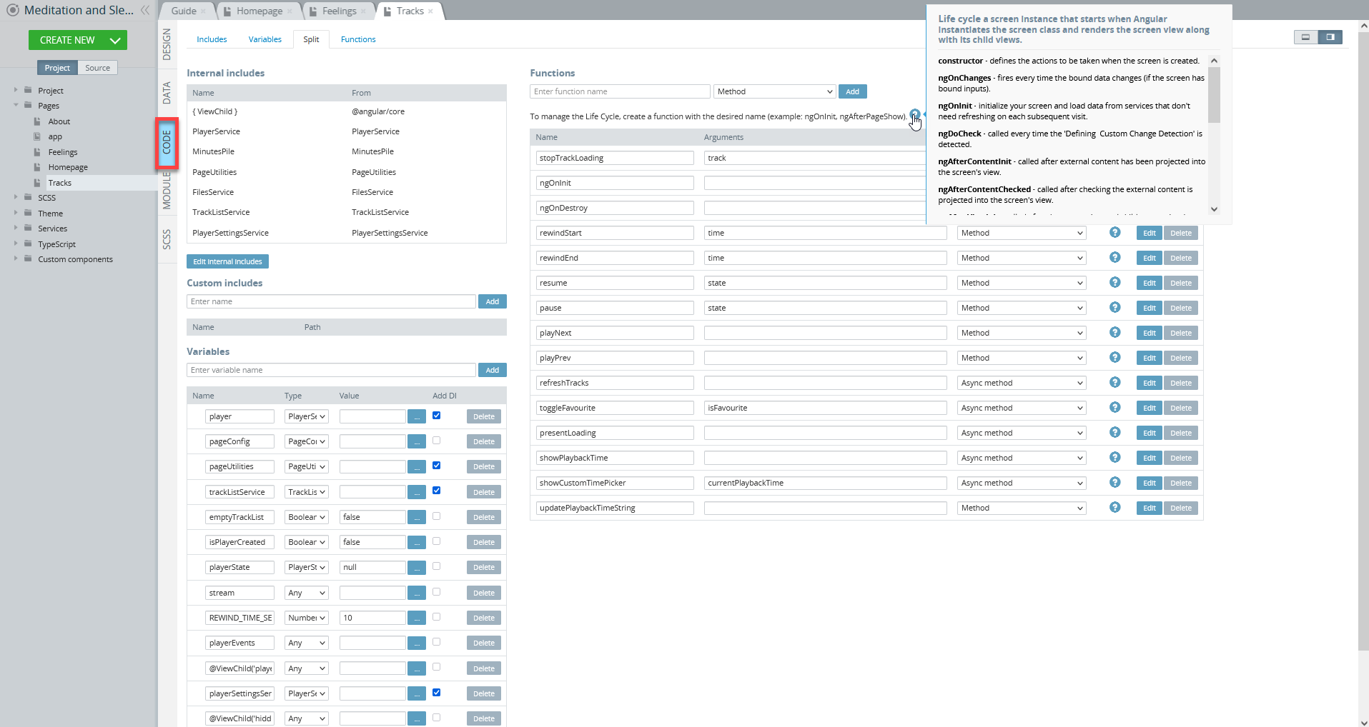
The high-level architecture of the Project view > Pages tabs includes five panels: DESIGN (to build the UI), DATA (to add services), CODE (to add functions and variables), MODULE (to work with app imports), and SCSS (to apply SCSS styles to the app):
They are all used to change the behavior or the appearance of the selected page.
DESIGN Panel
The DESIGN panel has the following tabs:
- Components PALETTE – to drag and drop the components to build the UI. Read more about components here.
- PROPERTIES panel – to edit properties of the page or component.
- EVENTS tab – to add and edit events to the page or component. Read about events here.
- Mobile frame (the image of your device in the middle) – to see how it looks on your device while you’re building the UI.
The DESIGN panel allows the following operations:
- placing/editing/deleting components.
- using breadcrumbs for easy navigation between the parent/child components.
- changing layout (portrait or landscape) and scaling.
- selecting the screen size and view mode (MD or iOS).
- applying themes to the page UI.
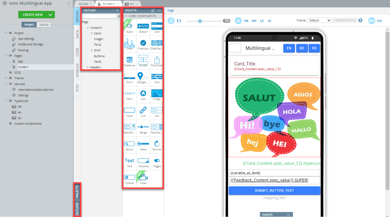
The PALETTE tab allows access to the PALETTE items which are different UI components that can be dragged and dropped to the frame to configure the app UI. To make more room for the MOBILE FRAME, you can hide the components PALETTE by clicking the PALETTE tab.
Clicking on the OUTLINE button opens the components tree view where all the added components can be viewed and/or edited:
You can read more about how to work with UI components on the DESIGN panel via this link.
EVENTS Tab
The EVENTS tab is used for adding the events and actions to UI components and/or services and can be found at the bottom of the DESIGN and DATA panels correspondingly.
For example, to add the Mouse over custom event for the Image component, unfold the EVENTS tab from the bottom of the DESIGN panel and define the action for this event:
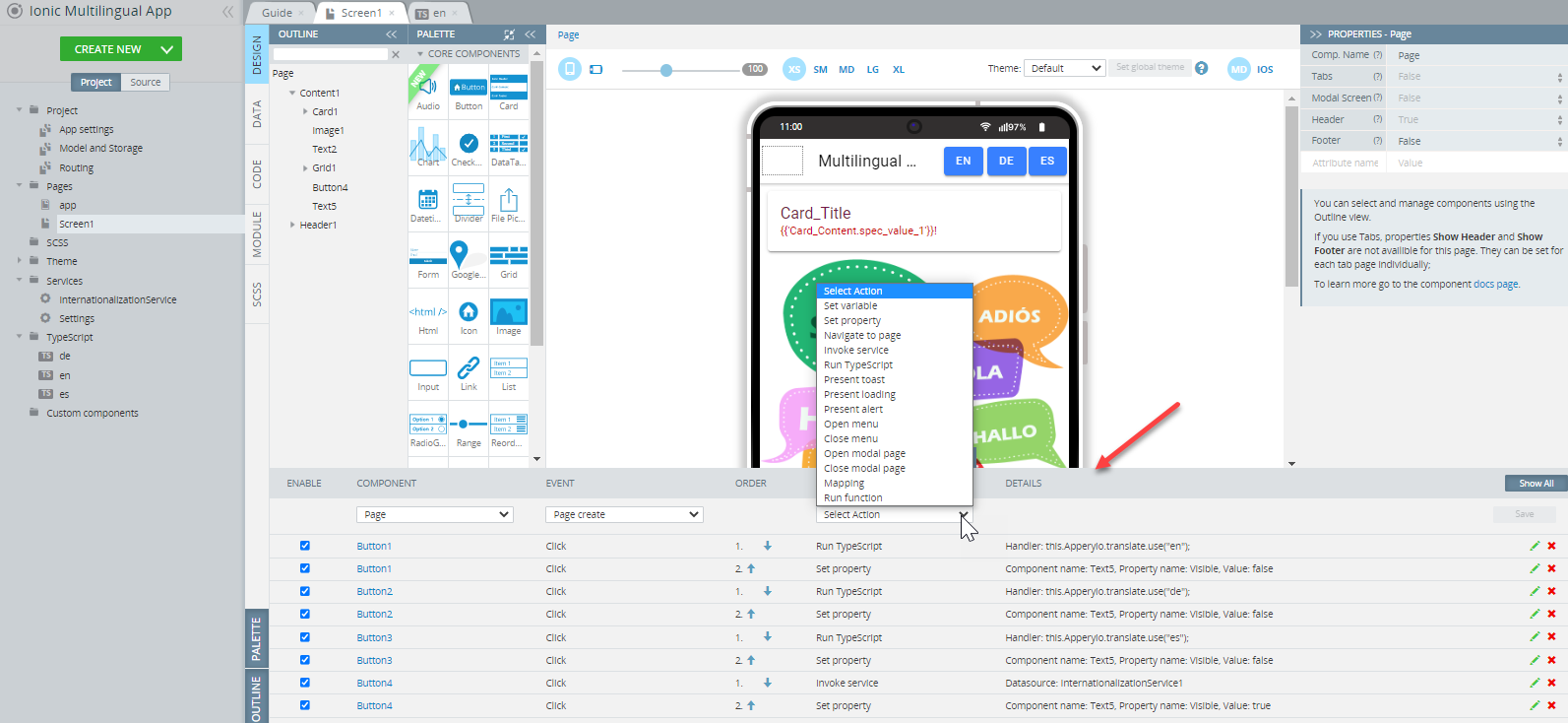
Then, select the needed action from the drop-down list:
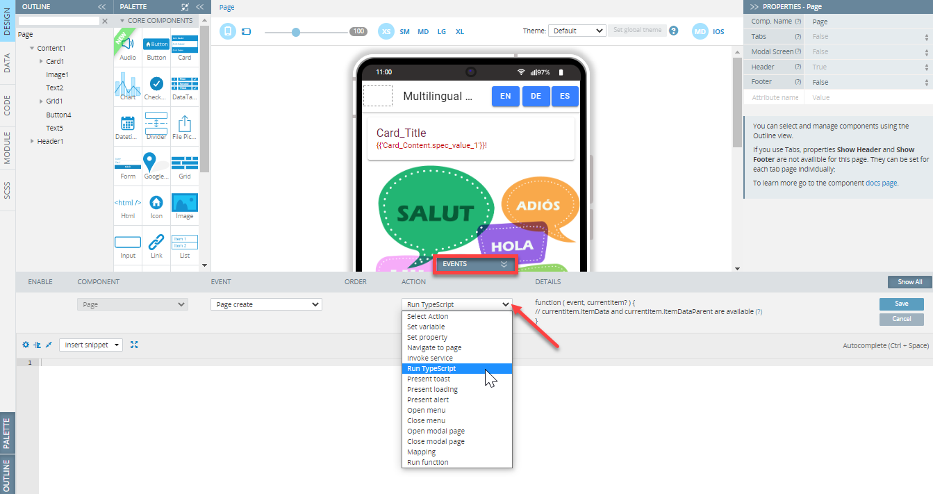
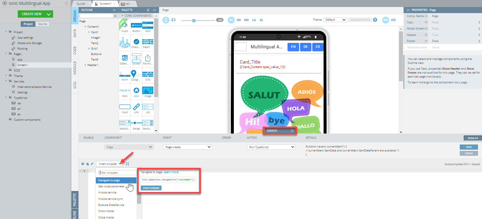
Defining one of the popular events, Run TypeScript can be made easy by using snippets:
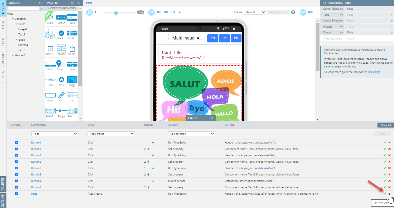
After the event is added to the page it gets listed and can be edited or deleted - just select the corresponding button. If you do not want to lose sight of the EVENTS tab but need more working area, you can adjust its height:
Want to know more?Read more about how to work with events and actions via this link.
DATA Panel
The DATA panel is used to create and define app datasources (should be added beforehand) or creating new 3rd party client services from the REST, Generic, and Settings (REST settings) drop-down selection:
After the datasource is created, you get access to defining the events in a way similar to how it is done from under the DESIGN panel.
To define the event(s) and/or action(s) for a service, first, unfold the EVENTS tab from the bottom of the panel and define the action for this event:
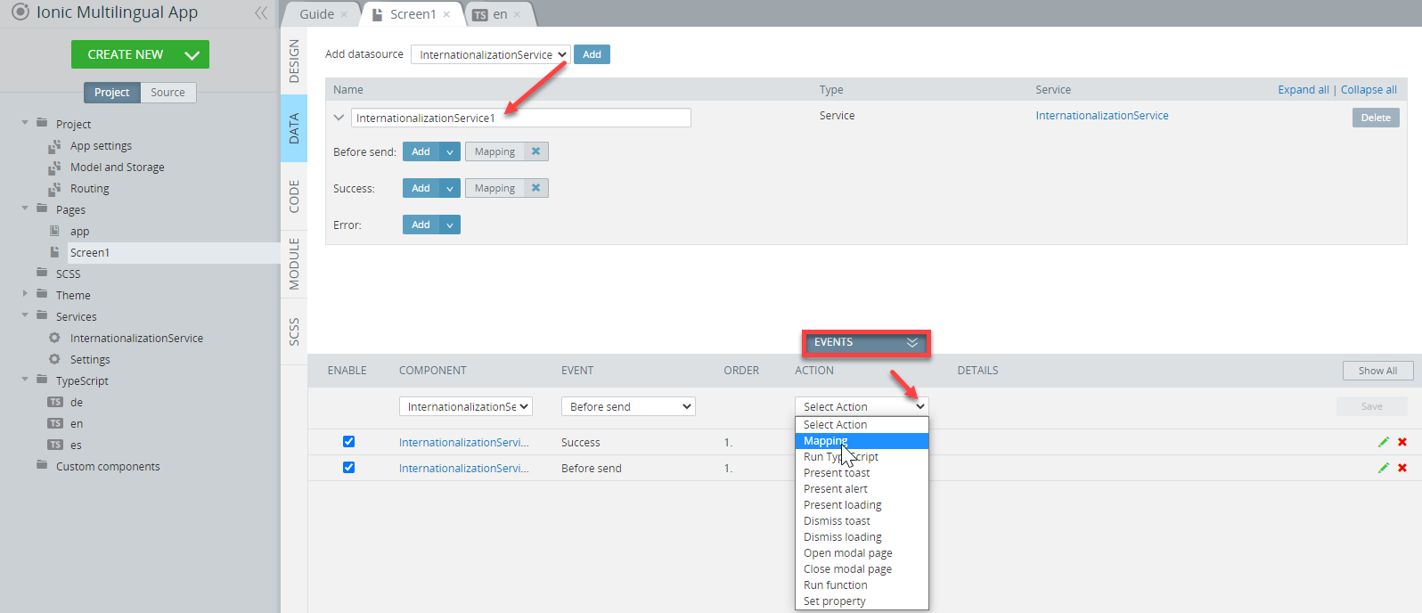
Also, if you are adding, for example, the Run TypeScript event, it can be defined with the needed action by selecting the needed out-of-the-box snippet:
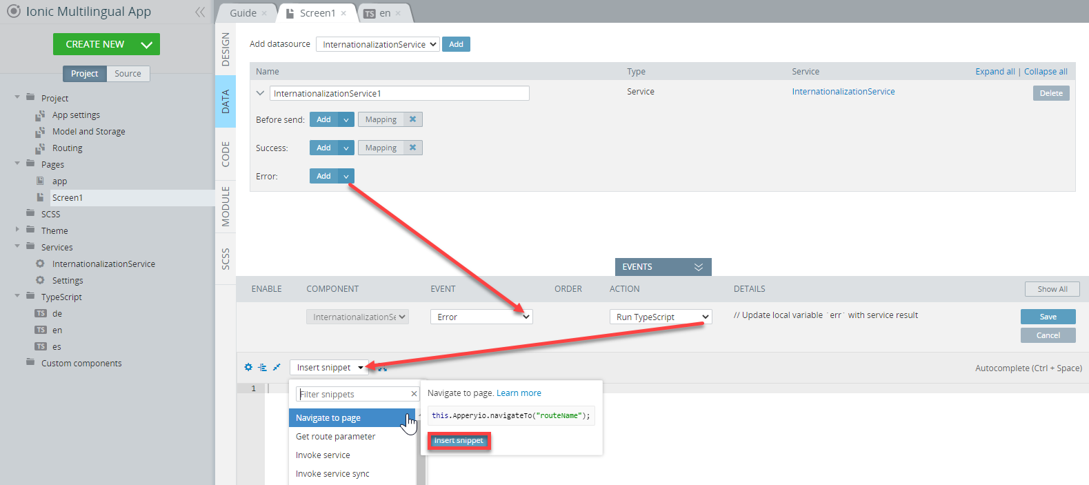
When invoking services in an app or handling Error events, you will be redirected to the Mapping Editor. Please check this link to learn more about how to work with it.
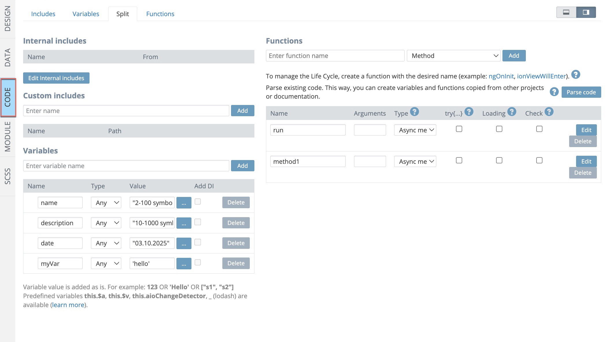
CODE Panel
The CODE panel is used to add and define app includes, variables, and functions. If the page has many items, it can also be handy to switch from Stack to the Side view (the upper right corner of the editor): this way, you will not need to scroll the page down to see all available elements:
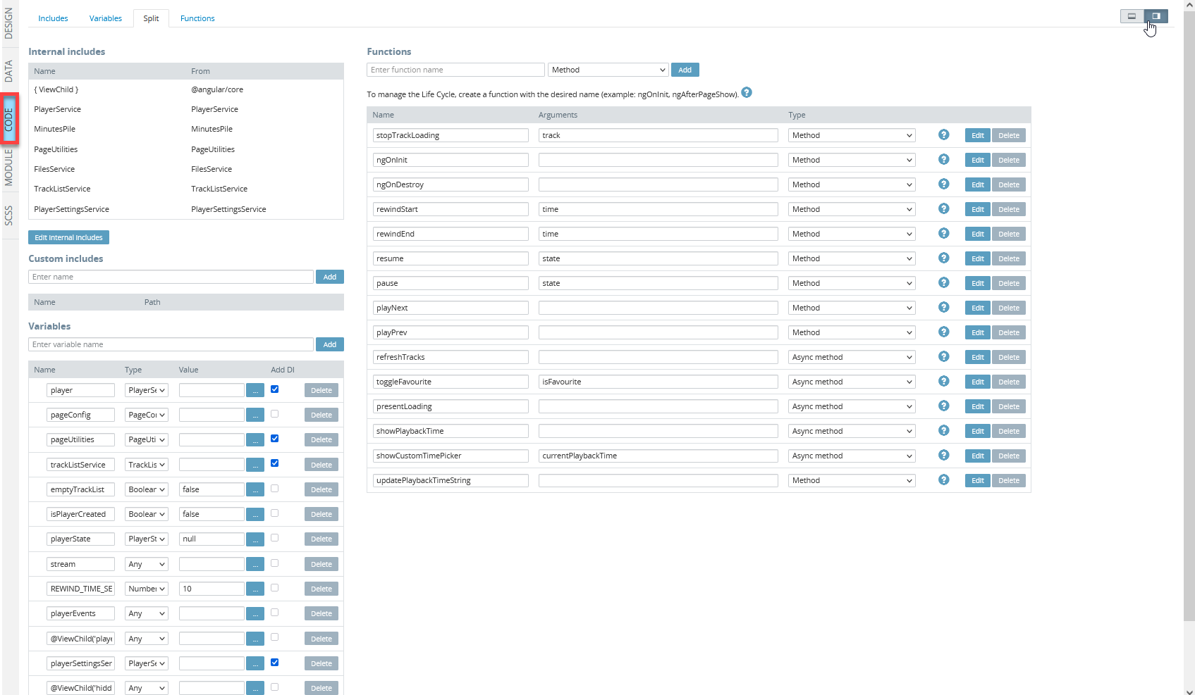
There are three corresponding tabs (Includes, Variables, Functions) where all of these can be defined but it is a good practice to use the Split tab to take control of all of them in one place:
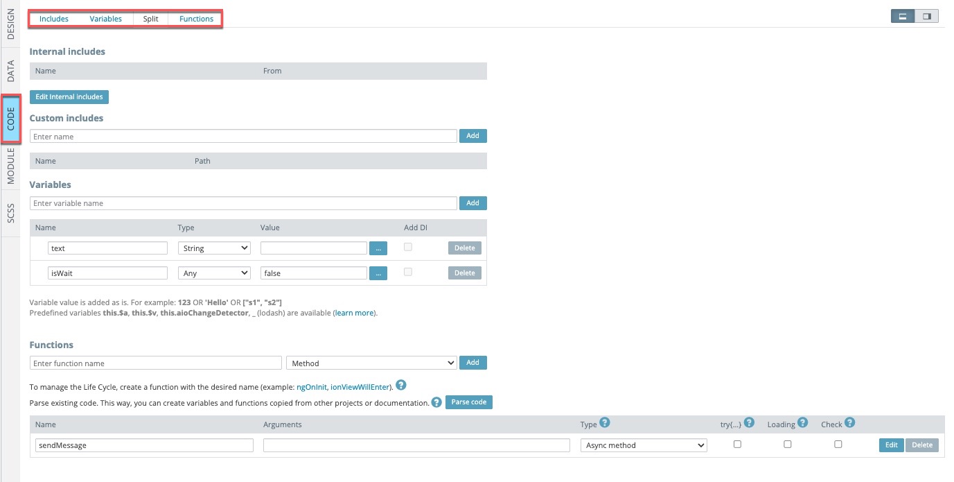
NoteUnlike storage variables, the variables created for a specific page under its CODE > Variables tab can be used for this specific page only.
Working with functions
When working with functions, you can define them by using our out-of-the-box snippets:
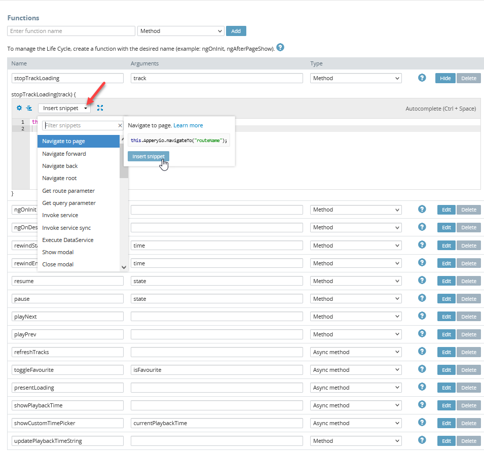
There is a useful helper to assist you in adding necessary functions:
Angular Life Cycle EventsYou can also check this guide covering how the page life cycle works in an app built with Ionic and Angular: https://ionicframework.com/docs/angular/lifecycle.
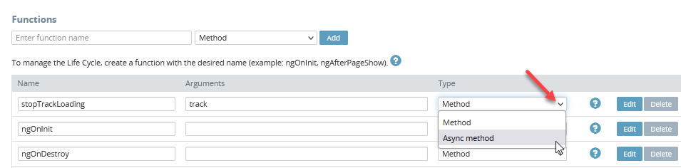
You can also change the Method selection even after the function has been created:
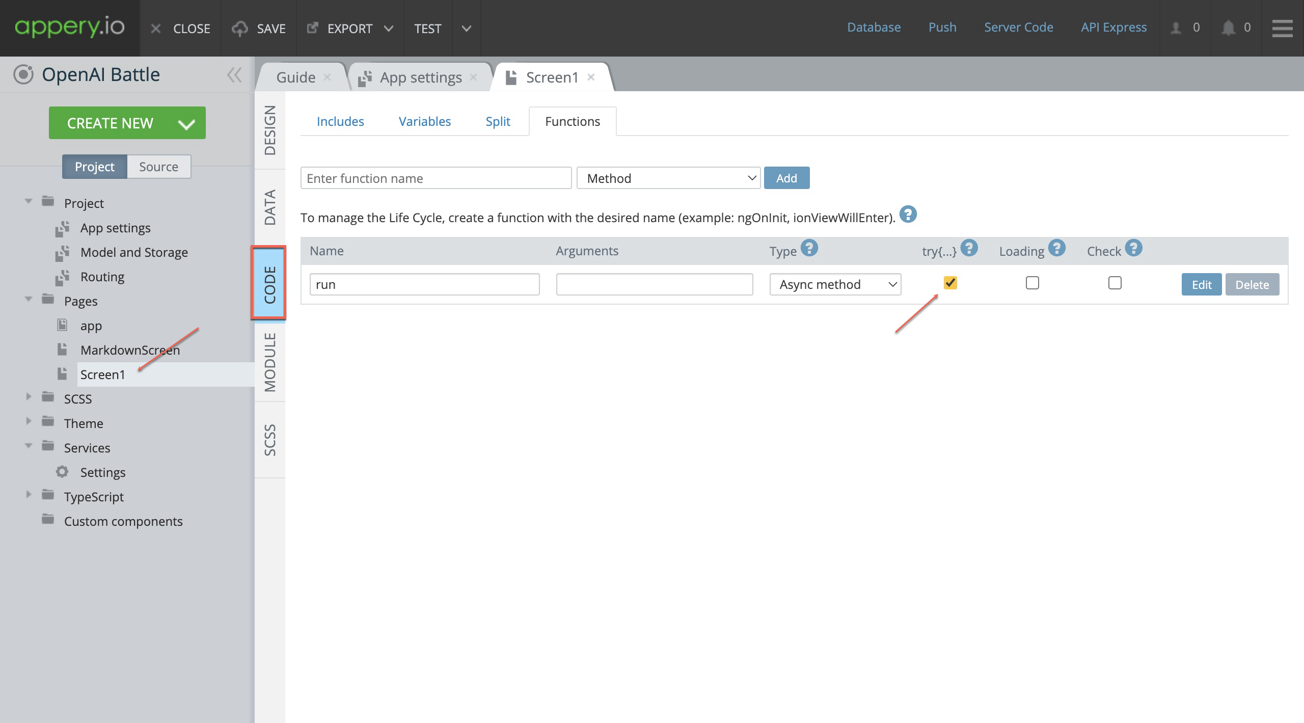
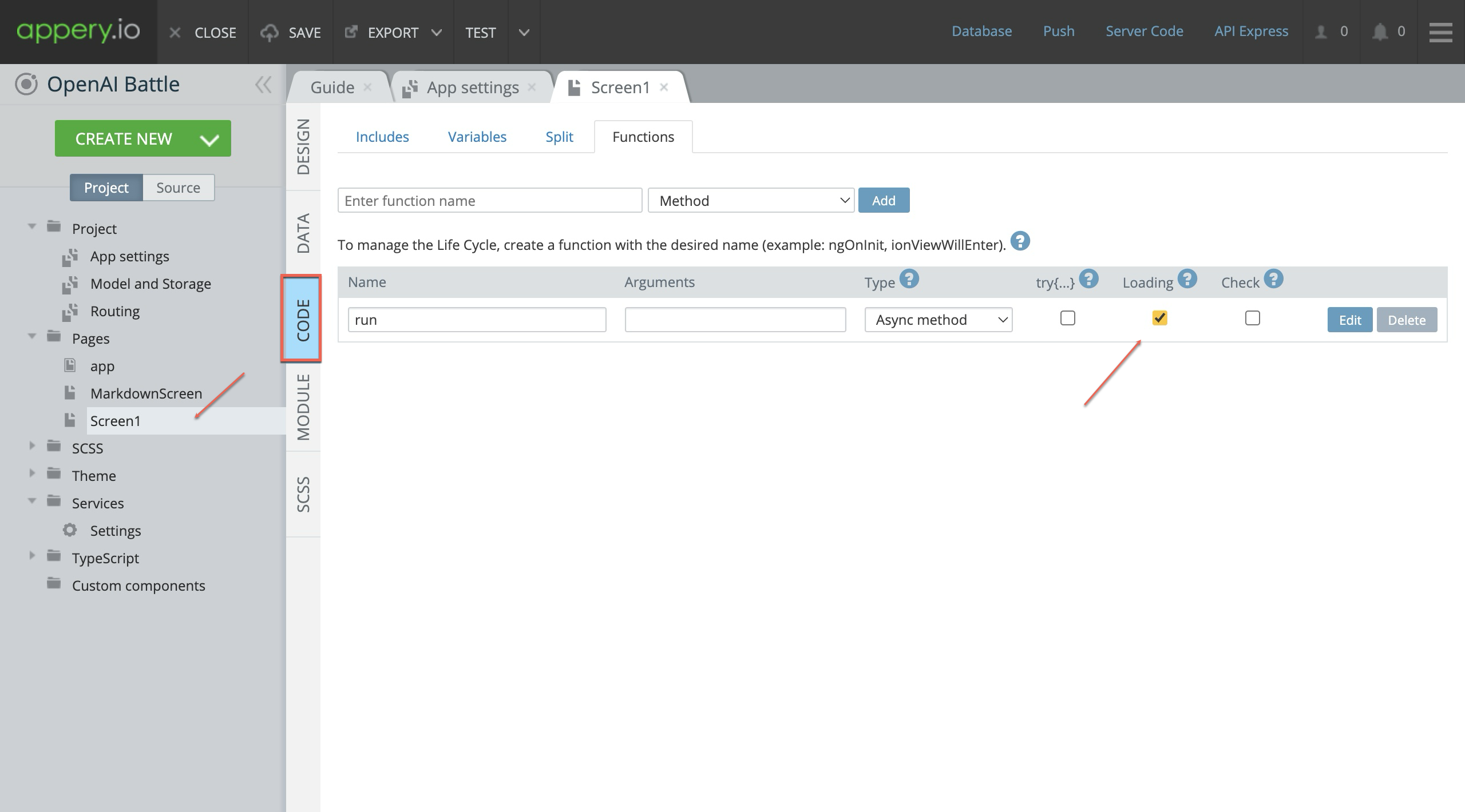
Checkboxes: Try-catch, Loading, Check
- The JavaScript Try-catch checkbox is used to simplify error handling.
Quite often, scripts can contain errors due to many reasons: developer mistakes, incorrect user input, erroneous server response, and many others.
This syntax construct helps to catch the errors so the script can provide what’s wrong instead of keeping still.
- The Loading checkbox is checked to show loading before the function execution starts and hide it after the function completes.
NoteLoading checkbox works for async methods only.
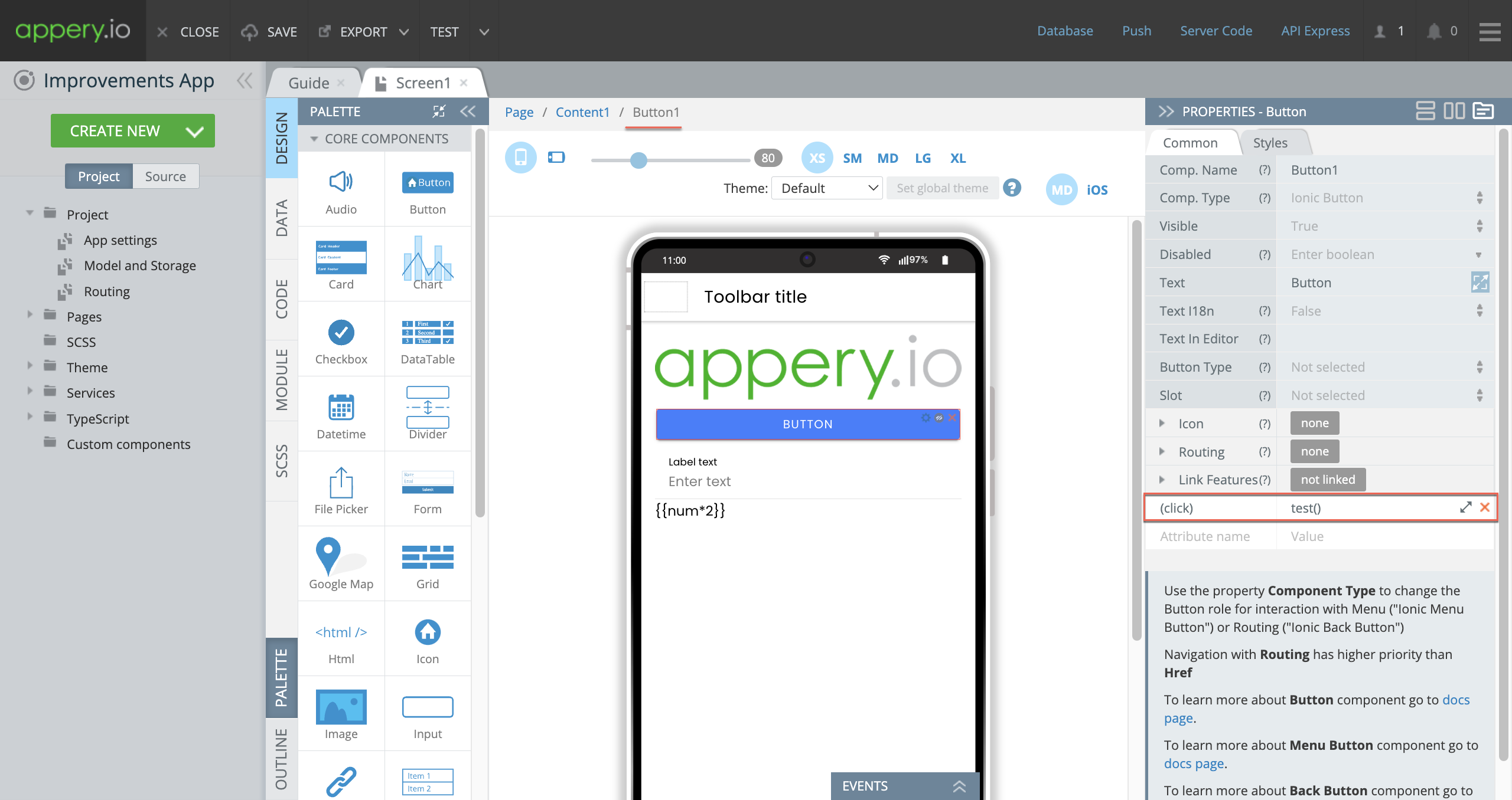
- The Check checkbox is used to validate the form if it is present on the page before executing the function.

If the used form is invalid, the validation error will be displayed and the function will not be executed.
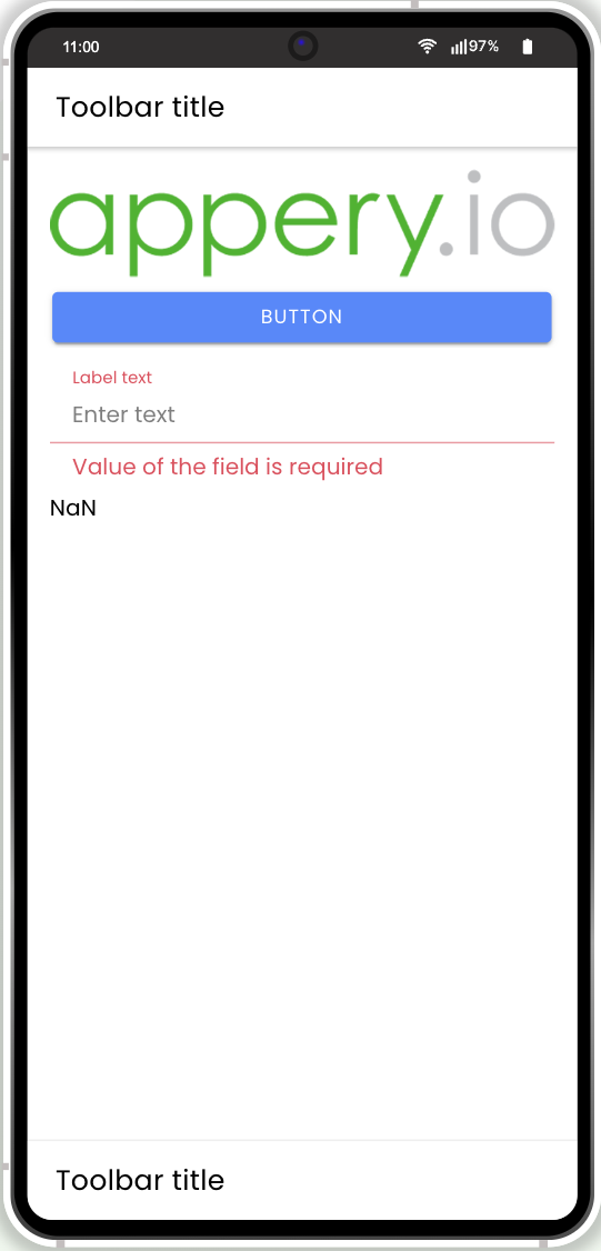
Example:
In the DESIGN panel, the Button is added with the test function defined:
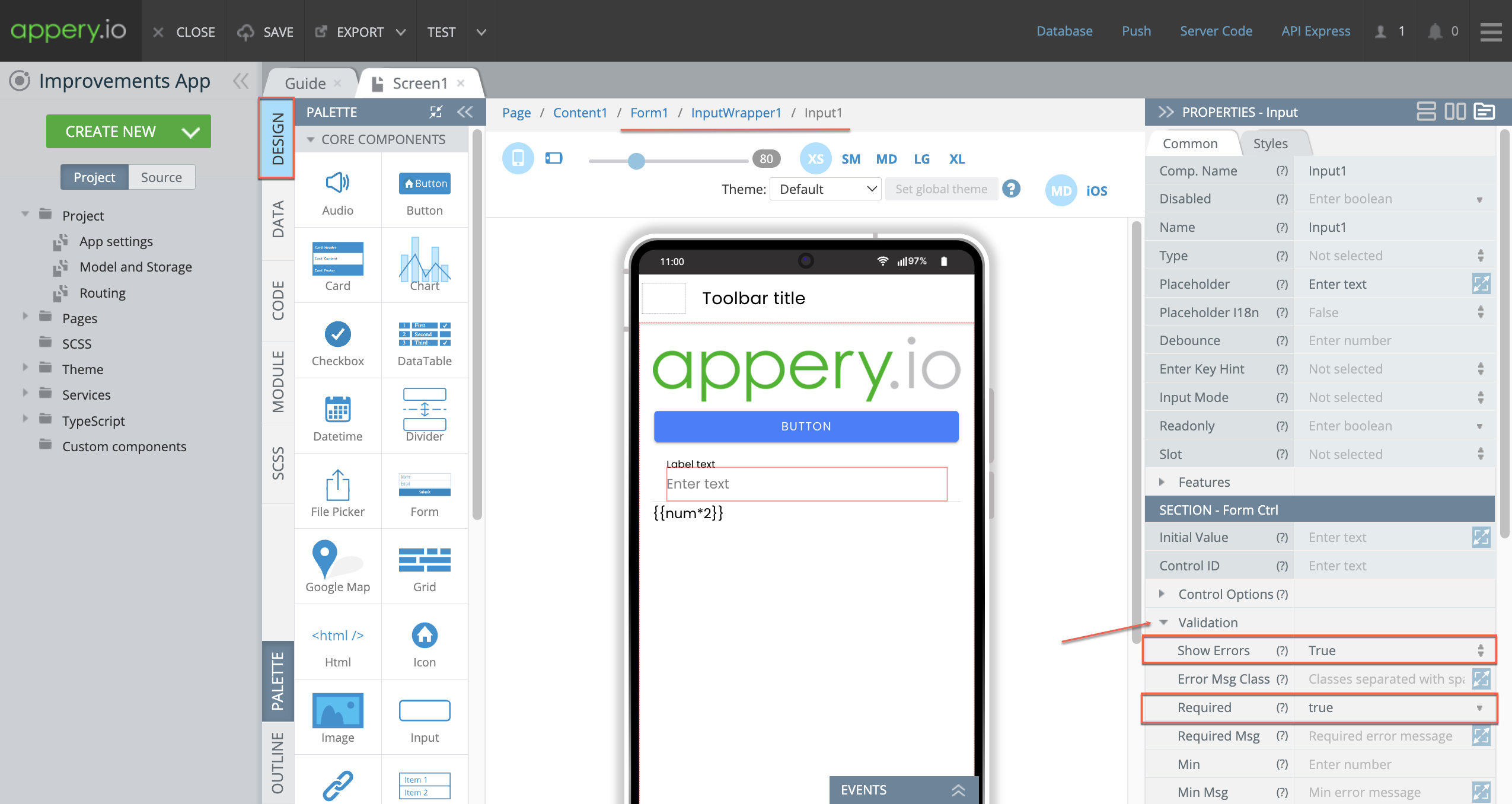
Also, the Form component is placed with the Input component added to it.
Input has the Validation property defined as follows:
Show Errors = True;
Required = true.
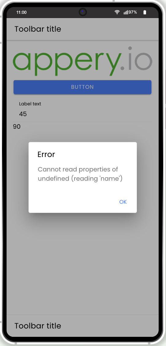
When testing on preview by clicking the button, the button test function does not execute and you are asked to enter some value into the field:
Only after you enter it into the form, it becomes valid and the error is shown which means that the function now executes as expected:
Want to know more?You can also watch this video to learn how to include try-catch error handling for streamlined debugging, use the loading indicator for asynchronous methods and form validation checks to ensure data integrity:
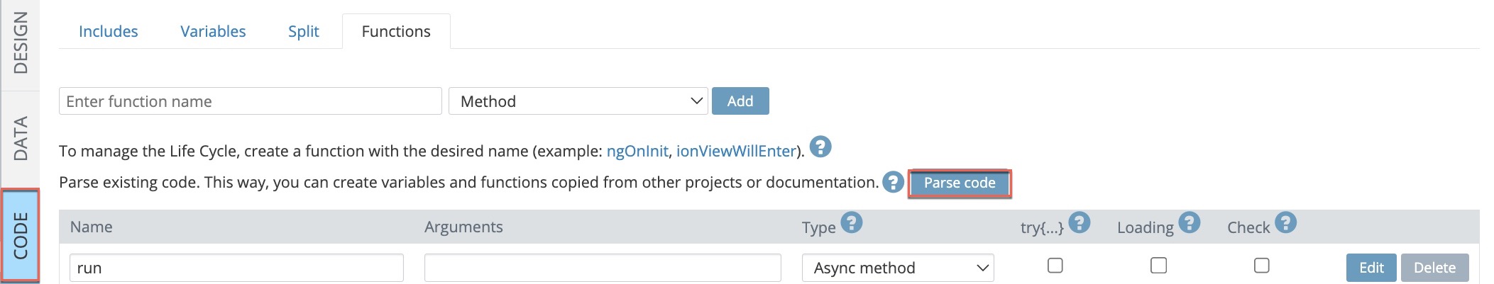
Parse Code
The Parse code feature can be used for parsing any existing Angular or Ionic code for your Appery.io mobile app. This way, you can automatically create variables and functions copied from other Angular or Ionic projects/documentation.
To integrate the needed code into your Appery.io project, in the CODE tab, click the Parse code button:
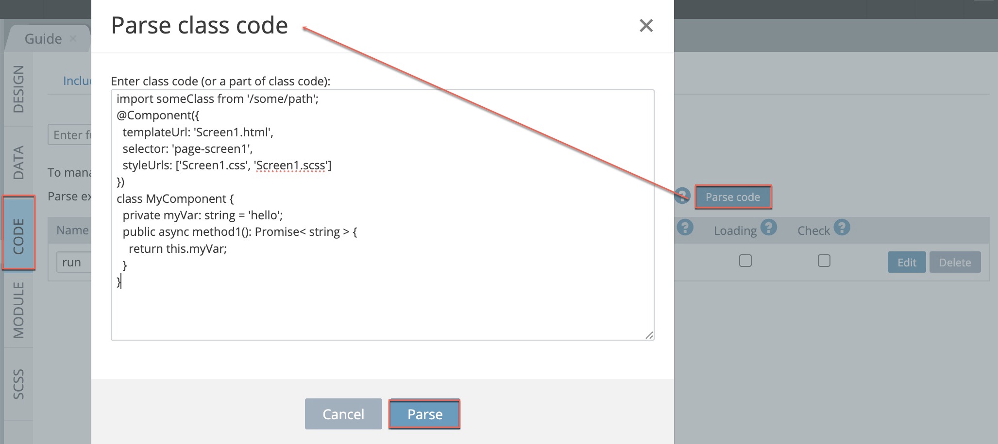
In the window that opens, enter the copied code and click Parse.
In a moment, the Parse result popup will update you on what has been added to your app:
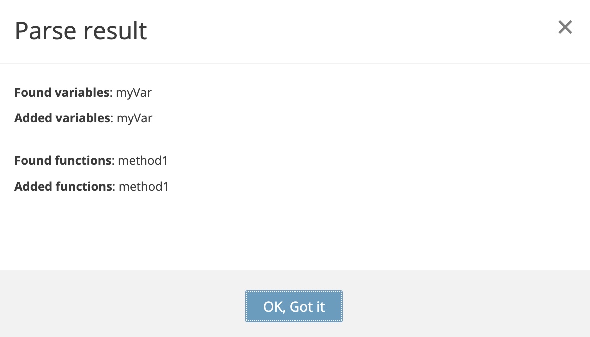
In the CODE tab you can now see the new variable and the new function parsed from the code added:
Want to know more?You can also check this tutorial for the example of how to work in the CODE panel.
MODULE Panel
The MODULE panel is where native APIs from Ionic (npm packages and modules) can be defined to allow simple integrations with adding native device functionality:
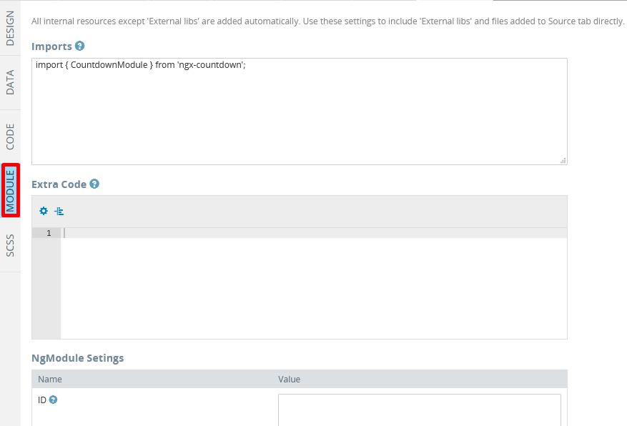
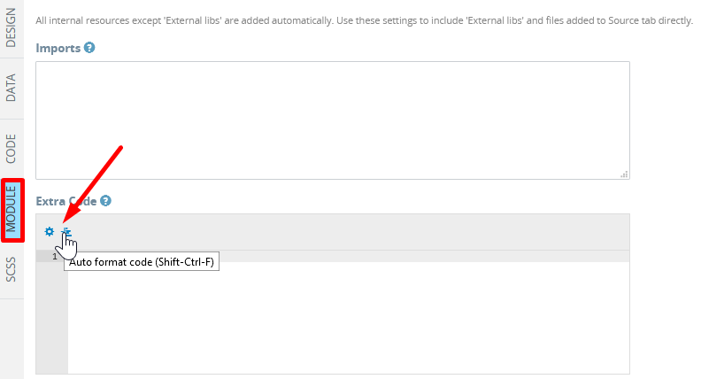
Note that the Extra Code section editor is equipped with the cog icon that opens the code editor color schemes settings and the Auto format code button used for making code more readable:
Want to know more?Please see our Ionic solutions page to learn how you can add the npm-modules to your projects.
Also, you can check this tutorial to learn how to work in the MODULE panel.
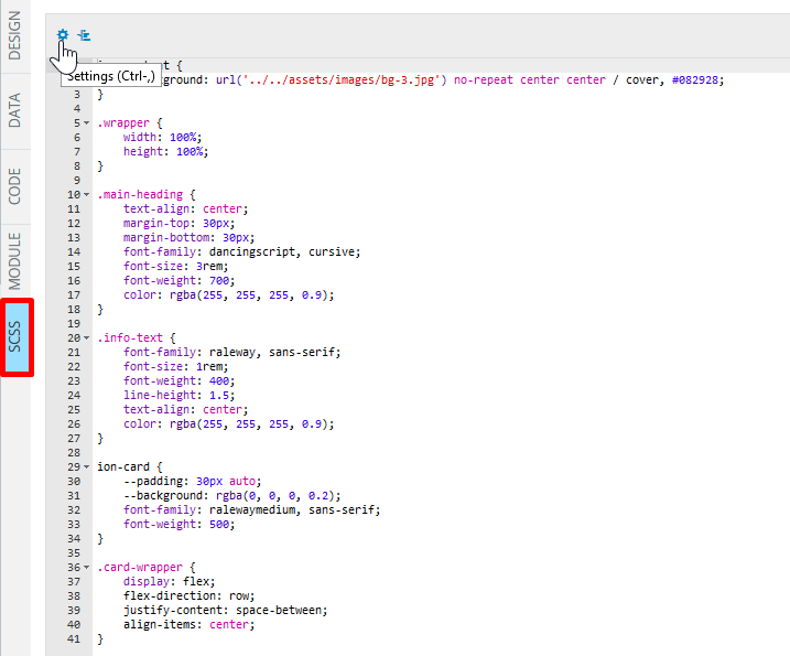
SCSS Panel
The SCSS panel is the style code editor that is also equipped with the cog icon that opens the code editor color schemes settings and the Auto format code button:
Styling AppsCheck out this link to learn how to easily design your app UI according to your preferences by using a custom color theme, define its launch icons and/or launch screens or adding custom fonts, etc.
Want to know more?You can also check this section to learn how to add code to the SCSS panel to apply styles to your app.
Updated about 1 year ago