Ionic UI Components General Properties
This section provides an overview of the properties that are common for most Ionic UI components available in Appery.io
Introduction
Every Appery.io UI component has its own properties: some are available for most components, and others are specific to a particular component (the full list of them can be found in this document).
Important Note!This section describes the properties that are common to most UI components.
To check for the properties that are specific to particular UI components please check this component's document page:
All the UI components available in the Visual App Builder feature further subdivision into common properties and properties related to the component's styling.
Common properties are grouped under the component's PROPERTIES Common tab while the properties used to define styling can be found under the Styles tab:
The general Common properties belonging to most UI components available in the Visual App Builder include:
| Property Name | Property Description |
|---|---|
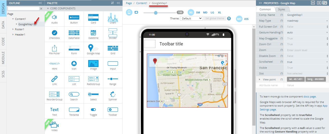
| Comp. Name | The mandatory property used for identifying the component. When you drag and drop the component from the components PALETTE the Appery.io Visual Builder gives it a standard name (e.g. GoogleMap1, Image1, etc.). It’s beneficial to rename the components so that you could easily identify them. This property exists inside the visual editor only and does not have any reflection in an application. |
| Visible | Set to True to determine that the component is visible on the page. For more details, read here. |
| Disabled | Every component on the page is enabled by default. You may need to disable components. If set to true, the user cannot interact with the component. For more details, read here. |
| Text | The item text. |
| Text I18n | If set to true then use the Text property for internationalization. |
| Text in Editor | This text is shown only in the editor and does not have any reflection in the application. For more details, check our YouTube video here. |
| Slot | Position inside another component. It can be set to Fixed. Some components can have different settings: Start or End. |
The general Styles properties belonging to most UI components available in the Visual App Builder include:
| Property Name | Property Description |
|---|---|
| Class | The Class property allows listing different classes. Check this link for Ionic CSS utility classes. |
| Mode | Determine which platform styles to use. Possible values are iOS or MD. |
| Margin | Set the margin area of an element in px, %, em, vh, and vw: All sides, Top, Right, Bottom, Left. |
| Padding | Set the card padding area in px, %, em, vh, and vw:
|
| Opacity | Set the opacity of an element. Opacity is the degree to which the content behind an element is hidden. Opacity value must be in the range from 0 to 1.Opacity value must be nonnegative. Opacity value length can't be more than 10. |
| Bg Color | Color to use from your application's color palette. Select CSS color from the available colors: Primary, Secondary, Tertiary, Success, Warning, Danger, Light, Medium, Dark, and Custom, use the Color-picker, or enter your custom color name. |
| Display | Set the display behavior (the type of rendering box) of an element by using the group of predefined buttons:
|
| Position | Set the position of an element. The possible values are:
|
| Color | Color to use from your application's color palette. Select CSS color from the available colors: Primary, Secondary, Tertiary, Success, Warning, Danger, Light, Medium, Dark, and Custom, use the Color-picker, or enter your custom color name. |
| Width/Height |
|
| Border Style | Set the line style of an element's border. Available values are: Solid, Dotted, Dashed, and Double. |
| Border Width | Set the line width of an element's border in px, em, vh, and vw: All sides, Top, Right, Bottom, Left. |
| Border Color | Color to use from your application's color palette. Select CSS color from the available colors: Primary, Secondary, Tertiary, Success, Warning, Danger, Light, Medium, Dark, and Custom, use the Color-picker, or enter your custom color name. |
| Border Radius | Round the corners of an element's outer border edge in px, %, em, vh, and vw: All sides, Top Left, Top Right, Bottom Left, Bottom Right. |
| Text Align | Set the horizontal alignment of the text by using the group of predefined buttons: align to the left center align to the right
|
| Vertical Align | Set the vertical alignment of an element (inline or inline-block). The available values are: Baseline, Middle, Sub, Super, Top, Bottom, Text-top, Text-bottom. |
| CSS rule | Add here all the necessary styles. |
Using Class CSS on the Components' Styles PanelIf you are interested in the samples of how class CSS can be used on the components' Styles panel, visit this document page.
Also, if you experience issues with prioritizing CSS styles for some UI components please check this section for help.
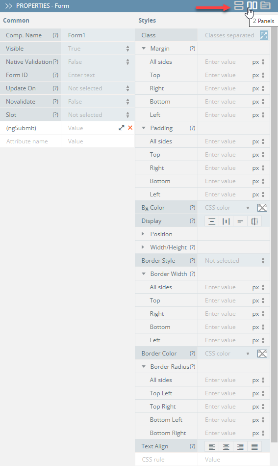
PROPERTIES Panel View ModesNote that, in our App Builder, you can make customizing UI components even more comfortable and easily adjustable to different monitors' sizes: now, you can switch the PROPERTIES panel views between 2 Panels, 1 Column or Tabs modes:
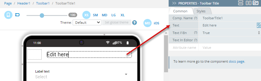
Tip!You can additionally select and manage components by
- Using Breadcrumbs
or- Selecting them on the OUTLINE view menu:
Working with Class Property
Ionic offers the solution that allows specifying different responsive display attributes. This functionality is also integrated with our platform and is easy to use.
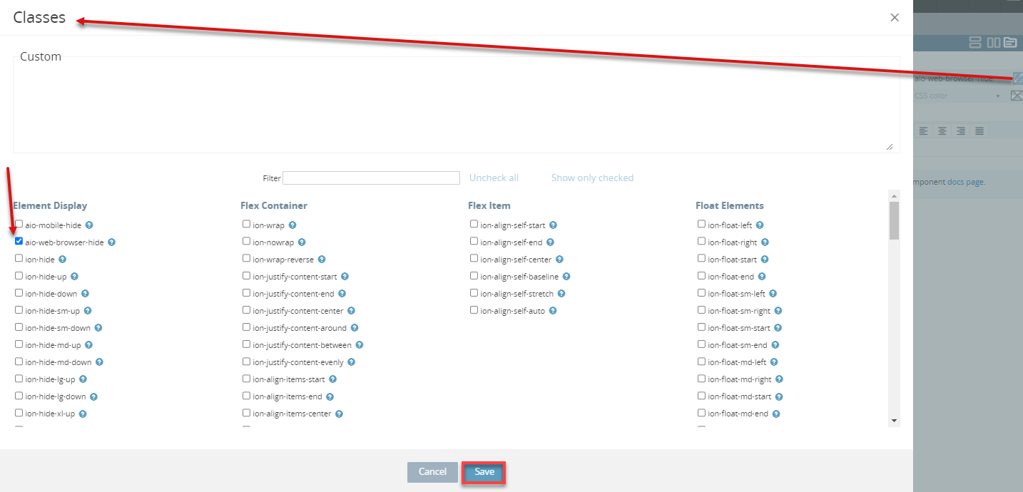
This option will be appreciated by those users who need to publish their Appery.io project both as the web app and mobile app and want to differentiate the app behavior of both versions. Defining such custom behavior for different target devices is simple in the Classes editor: just select the UI component needed and click the Class property button.
For example, you need to hide some UI element (here, it's Content) if the current device is running in the web browser only, select the Content component, then click the Class property button to open the Classes editor and check the aio-web-browser-hide checkbox (available in Appery.io only). Then save:
Similarly, if hiding your page content is required for mobile devices only, check the aio-mobile-hide (available in Appery.io only): the app will show the blank page when run on a mobile.
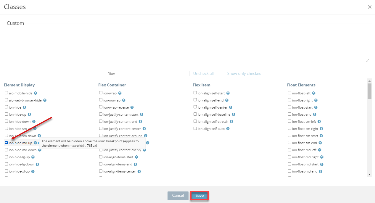
Class ReferenceApplying custom classes allows differentiating the app behavior across different platforms / devices (sizes), etc. You can also use filter to look for the needed class(es).
To get more information about the classes, hover over the ? button:
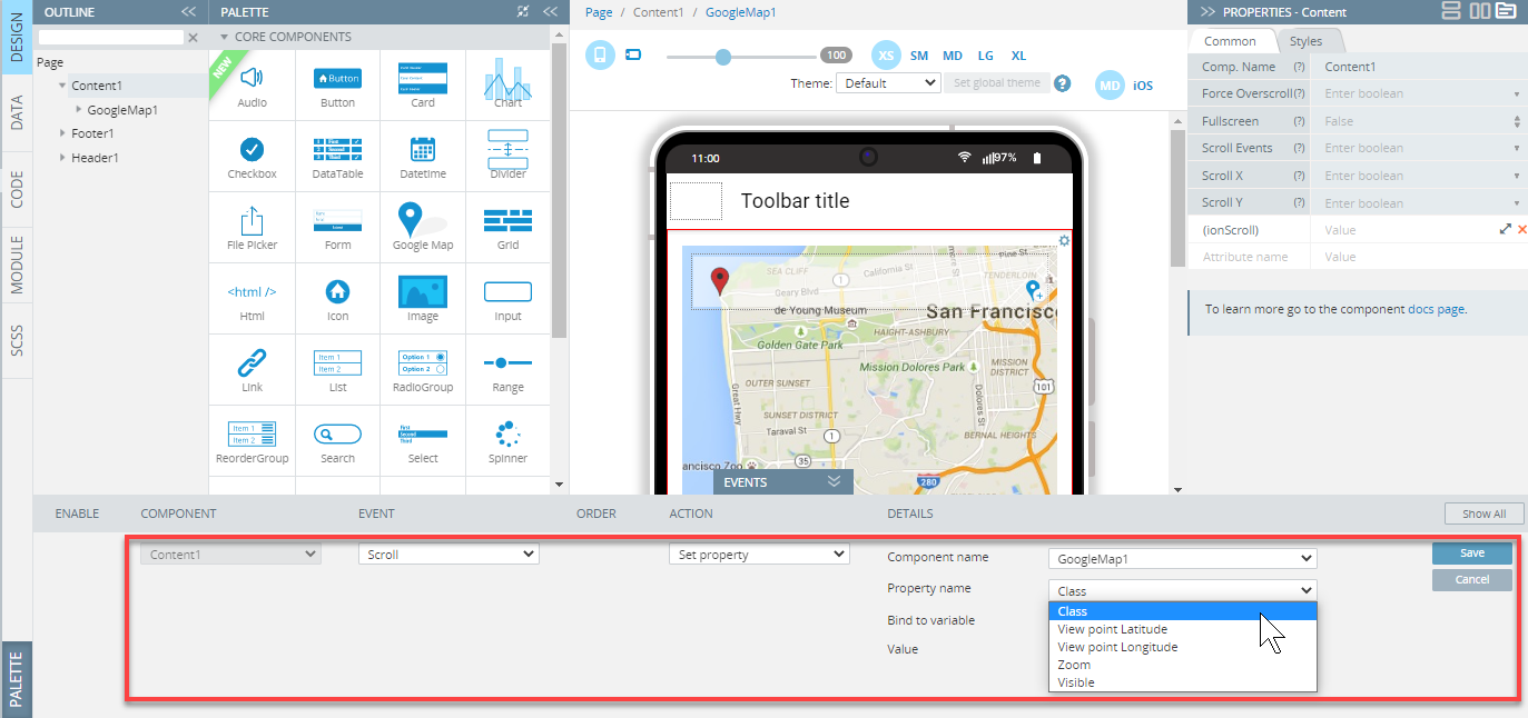
Also, the Class property is available for specifying component's events with the Set property action:
Working with Properties Popups
Often, editing long text strings for some components' properties is needed. To make it more convenient, many Appery.io UI components support opening popups with big text areas:

Properties of the Input component that allow editing in popups
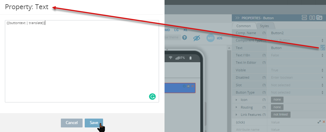
For example, for editing the Text property of the Button component, click the corresponding button under the PROPERTIES panel, enter the code and save:
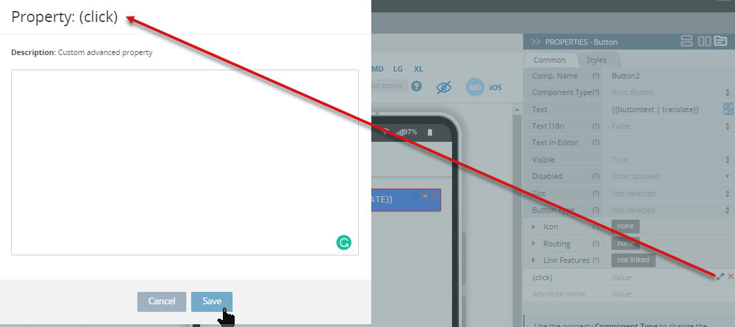
Similarly, the popup option is available for editing custom attributes' values:
Also, all the components that offer entering text strings allow editing them inline right in the MOBILE FRAME: