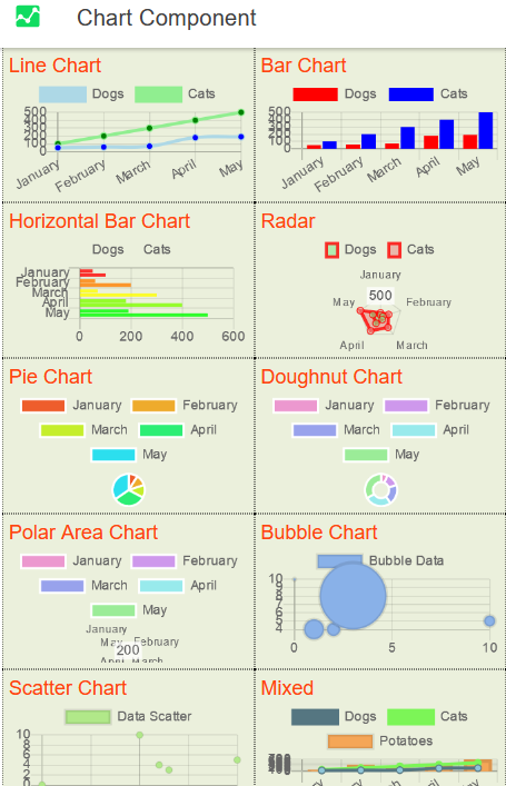
The Chart component offers a variety of chart types and visualization styles that come with extensive configuration options. This flexibility allows for creating the needed chart quickly and easily. The following built-in chart types are available in Appery.io Visual App Builder:
Bar
Bubble
Doughnut
Line
Pie
Polar Area
Radar
Scatter
Mixed
Please check below for different chart types organized in one project:
👍More details about how to work with the Chart component and its properties can be found in this document.
🚧This document lists the properties that are specific to this particular UI component.
To check for the properties common for most UI components, please check the General components document.
The Chart component has the following common properties that apply to all chart types:
| Property Name | Property Description |
|---|
| Auto init Chart | If set to true, the Chart component is automatically initiated. |
| Labels | The array of labels to display. To specify it, switch to the CODE tab, add a variable, ex. label of Any type and provide the value(s) to be displayed in the chart: For example: ['Label 1', 'Label 2', 'Label 3', 'Label 4', 'Label 5'] (for simple labels) or [ ['Label 1', 'value: 3'], 'Label 2', 'Label 3', 'Label 4', ['Label 5', 'Value: 5'] ] (for multilabels). Now, the Labels property can be defined with the label value. |
| Type | Select the type of chart to be created:
- *line(default),bar,horizontal bar,**radar, pie, doughnut, polarArea, bubble, scatter,mixed.
|
| Responsive | Resize the chart canvas when its container does. |
| Animation Duration | Duration in milliseconds it takes to animate to a new size after a resize event. |
| Maintain Aspect Ratio | Maintain the original canvas aspect ratio (width / height) when resizing. |
| Aspect Ratio | Canvas aspect ratio (i.e. width / height, a value of 1 representing a square canvas). Note that this option is ignored if the height is explicitly defined either as an attribute or via the style. |
| Show Advanced Properties | If set to true, the advanced chart properties can be accessed:
- All - all the advanced properties are available.
- Animation - animates charts out of the box. A number of options are provided to configure how the animation looks and how long it takes:
- *duration** - the number of milliseconds the animation takes
- *easing - the easing function to be used.
Possible values are linear,easInQuad,easeOutQuad,easeInOutQuad,easeInCubic,easeInOutCubic,easeInQuart,easeOutQuart,easeInOutQuart,easeInQuint,easeOutQuint,easeInOutQuint,easeInSine,easeOutSine,easeInOutSine,easeInExpo,easeOutExpo,easeInOutExpo,easeInCirc,easeOutCirc,easeInOutCirc,easeInElastic,easeOutElastic,easeInOutElastic,easeInBack,easeOutBack,easeInOutBack,easeInBounce,easeOutBounce,**easeInOutBounce.
- Legend - displays data about the datasets on the chart:
- *Align- alignment of the legend (start,center(default for unrecognized values), or**end)
- *Display- set to**true to display the legend
- *Labels Box Width** - the width of the colored box
- *Labels Font Color** - the text color.
- *Labels Font Size** - the text font size
- *Labels Font Style** - the text font style
- *Labels Use Point Style- the label style will match the corresponding point style (size is based on the minimum value betweenBox WidthandFont Size**)
- *Position - the legend position (top,left,bottom,**right)
- *Reverse** - the legend will show datasets in reverse order
- *Rtl- set totrue** to render the legends from right to left.
- Title - defines text to draw at the top of the chart:
- *Display- set totrue** to display the title
- *Font Color** - the font color.
- *Font Size** - the font size
- *Font Style** - the font style
- *Line Height** - the height of an individual line of text
- *Padding** - the number of pixels to add above and below the title text
- *Position - the title position (top,left,bottom,**right)
- *Text** - the title text to display. If specified as an array, text is rendered on multiple lines.
- Tooltips:
- *Background Color** - the tooltip background color.
- *Body Align- the horizontal alignment of the body text lines. ThetitleAlign,bodyAlignandfooterAlignoptions define the horizontal position of the text lines with respect to the tooltip box. The following values are supported:left(default),right,center. These options are only applied to text lines. Color boxes are always aligned to the left edge.
Body Font Color**
Body Font Size
Body Font Style
- *Body Spacing- the spacing to add to top and bottom of each tooltip item
Border Color**
- *Border Width** - the border size
- *Caret Padding** - extra distance to move the end of the tooltip arrow away from the tooltip point
- *Caret Size** - size, in
px, of the tooltip arrow
- *Corner Radius** - the radius of the tooltip corner curves
- *Display- if set totrue** (default), the tooltips are enabled on canvas
- *Display Colors- if set totrue**, color boxes are shown in the tooltip
- *Intersect- if set totrue**, the tooltip mode applies only when the mouse position intersects with an element. If set to**false**, the mode will be applied at all times
- *Mode** - sets which elements appear in the tooltip. When configuring interaction with the graph via hover or tooltips, a number of different modes are available. The modes and how they behave in conjunction with the intersect setting are detailed below:
- *point** finds all of the items that intersect the point.
- *nearestgets the items that are at the nearest distance to the point. The nearest item is determined based on the distance to the center of the chart item (point, bar). You can use theaxissetting to define which directions are used in distance calculation. Ifintersectis set totrue**, it is only triggered when the mouse position intersects an item in the graph. This is very useful for combo charts where points are hidden behind bars.
- *indexfinds item at the same index. If theintersectsetting is true, the first intersecting item is used to determine the index in the data. Ifintersectis set tofalsethe nearest item in theXdirection is used to determine the index. To use index mode in a chart like the horizontal bar chart, where we search along theYdirection, you can use theaxissetting introduced in
v2.7.0. Setting this value to yon theY** direction is used.
- *datasetfinds items in the same dataset. If theintersectsetting istrue, the first intersecting item is used to determine the index in the data. Ifintersectis set to**false, the nearest item is used to determine the index.
- *Xreturns all items that would intersect based on theX** coordinate of the position only. It would be useful for a vertical cursor implementation. Note that this only applies to cartesian charts.
- *y** returns all items that would intersect based on the Y coordinate of the position. This would be useful for a horizontal cursor implementation. Note that this only applies to cartesian charts.
- *MultiKey Background** - the color to draw behind the colored boxes when multiple items are in the tooltip
- *Position** - the mode for positioning the tooltip. Possible modes are:
- *averagewill place the tooltip at the average position of the items displayed in the tooltip.**nearest will place the tooltip at the position of the element closest to the event position. New modes can be defined by adding functions to the
Chart.Tooltip.positioners map.
- *Rtl- selecttrue** for rendering the legends from right to left.
- *Title Align- the horizontal alignment of the title text lines. ThetitleAlign,bodyAlignandfooterAlignoptions define the horizontal position of the text lines with respect to the tooltip box. The following values are supported:left(default),right,center. These options are only applied to text lines. Color boxes are always aligned to the left edge.
Title Font Color**
Title Font Size
Title Font Style
- *Title Margin Bottom** - the margin to add on the bottom of the title section
- *Title Spacing** - the spacing to add to top and bottom of each title line
- *X Padding** - the padding to add on left and right of tooltip
- *Y Padding** - the padding to add on top and bottom of the tooltip.
- Elements - while chart types provide settings to configure the styling of each dataset, you sometimes want to style all datasets the same way. A common example would be to stroke all of the bars in a bar chart with the same color but change the fill per dataset. Options can be configured for four different types of elements: line, arc, point, and rectangles. When set, these options apply to all objects of that type unless specifically overridden by the configuration attached to a dataset.
|
Additionally, the following chart styling property can be found under the Styles section:
| Property Name | Property Description |
|---|
| Class | Add CSS classes for chart wrapper (class will not modify the chart canvas). |
📘The Radar and Polar Area charts also allow defining the following advanced properties:
- Ticks
- Grid Lines
- Point Labels
- Angle Lines
🚧All Elements properties are global properties for the selected Chart type.
You can also check the links below to learn more about charts:
Chart documentation: https://www.chartjs.org/
Chart samples: https://www.chartjs.org/samples/latest/.
📘More information about the easing function can be found here:
http://robertpenner.com/easing/;
https://matthewlein.com/tools/ceaser;
https://easings.net/en;
http://sol.gfxile.net/interpolation/.
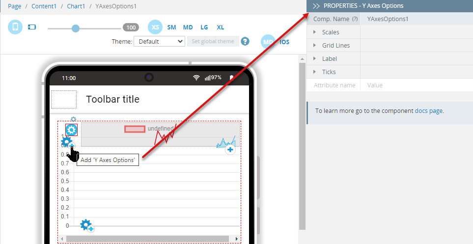
The Chart component comes with a nested Chart Data component and the X/Y Axes Options components that can be added by clicking the corresponding gear icon within the selected chart.
The Chart Data component properties that are offered for setting heavily depend on what chart type is being defined.
There are also some Chart Data properties that apply to all chart types:
| Property Name | Property Description |
|---|
| Data | The list of data value(s). |
| Legend Label | The label for the dataset which appears in the legend and tooltips.
Not available for Polar Area, Pie, and Doughnut chart types. |
| Order | The drawing order of dataset. Also affects order for stacking, tooltip, and legend.
Not available for Polar Area, Pie, and Doughnut chart types. |
| Axis ID |
- *X Axis ID** - the ID of the X-axis to plot this dataset on.
- *Y Axis ID- the ID of the Y-axis to plot this dataset on.
Not available for Polar Area,Radar,Pie,Doughnut, andBubble** chart types.
|
Additionally, the following chart styling properties are groped under the Styles section:
| Property Name | Property Description |
|---|
| Fill | Select to choose how the area under the line must be filled: start, origin (default), end, don't fill. |
| Bg Color | The line fill color in the format rgba(0, 0, 0, 0.1). |
| Cubic Interpolation Mode | The "default" algorithm uses a custom weighted cubic interpolation, which produces pleasant curves for all types of datasets. Two modes are available: default or monotone. |
| Line Tension | Bezier curve tension of the line. Set to 0 to draw straight lines. This option is ignored if monotone cubic interpolation is used. |
| Stepped Line | If the Stepped Line value is set to anything other than false, Line Tension will be ignored:
- *before,after,middle,**default.
|
| Span Gaps | If set to False (default), NaN data causes a break in the line. |
| Show Line | If set to False, the line is not drawn for this dataset. |
| Border |
- *Color** - the line color in the format
rgba(0, 0, 0, 0.1).
- *Dash** - length and spacing of dashes (not available for Bubble).
- *Width** - the line width (in pixels).
|
| Point |
- *Background Color** - the fill color for points in the format
rgba(0, 0, 0, 0.1).
- *Border Color** - the border color for points in the format
rgba(0, 0, 0, 0.1).
- *Border Width** - the width of the point border in pixels.
- *Hit Radius** - the pixel size of the non-displayed point that reacts to mouse events.
- *Hover Background Color** - point background color when hovered.
- *Hover Border Color** - point border color when hovered.
- *Hover Border Width** - border width of point when hovered.
- *Hover Radius** - the radius of the point when hovered.
- *Radius** - the radius of the point shape. If set to 0, the point is not rendered.
- *Rotation** - the rotation of the point in degrees.
- Style- style of the point:circle,cross,crossRot,dash,line,rect,rectRounded,rectRot,*star ,**triangle.
|
Axes are an integral part of a chart. They are used to determine how data maps to a pixel value on the chart. In a cartesian chart, there is one or more X-axis and one or more Y-axis to map points onto the 2-dimensional canvas. These axes are know ascartesian axes.
In a radial chart, such as a radar chart or a polar area chart, there is a single axis that maps points in the angular and radial directions. These are known as radial axes.
🚧The scales in Chart.js > v2.0 are significantly more powerful, but also different than those of v1.0.
Multiple X- & Y-axes are supported. A built-in label auto-skip feature detects would be overlapping ticks and labels and removes every nth label to keep things displaying normally.
Scale titles are supported. New scale types can be extended without writing an entirely new chart type.
Click the corresponding gear icon (X or Y) within the selected chart to add a new Axes Options element:
Then, select it to get access to its properties.
X/Y Axes Options have the following properties:
| Property Name | Property Description |
|---|
| Scales |
- *Display- control the axis global visibility if set totrue**.
- *Id- is used to link datasets and scale axes together. The propertiesdataset.xAxisIDordataset.yAxisIDhave to match the scale propertiesscales.xAxes.id/scales.yAxes.id**. This is especially needed if multi-axes charts are used.
- *Labels** - the labels list:
['Label 1','Label 2','Label 3','Label 4','Label 5']or ['Label 5','Label 1','Label 2','Label 3','Label 1'].
- *Position- the position of the axis in the chart. The possible values are:
X Axes**:top,**bottom**
- *Y Axes :left,**right.
- *Stacked- if set totrue**, data is stacked.
Stacked area charts can be used to show how one data trend is made up of a number of smaller pieces. Bar charts can be configured into stacked bar charts by changing the settings on the X- and Y-axes to enable stacking.
- *Type- the type of the scale to be used:linear,logarithmic, orcategory**:
- *Linear** scale is used to chart numerical data. It can be placed on either the X- or Y-axis. The scatter chart type automatically configures a line chart to use one of these scales for the X-axis. As the name suggests, linear interpolation is used to determine where a value lies on the axis
- *Logarithmic ** scale is used to chart numerical data. It can be placed on either the X- or Y-axis. As the name suggests, logarithmic interpolation is used to determine where a value lies on the axis
- *Category- if global configuration is used, labels are drawn from one of the label arrays included in the chart data. If only data.labels is defined, this will be used. Ifdata.xLabelsis defined and the axis is horizontal, this will be used. Similarly, ifdata.yLabelsis defined and the axis is vertical, this property will be used. Using bothxLabelsandyLabels together can create a chart that uses strings for both the X- and Y-axes.
Specifying any of the settings above defines the X-axis as thecategory** type if not defined otherwise. For more fine-grained control of category labels it is also possible to add labels as part of the category axis definition. Doing so does not apply the global defaults.
|
| Grid Lines | The grid line configuration is nested under the scale configuration in the gridLines key. It defines options for the grid lines that run perpendicular to the axis.
https://www.chartjs.org/docs/latest/axes/styling.html
- *Border Dash** - the length and spacing of dashes on grid lines.
- *Color** - the grid lines color. If specified as an array, the first color applies to the first grid line, the second to the second grid line, and so on.
- *Display- if set tofalse**, the grid lines for this axis will not be displayed.
- *Draw Border- if set totrue**, the border at the edge between the axis and the chart area is drawn.
- *Draw On Chart Area - if set to**true, the lines on the chart area inside the axis lines are drawn. This is useful when there are multiple axes and you need to control which grid lines are drawn.
- *Draw Ticks- if set totrue**, the lines beside the ticks in the axis area beside the chart are drawn.
- *Line Width** - the stroke width of grid lines.
- *Offset Grid Lines- if set totrue**, the grid lines will be shifted to locate between the labels. This is set totruefor thebar chart by default.
- *Tick Mark Length** - the length in
px that the grid lines will draw into the axis area.
- *Z-Index** - z-index of the grid line layer. The values
<= 0 are drawn under datasets, those that are `> 0 on top.
- *Zero Line Border Dash** - the length and spacing of dashes of the grid line for the first index (
index 0).
- *Zero Line Color** - the stroke color of the grid line for the first index (
index 0).
- *Zero Line Width** - the grid line stroke width for the first index (
index 0).
|
| Label |
- *Display- if set totrue**, displays the axis title.
- *Font Color** - the font color for scale title.
- *Font Size** - the font size for scale title.
- *Font Style - the font style for the scale title, follows the CSS font-style options (i.e.normal,italic,oblique,initial,**inherit).
- *Label String** - the text for the title.
- *Line Height** - the height of an individual line of text.
- *Padding** - the padding to apply around scale labels. Only top and bottom are implemented.
|
| Ticks |
- *Auto Skip- if set totrue**, automatically calculates how many labels can be shown and hides labels accordingly. Labels will be rotated up tomaxRotationbefore skipping any. Turn**Auto Skip** off to show all labels available.
- *Auto Skip Padding- the padding between the ticks on the horizontal axis withAuto Skip** enabled.
- *Begin At Zero- if set totrue**, the scale will include 0 if it is not already included.
- *Display- controls the axis global visibility (visible whentrue**, hidden when**false**).
- *Font Color** - the font color for tick labels.
- *Font Size** - the font size for the tick labels.
- *Font Style** - the font style for the tick labels, follows the CSS font-style options.
- *Label Offset - the distance in
px to offset the label from the center point of the tick in theXdirection (for the X-axis), and theY** direction (for the Y-axis). Note that this can cause labels at the edges to be cropped by the edge of the canvas.
- *Line Height** - the height of an individual line of text.
- *Max** - the user-defined maximum number for the scale, overrides maximum value from data.
- *Max Rotation** - the maximum rotation for tick labels when rotating to condense labels. Rotation doesn't occur until necessary. Only applicable to horizontal scales.
- *Min** - the user-defined minimum number for the scale, overrides minimum value from data.
- *Min Rotation** - the minimum rotation for tick labels. Only applicable to horizontal scales.
- *Mirror**- flips tick labels around axis, displaying the labels inside the chart instead of outside. Only applicable to vertical scales.
- *Padding- the padding between the tick label and the axis. When set on a vertical axis, this applies in the horizontal (X) direction. When set on a horizontal axis, this applies in the vertical (Y**) direction.
- *Precision- if defined with theStep Size** property unspecified, the step size will be rounded to this many decimal places.
- *Reverse- reverses the order of tick labels if set toTrue**.
- *Sample Size** - the number of ticks to examine when deciding how many labels will fit. Setting a smaller value will be faster, but may be less accurate when there is large variability in label length.
- *Step Size** - the user-defined fixed step size for the scale.
- *Ticks Max Ticks Limit** - the maximum number of ticks and gridlines to show.
- *Z-index** - z-index of the tick layer. It is used when ticks are drawn on a chart area. The values
<= 0 are drawn under datasets, those > 0 on top.
|
🚧For the linear Axes type Zero Line is 0!
📘You can also check this step-by-step tutorial that shows how to create a simple Ionic mobile application with a line chart in Appery.io.