Datetime
Overview of the Datetime Component
DatetimeWrapper
The DatetimeWrapper component provides an interface that makes it easy for users to select dates and times.
Each new DatetimeWrapper component is created with a default label and the current date/time value.
Properties
Important Note!This document lists the properties specific to this UI component.
To check the properties common to most UI components, please see the General components document.
The DatetimeWrapper component has the following properties and includes two child components: Datetime and Label.
| Property Name | Property Description |
|---|---|
| Item Wrapped | If set to true, the component will be included in the Item with additional properties. |
| Show Label | If set to true, the component will display a label. |
| Lines | Determines how the bottom border should be displayed on the item. Possible values are: Full, Inset, None. |
| Reorder | Reorder properties:
|
Datetime
The Datetime component has the following properties:
| Property Name | Property Description |
|---|---|
| View | Select from two options:
|
| Name | The name of the control, which is submitted with the form data. |
| Value | The value of the datetime as a valid ISO 8601 datetime string. Click the Calendar icon to set the desired value. |
| Presentation | The available values are: date, date-time, month, month-year, time, time-date, year. |
| Placeholder | The text to display when no date is selected yet. Default is set to Select date. |
| Placeholder I18n | If set to True, then use the Placeholder property for internationalization. |
| Format | Format options JSON object.Example: {"year": "2-digit", "month": "2-digit", "day": "2-digit"}. See details here. |
| Readonly | If set to True, the value cannot be modified. The default is False. |
| Min | The minimum datetime allowed. Click the Calendar icon to set the desired value. |
| Max | The maximum datetime allowed. Click the Calendar icon to set the desired value. |
| Buttons | Add a picker to the datetime. Picker properties are:
|
| Values | Comma-separated values used to create the list of selectable years, months, days, hours, and minutes. |
| Localization |
|
| Slot | Position inside another component: Start or End. Default is set to «». |
| Multiple | If set to True, multiple dates can be selected. |
| [(ngModel)] | Angular directive for data binding. |
| (ionChange) | The event emitted when the value has changed. |
Styles Properties
Under the Styles tab, Datetime components can be styled with the following attributes:
| Property Name | Property Description |
|---|---|
| Calendar Color | Select CSS color of a datetime from the available colors: Primary, Secondary, Tertiary, Success, Warning, Danger, Light, Medium, Dark, and Custom. |
| Text Color | Select CSS color of a datetime placeholder from the available colors: Primary, Secondary, Tertiary, Success, Warning, Danger, Light, Medium, Dark, and Custom or use the Color-picker. |
ItemLabel
The ItemLabel component has the following properties:
| Property Name | Property Description |
|---|---|
| Truncate Text | Set to True (default) to truncate label text if it is too long. |
| Position | The position determines where and how the label behaves inside an item. |
Styles Properties
Under the Styles tab, ItemLabel components can be styled with the following attributes:
| Property Name | Property Description |
|---|---|
| Font Size | Enter font size in px, %, em, vh, and vw. |
| Font Weight | Set the weight (or boldness) of the font: Normal or Bold. |
Using Datetime as a Form Control
If included in a Form component, Datetime becomes a Form Control:
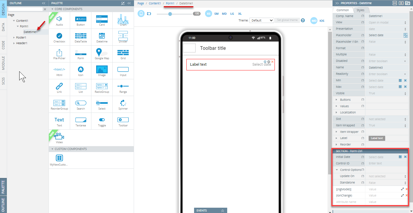
Note that the Name property should be specified. By default, the Name property is set to the Component name property. Change it to your preferred name if necessary.
To use variables as the control's data, the advanced property [(ngModel)] should be specified - the variable name should be entered as the property value. It replaces the value that is set by the Initial Value property.
The component can have additional properties (Control ID and Control options) that allow checking validity, changing update strategy, etc. These properties can be used if the Native Validation property is disabled for the Form component.
Read more about validation in the Form section.
Datetime Validation Customization Video TutorialYou can also check this YouTube video to to learn how to how to use the plugin, make date fields required and ensure user input, and see how the Validation component works within the Form container for reliable datetime checks:
Note!The component cannot be used with array iteration data for creating a dynamic form structure. If you need to create such a structure, follow these recommendations.
Visit the Ionic documentation to read more about datetime.