Ionic Components Sample App Template
Overview of the Ionic UI components and their properties available in the visual App Builder
Introduction
In this document, you will be able to review the app template introducing all Ionic UI components currently presented by Appery.io. This application demonstrates the main customizable properties available in the visual App Builder.
We will guide you on the step-by-step flow of how each of these pages was created so that you can recreate it in full in your own app or use some particular UI components and/or define their behavior depending on your needs. Moreover, you will learn how to copy the UI component(s) you liked or modify UI components according to your needs with further exporting them.
Working with Ionic Components Sample App Template
This Ionic Components App template shows possibilities for customization of Ionic UI components as well as a wide set of use cases to build custom mobile UI. Feel free to clone or copy any components or approaches to your app.
Creating App from Template
NEW: One-Click Template Installation!You can now enjoy the one-click-away option of installing the template app: simply click the button below and in a moment, your app is ready to start! There’s no need to go to the Create new app dialog or download the template backup with further installing it!
You can also create this app by using our Create new app dialog:
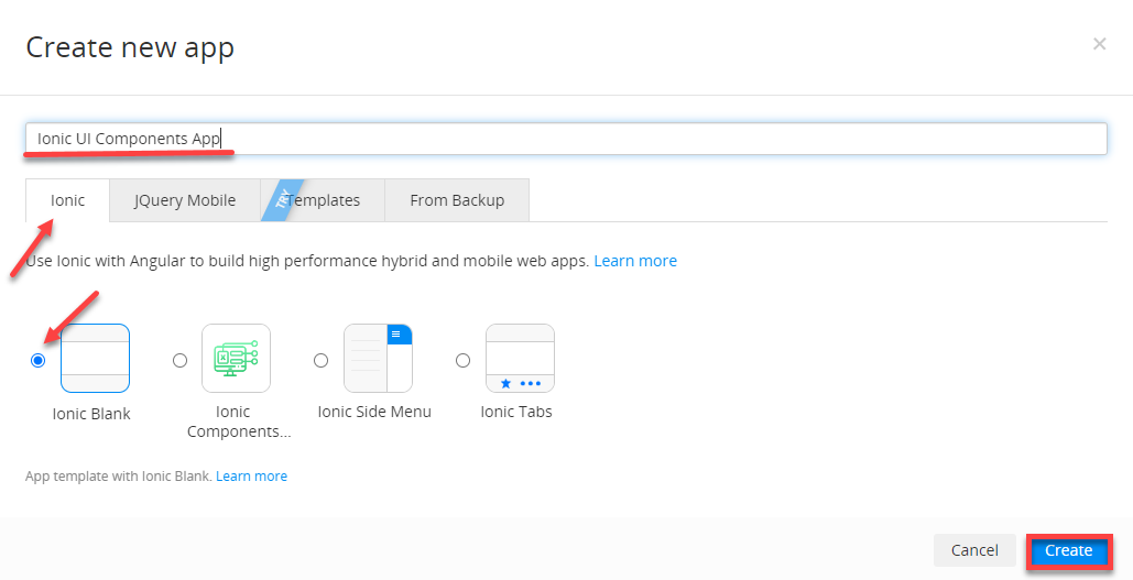
- From the Apps page, click Create new app > Ionic Components Sample App, enter the name for your project (for example, Ionic UI Components App), and click Create.
App NameIf you like, you can name your project now or rename it later under its General tab.
- In a moment, you will see that the application has been built under your account.
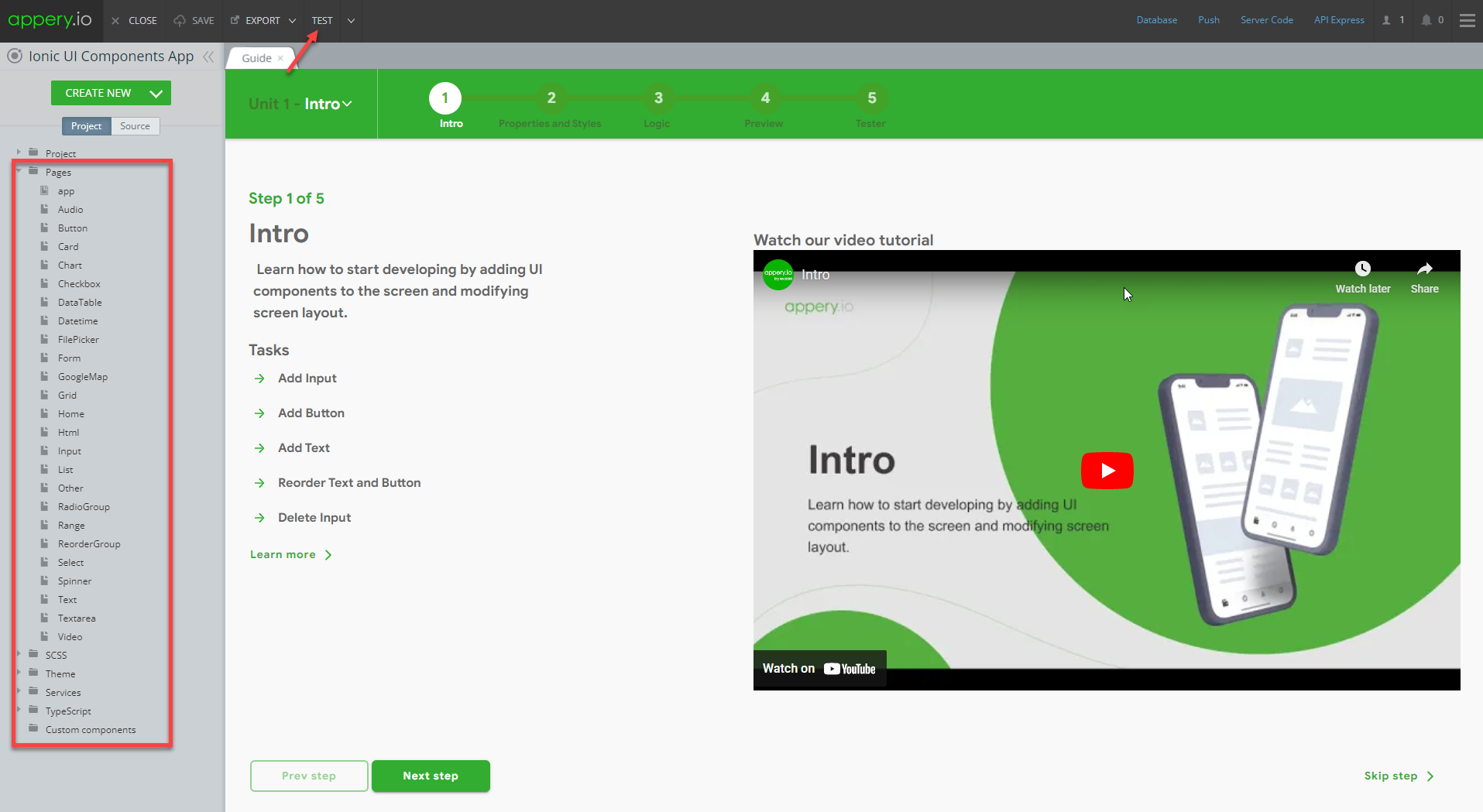
The first thing you can see is our App Builder Educational Video Guide page with the Project View section on the left where all the predefined project data can be found.
To view the app in work, click the TEST button in the App Builder Toolbar:
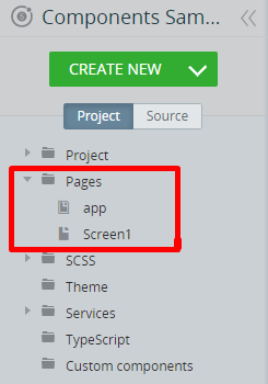
Template Overview
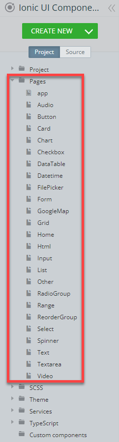
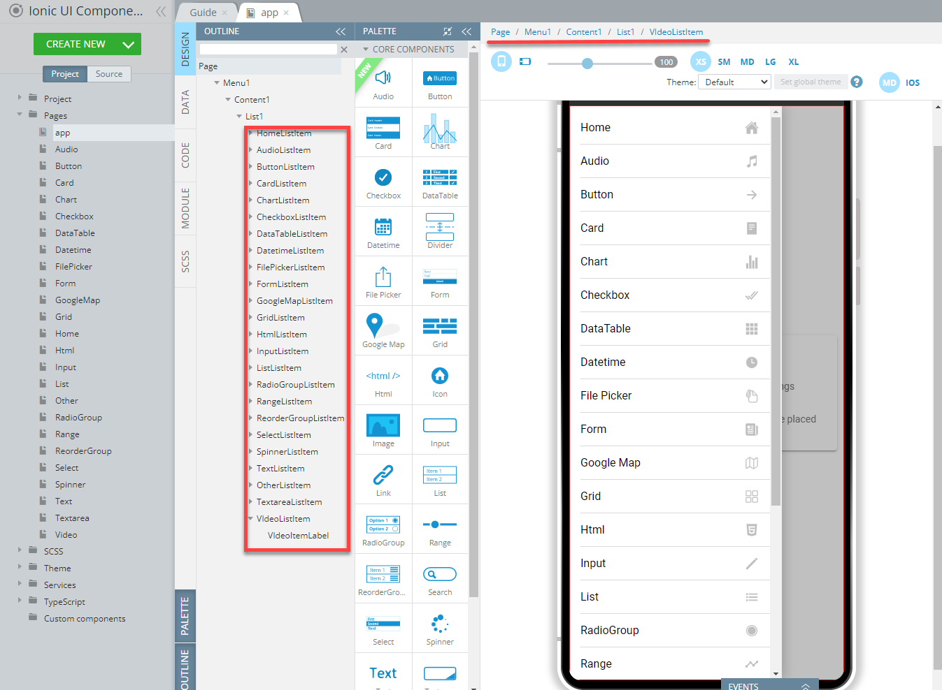
To get an overview of the structure of the application pages, click the arrow next to the Pages folder to unfold it: this will give you full access to all the app pages grouped on the Project tab list:
In this document, we will provide details on every app page of our Ionic Components Sample App template so that if you decide to recreate this app in full or would like to learn how some particular page and/or UI component was created, you will be able to do so by following our step-by-step instructions provided below.
Creating your Custom App
If you are rather interested in creating your own application, you will need to create a blank Ionic app first and then follow our directions provided below.
And if you are rather interested in customizing, it is also recommended that you check out the instructions in this video to learn how to do it.
Creating ... Page sectionsPlease check the corresponding Creating ... Page sections of this document to learn more details about how the particular page of the sample app was created.
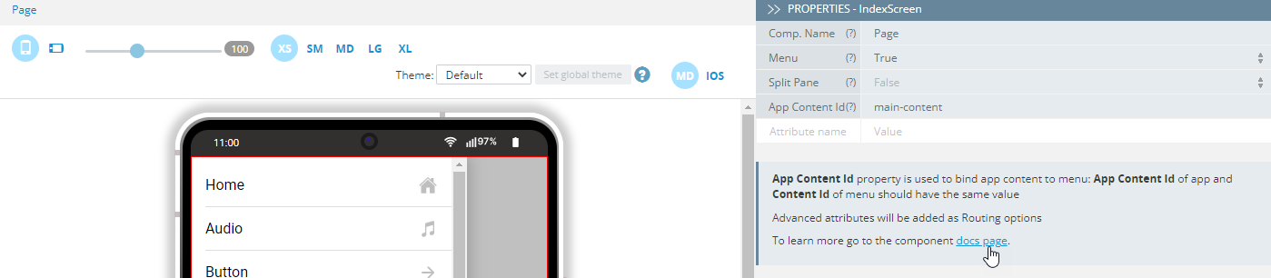
Note as well that you can always get detailed information on any UI component by clicking its docs page link under the PROPERTIES panel:
- To create a new Ionic app, under the Apps tab of the Appery.io platform, click the Create new app button.
- In the new window, provide the new app's name, for example, Ionic UI Components App (or any other name you like) and confirm by clicking Create:
In a moment, you will find yourself inside Appery.io App Builder.
- Go to the Project tab on the left and unfold the Pages folder to see the default app pages (screens):
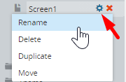
For our Ionic Components Sample App template, the default app page was defined as follows and Screen1 was renamed (and then modified) to the Home page by hovering over the Screen1 page, clicking the cog icon and selecting Rename:
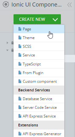
All the other pages were created by clicking CREATE NEW > Page and then defined separately to feature different UI components:
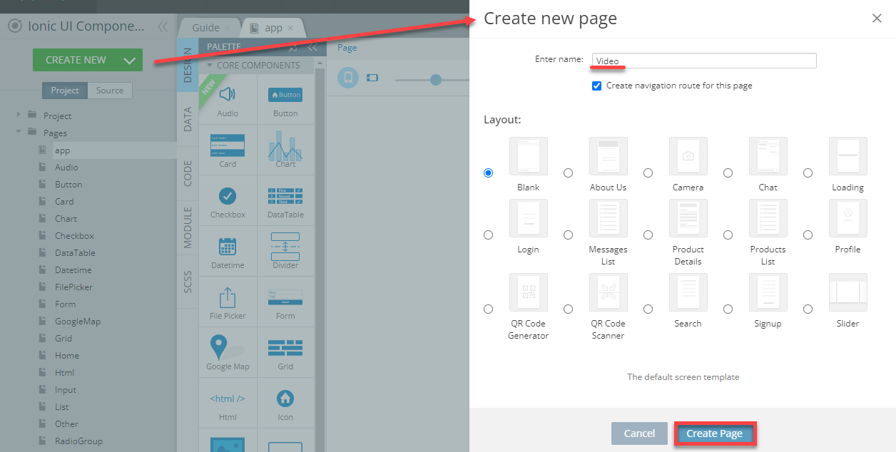
If you want to replicate the entire Ionic Components Sample App, you will need to repeat the CREATE NEW > Page action for 23 more new pages with naming them according to the sample app pages:
As a result, you should get the following pages set organized under the Pages folder of the Project tab:

Additional MenuYou can go to the Additional Menu located in the upper right corner of the App Builder Toolbar (the three lines button), then click it to select Close all Tabs to clear the tabs that were automatically opened while creating:
Now, you can proceed to check the sections below if you want to learn how each page of the sample app was created and, if needed, to recreate it.
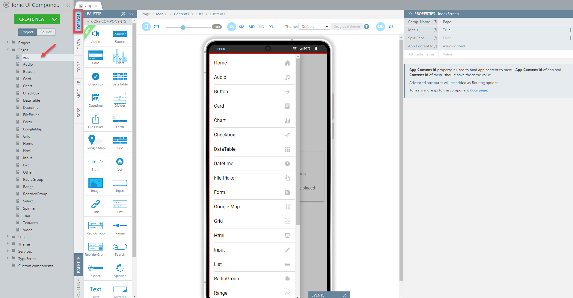
app Page
The first page on the pages list of our Ionic Components Sample App, app, is actually the indexScreen. Being the page of the highest level, it manages the general app behavior.
In this sample app, the menu functionality has been added that allows redirecting to every app page demonstrating different UI components. Check below for how you can achieve this if you decide to build your app with a menu.
It is not recommended that you start with making custom changes to this app page until you feel more knowledgeable about customizing other UI components.
Creating app Page
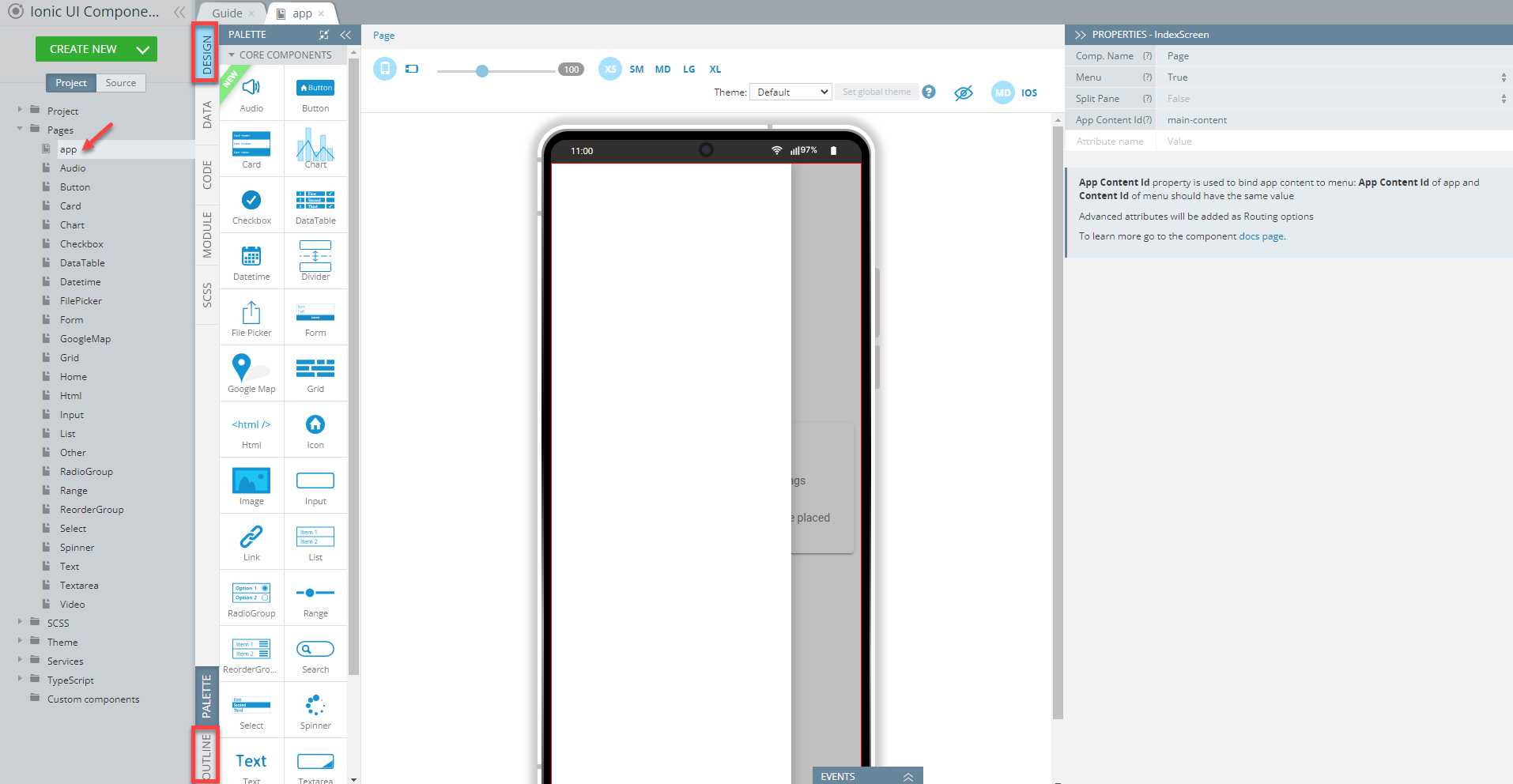
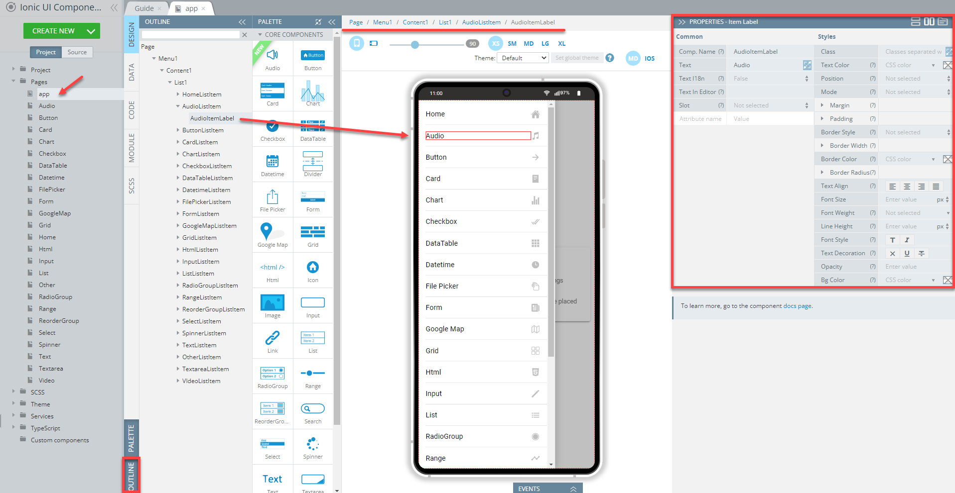
- It's a good practice to open the OUTLINE view to be able to review all the components added to any page. So, let's do it for the app page:
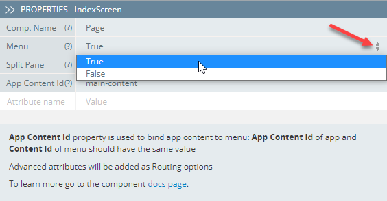
- To add the menu functionality to the page, you first need to go to the page PROPERTIES tab on the right and set its Menu property to True:
If you unfold the Menu folder and select any of the files on the OUTLINE list, this particular component will get selected and its properties list will be shown on the PROPERTIES tab on the right. It will also be selected on the breadcrumbs chain on top of the mobile frame so that you can see its nesting and easily switch between the other related page components:
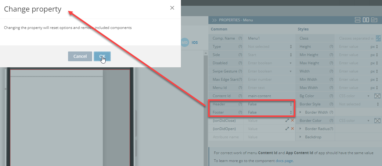
- The Menu header and footer are not used in this app, so, in your new app, you will need to select the Menu component (you can simply click it on the screen, use the breadcrumbs or use the OUTLINE view) and, one by one, set its Header and Footer properties to False. You will need to agree to the warning before these changes can be applied to the page:
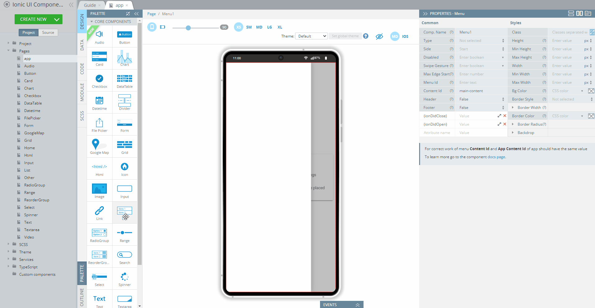
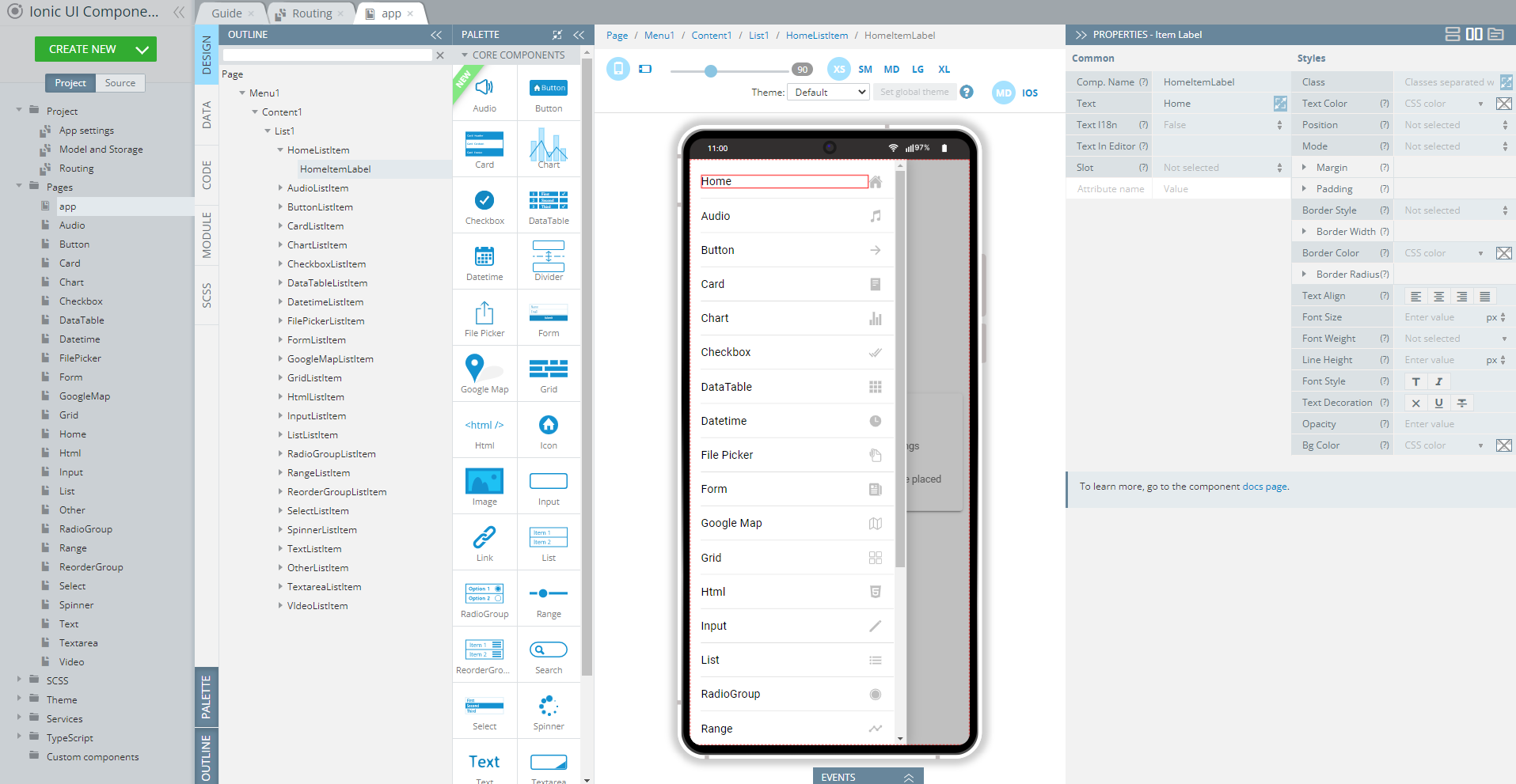
- Now, drag the List component (it can be accessed from PALETTE and drop it to the screen, so click the corresponding button to open it) to the mobile phone area so that it gets placed inside the menu area:
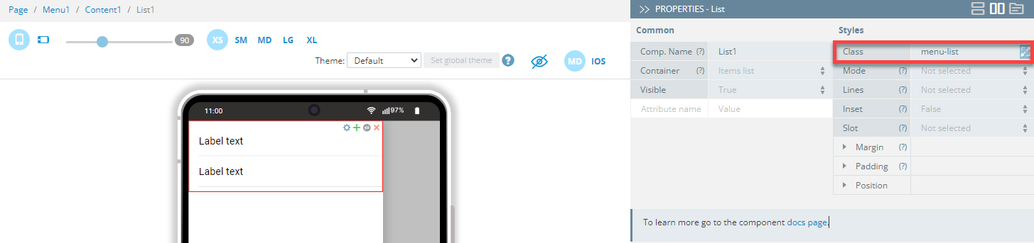
- A list with two default list items each having an item label will be created. Select the List component and define its Class as menu-list:
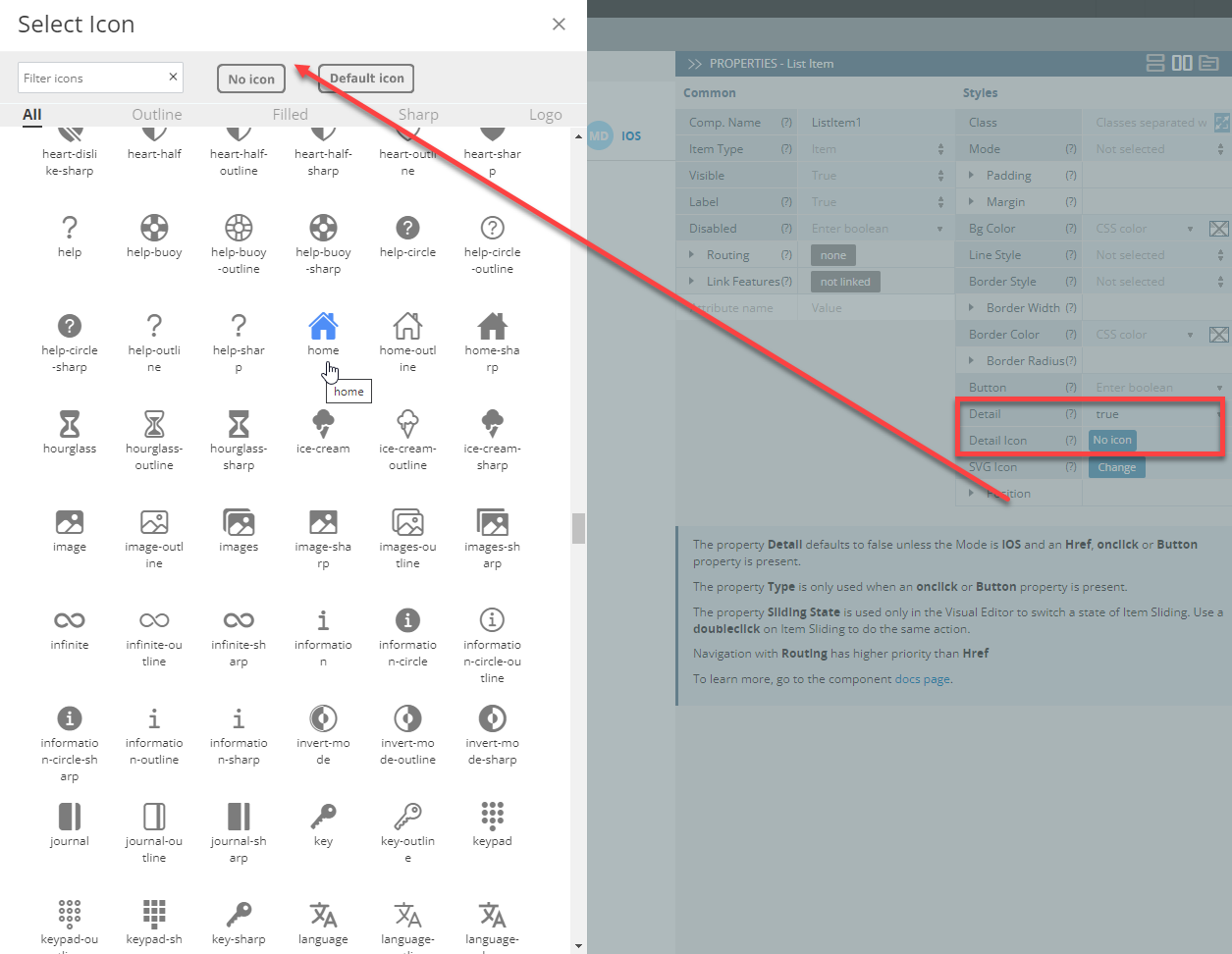
- From the two default List item, let's first define the upper one. First of all, select it and set its Detail to true. Then, click Detail icon to open the icon selection window.
As you can see, there are many options and it can take some time to find the needed one, so we can recommend selecting the icon groups to save time: switch from All to Outline, Filled, Sharp, or Logo. Or, even better, use search to filter icons: just enter, for example, home into the search window and hit Enter. Now, you can select the icon you like, for example, home:
-
Lastly, select the Item Label1 and set its Text property to Home:
-
Now, let’s explore the Appery.io UI components' Routing feature which is used for redirecting to specific app pages: unfold the Routing folder for this List Item component of our sample app to set routing to the Home page (Route Name = Home):
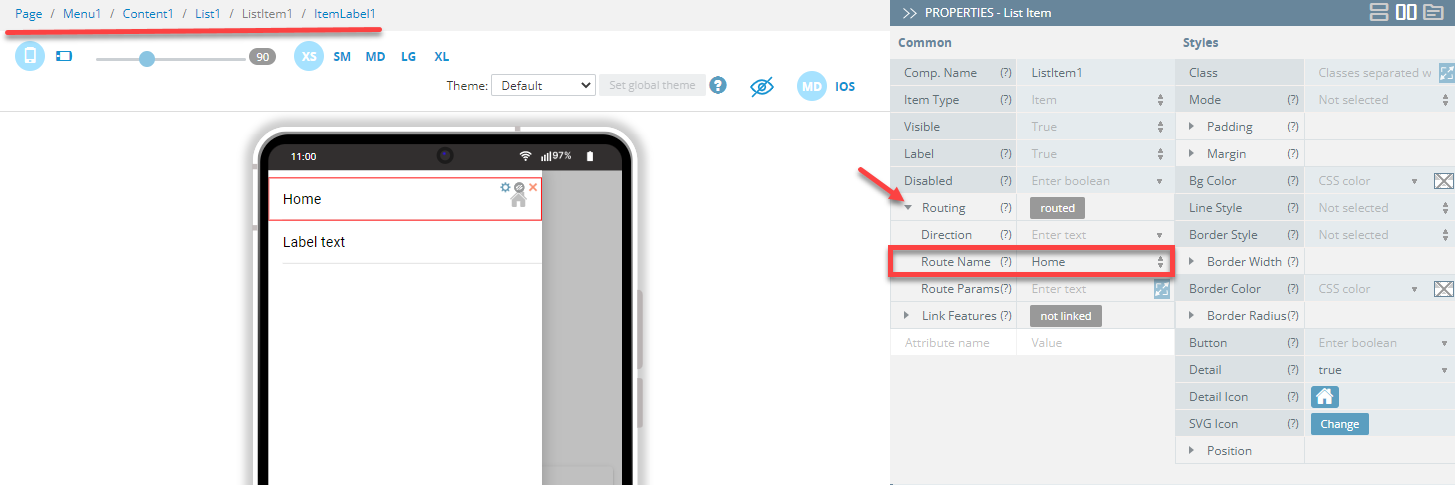
This means that if this particular list item is selected (clicked) in an app, you will be redirected to the app Home page. And, of course, you can customize this behavior by selecting another Route Name value. Note as well, that when folded, the Routing value (routed) indicates that some routing path is defined for this component.
Please be informed that if you are building your app from scratch and have not defined any custom page yet, the Route Name can be set to the only page available at the moment: Screen1.
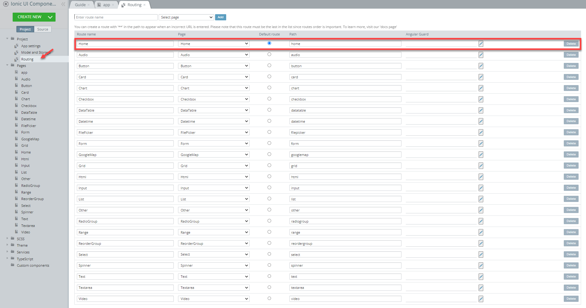
All routing options are defined under the Project > Routing tab, so, let's open this tab in our new app.
As you can see, the default routing is set to the Home page but the route name and the path are still named after the default Screen1. So, let's rename them for the sake of consistency:
Now, when the Routing tab looks good, we can go back to the app page and define the second List item.
- Select it and set its Detail property to true (this is to be applied to all of the List items on the list).
- For the Detail icon property, click Default icon and select arrow-forward.
- Set the Route Name to Button:
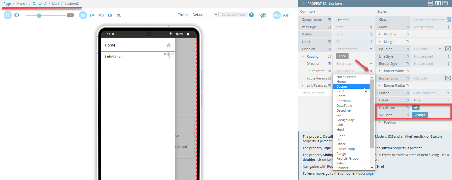
- Switch to the Item Label component and set its Text property as Button.
Congratulations! You are done with configuring the first two menu items that will be redirecting to two app pages: Home and Button!
Tip!It's a good practice to replace the generated components' names with some meaningful names, so you can easily identify the components you are working with. This can be very useful when there are many similar UI components:
Adding List Items to List
We now have two menu list items but our Ionic Components Sample App features as many as twenty-four List items so, if you want to recreate the app in full, you will need to create more.
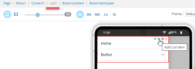
To do it, you can select the List component and click the green + button:
If you want to replicate the entire sample app, you will need to repeat this action for twenty-three more list items and define them accordingly.
Using clone Feature
There is also another, easier way to add more items to the list by using the clone feature:
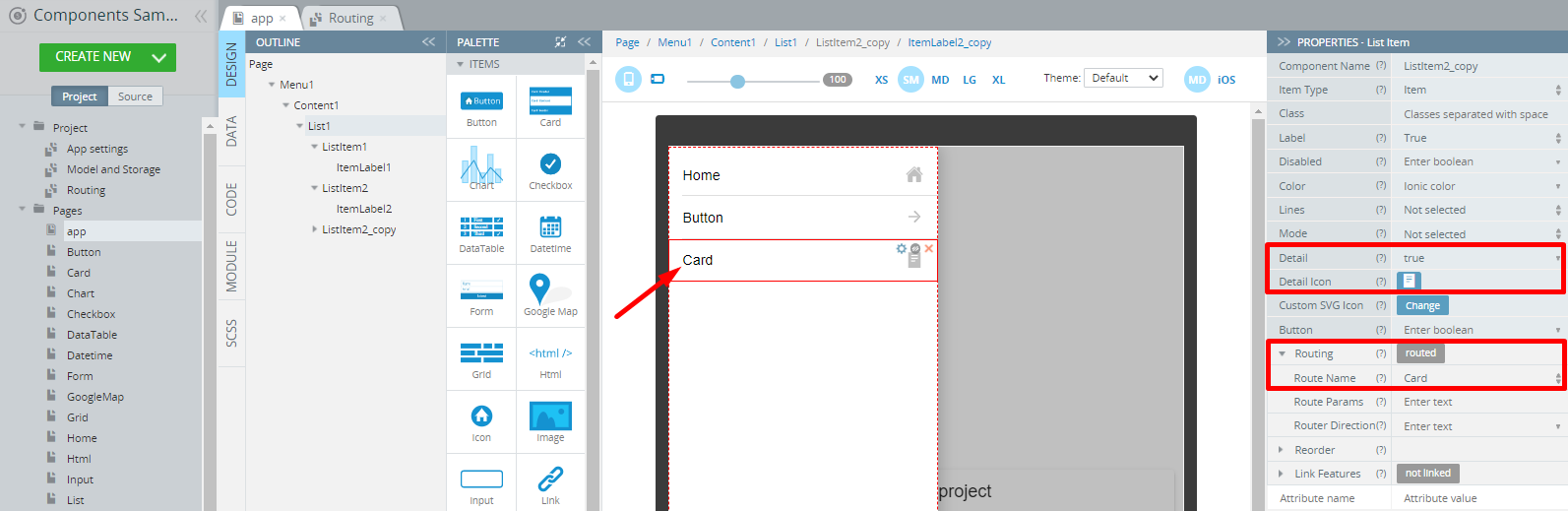
Select the component (here, it's List item) you want to clone and click its cog button, then select clone to get the copy of this particular component:
Then, you will only need to modify some of the component's properties like setting the new Text property value for its Item Label, defining the correct Route Name, and selecting the appropriate detail icon:
Similarly, this List item can be further reused as the template for creating another List item and this operation can be repeated until you get the full list of the items redirecting to the particular app pages.
Cloning ComponentsBy default, all cloned UI components are named after their original instance with the added _copy extension.
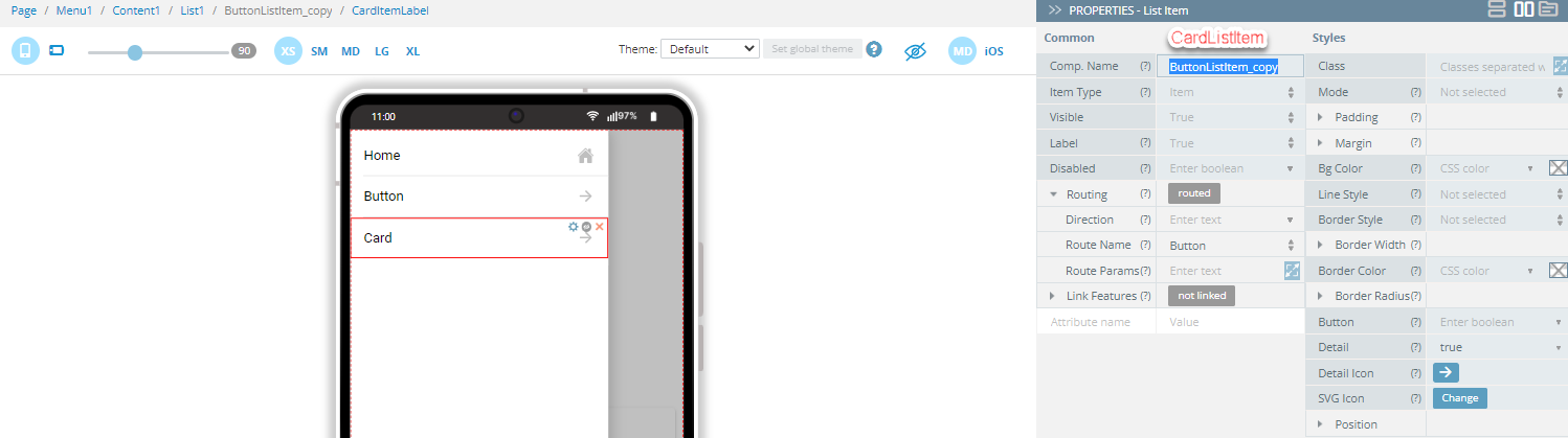
You might like to rename them (including their child components) to some more meaningful names, for example, ButtonListItem_copy to, for example, CardListItem, etc., but this is optional and is up to you:
Here is what the list can look like with all the cloned list items renamed and in their places:
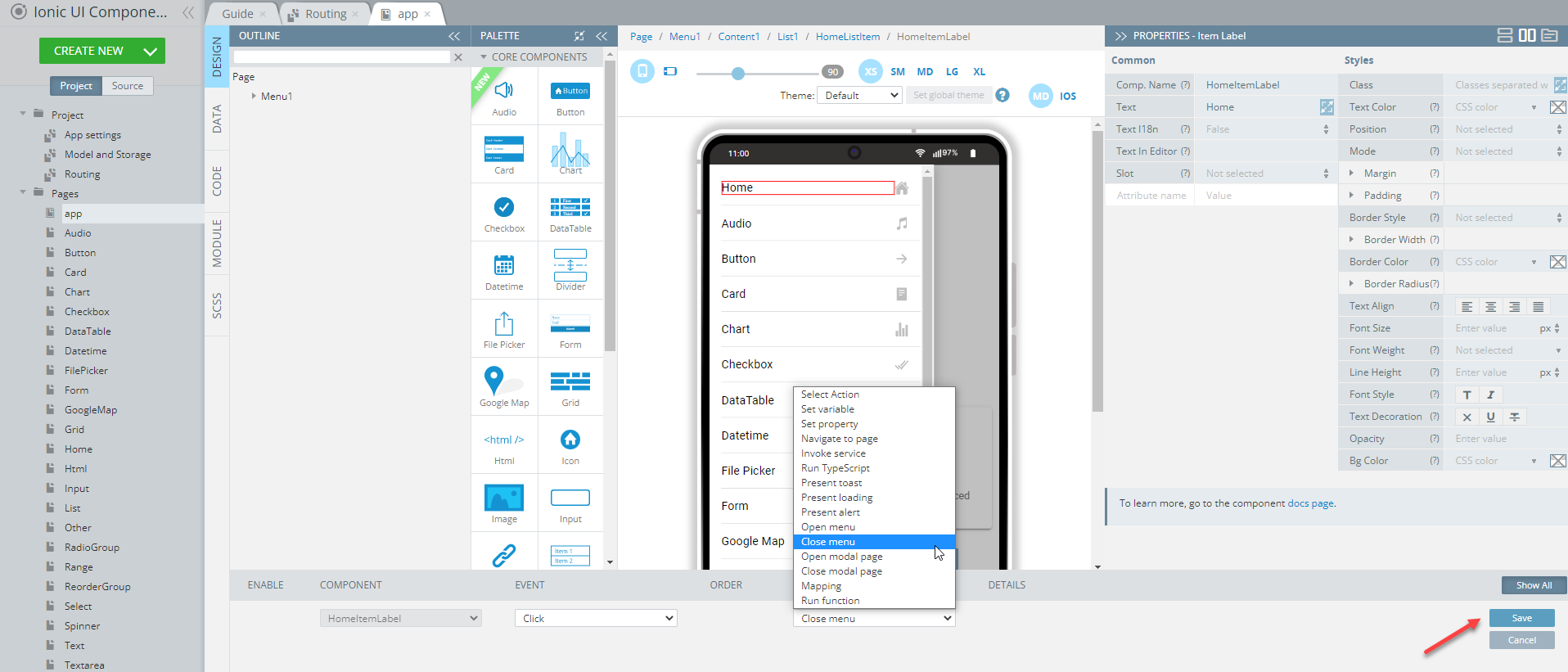
To finish with the page, let's make the menu close automatically.
To do it, expand the EVENTS tab from the bottom and select the Close menu action from the drop-down list of events available for the list Click event, click Save:
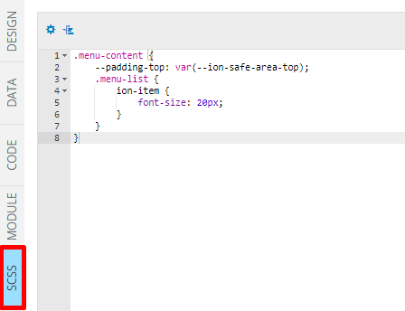
Finally, as this is the page of the highest level and should look accurate, it is required that its SCSS panel be modified:
It's easy: you just need to copy the below code:
.menu-content {
    --padding-top: var(--ion-safe-area-top);
    .menu-list {
        ion-item {
            font-size: 20px;
        }
    }
}
add it to the page code editor and save the app:
Well done! Let's proceed with another important page,Home, that is created to redirect you to the rest of the app pages.
Home Page
Open our ready-to-go Ionic Components Sample App and select the page in the Project view tree.
You will see that there are several UI components added to this page. To see the full list of them, expand the OUTLINE view by clicking on the corresponding button in the left bottom corner of the screen:
Now, when you click any of the components on the screen, you will be able to review this element in detail and make any changes to its properties that will be listed on the right, under the PROPERTIES panel (you can use the text popups to make editing more comfortable). If you like, you are also free to edit any text strings right in the mobile frame:
To recreate the page as you see it now, follow the steps below.
Creating Home Page
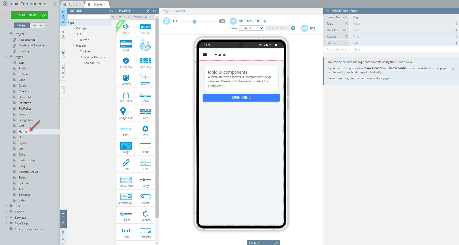
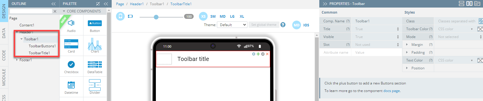
Every page Header has a Toolbar with Toolbar buttons and Toolbar title components by default:
- Drag a Button and drop it to the Toolbar buttons area, then define its Comp. Type property as Ionic Menu Button:
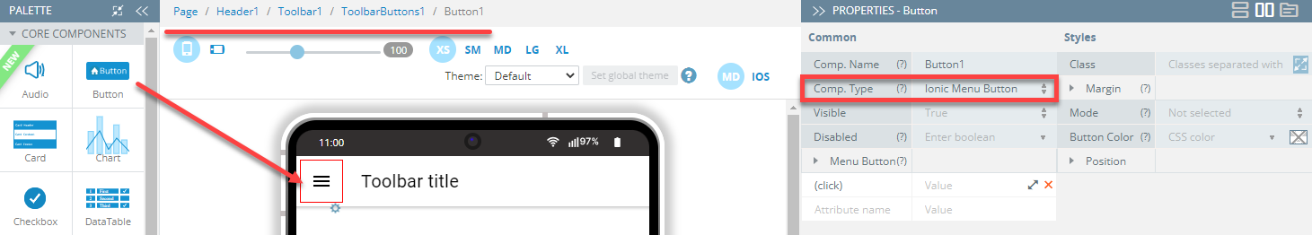
- Rename Button1 to Menu.
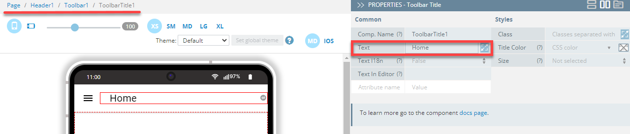
- Set the Toolbar title component's Text property as Home:
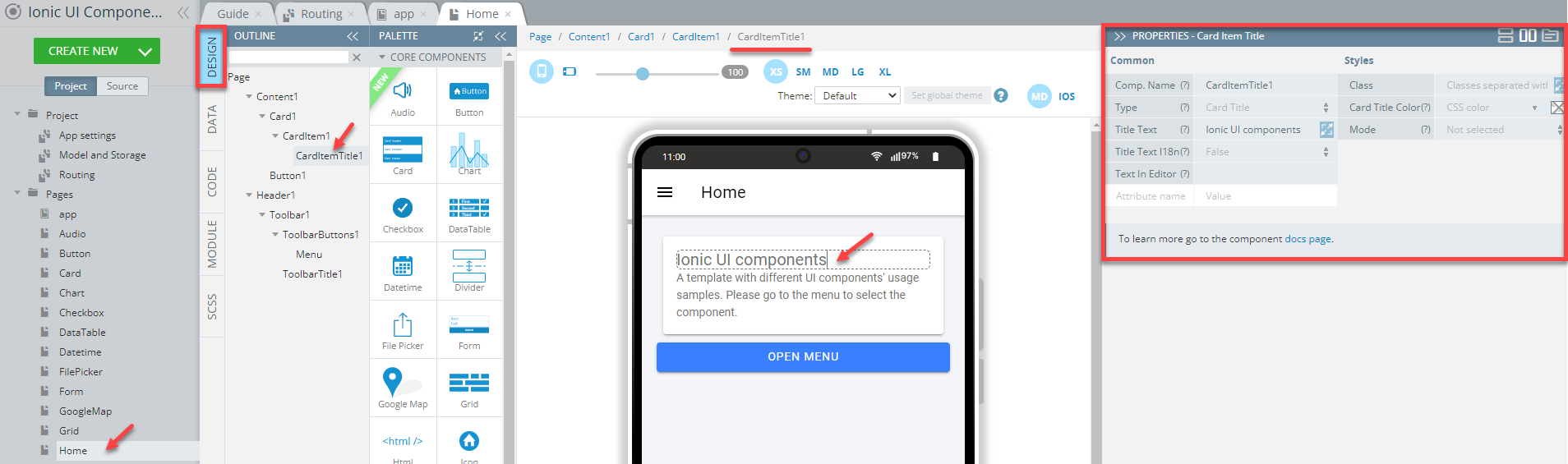
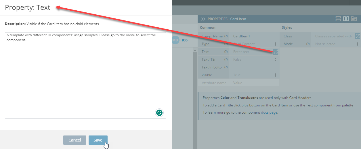
- Now, drag the Card component and drop it to the Content area; then replace the default Card Item Title Text with Ionic UI components.
- Set the Card Item Text value to A template with different UI components' usage samples. Please go to the menu to select the component. (you can use the text popups to make editing more comfortable):
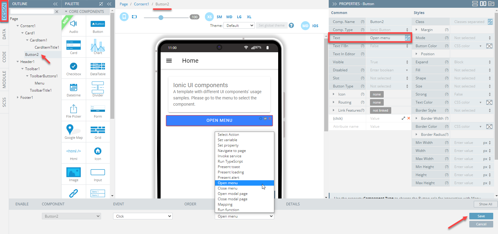
- Drag a Button and drop it below the card; then set its Text property to Open menu. You might also like the rename the button but this step is optional.
- Expand the EVENTS tab from the bottom and select the Open menu action from the drop-down list of actions available for the Click event.
- Save the event and check to see that it looks like expected; then, close the EVENTS tab:
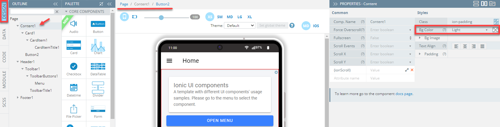
- To apply some color to the app background, select the Content component and set its Bg Color property to light under Styles:
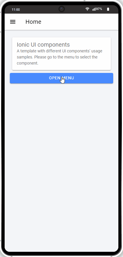
Actually, that's it for the app and Home pages. With these two pages defined, you can proceed with testing your app.
Tip!We highly recommend renaming UI Components that were autogenerated or cloned (including their child components) to some more meaningful names.
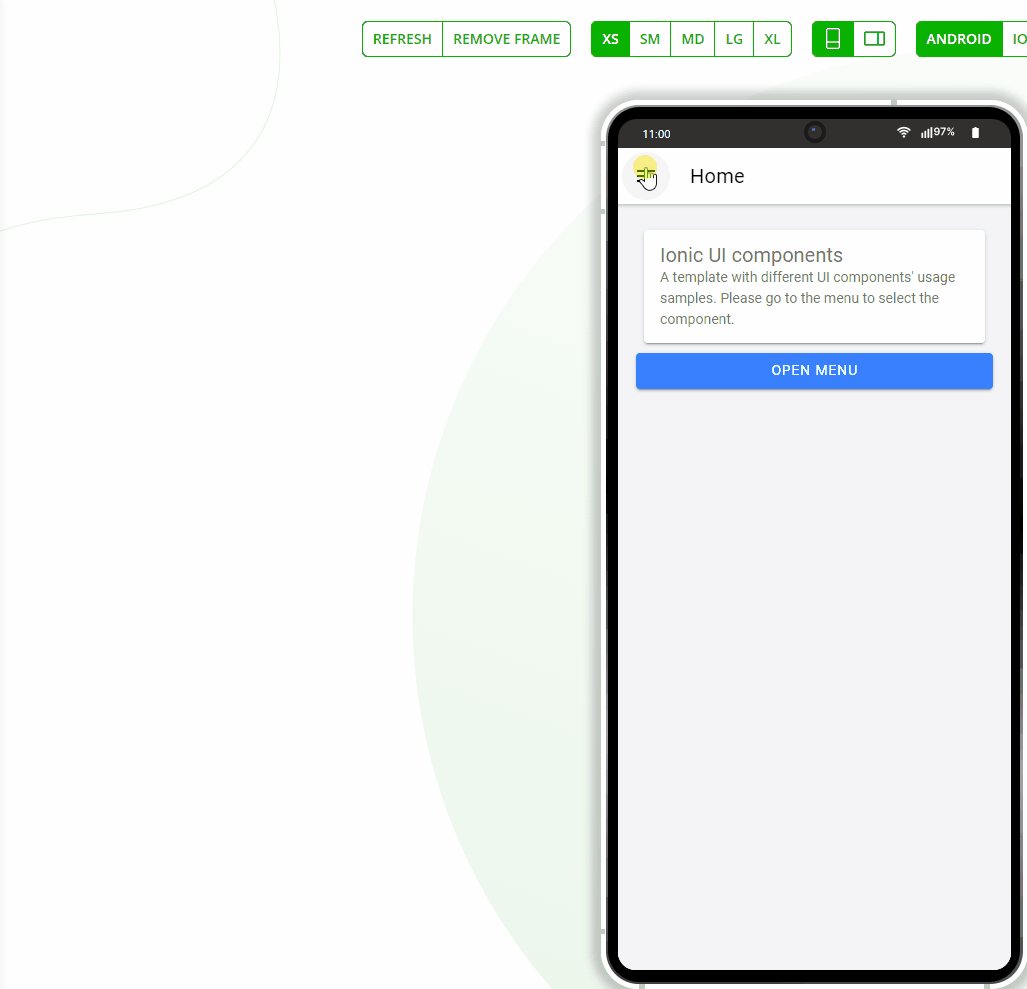
To do it, click TEST to open the default app preview page in a new desktop web browser tab. The app has only one screen (page) defined but the menu routing should already work perfectly:
Since you are now launching the project for the first time, please allow some time for the app preview to load.
Pages Featuring Ionic UI Components
The rest of the pages on the Project tab list represent the UI components that are available for Ionic (except for the Other page where four different components, Icon, Image, Divider, Link, and Toggle were added).
Some of the pages demonstrate rather simple UI while others incorporate more complex behavior so that you will be able to check different options of the same component.
Like the Home page described above, all the other pages of our ready-to-go Ionic Components Sample App can be reviewed and modified. Note as well that all of the pages feature some common components: Header and Content: they are used to combine everything to make the app work as a whole.
Please check out the below to learn how each of the sample app pages was created.
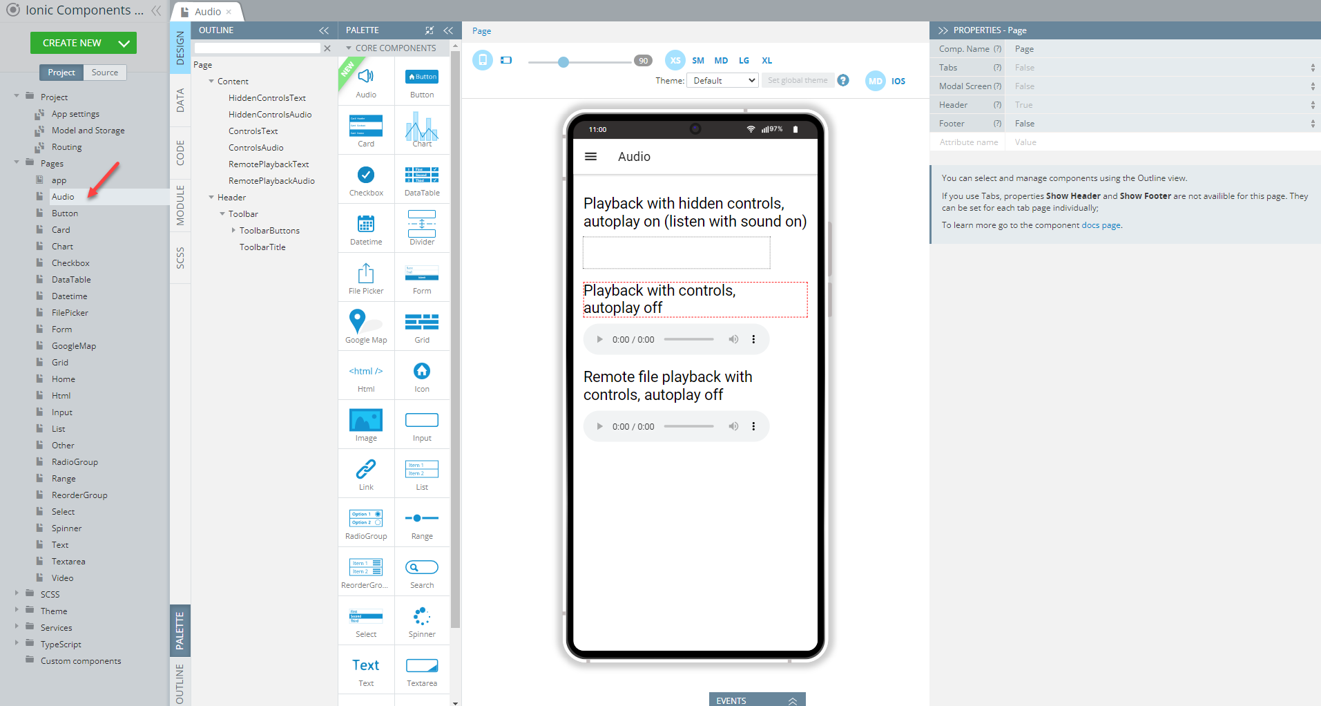
Audio Page
Open our ready-to-go Ionic Components Sample App, select the page in the Project view tree, and open the OUTLINE view to check the details of its UI components predefined in our sample app:
To recreate the page as you see it now, follow the steps below.
Creating Audio Page
- Disable the footer for the Page component (Footer = False).
- Set the Toolbar Title Text property to Audio.
- Drop the Button component to the Toolbar Buttons area, rename it to Menu (Comp. Name = Menu) and set its Comp. Type property to Ionic Menu Button.
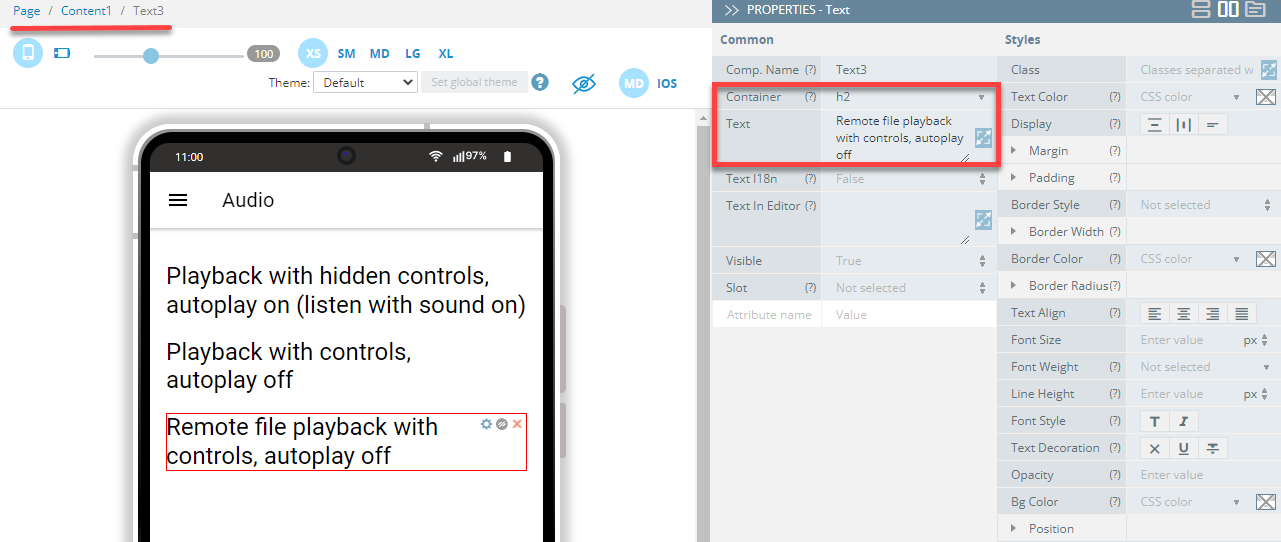
- Drag three Text components and drop them to the Content area. Set their Container to h2 and then, one by one, define their Text properties as follows:
- Text1 = Remote file playback with controls, autoplay off
- Text2 = Playback with controls, autoplay off
- Text3 = Remote file playback with controls, autoplay off:
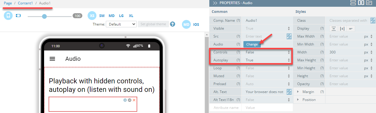
- Now, drag three Audio components and drop them under the Texts.
- Select the first Audio component and define its Controls property as False and then set its Autoplay property to True. Next, click the Change button for the Audio property:
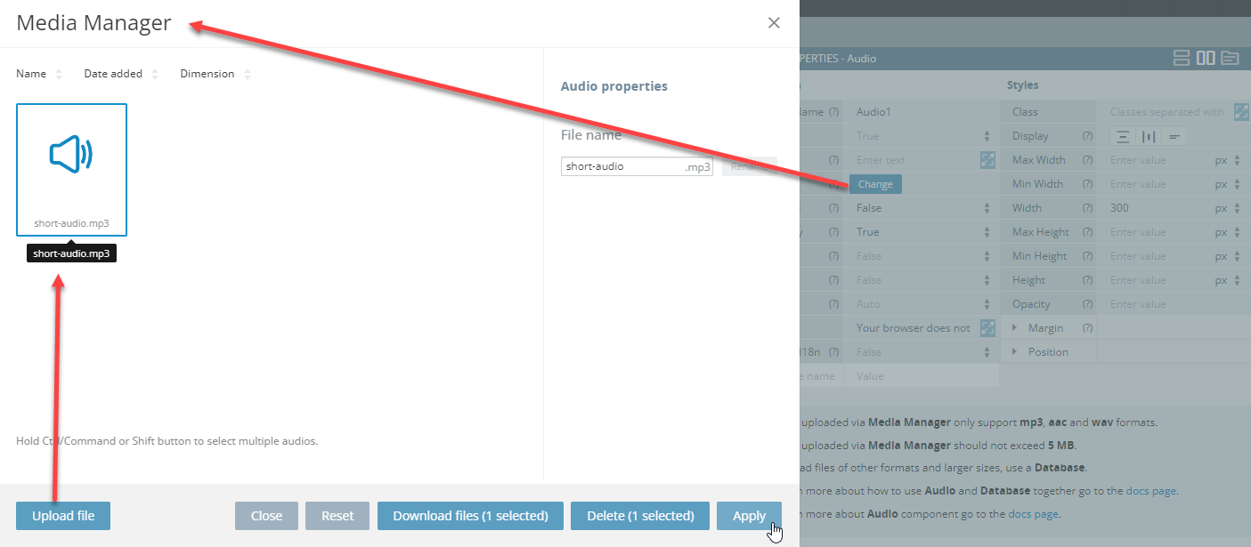
- The Media manager window opens, where you can upload the needed audio file (should be prepared beforehand) to apply it to the component:
- Similarly, upload the needed audio file and then apply it to the second Audio component. Then set its Controls property as True and its Autoplay property to False:
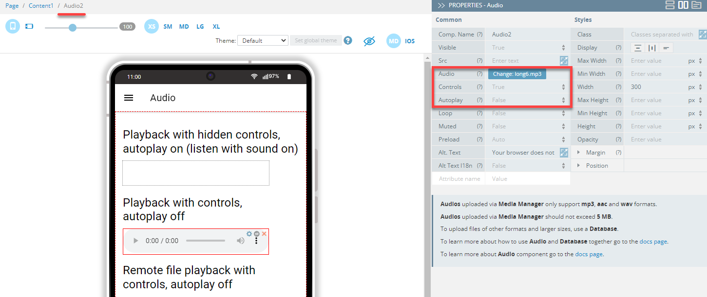
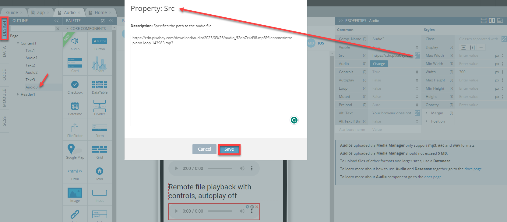
- Finally, select the third Audio component and define its Controls property as True and then set its Autoplay property to False. Next, enter the link to the remote file into the Src field (you can also use the property popup to make editing more comfortable):
Tip!We highly recommend renaming UI Components that were autogenerated or cloned (including their child components) to some more meaningful names.
When done, you can check how the Audio page looks like and test its behavior:
Button Page
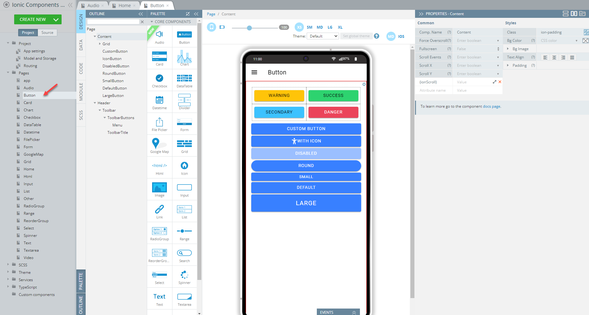
Open our ready-to-go Ionic Components Sample App, select the page in the Project view tree and open the OUTLINE view to check the details of its UI components predefined in our sample app:
To recreate the page as you see it now, follow the steps below.
Creating Button Page
- Disable the footer for the Page component (Footer = False).
- Set the Toolbar Title Text property to Button.
- Drag the Button component to the Toolbar Buttons area, rename it to Menu (Comp. Name = Menu) and set its Comp. Type property to Ionic Menu Button.
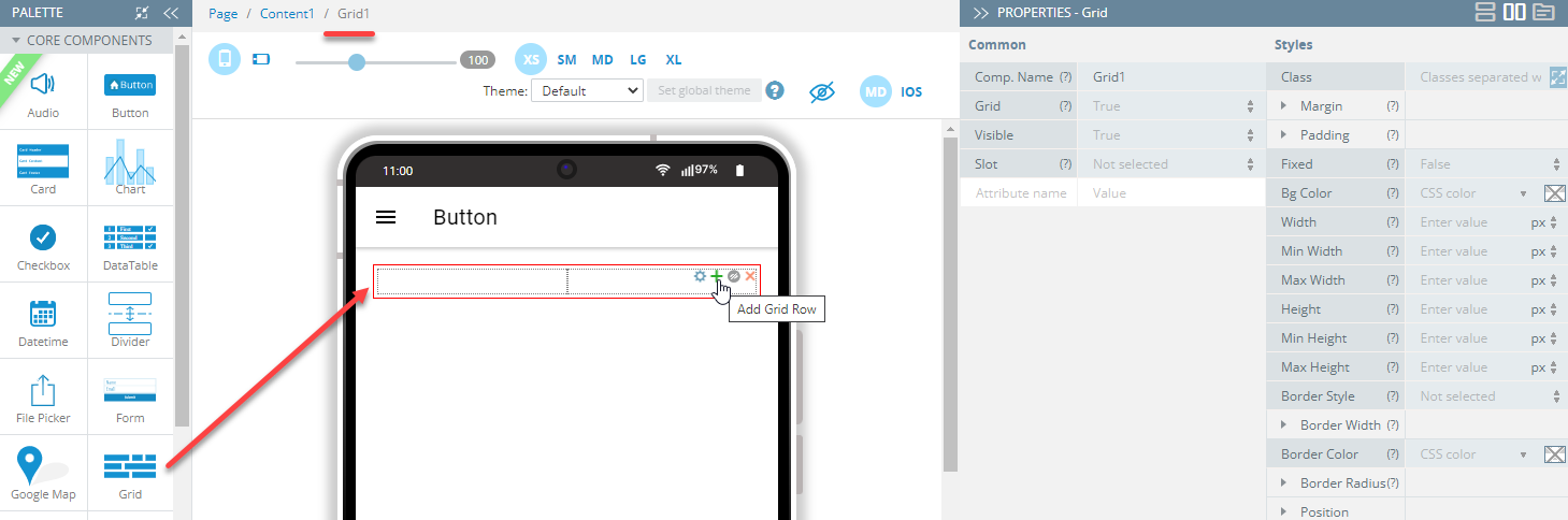
- Drag the Grid component and drop it to the Content area. A grid with one default Grid Row having two child Grid Cell components will be created.
- With the Grid component selected, click the green + button to add one more Grid Row to the grid:
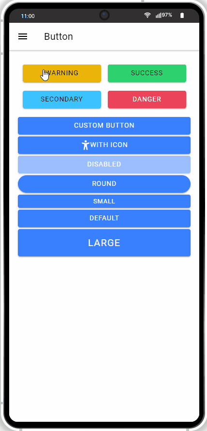
- In total, the grid will have four grid cells equally distributed between two grid rows. Now, drag per one Button component to each grid cell and define them so that they display different Text and Color properties correspondingly:
- Text = Warning, Success, Secondary, Danger
- Color = warning, success, secondary, danger.
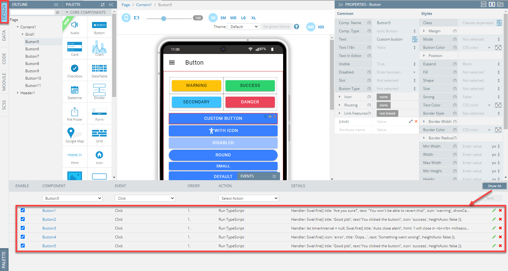
- Now, to define different behavior patterns for each button, we will add events to each of them. So, first, unfold the EVENTS tab from the bottom and, one by one assign the Run TypeScript action from the drop-down list of actions available for the Click event for each button and provide the below code for each button; when finished, click Save:
- Warning button:
Swal.fire({
    title: 'Are you sure?',
    text: "You won't be able to revert this!",
    icon: 'warning',
    showCancelButton: true,
    confirmButtonColor: '#3085d6',
    cancelButtonColor: '#d33',
    confirmButtonText: 'Yes, delete it!',
    heightAuto: false
}).then((result) => {
    if (result.isConfirmed) {
        Swal.fire({
            title: 'Deleted!',
            text: 'Your file has been deleted.',
            icon: 'success',
            heightAuto: false
        })
    }
});- Success button:
Swal.fire({
  title: 'Good job!',
   text:'You clicked the button!',
  icon: 'success',
  heightAuto: false
});- Secondary button:
let timerInterval = null;
Swal.fire({
  title: 'Auto close alert!',
  html: 'I will close in <b></b> milliseconds.',
  timer: 2000,
  timerProgressBar: true,
  heightAuto: false,
  didOpen: () => {
    Swal.showLoading()
    timerInterval = setInterval(() => {
      const content = (<any>Swal).getContent();
      if (content) {
        const b = content.querySelector('b');
        if (b) {
          b.textContent = Swal.getTimerLeft().toString();
        }
      }
    }, 100)
  },
  willClose: () => {
    clearInterval(timerInterval);
  }
}).then((result) => {
  /* Read more about handling dismissals below */
  if (result.dismiss === Swal.DismissReason.timer) {
    console.log('I was closed by the timer');
  }
});- Danger button:
Swal.fire({
  icon: 'error',
  title: 'Oops...',
  text: 'Something went wrong!',
  heightAuto: false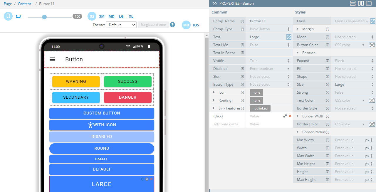
});- Now, drag seven more Button components, drop them below the grid, and define them one by one as follows:
- Text = Custom button
- Text = With icon, Icon > Style = accessibility
- Text = DIsabled, Disabled = true
- Text = Round, Shape = Round
- Text = Small, Size = Small
- Text = Default
- Text = Large, Size = Large:
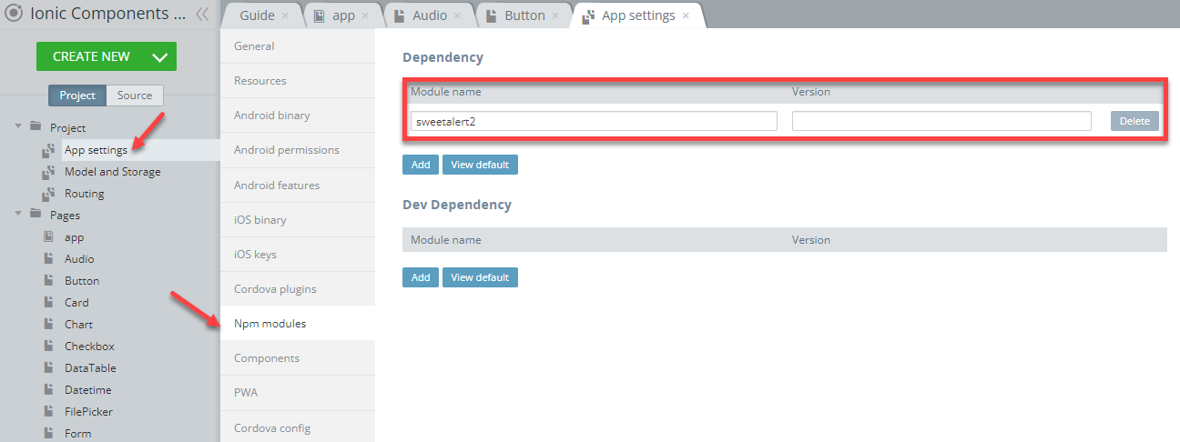
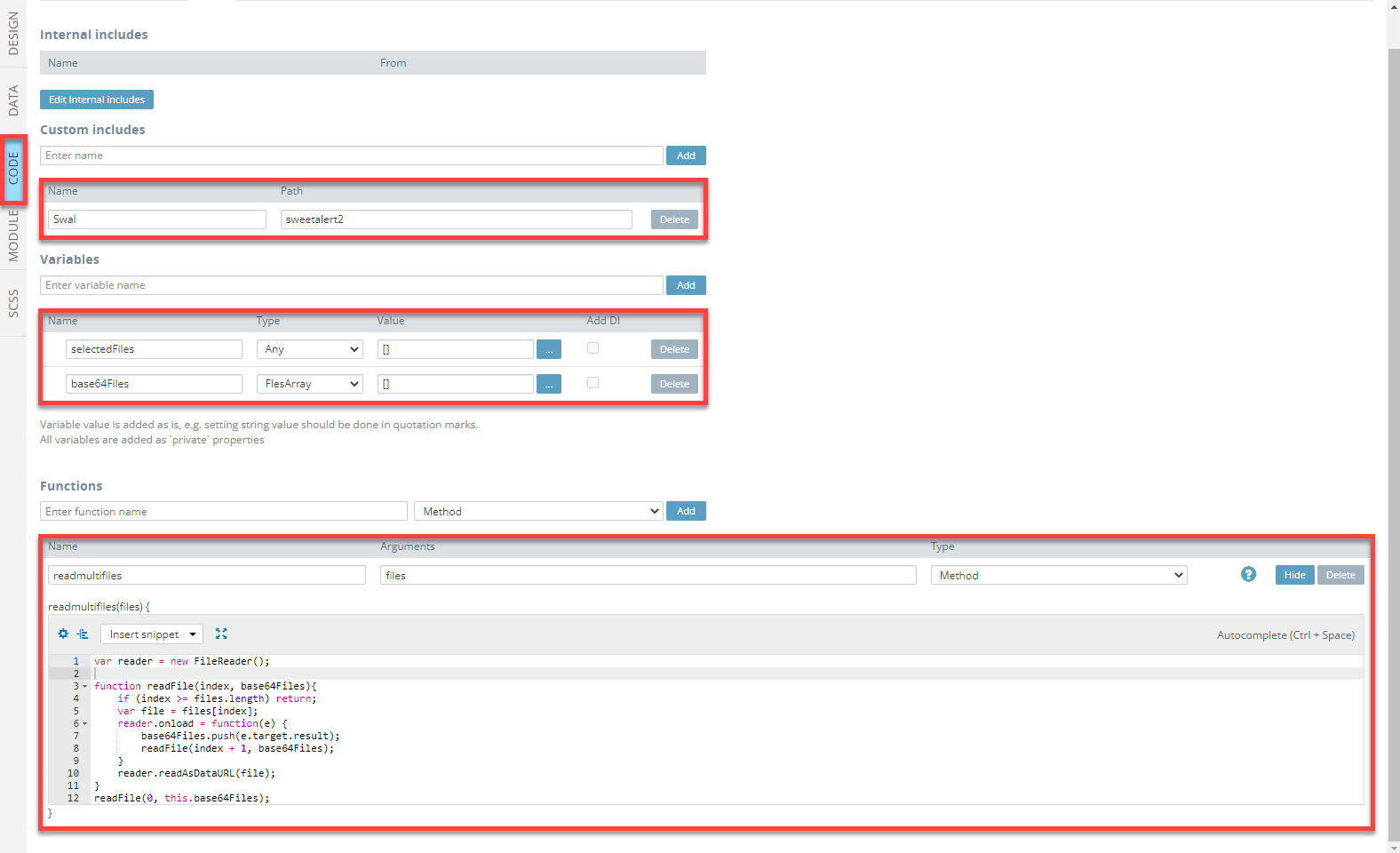
- On the Project tab list, go to the Project folder and open App Settings > Npm modules and add sweetalert2 as an app Dependency:
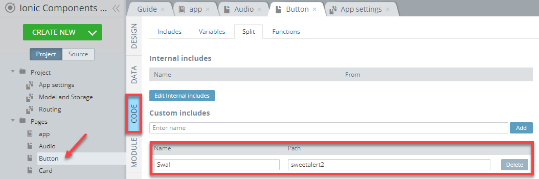
- Now, switch back to the Button page and open its CODE panel. Then, add the Swal custom includes and set its path to sweetalert2:
- In the DESIGN panel, select the Custom button, unfold the EVENTS tab and define the Click >Run TypeScript action with the below code:
Swal.fire({
  title: 'Good job!',
   text:'You clicked the button!',
  icon: 'success',
  heightAuto: false
});- Save the event:
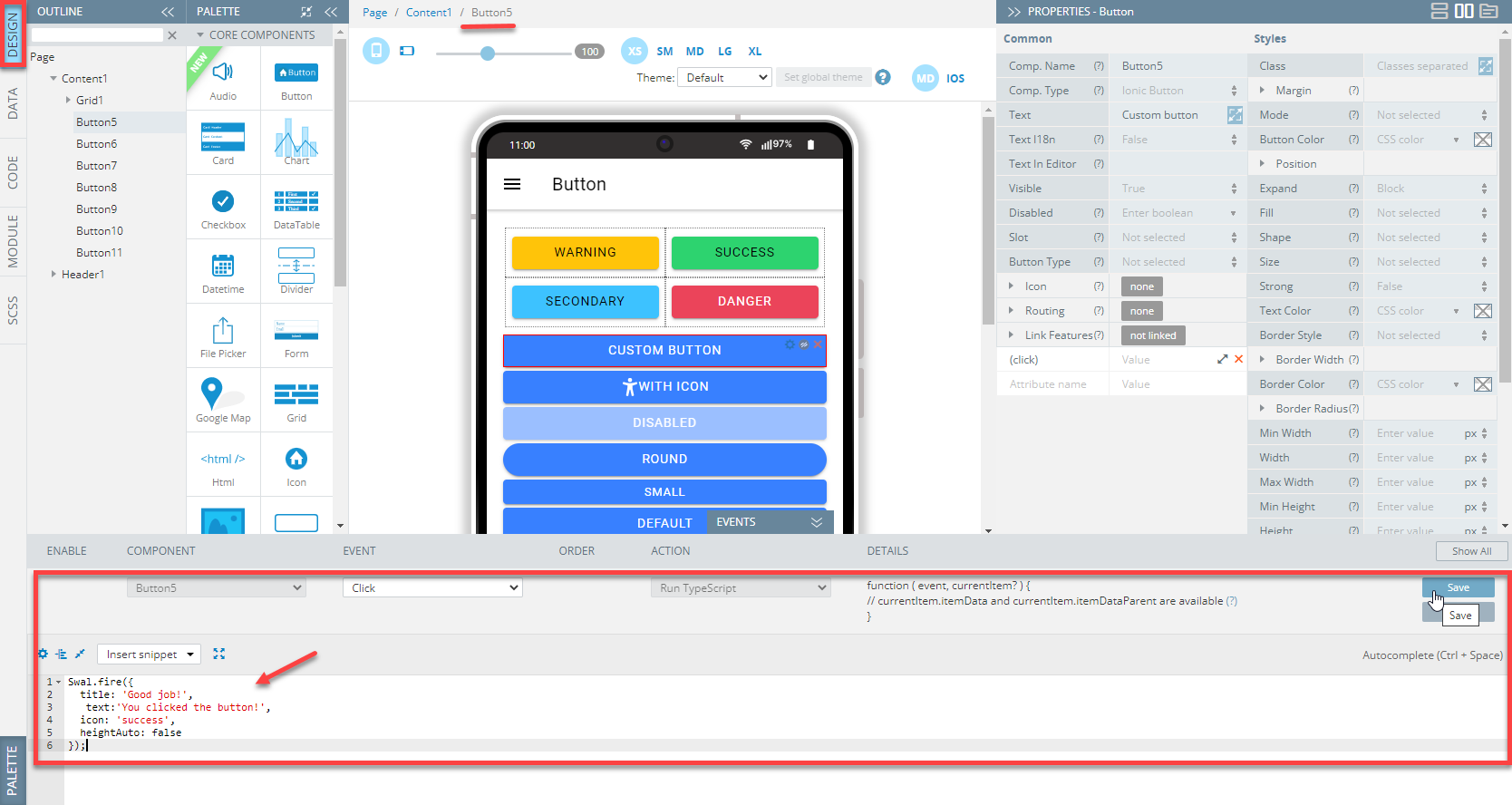
Here is what the page's EVENTS tab with all page actions defined should look like (click Show all to see all events):
Tip!We highly recommend renaming UI Components that were autogenerated or cloned (including their child components) to some more meaningful names.
When done, you can check how the Button page looks like and test the behavior of the buttons defined for this page:
Card Page
Open our ready-to-go Ionic Components Sample App, select the page in the Project view tree and open the OUTLINE view to check the details of its UI components predefined in our sample app:
To recreate the page as you see it now, follow the steps below.
Creating Card Page
- Disable the footer for the Page component (Footer = False).
- Set the Toolbar Title Text property to Card.
- Drag the Button component and drop it to the Toolbar Buttons area, rename it to Menu (Comp. Name = Menu) and set its Comp. Type property to Ionic Menu Button.
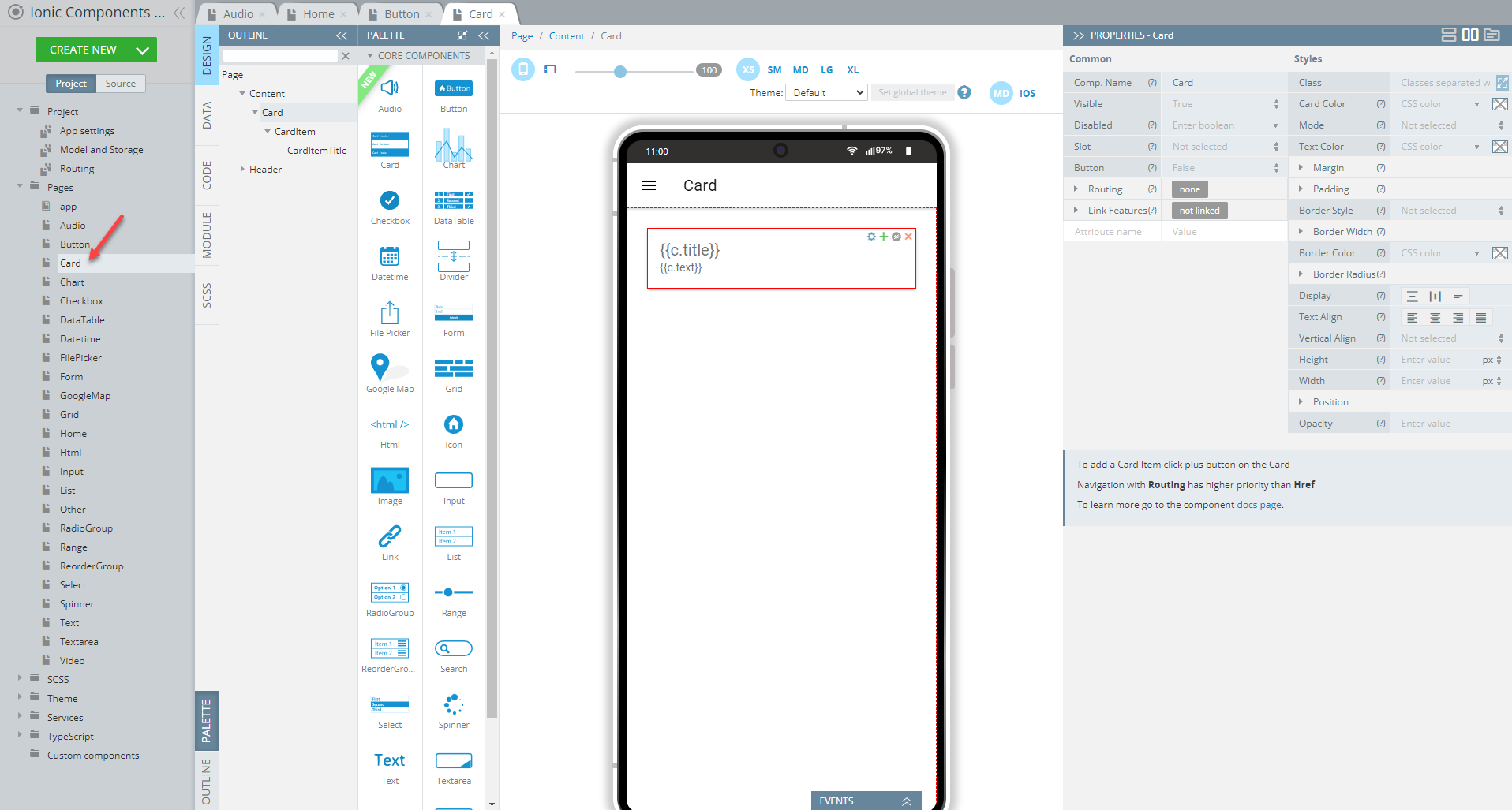
- Drag the Card component and drop it to the Content area. A card with one default Card Item nesting a Card Item Title will be created.
- Select the Card Item and set its Text property to {{c.text}} and add the *ngFor property with the let c of cards value:
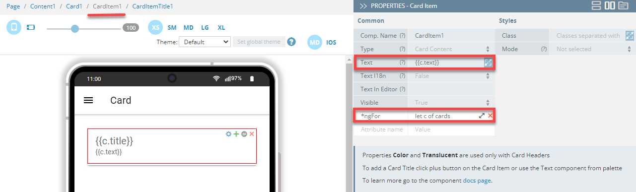
- Switch to the Card Item Title component and replace its default Content title text to {{c.title}}.
- There is one more thing left you will need to do to enable the correct card behavior (showing card data): define the CODE panel so let's switch to it and add a variable, cards of the Any type and one function, constructor:
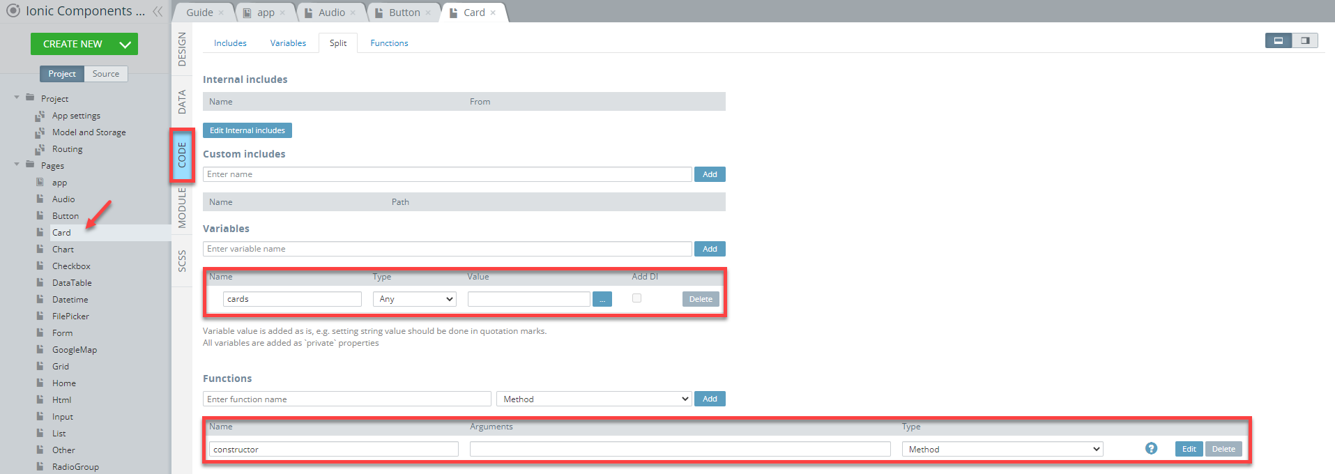
- For the function, provide the below code and save:
this.cards = [
    {"title": "Admin", "text": "Has all permissions"},
    {"title": "Moderator", "text": "Might add new items"},
    {"title": "User", "text": "Has permissions to leave comments"},
    {"title": "Guest", "text": "Might read items only"}
];
Now, you can test what the Card page looks like:
Tip!We highly recommend renaming UI Components that were autogenerated or cloned (including their child components) to some more meaningful names.We highly recommend renaming UI Components that were autogenerated or cloned (including their child components) to some more meaningful names.
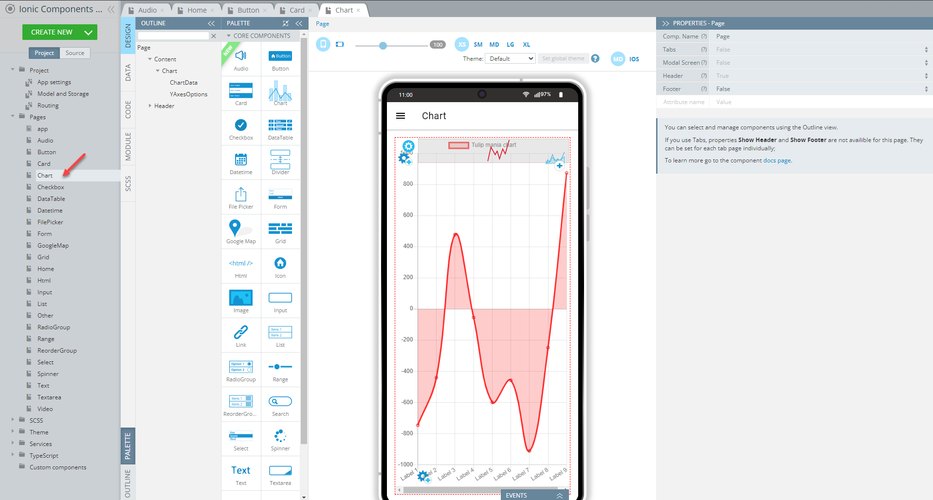
Chart Page
Open our ready-to-go Ionic Components sample app, select the page in the Project view tree and open the OUTLINE view to check the details of its UI components predefined in our sample app:
To recreate the page as you see it now, follow the steps below.
Creating Chart Page
- Disable the footer for the Page component (Footer = False).
- Set the Toolbar Title Text property to Chart.
- Drag the Button component and drop it to the Toolbar Buttons area, rename it to Menu (Comp. Name = Menu) and set its Comp. Type property to Ionic Menu Button.
- Drag the Chart component and drop it to the Content area.
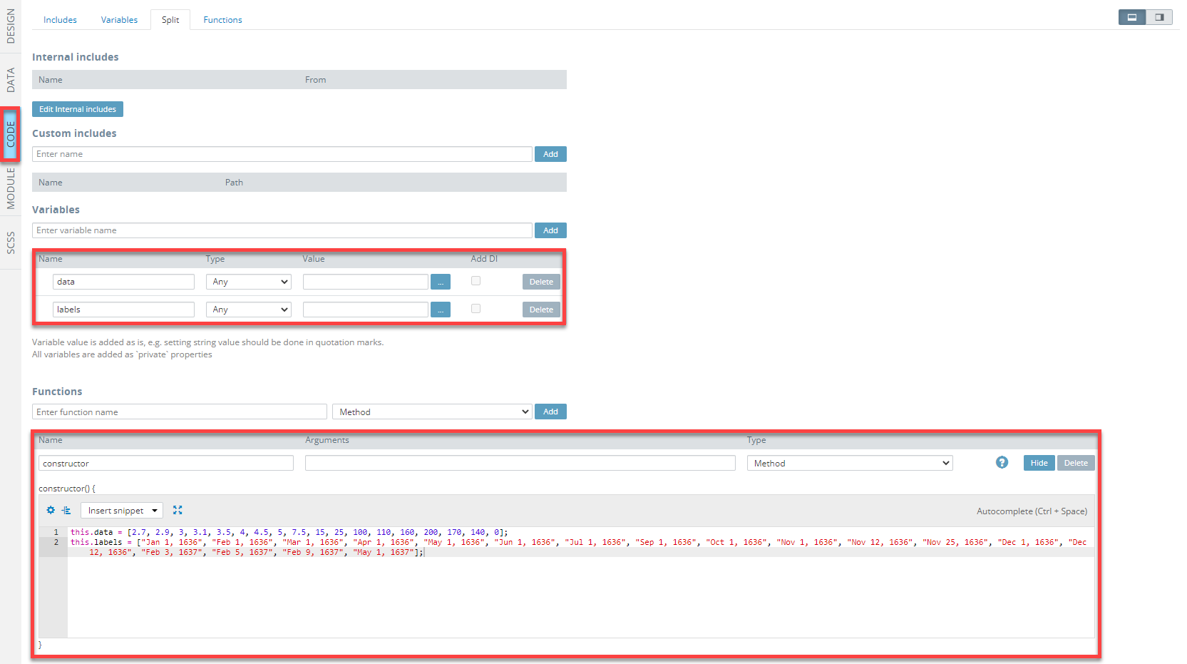
- Before you can define the chart data, you will need to add two variables, data and labels, both of the Any type and one function, constructor, to the CODE panel so let switch to it and do it.
- To set the function with sample data, provide the below code and save:
this.data = [2.7, 2.9, 3, 3.1, 3.5, 4, 4.5, 5, 7.5, 15, 25, 100, 110, 160, 200, 170, 140, 0];
this.labels = ["Jan 1, 1636", "Feb 1, 1636", "Mar 1, 1636", "Apr 1, 1636", "May 1, 1636", "Jun 1, 1636", "Jul 1, 1636", "Sep 1, 1636", "Oct 1, 1636", "Nov 1, 1636", "Nov 12, 1636", "Nov 25, 1636", "Dec 1, 1636", "Dec 12, 1636", "Feb 3, 1637", "Feb 5, 1637", "Feb 9, 1637", "May 1, 1637"];
Here is how the page CODE panel should look like:
- Auto init Chart = True
- Class = my-chart
- Labels = labels
- Maintain Aspect Ratio = False
- Show Advanced Properties = All.
- Now, select the Chart Data component that was created by default and set its properties as follows:
- Data = data
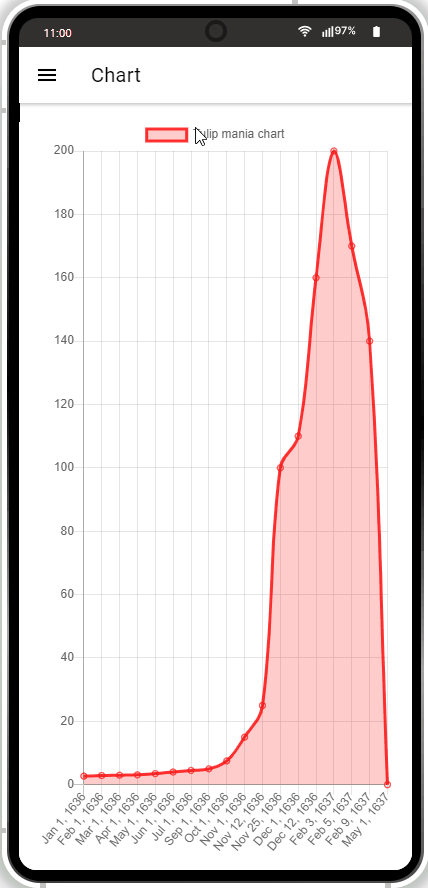
- Legend Label = Tulip mania chart.
- Finally, switch to the SCSS panel and add the following code to it:
.my-chart {
    height: 100%;
}
Tip!We highly recommend renaming UI Components that were autogenerated or cloned (including their child components) to some more meaningful names.
When ready, the Chart page should look like this:
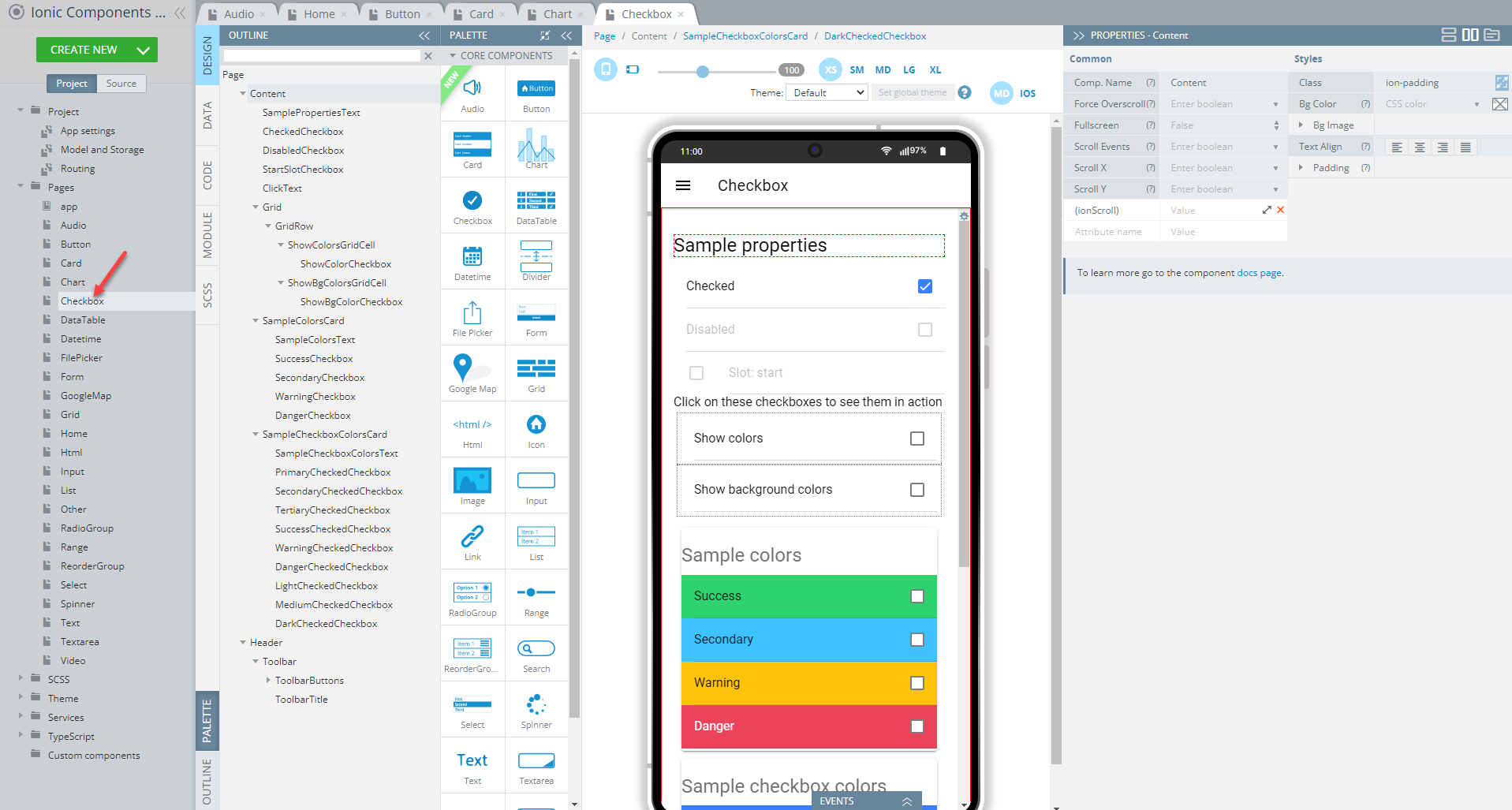
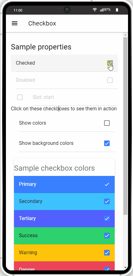
Checkbox Page
Open our ready-to-go Ionic Components sample app, select the page in the Project view tree and open the OUTLINE view to check the details of its UI components predefined in our sample app:
To recreate the page as you see it now, follow the steps below.
Creating Checkbox Page
- Disable the footer for the Page component (Footer = False).
- Set the Toolbar Title Text property to Checkbox.
- Drag the Button component and drop it to the Toolbar Buttons area, rename it to Menu (Comp. Name = Menu) and set its Comp. Type property to Ionic Menu Button.
- Drag the Text component and drop it to the Content area and set its Container property to h2 and Text property to Sample properties.
- Now, drag three Checkbox components and drop them below the text, then define them as follows:
Checkbox1: Checked = true, Label > Text = Checked
Checkbox2: Disabled = true, Label > Text = Disabled
Checkbox3: Disabled = true, Slot = Start, Label > Text = Slot: start. - Place another Text component below and set its Text property to Click on these checkboxes to see them in action.
- Drag the Grid component and drop it below the text. A grid with one default Grid Row having two child Grid Cell components will be created.
- Add the Checkbox component to each grid cell and define their Label > Text properties: the left checkbox - Show colors and the right checkbox - Show background colors.
- Also, set the [(ngModel)] property to showColors for the left checkbox and to showBackgroundColors for the right one.
- Drag the Card component and drop it below the grid. A card with one default Card Item nesting a Card Item Title will be created.
- We will not use them here so delete both and add one Text and four Checkbox components instead.
- Add the *ngIf property to the card and set its value as showColors.
- For Text, set Container = h2 and Text = Sample colors.
- Switch to the Checkbox components and define them so that they display different Item Wrapper > Color and Label > Text properties each:
- Item Wrapper > Color = success, secondary, warning, danger
- Label > Text = Success, Secondary, Warning, Danger.
- Drag another Card component and drop it to the Content area and then delete its Card Item and Card Item Title components.
- Add the *ngIf property to the card and set its value as showBackgroundColors.
- Place one Text and nine Checkbox components inside the card.
Cloning ComponentsYou can initially add only one Checkbox, define it and then clone it to create eight more.
You might also like to rename them (including their child components) to some more meaningful names, but this is optional and is up to you.
- For Text, set Container = h2 and Text = Sample checkbox colors.
- Define the Checkbox components so that they display different Item Item Wrapper > Color and Label > Text properties each:
- Item Wrapper > Color = primary, secondary, tertiary, success, warning, danger, light, medium, dark
- Label > Text = Primary, Secondary, Tertiary, Success, Warning, Danger, Light, Medium, Dark.
Also, set the Checked property to true for all nine checkboxes.
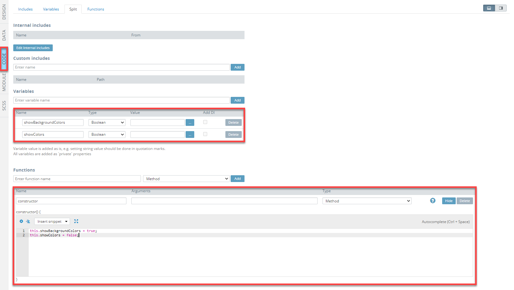
- There is one more thing left you will need to do to enable the correct checkboxes behavior (checking/unchecking): define the CODE panel so let switch to it and add two variables, showBackgroundColors and showColors, both of the Boolean type and one function, constructor.
- For the function, provide the below code and save:
this.showBackgroundColors = true;
this.showColors = false;
Here is what the page CODE panel should look like:
Tip!We highly recommend renaming UI Components that were autogenerated or cloned (including their child components) to some more meaningful names.
Now, you can see what the Checkbox page looks like and test the behavior of the checkboxes:
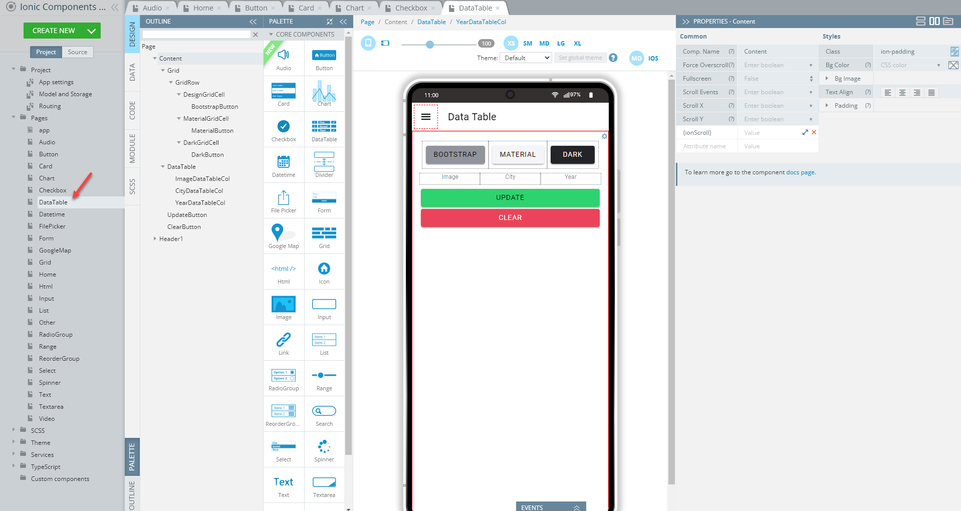
Data Table Page
Open our ready-to-go Ionic Components Sample App, select the page in the Project view tree and open the OUTLINE view to check the details of its UI components predefined in our sample app:
Creating Data Table Page
-
Set the Toolbar Title Text property to Data Table.
-
Drag the Button component and drop it to the Toolbar Buttons area, rename it to Menu (Comp. Name = Menu) and set its Comp. Type property to Ionic Menu Button.
-
Drag the Grid component and drop it to the Content area. A grid with one default Grid Row having two child Grid Cell components will be created.
-
With the Grid Row component selected, click the green + button to add one more Grid Cell to the grid row.
-
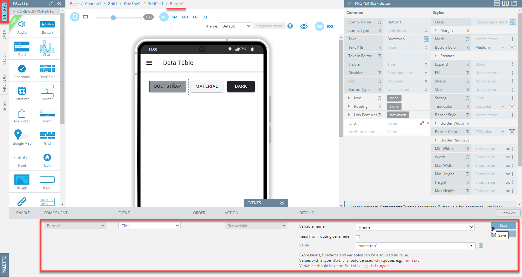
Now, drag per one Button component and drop them to each grid cell; then define them so that they display different Text and Color properties correspondingly:
- Text = Bootstrap, Material, Dark
- Color= medium, light, dark.
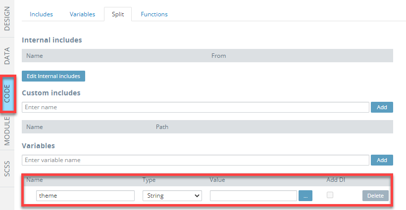
- Now, we will define the CODE panel, so let's switch to it and add a variable, theme of the String type:
- Now, to define different behavior patterns for each button, we will add events to each of them. So, first, unfold the EVENTS tab from the bottom and, one by one assign the Set variable action from the drop-down list of actions available for the Click event for each button and define the below details for each button; when finished, click Save:
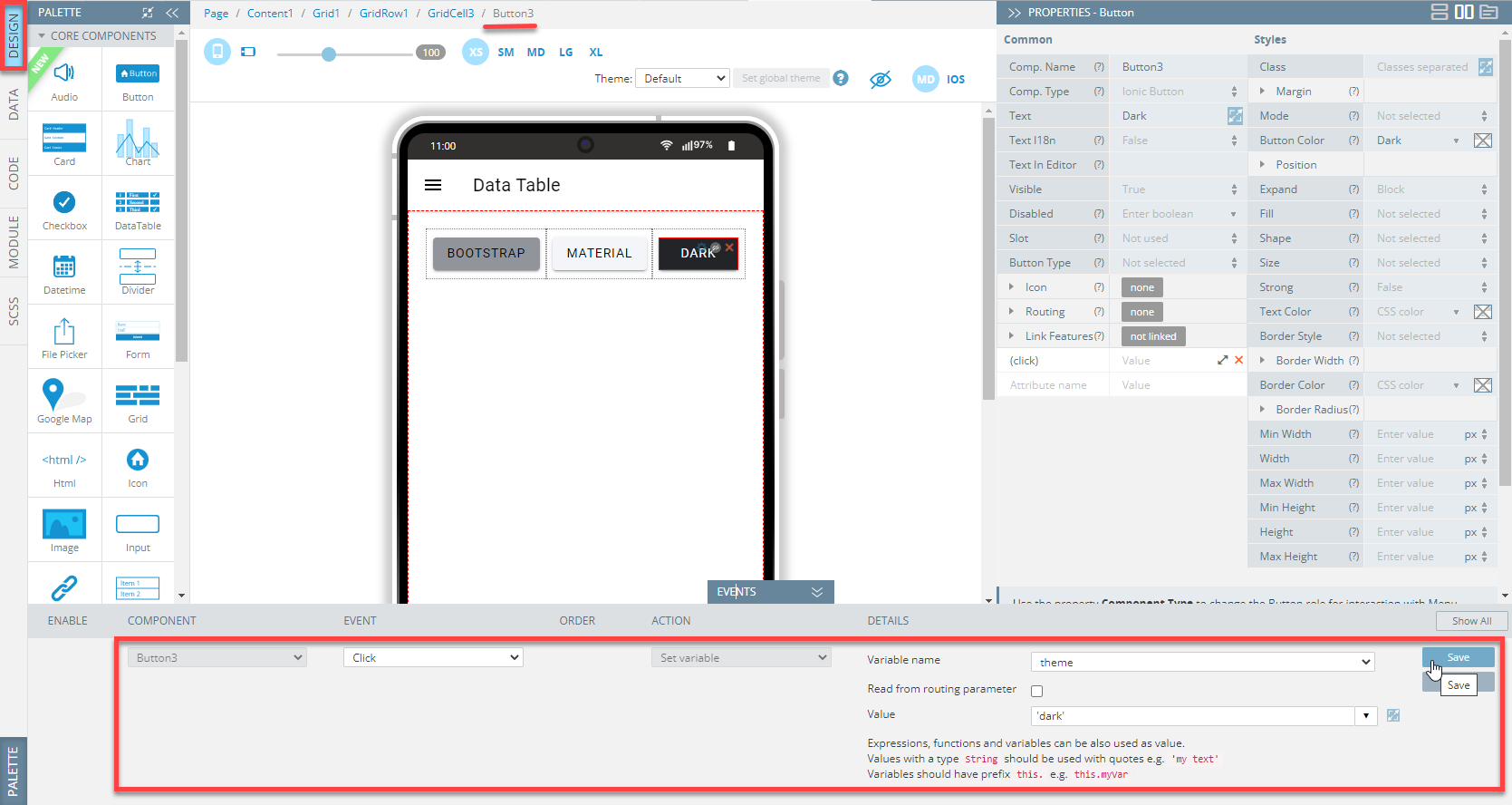
- Bootstrap button:
- Material button:
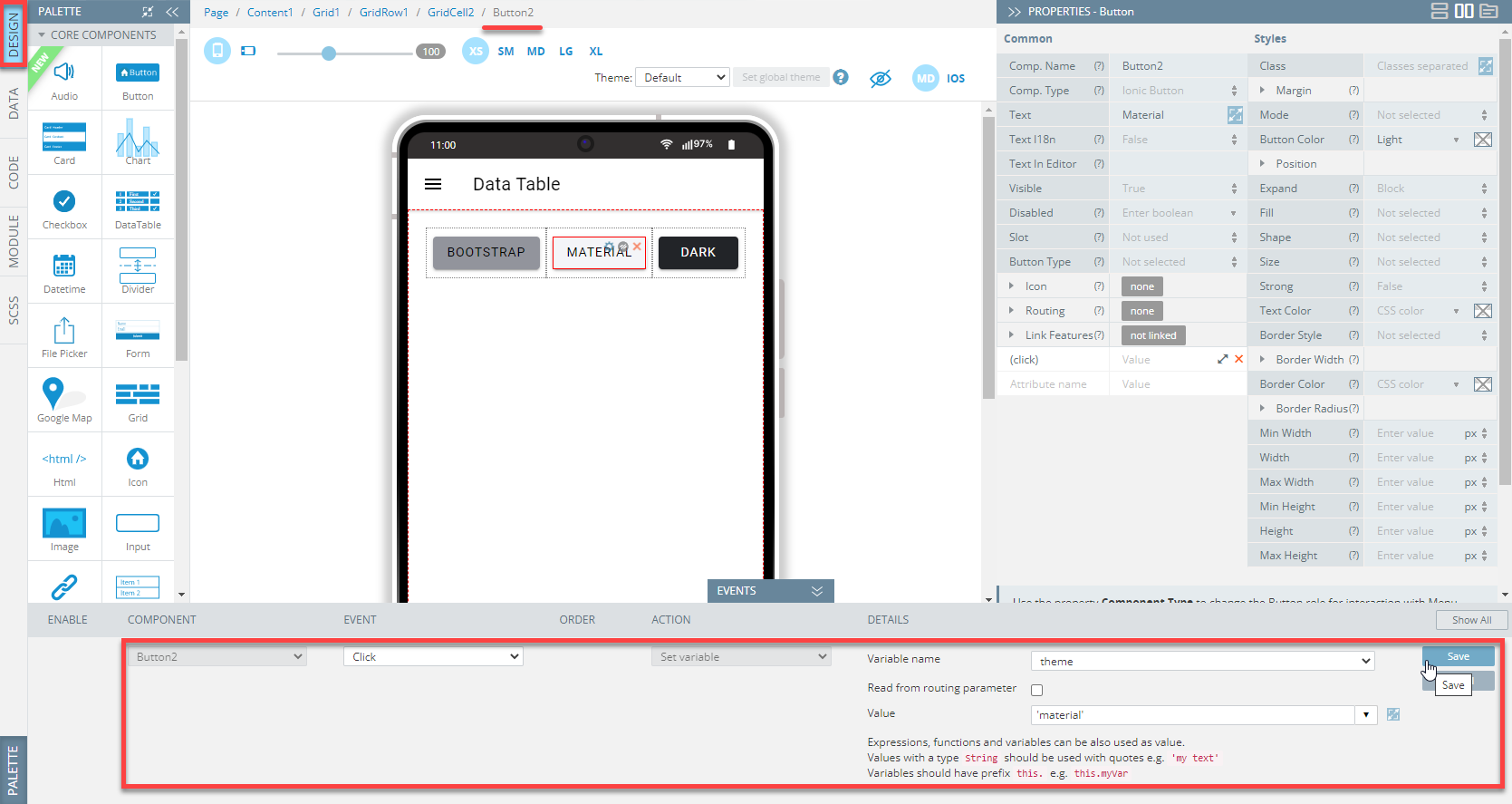
- Dark button:
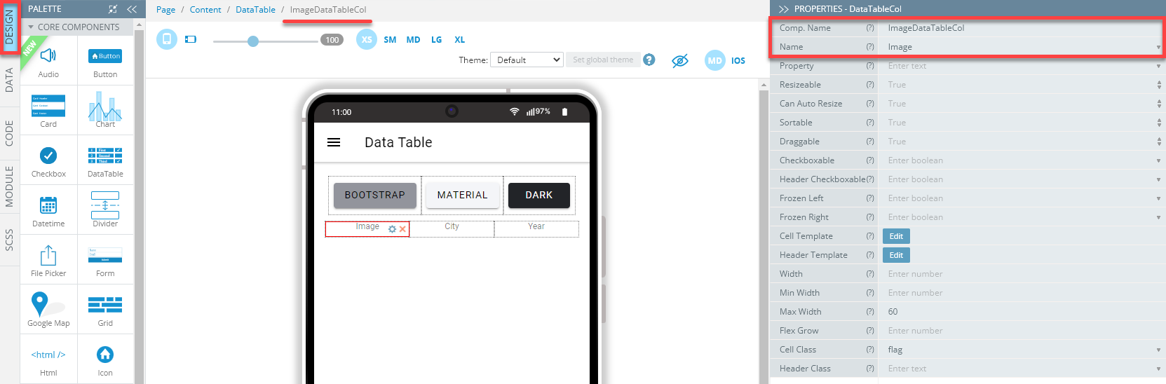
- Drag the DataTable component and drop it to the Content area. A table with two default DataTableCol components will be created.
- With the DataTable component selected (you might also like to rename the component as well), click the green + button to add one more DataTableCol to the datatable.
- Now, define the DataTableCol names as follows (optional):
- To finish with the page UI, drop two more Button components below the data table and define them one by one as follows (you might also like to rename the components as well):
- Text = Update, Color = success
- Text = Clear, Color = danger.
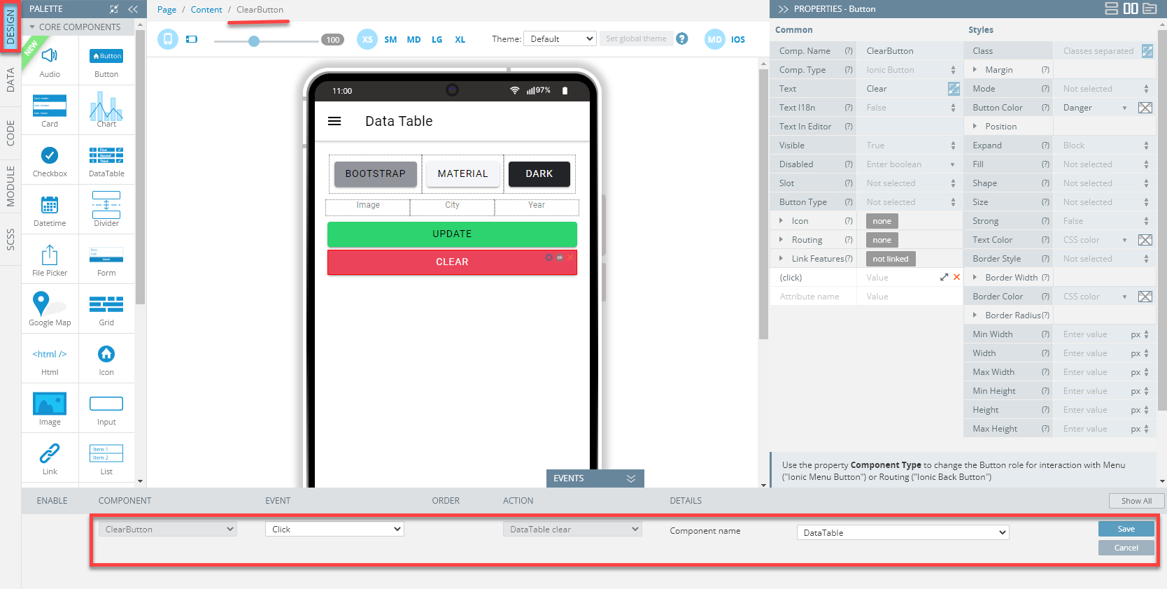
- Again, unfold the EVENTS tab from the bottom and, one by one add the following events for both buttons:
- Update button:
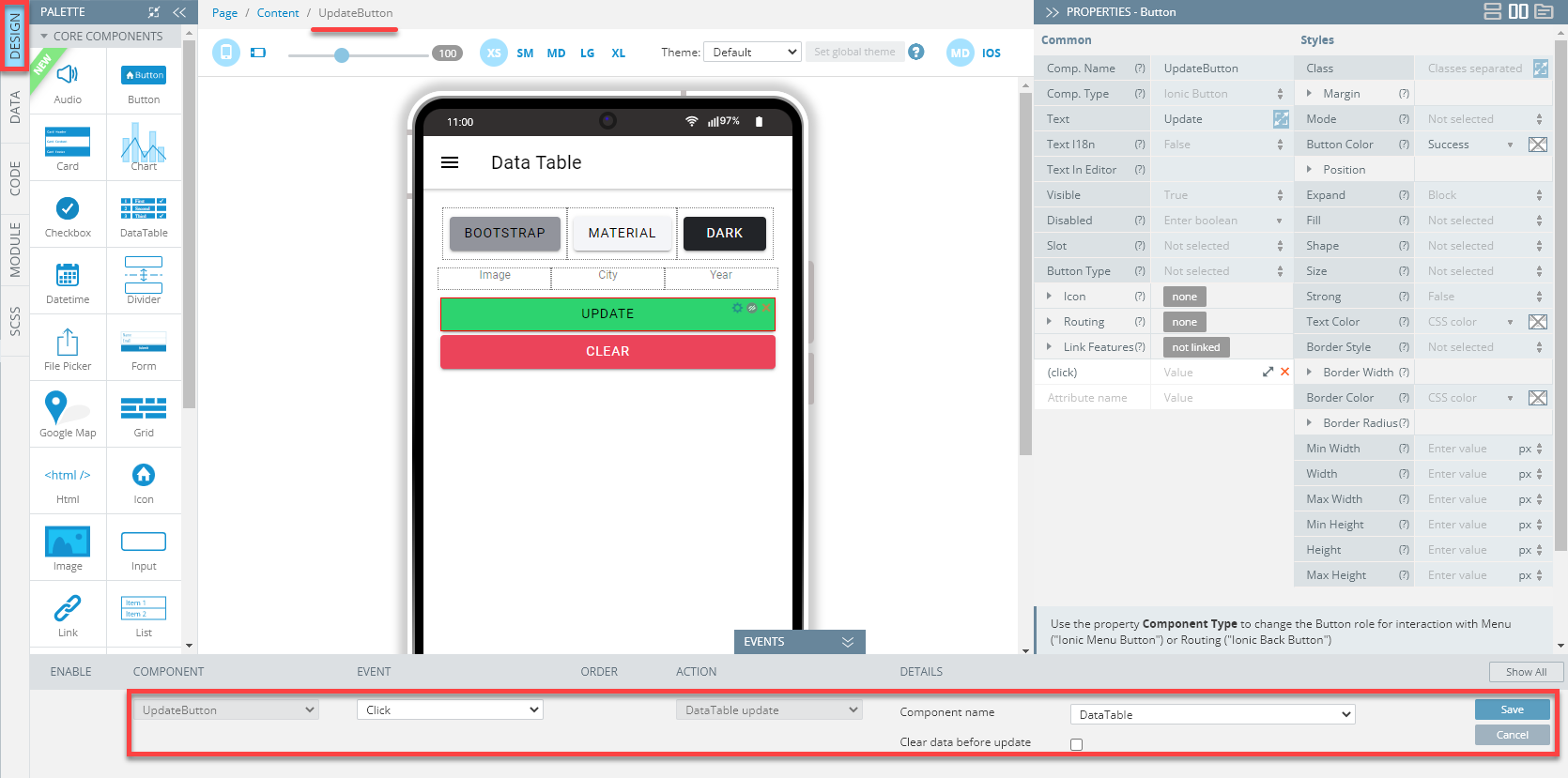
- Clear button:
- Also, select the Page component and set its Before Page showing event like this:
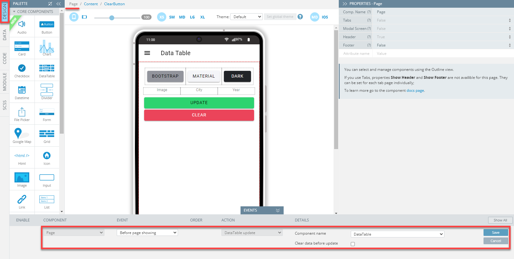
- When finished, click Save.
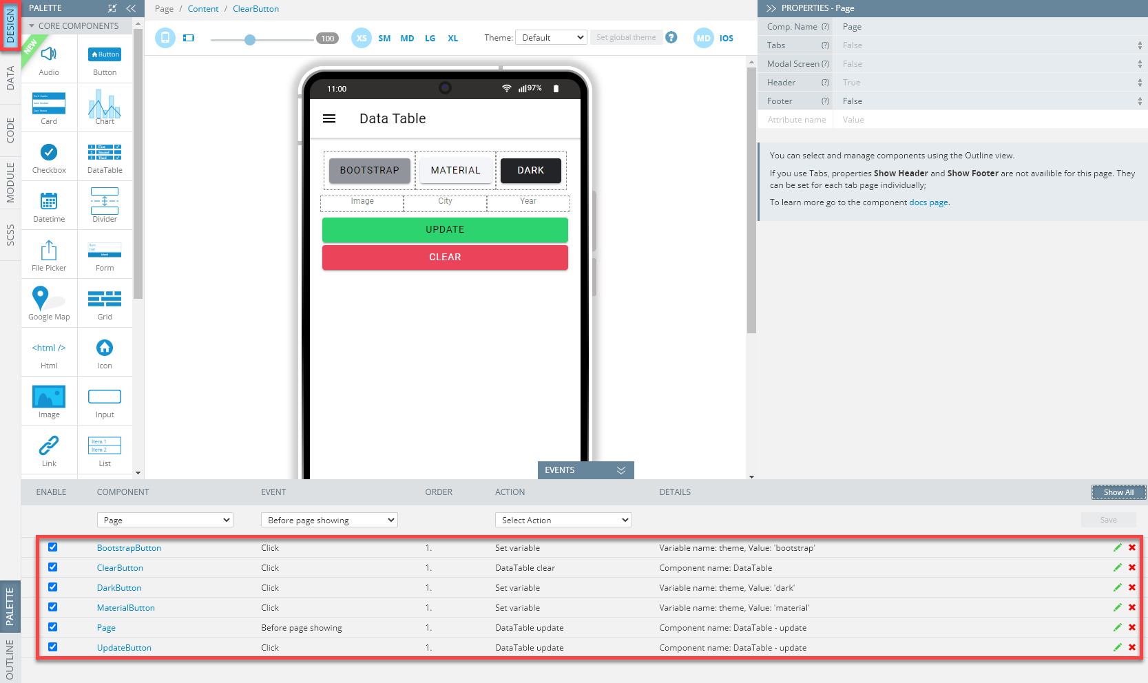
To check that all the needed events are defined correctly, click the Show all button: all the page events should be listed like the following:
In this stage, when you click TEST to see the app in action the No data to display message will be shown. So, the next step will be adding services to display data in the table.
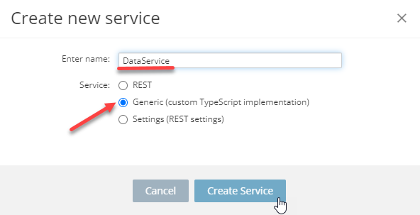
- Click CREATE NEW > Service, select Generic (custom TypeScript implementation) and confirm the action:
- Inside the newly created service, DataService, open the Response tab and add the following service parameters:
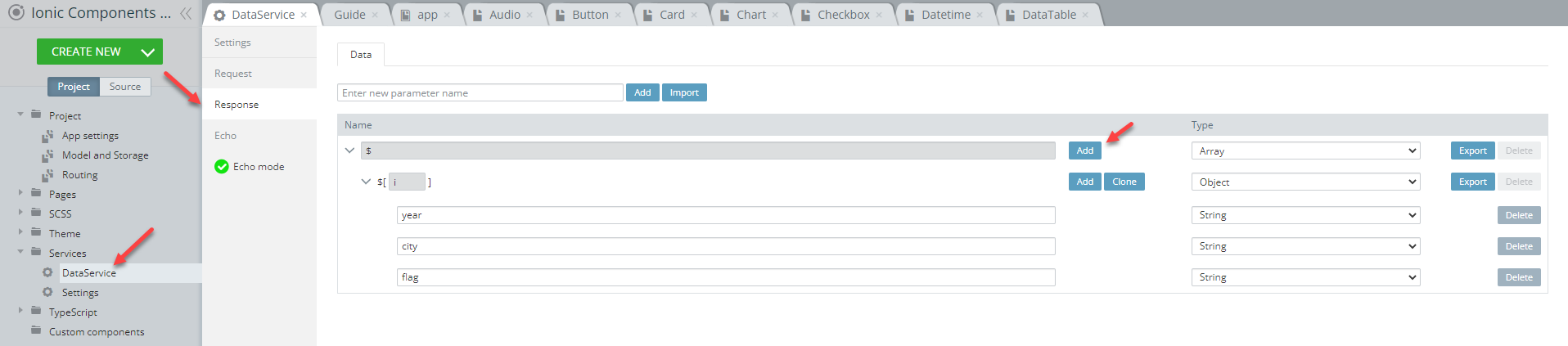
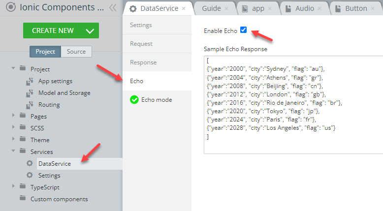
- Then, switch to the Echo tab, check the Enable Echo checkbox and paste the below code that contains mock data of the list of Olympic Games host cities that will be returned on the page:
[
{"year":"2000", "city":"Sydney", "flag": "au"},
{"year":"2004", "city":"Athens", "flag": "gr"},
{"year":"2008", "city":"Beijing", "flag": "cn"},
{"year":"2012", "city":"London", "flag": "gb"},
{"year":"2016", "city":"Rio de Janeiro", "flag": "br"},
{"year":"2020", "city":"Tokyo", "flag": "jp"},
{"year":"2024", "city":"Paris", "flag": "fr"},
{"year":"2028", "city":"Los Angeles", "flag": "us"}
]
Here is what the tab should look like:
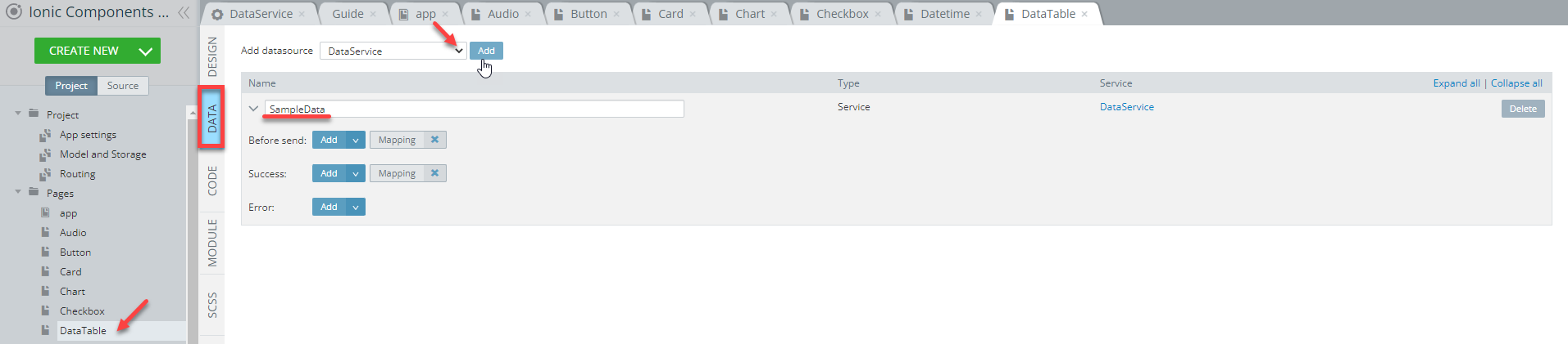
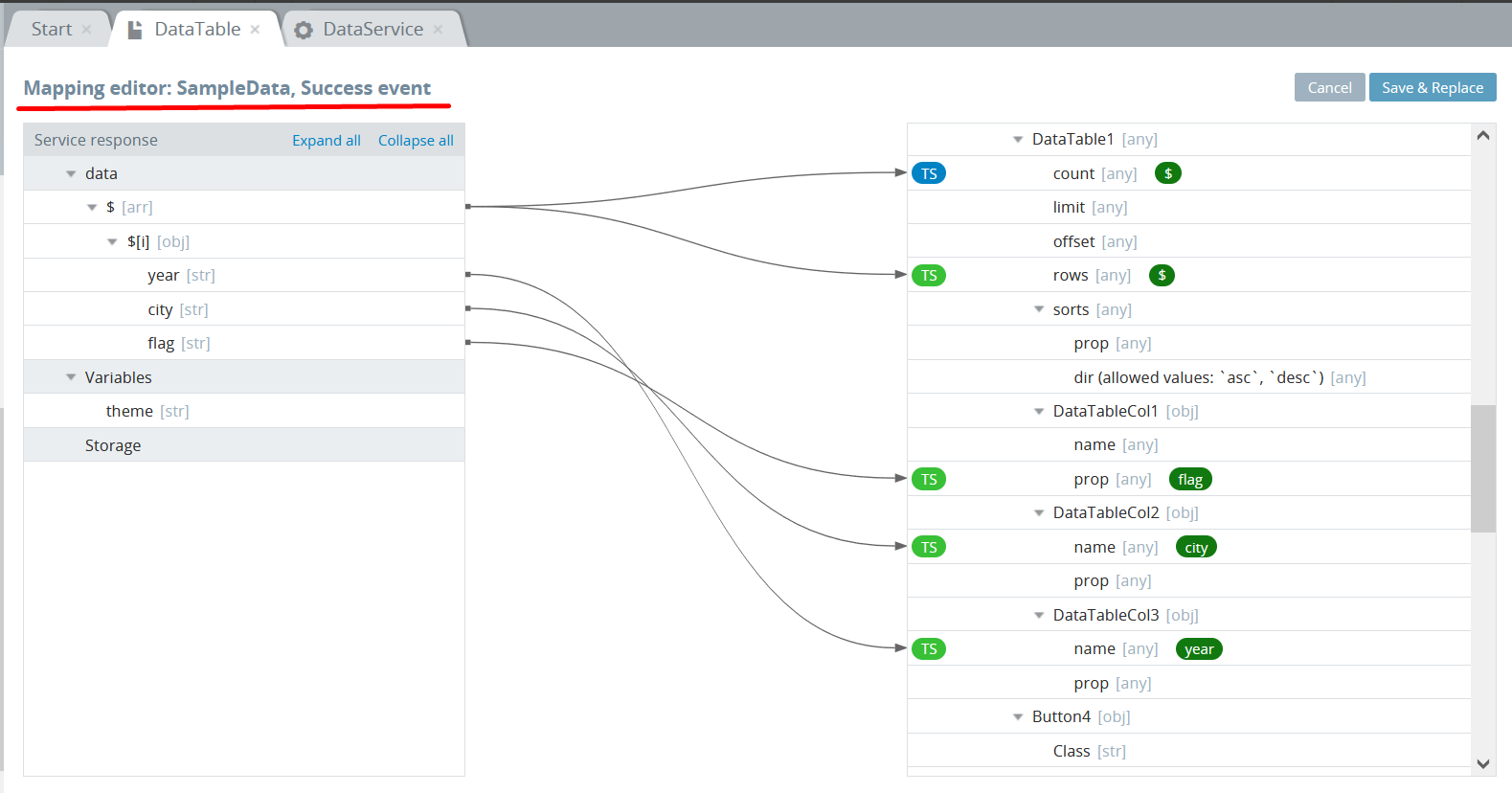
- It's time that the created service be added to the page. So, go back to the DataTable page tab and open its DATA panel to add the DataService datasource:
- Now, click the Success Mapping button, recreate the below service mapping, and click Save & Replace:
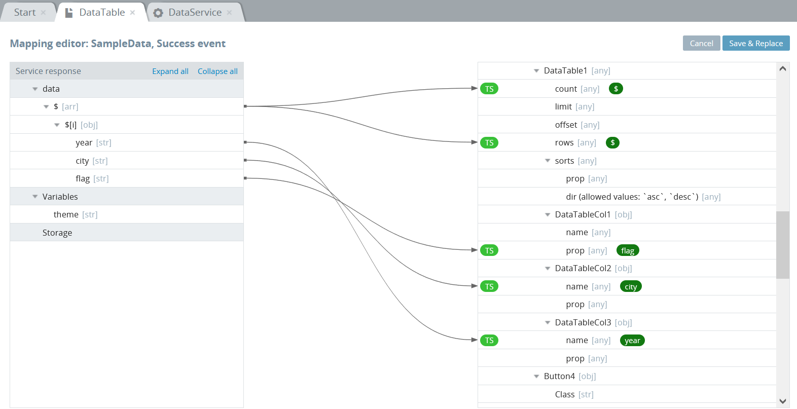
- Click the green TS button next to the DataTable1 > count to open the TS editor, paste the
return value.length;code, and save:
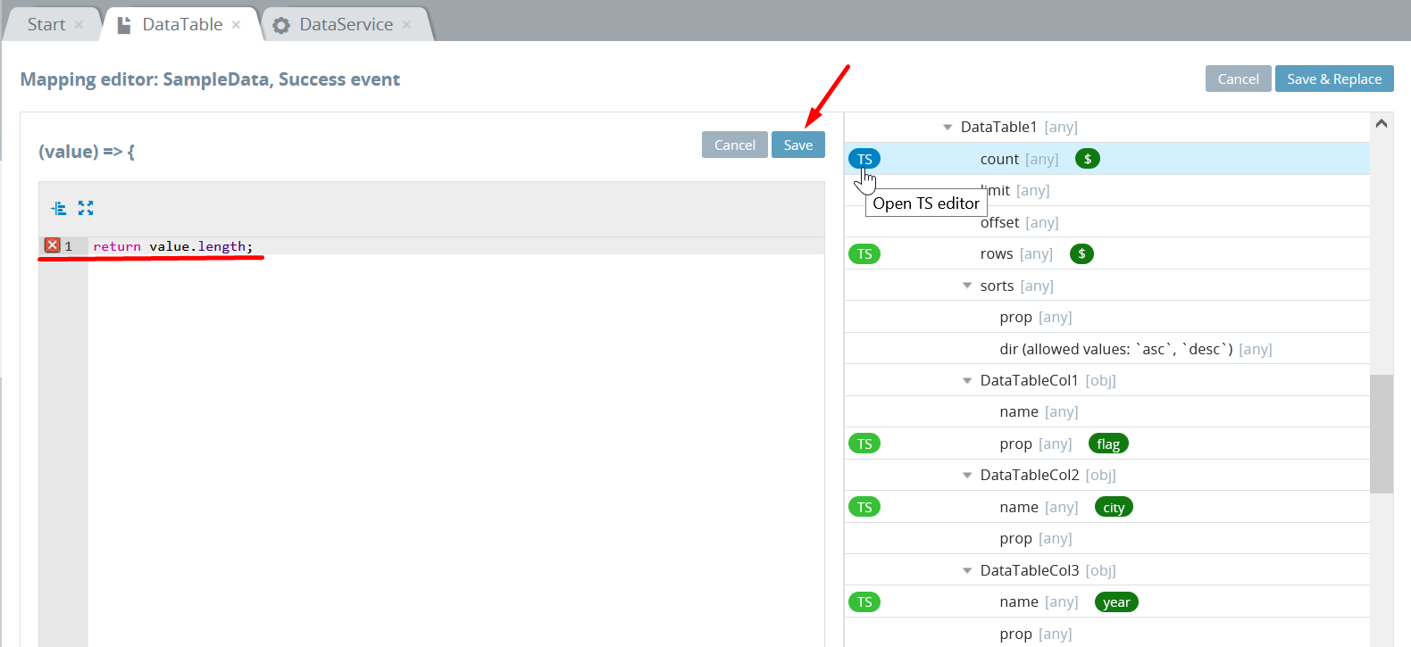
Make sure that the TS button turns blue:
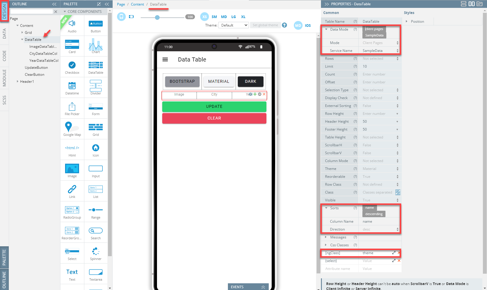
- Now, let's define the DataTable component. Select and set it:
- Data Mode > Mode = Client Pages
- Data Mode > Service Name = Sample Data
- Sorts > Column Name = name
- Sorts > Direction = desc.
Also, add the [ngClass] property and set its value as theme:
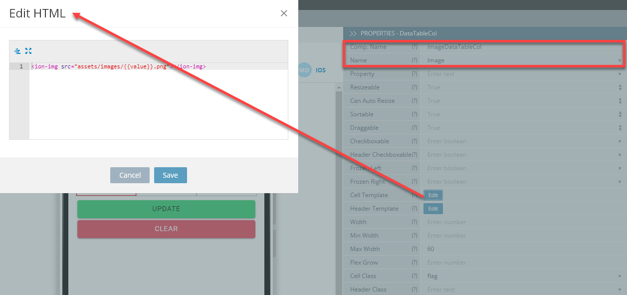
- Switch to the left datatable column, DataTableCol1 (you might also like to rename the component as well), select it, then define its Name, Max Width and Cell Class properties like shown below; click the Edit button next to Cell Template and, in the HTML editor, provide the following code, then save:
<ion-img src="assets/images/{{value}}.png"></ion-img>Here is how the component's properties should be defined:
In this step, you can try testing the page as it is almost ready and the only thing that lacks now is the images of countries' flags, so let's add them to the app.
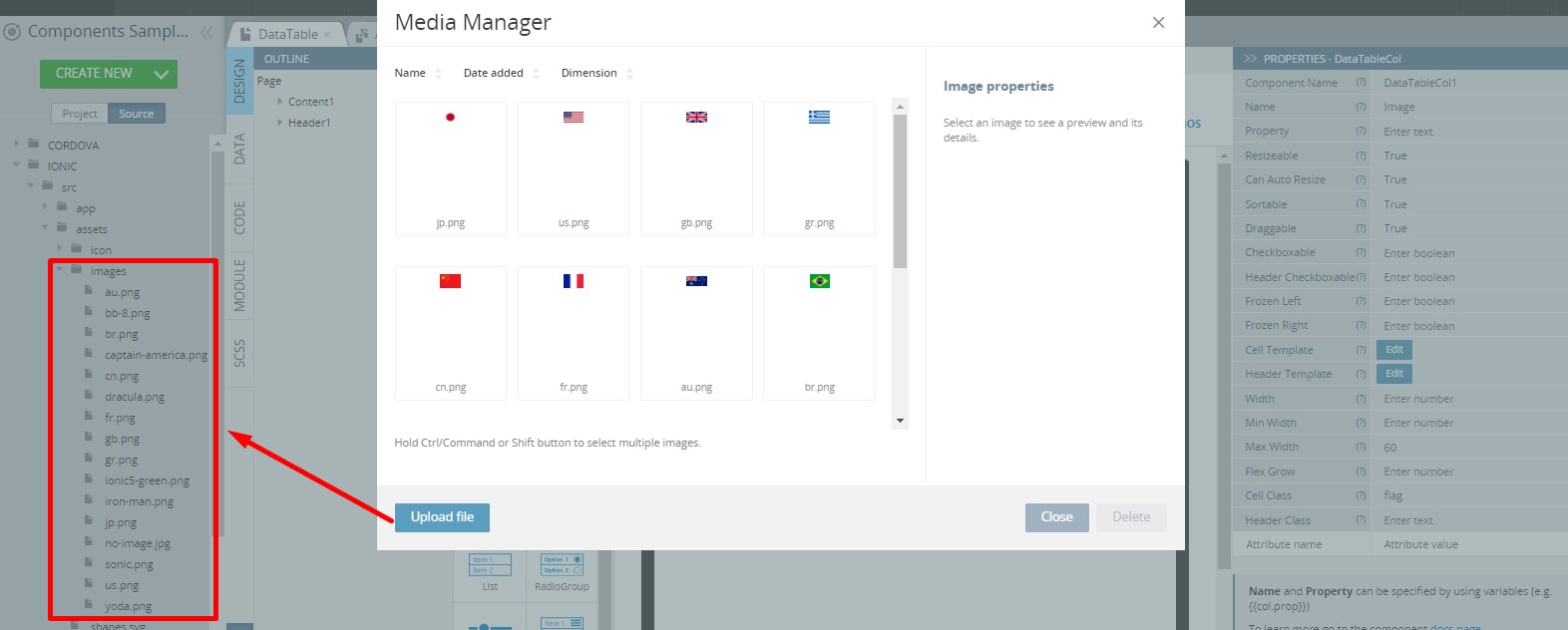
- To be able to preview the listed images, you need to pre-upload them to the app by using the Media Manager. To open it, click the Additional Menu (the three lines button) in the upper-right corner of the App Builder Toolbar and select Media Manager; then upload the needed images.
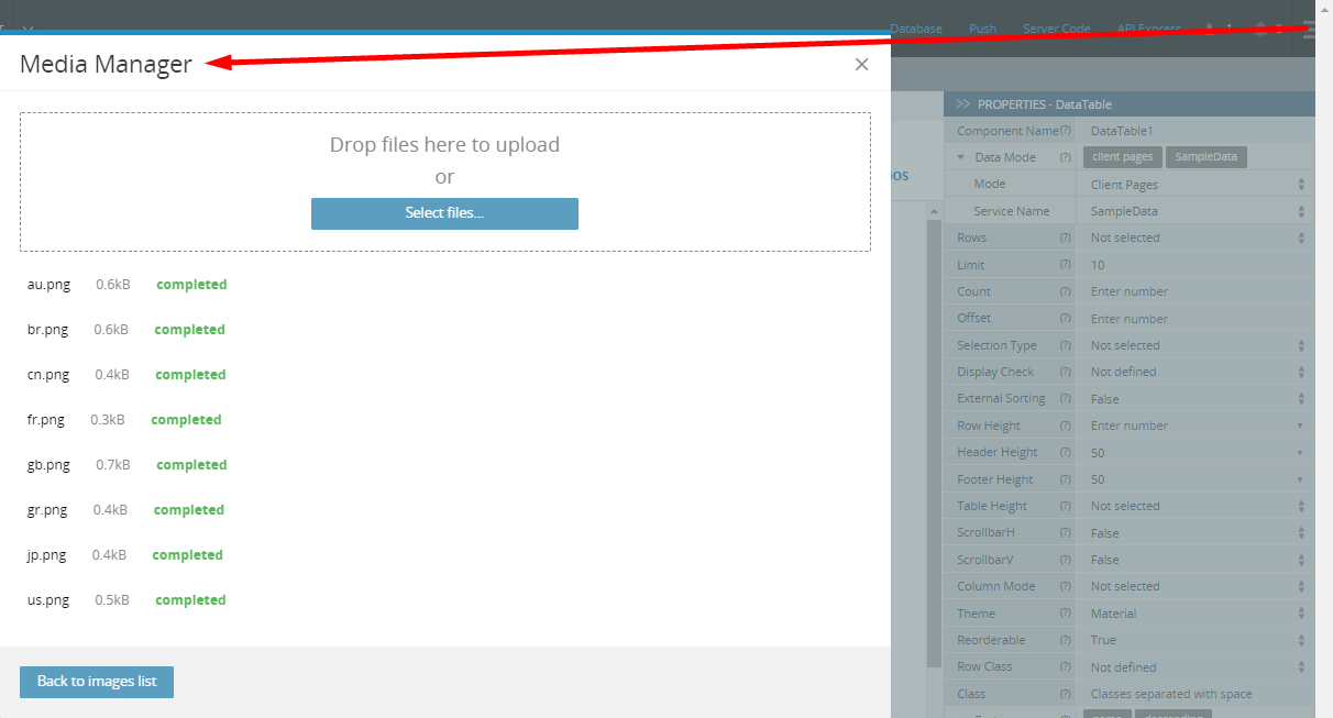
When ready, the uploaded files will become available under the Source Tab:
Tip!We highly recommend renaming UI Components that were autogenerated or cloned (including their child components) to some more meaningful names.
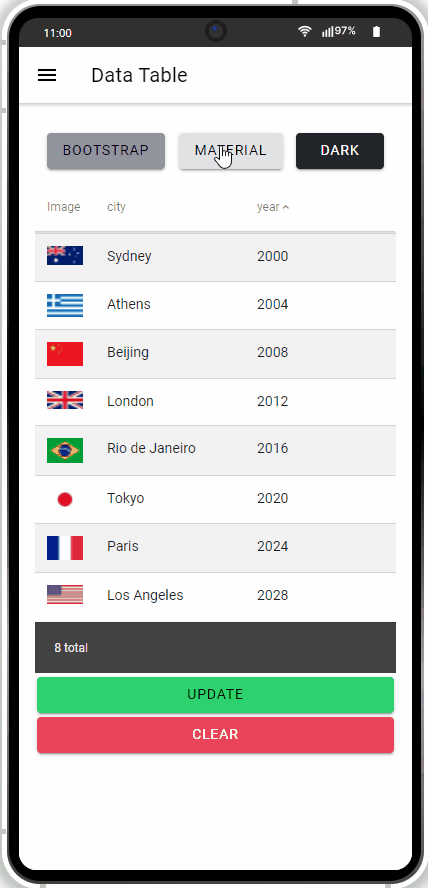
Finally, the page is ready and can be tested:
Datetime Page
Open our ready-to-go Ionic Components Sample App, select the page in the Project view tree and open the OUTLINE view to check the details of its UI components predefined in our sample app:
To recreate the page as you see it now, follow the steps below.
Creating Datetime Page
- Disable the footer for the Page component (Footer = False).
- Set the Toolbar Title Text property to Datetime.
- Drag the Button component and drop it to the Toolbar Buttons area, rename it to Menu (Comp. Name = Menu) and set its Comp. Type property to Ionic Menu Button.
- Drag four Text components and drop them to the Content area.
- Define the Text components so that they display different Container, and Text properties correspondingly:
- Container = h3, h3, ion-text, and h3
- Text = Date range, Date format, ..., and Positions.
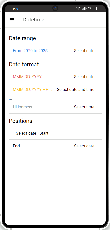
- Place the Datetime component under the first Text and define it as follows:
- Presentation = date
- Placeholder = Select date
- Min = 2020-01-01 12:00
- Max = 2025-01-01 12:00
- Label > Text = From 2020 to 2025
- Label > Color = primary.
- Now, add two more Datetime components under the second Text and define them correspondingly:
- Placeholder = Select date and time and Select date
- Presentation = date and date-time
- Label > Text = MMM DD, YYYY HH:mm and MMM DD, YYYY
- Label > Color = warning and danger.
- Place another Datetime component under the third Text and define it as follows:
- Placeholder = Select time
- Presentation = time
- Label > Text = HH:mm:ss
- Label > Color = medium.
- To finish, add two more Datetime components under the fourth Text and define them correspondingly:
- Placeholder = leave both as Select date
- Presentation = date
- Slot = Start and End
- Label > Text = Start and End.
Tip!We highly recommend renaming UI Components that were autogenerated or cloned (including their child components) to some more meaningful names.
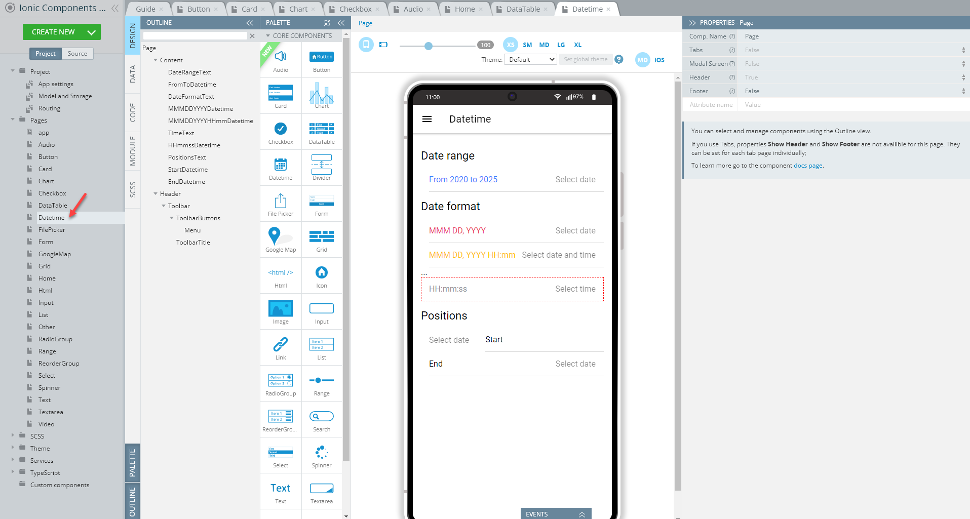
Now, you can test the Datetime page in work:
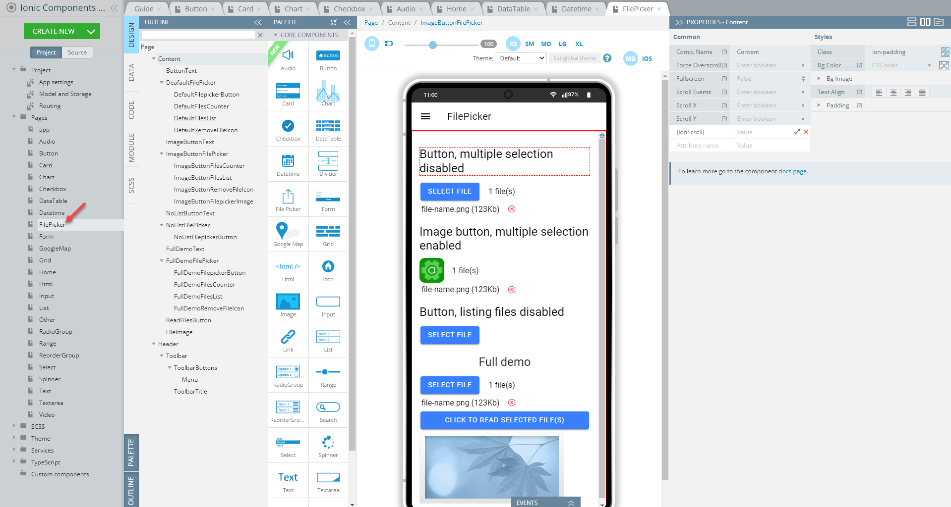
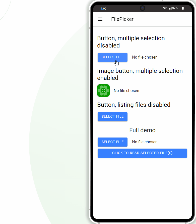
FilePicker Page
Open our ready-to-go Ionic Components Sample App, select the page in the Project view tree and open the OUTLINE view to check the details of its UI components predefined in our sample app:
To recreate the page as you see it now, follow the steps below.
Creating FilePicker Page
-
Set the Toolbar Title Text property to FilePicker.
-
Drop the Button component to the Toolbar Buttons area, rename it to Menu (Comp. Name = Menu) and set its Comp. type property to Ionic Menu Button.
-
Drop four Text components to the Content area, set their Container to h2 and then, one by one, define their Text properties as follows:
- Text1 = Button, multiple selection disabled
- Text2 = Image button, multiple selection enabled
- Text3 = Button, listing files disabled
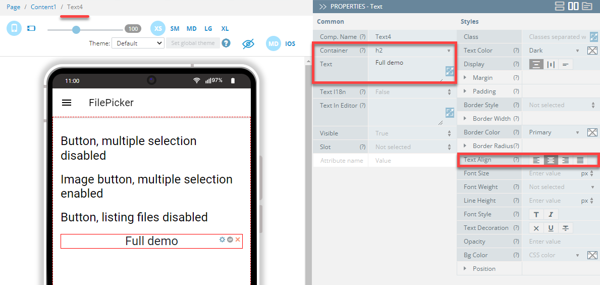
- Text4 = Full demo.
-
Also, set the Text align property of Text4 to Centers the text:
-
Then, drop per one FilePicker component under eachText component and one by one, define them as follows:
- FilePicker1: leave unchanged
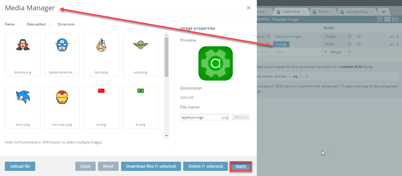
- FilePicker2: Type= Image, Multiple = True. Also, upload the image file you like with the Media Manager by clicking the Change button:
- FilePicker3: Type= Button, Multiple = False, delete File Counter
- FilePicker4: Type= Button, Multiple = True, delete File Counter.
- Now, add the Button component to the page, name it, and set its Text to Click to read selected file(s) . Also, add the Image component under the button and name it FileImage.
- Unfold the EVENTS tab from the bottom; then assign the Run TypeScript action from the drop-down list of actions available for its Click event, provide the below code and click Save.
this.base64Files = []; this.readmultifiles(this.selectedFiles); - Now, switch to the CODE panel and add two variables, selectedFiles of Any type and base64Files of FilesArray type, a custom includes, Swal with path = sweetalert2 and one function, readmultifiles.
For the function, provide the below code and save:
var reader = new FileReader();

function readFile(index, base64Files){
    if (index >= files.length) return;
    var file = files[index];
    reader.onload = function(e) {
        base64Files.push(e.target.result);
        readFile(index + 1, base64Files);
    }
    reader.readAsDataURL(file);
}
Here is how the page CODE panel should look like:
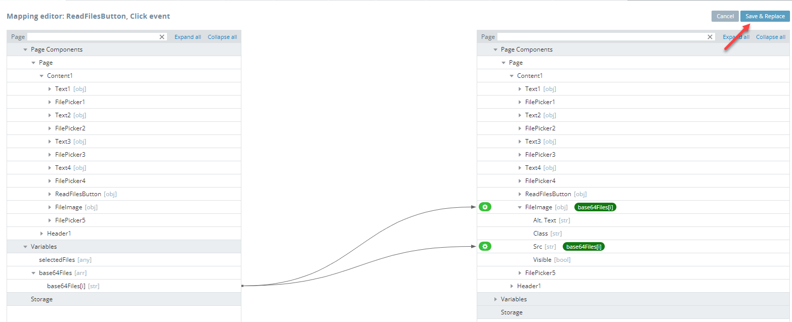
- Go back to the DESIGN panel and under theEVENTS tab, create another Click event for the ReadFilesButton button, but this time select Mapping as its action. In the Mapping editor window, create the following mapping and save:
Tip!We highly recommend renaming UI Components that were autogenerated or cloned (including their child components) to some more meaningful names.
- Ready. You can test the page:
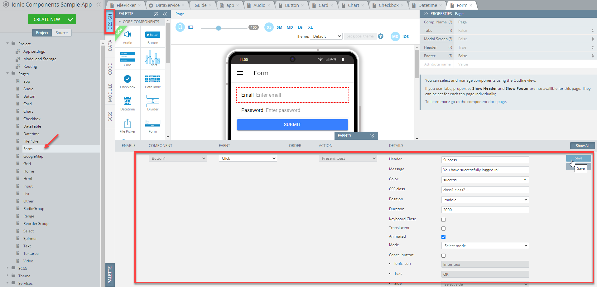
Form Page
Open our ready-to-go Ionic Components sample app, select the page in the Project view tree and open the OUTLINE view to check the details of its UI components predefined in our sample app:
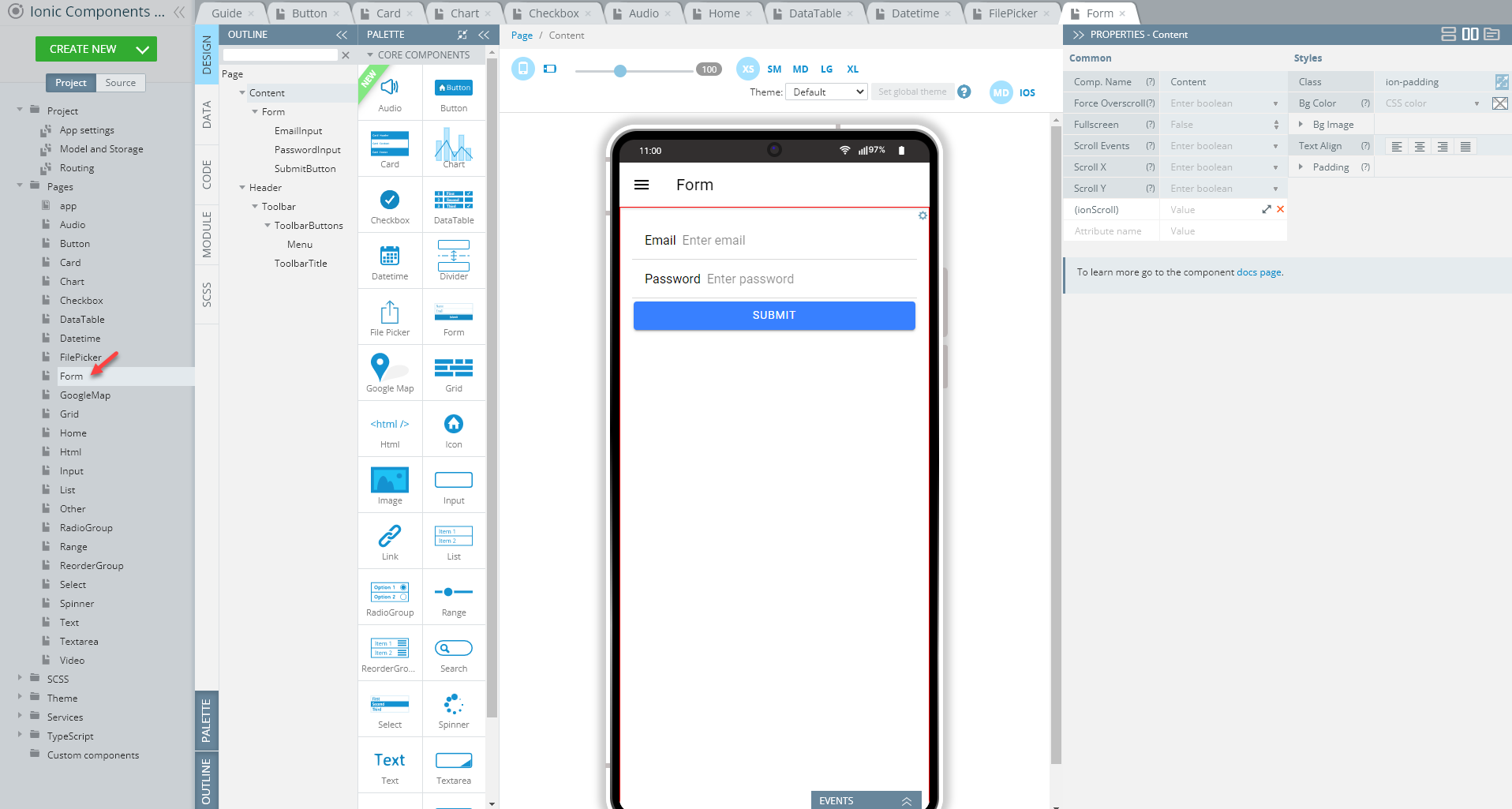
To recreate the page as you see it now, follow the steps below.
Creating Form Page
- Disable the footer for the Page component (Footer = False).
- Set the Toolbar Title Text property to Form.
- Drag the Button component and drop it to the Toolbar Buttons area, rename it to Menu (Comp. Name = Menu) and set its Comp. Type property to Ionic Menu Button.
- Drag the Form component and drop it to the Content area.
- Drag two Input components and a Button component and drop them to the Form.
- Define the Input components so that they display different Placeholder, Type, and Label > Text properties correspondingly:
- Placeholder = Enter email, Enter password
- Type = Email, Password
- Label > Text = Email, Password.
- Set the button's Text property to Submit.
- Lastly, unfold the EVENTS tab from the bottom; then assign the Present toast action from the drop-down list of actions available for its Click event, provide the toast message text, You have successfully logged in!. its header, Success, set its color to success and duration to 2000 and click Save:
Tip!We highly recommend renaming UI Components that were autogenerated or cloned (including their child components) to some more meaningful names.
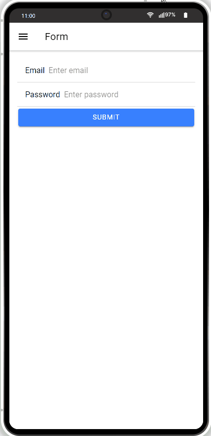
Now, you can test the Form page in work:
Google Map Page
Open our ready-to-go Ionic Components sample app, select the page in the Project view tree and open the OUTLINE view to check the details of its UI components predefined in our sample app:
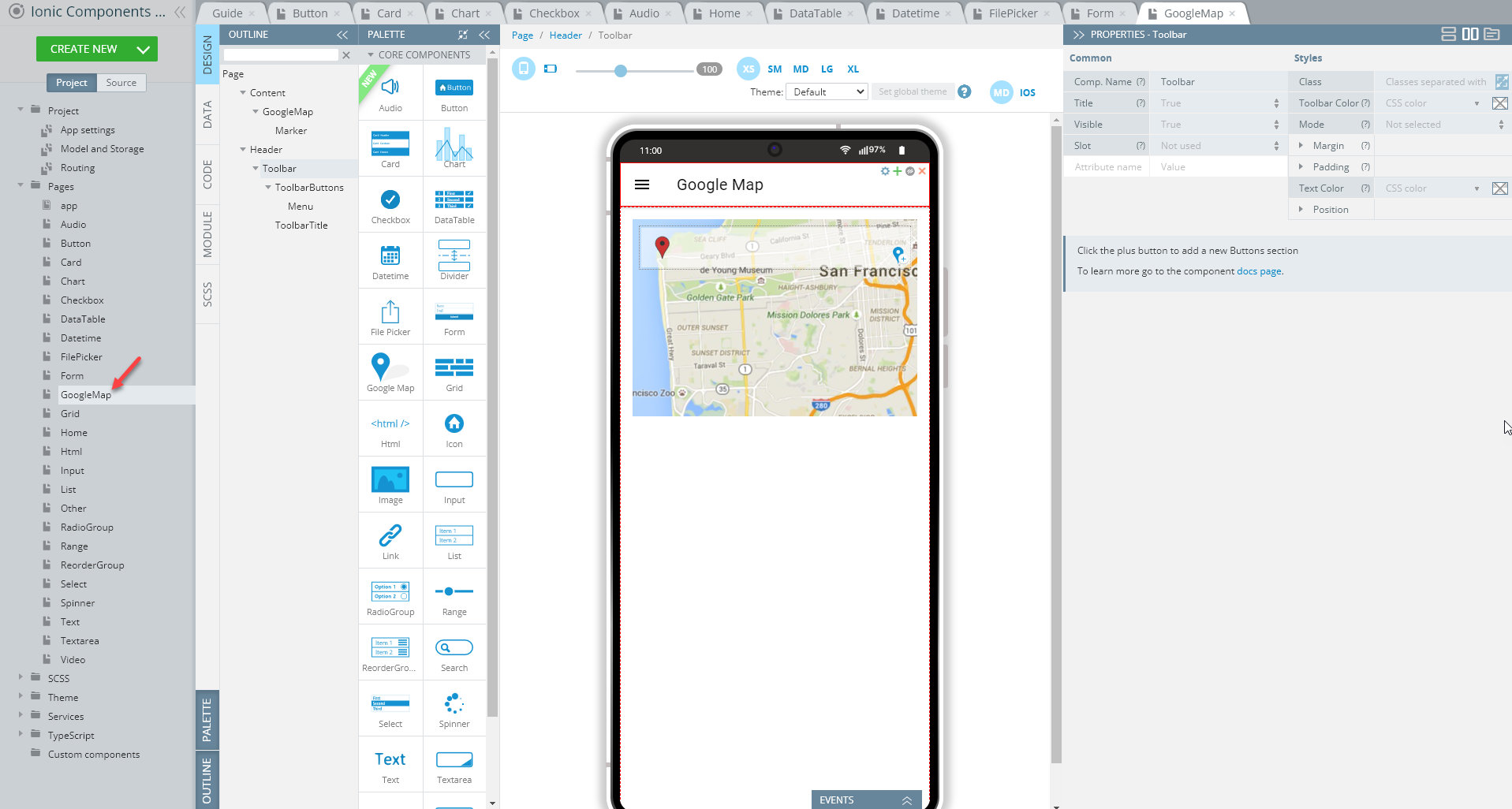
To recreate the page as you see it now, follow the steps below.
Creating Google Map Page
- Disable the footer for the Page component (Footer = False).
- Set the Toolbar Title Text property to Google Map.
- Drag the Button component and drop it to the Toolbar Buttons area, rename it to Menu (Comp. Name = Menu) and set its Comp. Type property to Ionic Menu Button.
- Drag the Google Map component and drop it to the Content area and define its Class property as google-map.
A map with one default Marker component will be created.
NoteGoogle Maps web browser API key is required for the component to work properly. You will need to set the Google API Key on the App Settings page of your app to be able to test it.
Tip!We highly recommend renaming UI Components that were autogenerated or cloned (including their child components) to some more meaningful names.
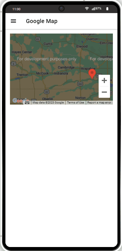
This is how the Google Map page will perform without web browser API key defined:
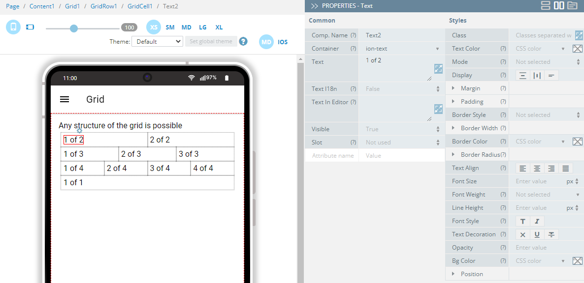
Grid Page
Open our ready-to-go Ionic Components sample app, select the page in the Project view tree and open the OUTLINE view to check the details of its UI components predefined in our sample app:
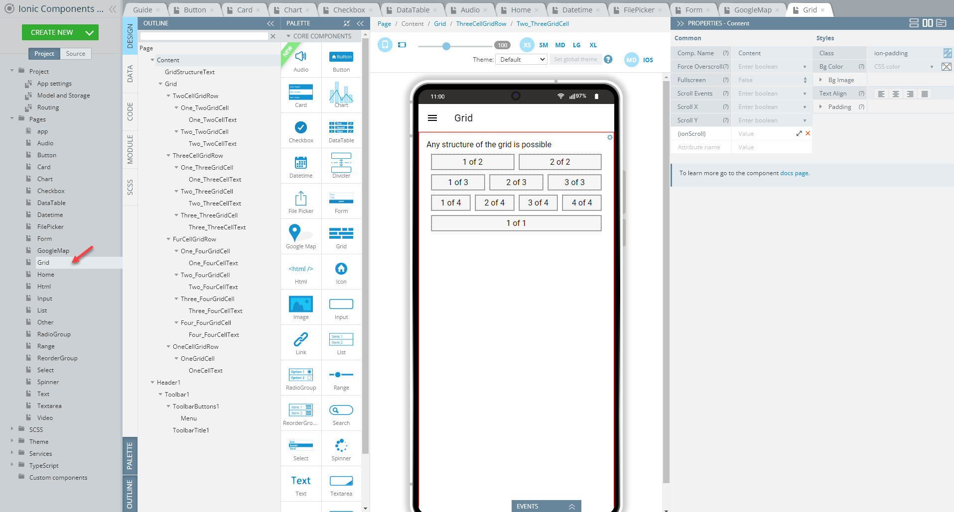
To recreate the page as you see it now, follow the steps below.
Creating Grid Page
- Disable the footer for the Page component (Footer = False).
- Set the Toolbar Title Text property to Grid.
- Drag the Button component and drop it to the Toolbar Buttons area, rename it to Menu (Comp. Name = Menu) and set its Comp. Type property to Ionic Menu Button.
- Drag the Text component and drop it to the Content area and set its Text property to Any structure of the grid is possible.
- Drag the Grid component and drop it below the text. A grid with one default Grid Row having two child Grid Cell components will be created.
- Define the grid Class property as sample-grid.
- Add the Text component to each grid cell and define their Text property for each as follows: left grid cell Text = 1 of 2 and the right grid cell Text = 2 of 2.
- Select the grid and add three more Grid Row components to the page (you can also use cloning to do it).
- Rename the newly added Grid Row components (if received by cloning) to Grid Row2, Grid Row3, and Grid Row4 (optional). You can also adjust the names of their child Grid Cell correspondingly.
- In total, the grid should have four grid rows, all nesting a different number of grid cells: from 1 to 4, each with an added Text component. To get this:
- select the second Grid Row and add one more Grid Cell to it by clicking the green + button once; drag & drop a Text to both cells
- select the third Grid Row and add two more Grid Cells to it; drag & drop a Text to each cell
- remove one Grid Cell from the fourth Grid Row.
- One by one, adjust the Text components of each Grid Cell so that they display different Text properties each:
- To make the grid look more attractive, switch to the SCSS panel and provide the following code:
.sample-grid {
    ion-row {
        ion-col {
            border: 1px solid grey;
            background: #f6f6f6;
            margin: 5px;
            text-align: center;
        }
    }
}
Tip!We highly recommend renaming UI Components that were autogenerated or cloned (including their child components) to some more meaningful names.
Here is the result:
Html Page
Open our ready-to-go Components sample app, select the page in the Project view tree and open the OUTLINE view to check the details of its UI components predefined in our sample app:
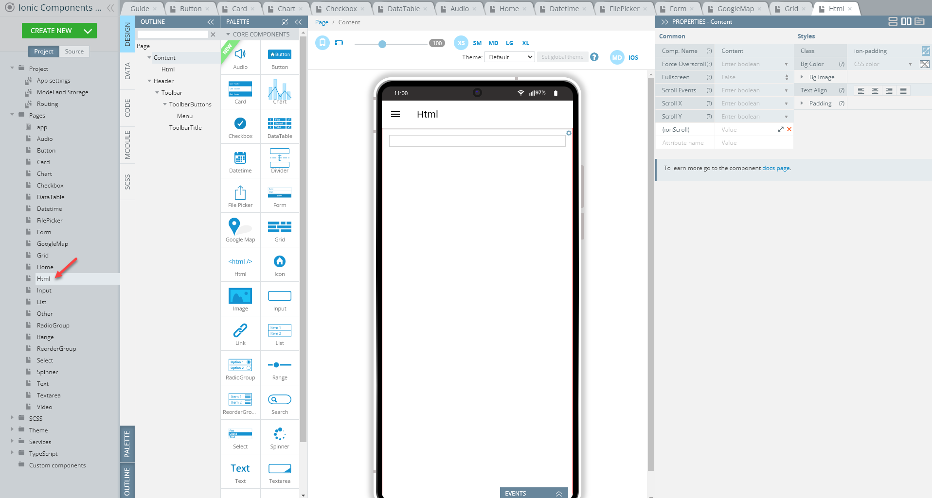
To recreate the page as you see it now, follow the steps below.
Creating Html Page
- Disable the footer for the Page component (Footer = False).
- Set the Toolbar Title Text property to Html.
- Drag the Button component and drop it to the Toolbar Buttons area, rename it to Menu (Comp. Name = Menu) and set its Comp. Type property to Ionic Menu Button.
- Drag the Html component and drop it to the Content area.
- Click the Edit button for the HTML property to open the edit HTML window and provide the below code, then save:
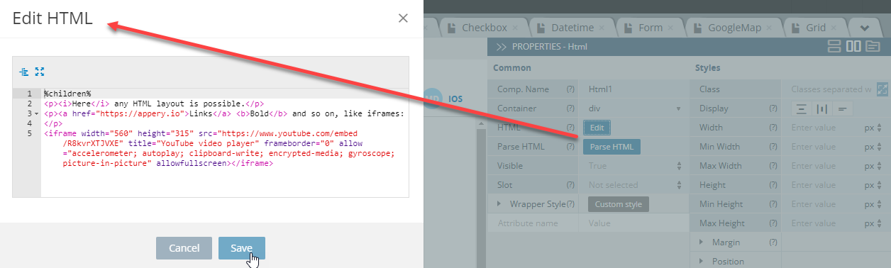
%children%
<p><i>Here</i> any HTML layout is possible.</p>
<p><a href="https://appery.io">Links</a> <b>Bold</b> and so on, like iframes:
</p>
<iframe width="560" height="315" src="https://www.youtube.com/embed/R8kvrXTJVXE" title="YouTube video player" frameborder="0" allow="accelerometer; autoplay; clipboard-write; encrypted-media; gyroscope; picture-in-picture" allowfullscreen></iframe>- Lastly, switch to the SCSS panel and provide the following code:
p{
    padding:10px;
}
Tip!We highly recommend renaming UI Components that were autogenerated or cloned (including their child components) to some more meaningful names.
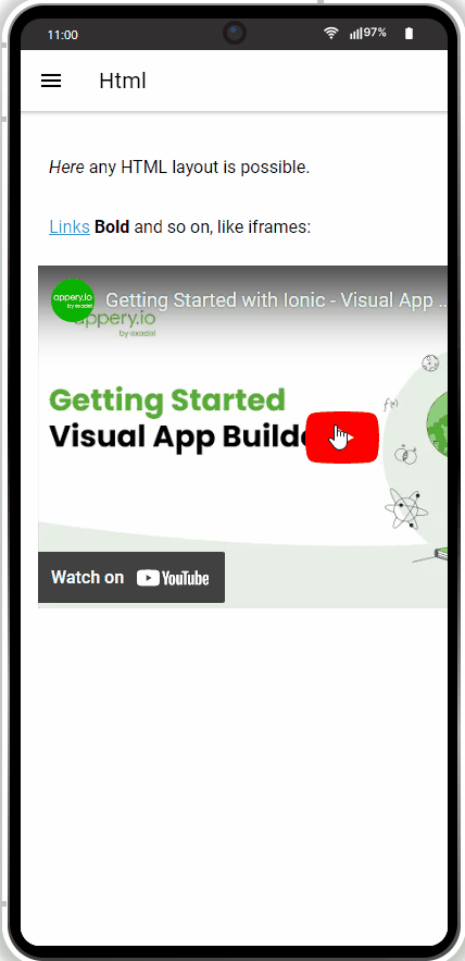
Ready! You can check your Html page now and test its work in the preview:
Input Page
Open our ready-to-go Components sample app, select the page in the Project view tree and open the OUTLINE view to check the details of its UI components predefined in our sample app:

To recreate the page as you see it now, follow the steps below.
Creating Input Page
- Disable the footer for the Page component (Footer = False).
- Set the Toolbar Title Text property to Input.
- Drag the Button component and drop it to the Toolbar Buttons area, rename it to Menu (Comp. Name = Menu) and set its Comp. Type property to Ionic Menu Button.
- Drag the Text component and drop it to the Content area. Set its Container property to h3 and the Text property to Different types are available.
- Drag ten Input components and drop them below Text (you can also use cloning to do it).
- One by one, define the newly added Input components so that they display different Type, Color, and Label > Text properties each:
- Type = Date, Email, Number, Password, Search, Tel, Text, Time, URL, File
- Color = primary, warning, danger, medium, warning, tertiary, leave empty (for Text), tertiary, dark, danger.
- Label > Text = Date, Email, Number, Password, Search, Tel, Text, Time, URL, File.
- Drag another Text component and drop it below the inputs and set its Container property to h3 and the Text property to Label Position.
- Now, add three more Input components below the second Text instance (you can also use cloning to do it) and, one by one, define them as follows:
- Color = warning, success, tertiary
- Label > Text = Fixed, Stacked, Floating
- Label > position = Fixed, Stacked, Floating.
Tip!We highly recommend renaming UI Components that were autogenerated or cloned (including their child components) to some more meaningful names.
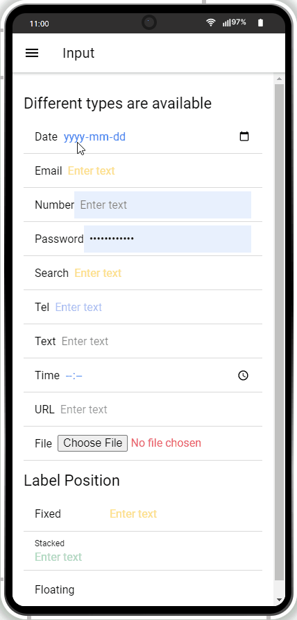
The Input page should perform like this when defined:
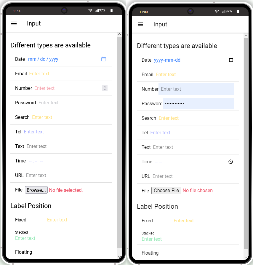
Note that some components can display different UI depending on the browser used.
Compare the Input component defined with its Type property set to Number, Password, Time, or File in Mozilla Firefox vs Google Chrome:
List Page
Open our ready-to-go Components sample app, select the page in the Project view tree and open the OUTLINE view to check the details of its UI components predefined in our sample app:
To recreate the page as you see it now, follow the steps below.
Creating List Page
- Disable the footer for the Page component (Footer = False).
- Set the Toolbar title Text property to List.
- Drag the Button component and drop it to the Toolbar buttons, rename it to Menu (Comp. Name = Menu) and set its Comp. Type property to Ionic Menu Button.
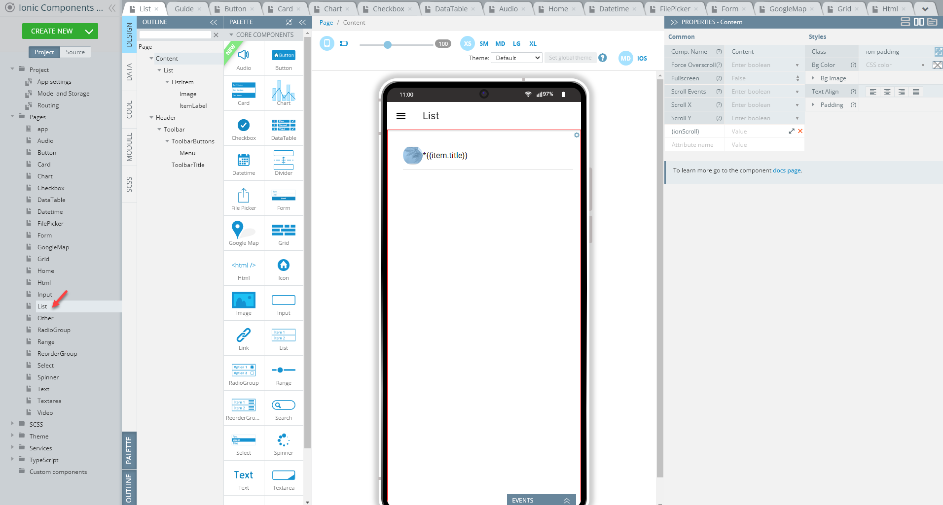
- Drag the List component and drop it to the Content area. A list with two default List items each having a child Item Label component will be created.
- Delete the second List Item:
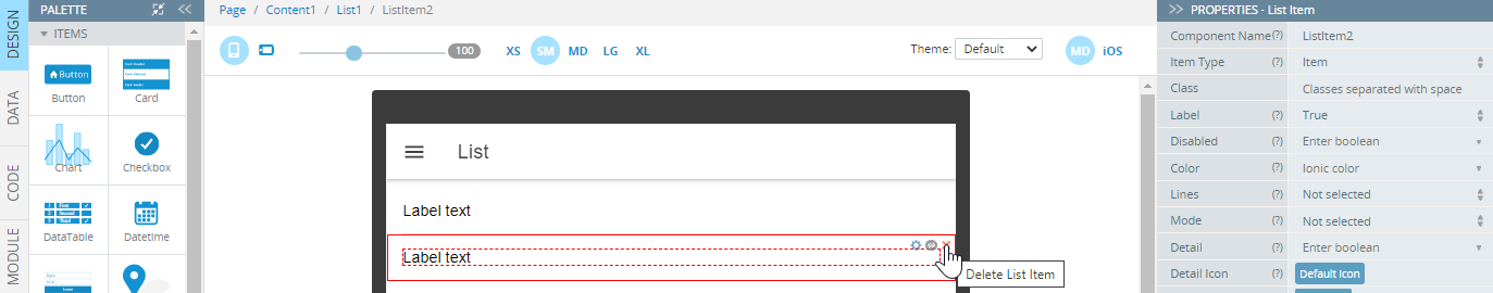
- For the remaining list Item, add a new attribute under the PROPERTIES panel: *ngFor and provide it with the value let item of items.
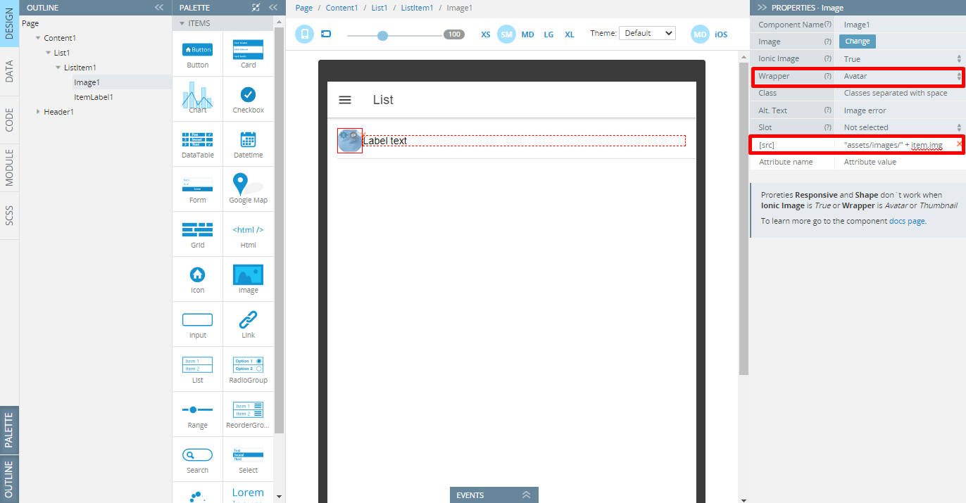
- Add the Image component to the list item and set its Wrapper property to Avatar; then, add a new property to it: [src] with the value set to "assets/images/" + item.img:
- Switch to the Item Label component and set {{item.title}} for its Text property.
- Since this page is created to display some items, they need to be defined under the CODE panel. So, first, create a new variable, items of Any type, and then create a function, constructor, by adding the below code and saving the changes:
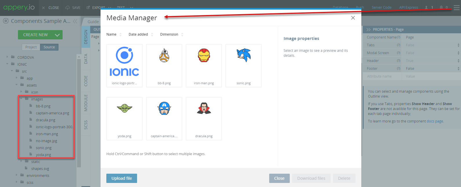
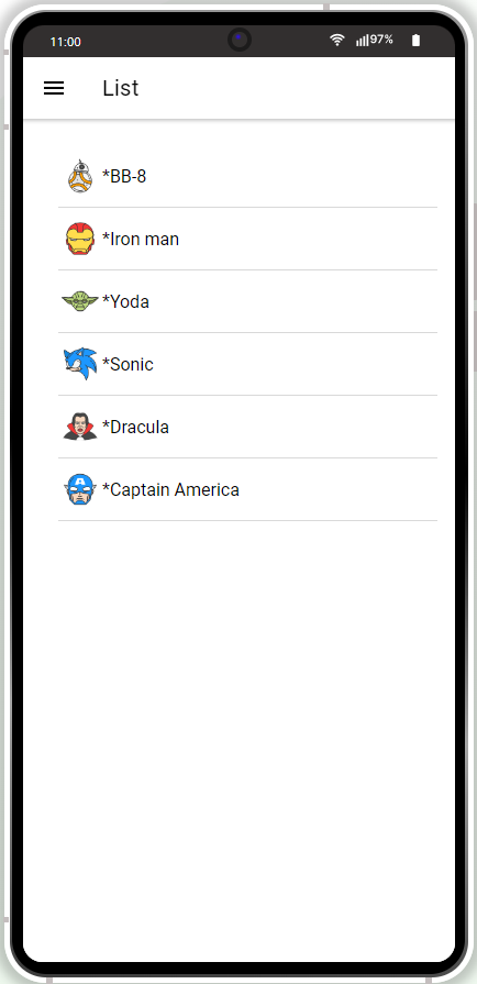
this.items = [{
    "img": "bb-8.png",
    "title": "BB-8"
}, {
    "img": "iron-man.png",
    "title": "Iron man"
}, {
    "img": "yoda.png",
    "title": "Yoda"
}, {
    "img": "sonic.png",
    "title": "Sonic"
}, {
    "img": "dracula.png",
    "title": "Dracula"
}, {
    "img": "captain-america.png",
    "title": "Captain America"
}];Note, that to be able to preview the listed images, you need to pre-upload them to the app by using the Media Manager. To open it, click the Additional Menu (the three lines button) in the upper-right corner of the App Builder Toolbar and select Media Manager; then upload the needed images.
When ready, the uploaded files will become available under the Source Tab:
Tip!We highly recommend renaming UI Components that were autogenerated or cloned (including their child components) to some more meaningful names.
The ready List page is static but you can check how it looks like with all the list elements added:
Other Page
Open our ready-to-go Components sample app, select the page in the Project view tree and open the OUTLINE view to check the details of its UI components predefined in our sample app:
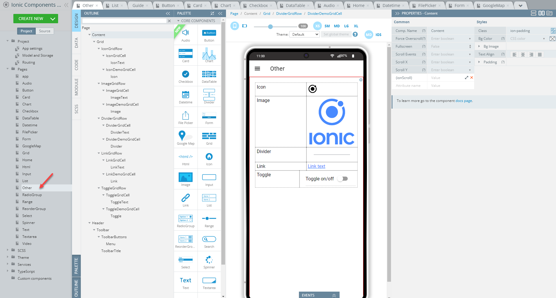
To recreate the page as you see it now, follow the steps below.
Creating Other Page
- Disable the footer for the Page component (Footer = False).
- Set the Toolbar Title Text property to Other.
- Drag the Button component and drop it to the Toolbar Buttons area, rename it to Menu (Comp. Name = Menu) and set its Comp. Type property to Ionic Menu Button.
- Drag the Grid component and drop it to the Content area. A grid with one default Grid Row having two child Grid Cell components will be created.
- Place a Text component into the left Grid Cell and set its Text property to Icon.
- Select the grid and add three more Grid Row components to the page. Add a Text component into the left Grid Cell of every new grid row (you can also use cloning to do it).
- One by one, select the Text components inside the left grid cells of the newly added Grid Rows so that their Text properties are defined with the corresponding values: Image, Link, and Toggle.
- Now, switch to the right-sided Grid Cells and add the related components to each of them:
- Icon
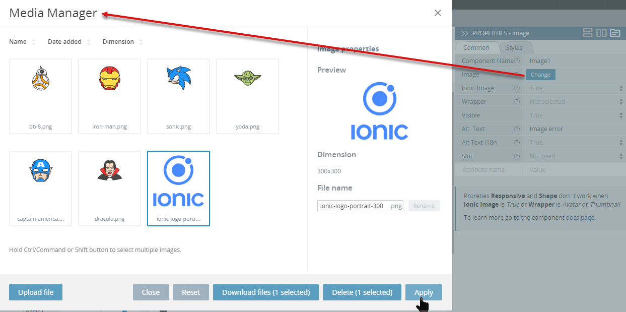
- Image with its Image property set to, for example, Ionic-logo-portrait-300 (click the Change button to open the Media Manager for uploading and then applying the needed image file):
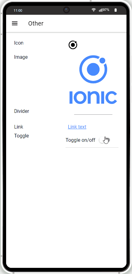
Tip!We highly recommend renaming UI Components that were autogenerated or cloned (including their child components) to some more meaningful names.
The page is ready and you can preview it:
RadioGroup Page
Open our ready-to-go Components sample app, select the page in the Project view tree and open the OUTLINE view to check the details of its UI components predefined in our sample app:
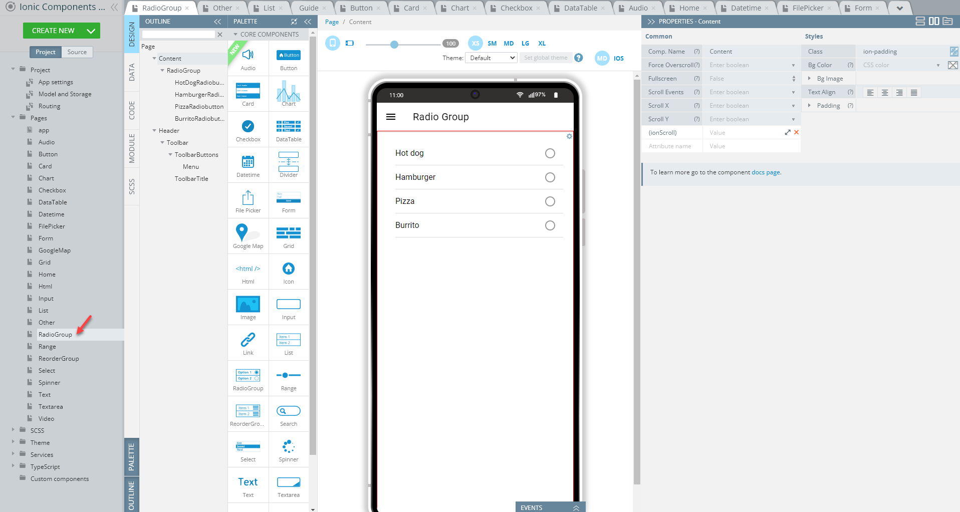
To recreate the page as you see it now, follow the steps below.
Creating RadioGroup Page
- Disable the footer for the Page component (Footer = False).
- Set the Toolbar Title Text property to Radio Group.
- Drag the Button component and drop it to the Toolbar Buttons area, rename it to Menu (Comp. Name = Menu) and set its Comp. Type property to Ionic Menu Button.
- Drag the RadioGroup component and drop it to the Content area. A radio group with three default Radiobutton components will be created.
- Add one more Radiobutton component to the page (ou can use cloning to do it).
If you used cloning to create the fourth Radiobutton, make sure its Value property is different from the parent component.
- Set the Label > Text properties of the four Radiobuttons so that they display different values correspondingly: Hot dog, Hamburger, Pizza, Burrito.
Tip!We highly recommend renaming UI Components that were autogenerated or cloned (including their child components) to some more meaningful names.
The simple Radio Group page is ready and you can check it:
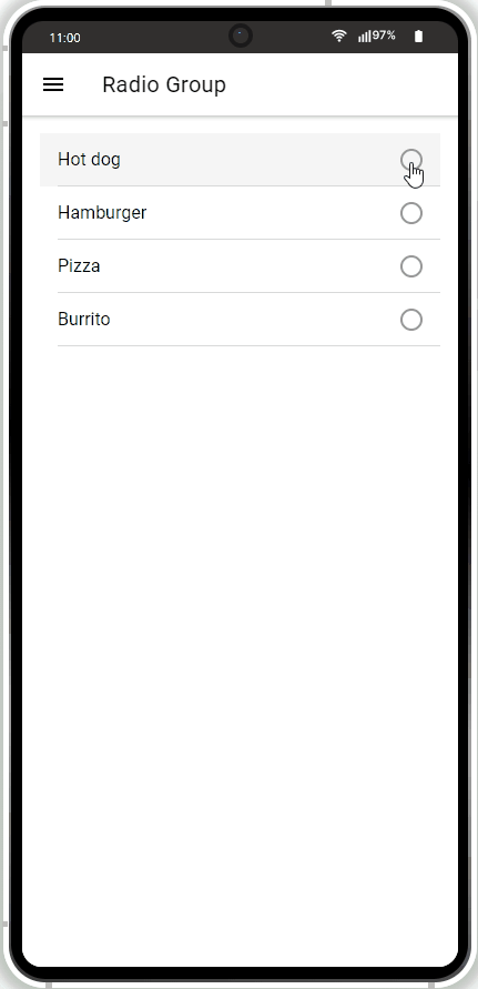
Range Page
Open our ready-to-go Components sample app, select the page in the Project view tree and open the OUTLINE view to check the details of its UI components predefined in our sample app:

To recreate the page as you see it now, follow the steps below.
Creating Range Page
- Disable the footer for the Page component (Footer = False).
- Set the Toolbar Title Text property to Range.
- Drag the Button component and drop it to the Toolbar Buttons area, rename it to Menu (Comp. Name = Menu) and set its Comp. Type property to Ionic Menu Button.
- Drag the Range component and drop it to the Content area and define its components as follows:
- Color = danger
- Left Label > Text = 0
- Right Label > Text = 100:
- Add three more Range components to the page (you can also use cloning to do it).
- Place a Text component under the upper Range component (Range1) and set its Text to Dual Knobs.
- For the second Range component (you might like to rename it to Range2 if cloning was used) the properties should be set as follows:
- Dual Knobs = True
- Left Label > Text = min
- Right Label > Text = max.
The Color property is cleared.
- Add another Text component below the Range2 component and set its Text property to Snaps.
- For the third Range component (you might like to rename it to Range3 if cloning was used) the properties should be set as follows:
- Color = success
- Snaps = True
- Left Label > Text = A
- Right Label > Text = Z.
- Lastly, define the fourth Range component:
- Color = secondary
- Left Label > Text = Departure
- Right Label > Text = Arrival
- Left Icon > Style = alarm-sharp
- Left Icon > Color = medium
- Right Icon > Style = airplane-sharp
- Right Icon > Color = tertiary.
Tip!We highly recommend renaming UI Components that were autogenerated or cloned (including their child components) to some more meaningful names.
The Range page will look like this in the preview:
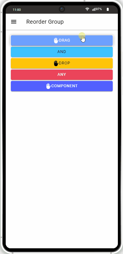
ReorderGroup Page
Open our ready-to-go Components sample app, select the page in the Project view tree and open the OUTLINE view to check the details of its UI components predefined in our sample app:
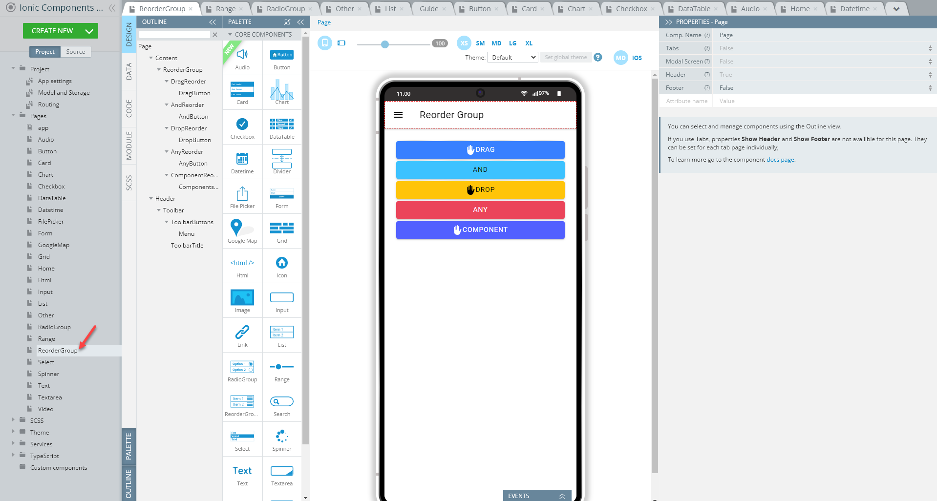
To recreate the page as you see it now, follow the steps below.
Creating ReorderGroup Page
- Disable the footer for the Page component (Footer = False).
- Set the Toolbar Title Text property to Reorder Group.
- Drag the Button component and drop it to the Toolbar Buttons area, rename it to Menu (Comp. Name = Menu) and set its Comp. Type property to Ionic Menu Button.
- Drag the ReorderGroup component and drop it to the Content area. A reorder group with three default Reorder components will be created.
- Place a Button into the first Reorder component and define its properties as follows:
- Text = Drag
- Color = primary
- Icon > Style = hand-left.
- Add another Button to the Reorder2 component, and define its properties as follows:
- Text = And
- Color = secondary.
- Switch to the Reorder3 component, and add one more Button to it, then define its properties as follows:
- Text = Drop
- Color = warning
- Icon > Style = hand-left.
- In total, the reorder group should have five Reorder components, so, you need to add two more with their child buttons: it's easy to do by cloning the Reorder3 component.
- Switch to the newly created copy of the Reorder component (you might also like to rename it), and define its Button component as follows:
- Text = Any
- Color = danger.
The Button Icon > Style property is undefined (No icon is selected).
- Click the last, Reorder5, component, select its Button, then set:
- Text = Component
- Color = tertiary.
Leave the Icon > Style property as hand-left.
- Finally, switch to the EVENTS tab, define the Item reorder >Reorder complete action and save.
Tip!We highly recommend renaming UI Components that were autogenerated or cloned (including their child components) to some more meaningful names.
Now, you can check what the Reorder Group page looks like and test the behavior defined for this page:
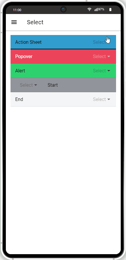
Select Page
Open our ready-to-go Components sample app, select the page in the Project view tree and open the OUTLINE view to check the details of its UI components predefined in our sample app:
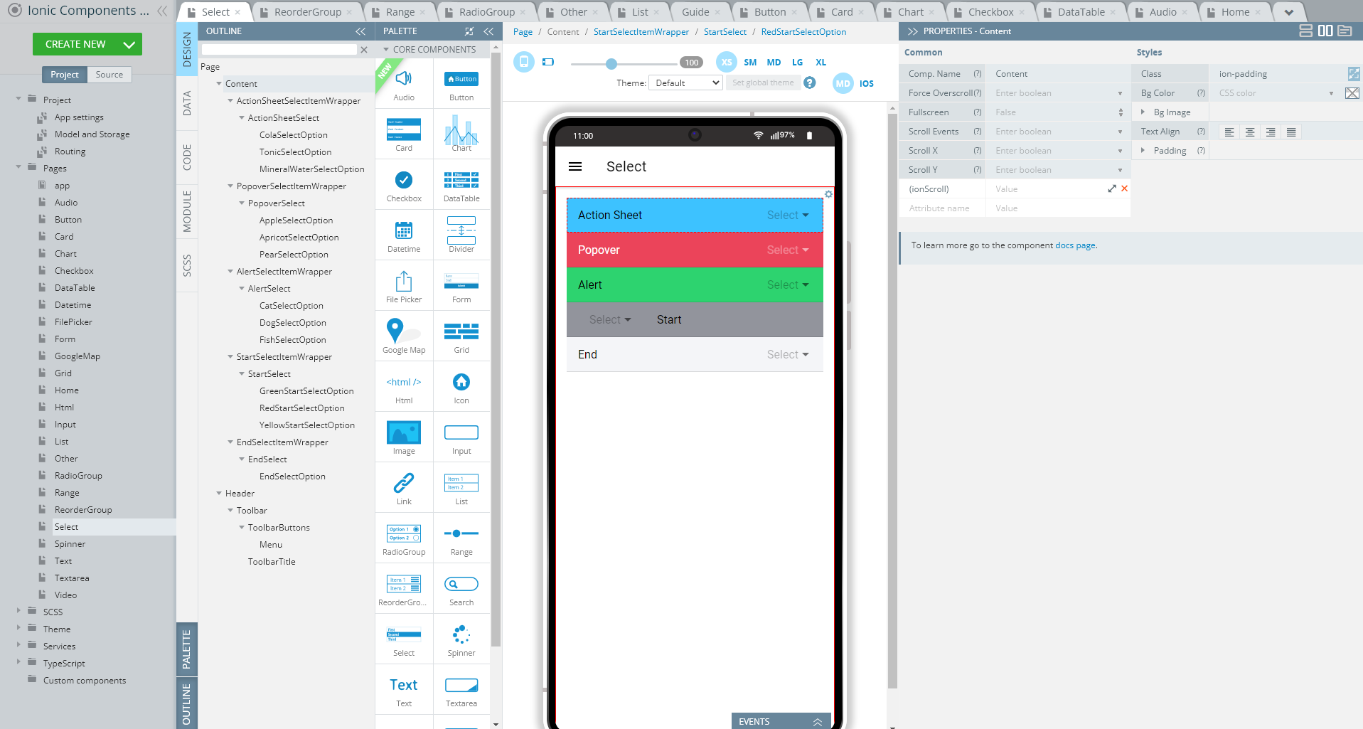
To recreate the page as you see it now, follow the steps below.
Creating Select Page
- Disable the footer for the Page component (Footer = False).
- Set the Toolbar title Text property to Select.
- Drag the Button component and drop it to the Toolbar buttons area, rename it to Menu (Comp. Name = Menu) and set its Comp. Type property to Ionic Menu Button.
- One by one, drag five Select components and drop them to the Content area and define them so that they display different Color and Label > Text properties correspondingly:
- Color = secondary, danger, success, medium, light
- Label > Text = Action Sheet, Popover, Alert, Start, End.
- Using the OUTLINE view, expand the first Select Item Wrapper component to click its child Select component, and under the PROPERTIES panel, set its Interface property to Action Sheet.
- In the mobile frame, locate the Select Option for this select wrapper and add two more select options (you might also like to rename them).
The three select options have their corresponding Text options like the following:
- Cola
- Tonic
- Mineral water.
- For the SelectI2 component, set the Interface property to Popover.
Add two more select options so there are three of them and define their corresponding Text options like the following:
- Apple
- Apricot
- Pear.
- For the Select3 component, set the Interface property to Alert.
Add two more select options so there are three of them and define their corresponding Text options like the following:
- Cat
- Dog
- Fish.
- For the Select4 component, set the Slot property to Start.
Add two more select options so there are three of them and define their corresponding Text options like the following:
- Green
- Red
- Yellow
- For the Select5 component, set the Slot property to End. For its Select Option Text property, enter Have fun!.
Tip!We highly recommend renaming UI Components that were autogenerated or cloned (including their child components) to some more meaningful names.
Now, you can check the behavior of the elements on the page:
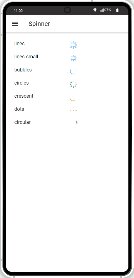
Spinner Page
Open our ready-to-go Components sample app, select the page in the Project view tree and open the OUTLINE view to check the details of its UI components predefined in our sample app:
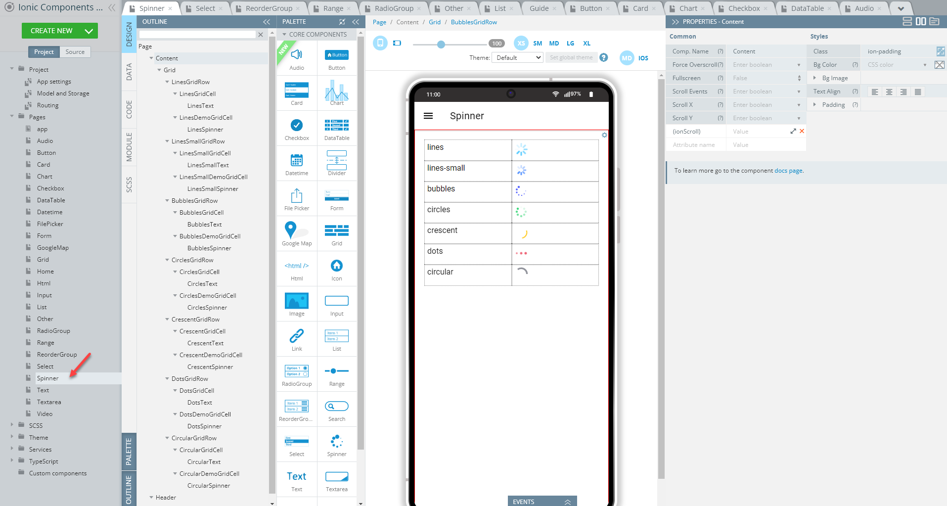
To recreate the page as you see it now, follow the steps below.
Creating Spinner Page
- Disable the footer for the Page component (Footer = False).
- Set the Toolbar Title Text property to Spinner.
- Drag the Button component and drop it to the Toolbar Buttons area, rename it to Menu (Comp. Name = Menu) and set its Comp. Type property to Ionic Menu Button.
- Drag the Grid component and drop it to the Content area. It will be added with one default Grid Row having two Grid Cells.
- Place the Text component inside the left Grid Cell and the Spinner component inside the right one.
Define the Text property of the Text component as lines; then switch to the spinner and for its Spinner Name property, select lines and set its Color property to secondary using the drop-down. - Now, select the grid and add six more Grid Row components. This can be quickly done by cloning the Grid Row that has been defined before.
- Rename the newly added Grid Row components to Grid Row2, Grid Row3, ..., Grid Row7 (optional). You can also adjust the names of their child components (Grid Cell, Text, and Spinner) correspondingly.
- Define the Grid Row components so that their Grid Cell components display different spinner type properties each:
- Text property of the corresponding Text components = lines-small, bubbles, circles, crescent, dots, circular
- Spinner Name property of the corresponding Spinner components = lines-small, bubbles, circles, crescent, dots, circular
- Color property of the corresponding Spinner components = primary, tertiary, success, warning, danger, medium.
Tip!We highly recommend renaming UI Components that were autogenerated or cloned (including their child components) to some more meaningful names.
You can check now what the Spinner page looks like in the preview:
Text Page
Open our ready-to-go Components sample app, select the page in the Project view tree and open the OUTLINE view to check the details of its UI components predefined in our sample app:
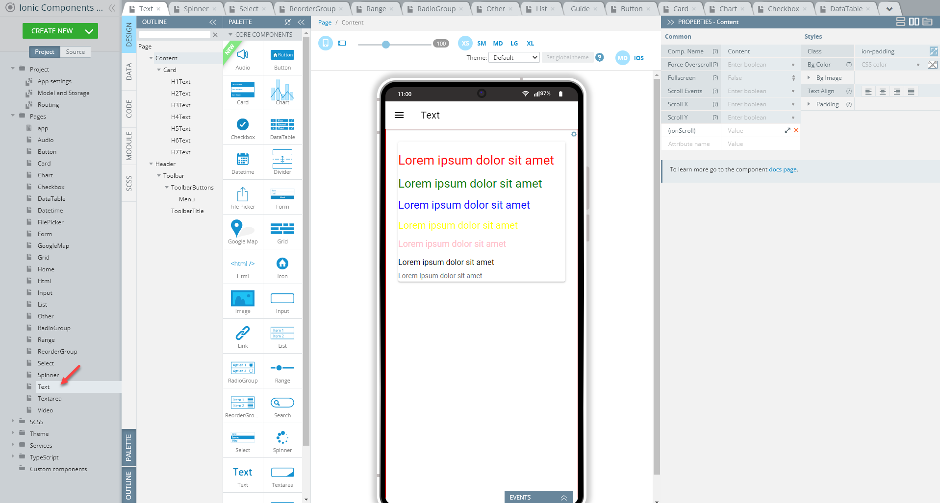
To recreate the page as you see it now, follow the steps below.
Creating Text Page
- Disable the footer for the Page component (Footer = False).
- Set the Toolbar title Text property to Text.
- Drag the Button component and drop it to the Toolbar buttons area, rename it to Menu (Comp. Name = Menu) and set its Comp. Type property to Ionic Menu Button.
- Drag the Card component and drop it to the Content area and delete the default Card Item component, CardItem1.
- Place the Text component inside the Card and define its properties as follows:
- Container = h1
- Text = Lorem ipsum dolor sit amet
- Class = red.
- Now, add six more Text components to the card. This can be quickly done by cloning the Text that has been added before.
- Rename the Text components to Text1, Text2, ..., Text7 (optional).
- Adjust the newly added Text components so that they display different Container and Class properties each:
- Container = h2, h3, h4, h5, h6, ion-text
- Class = green, blue, yellow, pink, black; for Text7 clear the class field.
To apply the classes for the page UI components (here, Text instances) that were defined to display different text colors, switch to the SCSS panel and provide the following code:
.green {
    color: green;
}

.red {
    color: red;
}

.blue {
    color: blue;
}

.yellow {
    color: yellow;
}

.pink {
    color: pink;
}

.black {
    color: black;
}
Tip!We highly recommend renaming UI Components that were autogenerated or cloned (including their child components) to some more meaningful names.
Save the project and check how the Text page looks like in the preview:
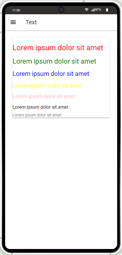
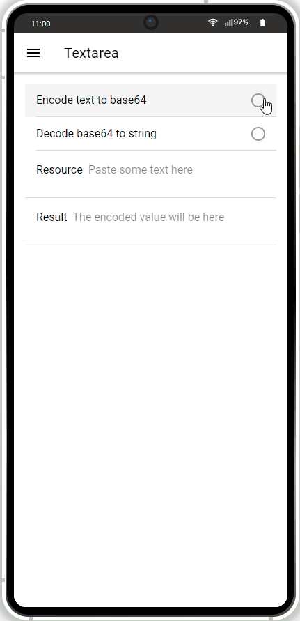
Textarea Page
Open our ready-to-go Ionic Components sample app, select the page in the Project view tree and open the OUTLINE view to check the details of its UI components predefined in our sample app:
To recreate the page as you see it now, follow the steps below.
Creating Textarea Page
-
Set the Toolbar title Text property to Textarea.
-
Drag the Button component and drop it to the Toolbar buttons area, rename it to Menu (Comp. Name = Menu) and set its Comp. Type property to Ionic Menu Button.
-
Drag the RadioGroup component and drop it to the Content area. A radio group with three default Radiobutton components will be created.
-
Delete the third Radiobutton component so that there are only two left.
-
Under the PROPERTIES panel, define the RadioGroup component properties as follows:
- Name = encodeType
- [(ngModel)] = encodeType
- (ionChange) = encodeDecode({}):
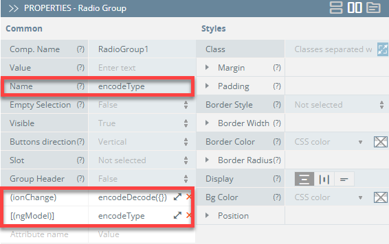
- Define the properties of Radiobutton1 and Radiobutton2 as follows:
- Value = btoa and atob
- Label > Text = Encode text to base64 and Decoode base64 to string.
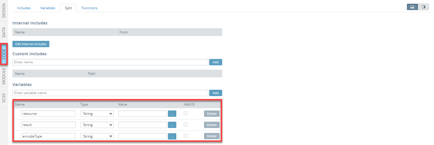
- Switch to the CODE panel and add three variables to it, all of the String type: resource, result, and encodeType:
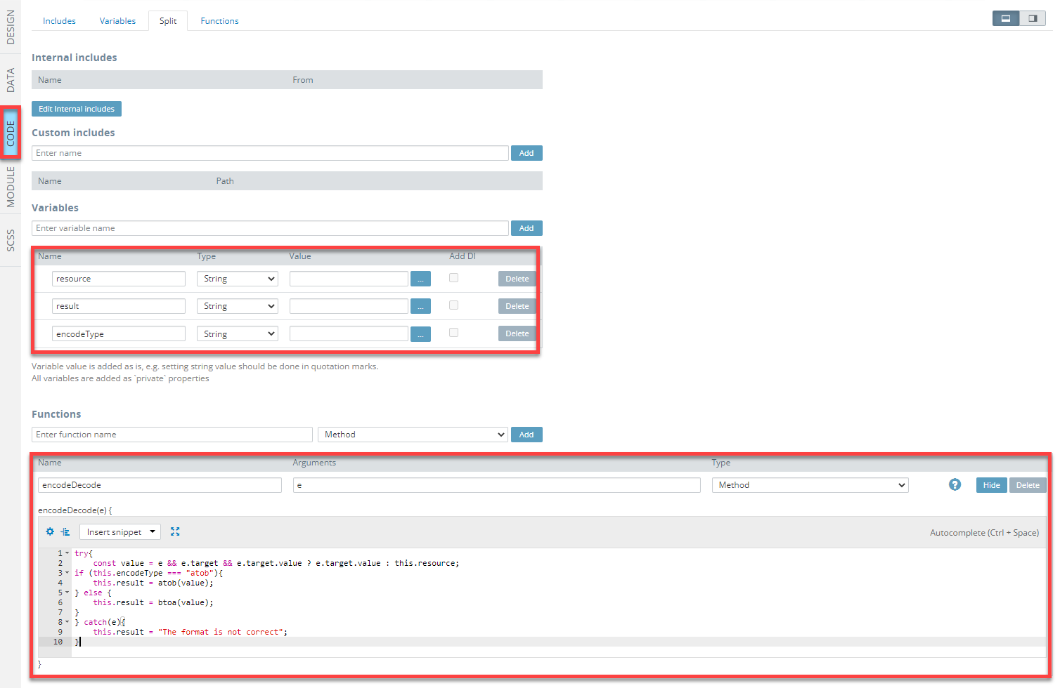
- Now, add a function, named encodeDecode of the Method type and e for its argument and provide it with the following code:
try{
    const value = e && e.target && e.target.value ? e.target.value : this.resource;
if (this.encodeType === "atob"){
    this.result = atob(value);
} else {
    this.result = btoa(value);
}
} catch(e){
    this.result = "The format is not correct";
}
Check how the CODE panel should look like now:
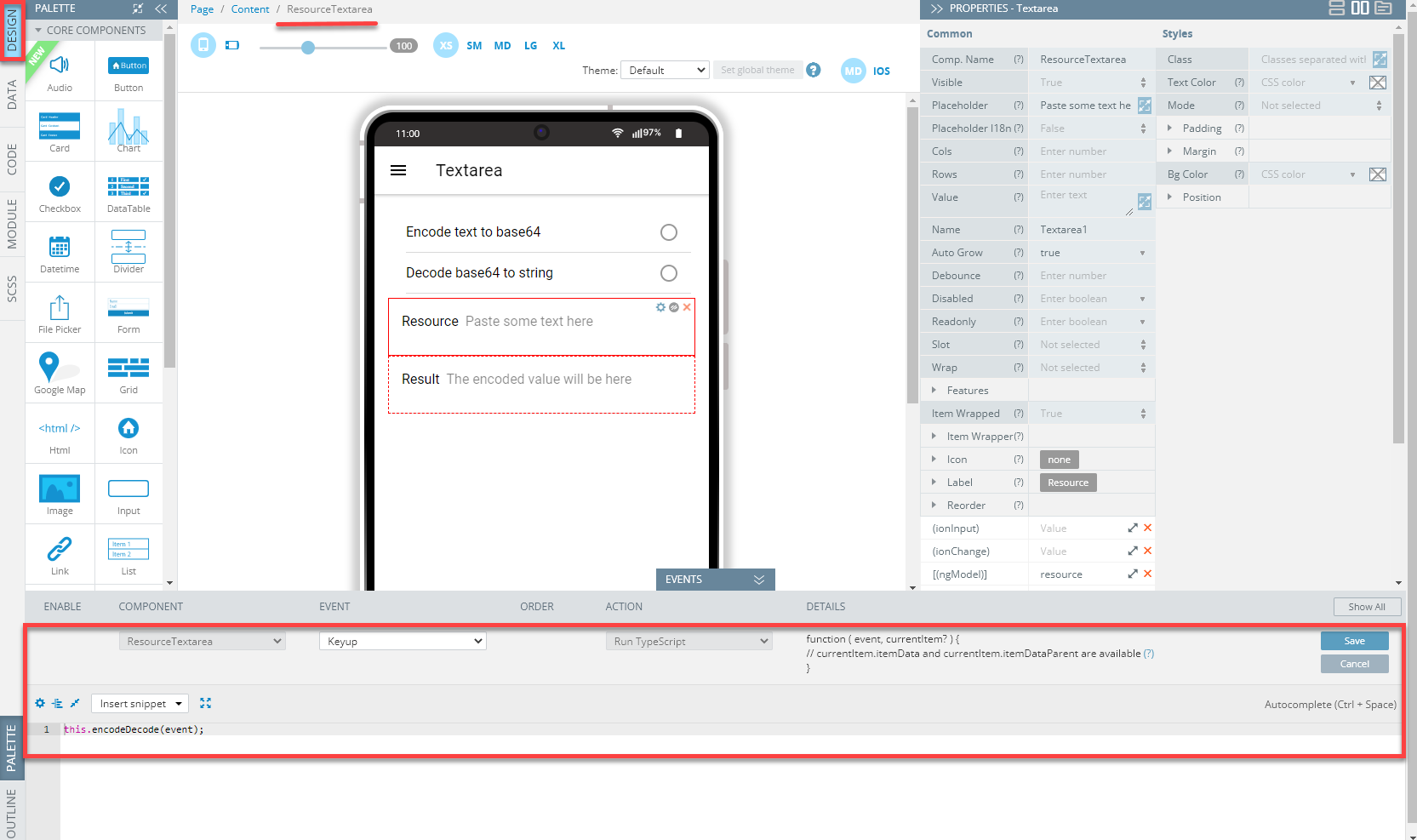
- Go back to the page DESIGN panel and place two Textarea components below the radio group.
- Adjust the newly added Textarea components so that they display different Placeholder, Label > Text, and [(ngModel)] properties each:
- Placeholder = Paste some text here and The encoded value will be here
- Label > Text = Resource and Result
- [(ngModel)] = resource and result.
- Finally, select the Textarea1 component (we also recommend rename it to a more meaningfu name), unfold the EVENTS tab from the bottom and define the component with the Keyup* event. Then, select Run TypeScript from the ACTIONS drop-down and provide the following code:
this.encodeDecode(event);- Save the event:
Now, save the project and proceed with testing it.
Tip!We highly recommend renaming UI Components that were autogenerated or cloned (including their child components) to some more meaningful names.
You can check how the Textarea page looks like in the preview:
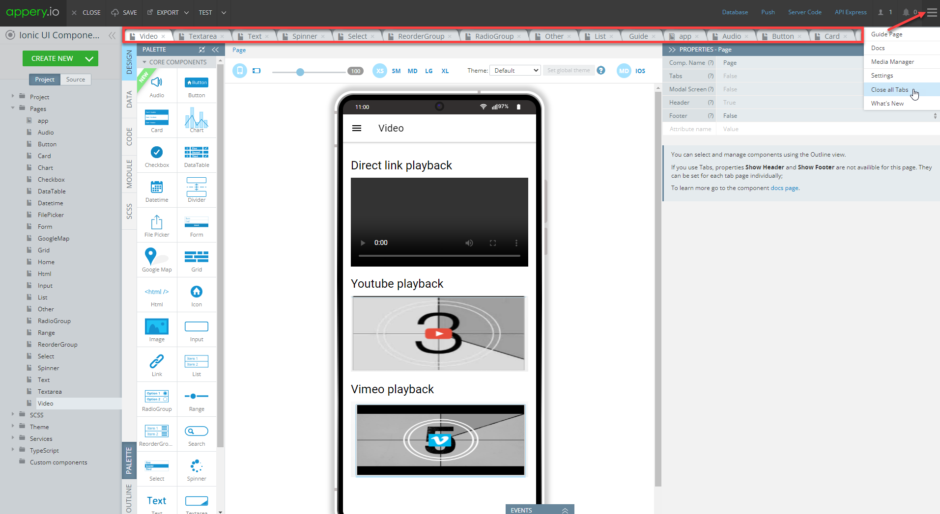
Video Page
Open our ready-to-go Ionic Components Sample App, select the page in the Project view tree, and open the OUTLINE view to check the details of its UI components predefined in our sample app:
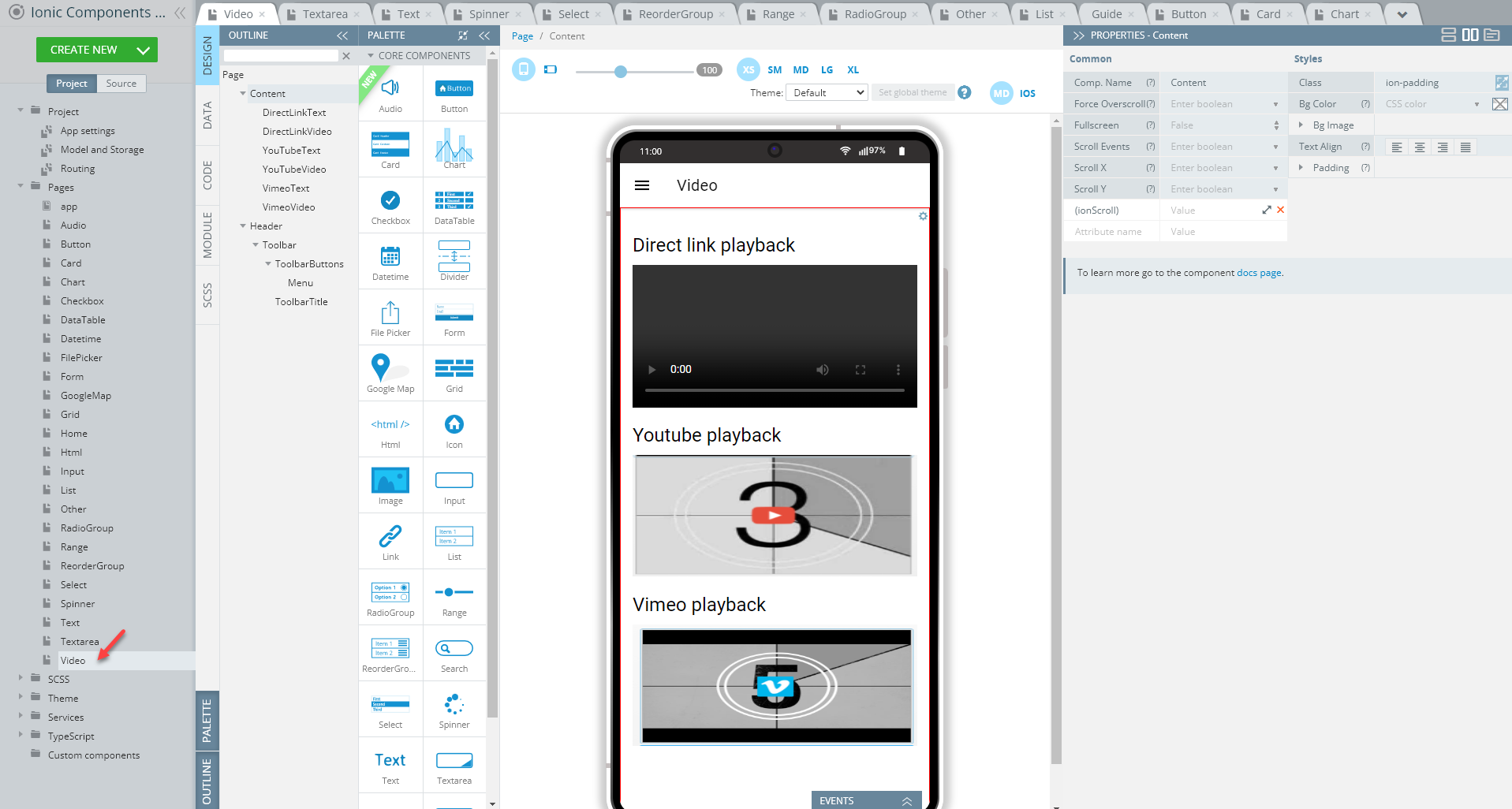
Creating Video Page
- Disable the footer for the Page component (Footer = False).
- Set the Toolbar Title Text property to Video.
- Drop the Button component to the Toolbar Buttons area, rename it to Menu (Comp. Name = Menu) and set its Comp. type property to Ionic Menu Button.
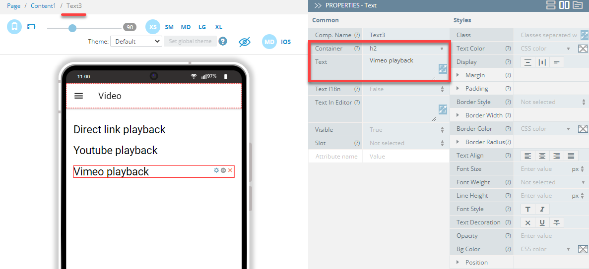
- Drag three Text components and drop them to the Content area. Set their Container to h2 and then, one by one, define their Text properties as follows:
- Text1 = Direct link playback
- Text2 = Youtube playback
- Text3 = Vimeo playback:
- Now, drag three Video components and drop them under the Texts.
- Select the first Video component and enter the link to the remote video file into the Src field (you can also use the property popup to make editing more comfortable):
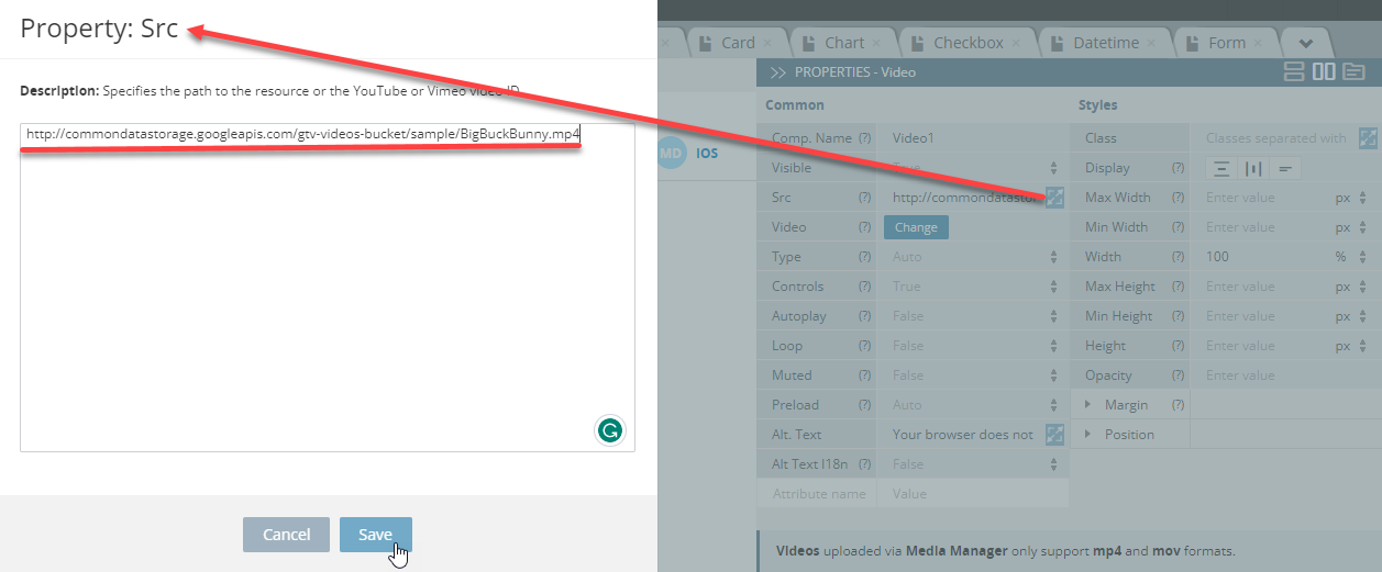
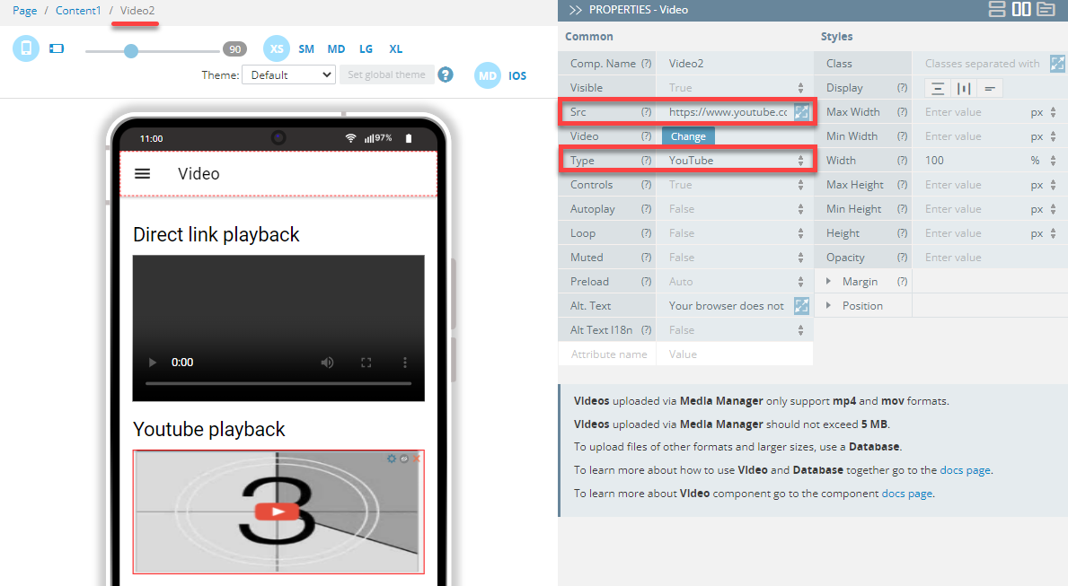
- Now, select the second Video component add the link to a YouTube video file and set its Type property as YouTube:
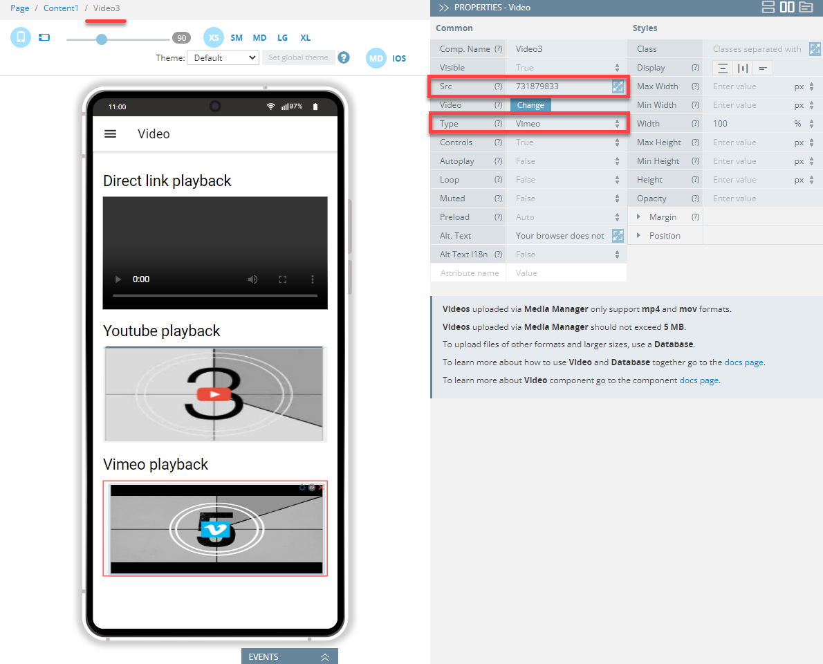
- Finally, select the third Video component and set its Type property as Vimeo and then provide the Vimeo video ID ink as the component's Src property:
Tip!We highly recommend renaming UI Components that were autogenerated or cloned (including their child components) to some more meaningful names.
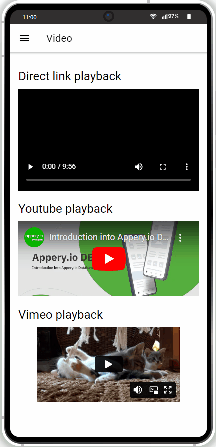
When done, you can check how the Video page looks like and test its behavior:
Testing App
Testing the app is fast and simple. All you need to do is simply click the TEST button in the top App BuilderToolbar.
The browser will launch with the app that you have just built.
Testing on Device
Also, when your app version is ready, you might like to test it on the device.
Appery.io Tester AppA great option to quickly test the app on the device is to use our Appery.io Tester app.
The app is free and available for both iOS and Android.
You can check out this page to learn more about using the Appery.io Tester app.
Creating and Using Custom Components
We also recommend that you consider using the Custom Components feature while working with your custom app UI. It can save a lot of time and development efforts if you need to create an app with complex customized UI components that need to be applied for several screens.
With each screen having its own content but all the screens featuring the same component, say Grid, with several dependent elements (text, icons, etc.), you can create a custom component, add the Grid component to it, define its properties, add the needed events to it, and then simply drag this customized component to all the needed app pages. This way, you will not have to add and modify every new grid on every screen but will be able to modify the custom component style.
If you are interested, you can check here for more instructions and sample apps demonstrating using the Custom Components feature.