Ionic Date and Time Input Sample App
Sample app demonstrating Date and Time Input in Ionic
Introduction
In this sample app, we will demonstrate several ways of entering date and time values in an Appery.io app:
First, you will learn how to implement single date and time input, then we will move on to more complicated cases: multiple dates and date ranges input types.
Creating App
You can select how you would like to get the app working under your Appery.io account:
- Download the app backup with further installing it (the backup can be securely saved for further use);
- Create the app from our template with one click (the easiest and quickest option: you will get the working app in a matter of moments)
- Create the app by yourself using our step-by-step illustrated instructions (more time-consuming but highly educating option that will help in mastering work with Appery.io).
Downloads and Resources
You can try the app yourself by recreating it from the backup.
To restore the app from the backup, follow these steps:
- Download the app backup file.
- Click From backup and select the project backup file on your drive.
- Type in the app name and click Create.
Creating App from Template
NEW: One-Click Template Installation!You can now enjoy the one-click-away option of installing the template app: simply click the button below and in a moment, your app is ready to start! There’s no need to go to the Create new app dialog or download the template backup with further installing it!
But if you are interested in the app details, please check out the steps below.
Creating New App
- Navigate to the Appery.io dashboard. Here, from the Apps tab, click Create new app.
- Select Blank as a template. Name it, for example, Ionic DateTimeApp and confirm by clicking Create.
In a moment, you will find yourself inside Appery.io App Builder. - Go to the Project tab on the left and unfold the Pages folder to see the default app pages (screens): app and Screen1.
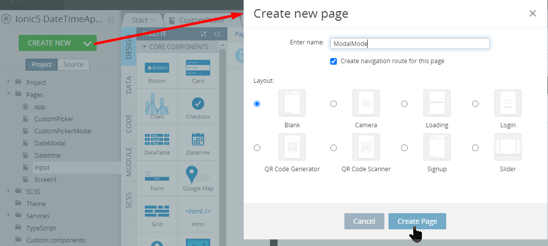
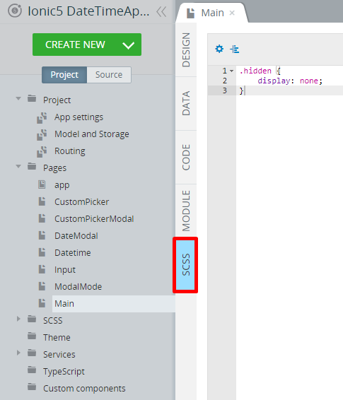
- Now, create six more pages by clicking CREATE NEW > Page that will be later defined to feature different cases of inputting date and time. Name them to CustomPicker, CustomPickerModal, DateModal, Datetime, Input, and ModalMode accordingly:
Defining Main Page
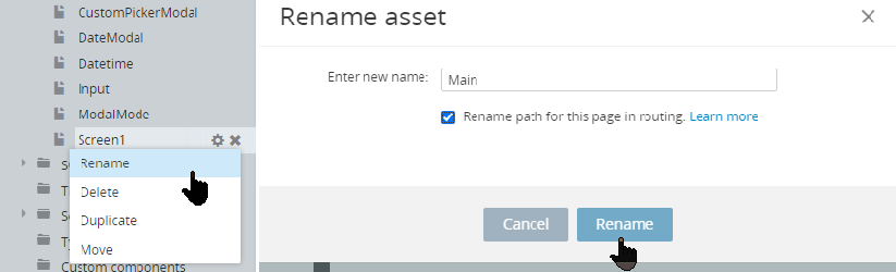
- First of all, rename the Screen1 page to Main:
and under the page PROPERTIES panel, set the Page Footer property to False.
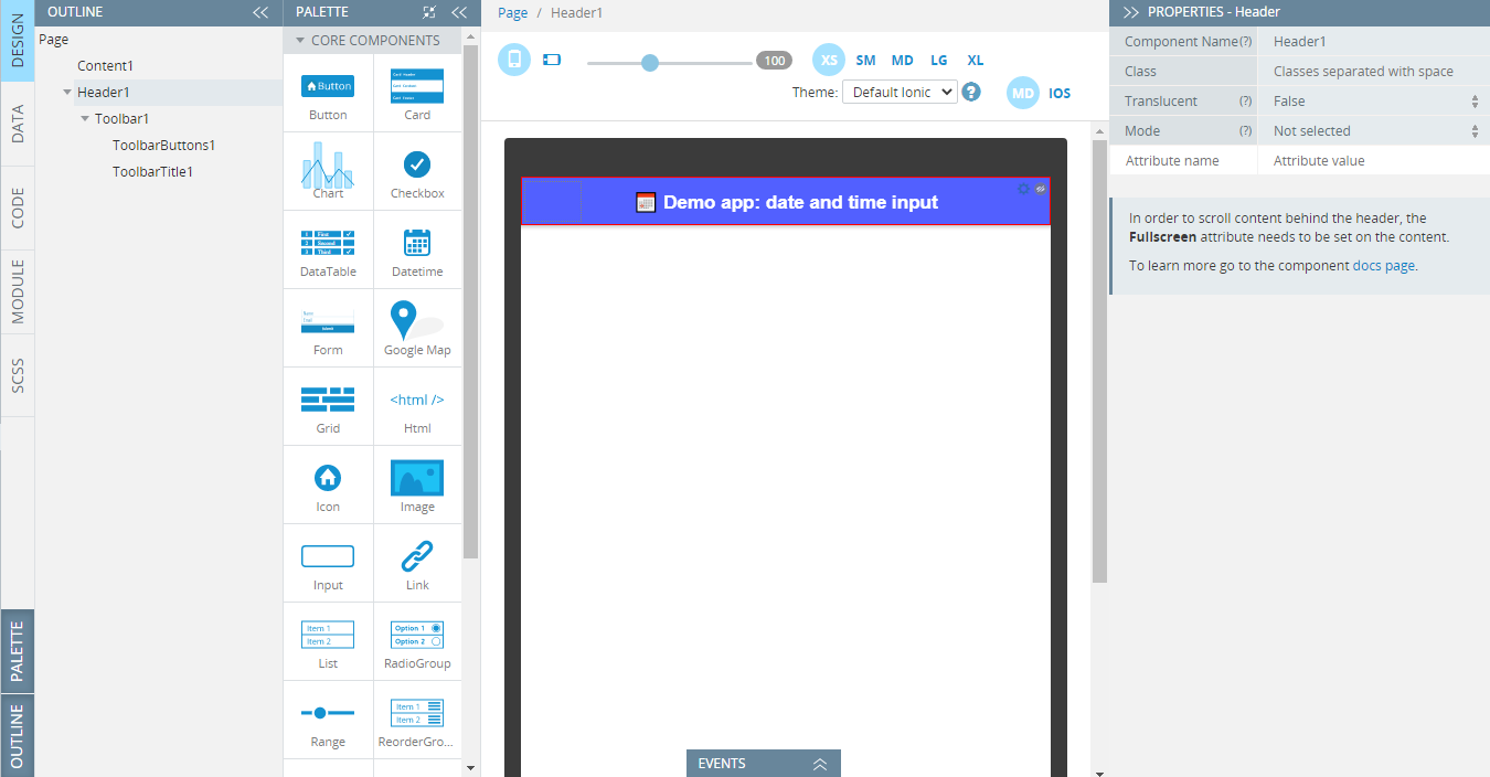
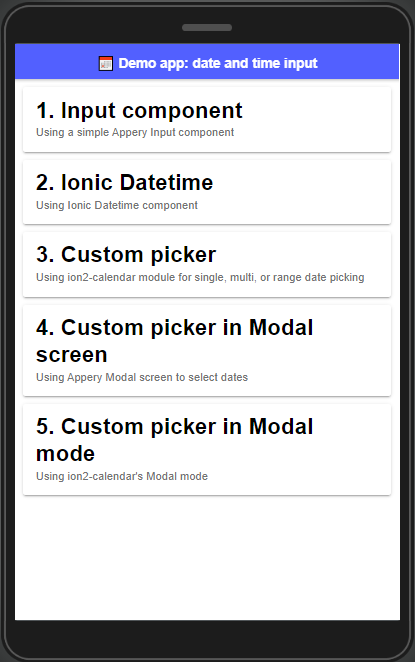
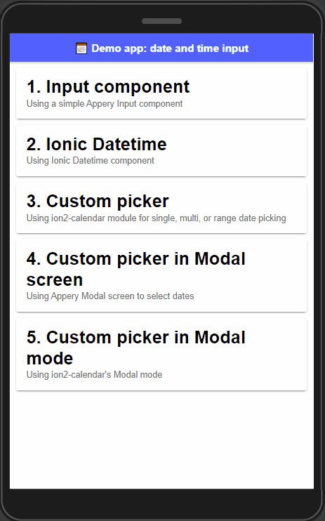
- Then, select its Toolbar component and change its Color property to tertiary and its Mode property to iOS; then switch to the ToolbarTitle component and set it's Text = 📅 Demo app: date and time input:
- Now, drag five Card components and drop them to the Content area. Five cards will be created each nesting one default Card Item with a Card Item Title.
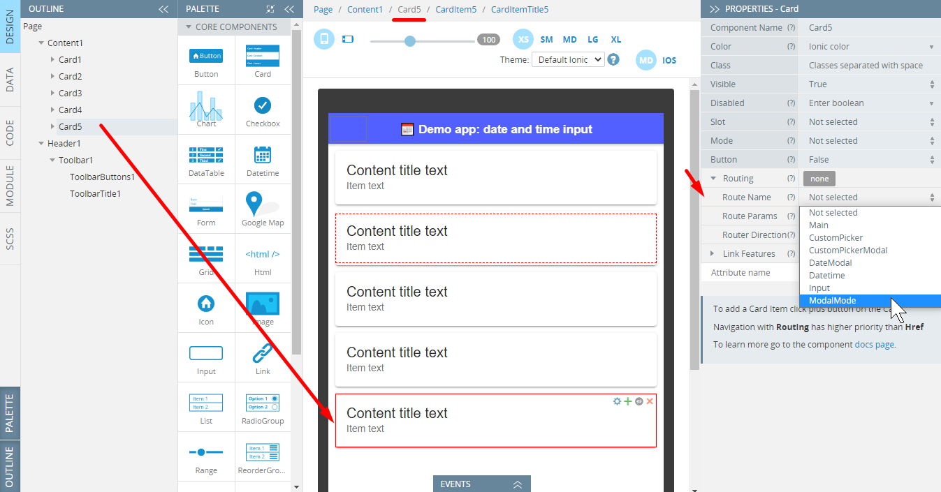
- Under the page PROPERTIES panel, one by one, select every card and set their Route Name parameters as described below:
- for Card1: Input
- for Card2: Datetime
- for Card3: CustomPicker
- for Card4: CustomPickerModal
- for Card5: ModalMode:
- Also, select every Card Item one by one and define their corresponding Text properties as follows:
- for Card1: Using a simple Appery Input component
- for Card2: Using Ionic Datetime component
- for Card3: Using ion2-calendar module for single, multi, or range date picking
- for Card4: Using Appery Modal screen to select dates
- for Card5: Using ion2-calendar's Modal mode.
Additionally, set each item's Mode property to iOS.
- Finally, select every Card Item Title one by one and define their Title Text properties as follows:
- for Card1: 1. Input component
- for Card2: 2. Ionic Datetime
- for Card3: 3. Custom picker
- for Card4: 4. Custom picker in Modal screen
- for Card5: 5. Custom picker in Modal mode.
Also, set the Mode property of each to iOS.
- To finish, add the following code to the style code editor under the SCSS panel:
.hidden {
    display: none;
}
We are done with the Main page. To see how it should look like on the preview, click the TEST button in the App Builder Toolbar:
Using Appery.io Input Component
For some reason, you may need the ability to enter dates from the keyboard on the desktop. This can be implemented using the Input component with its Type attribute set to Date or Time. It creates an input field that allows entering a date or a time value, either with a text box that validates the input or a special date picker interface. The date value will be formatted as yyyy-mm-dd.
- So, let's go to the Input page to add this functionality.
- Under the PROPERTIES panel, set the Page Footer property to False, then select its Toolbar component and set its Color property to tertiary and its Mode property to iOS; then switch to the ToolbarTitle component and change it's Text property to Using Input component.
- Then, from the PALETTE panel, drag & drop the Button component to the Toolbar Buttons area and set its Component type property to Ionic Back Button.
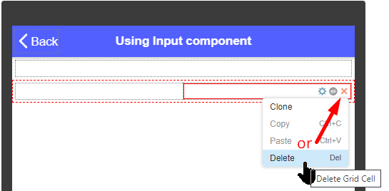
- Drag two Grid components and drop them to the Content area.
Two grids will be created each nesting one default Grid Row with two child Grid Cell components. - For each row, select the right Grid Cell and remove them from by using the Context menu or simply click the red cross icon:
- Now, let's define the first Grid Row:
- Drag the Text component and drop it to the Grid Cell, replace its default Text property with Pick date and time: and set its Container property as h3:
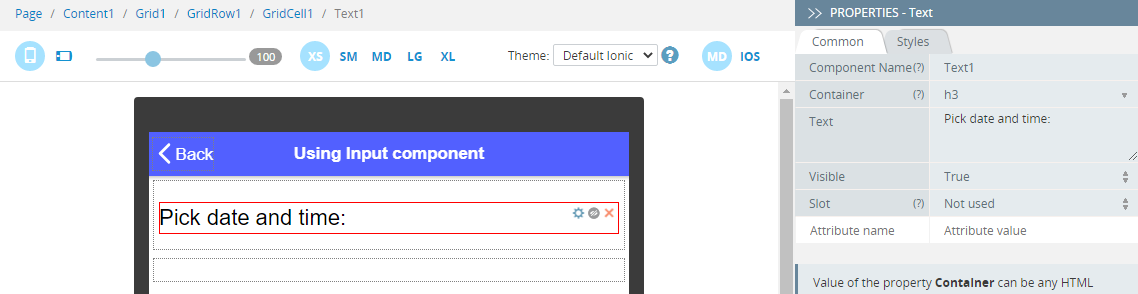
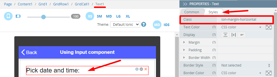
After that, switch to the component's Styles tab and set the Class property to ion-margin-horizontal:
- Drag two Input components and drop them below the text and define their properties like this:
- for the first input component:
- Value = 2022-01-01
- Placeholder = Select date
- Type = Date
- Label > Text = Date
- Label > Position = Stacked
- Label > Mode = iOS
- [(ngModel)] = date:
- for the second input component:
- Value = 10:30
- Placeholder = Select time
- Type = Time
- Label > Text = Time
- Label > Position = Stacked
- Label > Mode = iOS
- [(ngModel)] = time:
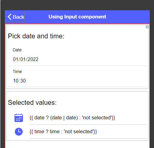
- First, drag another Text component and drop it to the Grid Cell and set its Text property to Selected values: and its Container property as h3. Switch to the component's Styles tab and set the Class property to ion-margin-horizontal.
- Now, drop the List component below the text. A list with two default List items each having a child Item Label component will be created. Set the list Mode property to iOS.
- Go to the first Item Label and define its Text property as {{ date ? (date | date) : 'not selected'}}.
- Then, define the Text property of the second Item Label to {{ time ? time : 'not selected'}}.
- Finally, add per one Icon component to both List item and define their properties accordingly:
- Name= calendar (for ListItem1)/time (for ListItem2)
- Color = tertiary
- Slot = Start:
- Save the changes and switch to the CODE panel.
Here, in the Variables section, create 2 variables, both of String type:dateandtime:

Placeholder AttributeNote that the Placeholder attribute doesn't work with Inputs of Date and Time type. You can set the default input Value instead.
If you still need a placeholder in your control, please try the Datetime component.
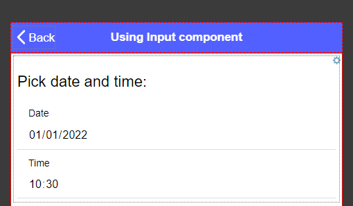
That’s it, you can now test the pickers in the preview. When you click the date input field, the native datepicker dialog will appear. Also, on the desktop, you can type the date manually. The appearance of the picker may vary depending on the browser and OS:

Desktop Safari SupportAlso note that Safari desktop browser does not include a native datepicker (although it does for iOS). Instead, a regular text input will be shown.
Useful link for tracking browser support: http://caniuse.com/#feat=input-datetime
Using Ionic Datetime Component
The simplest way is to use the Datetime component from Ionic. It displays values in two places: in the component itself and in the picker interface that is presented at the bottom of the screen. This picker interface looks the same on both platforms and in the browser.
- Open the Datetime page and under the page PROPERTIES panel, set the Page Footer property to False.
- Then, select its Toolbar component and set its Color property to tertiary and its Mode property to iOS; then switch to the ToolbarTitle component and change it's Text property to Using Datetime component.
- From the PALETTE, drag and drop the Button component to the Toolbar buttons area and set its Component type property to to Ionic Back Button.
- Now, drag two Grid components and drop them to the Content area.
Two grids will be created each nesting one default Grid Row with two child Grid Cell components. - For each row, select the right Grid Cell and remove them by using the Context menu or simply click the red cross icon.
- Now, let's define the first Grid Row:
- Drag the Text component and drop it to Grid Cell1; then set its Text property to Pick date and time: and its Container property as h3. After that, switch to the component's Styles tab and set the Class property to ion-margin-horizontal.
- Now, drag two Datetime components and drop them below the text.
Define the first as follows: - Placeholder = Select date
- Label > Text = Date
- Label > Position = Stacked
- [(ngModel)] = date .
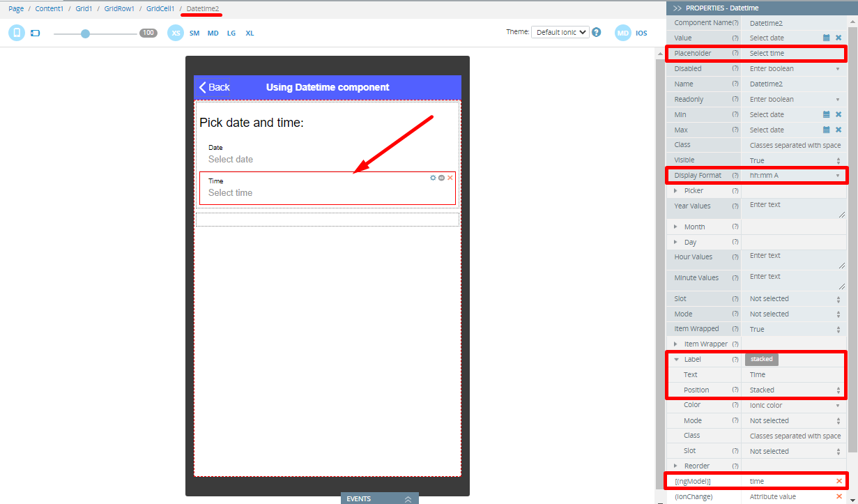
Then, select the second Datetime component and define it as follows: - Placeholder = Select time
- Display Format = hh:mm A
- Label > Text = Time
- Label > Position = Stacked
- [(ngModel)] = time :
- First, drag another Text component and drop it to the Grid Cell; then set its Text property to Selected values: and its Container property as h3. After that, switch to the component's Styles tab and set the Class property to ion-margin-horizontal.
- Now, drop the List component below the text. A list with two default List items each having a child Item Label component will be created:
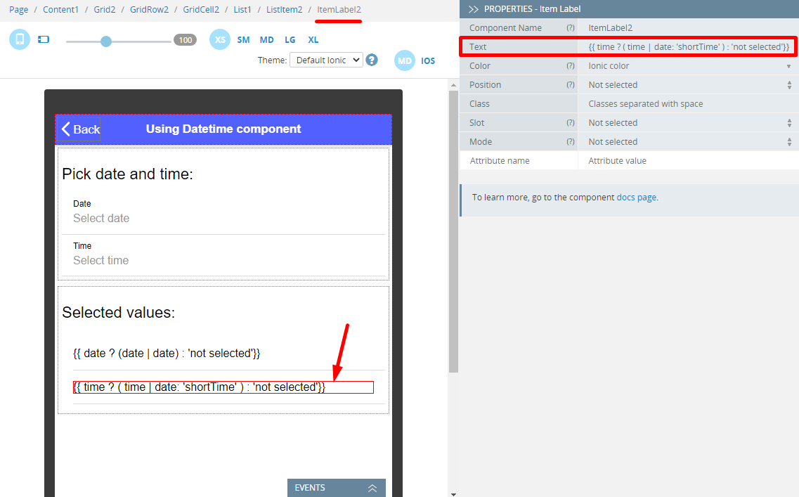
- Define the Text property of the first Item Label to {{ date ? (date | date) : 'not selected'}}
- Define the Text property of the second Item Label to {{ time ? ( time | date: 'shortTime' ) : 'not selected'}}:
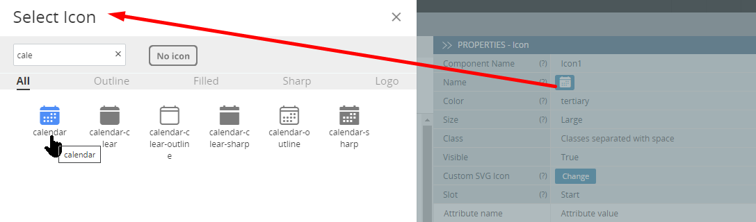
- To finish, add per one Icon component to both List items and define their properties accordingly:
- Name= calendar (for ListItem1)/time (for ListItem2)
- Color = tertiary
- Slot = Start.
For the Name property, click the Default icon button to select the icon you need:
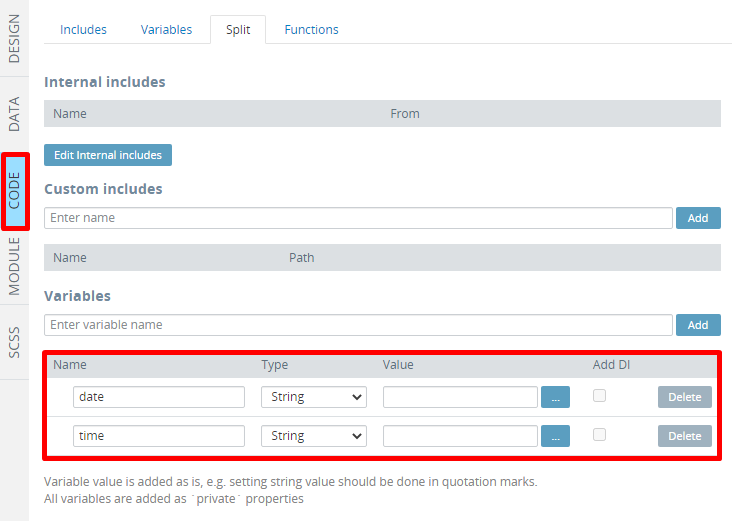
- Save the changes and switch to the CODE panel.
Here, in the Variables section, create 2 variables, both of String type:dateandtime:
Test the app. It should work like this:

Using Custom Datepicker
The Datetime and Input components are a good solution if we need to enter only one value. But what if we need to select multiple date values or a date range?
In this case, a separate modal screen or the ion2-calendar Modal Mode can be used.
Setting Up Datepicker with DateModal Page
Defining App settings
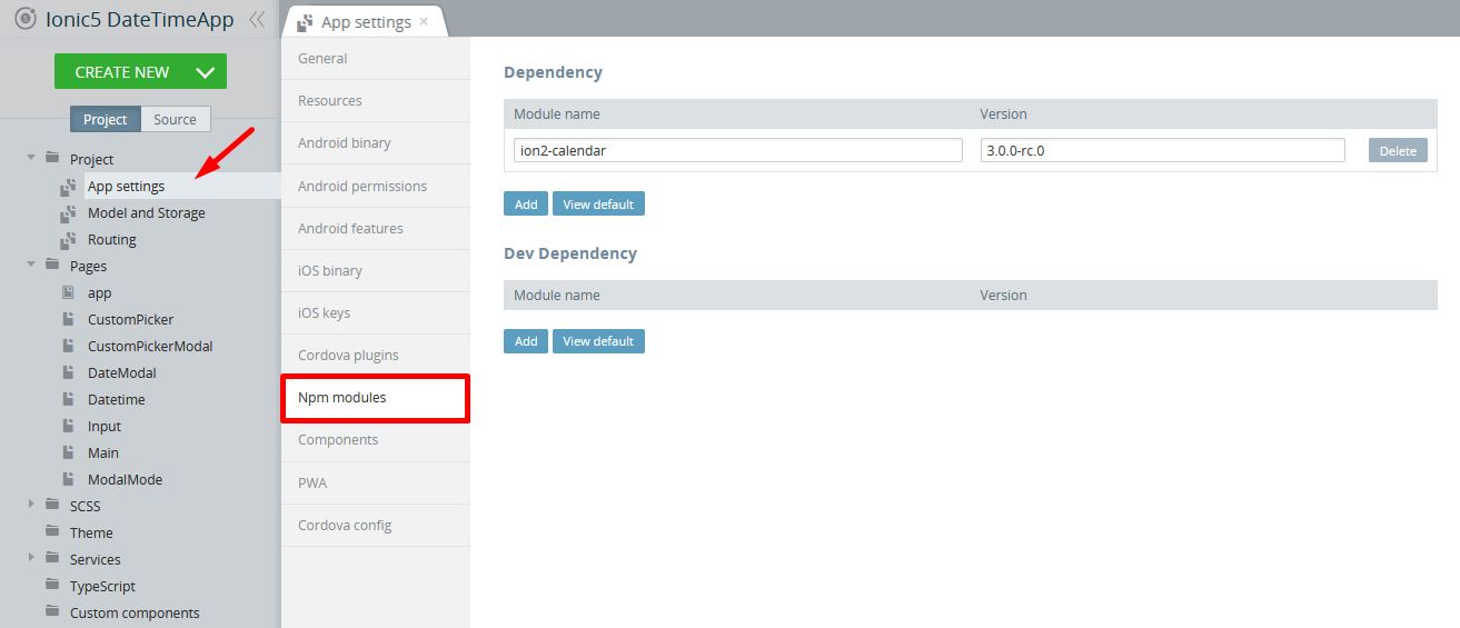
- Go to Project > App settings >Npm modules.
- Add a new Dependency with ion2-calendar for its name and 3.0.0-rc.0 for its version:
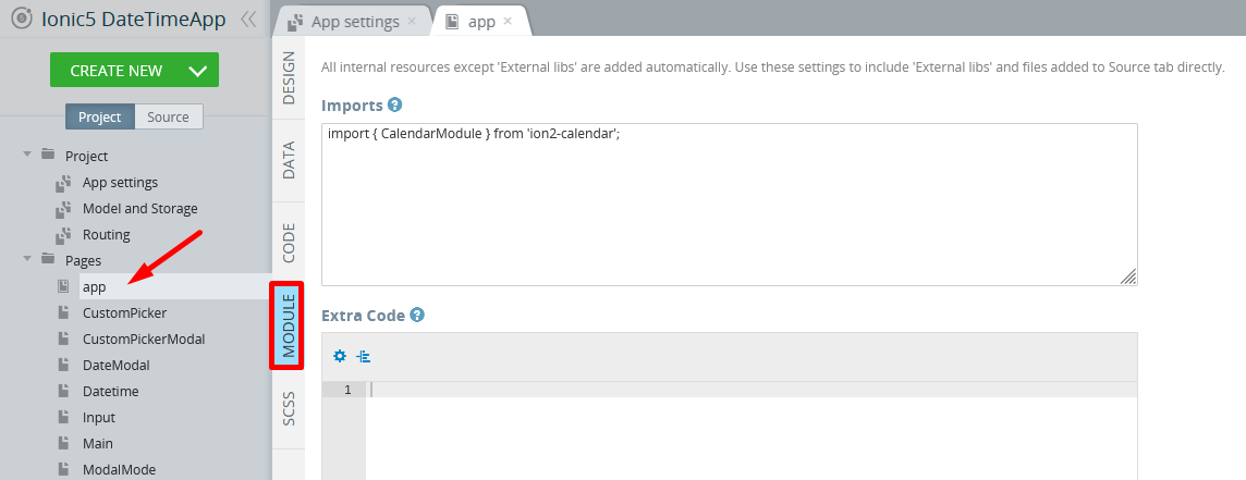
- Then navigate to Pages > app >MODULE. In the Imports section, add:
import { CalendarModule } from 'ion2-calendar';
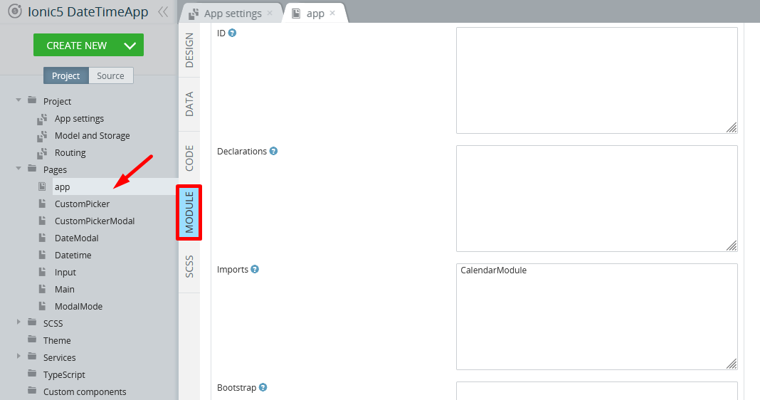
- Scroll down and in the NgModule Settings > Imports section, type
CalendarModule. Save the changes:
Adding Options of Date/Time Selection (Single, Multi, and Range)
Let's see how you can set up your app if you, for example, need to select only single date/time combination, select several dates or, select a range of dates.
Defining DateModal Page
- Select the DateModal page and open its DESIGN panel.
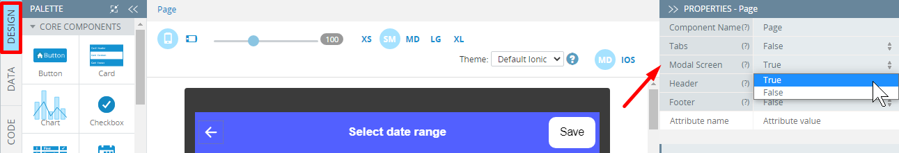
- Under the PROPERTIES panel, change its Footer property to False and set Modal Screen to True.
- Then, select its Toolbar component and set its Color property to tertiary and its Mode property to iOS; then switch to the ToolbarTitle component and change it's Text property to Select date range.
- Now, drag the Button component and drop it to the Toolbar buttons area, clear its Text value, and set its Icon > Style property to arrow-back.
- To make the page to a modal screen, set the Modal Screen property of the Page component to True, otherwise, this functionality will not work:
- Unfold the EVENTS tab from the bottom, select the Button1 component; for the Event, select Click, for the Action, select Run Typescript. Copy the code below and paste it to the code editor.
this.Apperyio.getController("ModalController").dismiss();As a result, the button configuration should be like this:
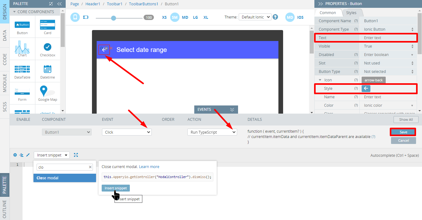
- Also, drag another Button component and drop it to the Toolbar buttons area; then set its properties as follow:
- Component Type = Ionic Button
- Text = Save
- Slot = End
- Button Type = Bar Button.
- Now, unfold the EVENTS tab from the bottom, and for the Button2 component Click event, define the Run Typescript action. For the action details, insert the below code and save:
this.Apperyio.getController("ModalController").dismiss(this.selectedDates);- Finally, drag an Html component and drop it to the screen. Click the Edit button next to its HTML property in the PROPERTIES panel on the right. Type the following code in a popup and click Save:
<ion-calendar [(ngModel)]="selectedDates"
              [options]="options"
              [type]="type"
              [format]="'YYYY-MM-DD'">
</ion-calendar>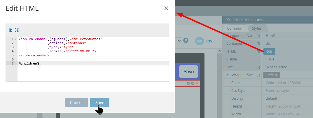
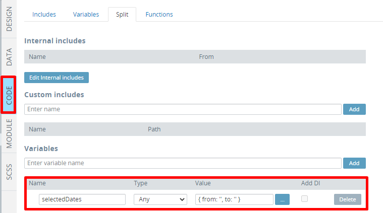
- Save the changes and switch to the CODE panel.
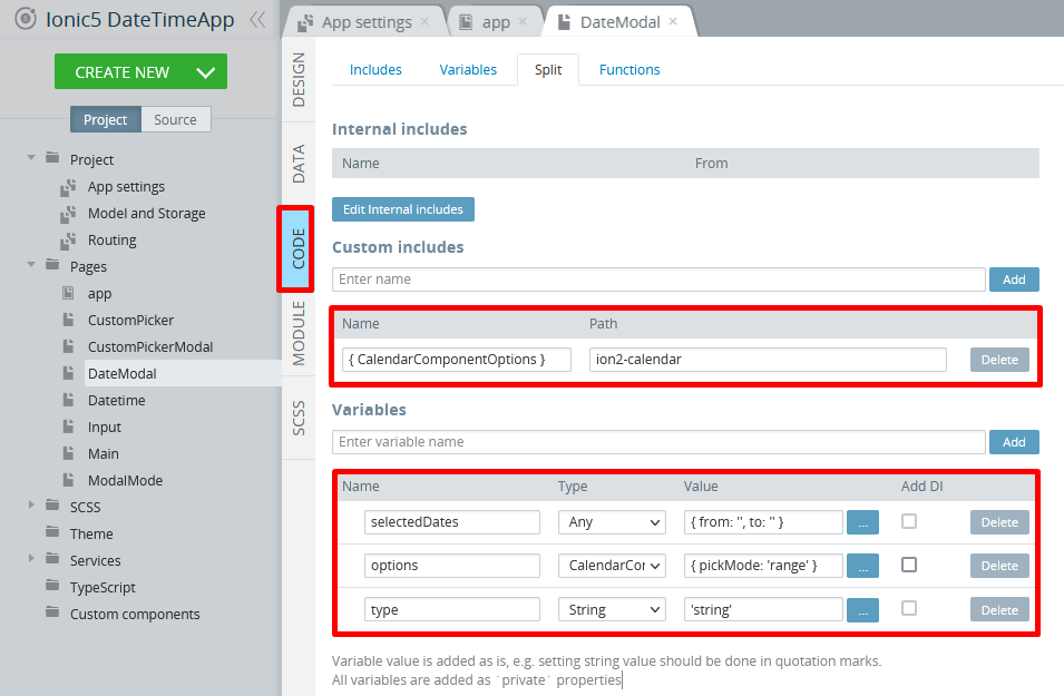
Here, in the Custom Includes section, add an include with{ CalendarComponentOptions }for its name and setion2-calendaras its path. - In the Variables section, create 3 variables:
selectedDatesvariable of Any type and{ from: '', to: '' }valueoptionsvariable of CalendarComponentOptions type with{ pickMode: 'range' }default value,typevariable of String type with'string'as its default value:
Component optionsThe
typevariable defines the type of the date values, returned from the picker. You can set the following types:'string','js-date','moment','time'and'object'.The
pickModeoption sets the picker mode:'single','multi'or'range'.For more information, check the module documentation.
- Then navigate to the page MODULE panel and in the Imports section, add:
import { CalendarModule } from 'ion2-calendar';
Also, scroll down and in the NgModule Settings > Imports section, typeCalendarModule. Save the changes.
Defining CustomPicker Page
- Switch to the CustomPicker page and open its MODULE panel to add the same modules:
import { CalendarModule } from 'ion2-calendar';(in the Imports section) andCalendarModule(in the NgModule Settings > Imports section). Save the changes. - Now, select its CODE panel. Here, in the Custom Includes section, add an include with
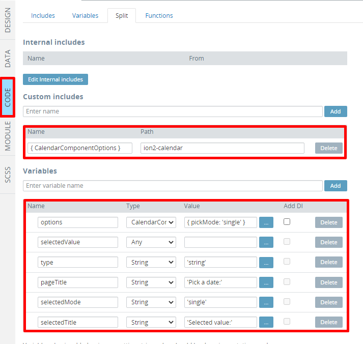
{ CalendarComponentOptions }for its name. Setion2-calendaras its path. - In the Variables section, create 6 variables:
optionsvariable of CalendarComponentOptions type with{ pickMode: 'single' }default value,selectedValuevariable of Any typetypevariable of String type with'string'as its default valuepageTitlevariable of String type and'Pick a date:'valueselectedModevariable of String type and'single'valueselectedTitlevariable of String type and'Selected value:'value:
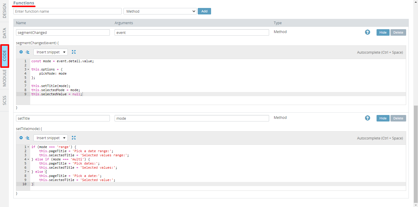
- Now, scroll down to the Functions section and add two functions, both of Method type:
segmentChangedwitheventas an argument and the below code:
const mode = event.detail.value;

this.options = {
    pickMode: mode
};

this.setTitle(mode);
this.selectedMode = mode;
this.selectedValue = null;setTitlewithmodeas an argument and the below code:
if (mode === 'range') {
    this.pageTitle = 'Pick a date range:';
    this.selectedTitle = 'Selected values range:';
} else if (mode === 'multi') {
    this.pageTitle = 'Pick dates:';
    this.selectedTitle = 'Selected values:';
} else {
    this.pageTitle = 'Pick a date:';
    this.selectedTitle = 'Selected value:';
}
When done, the Functions section of the CustomPicker page CODE panel should look like this:
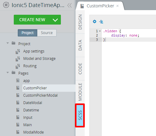
- To finish, add the following code to style code editor under the SCSS tab:
.hidden {
    display: none;
}
Let's do the page UI now.
- Open the CustomPicker page DESIGN panel and under the PROPERTIES panel, set the Page Footer property to False, then select its Toolbar component and set its Color property to tertiary and its Mode property to iOS; then switch to the ToolbarTitle1 component and change it's Text property to Custom ion2-calendar picker.
- Then, from the PALETTE, drag & drop the Button component to the Toolbar buttons area and set its Component type property to Ionic Back Button.
- Drag two Grid components and drop them to the Content area.
Two grids will be created each nesting one default Grid Row with two child Grid Cell components. - For each row, select the right Grid Cell and remove them from by using the Context menu or simply click the red cross icon.
- Drag per one Html component and drop them to both grid cells. Then, define them one by one by clicking the Edit button next to their HTML property in the PROPERTIES panel on the right. Type the following codes in a popup and click Save:
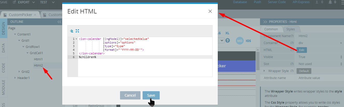
- for Html1:
<ion-segment color="tertiary" (ionChange)="segmentChanged($event)" value="single">
  <ion-segment-button value="single">
    <ion-label>Single</ion-label>
  </ion-segment-button>

  <ion-segment-button value="multi">
    <ion-label>Multiple</ion-label>
  </ion-segment-button>

  <ion-segment-button value="range">
    <ion-label>Range</ion-label>
  </ion-segment-button>
</ion-segment>- for Html2:
<ion-calendar [(ngModel)]="selectedValue"
              [options]="options"
              [type]="type"
              [format]="'YYYY-MM-DD'">
</ion-calendar>- Move to the second Grid and define its Grid Row by setting its Justify Content property to start.
- Then, drag another Grid component and three List components and drop them to the Grid Cell2.
- First, let's define the left grid cell:
Set its Text Alignment property to text-center and then drop an Icon inside the grid cell.
- For the icon, set:
- Name= calendar (click the Default icon button to select the icon you need)
- Color = tertiary.
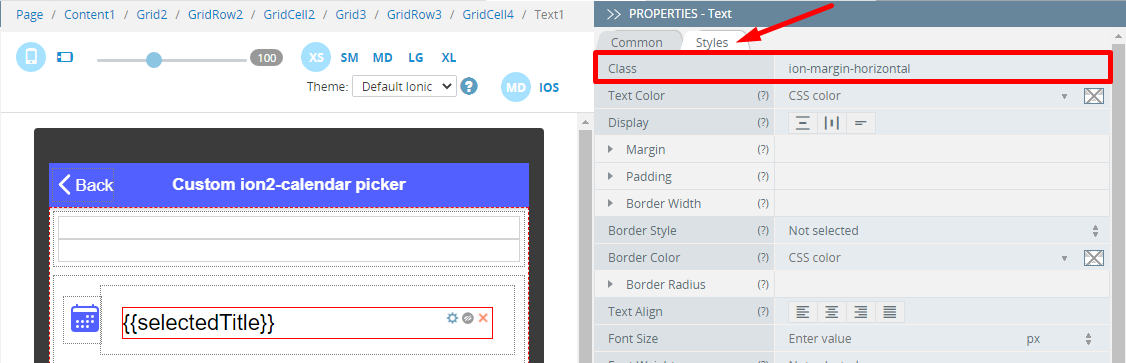
- Switch to the right grid cell and set its Align Self property to center. Also, drag & drop the *Text component to the Grid Cell, replace its default Text property with {{selectedTitle}} and set its Container property as h3. After that, switch to the text Styles tab and set the Class property to ion-margin-horizontal:
It's time to define the lists:
- List 1:
- Mode = iOS
- ngIf = selectedMode === 'single'
Then, delete the second List item and define the Text property of the first item Item Label to {{ selectedValue ? (selectedValue | date) : 'not selected'}}. - List 2:
- Mode = iOS
- ngIf = selectedMode === 'multi'
- For the first list item (ListItem3), set its *ngFor property to let item of selectedValue and set the Text property of its Item Label to {{ item | date }}.
- For the second list item (ListItem4), first, set its *ngFor property to let item of selectedValue:
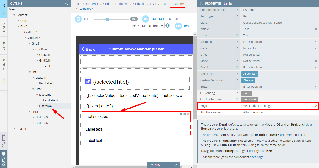
and then set the Text property of its Item Label to not selected.
- List 3:
- Mode = iOS
- ngIf = selectedMode === 'range'
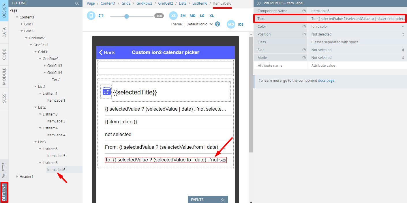
- for the first list item (ListItem5), set the Text property of its *Item Label to From: {{ selectedValue ? (selectedValue.from | date) : 'not selected'}}.
- for the second list item (ListItem6), set the Text property of its Item Label to To: {{ selectedValue ? (selectedValue.to | date) : 'not selected'}}:
- Save all the changes and test how selecting different options (single, multi, and range) works in one app page:

Adding Custom Datepicker with Appery.io Modal Screen
- Switch to the CustomPickerModal page DESIGN panel, set the Page Footer property to False and change the Header ToolbarTitle Text to Custom picker in a modal.
- Then, select its Toolbar component and set its Color property to tertiary and its Mode property to iOS.
- From the PALETTE panel, drag and drop the Button component to the Toolbar buttons area and set its Component type property to to Ionic Back Button.
- Now, drag the Grid component and drop it to the Content area.
A grid will be created nesting one default Grid Row with two child Grid Cell components. - Delete the right Grid Cell.
- Drag & drop two Text components to the Grid Cell and set the Text property of the first text to ion2-calendar date range picker and its Container property to h3. After that, switch to the text Styles tab and set the Class property to ion-margin-horizontal.
- Now, select the second Text component and set its Container property to ion-note and its Text property to Opens in a modal screen (DateModal page).
- Now, drag the Button component and drop it below the texts; then and set its Text as Select dates.
- Then, switch to the button Styles tab and set the Class property to ion-margin-vertical, Mode = iOS, Button Color = Tertiary, and Shape = Round.
- To finish with the button, define its (click) event with the Run TypeScript action. Copy the code below and paste it to the code editor.
this.Apperyio.showModal("DateModal", {
        componentProps: {},
        showBackdrop: true,
        backdropDismiss: true,
        cssClass: "modal",
        animated: true,
        keyboardClose: true
    })
    .then(modal => {
        modal.present();
        modal.onDidDismiss().then((dataReturned) => {
            this.selectedDates = dataReturned.data;
        });
    });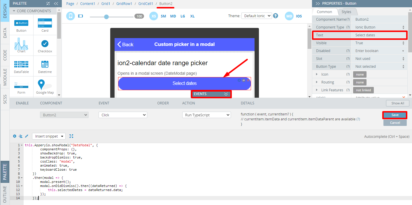
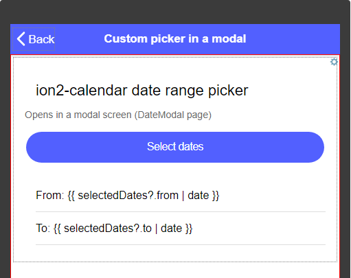
- Now, drag the List component and drop it to the Grid Cell.
- Inside the list, for the first List item, set its label's Text property to From: {{ selectedDates?.from | date }}. For the second one — to To: {{ selectedDates?.to | date }}.
Here is how the resulting page UI should look like:
- Navigate to the page CODE panel and add a
selectedDatesvariable of Any type and{ from: '', to: '' }value:
Save the changes and test the app. Now you can select a range of dates using the modal screen functionality by clicking the start and the end dates:

Using ion2-calendar Modal Mode
In the previous steps, we created a separate modal screen to display the date picker. Another option is to use ion2-calendar's Modal Mode.
- Open the Datetime page DESIGN panel, set the Page Footer property to False and change the Header ToolbarTitle Text to Custom picker in a modal.
- Then, select its Toolbar component and set its Color property to tertiary and its Mode property to iOS.
- From the PALETTE panel, drag and drop the Button component to the Toolbar buttons area and set its Component type property to to Ionic Back Button.
- Now, drag the Grid component and drop it to the Content area.
A grid will be created nesting one default Grid Row with two child Grid Cell components. - Delete the right Grid Cell.
- Drag the Text component and drop it to the Grid Cell; then set its Text property to Modal Mode provided by ion2-calendar and its Container property as h3. After that, switch to the text Styles tab and set the Class property to ion-margin-horizontal.
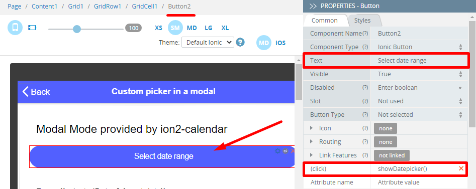
- Now, drag the Button component and drop it below the text; then set its Text =Select date range and define its (click) property as showDatepicker():
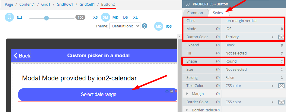
- Then, switch to the button Styles tab and set the Class property to ion-margin-vertical, Mode = iOS, Button Color = Tertiary, and Shape = Round:
- Now, drag a List component and drop it below the button.
- Inside the List, for the first List Item, set the ItemLabel Text property to From: {{selectedDates?.from | date}}. For the second one — to To: {{selectedDates?.to | date}}.
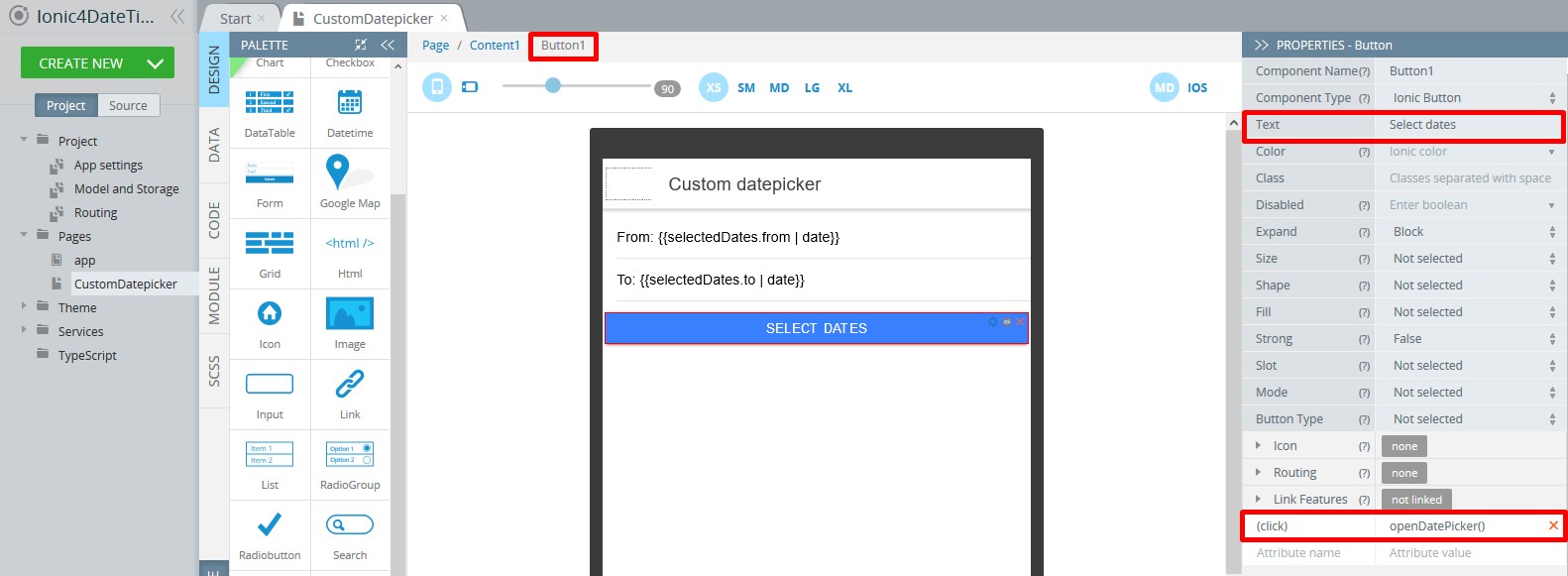
- For the button, set Text to Select dates and define its (click) property as openDatePicker():
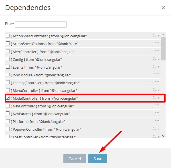
- Navigate to the CODE panel. In the Internal Includes section, click the Edit internal includes button. In the popup, select the { ModalController } from "@ionic/angular" include and save:
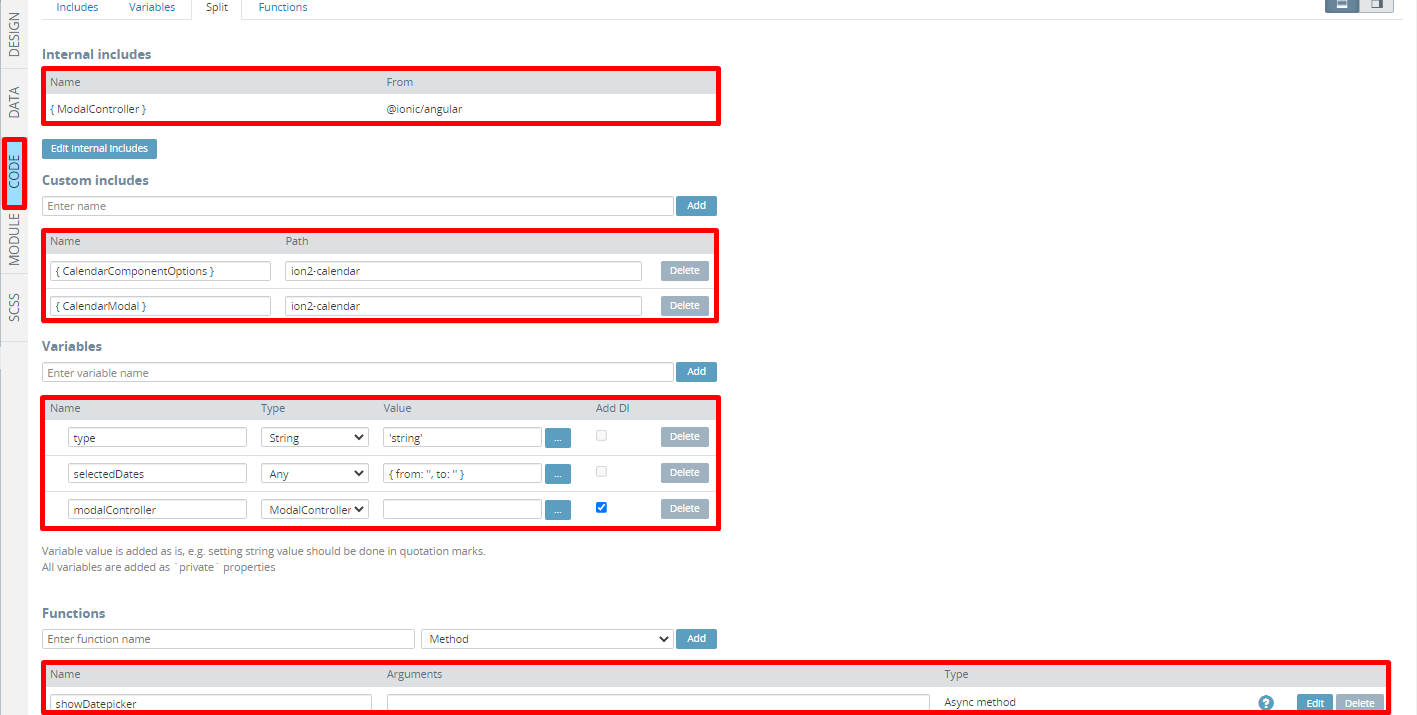
- Also, add the following Custom Includes:
- with
{ CalendarComponentOptions }for name andion2-calendarpath, - with
{ CalendarModal }for name andion2-calendarpath:
- Scroll down to the Variables section and create 3 variables:
typevariable of String type with'string'as its default valueselectedDatesvariable of Any type and{ from: '', to: '' }valuemodalControllervariable of ModalController type (select the Add DI check box).
- In the Functions section, create a new
showDatepickerAsync method. In the code editor, type the following code for the new function:
const options = {
  pickMode: 'range',
  title: 'Select date range'
};

const calendarModal = await this.modalController.create({
    component: CalendarModal,
    componentProps: { options }
});

calendarModal.onDidDismiss().then(({ data }) => {
    if (data) {
        this.selectedDates.from = data.from.dateObj;
        this.selectedDates.to = data.to.dateObj;
    }
})

return await calendarModal.present();
Here is how the page CODE panel should look like:
Finally, navigate to the page MODULE panel and in the Imports section, add: import { CalendarModule } from 'ion2-calendar';
Also, scroll down and in the NgModule Settings > Imports section, type CalendarModule.
Testing App
Save the changes and test the app:
Customizing ion2-calendar datepickerYou can customize the component more flexibly. It supports:
- selecting single date, date range and multi date.
- HTML components.
- disabling weekdays or weekends.
- setting days event.
- setting localization and calendar appearance.
Information on available properties and methods can be found in documentation.
Note that ion2-calendar can be used precisely for the selection of date values. If you need to create integration with the native calendar app, please check Ionic Calendar plug-in tutorial.
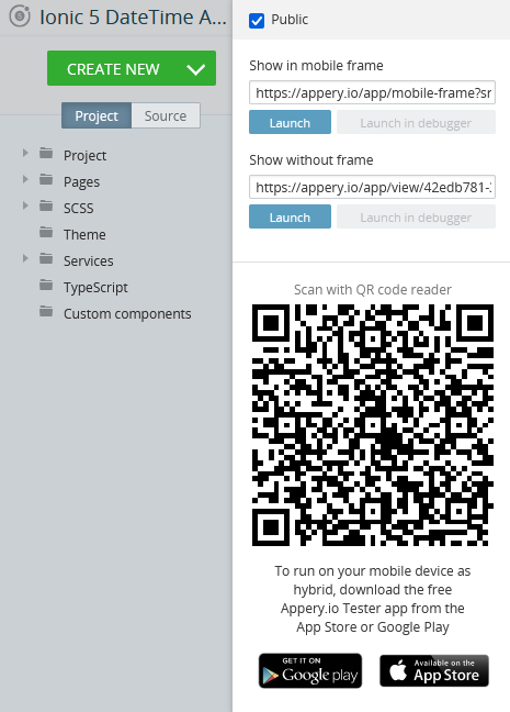
Testing on Device
When your app version is ready, you might also like to test it on the device.
Appery.io Tester AppA great option to quickly test the app on the device is to use our Appery.io Tester app.
The app is free and available for both iOS and Android.
You can check out this page to learn more about using the Appery.io Tester app.